hi in this video we'll go over different methods that data can be visualized and how the data can be interpreted so what is data visualization it's when you use graphs charts images that help you visualize complex data here's an example on the top is the raw data collected about temperature rainfall and sunlight in Great Britain it's kind of hard to pull any useful information from these numbers right on the bottom the information has been presented in a way that makes it much less difficult to make sense of the data you can easily see the location
since a map is used and the colors represent the amount of the rain or sunshine so why do we want to visualize data well it makes it easier to understand the data and then we're able to use information from the data when we see it in a visual form it's much faster than reading through pages and pages of numbers and this isn't just about maps and rainfall data visualization assists everywhere it's in science government sports everywhere you can see this data used in data visualization is incredibly useful because it helps us recognize problems here's a
visualization that displays the amount of endangered-species across the United States your eyes are almost instantly drawn to the two locations with the highest amount of endangered-species do you see them you can see that Florida and then the bottom left of the US contain the most endangered species this is helpful because now we know that programs to save these species should probably focus in those area and data visualization has been around for centuries you can even count maps and map creation as one of the first data visualizations this is an example of a very early data
visualization this was created to track Napoleon's losses along his route now think back to this time period see if you can actually picture Charles Joseph Minard creating this visualization he probably had a table of values drawn out and he had to look at the value and then very carefully plot the points and make sure the distance between the points were uniform he had to probably have a little bit of artistic talent how to take quite some time there were no computers or database programs back then it was all done by hand in today's data visualization
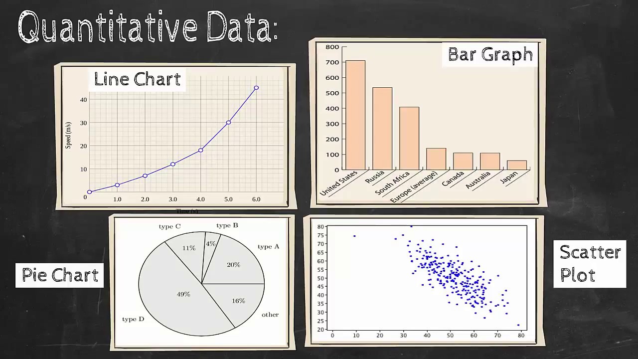
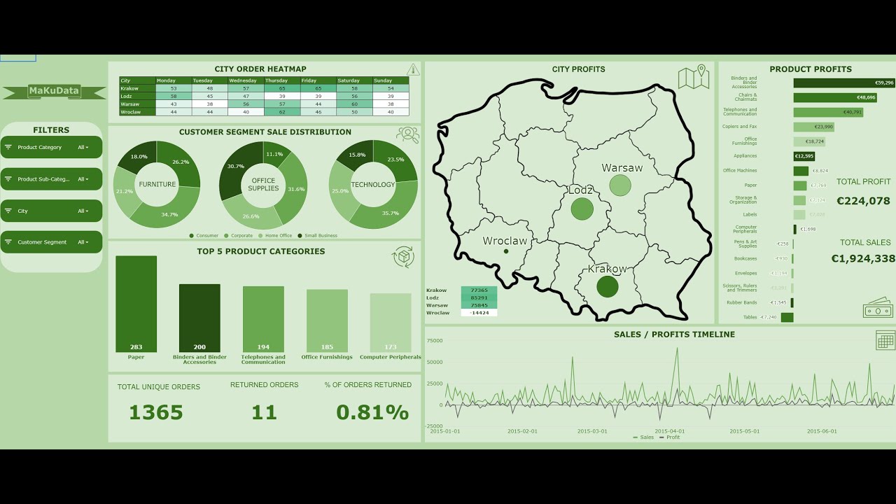
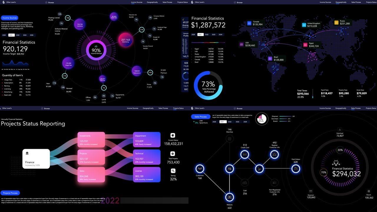
we have come so far we can process large amounts of data very quickly we can even keep it updated so that it is current and always accurate and then we can add interactivity as well and this helps us blend science and art it makes our visualizations very nice to look at there's so many different kinds it's not just graphs and pie charts anymore and more being created every day now a lot of these visualizations seen here are been advanced so we're going to start by looking at some of the basic most commonly used types tables
are great to use when you need precise data when you actually leave the number and not just the color or comparison with another number this table shows the Train times of the Train leaving San Francisco well this would be something that you would definitely want precise values for so that you don't miss the train so a table makes sense to display the data and then the colors are used as well which might represent different ticket costs or maybe if the Train is on or off peak so can you tell what exactly or what exactly does
the earliest train leave San Francisco see if you can find it yeah it looks like it's in the top-left corner at 4:55 in the morning way early pie charts are a good choice when a percentage can be useful in interpreting the data we don't have the exact value here but not might not be what we're trying to display this pie chart shows how often twitter users check their feed if I were to ask you how many check once a day you could use the chart to figure that out do you see it it looks like
about 12% looks like 12% of 20 users check their Twitter once a day so it doesn't actually matter how many users were talking about here either way 12% of that group of the Twitter group will probably check their Twitter feed once a day a line chart is great for showing trends over time so you can quickly compare the broadband rates for different countries it looks like Denmark and the Netherlands have the best rate also you can see the increase in the rates for each individual country so let's see has access to high-speed Internet gotten better
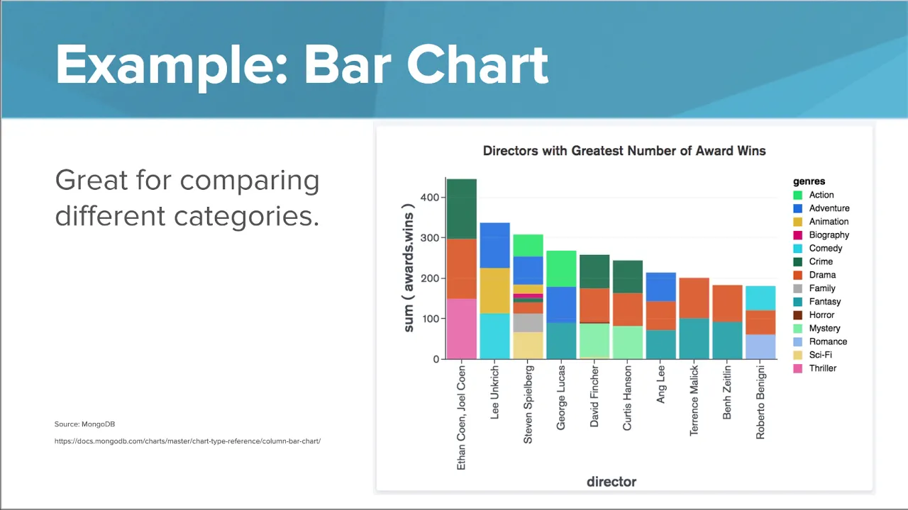
or worse for these countries well you can definitely see it's increasing now bar charts are great for comparing different categories and this is actually a stacked bar chart which offers even more information in each individual bar now at first glance you might notice that the first bar is the highest so Ethan and joel coen have the greatest number of award wins now there are three colors in the bar and if you use the key on the right you can see that they've won awards for thrillers dramas and crime films now it's interesting as well is
the third bar from the left take a look at Steven Spielberg's bar he may not have won as many awards but look at all the different colors all the different genres of film that he's won for that's very impressive as well so there's a lot of useful data from this visualization a histogram is used to this is great for showing the frequency of events this is this is used a lot to display scores on a test because the scores can be grouped together as shown so which floor range had the most students do you see
it looks like it's that orange bar and it looks like this exam was pretty tough it looks like about 55 students scored between 50 and 60 on this exam which score range had the least well it's a light purple all the way on the right it's only a few students scored between 90 and 100 and when we add interactivity it it even adds more to the visualization it can allow the user to narrow in on the information that they want to know so this interactive lets you hover over each city and it will display the
population for that city here you can see the top three overall players or you can choose a certain skill like ball control and see the top three players in that category alone this interactivity can engage the user and allow them to narrow in on the information that they want to know now having creativity in your visualization can be very helpful when interpreting the data if you look at just the top two rows of data it's hard to pull up anything useful about LeBron James shooting statistics but if we place these values on an actual basketball
court because very useful if we were LeBron James we could see where we might want to practice a bit more and if we were the team playing against him we now know that we have probably should keep him out of the key where it shows him shooting at 66.7% and he definitely shoots more from the left side of the hoop so we might want to cover and tighter when he's over there so how do these visualizations used well there are a lot of public datasets and these tools allow widespread access so anyone can go to
the Google public data Explorer or Gapminder and anyone can use the data to try to find patterns find trends and recognize problems and that is a quick overview on the different types of data visualizations that we can use







![Pink Floyd - The Dark Side Of The Moon (50th Anniversary) [2023 Remaster] {Full Album}](https://img.youtube.com/vi/k9ynZnEBtvw/maxresdefault.jpg)