With the new Cloud EPM Platform Reporting Solution, you can design reports for Planning, Financial Consolidation and Close, and Tax Reporting. The user interface is similar between business processes. In this tutorial, I’ll be working with Planning.
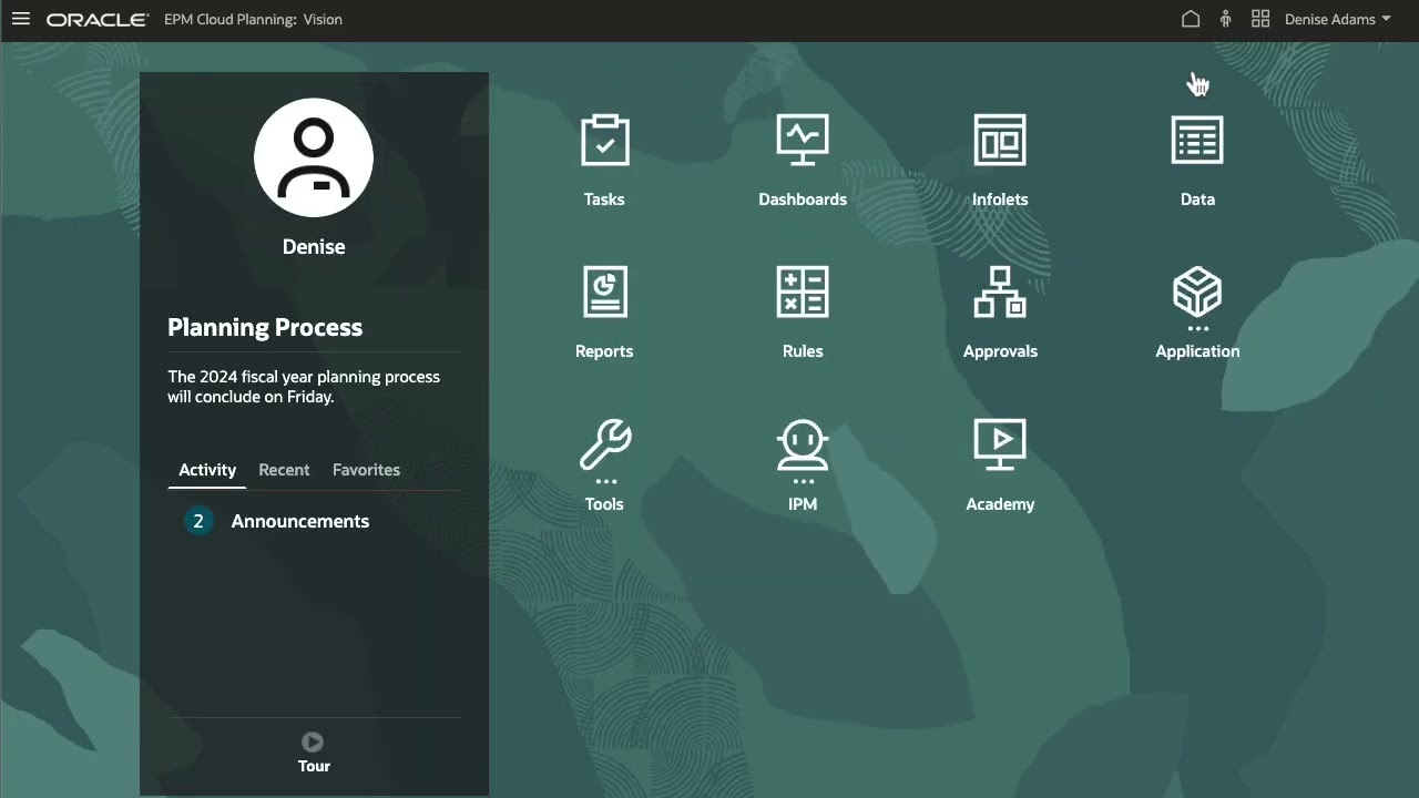
Reports are managed on the first tab in the Reports card. You can filter the list of reports and choose to display reports, report snapshots or both. I’ll create a folder for my Revenue reports.
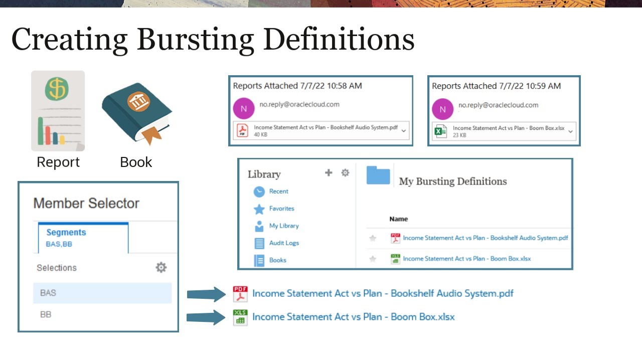
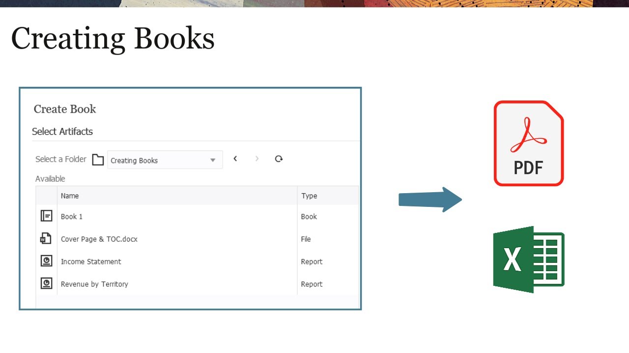
Folders are listed in alphabetical order. Power users can design reports, create books, and bursting definitions. Users can view books and reports.
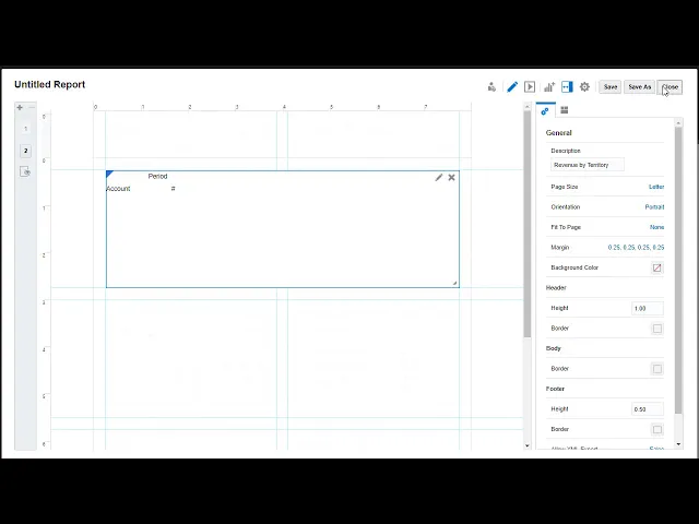
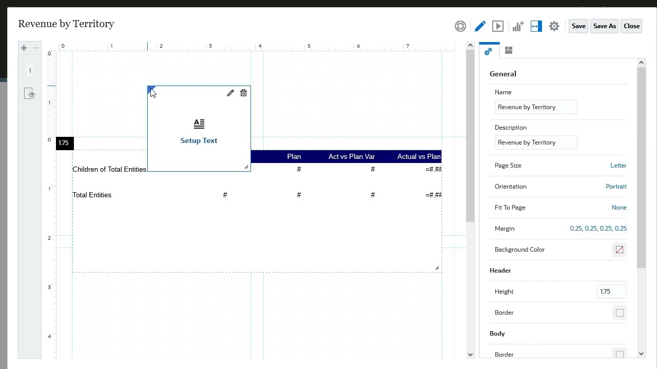
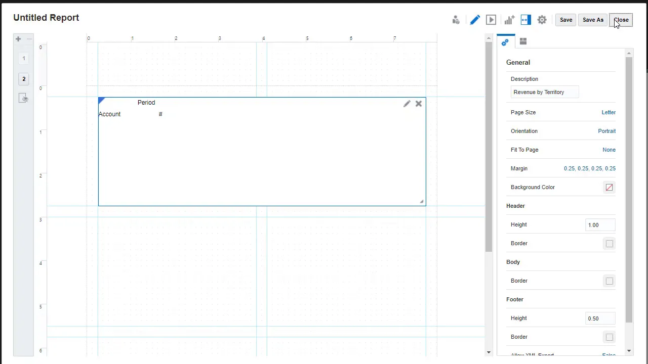
Next, I’ll create a report. The Report Designer opens a canvas where you can insert, resize, and reposition objects in the header, body, and footer of the report. The body includes an initial undefined grid as a starting point.
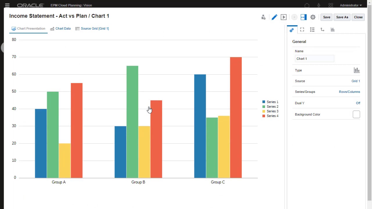
You can add or delete multiple report pages; each page with the same header and footer, but with different content. Use the hidden sheet to hide a grid from being displayed in the report. You can use the hidden grid as an additional data source for row or column formulas in a displayed grid or as the source for a chart.
The buttons on the top-right section let you Switch between edit and preview mode Add grids, charts, text, and images Hide or display the Properties pane. The Properties pane allows you to set general and layout properties for the report. I’ll start with the grid so we can set a data source for the report.
When setting a data source, you can double-click the grid and select from the available cubes in your application. When you add or edit a report object, it opens in its own editor. To edit a report object, click the Edit icon for that report object.
The contents of the Properties pane also become specific to the object you are working with. For grid, it includes tabs for column, row, and cell properties… Sorting… Conditional Properties… And Drll to Content. In General properties, you can change the grid’s data source.
After selecting a data source, the grid displays the initial selection of row and column dimensions. Typically, time periods are displayed in columns while accounts are in the rows. The POV bar includes the rest of the dimensions in the cube.
You can switch between edit and preview mode for the grid. When you click Show Dimension Layout, the view is updated to where you can drag and drop dimensions between the POV, rows, and columns. You can also reorder how you want dimensions displayed in the POV.
When finished working with the dimension layout, you can hide it. You can set how member labels are displayed in the grid… If you have more than one dimension in the heading or rows, you can set individual header display labels. I’ll move my Period dimension to the POV before selecting members.
Now, I’ll select members for the dimensions in the grid, starting with Scenario. To display Member Selector, you can: Click the dimension name and click the Select Members icon… …or right-click the dimension name and choose Select Members… For Entity, I’ll use function selector to include the children of a member. You can separate members into individual rows and columns to allow for formatting or use them in formulas or charts.
I’ll add a separator row to provide some space between the parent member and its children. I’ll also add a column formula that calculates the Actual vs Plan variance as a percentage, and displays a custom column heading. Next, I’ll quickly complete member selection for the POV dimensions to further filter the data displayed in the report.
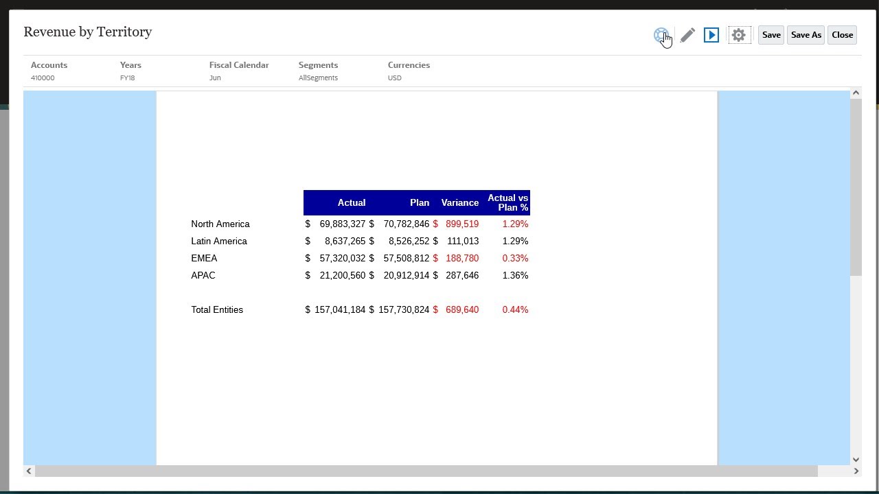
I’ll switch to Preview mode to see how the grid will look like in the report. Notice that negative numbers are prefixed with a dash. Cells with no data display a dash.
There are also no formatting styles set for the grid. I’ll switch back to Edit mode and apply formatting options. I’ll set the suppression for cells with no data to True.
For negative numbers, I want them to display in red and within a parenthesis. I’ll also change the font and shading color of the column headers. I’ll add a prefix to this column, which displays percent data, and set the decimal places to 2.
I’ll take a quick preview of my grid and then close it. Before I add more report objects, I’ll save my report. View the Adding Report Objects tutorial to learn more about including text, text functions, images and other report objects in the report layout.
To learn more, visit docs. oracle. com.