welcome to lecture one of business 355 data visualization in this lecture we're going to focus on why do visualizations matter so let's first talk about what is a visualization visualization is defined as the formation of mental visual images and the act or process of interpreting in visual terms or of putting into visual visible form so visualization is really the process that transforms data into interactive graphical representations for the purpose of exploration confirmation or presentation so i like to look at that and break it down into three parts the first is the part about transforming data
so it's the idea of taking what may be abstract things like numbers things like thoughts sums averages standard deviations etc and then putting those into some sort of interactive graphical representation something that illustrates what that data is saying and then always keeping in mind what the end goal is is the end goal exploration confirmation or presentation so this is a great example of a piece of data as you're looking at this don't worry i haven't violated any ferpa policies here because this is all fake data it does not it's not real it doesn't exist i
actually created this data in order to do some illustrations with faculty and staff on how to use student data so in this instance you can see things like id number last and first name gender race ethnic description class active credits completed credits cumulative gpa applicant admit status their major their sport whether they're associated with a greek organization who their advisors are etc and this is a small small piece of a much larger data set so imagine the data having instead of just maybe the 40 rows you see here instead it has thousands and instead of
maybe the you know 15 columns you see it has a hundred so when you're looking at a piece of data like this it's really hard to make sense of it if i were to ask you what percent of the students are readmitted freshmen so you could count them in this type of a data set where it's small enough you can go one two three four and say okay well four divided by whatever the total number is but again imagine instead that we had thousands of rows same thing for major people always want to know what's
the most popular major on campus well this is a piece of data where i would be able to answer that question however just looking at the data the way it exists here i really couldn't do something graphical with it i couldn't talk about major i couldn't talk about what the average gpa is what the average number of credits a student is signed up for so again this is limited the ability for me to talk about the data is very limited in this instance so one of the things i love is this graphic right here so
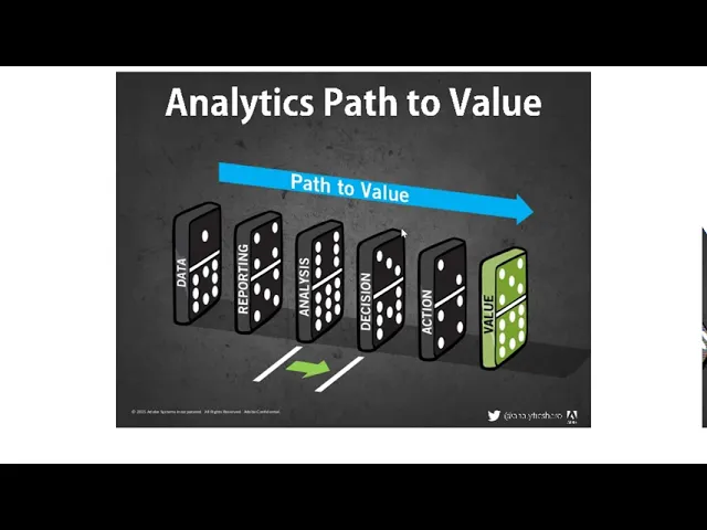
according to brett dykes who we'll talk about and i'll actually show you um which book i'm pulling some of this this information from there are five key steps to deriving value from analytics data information or reporting as you see here analysis or insight decision action and value so in the previous slide with the screenshot of the raw data in excel you can probably see that interpreting the data as it was displayed would have been impossible so it would have been really hard using that data without doing some data manipulation when i say manipulation i don't
actually mean manipulating it in a negative way i mean massaging it and organizing the data it would have been hard for us to take action or make decisions or even provide value using that data so like the line of dominoes that you see on the screen each step plays a role in driving towards value it starts with collecting raw data to serve as the foundation for gaining knowledge on a subject the data is organized and summarized into reports which turns raw data into information that's easier for more people to consume i like to think about
that as being one of the most important things you get out of this course right you can have data but unless it's unless it's in a palatable form unless you've made it so that it is easily consumable by the audience there's really nothing to be derived from it no value so here after we've organized and summarized it and we've turned it into information we then can be we can then examine it and analyze the reports and then discover meaningful insight that drives and informs our decisions and actions to create value as you'll see in a
video later in this course it's a ted talk by trisha wang it's called the cost of missing something i've seen her live she's phenomenal and if i could bring her to our class well it would cost me tens of thousands of dollars but she is phenomenal so we'll get to see her in action later you see that this is really a simplification it's not as easy or as simple as just getting raw data and providing value there's lots of parts in between so i'm sure you can all think of times where data has been analyzed
and decisions were made where you felt that the decision makers jumped to conclusions without taking into account things as such as culture tradition the current climate and more meaning it's not just about data summarizing value there's actually a lot of other parts that are here that may not be a domino right so for example these dominoes is placed well if they are spaced just far enough apart they may not hit if one domino hits another and it's not hard enough it may not keep going right so additionally one of the things we want to do
is think about how can we take data take into account what's going on in the world around us and use those two things to provide value i'm sure you can all think of times where data were misinterpreted if they didn't fall in line with the preconceived notions and we'll talk more about that this semester as we start to analyze things like good bad and ugly data visualizations so why do we use graphics why use graphics instead of numbers why use graphics instead of words well one graphics provide richer information our mind likes to look at
graphics and we can pretty much take them in and remember them much longer so think about if you hear a commercial on the radio versus the commercial that you see right when you're looking at a graphic something about it just sticks we also use graphics because there's less clutter one of the things you've seen a lot of people moving towards with regards to infographics is less paragraphs and more pictures there's also a more visible structure it's called the gestalt effect the ability to look at something follow it across and for it to make an immediate
connection in your brain we like graphics also because they're easier to understand and grasp when somebody in a paragraph starts talking about how an act score of 33 is in the 98th percentile and it's all part of something kind of larger your brain doesn't quite pull it in and keep it but if you see that in an infographic represented in some way that makes a connection with your brain you're more likely to recall that information later on which leads us to the graphics just being more memorable and to be honest at the end of the
day graphics are just more fun who wants to read entire paragraphs about and and about something and have to figure out what the main points what the main statistics what the main things you were supposed to recognize were we know that infographics tend to be catchy people like them we see them on walls and on and posted all throughout campus we see them outside of our you know our campus world even at our jobs so i like this ability matrix i think of this you know it's man versus the machine but it's known as the
ability matrix and it compares different aspects of what your of what can what can occur with regard to data and how that occurs better maybe with the performance of a computer versus with the performance of a human so as you can see things such as data storage numerical calculations searching and finding those are things that a computer can do very very very quickly that a human can't so for example with that um data set that i showed you if i asked you to calculate the gpa looking at that you could theoretically with your brain sit
there look at it and start to go through the process of creating a calculation but that a computer would do that a lot faster in fact in excel if all if i highlight those cells it automatically will tell me what the average and what the sum is same thing with data storage and searching and finding logic logic can be performed by a human or a computer just depending on what the logic process is but when we get into things like cognition common knowledge creativity planning diagnosis prediction these things these are considered things that are insightful
and these are things that are more likely to be able to be performed accurately quickly better with the use of a human so getting into thinking about statistics versus visualization so here is two examples one has the same information but in a paragraph form it's just traditional statistics as presented the other is the visualization of those statistics so on the left you see 66 percent of marketers rank linkedin as the most effective social media platform and then they go into what the other effective platforms are but if you read that sentence and you walk away
if i asked you later to put those in a list or what you know or to make sense of those you could but your eye is going to be drawn more towards the right because our brain just likes those images it makes that connection for us so instead as i look at this i can visually see using those pie charts and pie charts we can we can discuss some people love some people hate and some people are indifferent but here you see something like that pie charts and i can see just going through visually to
my brain the difference between linkedin and facebook as for b2b's first choice for most effective social media platforms so i thought i'd include some of my favorite quotes with regard to visualization and these really get at why is it important why is visualization important well so held oshie says most of the world will make decisions by either guessing or using their gut they will either be lucky or wrong because they have not used data they've basically just guessed visualizations will help them be right i keep saying that the sexy job in the next 10 years
will be statisticians and i'm not kidding hal varian chief economist of google vinidkosla kosla i'm sorry says big data will replace the need for 80 percent of all doctors we're already seeing the effects of ai aren't we ai can predict what you're going to shop for what kinds of things you need it will even predict for you whether or not you're pregnant based on your shopping patterns another is the goal of data the goal i'm sorry is to turn data into information and then information into insight so i love this one because it thinks about
it as this multi-part process if you're if your goal is just to take that data and make it into information that's one part but often if you think back to the dominoes our goal is to create insight that leads to action that leads to change that leads to movement we are slowly moving into an era where big data is the starting point not the end so this may be surprising to some because for a very long time for the last 10 years or so and maybe longer we've had this move towards big data there are
conferences about big data books about big data websites about big data but a lot of people don't actually know what big data is they just know that they want it and once they have big data once they've invested lots and lots and lots of money in big data they actually then stall because they haven't thought through what to do with that big data once they have it the ability to take data to be able to understand it process it extract value from it to visualize it to communicate it that's going to be a hugely important
data skill or i'm sorry important skill in the next decades because now we really do have essentially free and ubiquitous data so that's part of the reason that you're taking this course right it's that you believe um either you have to take this course for because it's part of the requirements but you may be taking this course because you believe that it's a hugely important skill that you think it's a marketable skill and you believe that it'll increase your value in the workplace data scientists are involved with gathering data massaging it into tractable form making
it tell its story and presenting that story to others so notice the word massaging again i want to make sure that we're all clear that we do not mean that in a nefarious way we're talking about just taking the data and making it something that we can use process data is information process information is knowledge knowledge is wisdom so brent dykes has done a lot in terms of thinking about how stories beat statistics we know that storytelling is the most powerful way to put ideas into the world today and one of the things i want
to make sure that i'm clear about is that it's not that statistics are not important or that data itself doesn't matter it is that people are more likely to remember and connect with stories that is why data visualization is not just about displaying facts and that there's an art to it so in order to connect with others to communicate rather than inform we must use our data to tell a story putting something out there that just says 98 of something may not be enough to really sway someone so as brenda dyke says when statistics are
pitted against stories it's not even a fair fight statistics don't even last the first minute of the opening round so a little bit about brent dykes because i'm pulling some of his information from this book you see right here now as i said i'm a true believer that students should have to buy six books for one class i also don't think that you should have to spend hundreds of dollars so instead i kind of pull the things that i think are most valuable from a variety of different stories that are out there different books different
websites and brent dykes is one of the leading people in this industry he spent more than 15 years doing analytics consulting with some of the world's most recognized brands including microsoft sony nike amazon comcast and right now he is the senior director of data strategy at domo so this book right here is 25 if you have an interest again in effective data storytelling and you want to dive a little bit further this would be a great resource for you so in his book he gives several different examples of how stories beat statistics so one is
a experiment that was done at stanford by professor chip heath the course exercise was he divided the class up into groups of six or eight and he provided them with various crime data and each group had to deliver a one-minute persuasive speech i'm sorry persuasive pitch to their group on why non-violent crime is or is not a serious problem and the other students rated each other's performance they all thought the activity was over but it wasn't he then asked them to write down every idea they can remember from their peers speeches 10 minutes just 10
minutes after these persuasive speeches do many people remember many of the facts that they heard nope they didn't in fact many of them couldn't recall a single fact that they heard so persuasive speech i would say i think not when asked 63 percent remembered the stories that were told a second example carnegie mellon university did an experiment where people were given five one dollar bills for participating and a pamphlet for save the children participants were asked to read the pamphlet and offer a donation if they wish to in an envelope that was provided there were
two versions of the pamphlet one loaded with statistics and another had a more story based approach which one do you think resulted in more donations well the statistics-based version the average donation was a dollar and fourteen cents for the story based version of the pamphlet the average donation was two dollars and 38 cents people responded differently to identifiable victims than statistical ones and i'm going to share a personal experience in this arena when i worked for the georgia independent college association one of the things we were advocating for was so that students like you students
attending independent private colleges receive hope and zell and teg these are financial aid funds so one of the stories we had to tell about the teg if you're one of those students who receives the tuition equalization grant then i'm happy for you but some of the reason why you actually have that as a um as a scholarship is because of the work that we did so one of the things we had to wrap our minds around was the fact that at that time it was four hundred and fifty dollars a semester and legislators kept saying
i can't imagine that four hundred and fifty dollars makes a difference we really don't we should just do away with this four hundred and fifty dollars is nothing it's not going to make or break a student it's not going to impact whether or not they go to college and one of the things we realized with it was that legislators statistics don't work it didn't matter how many if we said what percent of students relied on it that wouldn't have made the difference so instead we started talking to students and one of the students gave us
a great quote that we used and the student said i know 450 does not sound like a lot however if i i do he's the student said do you know how many shifts i would have to waitress to get 450 in tips that money makes it possible for me to go to school and that was a wow factor it was the story behind it and when we would talk to legislators after we released that as as part of our campaign that's what they recalled they didn't recall the percentages they didn't recall the average income of
our students what they recalled was that 450 was a lot of shifts waitressing so here i want to talk about strong man so again this is also from brent dyke's work he said in the strongman game known as high striker the one that you see right here you might recognize it from some carnivals you prove your strength by hitting a lever with a large hammer to ring a bell suspended at the top of the tower similarly what he says is the strength of your message can be judged by how many communication levels it reaches right
so if your communication gets someone's attention well that's great but that's a starting point if your communication is good so that people understand also good if your communication is one that people remember then it's even better but the ultimate goal is that your piece of communication is one that causes folks to add to act so let's look at three examples where we have data going into action one is this example from the technology call center so in this example they were trying to determine um whether prospective leads to either phone or call center had an
impact versus an online lead form so when the call center was closed the page's content would direct people to the online form right so you'd call they would be closed they put you through to an online form brett dykes then analyzed the traffic to this page on an hourly basis and one of the things he noticed was a decent number of unique visitors were visiting the lead page before and after the call center's office hours not surprising but think about yourself trying to call your credit card company or the the cable company or even the
bookstore imagine the hours of the bookstore are 8 30 to 6 30. well what if there were a fair number of calls in the hour before or in the two hours after as you see here it might lead you into action it might lead you to maintain longer hours another great example is the one that you see here so in this study this was done by the university of colorado they wanted to explore how storytelling influenced juries and how they perceived presented evidence the focus of their study was a real 1983 criminal case involving a
boston bar fight that resulted in a stabbing death there was some debate as to whether the smaller man was simply defending himself from a much larger aggressive bully or if it was homicide when the study's participants heard the evidence from both sides and it was presented at the actual murder trial 63 agreed it was murder however when the prosecuting attorneys presented the same evidence in a story format 78 were convinced of his guilt on the other hand when the defending attorney shared their evidence in a story format only 31 percent felt the man was guilty
of murder this mock trial showed how the combination of data and story can have a powerful persuasive effect and lastly you see the example on the screen patients who received the illustrated instructions were more likely to have read the instructions so they preferred their eyes were drawn to the illustrations more so they were likely to understand the content and they were also more likely to follow advice this is why when you go to doctor's offices today oftentimes when they give you a pamphlet it's no longer just words instead it also has some illustrations and finally
from dykes one of the things he points out is that all storytelling has three components one is narrative one is visuals and one is data and what he says is depending on what your goal is you may have to focus on two of these instead of all three but the most effective data storytelling is all three so if you're trying to explain something help your audience interpret and understand something the focus is really on the narrative and the data if you're trying to enlighten people and use the data visualizations to reveal insights that are hidden
then data and visuals are what stand out if you want to engage people then you combine the narrative and the visuals to connect with the audience but if you want to impact change right you want to explain enlighten and engage then all three of these are important alberto cairo is one of the four most people when it comes to talking about data visualization he is an associate professor at the university of miami and the night chair in visual journalism he is i think first and foremost a journalist and a designer with many years of experience
leading graphics and visualization visualization teams in several countries he is one of the people that if you type in data visualization and you are looking for an author he is the one and luckily we have several different videos that we'll get to watch where we get to see him present so he talks about the five qualities of great visualizations what are the five things that that you need to keep in mind what are the five things that we look to and here i've got them phrased as questions if you can answer yes to all of
these questions chances are it's a great visualization the first question is is it truthful is it based on thorough and honest research secondly is it functional is it functional as it constitutes an accurate depiction of the data is it built in a way that lets people do meaningful operations based on it is it beautiful yes great visualizations are beautiful is it beautiful in the sense of being attractive intriguing and even aesthetically pleasing for the intended audience is it insightful does it reveal evidence that we would have had a hard time seeing otherwise and lastly is
it enlightening it's enlightening if we can grasp and accept the evidence it depicts and if it changes our minds for the better so as a quick review of what we've covered in this lecture one we talked about what is data visualization we talked about analytics as the path to value we talked about why we use graphics we covered computer versus man the ability matrix and last we talked about how stories beat statistics every time thanks for tuning in this week i'll see you all soon