welcome to lecture three in business 355 data visualization today's focus will be on key principles of data visualization so an often asked question when it comes to data visualization is what is too much or what is too little the principle of relevance tells us that communication is most effective when neither too much nor too little information is presented so to me this is about clear as mud right who is to determine what's too much or what's too little oftentimes this will depend on the purpose of your visualization and the audience for your visualization some people
prefer clean quick easy graphics others like them a little bit more sophisticated in fact i've attended many many many workshops on data visualization and in each of these workshops we're asked to bring an example of a data visualization we've created at each of these sometimes i'll bring the exact same data visualization just to see how different experts consider the the visualization so each time i've brought them i'll have one person say this is too simple you could make this a little more creative you could add a little bit of embellishment here others will say you
know there's not enough white space i think you need to simplify your graphic in that what i've learned is that design is personal so there's this great song called cup of tea from casey musgraves i'm not sure if you're familiar with her but i happen to love her and her lyrics to me are always spot on one of her songs cup of tea really kind of speaks to the purpose and the goal and what the point is i'm trying to get across today the lyrics go you can't be everybody's cup of tea some like it
bitter some like it sweet nobody's everybody's favorite so you might as well just make it how you please because you can't be everybody's cup of tea so when i was thinking about the course and i was thinking about design principles this is a song that popped into my head because design is personal and you can focus on the goal but at the end of the day somebody will take issue with your graphic there are very few universal rules to follow but there are evidence-based universal suggestions that will nudge you in the right direction you should
always remember that how you like to see data visualized may not be how others like to see it so one key thing to keep in mind in your workplace or in your class or even this class is that you may come up with a visualization and turn it in to your boss or to your supervisor or your professor and receive criticism and you might look at it and say i think it's fabulous i love it if somebody gave me this graphic i would be pleased but again remember just how you like visualizations may not be
how others and you should always be speaking to your audience and the point so as you saw in the first two lectures i like to bring in other authors other experts in our lectures and to our course moodle page we have an expert in the textbook that i have assigned for the class she is phenomenal she is wonderful you will actually see um if you haven't yet nope you have her present at google when she where she used to work and while i believe that she is great and i thought her text was the best
for this course there are times where other experts have a lot to say on this topic and i want you to hear from them as well and one is alberto cairo who you heard about in previous lectures he is phenomenal i love to hear him speak and i love his visualizations so we're going to talk a little bit about what he has found in terms of the truthful art so there are five main points to keep in mind says cairo we'll go through each of these but as an overview getting the information right comes first
being concise and clear doesn't imply oversimplifying good design isn't about embellishment graphics that encode information function as cognitive aids and if words are sometimes useless by themselves so are charts so let's talk a little bit about each one of these getting the information right comes first means that while a graphic may be aesthetically pleasing it may be great it may use great color and may be legible in its font if the data is not good and if the information is not right the visualization is pointless and he says that being concise and clear doesn't imply
over simplifying and i think that this is something that most folks struggle with they struggle between you know being concise and making sure that the point they're making is clear but not wanting it to look simple wanting it to look like they invested time and energy in their graphic sometimes a number by itself is clear and concise and not an oversimplification and we'll talk more as the course goes on about when those are appropriate when he says good design isn't about embellishment what he's saying is that you don't need to add to something in order
to make it visibly pleasing in fact you'll hear lots of viewpoints throughout the semester um and in our text about embellishment about the use of white space there's a feeling when we look at things sometimes that it needs more and oftentimes we don't even know what the more is we just feel like there should be something else on the page sometimes it's good to step back and give it some time before adding something to that graphic graphics that encode information function as cognitive aids so when you're looking at something if it makes a connection and
it's something then that you remember then that's a cognitive aid graphics should do that the whole point of a graphic is to be understood to make an impact and sometimes to then act upon it it's hard to do that if you're not making a cognitive uh relationship with it and i love his last point where he says sometimes if words are useless charts are two there are times where a chart just simply won't cut it just like there are times where certain words won't explain something so that begs the question well where do we start
if your goal is to have all of those things those main points that he kept that he that he expressed and you want to keep those in mind where do you start so first you want to think about the task or the tasks that you want to enable what is your goal second try different graphic forms it's okay to experiment sometimes you think oh a bar graph would be perfect for this and then as you're looking at it you're thinking well that's too simple it doesn't really tell the whole point or that's a little complex
i really just want people to focus on the growth or the percentage or a number so try different graph forms and see what really gets your message across next arrange the components of the graphics this is particularly important when you're creating an infographic an infographic typically will have more than one graphic if that's the case think about the story you want to tell and arrange the components so that they tell that story last test the outcomes you can do this by taking your graphic or your infographic to someone who would be like the audience and
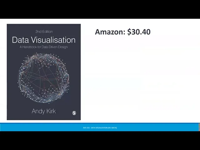
see what do they think does it encourage them to act does it have an impact on them do they remember the main points you are making in your graphic another great person in the field of data visualization is andy kirk andy kirk is a freelance data visualization consultant designer and educator and he's based in the uk his work this book in particular can be found on amazon for 30 or less if you buy it used for him he has three principles principle one is that good data visualization is trustworthy what this means is is it
reliable is the handling of the data reasonable and faithful to the subject does the representation of the presentation design have integrity principle 2 good visualization design is accessible this means is it usable is the portrayal of the data and the subject relevant is the representation and presentation design suitably understandable and principle three good data visualization is elegant this is the question is it aesthetic is the representation and presentation design appealing does it beg the eye for him he would say that all three principles must be met in order for a data visualization to be considered
good kirk likes to think about dieter rams and his notions of what makes a good design and according to dieter rams the good design would be innovative make a product useful aesthetic make a product understandable unobtrusive honest long lasting thorough down to the last detail and involve as little design as possible now when we're thinking about aesthetic thorough to the last detail little design as possible those are things that go under elegance in our text cole nesbaumer netflix actually points to some of the most used visual displays these are ones you have probably seen many
many many times in your life so we'll talk a little bit about each of these and then i'm going to share with you some lesser-known visual displays so simple text when you have just a number or two to share simple text can actually be a great way to communicate think about solely using the number and making it as prominent as possible and a few supporting words to clearly make your point we often see something like this 91 and then underneath it in smaller text you might see percent of people who attended class every day of
the semester that might not be true but we'll hope we'll hope for that right you might see something like 20 percent in large font followed by smaller statement of children who had a traditional stay-at-home mom in 2012. these are simple ways to get your point across you're starting to see these used more and more often in publications tables tables typically interact with our verbal system so this means that we actually read them for most of these other things that you see here your eye is drawn to it and using what it's it your brain has
developed as a cognitive path you tend to kind of know what you're reading just based off of the color and because of the shape of the display when it comes to a table though you do actually have to read it when i have a table in front of me i typically have my index finger out that is what netflix says and she's right when i'm reading a table i typically if it's on a piece of paper i might have a ruler there if not i have a finger and i'm kind of following along to see
what does this say um if i'm looking at this i see category five for c had the highest percentage okay so what does that mean based on it is that number of votes for something or how somebody felt about something we see these oftentimes with like likert scales right where category one is strongly disagree category two is disagree category three is neutral category four is agree and category five i strongly agree so that's one way in which we see tables being used some people like to have a graph and then a table below it just
to have that information there we see scatter plots scatter plots are useful for showing the relationship so instead of just seeing something as let's say a um a positive relationship or a negative relationship where just the slope is lined the scatter plot gives you all of the points so that your eyes can see when there's an outlier and you might then want to investigate a little bit further about why that outlier exists lines lines are probably the most commonly used to plot continuous data if we're looking at something over time this is one where most
folks will go this is not necessarily a good visual display for something that's a dichotomous or categorical variable slope graphs slope graphs are great and these are great when you have two time periods or two points of comparison and want to quickly show the relative increases or decreases or differences across the various categories between the two data points so i won't go through the rest of these i think that for the most part you have seen these often enough feel free to please review in your text more information about each to determine when they best
work for you i want to share with you a great website it's called datavizcatalog.com this website as i'll show you in a second has many many many it's basically a catalog of different data visualization tools and as you look through it it helps you determine which one is a is the best way to illustrate whatever it is you're trying to display so when you go to their website they have um you know a whole a whole lot of these right and it tell and these are just different types of graphic forms some of these you're
really familiar with things like area graphs bar charts bubble maps chloroplasts dot maps those you're you're familiar with same thing on this page where if i were scrolling down the page i would see more of these i might see flow charts pictogram charts but some of these are lesser known to you so if you want to experiment with these during the course please feel free to do so as i said there's many of many of these we see sankey diagrams uh often so as you as you're thinking ways to show your your your illustrations um
feel free to go to that website and look at some of these as you do if you click on any one of these bubbles that you see here it's going to show you an example of what that looks like a description as well as the anatomy of it so let's think through when it comes to data visualization and we're talking about principles it may seem like well there's so many different principles we have some that notlik has given us we have some that kirk has given us and i would argue that my goal in this
class isn't for you to remember one set of rules or one set of best practices these are kind of just things to nudge you in the right direction and depending on what type of graphic or what type of visualization you're aiming for you'll use some of these more than others but 10 golden rules to to to apply would be one begin with a goal have an idea of the end in mind it's hard to know where you're going if you don't know where the destination is to know your data understand it have gone through it
looked at what the range of responses is look at what the sum or the average or the standard deviation is know what the modal category is so that when you make your visualization you're not caught off guard if you see something odd put your audience first again while you might like pie charts maybe not everybody does and maybe not everything needs to be a pie chart so think about what the audience might like what would connect for the audience be media sensitive this doesn't mean um you know think about who your audience is um or
um you know how you're gonna you know share this right not social media this really means being media sensitive and thinking about how your audience is going to read your infographic is it going to be on a screen is it going to be on a phone is it going to be printed is it going to be a handout because all of these things will matter when you're picking your graphic choose the right chart so what's hard here is the word right in there what determines whether or not a chart is right well if it's easily
understood if it's elegant if you're able to make an impact if it is a good representation of the data then it's probably the right chart sometimes you won't know it's the right chart until you've tested a few and you and you've realized that some other ones were not right use labels wisely one thing to remember about labels is a you should have them in case there are questions about what is the y-axis so what is the x-axis what is the title um what are the different categories that we're looking at what's the key so those
labels are really important but you shouldn't just assume that everybody is going to read them sometimes people will look at your graphic and not pay attention to any of the written words make sure your design is to the point think about what is the point you are trying to make and make sure that your design speaks to that which leads us to the next one which is let the data speak at the end of the day your graphic may be beautiful your visualization may be gorgeous but if the data is not speaking the visualization is
pointless and lastly feedback is a good thing it's always good to test your graphics and your visualizations on other people to see what they're walking away with as a main message one of my favorite books is this one right here it's from the wall street journal and it's called the guide to information graphics the do's and don'ts of presenting data facts and figures you can find this on amazon for 18.89 it's really short it is very colorful and it is a great practical guide about what to do and things to know so i'm going to
give you a little bit of a teaser about this and then if you're interested you can find it on amazon for under 20. so in the book they go over a number of different things things that you should know things such as legibility of your um of your font right there are times where you use serif versus sans serif do you you pay attention to type size whether or not there's um the text is leading um you might look at things and some of the um some of the suggestions in the book are about basic
rules of type legibility in charts they say the leading should be about two points larger than the type size don't make the type size too small or too condensed where people have to work to read it don't use all caps it's hard to read avoid hyphenation don't use highly stylized fonts don't set your type at an angle so there's a number of things with regard to legibility in there typography there's information in on color palettes and so we'll be talking about each of these in depth and we do have some videos in here that go
over each of these but i want to make sure that you're you're aware and that if you wanted to you can order this book and be able to to kind of dive in deeper into things like the base color palettes when to use ymyk rgb i'm sorry and that should be cymk i'm not sure why it says that on the screen and some of the do's and don'ts in color there are some arguments for making sure that your your chart is understandable to somebody who is colorblind for an instance so doing red green or yellow
blue may make it so that somebody who is colorblind can't understand your chart then this book also goes into some different strategies talking about your set type in black labeling things directly on the chart ensuring high contrast in your values and converting as a final test to grayscale so what does that mean it means that if you really want to see what something looks like and how the colors work and whether or not it's legible and readable go ahead and convert your typography i'm sorry those are my dogs i promised right at some point this
semester that would happen um go ahead and convert your visualization to grayscale and that will help you see what a reader might see if they were looking at it in print i love this data this visual data continuum this is part of the wall street journal guide to information graphics that i was mentioning and it talks about when you have sparse data versus rich data what makes a low visual impact and what makes a high visual impact obviously if you see high visual impact these are lots of the things that we've talked about so far
things that are graphical in representation things like vertical um vertical bars multiple charts line graphs um you know pictures images actual maps themselves these are things where people look at them and they feel like they have a visual connection they have a visual impact there and so when it comes to talking about some of this information that i pulled out of the wall street journal guide to information i'm going to actually share this with you in another video and i'll go a little more in depth now our text uh author has what she considers to
be six lessons in visual communication these are some of the tips that she says helps you get started one she says you need to understand the context understand what it is that you're trying to get across to someone two choose an appropriate visual display three eliminate the clutter four focus your attention on where you want it and five think like a designer at the end you should be telling a story our text is actually organized with a chapter on each of these and notice that these are not vastly different from the recommendations we've heard from
kirk and from cairo so when we go throughout the semester we'll actually spend a little more time on each one we'll talk a little more about understanding context and appropriate visual displays we'll spend some time on how to eliminate clutter and focusing your attention and then we'll spend the rest of that time talking about thinking like a designer and telling a story well that's it for lecture three as i said we'll have a couple more videos this week with a little more in-depth information about the information i shared from the wall street journal guide to
information graphics the do's and don'ts of presenting data facts and figures see on the boards