This is a little piece of jazz history and it's one of the coolest things I've ever held. It's three cropped photos held together with scotch tape and a note dictating how to print the negatives for the final photos. The remarkable thing about this post-it note-sized image, is how little it changed when it became the full album cover for jazz saxophonist Joe Henderson's 1966 classic "Mode for Joe.
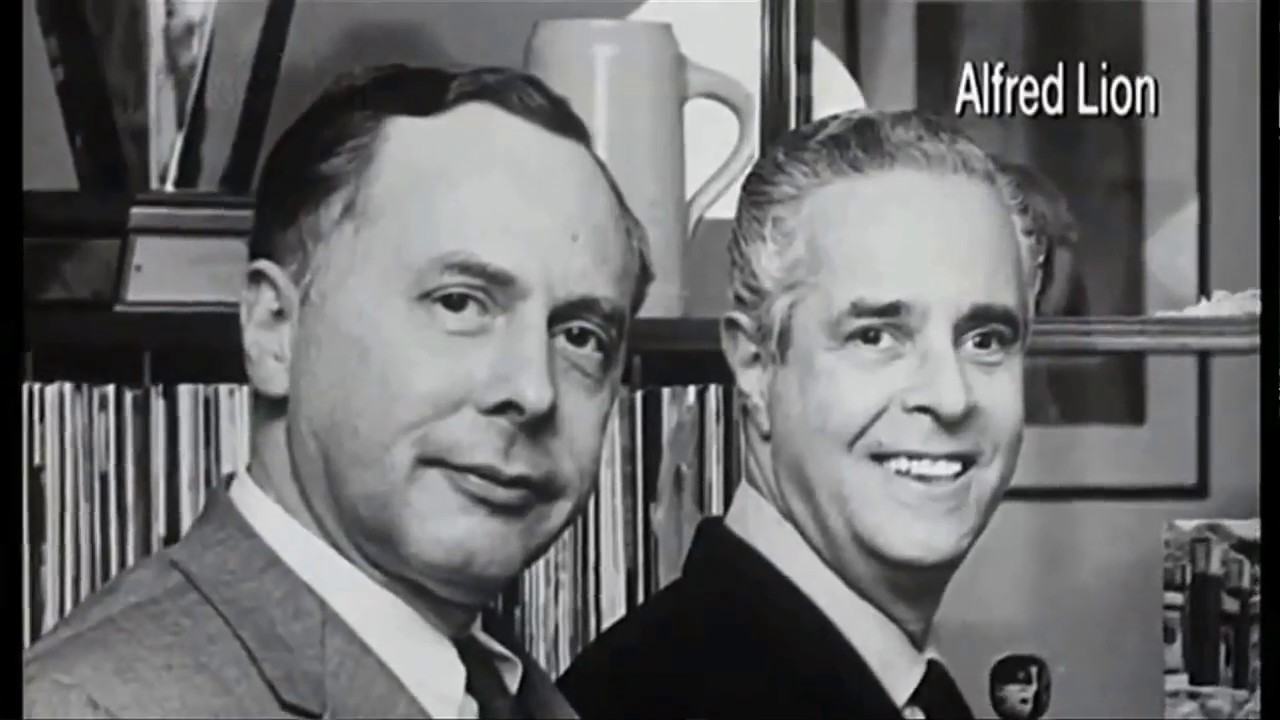
" The story of how this became this didn't start in 1966. It started in 1939, when two Jewish-German immigrants, Francis Wolff and Alfred Lion, started the Blue Note jazz label in New York City that would come to be revered not only for its sound, but for its iconic album covers. What they were going for is, they wanted to make tunes that were memorable, that people could walk out of a club humming, and that had a certain amount of soul to them.
That's Michael Cuscuna, a record producer and Blue Note aficionado. That soul sound Michael's describing was called Hard Bop, a genre of jazz steeped in Gospel and Rhythm & Blues that became synonymous with Blue Note by the mid-1950s. The mastermind behind the sound was recording engineer Rudy Van Gelder.
"I'm not standing too close when we play the ensemble am I? You want me to articulate my solo? Yeah, you're a little too close.
Yeah well I'll step back a little bit. Is that it? Uh, this is take four.
When you heard a Blue Note record, you heard a lot of air coming through the saxophones and the trumpets. And you heard all the power and crystal details of the drums. That description is fully evident in Art Blakey and the Jazz Messengers' "The Drm Thunder Suite.
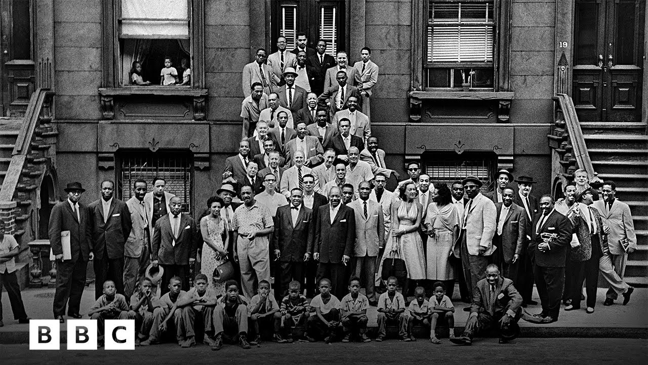
" That was kind of the classic time for modern jazz and New York was heaven on Earth. There was a record store on every other block, throughout all of, not midtown, but also the Village and Harlem. And, if you went to those record stores, it probably wasn't the sound of Blue Note that immediately caught your attention — it was their album covers.
Their bold use of color, intimate photography, and meticulous placed typography came to define the look of jazz during the 1950s and '60s. These covers are energetic, moody, and they're sophisticated. These album covers are jazz.
Now, if you flip a Blue Note record over, it's likely you'll see two names credited for its look. Cover Photo, Francis Wolff, Cover Design, Reid Miles. Francis Wolff started shooting every Blue Note session the minute he arrived.
One of the most impressive and kind of shocking things was that the average success rate of those photos was really extraordinary. He's like the jazz artist of photography in the sense that he could nail it immediately. But the person who decided that this photo would be this cover, was graphic designer Reid Miles.
He could look at a contact sheet and zero in on one image that you or I might not even think twice about, and find a little crop of a square that would be like, wow, that's a dynamite image. Yeah, that is dynamite. One of the things that amazed me was what I call the "pullback effect.
" Take Hank Mobley's "No Room for Squares. " There was a new subway station that was built, it was unlike any other subway stop. It had these metal concentric circles.
Now, try to find the final album cover. There it is. The pullback shows you the whole image and it shows you an insight into the eye of the designer, that I think is absolutely amazing.
This is Lee Morgan's "Search for the New Land. " What was really going on was, Lee was listening to the music and sitting next to him is Alfred Lion with his eyes closed in a reverie. Listening to the same music.
By the 1960s, Reid became more and more adventurous in how he'd use typography, sometimes omitting photos altogether. This is Joe Henderson's 1964 album, "In'n Out. " A tiny crop of a photo of Henderson plays a supporting role to a bold and energetic design, with those arrows driving the feeling of the album title home.
There's a Jackie McClean album called "It's Time. " There's that tiny crop of a photo again. And then, just exclamation points for the rest of this cover.
Black type on white. And it's just startlingly beautiful and startlingly getting your attention. But some of my favorite covers are the ones where Reid uses Wolff's photography as a playground for typography.
If you look at the contact sheet of "Uno Mas," the upper-right hand shot is the one that Reid Miles focused on. That would probably be one of the least memorable images on a contact sheet. There's photos of Herbie Hancock and Joe Henderson.
And also there's two shots of Tony Williams who, in this photo, looks 17 years old. And who is 17 years old. But Reid chose this image and perfectly placed the title of the album right in Kenny Dorham's hand.
He did this with Freddie Roach's "Good Move! " And fit "Our Man in Paris" around Dexter Gordon's cigarette. What always amazed me about art directors was the ones that could create a look for a record that was highly individual, but also that fit into a stream that gave the label a look.
Reid Miles was a master of that.