Hello friends today we are going to create a portfolio website using animated react components and 3D objects let's refresh the page and see the animations here we have a typing animation and this 3D background for this project we'll be using snap scrolling so when I scroll down it's going to snap to the next section you can see the Transitions and the counter animations and here we have a 3D object You'll learn how to add 3D modelss to your react applications and how to use lights perspective and interactivity and you'll see how easy it is to
customize 3D objects with your own images and the best thing is you don't have to know anything about 3D design and after that we'll have the portfolio section we'll create this beautiful animation and this Progress Circle when I scroll down down or up it's going to animate the Progress finally we'll create this contact Section and you'll learn how to animate svgs using motion animations and this form is functional if someone writes a message and sends it you'll receive that message as an email and this website is responsive we'll create different break points for each screen
type and change the style of the items after creating our website we'll deploy it using hostinger it's the hosting sponsor of the channel and I use it for All my projects and now there is the biggest discount of the year on all hosting and server plans just special for Black Friday for this project we'll be using a hosting plan using the business hosting you can deploy a 100 webites and you'll have a really generous storage free SSL and AE free domain but if you have fullstack applications you can also consider the VPS plans and deploy
all your projects on a single server and don't forget if You use the link in the description and the lamad dev coupon code here you will get an extra discount after purchasing you are ready to claim your free domain let's choose a domain and claim and after that you are ready to set up your hosting we'll create an empty website use your domain and choose a location it's going to take a while and after that you'll see your H panel in this panel you can manage your domain Hosting database and backups and you can deploy
your websites using the file manager so if you are ready let's create our website and deploy it here okay I created here my project folder and inside this folder let's install our react application to do that you can open your console and create a react application using WID but as always I recommend you use my GitHub repository the link will be in the description and here you will find the starter Branch Inside this Branch you will find everything you need to start this project we have all the images here and we have the es link
configurations so you'll not get any warning when we use 3js and inside the source folder as you can see it's an empty project there are no unnecessary codes or Styles so we will create everything from scratch and at the end of the video I'll add here the completed version of the project there will be Another branch and it's going to be completely free open- source project so you can use it anywhere you want without any permission the only thing I want you to do is give a start for this project so I can create more
open- Source projects just like this one okay if you want to you can directly clone this project but also you can create your own repository by using Fork so when you make any changes you can push it to your own repository and it will be easier to See your progress after doing that let's clone your own repository of course I'm going to be using my own repost story I will come here and I will say git clone I'll paste the URL and I want to clone everything inside this folder so I will say dot and
enter and they are here okay right now we can start our application but before let's install our dependencies I'll say Mpm install as you can see our libraries are here so let's say mpm run Dev and our application runs on this port number let's run and it's here and right now I'm going to open my example here it runs on this part number and as you can see we have the hero section the services section the portfolio section and the contact Section so let's create them I'm going to refresh here come back and inside the
source folder I'll create a new folder and it's going to be components so let's create our section here hero Services portfolio and contact and for each section we are going to have a react component and a CSS file so I will say hero. Jsx hero. CSS let's create our comp component to do that I'm going to be using this shortcut as you can see it creates our component and gives here a class name if you don't have any shortcut just open your cipit choose here jsx or if you are using typescript typescript jsx and here
you can create your shortcuts if you want to use my shortcuts just visit my GitHub repository open the is Json file and You'll find all the shortcuts here just copy them and paste here after that you can use this shortcut okay let's import our CSS hero. CSS and let's give here a class name and use it here okay this is our main structure so let's do the same thing for the others I will close here and I will create my second Component Services CSS class name and the CSS file let's do the same thing here
component import the class name and the CSS file and finally the contact Section I will paste my class name create a CSS file and paste my class name here okay that's all let's close everything here and use them inside our appjs basically When we run our application the main JS runs this app component and inside this app component we can import our sections so I'm going to delete this text and call my sections so I'll say hero Services portfolio and contact let's import them hero component from the components folder hero folder and the hero Component
I'll do the same thing for the others here is going to be Services portfolio and contact let's make them lowercase okay let's see right now I'm going to save and as you can see all our sections are here right now we can give our Styles as you can see there's a space here on the top and left we can get rid of this and also I'm going to give here a background color I'm going To change my font family and for each screen type we are going to give different sizes let's open our example here
as you can see we have a container here we have a space on the left and right and if I open my console and Shrink my page you are going to see that we are changing our spaces for each screen type so let's do that I'll come back open my CSS file and firstly I'm going to be using the global selector so it's Going to select everything and delete the padding and margin so we are not going to have a default space Also I will say box sizing border box let's choose our body and I'm
going to give a background color you can directly give a single color but I prefer using a linear gradient and I will choose my first color and the second color and I'm going to write here my drag ction it's going to start from top And go to the bottom and also I'm going to change the text color since we are using a dark background our text should be something light I'm just going to give white I will change the font family and let's just say system UI if you want to you can visit Google fonts
and choose any font family here in this case you will need to add this to your HTML file and inside body Change your font family but I'm not going to be using any special font family it's going to be just system UI okay and one more thing I'm going to choose anchor text and I will say text decoration non and the color is white because by default when you add a link its color is blue and there's an underline to prevent this we are going to change them okay right now let's create our container and
give a size for each screen type so our application will Be responsive let's say container and let's write our class name here firstly I'm going to give my maximum width it's not going to be larger than this size and I'm going to give a space for the left and right side padding left 16 pixels and right and I'm going to Center my container so let's say margin left Auto and Right let's come here and as you can see there's a space here let me actually give here minimum height 100 VH so we can see better
okay and I'm going to give a background for now we are going to delete later and this is our maximum size and here we have a 16 pixels padding and right now I'm going to open my console and for each screen type I'm Going to change the size of my container for the mobile screen as you can see our 16 pixels padding is still here so I will come back and I'm going to use media query this is how we are creating responsive designs I'll say media and I'll write here my condition and it's going
to be minimum width let's say 640 pixels and I'm going to choose my container and maximum width will be again 640 pixels remember at the Beginning it was this number but for the small screens the maximum width will be 640 let's see I'm going to expand my page and after this point as you can see the space is changing because our container is always 640 pixels so let's do the same thing for other screens for the medium screen which is 768 pixels the maximum width will be the same in this case for the small screens
it's going to be 640 for the medium screens as you can see it's going to be bigger and I can do exactly the same thing for each screen type so I will come back create one more 124 and two more 1280 and finally the biggest screen 1536 if you want to you can add more break points but for our application it's enough I'm going to save and let's see again the small Screen medium large x large and XX large this is how we create responsive layouts using CSS right now whenever we want to change anything
on a specific screen size we are going to be using these break points right now I can close this CSS and for each section I'm going to give a 100 VH height because remember for each section we have exactly the same size they all are 100 VH so it's going to fit inside our screen to do that let's wrap our each section and give a size so I will come here and create my first section and I'm going to give here an ID hero or let's say home and let's do the same thing for the
others Services portfolio and contact okay let's give our height I'll open my CSS and after this container I'll say Section and the height will be 100 VH as you can see here are services and others right now I'm going to give a snap scroll effect let's close here and here firstly I'm going to give a different background for each section so we can see better of course it's temporary so I'll say section and child I will choose the first child and I'll say background color let's choose any color doesn't matter by the way I can
Remove this container color we don't need this anymore I'm going to choose the others and change the color okay I will save so right now we can give our effect so when we are on the hero section and when we scroll down a little bit it's going to automatically move to our services section to do that we are going to be using the HTML tag scroll snap Type it's going to be vertical so I'll say y AIS and mandatory and I'll say scroll behavior and it's going to be smooth so when we scroll down or
up the animation will be slower and I will come here and I'll say scroll snap align and it's going to be Center so it's going to scroll to the middle of our component and we'll be able to see the full size let's see I'm going to scroll up as you can see hero section I'm going to scroll a little bit services and others right now we don't need our colors let's get rid of them and save so right now we can take care of the hero section let's open close this app this menu and let's
see what we are going to have I'll open my example and here we are going to have a background that includes this 3D shape and this image And we are going to have different items for the left and the right side so basically we are going to have two sections inside the hero section left and right let's create I'll say hero section the first one will be left and right and inside this we are going to have a title these Awards and this SVG I'll come here and let's say H1 tag And it's going to
be hero title hay there and I'm going to give here a breakpoint and I'll create a span and I'll write a name here I'm John or what was that okay Robert I'm giving this span because as you can see this color is different I will paste it here and after that let's create one more do and it's going to be aarts and it includes a Title top rated designer we will have a description you can write here anything you want and after that we are going to have a list let's say aart list and it
includes three images let's add them the first one a one.png let's see our image inside the public folder as you can see they are here let's use them I'll create two more just like That and finally we are going to create our SVG so after this Awards actually let me give commment for each section so you can understand better it's going to be title Hort scroll SVG I'm going to create an anchor tag here and when we click here it's going to show our services section so I will just copy and paste my SVG you
can find it in the GitHub repository or just search for scroll SVG On Google and use it here you can also use an image doesn't matter I just mean you don't have to use this SVG you can use any icon you want and after that for the right side we are going to have four sections the first one will be follow component let's say follow inside we are going to add our social media accounts so let's say anchor tag you can write here your account link I'm just going to leave it empty and inside I'll
create an image and use here our images let me show you Instagram YouTube and Facebook let's use them I'll create two more just like that and after that we are going to have this Peach bubble as you can see there's an animation here and there's an image so let's say speech bubble or just Bubble and to do that I'm going to create a new component actually let's write it inside hero I'll say speech I'll create my component let's say bubble container and inside we are going to have our speech bubble we are going to add
here our animation but for now let's just say text and we are going to add here an image and it's going to be M PNG so let's use it Here I'm going to import speech from speech and after that we are going to have this certificate do I'm going to write my comment and my du inside this du we are going to have our image and these texts I'm going to copy and for each line I'm going to give a break point just like That and finally we are going to have this button it's going
to be a Circle which includes two texts and this Arrow I will come back and after this certificate let's say contact button I'm going to create an anchor tag and it's going to open our contact Section and inside I'm going to create a do let's say contact button and I'm going to here contact link and basically we are going to give An animation for this do as you can see it's going to rotate and inside we are going to have an SVG it's just a basic Circle let me show as you can see its color
is pink here and inside this circle I'm going to give my text and it's going to follow this path this is how we are seeing this circle effect as you can see our texts are rounded so let's create our texts inside This SVG I'll say a text tag let's give a class name Circle text and inside we are going to have two texts the first one will be higher now and the second one is contact me to do that we are going to be using text path higher now and it's going to follow this path
as I said so I will say HRA the ID of this path which is Inner Circle Path just like that I can do the same thing for the other here is going to be contact me and then are here let me zoom in right now I'm going to separate my texts the second one will be somewhere here to do that I'm going to give here start Offset you can give any percentage here let's say 40% and as you can see it starts here actually let's give More okay it's much better and right now now I'm
going to add one more SVG here and it's going to be our Arrow icon again you can use any image but I'm going to be using SVG again after this SVG I'm going to create a do let's say arrow and paste my SVG here again you can find it in the GitHub okay that's all I think I'm going to zoom out and right now we can give our style and after that we are going to add here our background but for now Let's separate our section and give a same size for the left and right
section so I will come here open my CSS close this menu and firstly I'll say height 100% remember the size of the section is 100 VH so it's going to be the same I'll say overflow hidden and and let's separate our items using display flx so the left and right side will be horizontal and right now I want to give a same size for the left and right side The half of the screen will be left and the other half will be right so I'm going to choose my sections remember a section and I will
say with 50% and again height will be 100 % okay perfect and let's separate our items to do that again I'm going to be using display flx but this time flx direction will be column so our items will be vertical and if I say just five content space between all items will be Separated just like that and for the right section I want to move my items to the right so I will come here choose my right section and align items will be end so they are going to be at the end of our container
just like that so let's take care of our first item which is this title it's going to be big and I'm going to give here a margin let's choose our class name firstly margin top and the font Size will be 100 pixels I'm going to give a color it's going to be pink and if you remember we have a span here and its color will be different so again I'm going to choose my title and I'm going to select my span and the color will be white just like that what about this two I'm going
to give a space between my items but as you can see this description is too long in our example Its size is a little bit smaller actually it's much smaller it ends somewhere here so I will come here choose my class name withth is 30% let's change this P tag and give space between this text and other items so let's choose our container and P tag firstly font size will be smaller the color will be a little bit darker let's say DD D and I'm going to give margin it's Going to be 16 pixels on
the top and bottom and zero from left and right just like that let's separate our items here if you remember we have a list display flag and Gap between each item will be eight just like that so let's choose our each item and make them a little bit smaller and I'm going to give a background as you can see they are rounded and the background is white so inside the list we have Image I'm going to choose my each item change the size I'm going to give a padding so we can see our background is
going to be White and The Border radius will be 100% so it's going to be a circle I'm going to save and perfect what about this SVG again I'm going to give a margin first say let's give a class name it's going to be scroll let's use it here Marin and let me show you something I'm Going to give a background and and as you can see it contains the entire left section to prevent this I'll say with maximum content so it's going to end here okay I'm going to remove this and we finished our
left section let's take care of the right section let's start with this container per see our icons will be vertical and remember we have a text here and we are going to rotate this text It's going to be vertical let's come here there is our right section I'm going to cut this and move this here so all the items related to right will be under this and the first one is the follow section first see I'm going to make them vertical remember how we are doing this Flex direction will be column gap between each item
and also I'm going to give a Padding and we have a background color let's see this purple color so I will save background color and paste my color here and I'm going to give border bottom right radius because remember there's a radius here border bottom right radius 10 pixels and I'm going to choose my images change their sizes and let's add our text it's going to be follow me after this third item let's say Follow text container and follow text just like that let's use it here again I'm going to give exactly the same size
as you can see and my item will be vertical so let's choose our text I'm going to give a background it's going to be this red color something between red and pink I'm going to reduce the font size it's going to be small and I'm going to be using rotate and it's going to be 90° Just like that let's change the size it's going to be just one line to do that we are going to be using width and maximum content and let's give our height 100% which is 20 pixels let's see as you can
see its position is here because we are rotating our item so what I'm going to do here is when we start rotating our item I'm going to keep this point stable the top left point is going to be stable it's not going to move and we are going to Start rotating other points to do that I'm going to be using transform origin and I will say left toop as you can see this point is stable and others are moving in this case there will be a 20 pixels space here to prevent this we can move
our item transform Translate Y and minus 20 pixels just like that it's on the X AIS but remember we use rotation this is why we are using Translate Y and let's go padding Zero from top and Bottom eight from left and right and let's Center this text we can use display Flex align item Center and perfect and right now I can do the same thing here I'm going to give border radius but only for this point so I will say border bottom this time left radius of course again it's rotated in this case it should
be right just like that because before the rotation the right point is Here and awesome it looks pretty nice we are going to take care of this animation but before this is easier let's take care of this I'm going to add my class names for the feature container and bubble and this image and after that we can take care of the certificate firstly I'm going to reduce its size 60% let's see it starts somewhere here And they are going to be vertical display flags flags Direction column and gap between our icon and text will be
8 pixels I'll say text align Center so they are going to be centered let's change this line height they are too close to each other 24 pixels just like that I'm going to change the color and font weight it's going to be Lighter 300s and the color will be a little bit darker not too much okay let's take care of this image it's too to Big I'm going to choose my image it's going to be 70 pixels but as you can see they are not centered since we use display Flags we can Center them using
align item Center and perfect and what about this I'm going to move my arrow here to do That we can use position absolute firstly I'm going to give here a margin as we did for this scroll button let's remember contact link 50 pixels and for this circle text I'm going to change leather spacing that's say three pixels as you can see there's a space between each letter and I'm going to increase the font size let's say 20 perfect and let's move our Arrow Here its class name is Arrow and its Position will be absolute if
you are using absolute positioning the parent should be position relative and our parent is contact button just like that actually let's move this here and let's enter our item to do that I'm going to write my directions and they are going to be zero and if I say margin Auto it's going to be centered inside our Parent okay it's still here because let's give a background and see its size as you can see it's too big I'm going to change its size and Center my arrow icon inside align item Center just by content Center just
like that so we don't need this background anymore and perfect so what about this speach bubble let's open our component firstly I'm going to give my style and after we are going to give our Animation I see it's going to be 50% our items will be horizontal and gap between them will be eight and I'm going to separate my items using justy content space between just like that let's give a background for this text firstly I will say 100% And I'm going to give a height 100 pixels and the background color will be white in
this case I should change the text color let's say Five so it's going to be gray I'm going to give a padding 24 pixels and I'm going to increase the font size just like that let's give a border radius but remember this side will be sharp so we are not going to give for bottom right so I will say border radius to any from top left right and bottom right will be zero and and bottom left just like that what about this Image let's fix it and we are going to give this background firstly let's
give our width and height is going to be a circle I'll say object fit cover and finally the background color will be our pink color okay it's still the same because this is not the parent it should be bubble container as you can see and let's move this here to do that I'll say align items And so right now we can give our animation to do that we are going to be using a library called react type animation let's install I'll open my console let's create a new one mpm install react type animation it's really
easy to use as you can see we are going to import this component and inside we can write our texts and for each text as you can see it weights 1,000 millisecond which is 1 second and you can change the Speed you can give a style you can repeat let's do that I'm going to copy this and inside the bubble I'm going to paste it let's close here import our component just like that and let's change this text actually I can use this one I'm going to make this small for now and here let's generate
a random text I will just copy and paste again one second and I'm going to remove the others we are going to have just two and Before starting again I want to wait 1 second because remember we are going to have different animations and it's going to take 1 second if I refresh the page as you can see after one second we can see our items and I want to start after 1 second I can change the speed let's say 40 I don't need this style we already have for this container and typing speed will
be 40 but deletion speed will be faster let's Say 60 and repeat will be Infinity if you want to you can ignore the leading by using omit delead in animation but I want to see anyway it's going to be faster and let's see okay awesome after 1 second as you can see it's going to delete and the second one 1 second and delete okay it works so I can close here and let's take care of our background I will come here we are going to have this image and after this 3D Shape close This and
at the end of the div let's create one more and it's going to be background and it's going to include our 3D shape for now it can stay we don't have the library yet so let's create our image container I'll say here image and inside I'll create my image and it's going to be hero. PNG okay let's enter this its Position will be absolute I'll come here and after the hero let's say background is going to be position absolute and it's Going to contain the entire component so let's say 100% height 100% And if I
say top zero left zero so it's going to start here and contain all our screen of course it should be under our other items to do that I'm going to be using Z index and let's say minus one as you can see we can see our texts and other items and right now I can do the same Thing for my image I'll say h image and I'm going to choose image here let's use position absolute again because I want to Center my item remember how we are doing this directions will be zero and margin will
be Auto and I'm going to reduce the height a little bit let's say 80% just like that but if I give background color as you can see it contains all Width to Pro prevent this remember what we are doing width will be maximum content and for this image 100% height 100% And the object fit will be cover so it's going to fit inside our container let's see okay but it's centered because we said top zero if I delete this it's going to be bottom zero and it's going to Center them horizontally using left and right
just like that Okay so right now we can create our 3D shape or if you want to let's take care of the animation first I think it's going to be better because after creating our 3D shape we are going to take care of this page this section and again we are going to be using 3D shapes so it will be more consistent and easier to understand for the animation we are going to be using Motion let's open motion. as you can see it's an animation library for JavaScript and react I'm going to choose react let
me zoom in and firstly let's install our library I will copy here and paste here and after that we can import the features using motion react let's see how to use it as you can see when we create HTML tags we are going to be using motion and after that we'll be able to animate our HTML Tex Let's test This first I'm going to open my menu and create here a test component of course you don't have to do this it's just a test I will open my appjs comment them out and call my test
component let's create here a motion do let's import this import motion from motion react I'm going to close this console and right now let's give a style for them actually I can directly make This a section so it's going to be 100 VH I'll say style I'll give width and height let's say 300 I'm going to give a background let's say red and I'm going to Center this this align items and justy content okay it's here so let's see how to give an animation as you can see we are going to be using the animate
object and inside this object we are going to pass our Animation it can be a background color opacity X and Y let's try them if I say animate x 100 as you can see it moves on the X AIS I can write something else here I'll say minus 200 for example as you can see I can change its apacity let's say 0.5 just like that right now our D is animated but we cannot see the animation because we don't have any duration or The initial type to do that I can come here and create my
initial position it's going to be let's say zero zero and here is going to be zero and let's make this one so basically at the beginning everything will be zero but when we animate we are going to change our position and the opacity and I can write here my transition and let's say duration 2 Seconds I'm going to refresh my page and perfect again okay this is how it works we can also give here the timing function so I'll say is as you can see there are many options if I say is in out it's
going to start and end slowly I'll refresh just like that I can also make this constantly so I will say repeat and Infinity just like that so it's going to move every 2 seconds I can also give here a delay let's say 4 seconds so at the beginning I'm going to refresh as you can see at the beginning the opacity is zero so we cannot see it and after it starts our animation it's that easy guys just give your initial Styles and animation Styles and write your transition and also you can write your animations without
Initial Styles I'm going to comment this out and this time I'm going to be using an array and right here my initial point and the animated point so it's going to start from zero and after 2 seconds it's going to be 100 I'm going to comment this out and again 0 - 200s and opacity I'm going to save and as you can see it's exactly the same this is how flexible our library is And also instead of writing everything inside this div you can Define them outside of your component to do that we are going
to be using variance I'll say const variance is going to be an object and inside we are going to Define our initial Styles let's say x - 100 opacity zero and when we animate X will be zero opacity will be one and I can write here my effect here transition duration will Be let's say 2 seconds and right now I can use my variance here I'll say variance equals Vari let's actually change this name so you can understand better I'll say shape variance for example and I will say the initial style will be initial inside
this object which is this object and the animate will be this animate as you can see it works so basically you Can give here any name you want just like initial rectangle animate rectangle and we can create other variants let's say Circle for example and we can use different animations here let's say y it's going to take 3 seconds and let's create one more div by the way I'm going to change here initial rectangle and animate and I will create one more div let's remove Here it's going to be let's say green and it's going
to be a circle so I will say border radius 100% and change my initial and animate Styles I will come here refresh my page and right now I can animate my items independently and one more thing I want to show you let's create here a list JavaScript react nextjs and right now using variance I Can give my animation I'll say const list variance is going to be an object let's say initial again x - 100 y - 100 and opacity I will create my animation animate as I said the name can be different but for
the consistency we are going to be using initial and animate here is going to be 0 0 and 1 let's write our Transition I will say duration will be 3 seconds and I'm going to add here one more thing and it's going to be stagger children and let's say 1 second so BAS basically we can use the same style for each children but the duration between each children's animation will be 1 second let's see per see I'm going to be using motion variance list variance I'll add here the initial and Animate and if I use
the same variants for the children we don't have to write initial and animate anymore we can directly animate them thanks to this tagger children so I'm going to write motion and variance let's see as you can see it takes 3 seconds and the duration difference between each item will be 1 second let's see again okay this is important because in our Website Let me refresh as you can see we are going to be using stagger children so this was a quick tutorial of course you are going to learn more advanced features like scroll effects but
for now this is enough let's take our changes back I'm going to leave this file in the GitHub repository but delete from here I will save and let's give animations for our hero items firstly let's take care of our Title so I will say motion let's import import motion from motion react let's firstly use all our animations here inside the H1 I'll say initial the Y will be minus 100 opacity will be zero I'm always using Y and opacity because they are the common animations of course you can use something different but changing color or
shape is not a good idea we usually use x y and opacity but as I said you can use whatever you want so let's go Here I'll say animate oppacity will be one y will be zero let me close this menu and I will write my transition and the duration will be one just like that let's refresh okay perfect what about here let's create our variants and use them for each item here I will will come here const award variance I will say Initial this time we are going to be using X and opacity one
more and it's going to be animate as we always do 0o and one and I'll write transition the duration will be 1 second and tager children will be 0.2 seconds okay let's use this here I will say motion do do variance will be award Variance I will write my initial style and animate and I can use variants for each item here but before of course I should use motion just like that and after variance just like that let's see see and perfect let's see again I'm going to refresh okay awesome what about this button as
you can see there's an infinite animation here and for this anchor tag I'll say Motion and let's define our animation in a different way here I'm just going to be using animate I'll say Y and remember for the initial point we are going to be using an array 0 to 5 and for opacity 0 to 1 you can also add here different break points if I say zero at the beginning of the animation it's going to be one and at the end it's going to be zero again so you don't have to Define here only
two points this is another awesome Feature and let's write up transition Pary I'll say repeat Infinity duration will be 4 seconds and timing function will be is in out just like that as you can see it's moving on the Y AIS and at the end its opacity is zero again and one more thing here let me open my example and as you can see we are also moving this line Here and this is our path here so I will say motion animate y will be 0 and five and the transition will be the same just
like that let's see and perfect it's that easy guys so let's do the same thing for the others let's take care of our follow motion. do and for each children I'm going to give motion again and also for this Text just like this and let's do the same thing I'm going to create my variance let's say follow variance and this time we are going to move them on the Y AIS just like that and the others will be the same if you want to you can write them inside this variance and use them together but
anyway it can stay like that let's give our Variant just like that I'll say initial and animate and use this variant for each children just like that let's see I will refresh and perfect okay awesome what about here we are going to take care of speech also motion motion react I will use it here let's say Animate and we are going to just change the opacity 0 to one and after that let's write our transition the duration will be one and that's all just like that what about here it's actually going to be exactly the
same I'll just keep it simple and I recommend you do the same of course you Can use some crazy animations but it's going to look over in I think the position and opacity is enough and for this contact link I say motion animate I will say x this time at the beginning is going to be 200 at the ending zero I'll say opacity again 0 to 1 and I write my duration it's going to take 2 seconds but for this contact Button we are going to do something different and we are going to use rotation
let's see as you can see it's turning and its repeat is infinity so I will say animate rotate 0 to 360 and the duration will be let's say 10 10 seconds so it's going to be slower and I will say repeat Infinity and I will say the timing function is linear so it's not going to change the speed just like that okay awesome let's see I'm going to refresh my page okay perfect so what about our responsive design let's open our console shrink our page at this point we can maybe change our font size let's
open our CSS actually I will open it here Too so we can compare as you can see it's 100 pixels let's reduce this this I will come here and write my break points and I will say media let say maximum width because we are using desktop first biggest point will be 1536 I'm going to choose my age title and the font size will be 72 just like that and if it Smaller here I'm going to change my background size as you can see it was 100% this time let's copy this paste here I'm going to
change my break point and this time it's going to be 60% and we were using top zero left zero this time top will be Auto because we are going to align this at the end of our Component to do that I'm going to be using bottom zero just like that but it's too small we can a little bit increase or we can change this image size as you can see it was 80% so I will say h image height will be 100% okay perfect what about about here as you can see it's overflowing let's see
our Bubble as you realize we are using 50% here let's change it it's going to be 100% okay perfect I can do the same thing here I can increase the size remember our container is Arts it was 30% but this time it's going to be 60% so it will be bigger I can increase this text size remember we decreased here but this time let's increase 88 Pixels and perfect what about smaller screen at this point I can decrease again I will copy this paste here and change the size This Time background will be smaller height
50% and age title F size will be 72 just like that and other SC stay the same let let's create one more it's going to be the medium screen Which is 768 and this time our left and right side will be vertical so I'm going to choose my hero component which is the parent component and flex direction will be column because remember at the beginning it's display flag that means left and right side are horizontal this time it's going to be vertical let's make this 60 again just like that and change our Width for each
section because remember for each section we are using 50% this time we don't need to do this it's going to be 100% let's decrease here okay let's Center our items so I'm going to choose the left side align item Center also text align will be Center just like that let's give a space g will be 36 just like that what about here again I'm going to Center so I'm going to choose aarts we gave here 60% but this time it's going to be 100% because our section is 100% right now I'm going to save awesome
I'm going to Center them also award list justy content Center just like that let's get rid of this speech follow list and certificate just like that and I'm going To move my button here to do that I'm going to choose the left side make this right and I will say justy content at the end of the right side just like that and it looks awesome this is how we give responsiveness just create your break points choose your elements and change the style and be careful here since we Are using desktop first the bigger screen will
be at the top of others so here is going to be the smallest so right now we can take care of our 3D shape let's close them come here and open our documentation just search for react 3 fiber you are going to see this website open it and click the installation I'm going to zoom in that's install I'm going to copy this open my console and paste it Here and again to test it I'm going to create one more component let's say test two or test 3D and let's use it here okay I can close
here and let's see how to use it we already have our application let's come here your first scene firstly we are going to use the C component it basically represents our scene and inside this scene we can create our 3D objects let's copy This import I'll close this sidebar and here again I'm going to be using section and Center everything and let's use our canvas component and inside we are going to add our mesh component by the way the canvas is responsive as you can see so it's going to fit inside the parent so you
can resize it using your parent size okay after that let's use mesh as You can see it says you don't need to import anything it's just like native jsx elements so after installing this Library whatever you write inside the canvas will be native elements just like we write inside our components our HTML elements like H1 ptag D so you don't have to import them and after creating mesh we can add any geometric shape inside as you can see in the example it uses a box let's Try inside mesh I'm going to be using box geometry
let's see our test by the way as you can see it's here it looks two dimensional but don't worry we are going to give our sizes and after it gives this standard material and it basically allows us to give any skin to our geometry it can be a color a text a skin in our example we are just going to be using a color let's see and this time our shape is black Because we didn't give any color let's scroll down and as you can see we can give our dimensions and it represents the width
length and depth just like that and after that we can add our lights essentially we have two lights the ambient light and directional light when you use the ambient light it provides even a non-directional light to the entire scene so basic basically it Lights everywhere same amount let's see and right now our shape is lighter it's not dark anymore and if I increase the intensity you are going to see that it's lighter and lighter if I make this one it's going to be white so higher values make the entire scene brighter let's make this a
little bit lower and I can give here a color let's say Red just like that we can also use the directional lights and when you use it it creates a light in a specific Direction so some parts of our shape will be lighter and the other parts will be darker and it will give us the 3D effect I'm going to copy this paste and if I change the direction we are not going to see anything because we cannot see the other Dimensions but since we are using light here we are going to see the same
color but if I delete this make this zero as you can see there is no light in this direction so it's going to be darker but how we are going to give the interactivity when we click and move our Mouse we need to see the other directions to do that we are going to be using one more library and it's going to allow us to use the interactivity and also when we use it we will be able to Add our 3D models just like this one or the others let's install I'll will open my console
mpm install react 3 and dry oops there's an error of course three okay right now we can control our shape let's close here and I'm going to import orbit controls that comes from our library that's save and see I'm going to come here and rotate my shape as you can See awesome I can also zoom in or out right now if you change your directional light you are going to see the changes as you can see we have light here here and here okay awesome and using this new library instead of this standard material you
can use mash dist start material let's give a Color and we are going to attach this as a material let's see right now and as you can see our shape is changing all the edges are being distorted we can also give the intensity of the Distortion let's say 0.5 we can also change the speed just like that you can enable or disable the zoom enable Zoom if I say false We won't be able to zoom anymore but we can rotate okay of course instead of this rectangle this box you can create different shapes you can
create a circle a triangle but I want to show you my favorite one and it's sphere again it comes from react 3 dry and I'm going to wrap my distort material with this sphere let's change here and see how it looks 50 100 as you can see it's just like a bubble and it looks awesome if you want to you can just play around these arguments 100 200 it's going to be different right now there is no a specific shape you can just play around here you can also give a scale so it's going to
be bigger or smaller if I say two for example it's going to be much bigger just like that and in our example we are using Exactly the same thing here as you can see its color is pink and it's bigger but we are not using our orbit controls let's create that it's going to be a little bit bigger the color will be this pink color let's remove this or comment this out so you can see in the GitHub I can change the light color let's make this one so it's going to be much brighter I'm
going to save and Perfect if I make this two as you can see it's exactly the same so let's use it in our application and after that I'm going to show you how to add 3D models so I can copy here and create a new component inside the hero section I'll say shape. jsx create my component and paste it here actually we can directly export our Sphere and use the canvas inside the hero component so let's use here react fragments rra this I'm going to delete here and here and let's use it inside the hero
after our background or before let's add our shape to do that we are going to be using canvas and our shape here be careful don't import this one we are going to be using our component this second one and there is something important Here since we are using 3D objects it's going to take longer to loot to prevent any interuption we can wrap this with react suspense that comes from react and during the loading process we can show let's say loading you can add here any text skeleton or progress bar in this case our application
will be faster let's use our sections again I'm going to remove this open them I can delete here let's import them I'll save let's see and awesome it looks amazing and for the small screens if you want to you can delete it but it looks okay we don't have to change it so right now we can take care of our second section the services so I'm going to come here close this menu and all tabs here and open my section Services and again we are going to have two sections left and right we are going
to have some texts here but let's continue with our 3D objects so after dividing my section I'm going to show you how to import 3D objects so I will come here create two sections service section one and two here is going to be left and right and their sizes will be equal so we are going to do exactly the same Thing here let's separate them again 100% overflow hidden and and display will be flex and for each section I'm going to give 50% so they are going to be equal and again I'm going to separate
my items using plx box they are going to be vertical and justify content will be Center so I'm going to Center everything vertically so let's see how to add 3D objects I'm going to come here and open sketchfab.com And here you can search for any 3D objects for our application we are going to need a Macbook so let's say MacBook and as you can see this looks pretty good and this is going to be our model and the best thing is we will be able to change this wallpaper we are going to add here our
own image in the example as you can see we are using exactly the same page and let's download this I'll scroll Down and here I'm going to be choosing gltf as you can see it's 2 megabytes it's not too low it's not too high we can use it but I don't recommend you use any heavy 3D objects because we are building a website it has to be fast so I'm going to download let's see as you can see our file is here and inside the textures as you can see we have the wallpaper so what
you can do here is you can open your image editor I don't know Which one you are using maybe Photoshop or any other software just open it and pass here your own image and do the same thing for this one and after that we are going to transform our gltf file into a glb file to do that we are going to be using gltf pipeline let's scroll down as you can see we can install it using not JS I'm going to copy but we are not going to do this inside our application so I will
Open my console and install it's already installed but anyway I just wanted to show you and after that we are going to open our folder right gltf Pipeline and the input will be cgtf and the output will be a glb file you can directly USB so it's going to generate a GP file with ex exactly the same name let's do this I will come here open my folder of course it's inside the desktop CD Desktop and my folder right now I will copy here gltf Pipeline and the name of our file which is scene and
and I will enter and as you can see it's here you can change the name I'll say computer and right now using this model we are going to create a react component to do that again we are going to need a library by the way you can find them in The description and it's going to be gltf jsx I'm going to scroll down so here we are going to be using MPX gltf jsx and pass here our model you don't have to install anything I'll say MPX gtf jsx computer. glb I'm going to enter it's
going to take a while and after that as you can see it's ready let's come back and our react component is ready so I can copy this and paste inside my react Application I will open my menu I can close here and inside Services I'm going to create a new folder and let's say computer and inside we are going to have two components the first one will be our model I'm going to paste let's say model and use this name here and save I'm going to delete them and as you can see we have to
pass our glb file so let's come back copy this file and paste inside our public Folder again I'll say model and use this here just like that and that's all right now using a canvas and suspense we can show our model to do that I'm going to create a container and let's create our canvas that comes from react 3 fiber and inside we are going to be using suspense because it's going to take a while during this process we can show auding text or icon or whatever and here I can use my model just like
that and I'm going to add an interactivity remember how we are doing this I'm going to add orbit controls but I don't want users to zoom in or out so I will say enable zoom and it's going to be false I'm going to use it here container okay it's here but it's too small to prevent this I'm going to add here one more thing and it's going to be The stage component I'm going to wrap my model and here you can add any environment it basically provides some environment effects and lights as you can see
you can choose any of them let's choose City for example I'm going to come here as you can see our item is bigger and right now in the background there's a Ste reflection you can change here and do whatever you Want you can say forest for example in this case there will be trees just like that it can be Knight as you can see I think it's much better we can use this one and we can also increase and decrease the intensity let's make this 0.5 and this time it looks much better and there are
some fingerprints here and it looks more realistic stick and one more thing I want to show You we can also show here a perspective camera you can give here any camera position you can basically play around here and I'll say Zoom 0.8 and I will say make default and right now we are using using different traction and it's smaller right now if you don't give a zoom here it's going to be bigger and it's going to cut here to prevent this Zoom will be 0.8 and we are changing our camera angle and what else you
can do you can rotate this item by default to do that we are going to be using orbit controls and I will say auto rotate just like that I'm not touching but it's rotating okay awesome so this is how we add 3D objects so right now you can do the same thing for other objects for example I searched for PlayStation I Think and here there was a box let's say PlayStation 5 box okay this one so we are going to do exactly the same thing here you are going to download by the way there is
no link just choose another one okay it was this one I think okay you can download use gltf but you can also directly download glb because we are not Changing anything for the first example we are changing this screen but here you can directly download and after that just transform this using gltf Pipeline and after creating glb file use gltf jsx to transform that into a react component so I will not waste time it's going to be exactly the same I will just copy and paste here of course they are going to be in the
GitHub repository if you don't want to convert you can directly use them and Let's create our other components I will copy this create two more and this is going to be console or Playstation whatever you say and and here let's change here they are going to be console and inside this model I'm going to delete here and paste my model let's do the same thing for the m just like that Again I'm going to paste my jsx I will save and let's see I'll open my service and let's test them I will say console and
awesome and the other one okay perfect as you can see I added here my logo you can change it when you download you can also change your environment your position actually let's make this 10 I'm going to change here it's going to be two and the zoom will be 0.7 okay let's make this minus one and and here zero okay this is what I want as I said just play around here and find the perfect position for you but I'm going to leave them like that let's close everything open our service component again right now
I'm going to comment this out and let's take Care of our left site I'm going to come here as you can see we are going to have a title here a list and counters let's create them inside the left I will create H1 how can I help or how do I help let's give a class name section title and after that we are going to have a list let's say service list and in inside each service we are going to have an icon and Texts okay I didn't save okay it's gone let's create our items
I'll say section actually we can use an array here that includes our services each service has an ID image title and counter image title and counter let's use them so basically I'm going to be using here a map services. map for each service Insight we are going to call this do let's give a uni key service. ID and I'm going to create my icon container let's say service I icon inside we are going to have our image and the source will be service. image and one more container and it's going to include our texts or
let's say info I'm going to create h2 tag which is our title and H three tag and it's going to be our counter Okay let's give a style I'll open my CSS here close this sidebar and choose my title it's going to be bigger let's say 88 and I'm going to give a margin bottom just like that and what about this list I'm going to give space between each item I will choose my list display flag flag Direction column and gap between each item will be 16 and for each service not section Service I'm going
to reduce the width because as you can see its size is smaller and items will be horizontal so let's say 50% I'm going to give a padding border radius 20 pixels and the background color will be this purple color and after that I can Center my items display Flags align item Center and gap between the icon and the text container will be 16 we can also click so let's say cursor pointer just like That of course they are too big let's take care of them I'm going to choose my icon container I will give my
size I'm going to make them a circle and Center my items and for the image Insight I'm going to give size is going to be smaller I'm giving this height and width here because I'm going to change the Background for each type we are going to give different background color so let's choose our h2 tag and H3 is going to be a little bit bigger font weight will be 500 and I'm going to give margin bottom so I'm going to separate this H2 and H3 TXS and for this one font size will be smaller and
the font weight will be lighter just like like this so let's give different color for each Icon so I will say take the service and the an child which is one and inside we have our icon service icon and its background will be this color just like that so let's do the same thing for the others second and third it's going to be green and gold and finally our counters to do that again I'm going to create a new component because we are going to be Using a state and whenever our numbers changes I don't
want to render my component so let's come here open our menu inside Services I'll will create one more component and it's going to be counter I'll will close this menu let's remove this and say counter and inside we are going to have our counter let's say for now 29 and a P tag let's say project completed after we are going to change Here we are going to take our number and tag as a props but for now for the design purpose they can stay like that after this do I'm going to create my counter list
I will call my component actually we can use them right now I'll say from 0 to4 and the text will be projects completed and I'm going to create one more happy clients and the number will be let's say 782 so let's take them from to and text and use them here of course we don't have any animation yet let's say two and text okay let's separate them and give a style as you can see color will be pink and font size will be bigger I will come here and I'll say counter display flag actually let's
write our list first I'm going to separate them firstly I'll say 50% display flag align item Center and just five content will be space between that's a space here just like that okay and for each item I'm going to make them vertical so I will say Flex Direction column and the gap between the number and tex will be eight and for the H1 tag Fone size will be bigger and the color will be our pink color just like that and for the P tag It was ptag or okay it's going to be smaller I can
also add here plus okay awesome right now let's take care of our responsive design and after that we are going to give the animations so I will come back open my CSS I'll say media and remember we are writing here our maximum width and it's going to be the biggest screen size let's open our Console and for the big screen we are going to change the size of our service and counter list containers let's open our CSS here also as you can see it was 50% but this time it's going to be bigger let's say
70% I will do the same thing for the counter list just like that and for smaller I'm going to increase this size let's say title and Fone size will be really big Of course pixels here okay and I'm going to increase is this size service this time is going to be 100% perfect and for smaller screen this time I can decrease this size let's create one more 1,24 and this time it's going to be smaller let's say 48 and the service and the counter list will be 100% just like that and if it's even smaller
we are not going to see our 3D object anymore Instead This section size will be 100% And I'm going to Center everything so let's create our last break point I will give a space between them okay and I will say Services remember we are using display flag right now I'm going to Center everything align item Center justy Content Center and our section will be 100% And I'm going to delete the right side so I will say section and the right section display will be none just like that okay awesome right now our component is responsive
so let's take care of the animation let's use variants I'm going to give Animation for this title and also for each list item we are going to Be using stagger children remember how we are doing this right now I can close them and create my variance I will say const text variance initial I will be using X and Y they are going to be minus 100 and the opacity at the beginning is going to be zero and after the animation let's say animate it's going to be zero 0 and 1 let's write our transition and
the animation duration Will be just 1 second I will create one more and it's going to be our list variance this time we are just going to be using X and opacity and I'm going to add here stagger children and the duration between each children will be 0.5 let's use them firstly I'm going to import motion from motion react and right now I can use Them firstly I'm going to use for my text I'll say motion do H1 variance text variance and I will say initial and animate let's see and perfect let's refresh okay awesome
but there is something important here if I scroll up and come back we are not going to see any animation or if I scroll down and up there is no animation because it runs only once so what we can do we can use motions use in view hook and whenever our component is visible we Are going to run our animation again let's do that I'll say const is in view use in view hook that comes from motion react and we are going to pass here the reference point of our component and it's going to be
the main container to do that we are going to use use ra hook const ra use ra that comes from react and we are going to pass it here in this case we can use it here so Basically if our main container is visible here is going to be true if not it's going to be false right now I can write my condition here I'm going to delete this and I will say if is in view use the animate if not use the initial when I come here okay but remember our position is here and
here if you want to you can reduce this threshold you can start somewhere here and here and I think it's Going to look better to do that we can write here our options and it's going to be margin and let's say minus 200 pixels this time when I scroll it's not going to run but if I pass the thrash hold it's going to run I will come here it's not going to run and here awesome so let's do the same thing for our container here I'll copy this I will say motion do do this time
our variants will be list Variants and for each item again I'm going to be using my variants just like that and since they are children we don't have to write this let's see I'm going to refresh so when I scroll down and up up and down and awesome we are not going to give anything for the counter but instead we are going to give our counting animation let's refresh here as you can see it's starts from zero to this number To do that firstly we are going to store our number let's open our counter component
I'll say const count set count use State hook and at the beginning it's going to be from and again we have going to check if it's visible or not I'll say constra use ra let's use it here and call our Hook const is in View and we are going to pass here our Ref I'm not going to give an margin because it's already small if they are visible we going to animate to increase our numbers we are going to be using the animate function and as soon as it's visible we are going to run that
function to do that let's use a use effect I will pass here is in view so whenever it changes we are going to run this effect and it's going to animate our count so let's say const animation animate from Two and we are going to give here our animation duration let's say 4 seconds and the timing function is out and during this animation we are going to update our count number to do that let's use on update we are going to take the previous value I'll say set count and pass here the previous value and
I will say math. FL and and the previous value we are using floors because I don't want to see something Like 10.2 it's just going to be 10 so basically it's going to go from zero to let's say 100 it's going to take 4 seconds and during this animation we are going to update our count so let's update here we can use our count and since we are using user fact we have to create create a cleanup function otherwise it's going to keep listening our animation so I will say animation dot Cancel and we are
going to need here our dependencies from and to by the way our es lint is not working there is something wrong it should be a warning here and we didn't import this animation and there is no warning but don't worry I'm going to fix that when you use the starter Branch it's going to be fixed by the way not animation animate let's see I'm going to scroll down and perfect it works so whenever it's Visible it's going to run again okay awesome right now we can open our 3D object but we need to write here
a condition at the beginning we are going to see our computer when I click here it's going to be Ma and the console to do that let's create here a use State I'll say current service ID Set current service ID at the beginning it's going to be one which is web development And when we click on our items we are going to set our state so I will say on click event set our state and pass here the service ID and using this current service we can write our condition I'll say if the current service
ID equal equals 1 we are going to run our computer container if not we are going to check it again if it's true we are going to Run M container and if it's not it's going to be the console container as you can see computer Mark and Playstation okay it works so we finished our second section so let's take care of the portfolio I will come here close everything and I will open my portfolio page and right now I'm going to add my Items here using a list let me just paste it as you can
see each list item has an ID image title description and a link of course you should add your own projects let me show you the images they are just our previous projects I'm going to be using them and the size of each project will be full screen let's see our example again I'll scroll down this is our first item its height is 100 VH and when I scroll down We are going to see the second item and the others so basically we are going to have five full screen items but for the animation our items
should be listed horizontally because we have this animation as you can see they are horizontal and when we scroll down or up we are going to move our list container on the xais to do that we are going to be using motion but before let's create our list Here I'll come back and here I'll say portfolio list and inside we are going to be using our array map and for each item inside we are going to return a div let's create that here const list item we are going to take the item from the parent
and I'll will say return I'll create a div let's say portfolio list item or just item and Inside we are going to have our image and the text container so I will say p image inside we are going to have our item image and after I'll say p text and inside the title the description and a link inside this link we are going to create a button and let's say what was that view project and here is going to be our Link let's use it here list item and we are going to pass here our
item of course if you are using a list you should give a unique key item do ID because each item has an ID here okay so let's give our first style I will open my CSS close this menu I will say pist is going to be display flag because our items will be horizontal height will Be 100 VH and the width will be maximum content and for each item I'll give the full size I'll say overflow hidden and inside the item again the image and text container will be horizontal so let's say display flag align
item Center and justy content Center and I'm going to going to give a gap between them this space if you want to you can give different color for each item let's see First as you can see image is too big let's come back I'll choose my image the container size will be 40% I give border radius and to see this radius we should give overflow hidden let's select our image its size will be 100% And object fit will be cover what about text again 40% and our texts will be Vertical so let's say display flags
flags Direction column and gap between each text will be 24 what about the title I will choose P text and H1 let's actually choose the others P tag and the button its size will be bigger 56 just like that I'm going to decrease the font weight 300 and for this button the background color will be pink I'm going to give some padding Border radius border will be none font weight and we can click so I'll say csor pointer just like this let's give a color for each item so we can see better I will say
p item and child and I'm going to select the first child I'll say background we are going to be using gradient to write I'm going to choose our main background and doesn't matter what you Are choosing let's say a little bit lighter and I will do the same thing for the others this time it's going to start with this color and it's going to be let's say this color and let's do the same thing and it's going to be our initial background color just like this okay let's see our list list as you can see
I can scroll on the X AIS and each list item is full Screen but there is something important here when I scroll down it's going to open the contact page but we should keep seeing our portfolio page to do that I'm going to add here some dummy sections after this list I'm going to add a section I'm not going to write anything inside for sections and remember inside the index CSS each section is 100 VH so we have here 400 VH and our list Is 100 VH also so in total there will be 500 VH
and right now I'm going to open my appjs and get rid of this section because we already have sections inside the portfolio if I save and comeb back I will scroll as you can see we are still on the portfolio if I keep scrolling as you can see color is changing and finally the contact page so What I want to do is during this scrolling process I want to see my portfolio list to do that we can use position sticky let's close here Pary I'll say height 500 VH and Position will be relative and for
the P list I'll say position sticky and the top will be zero so basically it's going to stick to its parent so even if we scroll down it's Always going to be visible so we are not going to see the SE s let's try I will scroll as you can see it's always here I'm going to scroll up actually let's change those backgrounds and you can see better I'll comment this out create a new one I say background color the first one will be red Green Tomato Gold Brown doesn't matter what you give okay it's
too bright maybe you are watching this video at night so I'm going to reduce this a little bit or this opacity okay and right now our list is here all these items and let's check this scroll bar when I scroll down as you can see our list is still here scroll down again here and finally the contact page and our X scroll bar is visible also we are Going to hide it and when we scroll on the y AIS we are going to move our list on the X AIS to do that we are going
to be using motion let's close here I'll say motion. div let's import motion from motion react but how we are going to get our scroll progress on the Y AIS it's really easy we are going to be using mod ions use scroll hook I'll say const use Scroll that comes from motion react don't import this one let me show you again here and we are going to pass here our reference point and it's going to be the main div so it's going to start calculating when the main div is visible remember how we are doing
this const ra use ra Hook from react and use it Here and I'm going to pass my ref here Target and ref right now we can reach the Y progress so I will say scroll y progress as you can see we can also see the X progress but we are going to use the vertical progress so I'm going to choose scroll y progress and this value is between 0 and 1 and using this value we can change our X position here so for each 100% scroll we are going to move our list 100% on the
X AIS we will take Care of this space but for now let's assume that our initial point is here when I scroll down it's going to move our list 100% so we are going to see the next item and when we scroll down again this time our list will be moved to 100% again when I scroll down 300% 400 but how we are going to give this effect it's really easy because there's an awesome motion hook for this I'll say Const x translate use transform hook again comes from motion react and we are going to
pass here our progress scroll y progress and as I said it's between 0 and one and during this changes we are going to update our x value it's going to start from zero and remember again for the first item it's going to be 100% to do that we should get our window width so I'll will say minus window Inner width and I'm going to write here our items do length so at the beginning it's going to be zero and at the end of the animation if we scroll all the items it's going to be 500%
and right now I can use this value here I'll say style and the X will be this value now let's see I'm going to scroll as you can see it works if I scroll one more second Third and fourth but as I said we didn't calculate that space let's get this back as you can see there's a space here so if I move this 100% we are going to see the second item here to prevent this let's add one more item here and its width will be 100% which is window inner width minus this space
but how we are going to get this space to do that let's create a use State const container distance set container Distance use State hook at the beginning is going to be zero and I will be using here use effect and when we run our component is going to calculate the space between our window and our container so I will say if R do current because at the beginning it's going to be empty let's say null but if it exists I'll say const r ra do current do get bounding client rect it basically gives the
space around Our div top is zero left is this space bottom is zero again what we are going to need is the left side so we can update our state here I'll say set state rect do left left so right now we know the distance let's create here an empty D empty actually we can directly give our style here because we are going to need our distance and I will say its width will be window do inner Width minus our distance container distance let's let's give a color so we can see better background color let's
say pink it's here and its width is 100% minus this space that means when I scroll to the right as you can see it ends here in this case we have here one more item so I'm going to increase the size of my container it's going to be 600 VH And I'm going to add here one more section and right now we can use our position again I'll say style x and x translate in this case when I scroll down as you can see it's the pink item and after we can see our first item
second third fourth and the last one and after that the contact Section this is how it works okay Awesome so let's remove this color I will comment this out so you can test it and inside the CSS file I will open them again and remove the others okay awesome and right now we are ready to give our animation we are going to have two variants let's see when I scroll down as you can see our image comes from somewhere here and the text comes from The bottom right let's see again as you can see bottom
left and bottom right and we are going to do this animation when our items are visible so if I scroll up this animation runs again to do that we are going to be using use in view hook we already did before you know how to do this let's come back create our variance const image variance Initial X will be - 500 y will be 500 and the opacity will be Z and when we animate they are going to be zero and the opacity will be one so it's going to be visible let's write our transition
the duration will be 0.5 and the timing function will be is in out let's create one more or you can use it inside this object doesn't matter but let's Create text variant this time is going to be 500 500 they are going to be the same but I'm going to add here stagger children and it's going to be 0.5 because remember ins the text we have different items let's use them here firstly I'm going to get my R const ra use ra hook and for each item we are going to have this Ra and remember
how we are using our hook I will say const is in view use in view hook that comes from react back motion and we are going to pass here our ref and remember we can give any margin and let's say minus 100 pixels so it's going to start from somewhere here and here and whenever it's visible we are going to apply our animation so let's say motion. do variance is going to be image Variance and I will say animate and I'll write here my condition if it's in view it's going to be animate if not
it's going to be initial let's do the same thing for the text this time it's going to be text variance just like that and I can do the same thing for other items of course we should write motion just like that I'm going to save and let's See I will open my application scroll up and as you can see our animation works but this tagger is too long let's make this smaller or maybe even smaller I'm going to scroll down okay awesome and we can see that our previous item is dropping here just like that
okay it works and and we are going to add one more thing here and it's Going to be our progress SVG as you can see it's here and at the beginning it's going to be 20% 40 60 80 and 100% so again we are going to be using our progress let's come here open our code and after our sections let's create a div here I'll say portfolio progress and inside I'm going to create a circle using SVG as you can see it's a Basic SVG we have the positions and the radius and right now I'm
going to give a stroke color firstly let's give background it's going to be non stroke it's going to be gray just like like that and the stroke width will be let's say 20 of course it's not going to be visible let's make this sticky also I will open my CSS and let's say p progress I'll say position sticky I'll give my Sizes and I'll say left zero and the button will be let's say 80% so it's going to be here here and inside this SVG I'm going to add one more Circle and its color will
be this pink color and I'm going to change its length at the beginning it's going to be zero and at the end of the animation it's going to be 100% so let's come back create one more this time it's going to be our pink Color and I'll say style path length and it's going to be our progress scroll by progress of course we should use motion for the animation let's see okay if I scroll down as you can see it's increasing but of course I can change its position it starts here here but in our
example it starts here at the Beginning so let's say transform rotate minus 90 80 and 80 just like that okay it works and at the end it's still here we can get rid of this or it can and when we click on this we can show the portfolio again or in the contact Section we can write here portfolio with an SVG and when we click it can go up I don't know okay let's just keep it and after creating our contact Section we Are going to decide but for now let's take care of our responsive
design I'll will open my console and for the smaller page Let me refresh by the way it's happening because we are calculating our distance just once if you want to you can listen your window width and for each movement you can calculate again but I'm not going to do this let's take care of our design firstly I can decrease this space here I'll open my Portfolio let's move it here and open again and let's say media query maximum width 1536 and I'm going to choose my item P item as you can see Gap is 100
pixels but this time it's going to be 50 okay and if it's even smaller let's refresh again so it can calculate I can decrease this font size so I will say p text and H1 and let's see what was the value it was 56 this time it's going to be 48 just like that and for the smaller screens they are going to be vertical let's create one more 1024 and I will choose my item P item and this time it's going to be Flex Direction column and inside remember our image and Text is 40% let's
make this a little bit bigger it's going to be let's say 80% let's move it here bottom and left is going to be 100% and 100 pixels let's see okay perfect it looks great and if it's even smaller for the mobile screens I'm going to refresh I can maybe decrease the size of this so I'm going to create the last One choose the progress and it's going to be 50 pixels okay awesome so right now we can can take care of our contact let's see our example here we have a form here and SVG and
for this SVG we are going to give some animations for each part as you can see here is moving we have a path here we are going to change the colors This hair we are going to give this vibration effect and move this paper let's do that firstly I'm going to split my entire component we are going to have the left and right side I will close everything here open my contact page and inside let's create two sections we are going to have here a form inside this form we are going to have a title
name email message and desent button so let's say Title let's keep in touch I will create a do let's say form item firstly we are going to have a label that's a name and our input is going to be a text and the placeholder will be John do we are going to have two more it's going to be email type will be email and the placeholder will be John gmail.com and here it's going to be message and this time we are going to be using a long content so instead of input Let's use text area
we are going to have 10 rows and the placeholder will be write your message and finally I will create my button and I will say sent form button and inside this section we are going to have our SVG let's give our style first I'll open my CSS here I'll say height 100% display flex And the gap between each item will be 100 pixels let's separate our sections it's going to be 50% height 100% and let's give a petting and I'm going to Center my items display Flags align items and justify content Center what about our
form it's going to be vertical and we are going to give gap between them Display flags flag Direction column and gap between items let's see let's increase its width it's going to be 80% just like that let's take care of our inputs and tex area I'll give a padding border will be none and the Border radius will be 5 pixels just like that let's make them vertical remember we have form Item plag Direction and gap between items or else we can decrease the label size it's going to be thir in and for the button the
background color will be our pink color text color will be white I'm going to give some padding let's delete the Border just like that I'm going to give a radius and cursor pointer just like that okay it looks awesome Let's actually take care of the functionality when we write our name email and message it's going to send email to the owner's email address if you are creating a fullstack application you can create your email backend but if you have a basic portfolio page you can use a basic solution like email JZ let's open I'll will
open email j.com sign in and as you can see you can have 200 mails per day for free you don't have to Pay anything I'm going to add a new service Gmail because I'm going to be using my Gmail account oh it's not even 200 it's 500 okay this is great you can connect your account okay I connected my account and after that I'm going to create my service okay it's here right now you can create your email template there's a default one as you can see if someone sends a mail we can use their
email their message and we can also use their Name because we are using this input so let's say new message from user username I'm going to save and right now using this template ID and service ID we can connect to email JS let's open the documentation there was a react documentation I think oh here let's click I'm going to copy this and install mpm install email Js browser let's import and use Ra just like that and after this we can use our form use our service ID template ID and public key and send our mail
as you can see inside the form we are going to be using onsubmit event but be careful here those names has to be the same name that we defined in the template usern name user email and user message let's remember again user username user message user Email let's do this and and create our onsubmit event and this function and let's pass here our IDs to do that we can hide them inside the EMV file I'll say em we are going to need service ID template ID and public key if you are using react and with
you should write here with underscore and The variable name of course we already have here underscore I'll create two more template ID and the public key let's take them open our dashboard and account and public key is here let's copy this and paste template ID of course public key is here and the service ID just like that I'm going to save and let's use them here I will copy this and I will import my variable to do that we are going to be using import meta EMV and the variable name just like that let's do
the same thing for the others template ID and the public key just like that and if everything is okay we can show our message const success set success Use State hook at the beginning it's going to be false we can do the same thing for the error and we can update our states here if it's successful set success will be true and here is going to be error okay let's use them here after this button I'll say span of course if we have the success message your message has been Sent and I can do the
same thing for the error something went wrong and it's going to be error of course you can give a style but it can stay let's change our input names user uncore username user uncore email and user underscore message it was message or okay message so we are ready to Send I will come here okay there is something wrong because we didn't Define our ref use ra hook and send it to our form okay its name is form and we are sending this here okay let's see I'm going to scroll down let's say John test I'm
going to send okay there is something wrong have the Ref I think we should Cent here our event Target that includes our inputs and text area if I sent as you can see your message has been sent okay it works if you open your Gmail you are going to see the message and of course if it's successful or if there's an error we should set the other state so set error will be False and set success will be false test two send and perfect okay it works so let's take care of our SVG here to
do that I'm going to create a new component I'll will open my menu inside the contact I'll say contact SVG I'll create my component import motion motion react of course we are going to do exactly the same thing for the contact Page because we are going to give Animation for the form and let's create our variant const list variant again we are going to be using stagger children in initial X will be 100 opacity will be zero and for the animate as we always do zero and one and transition duration will be really short 0.5
and the Stager children will be 0.2 let's use it again we can use use in view hook we already have the r here const is in view use in view hook I'll pass here my ra and again I'll give margin let's say minus 200 let's use it for the form motion. form variance list variant and I'll will say animate I'll close this menu and if it's in view it's going to be animate if not Initial let's use them for the children form items and finally this button just like that okay motion form let's see okay
let's open our console ref is not defined because we set form here let's say R if you want to you can create second ra for the form actually let's do this ra will be form and I'm going to create one More in this case we don't have the right target here we can directly use form. current let's see I'm going to refresh my page if I scroll up and down okay awesome so right now we can add here our SVG and take care of the animation let's close everything here and give this SVG again you
can find it in the GitHub repository I'll just copy and paste here Just like that and I created here commands for you so you can see where the part of our SVG starts and ends as you can see this is our string let's see first see I'm going to use my contact SVG here just like that let's see our string I will comment this out as you can see it's gone this is this paper we have the hat ear Hair the legs hands phone and finally this text so let's give our motion effects I'll say
motion as you can see we have a stroke here so we can use path length I'll say animate path length the initial and the animated version let's write our transition it's going to take let's say 6 seconds timing Function is going to be linear it's going to be Infinity I'll say repeatly between each animation will be 1 second and also repeat type will be reverse so it's going to do exactly the same animation from top and bottom bottom and top just like that okay awesome so let's copy here and give Animation for this paper there's
a group here I will say motion Do group animate and transition basically I'm going to move this on the X and Y AIS 0 to 10 and Y is going to be the same it's going to take 4 seconds linear infinity and reverse let's remove this I will save and as you can see it's moving okay let's copy again and create other animations I'm going to scroll Down we have the Hat here basically I'm going to change the color of this hat it's going to include all skin colors so we don't need this F anymore
instead I'm going to write it here I'll say fil inside the array as I said you can use multiple items it doesn't have to be just two and I'm going to add my skin colors it's going to take six Infinity linear and reverse of course we should use motion and Perfect let's do the same thing for the hands and legs I will copy this left leg right leg and H of course don't forget writing motion I will refresh and as you can see they are the same color okay awesome what's next okay there is hair
let's do the Same thing motion and we are going to change the colors just like that okay what else we have the let's give our vibration effect motion. group I'll paste my animation and I'm going to change my X position constantly so let's say x is going to start from zero - 5 5 - 5 5 and again I will do the same thing just like That and its duration will be really fast Infinity we don't need this e will be e in out and after each animation we are going to wait 4 seconds repeat
delay and four okay but this is moving also it should be this one let's move this outside and and after 4 seconds okay awesome what else we have the text here but I don't think we have any animation Here okay it's table we can change this laptop if you want to you can give an animation for the leave you can move it or whatever you you want and for the laptop we are going to use rotation let's say motion. G animate we are going to be using rotate minus 5 to0 and transition will be duration
2 is will be Linear repeat and repeat type just like that okay that's all I think let's take care of the responsive design as you can see this is too small let's open our CSS I'll say media query maximum withd let's start with the small one our main D will be vertical Contact Flex direction will be column and for each section it was 50% remember this time it's going to be 100% just like that if you want to we can make this smaller and make here bigger so I will say section and the first child
its height will be 70% and the second child will be 30% just like that it looks much better right now and for the bigger Screen here maybe we can decrease this number let's create one more and since it's bigger it should be on the top of this second one I'll say 1024 the contact and the Gap will be 30 and for the bigger screen we are going to change our form size remember it was 80% and it's going to be 100% okay let's see the biggest Screen and the smallest okay it works and our animation
is here right now we finished our project but there is something important here since we are using heavy animations here for the services section we have 3D shapes but we shouldn't load all our sections at once for example when we visit our website we shouldn't import all our sections we should import only this one and only when we scroll down we should import all these functions and Components in this case our application will be much faster to do that I will close everything here open my appjs and I'm going to import my components using lazy
loading but since we don't have any page we should import them only when we scroll down at the beginning it's going to be only hero section when I scroll down it's going to import Services scroll down again the next section which is portfolio and Finally the contact page to do that instead of importing our sections like that we are going to be using the Dynamic import so I will say const hero we are going to be using lazy that comes from react and we are going to import our component let's copy this and paste and
let's do the same thing for the others Services Portfolio and contact let's change them lower case okay right now we are going to L load our components only when they are visible to do that we are going to be using react laser Lo Library let's open our console mpm install react lazy loot okay let's import this import lazy loot from react lazy loot right now I'm going to rra my Sections with this component just like that and we can give here height remember each section is 100 VH and also you can give here offset let's
say minus 100 so it's not going to start immediately when we scroll down here it's going to start only after 100 pixels it's just like margin in the use in view hook and right now we can use suspense block Suspense that comes from react I'm going to rra my entire component and I will say fallback and you can show here any looing indicator or progress bar but I'm just going to write loading let's do the same thing for the others just like that here is going to be 600 and that's so I think right now
when someone visits our website it's going to be much faster what else you can do you Can decrease the image sizes and don't forget if you are adding 3D models make sure that they are under 2 mbes if they are too heavy your website will be much slower but since we are using suspense the initial loot time will be faster so they are going to see our content first and after 3D shapes but anyway if they are too heavy it's going to decrease the user experience okay right now we finished our project so we are
ready to deploy our Application so let's close here open my console and close here terminate this console and right now we can build our application and I will say mpm run built and it's ready of course since we are using 3js some JavaScript chunks are larger than 500 kilobytes but don't worry about that our website will be fast enough I will open my menu scroll up and as you can see our build folder is here and it includes all our images index HTML and all the Styles And JavaScript files so right now I'm going to
select all my my items here and move them into my hosting let's open our hostinger panel we have the file manager here let's open and inside the public HTML folder we are going to upload our files as you can see this is the default file let's delete this and I'm going to drag and drop my files here and it's ready let's see our Website right now I'm going to open a new tab and write my domain I will enter and as you can see it's really fast all our items are here let's see the portfolio
perfect okay awesome it works and as you realize our connection is secure because we are using a free SSL certificate and it's that easy to deploy your applications using hostinger panel if you want to you can create subdomains And deploy your portfolio projects in those subdomains so when you click on any project here you can use that sub domain okay that's all guys we finished our project I hope you like liked it if you learned something new today please like the video don't forget to follow lad's social media accounts I hope I'll see you in
the next tutorial goodbye
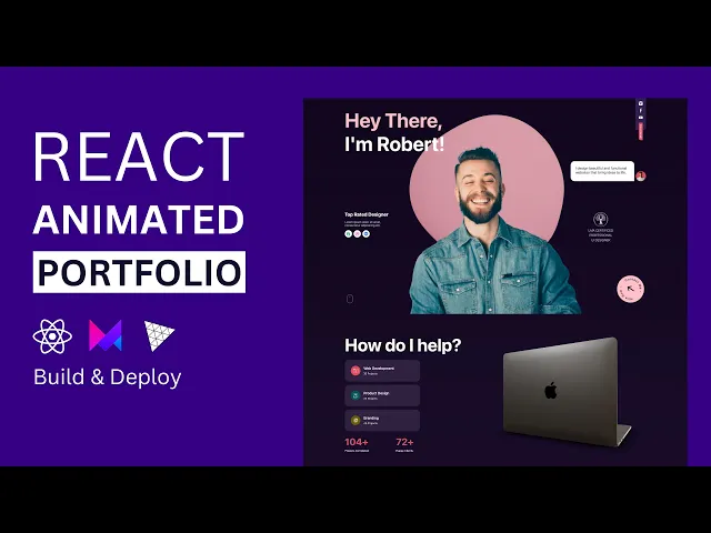


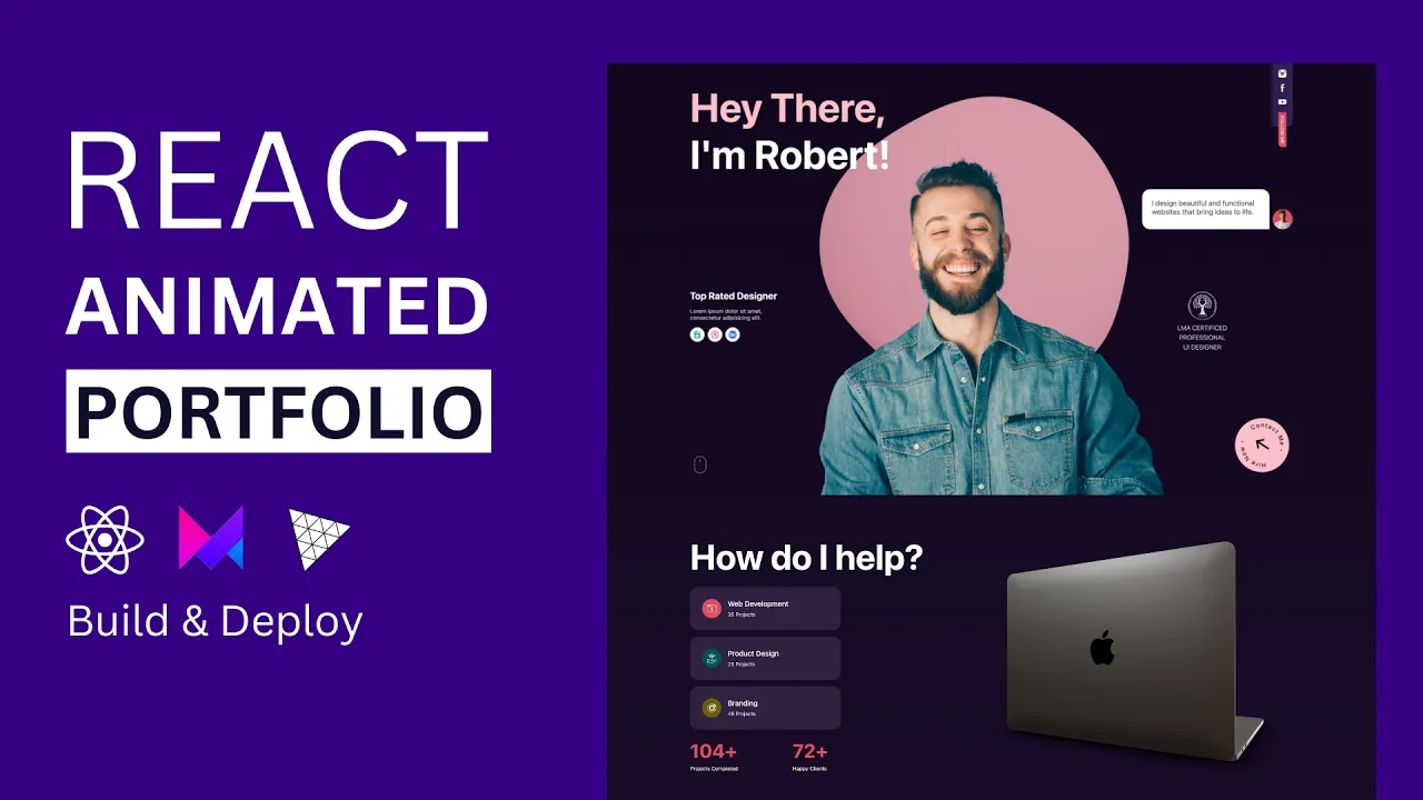