if you're looking for beautiful web designs let me show you 20 websites that I think are beautiful and might give you that inspiration to create your own stunning Design This web design is by Kickin and it's one that has a few different elements to draw inspiration from the very first thing that I really like is the big bold text here in the hero section which definitely focuses your eyes in on it as being a financial website the second part is the use of colors we've got these bright whites these light green limes and these dark
colors which all blend together even the background image here Blends together really well with these colors and it's the third thing that I like about this website it's got this unique imagery that looks like it's AI generated it's here at the very bottom of the page but it fits in nicely with this page not drawing too much attention to itself because the attention should be on the text and the C action here which says get funding but just as a supplement so that it feels like you're in nature and this is something that might feel
easy and relaxed to do the main style here is repeated throughout the rest of the website you've got these large big beats of text with these custom images which look really nice and it goes all the way through until you get to the footer here which has a nice beautiful image once more and a focused on the text here which this time is yellow but again this yellow looks perfect especially with this what looks like a sunset being more or less the same color my main takeaways from a web design like this is how important
it is to use color text and imagery together to enhance the entire design of a page here's a website I like called Orum and they're doing a couple of things here which are breaking the convention of what we're used to seeing they're using two types of text the first here says sell and the other one here says yeah but the year text looks like it was written on a whiteboard like on top of this website and so suddenly you want to read what is actually happening here on this piece of text you say sell yeah
opportunity is coming but coming is cross out and instead it says calling and obviously this website is kind of to do with phones and calling and sales and so immediately this year calling and request a demo all have the same color and your eyes are focused in on that and I think that's a great use of using font and color to draw your eyes to a call to action hero section that otherwise might look like every other section but this one looks different there are nice animations here for these buttons as well as for this
navigation section so all that looks already very fluid and professional and just means that this company might come across as one that will definitely know what they're doing the other sections obviously look good too they've got this Bento grid section here for their features as well as these animated sections of what the product actually looks like but mainly I just wanted to Showcase how this hero section here definitely works of course their use of color like a red here is probably on purpose because when you think of sales and you think of the color red
those work together so these are the kind kind of things you have to think about when you're designing a website this website here is called reom and what makes it beautiful are the micro animations which I want to showcase there's a lot of hover effects and movement happening so when I'm over the hero section here you can see a lot of the elements like the background color and these screenshots of websites are kind of moving about if I hover over this input section you can see it expands out so it showcases that it's in Focus
these feature sections here also change depending on the hover effect you can see that the background changes more image comes into focus and it animates up a little bit and even this UI style guide the background changes to a darker color so that each one of these little circles which are the colors for the style guide pop a little bit more and I like this this kind of movement that happens in the background like this text here for faster moving as I scroll or these hover effects when I go over this feature section making the
focus of the image expand out when I'm focused on it and the these are the kinds of things that make a website feel more alive micro interactions are something that I think are more beautiful and something that you can add to websites to make a user feel like they're experiencing the website rather than just browsing through it and reloom does one more thing really well this Shuffle button here if you select it the layout for the hero section changes and what's cool is it animates to a different type of layout using the existing images it's
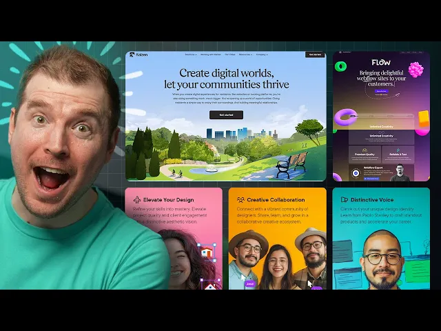
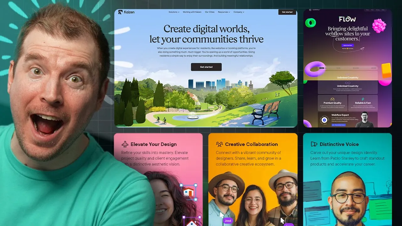
basically how Realo works but it uses animation as part of the homepage to Showcase this and I think that's just brilliant this here is Kaizen now this website doesn't have any crazy animation or interactions going on it's nice and simple but it's kind of like a breath of fresh air it's got this what looks like AI generated image in the background but it kind of looks realistic like a real city is back there and I like these images which are clear and simple and they focus more in on the text that's above them which has
this great topography here using this font that says create digital worlds and just one main call to action that says get started here once and maybe once more at the very top right over here now this is an example of how a website doesn't always need to have all these amazing sorts of things sometimes Simplicity is best and I thought I'd just show this example here as one that is doing just that this website I like for a number of reasons it's essentially a funnel for a design course it says Master gorgeous UI design and
the main call to action here is join the pre-sale but as soon as you load the page in you've got this subtle animation that kind of expands outl like that with this video that plays in the background incentivizing you to click the play button as I scroll through the feature sections have this subtle movement as I scroll through you can see these icons moving left and right up and down and when I hover over them the actual images zoom in a little bit but these icons stay the same adding this depth if I keep scrolling
through you might Noti notice sections like this on Pavo and think well they're not animated but they actually are if I start off at the very top you'll notice his hair is within the confin of this section but as you scroll up then you'll notice now his hairline is above it this means his actual figure is moving up about 20 pixels it's not much but it adds a little bit of life and Dynamics to this page and this is something I see throughout the entire website whether it's a Bento grid like this one here or
this one about benefits or outcomes you might not know notice but this person here is also moving up towards the frame and then outside of the section of this box as you can tell here and that's great because it does look like he's balancing and he's about to fall and the fact that he's actually moving independently of the background of the section he's in just makes that feel like he's really going to fall and here's my own website called design for developers it's the very first and only course I've really released which is over 400
pages in a dark and light version as a PDF and a video guide teaching everything from design to color theory to topography to components to visual hierarchy and lots more and this is one that I've put together with beautiful visuals to help make the learning process a lot more enjoyable and I put this website together to Showcase just how much is in the book and there's a lot here are the chapters and the table of content and if you click this button you get to see just how much is covered and then I've got videos
for each one of the chapters too so you can watch them here and preview them you can have a look at what the videos will cover and this is really the only course I've ever really put together and while this website doesn't have all these micro interactions sometimes design good design just means that you've put something together that you're proud of you can have a free preview of the book itself to get an idea of what it looks like but hopefully this is something that might help you and even if you want to support me
or the content I do this is the way to do it here's another design that I like and I might be biased because I've put this design together as well this one is for code stacker and his course vs code superhero he's put this together and there's a few things happening on this design that I particularly like which I'm going to Showcase firstly we have these floating elements in the background that move as you scroll you might notice that there is gloss morphism happening in the background of this container and it has a few good
things where it's using the colors of vs code to Showcase some of the content we have these svgs here like this Arrow over here which actually moves as you scroll it into the frame pointing towards this background of a video playing that's faded into the content so you get to kind of preview what's in the course by viewing this video as it's in this section and this continues on as well like this one here also has a video in the background and this SVG which zigzags across and I thought that's really cool then the next
section kind of flows through in this more red color showcasing more about what's in the course and we've got these SVG arrows which are drawing your attention to the buttons like this one here download a free chapter which is also a 3D button so you can see the micro interaction As you move through it basically changing its 3D perspective depending on where your mouse cursor is and this for example is one that I also like here we've got a video on the right hand side but this video is inside of a computer a Mac screen
so I think that like makes it more interesting when you have a video and rather than just have it in a box you have it in a device that someone's actually using like this Mac screen here there's a lot that gumes with this course but I've also added a very nice pricing table you might notice that it has a very similar style to the one that I had for enhanced UI but overall this should be a great course if anyone's looking to upskill their coding skills and it's a great design with lots of different sections
and a website that changes depending on which section you're viewing it on this website here is type F and there's one main thing that I like about it the micro interactions when you hover over different parts of this Bento grid each one kind of showcases what's happening in a very Dynamic fashion and I just love this way of like mousing over elements that have this kind of movement it kind of brings satisfaction to me and I just can't help but do it over and over so I think micro interactions is something I'm going to focus
on a little bit more in the next few videos just to Showcase how they can be done and how they can enhance your website design spline or spline design is another website I really like because it adds 3D elements to a page you'll have lots of different examples of how 3D works on the actual page itself but the perfect one here is in the hero section it's something that I've been interested in as well and something I want to learn a lot more of this year so I'll be doing probably some videos on how to
create 3D elements in spline design in the future as well this website here is by Punk I think they're called and there's something really cool happening on this website which I want to learn to do and create videos on as well it's using a little bit of spline design and it's this robot over here what he's doing is following the mouse cursor it's adding a little bit of 3D animation and interaction Allin one go and making the user that's browsing this website feel like they're more involved in that experience there are other cool things like
this bentto grid and these nice 3D objects and this scroll effect that's happening in other parts of the web side but I most particularly like the 3D aspect which I think I'm going to create more video content on in the future here's another example this one is Spidey uh and it's a website that uses spline design once again I know I'm saying it all the time but you're seeing more and more of spline design used on the web it's going to be as popular as Tailwind I assume and it's catching the scroll event and keeping
the 3D element here zoomed in and I suppose rotating as I'm scrolling through the page I've seen a few instances of this being used really well but this is something I also want to learn to do and showcase because it's a combination of good topography used with good 3D elements and animation the colors and animation and movement of this one which is called build with flow definitely stood out you can tell that they're using 3D elements from spline design but on top of that they also have this movement for the topography this movement for the
mouse cursor on their text here and this movement on the scroll event as well and you can see that this website's doing a lot of things we've got this Bento grid with these emojis that change and follow the mouse cursor we've got this background hover effect on this text and we've got all this cool funky stuff happening for this custom font here that says work we've got these 3D movement on these screens here and these hover and glass morphism effects uh this actual scroll slider looks pretty good as well to Showcase some of the case
studies and this pricing section also looks pretty good so generally this website I really like they're just doing so many things that make it look kind of alive and I can't help but just showcase this store filter is another website that I kind of like it's got a very nice hero section here with a preview of their product a nice simple hero text a little bit of a squiggly line helping you point to the free trial with the free trial being the main call to action but what I like is their background pattern this is
something I'm seeing a lot more more of where you're not using just a single color but multiple colors that kind of gradient through they're not even a direct gradient from left to right this is kind of like a radial or a few different types of radial gradients that are kind of fading in fading out and there's also some noise added on top of it so it just makes the whole thing feel a little bit more gritty but authentic then scrolling through they've got some nice animations and scroll Jacks happening showcasing some of of their product
with animations showcasing how it works as well so I think that's pretty cool the general layout for this showcases more with images and just general text and this is a great way to having these sections kind of in rows and columns vice versa showcasing the product in general so a good website overall but mainly I just wanted to Showcase that background which I think looks really cool GitHub is one of the largest websites for developers and while a lot of people use it not many people actually view their homepage their homepage looks great and I
wanted to Showcase some of the things that they're doing to make it look good they've got a nice simple bit of text here let's build from here which I think is great and then explore all your features as the main call to action their images are off to the right with some of the examples of people they work with below like KPMG Mercedes-Benz huge names essentially um but they also have this thing here on the left which basically is how the product works it works with revisions and different branches and you have these comments and
chains that you get to see and they've actually implemented this into their web design so as you're scrolling through you can see this kind of line appear and it takes you to I suppose the changes that are being done in this line of code and you get to see here exactly what's happening with a bit of AI doing the GitHub co-pilot change for this bit of code and then as you keep scrolling it showcases you more and more of what's happening with the product there is a little bit of a nice animation with this 3D
section here moving a little bit we've got these sections moving a little bit with images showcasing what GitHub co- spaces are what GitHub mobile is and each one of these sections has a little bit of micro interaction as you scroll through it so I think it's a great example of how you can add maybe not much interaction not much animation just a little bit to enhance what you're already displaying so yeah I think this is a great website I think not enough people take inspiration from these large organizations and then here at the end we've
got some 3D which I always love to see in website designs as well this web design here is by enantio and I really wanted to appreciate just how nice this hero section looks they're doing a few things right here that are worth taking notice of firstly because of this radial design which is something I don't often see a lot of your focus is taken into the center of this circle which says get your designs fast with A Touch of Magic because it's darker in the middle of this circle this white text stands out and then
this specific line which has a little bit of color and gradient to it definitely stands out a little bit more they're using this font which looks nice and curvy and definitely feels like a designer font and then this line here unlimited high quality designs for a monthly flat fee is I suppose a little bit more in opacity a little less a light in terms of the font weight and it's something you'd read secondary with the primary being this line then on top of that they've got these elements here like someone is actually designing in real
time feeling like you have your own personal designer and finally you have these additional things like 3day delivery unlimited requests pause or cancel any time as supplementary content you can learn a little bit more about what this website actually offers all up this design for this homepage is great and the main call to action here is the C plans if I select to it it immediately Scrolls me down to their different types of plans but the website itself still has a lot going on like this movement as I'm scrolling with previews of their work customers
they've worked with and this three simple step process of how they work choose a plan request a project receive your design simple this website here is called folk and what I like about them is that they do show rather than tell it's an all-in-one CRM but they've got a preview of what their tool actually looks like immediately on their homepage and you can actually select three through different sections like sales recruitment fundraising and Partnerships and investing to get an idea of what it actually looks like depending on what you might use it for so it's
a simple line with a selector and then the main call to action here is try for free it's a different way of creating a website where maybe you don't need all that animation or all that I suppose interaction you just have something simple where a person can click through and understand how their product actually works there's obviously more examples here that you can go through with a bit more color and a bit more preview but I particularly liked that homepage section where it's just showcasing a bunch of screenshots for the product and sometimes that's all
you need for a good design another example of just creating a very simple page that still is effective is this one here by notion I think they've released some calendar app and it's quite well designed for a hero section it's just it's time that's the one liner and its call to action is get notion calendar for free and then they've got a simple screenshot of it and that's all you need sometimes it's a screenshot of the desktop and the mobile versions of it and if you click it it also is a video of it playing
I suppose it's probably like a trailer or something but I like this Simplicity yeah sure there are some icons that don't really meet much with some color around the sides but this is sometimes all you need then as you scroll through you get a little bit of a Bento like section of features and screen shots of it in use and I think this is also useful as a design Trend I'm seeing more and more in a lot of these designs but overall it's just a simply but elegantly designed website this website is called hiara and
there's a really cool effect I wanted to Showcase as part of this website it's a recruitment website so I wasn't expecting too much from it and there's this kind of Blended gradient Circle here that I want you to take notice of as I scroll through the page it turns into a circle down here and it keeps moving it focuses on the word focused and then I I keep scrolling through now it's focused over here near adaptable and as you keep moving through it now focuses in on one of five over here and it just keeps
following the cursor I actually really like this animation it feels like it's just following you through the website like a little bit of a helper an assistant and I think there's a bit of inspiration that could be pulled through creating elements and journey Jes where items actually follow you through the website rather than just browsing a website this website here isn't a particular design but it's more information if you're looking for good web designs to get inspiration from it's called Landing Le and it's where I pulled a few of these examples from it has lots
of different types of website designs where you can preview the homepage and get inspiration from whether there are feature sections or how it works sections or testimonials all of these are nicely aligned in a gallery type grid where you can just have a look at these and then create or select or make something similar of your own design so it's definitely one that I think is worth checking out and if you're looking for inspiration there's always lots of websites you can go to browse and find such things now if you have any that you recommend
I should check out let me know in the comments and last but not least here's my own website called merge I've done a few things for the design here which I think you'll like first I've got this Giant M which is kind of 3D and moving in the background and I've added these retro icons at the very top here that have these kind of pixelated look but I like and I've got this custom font here that kind of looks like a design/ programmer font with some really curvy letters while some are more Jagged and rigid
and I just really like this font if you want to have a look I've added in some nice micro interactions with the scroll event here and the text moving and in this community I actually have myself and art doing lots of stuff like private in-house live streams and office hours and doing more in-depth into how to do some of these designs or reviewing your own design so if that's something you're interested in definitely join it and take a look it's a great Discord and a great Community to be a part of