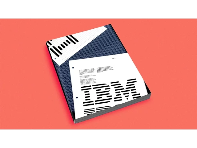
[Music] in 1956 the designer Elliot noise was employed by the director of IBM to rethink the company's design as a whole from products to communication right up to the architecture of the building's graphic designer Paul Rand was invited to define all of the graphic documents used in the company thus began one of the most memorable graphic design projects of the 20th century at the heart of the IBM graphic design program the series of IBM logotypes created by paul ran culminated in 1972 in a drawn version made up of layered strips making the company's initials instantly
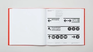
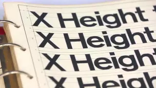
recognizable all over the world this iconic logo composed of eight bars continues to be used today between the 60s and the 80 is a significant group of graphic rules and uses was documented and regularly updated in a folder that was organized into sections inside we can find the instructions that allow us to reproduce the logotype graphic and typographic rules designed for internal and external document signage and architectural applications this document allows one to work with the company's graphic signs and coherence and efficient discussion with other trades today this folder is an iconic rare and little
documented object and it seems important to us to render it accessible and distributable to graphic designers students and anyone interested in the adventure undertaken by the emblematic company considering the many updates that were made to graphic design standards and norms the different folders of the IBM norm that we consulted often differed greatly in terms of their content this excessive document from the folder and their developments will be published and reproduced so as to offer the widest possible vision of the work accomplished over a period of more than 20 years this work will be done in
collaboration with the archive team from IBM New York and the Kandinsky library of the George Pompidou Centre in Paris the project is being undertaken with the approval of the legal successors of paul rand and IBM itself the intention is to reprint the folders contents in a softcover bound volume beginning with a high-definition scan of the original pages and the reprint that uses the twelve original colors accompanied by an optional French translation foreword by Stephen Heller graphic design curator