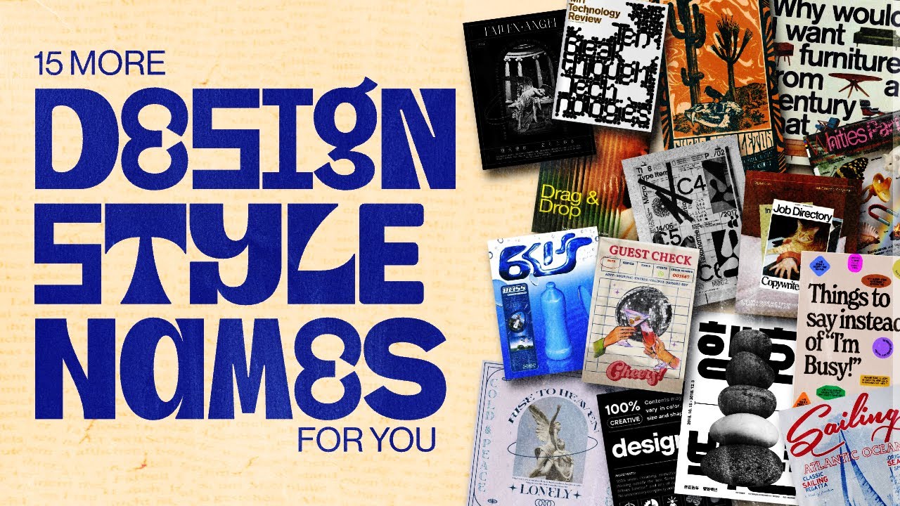
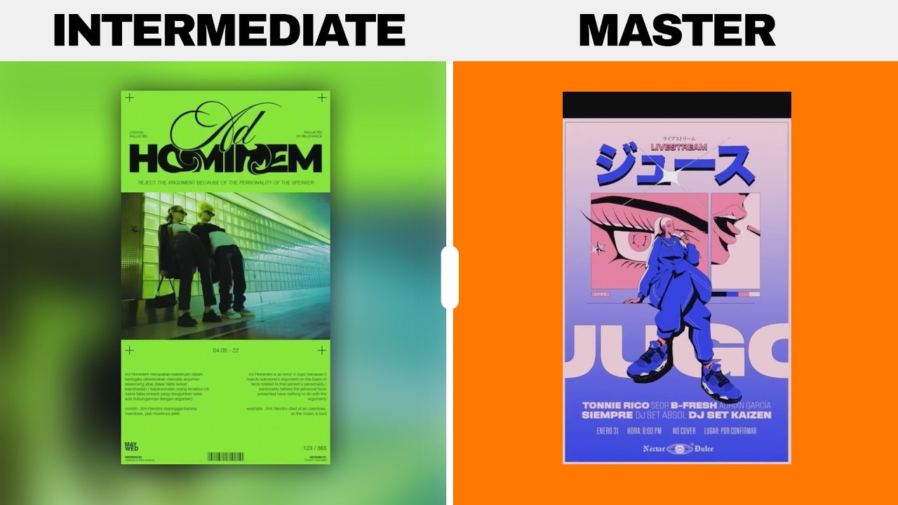
so welcome to this intermediate to kind of advanced graphic design course we're going to explore and master a topic that when fully understood by the designer will take their design game up a few levels and guess what it's something AI cannot do I'm talking about turning designs like this into designs like this I'm referring to visual communication and building narratives or stories into your designs now you can quickly skip to the first module in today's course or you can quickly learn why the content in today's course is so useful in graphic design according to a
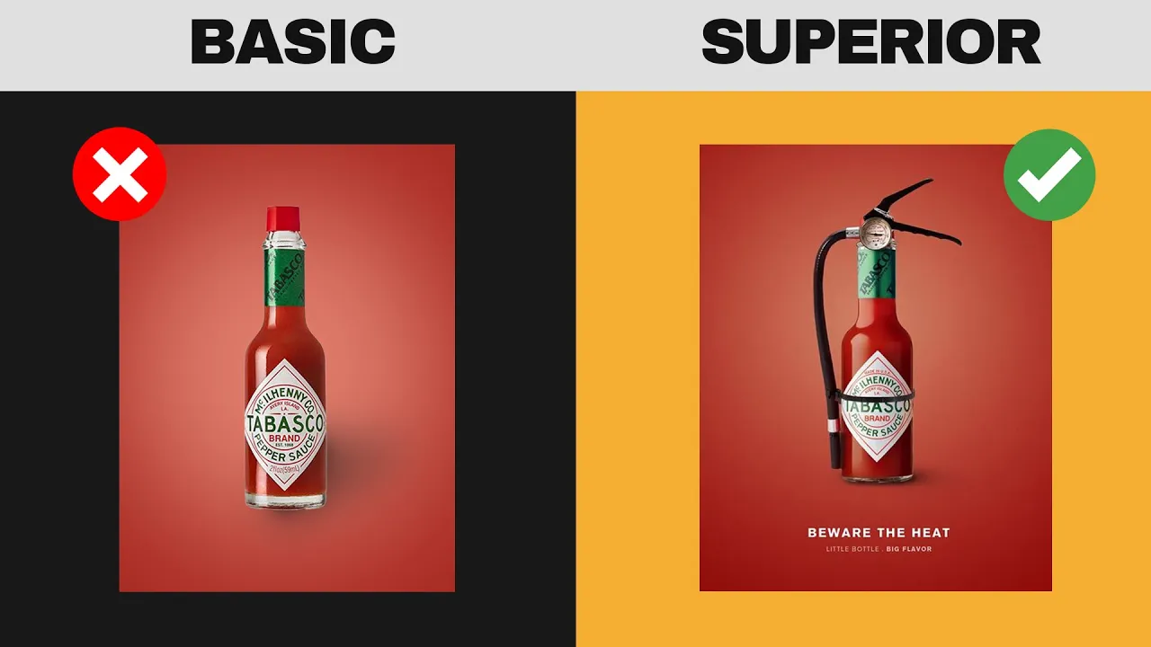
study by Adobe content with compelling visuals receives 94% more views than content without storytelling through Visual elements in graphic design plays a crucial role in capturing and maintaining audience retention and if your design fails to capture to hold and to inspire the attention of your audiences then you won't get very far in this landscape as a professional graphic designer many designers play down or don't understand the importance of visual narratives and storytelling in graphic design however if you actually look closely it's found literally everywhere in graphic design for example this design right here we have
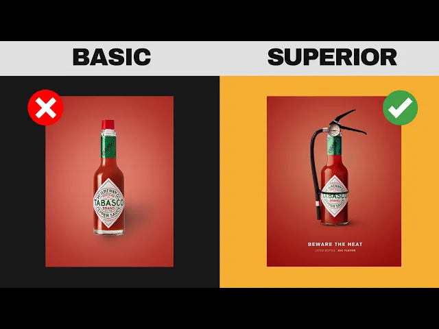
some hot sauce being marketed now the designer could have just easily or simply shown the bottle of hot sauce by itself in the middle of the design however instead the designer has cleverly built a narrative or a story that pushes the idea that this hot source is really really hot in reality Tobasco Source isn't all that hot but this design course isn't about to go into false advertising claims moving on we have this American football design which actually uses a more subtle form of Storytelling the design is expressing the athletes achievements in the sport however
there are aspects of this design that build a story or a narrative about success and victory but can you determine what those are are on this design I'm going to come back to this design at the end of the course to see if we can actually determine what has been used and how narratives play into this design and as to see if you fully grasp the content in today's course as you probably know to master anything you first need to know the principles and so let's look at and imprint into our minds the three principles
of Storytelling or visual narratives in graphic design now you should ensure the narrative is clear and easy to understand it's a great idea to try and simplify complex ideas and convey the message simply so avoid clutter or unnecessary details that might distract viewers from the main story when conveying narratives we want to maintain visual consistency throughout the design and that creates a cohesive narrative consistent use of colors fonts and imagery all help to tie together different elements and reinforce the overall story playing On Emotion is a big factor in constructing visual narratives it's wise to
evoke emotions through design choices so colors imagery topography can all contribute to creating a mood or atmosphere that resonates with the audience emotional connections enhance the impact and memorability of the story now there are literally many different ways or approaches to integrate storytelling and narratives into your graphic designs and we're going to look at a lot of them in today's course but one of the easiest and one of the most powerful and effective approaches is to use visual metaphors why is this such a good approach I hear you cry well firstly it provides instant communication
of your Design's message to the audience and that's in a snap of a finger so here for NES Cafe we see a very simple yet highly effective design the message is as follows coffee wakes you up and gets your behind out of bed in the mornings simple and and you get this message within a mere one or two seconds just looking at the design by itself but after the initial message has been conveyed we also notice Steam and the actual texture of the coffee and this will trigger the attention or interest of coffee lovers the
world over also notice how going back to the three principles from earlier the design is ultra simple which allows for the message to be delivered to us as viewers very quickly that plays right into the principle of clarity and simplicity now here's one of the most powerful advantages of using visual metaphors in your graphic design work basically they kind of Traverse all cultural or language barriers visual symbols often have Universal meanings that transcend language barriers as you can see on this poster right here now I don't speak Spanish but I know exactly what the message
of this design is through the simple Act of Storytelling and narrative driven design and that is of course via the use of metaphors metaphors are also highly memorable to audiences and so they're sort of like a super powerful graphic designers who know how to use them but importantly also when to use them not every design project or brief will require or need a visual metaphor built into it but that is your choice as a graphic designer it's something you need to make heading into a project now I hope you're listening and learning through this course
because we're about to go even deeper into this topic now here's something that's built directly into storytelling and visual narratives and graphic design and actually it's something many designers just forget about or don't even understand choosing fonts that complement the narrative is crucial to graphic design before you choose a font for a design stop right there make sure you have a deep understanding of the narrative and the emotion you want to evoke with your design consider the themes the target audience and the overall message you aim to communicate this design here is a very contrasting
kind of design the colors are bright and bold the imagery used is contrasting in the sense that we have fast food packaging with musical keys and to go along with that theme or the story the type face choice is also very contrasting and this is how it plays into the narrative the design without any typography looks modern and bold but if you look here we have a serif font in lowercase which is traditional and formal it's like how we have matched something sophisticated in the form of music School keys with something low brow like fast
food the choice of typ face reflects that story and narrative pretty perfectly see I told you this stuff goes deeper than a lot of people understand or realize and the next design uses humor as part of the story but the tight faac Choice here plays into the narrative which you will soon see so the caption your wife read your WhatsApp is a striking statement and it's meant to appear like a shocking or bad situation and so we have a loud and a bald Sans serif type face that's then contrasted with the smaller serif option to
the right which is a totally different voice it's the voice of the brand itself suggesting that you have a beer to forget the bad situation yeah I'm not too sure on the ethics on this one but hey obviously it works remember that type faces have a language and you want to fit that language into your storytelling narrative it's really that simple it's also very important to understand that color plays into this as well however I've gone over this so many times on my channel I'm not going to go into it in detail right now but
just remember that each color evokes a certain emotional feeling and that should help guide your narrative when choosing the right colors in traditional storytelling things are split into three different phases so we have the setup of the story we have the confrontation and then the resolution this has been used in TV Cinema and theater for countless years so the setup is the framing or the setting of the scene the confrontation is where there's a problem of some kind within the story or the characters and finally we have the resolution of the problem but believe it
or not we can include this three-phase story approach into our graphic designs so this design here is a prime example of how a designer has considered the three-phase approach the frame or the setup is that we have an overweight person at the very top the problem is that they want to change and become less fat and as we move down the design we see a resolution and a change in process but at the very bottom is the key resolution it's the logo of the gym which can take the audience to that very resolution of their
own problem and here's another design that uses more humor and humor might I add is a very good way to actually integrate storytelling and narratives into your graphic design work but here the setup is that we have a kid putting sliced meat into a computer the confrontation or the problem is well I doubt the computer would take too kindly to have having meat put into it and the solution well if you would have used protection there wouldn't be a kid in the first place there's the resolution pretty Stark I know but it hey it works
this three-phase approach can take your audience on a journey in just a matter of a few seconds and that's why it makes your designs that much better something else that can make your designs a lot better are the two PDF guides I have for my website relating to color theory and graphic design but also a logo design comprehensive guide as well and because Black Friday this week I've got a 50% sale on everything on my store if you use the code black 50 and it's only going to be active for 24 hours so on Friday
head over to my website link down below and you can grab that 50% discount on anything on my store okay so let's go back to the design from the start of the course this athlete has achieved 1,000 career receiving yards as a footballer the first way this design plays into the narrative is a topography on the 1000 this is a big a achievement and a superior effort so the type face is very tall and narrow which communicates a proud sort of narrative also yards the distance means that type face also should probably reflect distance in
some way and having it stretched high like this does help with that secondly this is a very personal design about one man's achievement and to get that across visually we have a signature style handwriting in two different areas of the design itself this makes it more personal and more authentic to this person and then we can see things such as Simplicity being used to help us focus on the main part of the story and however this design doesn't make use of that three act phase but that's completely fine because not every single brief will actually
demand or require something like that being used but remember that storytelling and visual narratives can be a huge part of your graphic design process it can be a subtle part or no part at all on a project to project basis you need to understand or determine if you're going to use this or not on that brief just ask yourself is it going to help achieve the goal of the design project by integrating storytelling and visual narratives simple as that but if you'd like to learn more coarse style material on graphic design just click that video
on screen but until next time guys design feure today [Music] peace [Music] all