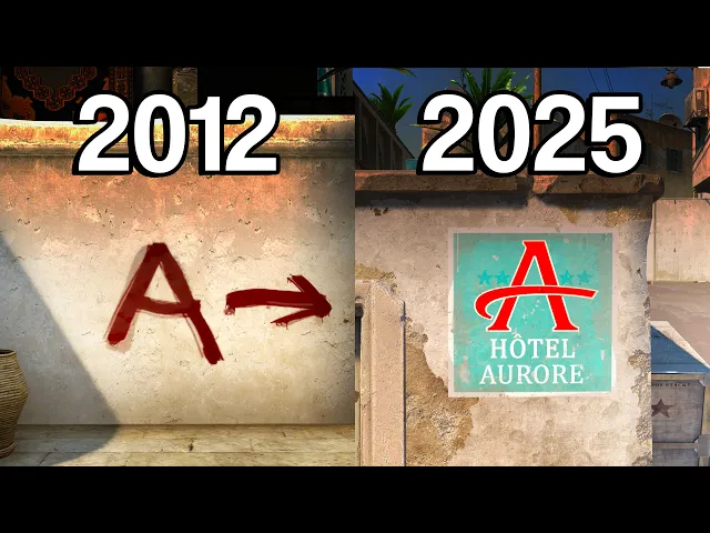
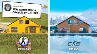
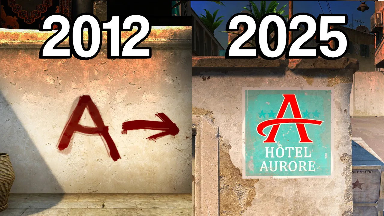
Pretty much all of the bombsite directions on the map CSGO released with had a uniform look being these big and bold red paint graffitis plastered in bountiful quantities all over the walls. But nowadays the only places you'll see them on in CS2 are just Mirage, Vertigo, and Overfuss. Since in terms of visuals, these three are still heavily based on their original CSGO release.
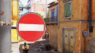
It seems that somewhere around 2016, Valve started slowly introducing a new modernized style of bombsite directions that has them be disguised as all sorts of signs and plugs rather than graffitis. First, it was the new cremake with its fuel rod storage A and reactor chamber B. Then, Dust 2 with the Aurora Hotel and Kazba.
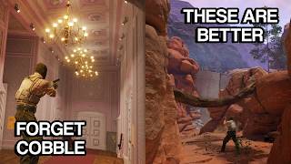
ancient with excavation sites A and B, inferno with some street signs, and lastly, train with the poor A and the POV, which don't make much sense considering that V is the third letter of the Russian alphabet. Nonetheless, I think we can all agree that this new style of directions is quite cute in the way it's personalized to each map and makes more sense than imagining that someone just so happened to make a bunch of A and B graffitis all over the place right before terrorists arrived. I especially love how some newer community maps started coming up with their own even more creative ways to show directions, such as Fleek with its filming stages A through E, which make you wonder why the terrorists chose A and B specifically, or Palasio that not only labels the bomb sites, but also the spawns as Terraso and Contraaso.
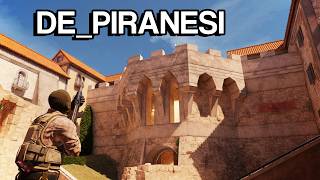
Though my favorite has got to be [ __ ] with how it subtly hides the A and B letters in the architecture of buildings surrounding the sides. I like I'm not even sure it's possible to bend wood into such a shape, but it's so cool. I'd give it a pass.
Now, a point can be made that the original uniform graffitis were better since if you think about it, these directions are mostly intended for newer players that rely on them heavily for navigation. and having them be so subtle and different on each map makes them less efficient at their job. As well, you could argue that since these big bombsite letters have been present on CS maps from the very beginning, they have become an important part of the Counterstrike identity, often being one of the very first things you picture when asked to think of a Counterstrike map.
So, removing them like this might contribute to the so-called death of an art style. Well, I can personally see the reasoning behind both sides of the argument and don't have a particularly strong opinion on the matter, but I would love to hear what you guys think is the better approach. So, make sure to tell me in the comments.
Meanwhile, to avoid controversy, I'll start developing a direction system of my own. One to be superior than anything that has come prior. [Music] Hi, are you lost?
One second. Follow [Music] me. I love my [Music] job.
Subscribe to Tamir.