what are the words that come to your mind if I tell you that today I'm going to talk about data technology algorithm big truth control what if I told you instead the data can be an incredibly powerful design and narrative very human material that you can write with and design with in fact through my professional and personal practice over the year I've learned that data not only can describe the objective world but it can especially illustrate try help us ask prosperous trade aspects of our lives and in our world that we really hardly associate with
numbers but I will get there I'm an information designer and for the past 10 years I've worked with data qualitative and quantitative big and small data that organizations already have or crafted by myself and together with my team at my firm we every day shape the way our clients interact with this information through data visualization and through building interactive experiences with these visualizations and I will show you a recent montage of our work to give you a sense of what we do where think that every shape color sizes and attributes in the images that you're
seeing are actual representation of data points in their dimensions so as I mentioned you four over the years my work we showed which I'll show you in depth in a second let me to question the actual definition of data and I'd like to start with a pretty fundamental consideration that data doesn't exist and if we think about it we all know it right data is an instrument that we human beings created to observe record an archival reality it's a partial abstraction of reality a proxy for something else but it's never the real thing and following
this last point well then data is imperfect our world is mostly random and messy and collecting data doesn't make it more perfect or more controllable and lastly data is human because even if it comes from a sensor or technological device well a human being designed that sensor and decided what to collect and what to leave out so then a driven doesn't make the data driven doesn't mean a mistake fully true it never did and it never will and it might all really sine obvious to you but when working with data it's really it's really easy
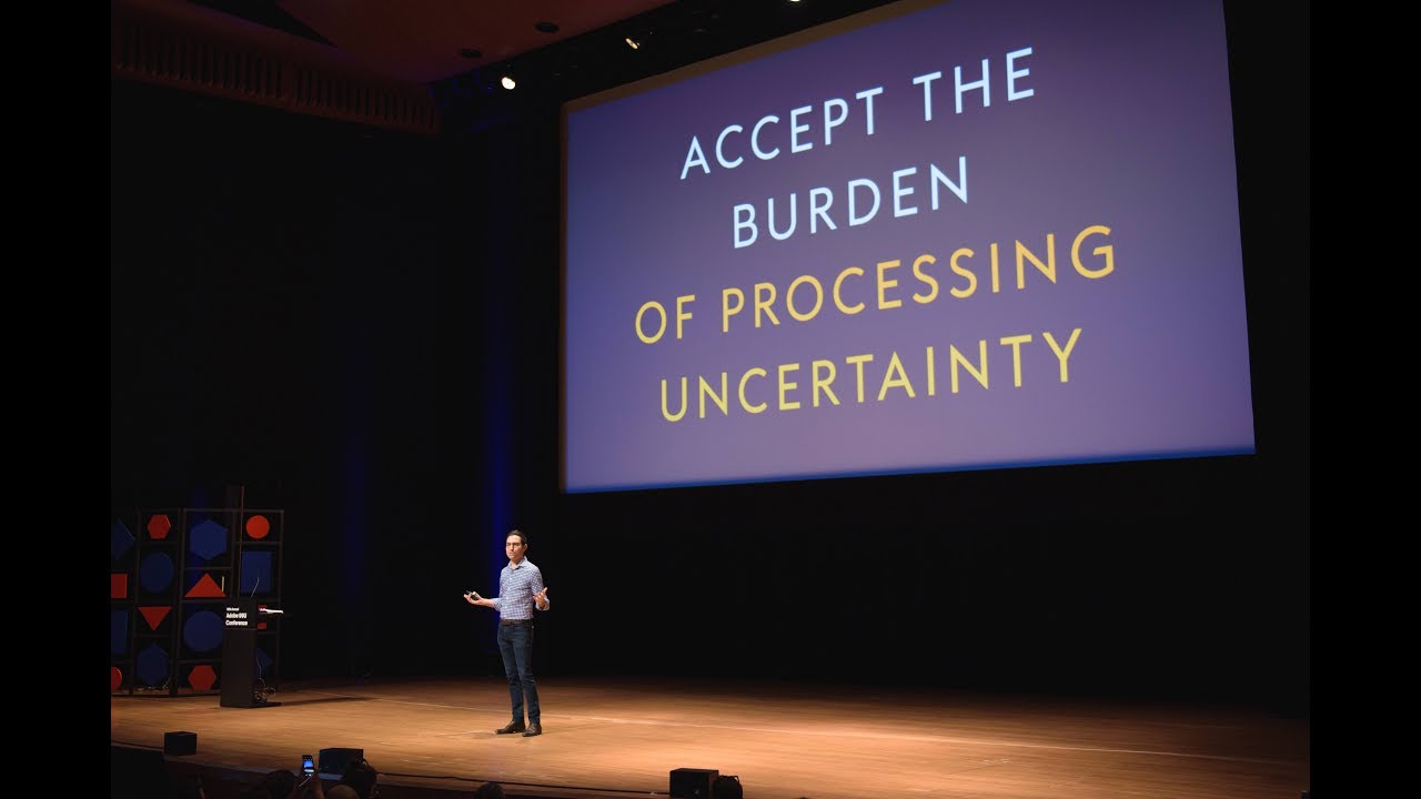
to fall into the idea that they are objective collection of facts overarching truth that will solve our problems it's easy to get fascinated by the numbers like in the technologies that we use to gather them that we lose we risk to lose the point the data is one of the ways we have to see and record our reality a lens a filter that we can apply and we can it can really help us discover and make visible the hidden patterns of our world but it should never be the focus it should really never be the
point and this is how I want to talk about data today how I want to talk today as a designer I'm covering a world of sometimes imperfect and intentionally handcrafted data that are the ones that can tell the most compelling stories and that can be used really as a design tool to create value and I will guide you through how I discover the beauty and humanity in data and data visualization how I'm experimenting with it and also how we gotta--we envision for the role of data in the future so I'm taking you now back in
2012 in Italy where we were originally from where we started to collaborate with a Sunday cultural supplement of the main Italian newspaper Corriere della Sera but from 2012 to 2014 we designed more than 40 data analysis and visualizations and the purple of that column in the newspaper was explicit to explore what can be done with data journalism and data visualization to push the boundaries of the discipline and also to make a stress test how much a complexity can our mirror absorb and so every week we looked for data on a main topic combining and overlaying
different information on cultural and social phenomena with many layer of context and then we visualized all of this data with a unique language created specifically for the data that we found as you can see from these previews so rather than just looking at numbers and visualizing these numbers directly we focus on the reality represented by the data and from there we imagine how to distill these stories into how we represented it we also started to experiment on how data visualization can almost become a meditative language to decode for the readers and also to learn that
complexity can be our friend and we can use design to let people in and invite them to spend really some times with data always providing a legend so a key to understand how to dig into these novel languages and personally I loved breaking free from the boundaries of the typical bar chart and pie charts that many times cannot really convey the depth of the stories that we find in data it was illuminating to me and it really it helped me still define now how I work with data in 2019 but we can of course blur
these boundaries even further beyond the to the environment and beyond the places that we normally expect to see data in a recent collaboration with Starbucks we built a hundred foot wide data wall that was carved and etched in brass for the first Starbuck Weiser browser in Italy that opened in Milan last September exploring the combination of large physical spaces and conventional building materials and virtual environment so this wall tells the story of Starbuck the journey of Starbucks with a timeline of the most important moments in the brand history a map of all of the places
that have been fundamental for the company and also a background data layer that explains the coffee making process for the most popular blends and to make this stories really accessible for visitors we also designed and developed a mobile app that through augmented reality really brings this data to life adding a digital layer that interacts directly with the physical space of the wall and where the wall is turned into a living artwork with access to extra content that can be experienced in this immersive way and so I guess you start seeing the power of data as
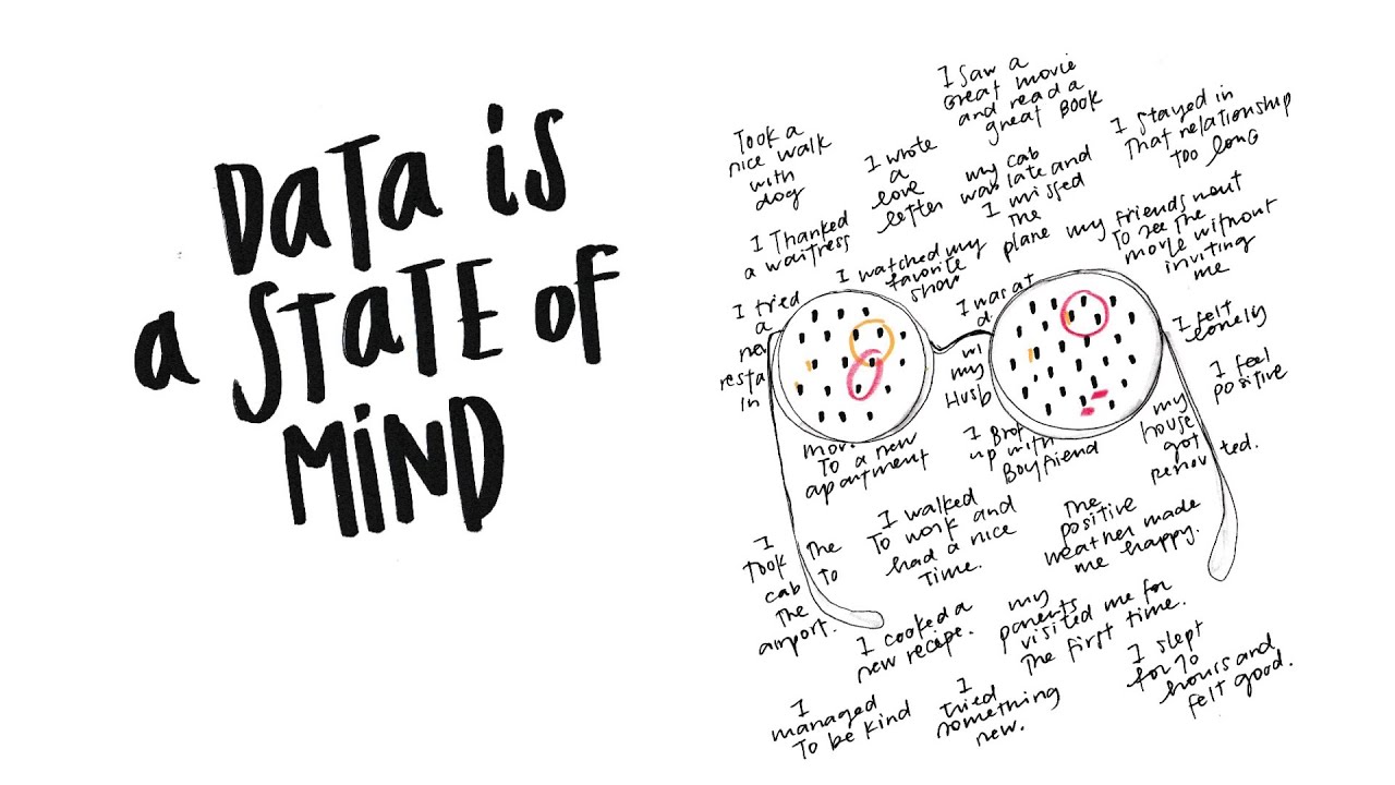
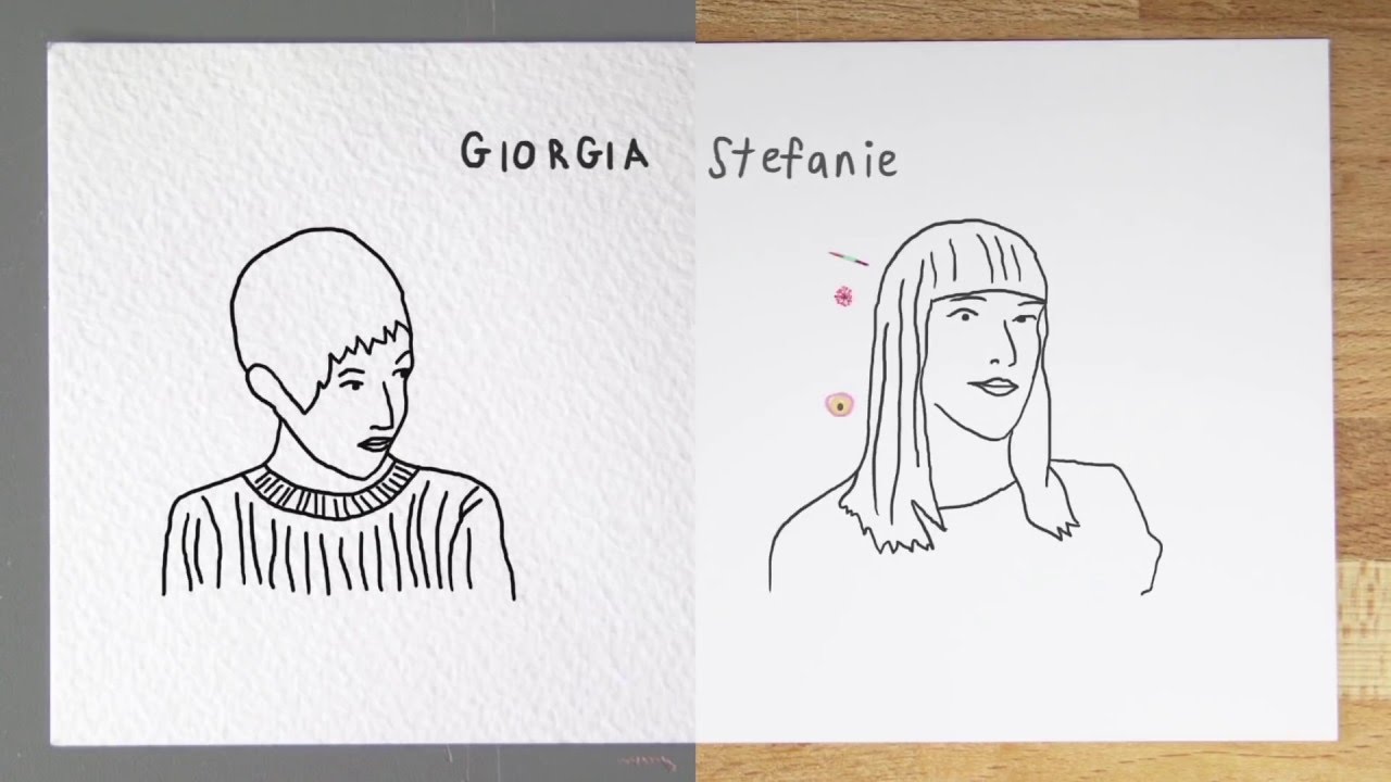
a narrative material not only in obvious context such a magazine or a web site and now moving very far away from technology and digging into personal stories made of data in 2014 I embarked in a year-long self-initiated project that I always say there was for me the big data hunger or cure called deer data a collaboration with london-based information designers definitely possible so Stephanie and I met only twice in our lives when we decided to run this very radical experiment around one main question is it possible to get to know another human being through data
only for deals data for every weekend for one year we use the word personal data to get to know each other personal data around weekly shared mundane topic from our thoughts and ideas to the interaction with our partners from our belongings to our most intimate feelings so 52 excuses in form of data to investigate and reveal a particular aspects of ourselves in about our days personal data we will manually hand drawn on a postcard site sheet of paper that every week was sent from New York to London where Stephanie leaves and from London to New
York where I live from for one year we're the front of the card was always the data drawing and the back of the postcards contain the address of the other person of course and the legend how to interpret our drawings so we started to look at our ways through data but not only quantifying the number of times we perform a certain action instead adding context and details about why what was happening what was the situation what was the feeling really realizing week after week out to put ourself in these numbers and the importance of adding
context and qualitative aspects to make this data truly representative of ourselves we investigated even our mind and our most intimate fears through data sharing with the other person all the moments that we felt anxious sad frustrated fearful explaining why through the way we categorize our moments of negativity for example as one of the 52 topics and ultimately we've been using data is our unique alphabet our language to communicate our lives to the other person for one entire year so dear data also became a book that is it as third edition and the original collection of
postcards has found the most amazing home as they've been acquired as part of the permanent collection of the Museum of Modern Art but what excites me even more is that dear Ted has been so well received from the public outside the data and design community we've seen we've seen thousands of postcards made by people not even designer or artist we've learned about the project and wanted to experiment on themselves even teachers of any grader using this format to teach their students their world of data it is opened the idea of data to a wider audience
that made it more approachable and more fun to the point that our publishers mark the advisor to create a second book which came out last fall called observe collected draw which is a journal for everybody to document the world in data so we have seen how we can turn even the smallest details of our lives in today that we can look at to see things from a different perspective but besides personal data we can do it everywhere and anywhere I'm often asked where do you find data and more and more replying that I design my
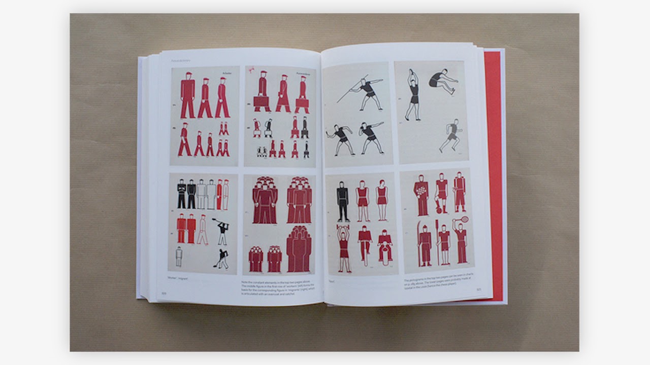
data sets another example in 2017 I have the great are to collaborate with Paola Antonelli the senior curator for our in architecture at MoMA and with her team on a piece that closed the show items is fashion modern that some of you might have seen if you were in New York so the show presented 111 items of clothing and accessories that have had a strong impact and influence truly our our culture from the bikini to the bikini from the Patagonia flees to the balaclava from Colin Kaepernick's Jersey to the Palestinian caffeine and I have this
incredible opportunity to create a site-specific hand-drawn of course visualization to guide visitors to explore the features of the items at the end of the show both individually and part of a bigger ecosystem but what's interesting here is that I didn't have any data I only have the list of a 111 objects and the background research conducted by the career toriel team on each of them and so I put on the glasses of the data collector and delved into the 111 stories in search for bits of quantitative and qualitative information that help me answer a few
made question and really understand and reveal why which is was each item included in the show and I asked for example is the item a medium or a message meaning is it iconic because of its technical and aesthetical features or for what you represent and are they want to conform or to escape meaning hasn't become a way to blend into a social context and break free from it and many questions of this kind really crafting the datasets from these questions and then each of the item became a symbol that I drew on the wall position
and visualized according to this set of attributes is actual data said that I built together with the curators with a legend on the side Walter interpreted for the visitors and so the whole point of my exercise was to start from the final manifestation of this process and work backward really reconstructing the invisible data set that Powell and her team used as an input for their design even without knowing it and then making it visible for everyone to see through the lens of data and let me pause for a second I see I think very pretty
interesting moment in time to mere merge data and design besides the more artistic questions that I showed you up until now so at this point we're all aware that the companies and brands that we love and use every day collect analyze and use the data that we customers make available to them and in this moment when the conversations about privacy and what is a fair use of personal data are rising this company will necessarily have to open up to us about the process owning the fact that they're collecting data and starting new type of conversations
in shaping new relationship with us through this data giving a measureable value back to us on the other side besides adds a recommendation and because we are not all data scientist most of us many of us have no use of raw data on a spreadsheet and so it's only through design that we can shake meaningful experiences in with this data informs that we all can understand and engage with and I'll show you now a few other example of how I think this dial could evolve that I have started to explore for example in 2017 target
one of the main sponsor of the TED Conference edition in Vancouver asked us for a way to engage the attendees of the conference on through data and we created a quite unusual data-driven experience we designed what we call data portrait of all the people who are at Ted images based on people's answers to a series of questions and translated into a hand-drawn image where every color symbol in position of the elements that you're seeing is of course a direct translation of one person's answer and these images were then immediately printed on buttons that people would
wear throughout the conference and use as a tool for sparking conversation and finding commonalities and differences with each other so we asked simple but somehow personal questions and you can as you can read on the legend such as which that letter are you technology entertainment or design and did you get your best ideas of tournedos beverage or will it work or out messy is your task or how many unread emails in your inbox before you freak out and people at Ted we're we're in their abstract symbol on their badges using them to really identify similarities
and differences with others at with other people at the first glance really an excuse to start a conversation an icebreaker and know in the meaning of course behind the colors and the symbols on the other person's badge and so in this small experiment we prototype a model when the data that were the data that I shared generates an output that gives a tangible value back to me in this specific case it was in the form of a keepsake and to create more interesting conversations and another example when the team at Google News initiative asked us
for an original text on how to look at their data meaning Google searches we in this case decided to let people define their frame of reference to interpret the data that they will see before before seeing it and engaging them in the actual production of data and as for the topic in a challenging moment of international tensions rising we decided to focus on the idea of hope and using it as our a lens to dig in so we created building owns building hopes and after lets you create physical sculptors that represent the ideas concepts and
movements that you're hopeful for and then using them as a means to access Google trend data so as the experience starts in incremented reality setup you're presented with floating topics to select from so medical discoveries improving education gender achieving gender equality ideas that you might be hopeful for that you can tap and give a way to rocks that you can really place in a specific location in the world through augmented reality to share with all of the other people using the app and once the sculpture is created then it can be used as a way
to access Google trend data on the topic of your choice revealing how people around the world are searching and have searched for the same concepts over time and seeing also how many other people who use the app are hopeful for the same ideas and concepts and again making you reflect upon the data that you're seeing in a conversation with yourself at that moment so the idea is that by picking what you're awful for before starting to engage in a conversation that you already have a stake in and even data coming from a brand becomes more
about you and it's filtered by what you care about and to translate this experience into a more general idea well if we think about what we see on social for example at this point we all know that we live in the bubbles that are created by our own behaviors what we like and what we share seeing pretty much only the content that confirms our thinking and preferences and in fact giving us a partial view of the world and well if through a design experience we could make people even more aware that what they choose filters
what they see and what is given back to them I think that we will have really way more opportunities for should we want it break free from the bubbles that we own that we own create by recognizing them first and I want to conclude getting into something that we can perhaps all relate to as human beings I wanted to share with you an even more radical experiment that deals with how medical data is presented and what is normally not even recorded in this context this project is a collaboration with my dear friend and guitar hero
kaki king we actually started to collaborate when John Maeda brought us together a few years ago for a branding project that combined music and data visualization for the 200 years anniversary of the Hennessy VSP edition of the cognac which I will not get into a lot of details for our time sake but then kaki and I fell in love with each other work immediately and decided to keep on exploring together until when two years ago caucus three years old daughter Cooper was diagnosed with a condition called ITP an autoimmune disease where her body attacks her
her platelets and leads to spontaneous blues in bruises burst blood vessels called petechiae all over her skin and in the most terrifying cases even internal bleeding's so for four months until her daughter Cooper was out of the danger zone we collected and combined quantitative data from Cooper's tests and qualitative observations from khaki like from her life her home level of stress and fear and the main episode there happened and we decided to share this very personal journey not with words but through this data then I then visualized in a way that you will probably not
expect from a medical data visualization so these that are really intimate and very intense and personal so I asked myself can a data visualization evoke empathy and activate us also at an emotional only at a cognitive one so I structured the fluid timeline to tell the shores of this for our very hard months for khaki and her family every symbol that you see represented at a point worth every petal every white petal is a day and the rhythm is broken when Cooper was admitted to the hospital to check her platelet count and the bursts of
red dots represent his value and then we have data as observed by khaki herself like the purple splotches with their intensity representing the visible bruises or the pink dots and their dimension represent the level of the number of petechiae like really the level of petechiae the blood marks on her skin when Cooper was taking steroids you see these grey shapes affecting the days and here's where Cooper had some incident that caused her skin to worsen such as she fell at the park or she was bitten by a mosquito but there's also all that was going
on in khakis lifing in her mind khaki tours a lot and she feels very stressed or went away from home in this particular moment and this is indicated with this black dots in the days that she was gone but there have also have been positive moments which is a fun birthday party for Cooper or her brother that are highlighted by these yellow spots that cheer up the visual in a way and lastly okay also khaki kept track of her home level of fear and hope for the day the she reported on a scale of 1
to 10 visualized through this floating line when the dark lines are her fears and the orange lines are her hope and all around we added khakis personal note for the day this visual was also used as a musical score by khaki to create a piece of music that she composed directly for the four month of data collection when the timeline of the song represents what was happening to in their life exactly as the data visualization that you saw and this is the song that you're here now as you can probably see this is not by
any means a scientific representation of data still I think that it paints a pretty complete and sensorial picture of this very personal journey and many people live in similar experiences told us that this visualization made them feel really part of a caucus stories in a way that probably a blog post wouldn't have done and I don't want to say that this can lead to any medical breakthrough scientific breakthrough in the medical field this is not the point of my work but I believe there is a world of unexplored small and intimate data that we often
don't see if we apply a straightforward definition of what data is and wait what if for example hospitals and doctors will also speak this type of languages back to us what if every company an organization that collects our data was opening to design the way we receive our information back and give us endless opportunity to engage with our own data and learn more about ourselves in the process we really live in a moment in time when we need and we can reclaim a human and therefore way more approachable and accessible approach to data I often
gather what I do and think under the umbrella of data humanism a new Renaissance were we humans in our needs and desires will be the focus of the conversations around data where we will design way story could empathy imperfection and human qualities into how we collect process analyze and display this information to make them faithfully representative of our human nature we're data-driven design is replaced by design driven data because we will design the way we will approach data depending on its unique context every time we will design the conversation around data and where ultimately instead
of using data only to become more efficient we will always use data also to become more human thank you