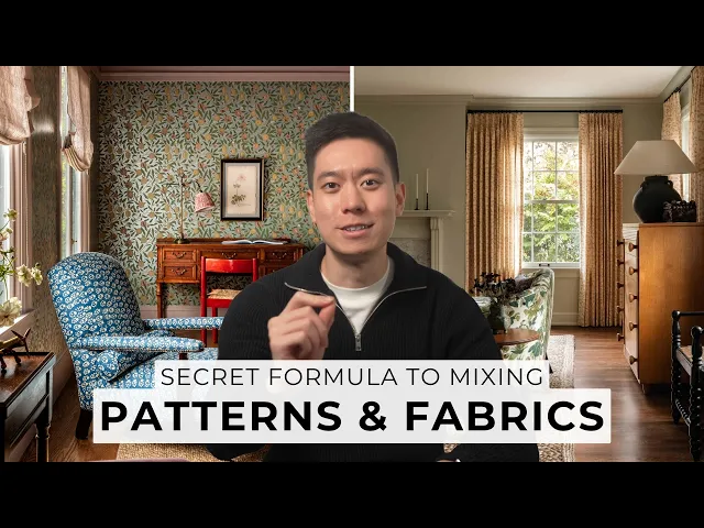
mixing patterns and fabrics is all about balance get it right and your space feels layered and intentional get it wrong and things get chaotic fast in this video we're going through everything you need to know to combine colors textures and skills to create a beautifully layered and balance space let's get into it okay first things first color before you even think about slapping patterns all over your space you need a cohesive color scheme this isn't just about keeping your home looking nice and cohesive it is about narrowing down your pattern choices to make your life
a whole lot easier with a million patterns out there if you don't start with a defined color palette it is basically like trying to find a needle in a hay stack you're going to be lost 4 days so here's my tip stick to five colors any more than that and it can get way too chaotic so how do you pick these colors it's very easy start with two colors you love for me it is earthy greens and maybe but hey that is just me it is all about what you like and don't just say I
like green get specific is it a deep forest green a bright lime or a pastel green throw in an objective to describe it then get three more colors together ideally two neutrals because they keep things grounded and one wild card that wild card is your chance to go bolt with an accent and create some interest in your space now if you're new to color theory I've actually got a playlist dedicated to it where I go through step by step on how to choose a color palette and also more advanced topic like undertones and mass Stones
I also dive deep into how colors work together in Chapter 2 of my practical Home Design course I walk you through how to select colors that complement each other and create a cohesive look now back to patterns let's check this out I've got three patterns here notice how they all work together it is because they've both got cohesive color schemes more specifically the patterns here work well because they have a similar neutral background and then the middle and last patterns both feature tonal greens even though one is a bit darker and the other lighter they're
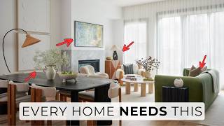
still the same Hue so you have repetition at play here then the first and last pattern both feature pink orange and red all of which are present in the flower in the middle so even though the patterns are different they feel connected because of the colors I've cated a gallery of images from leading designers who are Masters at mixing patterns which you can access for free here or down below see how patterns work together in real spaces and use this as inspiration for layering patterns in your own home now let's talk about texture I know
this video is all about patterns but trust me texture is just as or even more important it is not just about the feeling of the pattern fabric it is also about how those textures look patterns are a visual texture after all I'd like you to take a look around your home what textures do you already have maybe you've got some ordinate crown molding or TS in a herring bone pattern these are already giving your space texture now consider the patterns that come with these elements for example if you have shiplap walls or rustic wooden beams
on the ceiling you already have a built-in strip pattern these are the foundational textures that set the tone for the rest of your space and will influence the patterns you choose unless you're planning on changing them if there's something you particularly love you can either highlight it or play off it with complimentary or contrasting pattern patterns this is something a lot of people don't think about and will elevate your space to the next level think of texture like the base layer of a cake patterns are the frosting it is what people notice first but the
texture provides the structure and balance that makes the whole thing work the textures you choose will not dictate your pattern but certain subtleties can make it more Dynamic while still addressing your personal taste for example J unfinished wood and grasscloth wallpaper feel more casual and earthy while marble textured glass and silks feel much more refined consider how you can use different materials and always mix your textures matte with shiny rough with smooth hard with soft it keeps things fresh and dynamic now if you want to learn more about texture I've got an entire video on
that too it's Link in description box below you can thank me later all right onto one of the most important parts of mixing patterns scale and proportion sounds fancy but trust me you can do this I'm going to use scale as a word to describe the physical size of your pattern while proportion is used to disguise how much of that pattern you're using in the space you need to get both right first think about the overall role each pattern plays in your space use larger patterns to highlight areas you want to draw attention to like
a Boldt wallpaper or a statement armchair smaller patterns on the other hand are perfect for areas that you want to receed into the background or even hide the goal here is to guide the eye and slly Define the purpose of each space for example bold patterns on an armchair May invite people to sit on it so try and think about clever ways you can make patterns to find the purpose of various areas in your room remember that the scale of a pattern can feel different depending on the size of the room or the piece it's
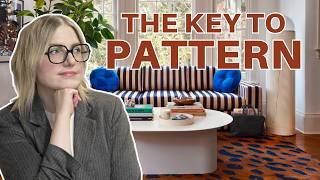
on what might seem like a mediumsized pattern on a large sofa could look overwhelming in a smaller room larger spaces generally handle bigger patterns better but even they need balance like this room the large pattern on the walls works because it's quite a large living room in a smaller room you may need to scale down your prints or use them more sparingly to keep things from feeling crammed for a balanced look stick to the rule of three small medium and large patterns start with about 3 to five patterns in total choose one large scale pattern
to be your hero piece to set the tone for the room the other patterns can be medium or small scale to support that main pattern that said design rules are meant to be broken sometimes a smaller accent pattern with lots of personality can steal the spotlight while a larger print may play a lesser role I like to think of parents like an ideal dinner party you need a few guests who can dominate the conversation these are the Bold parents some who fill in the gaps the medium parents and a quiet Observer the small parents too
many dominant voices and its chaos too many quiet ones and it's dull mixing parents is about letting each guest shine while ensuring they all contribute to the same harmonious atmosphere and lastly don't go overboard with the patterns your space needs room to breathe you don't want it to drown in patterns aim for about 40 to 60% of your space to be covered in pattern elements and keep the rest solid or with subtle texture to create balance also remember that you'll be adding patterns as your space develops over time so if you're not hitting this Mark
now it is all okay because you'll likely add more Decor in the future pattern scheme what's that well just like your color scheme you need a patternn scheme that includes a variety of pattern Styles so you've got your three sizes of patterns now let's talk about mixing Styles you might think hey I can throw a floral and a geometric together and boom done nope they need to have a similar vibe to work think about their artistic language is it hand painted digital is it realistic or abstract and Ora KY pattern might not work well with
the William Morris wallpaper the Artistic Styles are too different that said you do want to mix different patterns because only then you can create interesting J position for example if you choose a plate or linear pattern for the wall then you may want to stay away or minimize the use of linear textiles and instead layer in organic patterns and textures conversely if you're using patterns on the wall by the way this is one of the places where it's easier to go for it with bolt or large scale designs then the rest of the materials in
the space can act as a subtle complement to the bolt wallpaper and here's a cheat code always have some basic coordinating patterns in your back pocket these are your stripes dots Dy prints and what I like to call coordinate prints these will complement your hero pattern stripes for example are classic and they have the added bonus of adding width or hide to a room depending on how you use them then as far as dots go it is not just your classic poka Dots Dots can be playful abstract animal print even opart think outside the box
you've also got deadsy print which are small scale but can be anything from florals to abstract shapes and then there's the no print prints these ones are subtle but still have full motive coverage so from a distance they look almost solid but they feel textured perfect for mixing and matching these Basics can and should tie back to the colors or theme of whatever more dramatic piece you're including if you're newer to pattern interesting coordinates like this are a great place to start now if you're worried about clashing patterns start small try at adding in pattern
throw pillows or a single pattern Rock to test your comfort level this lets you experiment without committing to big changes as you gain confidence you can layer in more patterns and build a more Dynamic space over time remember it is okay to do things slowly every space evolves over time and just going back a little bit on texture a textural material in a single color can also be considered a pattern so remember that something upholstered in Bay or sometimes something made from travertin is as much as a pattern as something that features a printed pattern
finally if you're still finding it hard to choose patterns that work together consider looking at the fabric or wallpaper collection on which your favorite patterns come from patterns within the same collection are usually designed to complement each other so they'll almost certainly work well together now before you rush out and buy everything here's a little trick swatches samples and slow decorating seriously take your time get some fabric swatches and samples and see how they look in your space not just up close but from a distance you'll be surprised how different parents feel in context and
remember it is okay if not everything clicks immediately de rating is a journey take it slow collect pieces you truly love and watch how your space evolves over time don't overdo it with patterns sometimes less is more pattern on pattern can can be gorgeous but if you layer it too much things can get chaotic for example if you're going bolt with your headboard maybe keep the cushions plain or vice versa give the fabric some space to breathe choose your fabric first then paint too many people try to match their fabric to existing paint but trust
me it is much easier to find a paint color that works with your fabric than the other way around lastly remember the layered perfectly curated look it doesn't happen overnight it takes years of careful collecting so take your time enjoy the process and have fun with it there's also three books that I like to share here the first one is living with pattern by Rebecca Atwood this is great for the basics to start using color and print at home next are these two books one by Bea human and another by Heidi ker they're both really
great designers and I like how they use patterns and texture in their work obviously there are many others out there as well which is why I've curated a gallery of images so you can use them as inspiration and see how patterns work together in real spaces mixing patterns and fabrics definitely takes some practice but with these tips you'll be layering them like a pro in no time if you enjoyed this video check out this video where I dive deep into using texture and this video where I do a deep dive into beautiful homes thanks for
watching and I'll see you in the next one