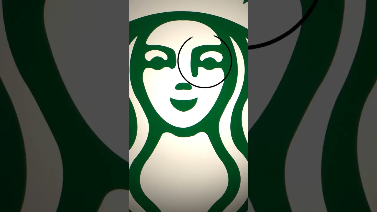
now if you can look without spilling your coffee you'll see that Starbucks logo is none other than a siren no not an ambulance a mermaid with not one but two tails do you see anything unusual about this mythological creature well the design team made her perfectly symmetrical thinking it would make the logo look more professional but something didn't feel right when they finished working on it they wanted the siren to look more like a human rather than a mask so they added a bit more shadow on the right this way the logo is asymmetrical but
only slightly so next time you sip your cup of joe don't forget to give the Starbucks siren a wink and a knot if she Winks back hmm maybe you better lay off the caffeine a bit
![Nuts [YTP] | A Moana parody](https://img.youtube.com/vi/MnIRAGodAXA/maxresdefault.jpg)