hi this is tom friedman with ventana systems i'd like to show you some methods for building causal loop diagrams in vincent we'll start simple in ple and then look at a few additional tricks you can do in dss and pro okay we're in vincent ple and i have a new blank model open because i'm starting from scratch there are actually two strategies to building causal loop diagrams if you're just building a cld you can use the variable tool it's slightly easier and faster if you want to build a causal loop diagram that serves as kind
of a guide or summary to a working dynamic model in the same file then you need to use the comment tool in place of the variable tool it's almost exactly the same process we'll take a look at the differences a little bit later okay let's build a little population model so i'm going to grab the variable tool and my advice when you're confronted with a blank sheet of paper is to just start putting things down because you'll get everything connected eventually so i'm going to put population in the middle here leaving myself some space to
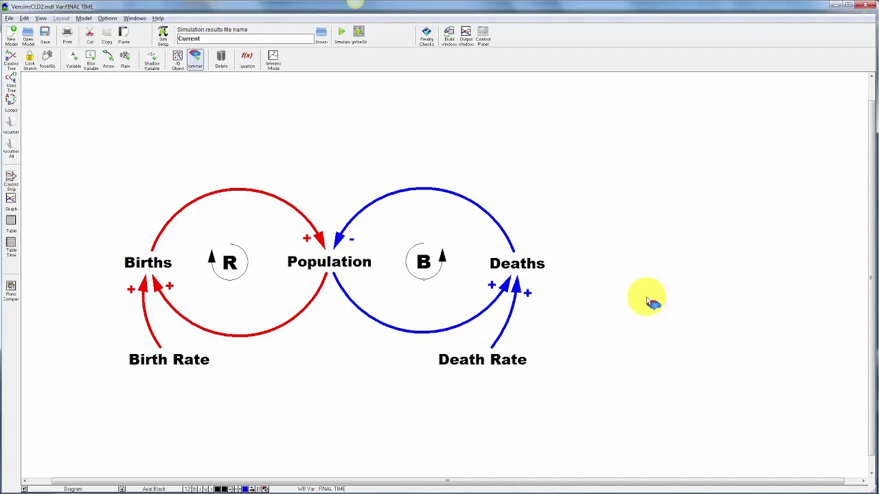
work and populations associated with births and deaths so there's a little bit of basic structure i can start connecting these things so i want to use the arrow tool bearing in mind that arrows here indicate causality not just correlation so births increase population if i just do that i get a straight line and then i can grab the handle here and adjust it to be curvy but i can also shortcut that by clicking births then clicking in the white space and then clicking on population and it'll pass through the point in the white space that
i clicked so births increase population is the story here population in turn increase is births and then same thing with deaths and i've got a choice here about whether to go clockwise or counterclockwise i tend to like things entering and leaving variables in the same side so i'm going to link population to deaths like this and then deaths back to population there might be other situations where you'd want to flip the orientation of that loop to coordinate with other loops that were coming in okay there's a basic structure now let's pretty this up a bit
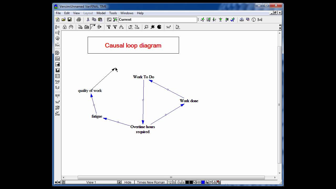
uh first of all births is a function not only of population but of the birth rate so i'm going to be clear and add that as a influence or parameter here and same thing for deaths and i'll connect those with arrows now we might uh pretty things up a little bit more i could probably make my loops a little bit uh loopier by making things more circular here and then i can think about formatting so one thing that's nice is to just use a nicer font i'm just going to switch the default using the toolbar
here to arial black makes for slightly more readable diagram and i'm going to select all of my arrows here and change the arrow style to something a little heavier and i may want to change one side uh by recoloring it using the toolbar here just to distinguish the uh two loops that's maybe a little bit uh garish but it will help you refer to loops when you want to talk about this in front of people so to really make this diagram communicate let's label the link polarities we can just walk through these one at a
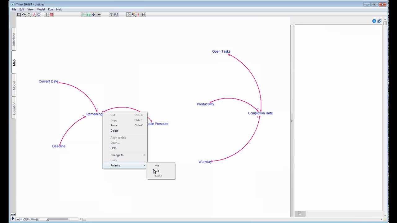
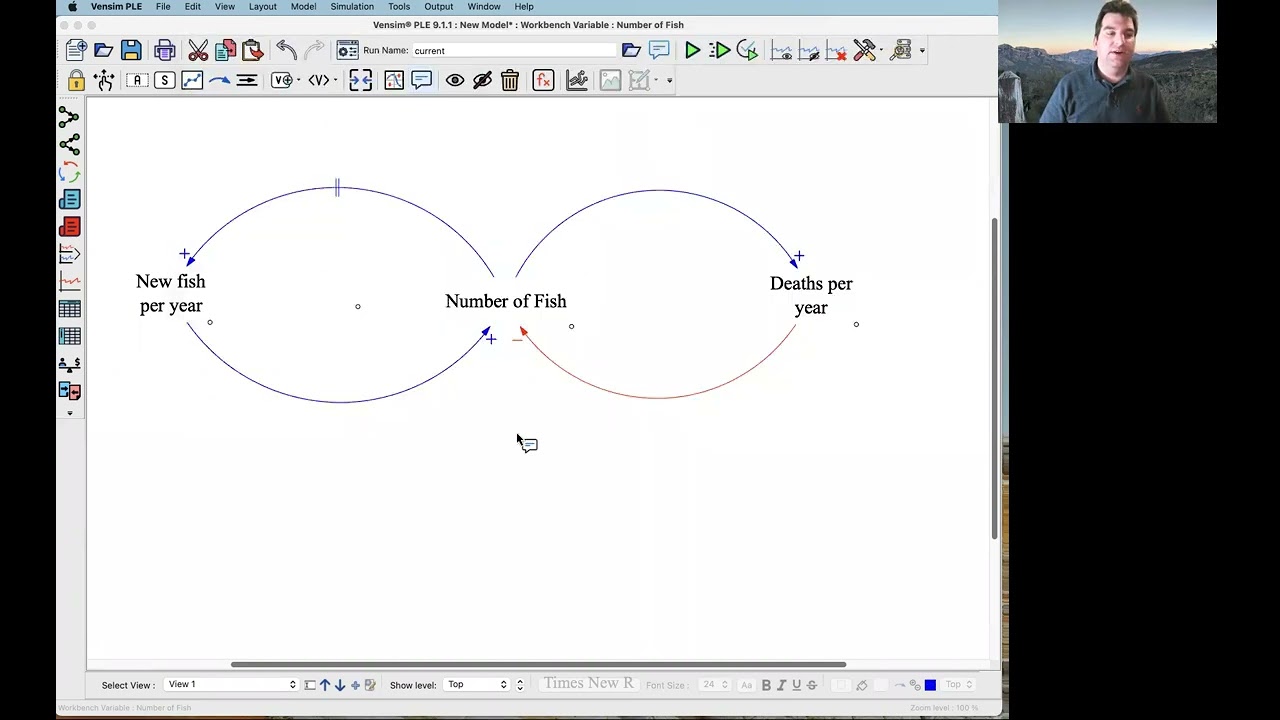
time so as births go up that increases or adds to population so this is a positive link so i can right click the arrow to get the options and set the polarity to positive and i can position the polarity mark at the arrowhead or the handle i usually leave it at the arrowhead but sometimes i move it to the handle to get a little more flexibility in placing it and you can also put it on the inside or the outside of the circle i'll leave this one on the inside the population to birth slang so
more people means more births that's positive and actually i'm gonna make this red in order to match the loop itself and then finally as the birth rate goes up that also increases the number of births and that's another positive link and we'll make that red as well here i've got a little bit of a conflict so i should move that polarity mark to the outside and that looks pretty good so let's do the same thing quickly for deaths so death subtract from the population all else equal more deaths means fewer people so that's a negative
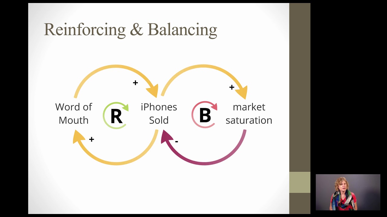
link and we'll make that blue to match but on the other hand if we have more people that's more deaths uh okay and as the death rate goes up the number of deaths goes up and i forgot to move that to the outside so we'll do that quickly all right that looks pretty nice okay that's the lengths now let's tackle the loops so thinking about this red loop here as population goes up births go up births add to the population more births all else equal more population so a change in population winds up or an
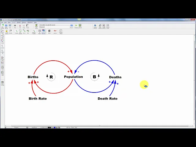
increase in population winds up reinforcing itself so this is a positive loop or a reinforcing loop so i'm going to label it as such and i'm going to grab the comment tool to do that and click right in the middle here and i'm going to indicate this as a loop so i'm going to change the appearance setting to be a clockwise loop bearing in mind that the icon should correspond with the direction of the actual loop and i can give this a either a name or a r or a b for reinforcing or balancing i'm
going to give it an r and i should probably bump up the font size a bit that's okay and i could color that as well let's do the same thing so here as population goes up more deaths more deaths fewer people so that's a balancing loop and this runs counterclockwise so i'll put a b for balancing and again bump up the size a little bit okay and in a bigger diagram i'll often give these either numbers like r1 r2 b1 b2 or some kind of comment text that indicates a name that tells the story of
the loop that way in the in the text or in your talk you can refer to the loop by number by name and make it easy for people to navigate to the structure that you're focusing on a couple other tricks i've been using the toolbar settings down here to change formatting but you can also right click on variables to highlight them for example set a background color on births you can do the same with arrows to change their color and i've been working zoomed in but actually i have quite a bit more real estate if
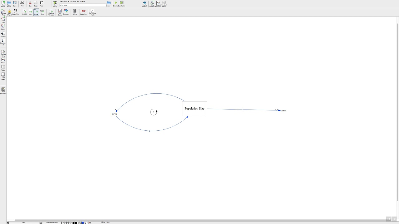
i want to make this diagram bigger a few more tricks i can apply the same methods to a stock flow model to document the polarity of the lengths and clarify other aspects of it like loop polarities one thing to bear in mind is that a flow an outflow in particular causality doesn't follow the direction of the arrow the causality runs from deaths back to population so if i right click this this arrow segment here i can add a polarity to it but notice it appears it sure should appear on this segment of the pipe and
i may want to move it to the arrowhead just to place it closer to the stock you can see it right there so if i'm starting with a stock flow model like this i may want to have a causal loop diagram in addition in order to explain things better if i want it to coexist in the same file but not use the same and use the same names as the variables but not the actual variables then i need to use sketch comments to place that so i can grab the comment tool and i can create
a population comment and i'm going to uncheck uh or i'm going to leave the uses arrow junction checked that lets me connect arrows to this comment and i'm going to check no cause otherwise vents him will prevent me from creating loops or cycles in the arrows that connect comments so there's population and here's births and i can connect these and i could pretty that up so this gives me a summary for the dynamics of the births part of the population structure and you can use that strategy to create higher level explanations of some of the
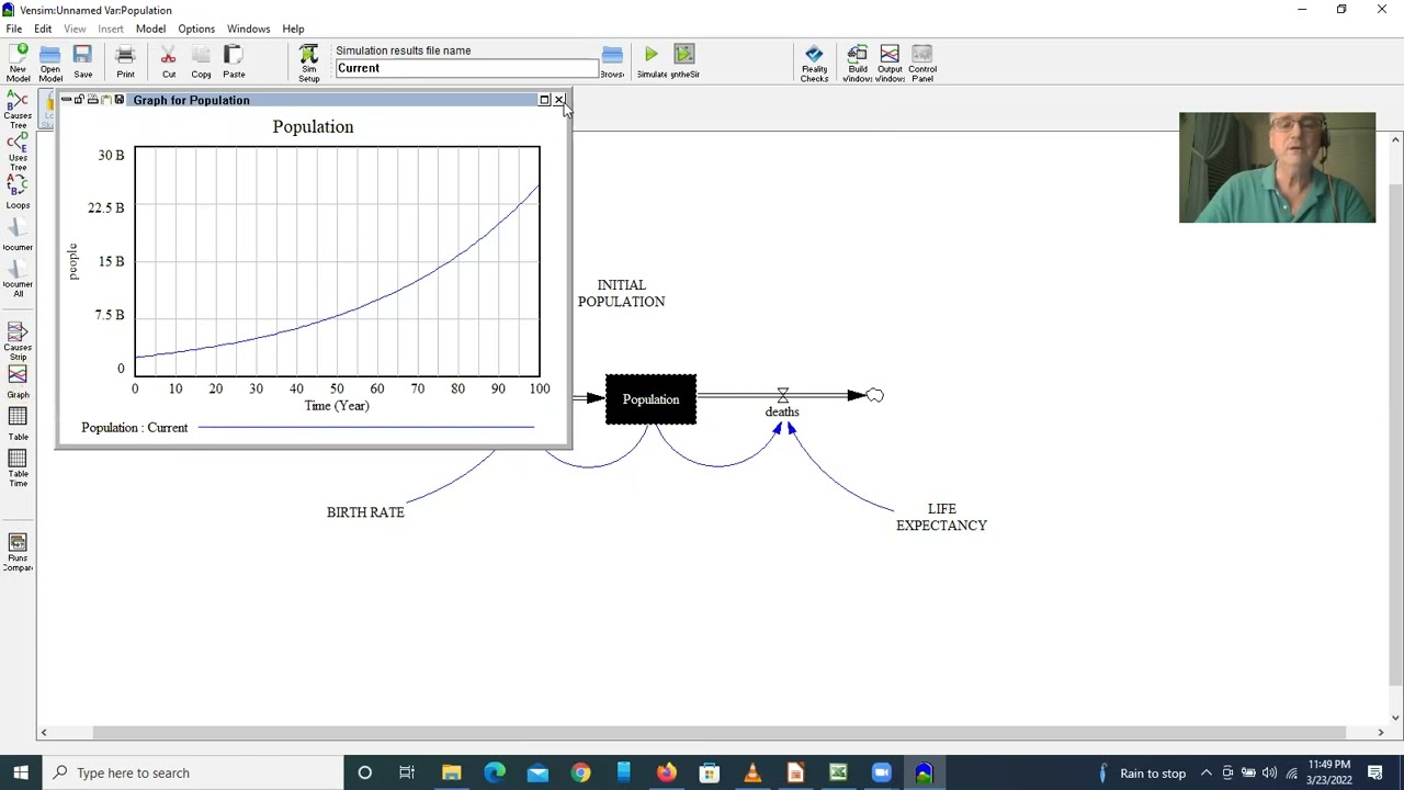
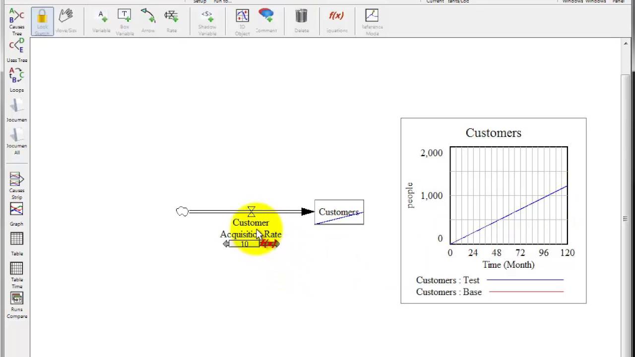
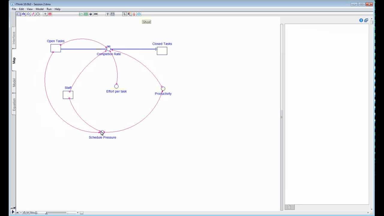
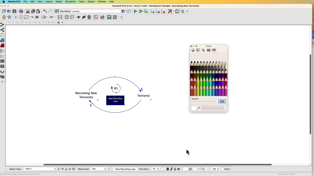
key features of a model without revealing the full structure and parameters and maybe nuisance variables that are required underneath to really make the simulation go switching to vents and dss yet another strategy for creating a cause loop diagram that summarizes the content of a stock flow model are possible so i can create a new diagram but within the same model and i can use the model variable tool to place existing variables so i'm going to place population here and you'll notice that it adds population along with its causes so i'm just going to drag deaths
and births off to the side here and then if i click on births and deaths with the same tool it'll add their causes as well so there's births in the birth rate and there's deaths and the death rate and of course in a complex model you can use this to trace through the structure now you'll notice that the arrows are bi-directional here because they're actually overlapping but i can quickly clean that up and now i have the causal loop diagram representation of the stock flow structure that i had in my first view and the nifty
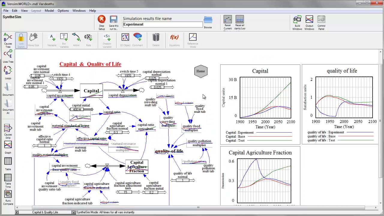
thing is that these are the actual underlying variables so if i want to run the model in synthesim i'll make myself a little more space and i'll make these a little bit bigger so they're uh will have more visible graphs now i simulate in synthesim and you can see i i have the behavior of each variable live on the diagram so i now have a simulatable causal loop diagram along with its corresponding stock flow structure and finally when models get more complicated let's take a look at world dynamics you can use comments to create a
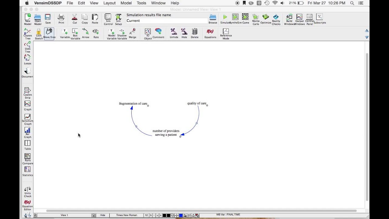
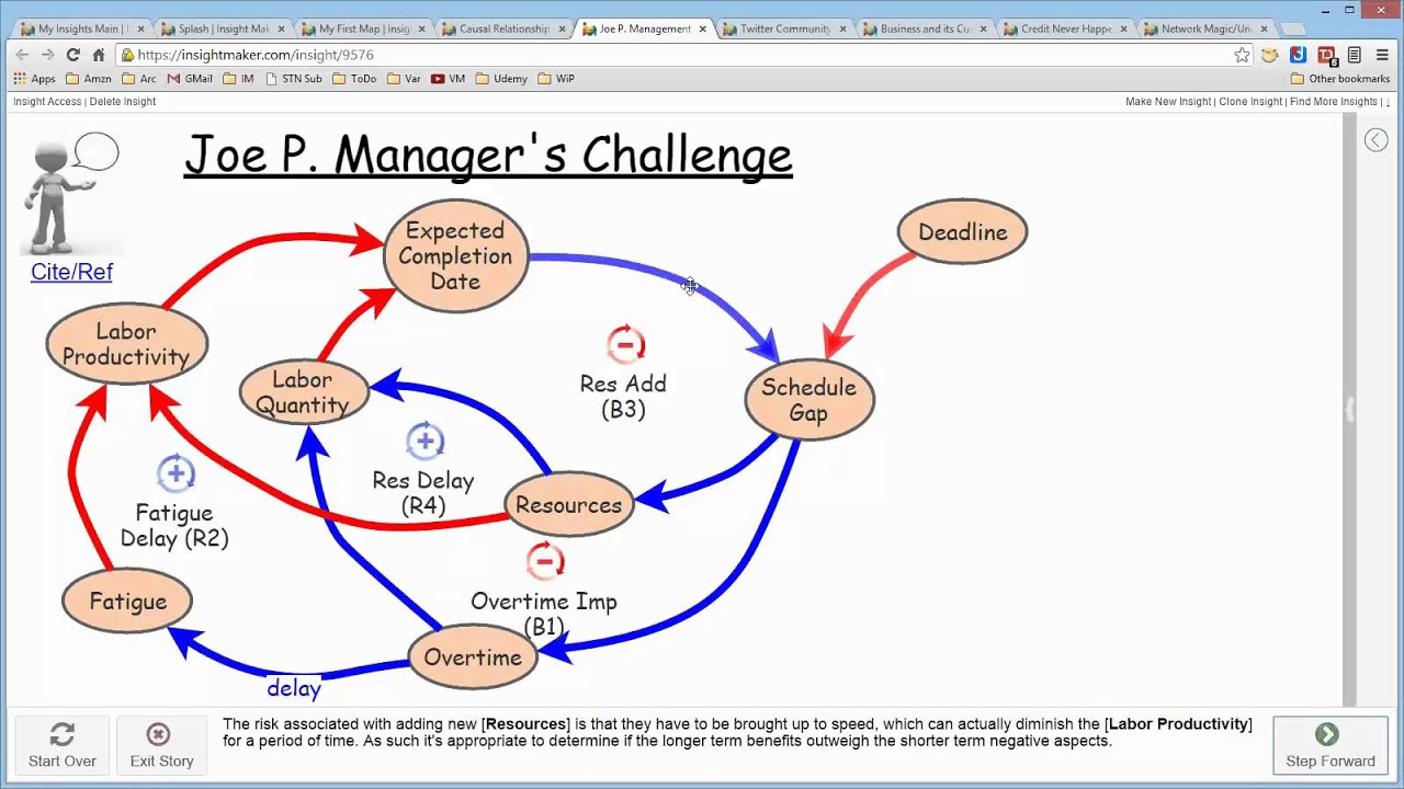
navigation system for your model so here you notice i have the major sectors of the model population and food capital and quality of life pollution and resources and actually population and food are separate sectors so i should probably turn that into two objects but these are actual navigable tiles here so if i click on population and food it takes me to the population and food diagram and then i've given myself a little button to go home here and the way that works can be seen easily by right clicking on one of these so population and
food is a comment created using the comment tool and i've set the navigate view setting here to the name of the view in the model so i set it to the population and food sector and since this is a comment i could also check the no cause box on at least one per loop and i could indicate the high level relationships among these sectors as well so i could build up a high level diagram with navigation to the low level diagrams that comprise the individual sectors chapter 5 of john sturman's business dynamics is full of
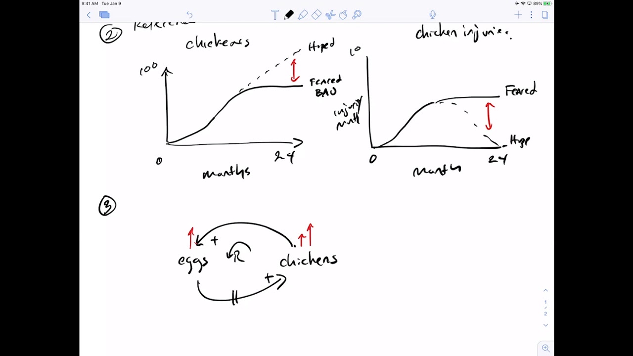
good advice on causal loop diagramming including good variable naming loop and link polarity identification and other essential habits john marcroft has a nice review of diagramming tools in the dynamica archives on the system dynamics society website you can google a couple of nice articles by george richardson on problems with causal loop diagrams these don't mean that cause-loop diagrams are bad it's just that you should be aware of these things so that you can use them wisely there's a nice article in the hbr on crap circles those vacuous loopy diagrams that you find in powerpoint here's
my favorite found by john sturman at a climate negotiation notice how causality proceeds from 2015 back in time to 1988. don't do that finally no discussion of cause loop diagrams would be complete without the dreaded afghan spaghetti this diagram actually got a bad rap because it summarized a lot of good thinking and even an underlying simulation model so much more was known about the structure that you see here then reporters were willing to tolerate in a briefing however this is not where you should start if this kind of diagram emerges from a group process or
brainstorming exercise that's great but otherwise to better communicate your own results and clarify your own thinking you should probably start simple build outward like an onion and keep to manageable chunks of structure that you always understand good luck with your diagrams be sure to check out the rest of our videos in the vinsm video library and we'll see you in the vincent forum
![Stocks and Flows [The Climate Leader]](https://img.youtube.com/vi/nRlYGDBGcRA/maxresdefault.jpg)


![Causal Diagrams [The Climate Leader]](https://img.youtube.com/vi/UgZTXf5PDis/maxresdefault.jpg)