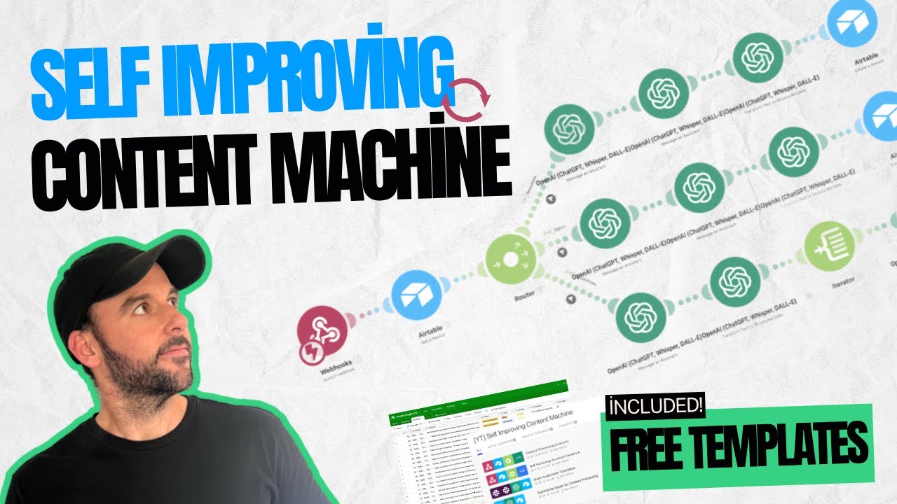
Hey guys, I'm Amit Tiwari from amittiwari. net and this is the final part of our Google Analytics series. And this is the best part.
There are two words in Google Analytics, Google and Analytics. In today's video, we'll be discussing the tab that allows us to put the Analytics concept into practice. We'll learn about it and get familiar with it.
In today's video, we will explore the Google Analytics Explore tab. The Explore tab will lead you to your website and assist you in answering questions about your business and website traffic. It helps you analyze your data.
In this Explore tab, you will see six options. We will learn about them. The three most commonly used and helpful dashboard techniques are Path Exploration, Funnel Exploration, and Freeform.
We will learn to make and use these three in detail. How to use these dashboards to answer important questions in your business. We will learn all this.
But where will all this happen? On the computer screen. So let's go to the computer screen and explore this Explore tab.
Today's video's sponsor is Nautix. Nautix is a push notification service that works on both desktop and mobile. And with Nautix's special in-house technology, you'll get a higher subscription rate and better delivery rate.
You can try Nautix without removing your current push notification provider. And the best thing is, Nautix is absolutely free under 30,000 subscribers. And if you take the monetization plan, then you will also get revenue from Nautix.
Okay, so we have come to our computer screen. And this is the dashboard of Google Analytics. Here we have already come to our Explore tab.
So, if you're checking out the Explore tab and thinking you can create a report here, you're actually mistaken. You get a lot of options here. If we click on the template gallery, we'll find a variety of options such as free form, funnel exploration, path exploration, segment overlap, cohort explanation, cohort exploration, and user lifetime.
You are getting all these options and techniques. But basically, this is not a reporting tab. What does Explore mean?
Explore means to find something new. Here, in fact, all the headlines say start a new exploration, right? Here we come with a question.
If you have any problems or questions related to your website or business, you can find solutions and answers in the Exploration tab. Now, we will see the best way to use this Exploration tab in today's video. But you will have to keep your mind open.
And you have to learn this technique from this video, from this particular tutorial. You have to learn how to use these techniques. And after that, you have to apply it according to your business, on your website, right?
So we will click on a blank screen. There are a lot of options here. If I click on the template gallery again, you'll notice that there are various icons available here.
And there are 1, 2, 3, 4, 5, 6 different options here. We will see in a while what techniques are used. However, out of these 6 options, we will mainly utilize the freeform, funnel exploration, and path exploration options.
The rest are also useful, but they are used in very extreme cases. Maybe it will be useful for your website. Maybe it won't be useful.
You will get to know that gradually. So for now, we will click on this blank button. But let me click on the back again.
And pay attention to one small thing. This is Google Analytics' own demo account. We are using it.
So this is not our data. This is Google Analytics' own data. It is dummy data.
The report we will make now will be funnel exploration. And we can also click on the funnel exploration button directly. But I want to show you how we can actually make it without any template.
How can we set all these explorations? So here we will click on the blank. If you've taken my courses or watched my old videos, you know that I never like to rely on templates.
Very less. If we want to use a template, we will make a template first. Then we will use that template.
Right? Otherwise, it is not a challenge. So we clicked on the blank button.
And here this dashboard is visible. It looks confusing to you. But the things that look confusing in the beginning, are actually very simple.
You should remember this. If something looks very scary, like a report, a dashboard, a new tool, it looks very dangerous to you. It looks confusing.
It means that it is actually very simple. Just now no one has explained it correctly to you. Okay.
So today you will understand the exploration tab of Google Analytics. First of all, we have to give the name of the exploration. That is, the dashboard we are going to make, we have to give it a name.
What do we give it a name? First of all, let's say first. Because I want to keep it a surprise.
Okay. Exploration. Tutorial.
Okay. We have given the name. And after this, you are getting the option to give the date range to collect the data.
Right now, for example, it is set for 28 days by default. And it is fine. Okay.
Let's keep it set for 28 days. Here, we'll begin with the options on the left-hand side, which is the correct way. No need to rush to this main tab and randomly clicking around.
First of all, let's set our data requirements from here. As I mentioned earlier in this video, you typically visit the Explore tab when you encounter a problem. Right.
And today, right now, the dashboard I have started making, what is my problem? My problem is that after all, the number of people purchasing on my website, the traffic, let's say, there is traffic on my website of 1000 people, but my product is being purchased, only 10 products are being purchased. Only 10 are being sold.
Right. So, where are these remaining 990 people disappearing? On which part, on which phase do they leave my website?
Are they not adding the product to the cart? Or if they are adding it to the cart, are they not going to the payment window? Or if they are going to the payment window, are they not checking out?
Is it possible that my payment processor is creating a problem? Anything can happen. Right now, you don't know and you can't ask your customers.
So, how do we find this? This, this answer, that after all, the user, the people who are coming to our website, on which step are they going out? Actually, they are not purchasing the product.
You've put in a lot of effort into SEO and running ads on social media and Google. You're getting traffic to your website and clicks, but that's not enough. but the purchase is not happening.
So, after all, on which step is the user disappearing? So, where will we get this information? For this, we will come, we will make this report.
So, first of all, we will come to the Dimension tab. We will click on the Dimension tab, and here, first of all, we will select Event Name. We will click on the Event Name, and here, we will click on the Import button.
In the previous video of this series, we learned about the process of creating events. So, why did we need to learn about creating events earlier? Because now that we have reached the Explore tab and are ready to use Google Analytics for its intended purpose - analysis - it's important to understand how to create events, as we saw in the first video of this series.
set up the Event Name properly? That is why we learnt about Event Names and Conversions in the first video. Alright, so if you've watched the first video and properly set up Google Analytics with correct event names, you'll have the necessary data to perform analysis on your website.
So, analytics, right? We have come to this step of doing analytics. So, here, we have selected the Event Name for now.
Right now, this is a dummy dashboard, so it will show you all the data. And if you haven't set up the events correctly yet, you can do it on your website today. This way, you can follow this entire video whenever you want to see it, whether it's after 28 days or one week.
So, here, we will click on the Matrix tab, and here, we will select Total Users. Total Users. Here, we have selected it, and then clicked on the Import button.
So now that we've chosen the Dimensions and Matrix tabs, let's move on to the second column which focuses on the technique. That is, what technique are we doing the exploration with? Right?
We want to travel, but how do we want to travel? Do we want to go by water, by a ship, or by a bus, or by a truck, or by a plane? How do we want to go?
This is a technique. Right? So, here, which technique will we use?
We will use Funnel Exploration Technique. This is our technique for today's tutorial, for this particular exploration. So, here, we are getting a type of visualization option.
Here, Standard Funnel is written. For today's video, we will select Standard Funnel only. Alright?
After this, we'll have several more options here, but you don't need to navigate to any of them. So, after visualization, the part we have to come to is Steps. We are not going to touch anything else.
We will click on Steps. And by using the Steps option, we can see how many stages are in our Funnel Exploration, which will appear as a tab on our dashboard. Right?
We will have to tell this. So, we will click on Steps here. And here, different steps are coming.
So, let's imagine for a moment that when a user visits our website, the first thing they will do is visit the page. Right? He will view the page.
After this, because we have selected Event Name. We haven't specified which page leads to which page, but this information can also be utilized. It is not that you cannot use it.
But here, right now, we want to see based on events. Okay? So, here, what is the first event we are going to give?
We give Page View. Right? So, here, we will click on Add New Condition.
And Event Name, already here, you are getting the option of Events. Right? So, here, we have come.
And here, what will be the first event? What do we want to see? What do we want to measure?
So, here, we come. And here, we search for Page. Right?
Events, Page View. Okay? Events, Page View, I have selected.
This is our first event. That is Page View. Next, I want to track how many people are adding our product to their cart as the second event.
So, here, I will click on the Add Step button. And after this, I will give it a name Add to Cart. And after this, Add New Condition, Event.
And here, we see Add to Cart. Here, you can see the event. So, we will click on Add Step again.
And then, we need to check how many people proceed to the payment page after adding the product to their cart. Right? So, here, we see Adding information.
Alright, let's add a new condition and event name. We need to find the payment information event, which we can also search for here. So, here is an event with add payment info, I will click on it.
And then, we'll click on the final step, "add step". You can see here how many times we've added steps, and the percentage and number of users who have reached the last step in comparison. to the first step.
No changes needed. The English translation is already contextual and modern. Now, moving on to the final step - the "add payment information" step.
And what do we call this last step? Purchase. So, after adding payment information, how many people have actually made a purchase?
So, now we'll head over to the events section where we can track the purchases. Alternatively, we can simply search for "events purchase". Make sure not to click on "create event purchase" as it will create a new event named "Purch".
You wouldn't want that, right? So, here we click on events purchase, and now this data will be updated here, and you can see that 1. 19% people have purchased the product, right?
So, we've completed all the steps and now we just need to click on the apply button to generate the report. So, our final exploration dashboard has been created here, and now you can see that from one event to another, how many percent people are traveling, right? So, how many people are coming to our website in total?
67,926 people. Out of 67,926 people, how many people are triggering the add to cart event? 5,427 people.
No changes needed. The current translation is already contextual and modern. That is, the biggest drop-off is happening on our page view event.
No changes needed as the translation is already contextual and modern. So basically, it could be that we're not showcasing the products well, or there's an issue with the product description, or maybe the button isn't functioning properly. But whatever the reason, the biggest decline is happening at the point where customers are adding items to their cart.
People are not showing interest in purchasing the product, they are not adding it to the cart. Once people add the product to the cart, then they are adding the payment information. This drop-off percentage is less.
Now, if you see here, the completion rate is 8% and it is reflecting 8% here. But in the second step, the 39. 5% completion rate is not reflected here, it is only 3.
2% here. The reason for this difference is that the percentage you see here is only in comparison to the first step. That is, how many percentage of the page view is triggering the add to cart event?
So here, what percentage of the total page views is triggering the add to cart event? And after that, how many percentage of that is actually adding the payment information? And then, what percentage of the total page views is actually leading to a purchase?
You can see that percentage value here. In the completion rate, you can see event to event. So, what percentage of people who view this page actually add the product to their cart?
That percentage is 8. And what percentage of people who trigger the "add to cart" event actually enter their payment information? That is 39.
5%. And then, what percentage of people who add payment information actually make a purchase? That is 43.
4%. As you can see, in simpler terms, only 8% of website visitors who view the product page actually add it to their cart. But 40% of the people who are adding the cart are adding the payment information.
And out of those who add payment information, 43% actually end up making a purchase. So the biggest drop-off is happening on page view status. People are adding the product to the cart.
So we have to present our product information in a better way. We have to improve the images of our product. We have to improve the copy of the page.
We have to make the payment button glowing. Whatever you want to do. But basically, the problem is not with your payment processor.
The problem is not with people's product journey. The problem is in the way you show your product. So by looking at this dashboard and this report, we can easily find out.
This is the use of Path Exploration Dashboard. So this was the first type of exploration. Funnel Exploration.
Now let's come to the second type of exploration. The video is not over yet. We will stick to it.
We will keep watching. So this was Google Analytics' Funnel Exploration technique. Now let's look at Freeform technique.
Freeform technique also helps you answer some important questions on your website. And those who have acquired a lot of expertise in Excel, they will also find this a little familiar. So we have made the Funnel Exploration Dashboard.
Now we have to make the second dashboard. Right. We have seen Funnel Exploration.
We have understood how to make a dashboard. What can be its use? Now we will make a completely different type of dashboard.
Okay. Let's click on this blank button again. And just to remind you, the work we have done on the dashboard has not been wasted.
It has been saved automatically. The dashboard we created named First Exploration Tutorial is already here. Whenever you want to see it again, you will click on it.
And this dashboard will open again. And you can use it. You can see its report.
And so on. Okay. So let's come back to the Explore tab.
You can see some other names here. But that is because we are using a dummy property of Google Analytics. This is not our own account.
So let's click on this blank button again. And here again we get the same familiar dashboard. I'm not using the template because it changes the way we perceive things.
Basically, all the paths are coming at the same place. It depends. What matters is, which style you choose from this technique column.
Right. So now by default, the free form is selected here. We will use the free form this time.
Okay. So we come here. And this time let's select the dimension.
So here we searched for the session. And here we select the source medium. Click on it.
And then we click on the import button. Okay. Then we come to the metric.
And in the metrics, we select total users. Total users is here. Here again we click on the import button.
Right. And here we have selected the dimension. Session source medium.
Here we select one more dimension. Here we take the device category. Device category.
We can see it here. Here we click, select and click on the import button. Okay.
After this, we come here. And this time we will not come to the steps. We will come to the rows.
Okay. We will click on the rows once. And here you can see the session source medium already.
Okay. Let's click on this. And after this, we come to the column.
So what will we select in the column here? We have selected the device category in the column. Okay.
After this, we have to give the value. What is the value? Right.
So we come to the value setting. And in the values, we will keep the total users. Because what do we actually want to see in this table?
The dashboard will come in front of us. We want to see the value of the total users. Here we have selected the total users in the metric.
Once we've chosen all these values, we'll be able to see that the session source is listed as "medium" in the rows. In the column, the device category is there. And the value is of the total users.
Okay. So now we will get this table properly here. It looks like a table like Excel.
We can clearly see that how many users are coming from which channel and on which device category. So as we can see, the direct traffic can be a bit confusing, so let's set it aside for a moment. So, as you can see, we have 11,006 users coming from desktop for organic traffic from Google.
How many users are coming from the mobile? 5,919. How many are coming from the tablet?
248. How many are coming from the smart TV? 4.
The total number is 17,034. You can easily get all the details here. Similarly, how much traffic is coming from Google CPC?
The report is based on the per device category. You don't have to do anything. Right.
There is no problem at all. Now let's see here, as I said, let's ignore the direct none for a while. We don't want to see it because we can't do anything with direct none.
So if there's something in your dashboard that you want to ignore, you can just leave it be and it will still be visible. If you want to ignore it, then right click on it and write Exclude Selection. So it will automatically disappear from here.
Okay. Similarly, let's do Exclude Selection on the not set as well. Whichever channel from these, whichever particular row you want to ignore, right click on it and exclude it.
If you want, you can include only this. Then all the others will disappear. Nothing else will be visible.
But we don't want to do that. Right. So now that your report is clear, you can see how many users are coming to your website from Google Organic.
How many are coming from Google CPC? How many are coming from Baidu? How many are coming from Bing?
All these information are available in the table. You can use it and give it to your marketing channel. Now, I made a mistake here.
I haven't given any name to my report yet. So let me give it a name. Second Dashboard Tutorial.
Let's give it any name. You can think and give a name which will help you to recall this report again. But I have given the same name for the tutorial.
Now, we have made this report here. If we want, we can make it more detailed. Here, in Dimension, we have selected Source and Medium in a simple and combined way.
If we want, we can click here and cut it. Let's remove it. In Dimension, let's select Source again.
Here, we have got Source. Okay. Let's import it.
Before importing, let's import Medium too. Medium. Okay.
Let's import both of them. We have got both Source and Medium. Now, instead of Rows, we will come to Columns.
In Columns, we have device category already. Also, we can add a Source here. Here, we can get the information on the basis of source and medium, if we want.
If we don't want it, we can remove it from here. Here, we can select the source and medium in the rows. And now you will get all the information categorized.
Here, we remove the source and medium from the rows. And after this, you will see all the information. The information of Google and Rani is visible here separately.
The information of Google CPC is visible separately. All the channels are clearly visible to you. So, this report is helping you to easily visualize the total number of users coming from various channels.
And you can share this dashboard with your marketing team and share insights with them. So, this is our second dashboard in which we have used the free form method. We have used the free form technique.
The exact word is technique. Next up is the most popular feature, which is also available from UA, following the free form technique. It is called Path Exploration.
Alright, now let's take a look at Path Exploration and see how it can assist in analyzing your website traffic. Now, moving on, we come to a widely used dashboard type known as Path Exploration. Path Exploration used to be available in UA as well.
So, let's see it once. Let's come back to our Explore tab. And here, we will click on the blank button once again.
And here, we will select Path Exploration instead of free form. Now, as soon as we select Path Exploration, you will get a lot of information here. This is visible here, but we will not use it again.
Here, we have not selected any metric yet. It is already visible in Path Exploration. But we don't want to use it because again, we want to make a revolution.
We don't want to use every template, we want to make it ourselves. So, here we are seeing the Start Over button. Let's click on the Start Over button.
So, here you can see two buttons. Either you can select the starting point or you can select the ending point. It's very interesting.
It is also giving the ending point. Starting point, ending point. Path Exploration Dashboard helps you in visualizing and understanding.
If a user visits one of your pages, where do they go next on your website? And when we have the option to set the endpoint, it means that if you choose a destination, you will receive assistance in comprehending the various routes that lead to it. So, let's say if you want to know where users go after visiting your homepage, you can select the starting point.
And if you want to understand which page is contributing to users coming from on your Add to Cart, Purchase or Thank You page, you can select the destination. In order to track the most important parts of your purchase journey, you can visualize it here. Once you have all the information, you can click on the starting point.
And here you can see four options. Event name, that is, you can see it based on the event. As I mentioned earlier, you can click on the final step and see where your customers are making purchases on your website.
So, you can select the Purchase event at the ending point. But let's not do it now. We have not yet selected Page Title, Screen Class or Screen Name.
So, let's come to Page Title. So, here we come to Page Path and Screen Class. Let's click on this.
We have clicked on the starting point. And once we click on this, you will see the option here. This forward slash means Home Page because nothing else is written here.
So, you can load more pages of your website here. But let's select the Home Page here. And now you can see that there are 37,402 users who have come to our Home Page.
And after coming to the Home Page, they are going to different pages. The number of pages is not set. There is no event.
But 873 users are going to the Sign In page. 38 users are going to the Basket page. And after this, you can see the number of people who are going to different pages.
If you want to check where users are heading after visiting the Basket page, simply click on Basket. html once more. And in the second step, there are other pages like YourInfo.
html, Sign In. html, etc. 51 users have gone to the Store.
html page. If I click on this, then one more step will be loaded. And we will know where the user is going.
And 8 users have gone back to the Basket. html. So, you can find out how many users are moving from one page to another and how they are doing it using the Path Exploration Dashboard.
If I click on the Not Set value, then I can find out where the user has gone. Not Set means Google doesn't have any idea which page it is. Maybe Google is not collecting the information about that particular page.
But after coming to this page, maybe it is some pop-up. 20,000 users are going from 10,000 in the Not Set category. But then 18,000 are coming from 20,000 to the home page.
Maybe it is some pop-up. If we click on it again, we can determine how many people are navigating from the home page to other pages. So, you can get all this information about the flow of users from the Path Exploration Dashboard.
And you can share this data with your marketing team and discuss where the user is dropping from and why the user is not going to your product page. So, let's click on the Start Over button and see how the user is reaching the final point. So, now let's click on the button at the end and select Page, Path, and Screen Class.
Now, you can see Basket. html Let's click on Load More and see if there is a Purchase Thank You page. It's not our page, so I don't have Let's use it only for Dashboard and Tutorials.
So, we can see a page here Payment. html. So, let's click on Payment.
html on the ending point. Now, we'll find out where the users are coming from on this Payment. html page.
As we've reached the end point, you'll notice that the orientation has changed and the report is now aligned on the right-hand side. So, out of the 2657 users 2518 users are coming from YourInfo. html But where are the users coming from on YourInfo.
html? Let's click on it again and this time it will load in reverse. So, 2333 users are coming from Basket.
html page. Let's click on Basket. html again.
So, where are these users coming from? 532 users are coming from SignIn. html and so on.
Users are coming from different pages. Likewise, you can identify the purpose of the Payment. html page to prioritize your focus on it.
Maybe you need to run ads on that page. And from which page users are not coming on this Payment. html page.
That means you need to focus more on that page. Maybe you need to copy check that page. You need to improve the text and images of that page.
To get more users to sign up and purchase the product or service, you should work on improving its approach. This Path Exploration Report helps you visualize your website users' journey and understand it better. So, this was a complete overview of Google Analytics.
Throughout these 5 parts, you have learned how to set up Google Analytics, create events, and establish conversions. And after this, you have seen different tabs like Google Analytics Reports, Explore, Advertising. These 5 different parts will make your journey of Google Analytics easier.
I am sure it will be very helpful for you. See you in the next series and other videos where we'll continue learning about Google and other digital marketing tools. Thank you so much for watching this video and this series.
My name is Amit Tiwari from itiwari. net and I will see you next time. Take care.