take a look at visually distinct films the use of color is harmonies may be simple in most cases it feels like the colors are not randomly chosen there's an intelligence at work that's color theory if a piece of furniture is a particular color in the scene that's by design it's not unintentional if the walls are a different color than white or cream that's intentional the color of clothes of umbrellas of a car it's all done because the filmmakers want to make a statement to the clever and careful use of color one popular formula to simplify
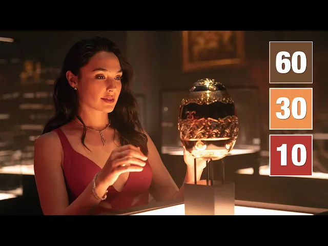
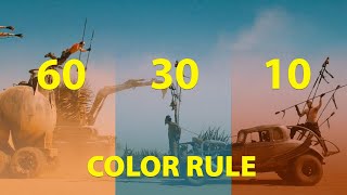
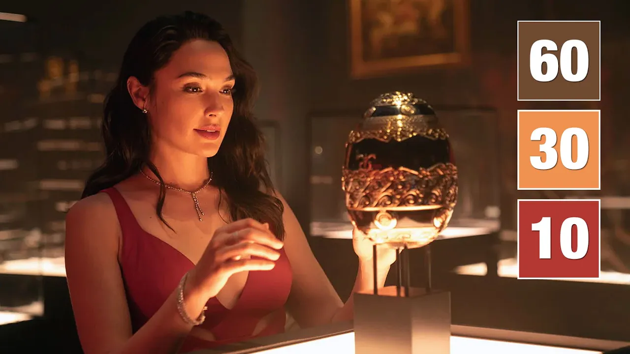
color design is the 60 30 10 rule it's not that complicated and the rule is as old as art itself today it's most commonly seen in interior and architectural design paintings and of course film sixty percent of your frame is one dominant color thirty percent is a secondary color and the last ten percent is a third color for simplicity sake let's call this third color the highlight color why would anyone have 60 of the frame just one dominant color and by the way when i say one color you must understand it's allowed to have the
color slightly lighter or darker or to find color similar to it just to give the scene some depth it's not like they buy one can of paint and brush everything with it variations give the scene depth and three-dimensionality you don't want to make cartoons when you're not making cartoons the dominant color is just that the dominating color of the scene you decide what the dominating color is based on the mood and tone of the story is it a high key scene is it a dark scene is it taking place on the street at midday or
in a nightclub in the early hours of the morning the dominating color is important because it is what sets the mood of the scene along with the lighting and cinematography many people erroneously think all this is done in color grading color grading is when you change colors in a computer after the film has been shot it's possible but impractical two reasons first you never get the same feel as a real thing a painted wall or furniture of a certain color has a different look than the color graded wall a great camera can reproduce all the
subtle variations in light and color but in color grading that's hard to do unless you're willing to spend hundreds of hours and that gets expensive really fast this brings us to the second more important reason why color design is typically not achieved in color grading it's cheaper to buy a red sweater if that's what you need because the costume designer or stylist is going to buy a sweater anyway it's cheaper to get the wall painted red than to color every shot painstakingly red especially when you have camera movement the same applies to everything else the
department in filmmaking then handles this is production design or the art department the production designer or art director takes instructions from the film director to determine what the colors of the set costumes and props should be and that's where the 60 30 10 rule comes in the color that constitutes 30 of the frame is the complementary color its purpose is to support the dominant color not fight it the reason why we have a second color is to give the scene more depth and some realism if it were all just one color that's unnatural we feel
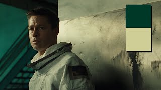
as if someone's shining a colored light on everything a second complementary color helps eliminate that artificiality you could have films with just two colors i've made a completely different video about it on why films are shot in two colors i'll put a link to it in the description let's say you don't want to use a third color you just want two colors as you see in the batman or uncharted to name a few films from the time of this video it's a popular trend nowadays the second color can be one of two things it can
either be complementary as in the case of the batman because you're looking for a kind of moody black and white look but with color or you could have a contrasting color as a second color this is what they did in uncharted if the dominant color is brown and shades of brown the contrasting color is typically blue lots of films with orange and teal in them they're natural contrasting colors because it's closest to human skin color particularly caucasian skin tones caucasian skin tones render a light pink or even somewhat of a white color on camera this
allows it to blend with many other colors without losing harmony when you're working with darker skin tones you might have to change the look and feel of your scenes not everything that works on caucasian skin tones works with you know say light brown skin or a dark brown skin when you have characters in your film with different skin tone types you might want to find colors that look good in both if you don't see that kind of application in a film you know they just didn't care about one skin color type because you can bet
it'll work okay on the other type if you're a filmmaker watching this try not to use colors randomly what works on one skin tone will probably not work in another skin tone beautiful color design must be harmonious unless you're making a strong color statement the third color in the 60 30 10 rule is the highlight color what aspects of the scene do you want to highlight the red dress has become such a cliche that so many films have them don't let that stop you what are you gonna do band red red is such a powerful
color because not a lot of things in nature are red or blue for that matter that's why they pick highlight colors the colors that are not found in nature the highlight color is used to bring attention to what's most important in the scene you have to be careful about its use in amelie the highlight color is blue thoughtfully placed in a few scenes you'll see liberal use of the 60 30 10 rule in italian giallo films of the 1670s you had muted dominant and complementary colors and then shocking red most of the time as the
highlight color if you're looking for more artistic directors to study try tarkovsky or pedro moderator they used muted tones often as a dominant and complementary colors and a highlight color when it was required yellow is another great highlight color think yellow in the village which was shot by roger deakins yellow green is the color human eyes are most sensitive to which is why it's used a lot in road work emergency services night lights etc you don't always need to stick to red and blue in fact the highlight color can be anything nothing stopping you from
using purple or pink highlight color or white for that matter don't forget the powerful impact of white and black as colors when used carefully with purpose every color has the ability to stand out and make an impact it all depends on the kind of story you want to tell it's not an exact science when colors come together in a harmonious way you'll know it if you're a low budget filmmaker and all you have is a room to film your scene start out by looking at the furniture let that be the complimentary color let's say most
of your furniture is kind of brown which is what you're most likely to have let it be as is you know you want to make your room interesting so pick a dominant color for the walls it's relatively inexpensive to paint walls a certain color you can even use wallpaper that can be removed without a trace if landlords are a problem it's easier and cheaper to paint walls than to find furniture of a particular color next step be ruthless in eliminating everything that doesn't conform to the two main colors make sure the two colors complement the
skin tones of the actors you're working with and finally throw in the highlight color with purpose make a statement and your film will look a million bucks all it cost you was a bucket of paint i hope you found this video useful i'll see in the next one bye now