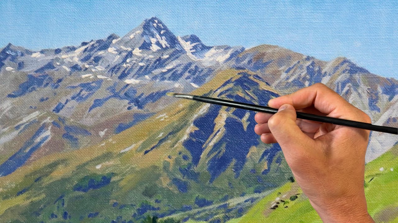
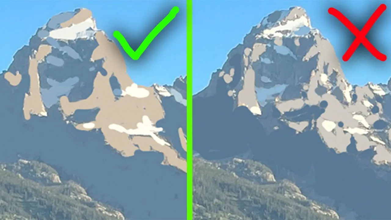
so the one thing that I learned that made painting mountains a lot easier was thinking of it in fewer simpler connected shapes all right welcome to paint coach if you're new to the channel my name is Chris fornito and I help thousands of students every single month get better at painting through my online courses and tutorials and now actually one of my courses is my landscape painting course which I talked about this topic in so I'm actually just going to show you a few videos pulled directly from the course that ends with an actual full
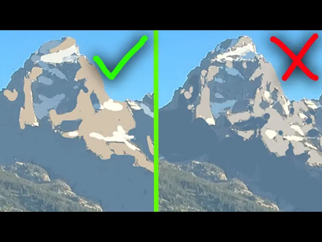
demonstration of painting the mountains you know showing what I talk about so let's not waste any more time and jump on into those videos all right mountains now not going to be giving you a bunch of Bob Ross tips uh but the best uh kind of shortcut or tip I can give you with mountains is try and break it down into fewer bigger shapes this is kind of what I mean on the left here I've broken the light side and the shadowed Side of the Mountain into pretty simple shapes whereas on the right here I
broke it down into pretty much all the shapes that I saw in the photo and you can just see that this one is just I don't know it's more pleasing to look at it's it's more clear the light pattern and what's happening it's also just going to make it easier to paint like I see a lot of people they'll try and do something like this over here and they'll try and get like every single little crack in every shadow that they see and what happens a lot of times it becomes to overwhelming and they kind
of lose the effect in kind of communicating where the light's coming from they get lost in the minutia of the mountain it's all about the big shapes you know just like we were talking about with painting trees and wanting to block out the light side and the shadow side first in you know that big shaped form and then cutting it down in the smaller shape same with the mountains here so whenever you see mountains and you see the snow and the cracks everything don't feel like you need to every single crack that you see like
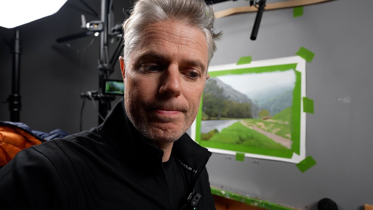
you don't it's going to actually benefit you to not do now the next quick video I'm going to show you is about color and value but before I jump into that if you're watching this video you're probably into landscape painting and if you're into landscape painting you really need to know composition there's really no way around it it's one of the first steps you do in painting a landscape and if you don't get a good composition no matter how well you paint your painting it's just not going to turn out well that's why I've made
my composition coaching guide It's completely free if you want to check that out there's a link to it in the description of this video now when it comes to uh the color and value when you're painting mountains they can be a little tricky especially if you're using the photo like here this is the photo that I used to paint this painting and you can see how uh like bright these you know rocks and the mountains are kind of like how warm they feel and that I feel like trips up a lot of people people and
I feel like a lot of times atmospheric perspective with mountains isn't portrayed well in a photo you know like this color here if I pull that out it's not that much different I mean it's a little bit cooler than the uh The Rock right here in the foreground you know I'm sure there's areas where I can oh wow see like look how much yellow and like warm that is whereas in mine I knew I couldn't make it that bright and so I pulled it down quite a bit you know and added that purple you know
it's still as reading as being in the sunlight you know this is just the shadow color now and this is the light um even back here the Rocks that's coming through the trees like I still knocked it down a bit let me grab a good you know it's a little bit warmer because it's it's more closer to the foreground and then these right here kind of the kind of the brightest not the brightest but like kind of the warmest is you know this part right here uh and uh the light if you look at this
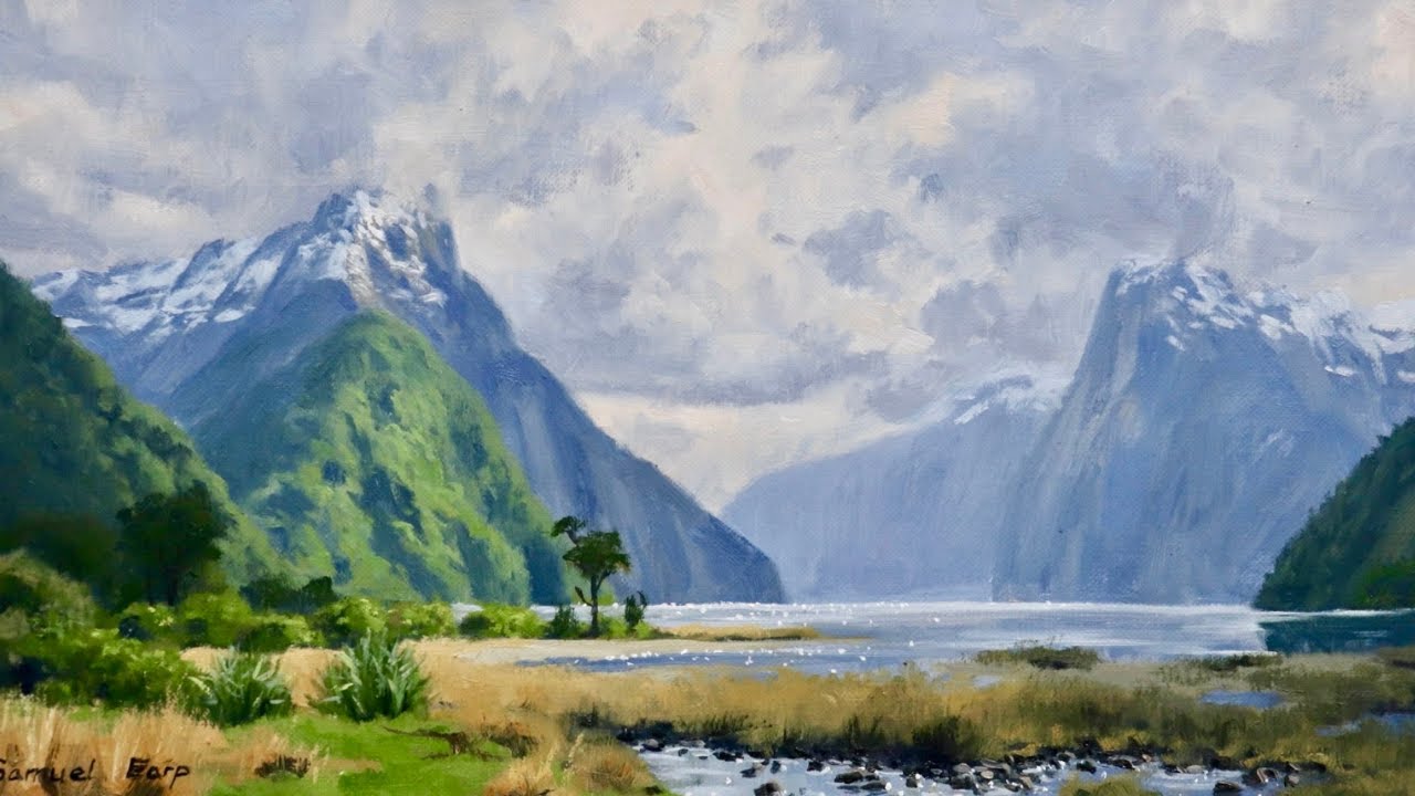
painting from Edgar Payne I think it's a great example of you know painting mountains and kind of how uh cool you can get the colors of mountains in the distance that are in light like you can see back here like this is definitely all read like it's getting hit with light and this is in the shadow but you can see like how cool that color is because he saved the warmer for for the the rocks that are you know up front here and with atmospheric perspective we know the further things are away from you the
less contrast there is and so you know just the difference between the shadowed side and the light side of this mountain is not going to be as dramatic as the same kind of mountain closer to you this is going to have a higher contrast there's a there's a bigger difference in value between these two values than these two values so always keep that in mind because most of the time when you're painting mountains if you're able to like see the whole Mountain that means you're standing pretty far away from it so that means they're you
know in the distance and they're also very high up and so the level of contrast is not going to be as much as it might be in a photo all right now I'm going to talk a little bit about snow on the mountains all right now when it comes to putting snow on mountains uh first thing I want to talk about is the shapes you know just like how I talked about breaking down the light and shadowed Side of the Mountain you know do that uh as simply as you can the same thing goes for
the snow uh coming back to this Edgar pain painting look at how kind of simple uh these shapes of the snow are we got like one there here you know I'm sure if we had a photo of this there would be like little things of snow kind of like all over the place but he's condensed it into these big simple shapes yeah there's like some soft small ones here or there you know that's good and fine but the he's definitely condensed it and he's also used them uh to help his composition and guide you your
eye through the painting you know it's it's no coincidence that these come down like this and bring you down here and then this thing brings you here and just kind of shoots you through uh the pain this you know starts from the cloud and brings you down here here uh I'm sure he left out you know pockets of snow to help with this composition now the other thing I want to talk about is the uh color and value because even when it's in Shadow like this you can see the value is pretty light I'm going
to put this in black and white so you can see this a lot easier um but it's definitely a lot lighter but not as light as you know the snow in the Sun so you have to balance out and understand that value uh when it comes to color this is really important you don't want to go to Pure White uh even in the snow that is in light uh again this snow if you're you're looking at snow on a mountain it's probably going to be really far away and so there's a lot of atmospheric perspective
you're you're seeing through so much of the atmosphere and that snow is not going to be Pure White there's probably going to be you know I A lot of times I find myself putting a little bit of birt Sienna in it because it's kind of more of a red um sometimes a little bit of yellow ochre but you can see here like kind of how gray down that is like that's not Pure White by any means and also this right here uh also don't get caught making the snow and Shadow too vibrant and too saturated
of a color sometimes we'll see people just take um just white nine blue it might look like that in the photo but you want to desaturate it just a little bit through just a touch of like burn SE or something in there to knock back that blue and dirty it up like you can see here in Edgar Payne's painting kind of how you know desaturated uh that blue is for the uh snow that is in Shadow all right now it is time for the full demo I'll see you at the end okay I'm going to
be doing a uh little demonstration of of mountains here you don't have to PID along with this this isn't like a paidal part of the course you can if you want to but just wanted to show you how I go about painting mountains uh and I have it already drawn out here just put the sky in to save some time but something I do want to talk about with the drawing and and blocking it in here is I just blocked out light and Shadow you see how simple the shapes I made are and you I'm
not worrying about like all these little shapes that are happening there I'm just worried about these big simple shapes you know it really starts at this uh phase and and keeping it simple like this uh it's going to help a lot uh my palette that's got ultr ring blue lizard Crimson burnt sienna cium red yellow ogre cium lemon titanium white gabblin solvent-free gel is my medium gsol uh is my paint thinner and I got number four brush here and this is my sky color a lot of times I'll just like Branch off from my sky
color to do the shadowed Side of the Mountain cuz it's just going to help me with the atmospheric perspective uh again I know the sky needs to be lighter so I'm going to add a little more blue maybe a touch of crimson maybe a little bit of birt Sienna just to neutralize it a bit I don't want to go too dark width it and I just want to block out these Shadows keeping everything very simple I know there's a lot of different colors and values Within These shadows I'm not worrying about that right now I'm
trying to connect shapes when I can and also since my sky it's wet paint it's okay if I kind of run my brush into my sky and kind of get like a softer Edge I actually kind of want that because these mountains are really far away so having a crisp Edge just wouldn't make much sense actually use a little more cium red to make this purple yeah like that works all right sometimes it takes me a minute to find right color right color and value so I'm just blocking out these simple shapes going to even
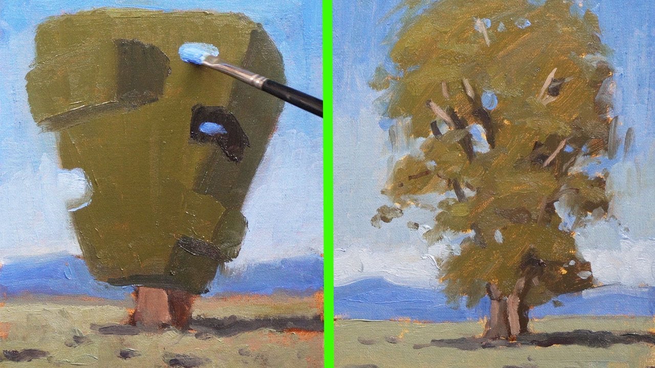
do it with the trees down here a lot of people myself included when I first started painting would get really caught up once it shifted and like Mountains from rocks to trees and it's really not that big of a color or value shift I mean the shadows in here it's the same as The Rock so I can block these out they kind of get smaller shapes because we're indicating trees here now I want to go to the light side of the rock so I'm actually just going to Branch off from my uh Shadow color I'm
going add some bird Sienna it's going to help warm it up you know don't get tricked in making it too too warm I actually like to start with it be a little darker a little cooler a little more birt Siena because then I can add on lighter warmer values on top so you going to get a touch of crimson in there I'm just going to block out the light side while I'm doing this I can start cutting back into the shadow shapes a bit kind of making it a little less perfect even have some stray
shapes you know like there you see kind of how close and color and value I'm I'm starting out with it and then I can do things like here where I put a light shape drifting into the shadow I see how the structure of the mountains is already starting to appear now I like to boun back to the Shadow and do what I was doing with the lights which is places where I can maybe pick and shoes where to drift little smaller shapes here there not too many we don't want to ruin the simple and simplicity
that we have but sometimes you need to make it look a little less perfect or it looks it looks too perfect it w look natural also going to kind of rub my brush along these edges I don't want them to be too crisp even though they kind of read that way and the photo you know it's so far away to have a bunch of crisp edges might not look might not look right so now I can see if I can add on lighter warmer values in the light I don't want to go too much so
I've add like a little more white and bird Sienna into my mixture here I'm trying to like see what areas are getting hit with the most light not worried about the snow just yet I know I can just plop that on where I want but you see how I'm kind of inching more light into them and so want to soften this Edge a bit now I can get a smaller brush and I can do the snow now with the snow and Shadow like to just get some white and blue and touch of uh Bur Sia
cuz I don't want it to be too saturated that bird s will knock it down just enough I'm not trying to paint every little shape of snow that I see trying to keep it grouped and also I'm thinking about like where and how the snow settles like the Snows in a lot of areas that are like kind of plateaus where it's collected I'm also kind of like letting my brush see how I kind of let that like fade off so I don't have a hard crisp Edge see I think I might have made these two
light a little more blue touch bir Sienna and darken these just a little bit Arrow those now for the light snow and the light let's get some white just a touch of birn Sienna just a little bit of the blue in there I don't want it pure white and I'm also thinking about where these are with the Shadow and connecting them I got one up here see how bright that looks even though I've knocked it down with some blue and bird Sienna and then I got these under here they don't really connect to anything maybe
that one connects there over here going to put some right here for see like this one up here I could come back with the shadow snow color connect it with the on the shadowed Side of the Mountain wherever you can do that it always helps sell sell the snow you see kind of how easy you can do mountains so simply now something I can do is there's a lot of kind of different values happening in there so I'm just going to try and see if I can find slightly lighter value kind of indicate more of
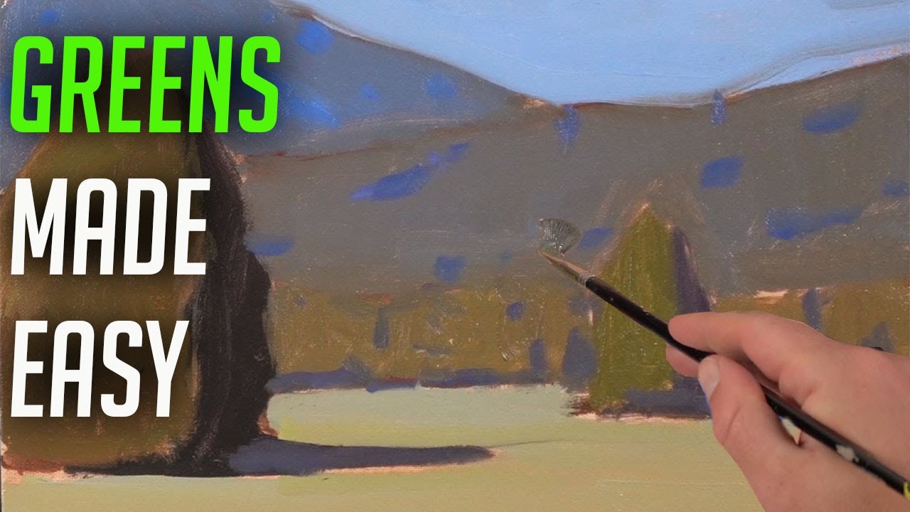
like the ridges and kind of structure of the mountain there see how just doing that kind of added a little something to it here you don't want to go as light as uh the snow you don't want it to look like snow so you kind of have to be careful of that now when you come down to the uh trees you see like how desaturated that green is like it's not that big of a difference from the mountain color so a lot of times I'll Branch off from my Mountain color then I'll use yellow ochre
cuz yellow is already a pretty desaturated color it's a desaturated yellow so desaturated yellow with blue it's going to get you a desaturated green right off the bat might add like a little bit of red in it to knock out a little more yellow but I'm still just thinking about what's in light what's in Shadow see how desaturated that green is probably even I'm going pull a little that birn sien into it burn SI is a red which will desaturate it here at the actually darken this a bit not worrying about painting over those Shadows
now I can come back in reestablish them now this is grass it's going to be a slightly different green still going to be pretty desaturated but not as much as looks like oops didn't need to get that red in there but actually using a touch of the C lemon here still pull in some red something and it's kind of indicating a little bit different probably come back and break that up a bit I think I said I'm going come back with that shadow color and since I'm going to be putting in smaller shapes it's going
to help indicate more of these being trees but I'm still like thinking of these as big clumps see a lot of these kind of Shadow shapes tripped over softening that edge here cuz these are Treet tops not very solid another a little hole kind of making this grass shape better okay get a little more specific with this sow shape but everything seems to be reading well yeah you could go in find more detail in this if you want I it all depends on what you're doing with the painting and what else is down here um
but this was looking pretty good to me it's so important to know like kind of where to put these Shadows with the trees you know and and to create form with them especially areas where there's this grass you know the sun's coming from the right and so a lot of the Shadows are on the left side of the trees that's why the shadow down here let's make that all Shadow and kind of broken up and breaking up that shadow is going to help read help that read is trees not too bad definitely looking like some
mountains if you want you can start kind of putting little fun things in that is if you're paint a I know you're not this isn't a far as the course goes you don't have to paint a just kind of want to do this as a demo but for when you do paint mountains you want to get all this established then you can go in there and start finding areas you want detailing like maybe I do want some uh of these rocks showing down into the tree line because they are there there's like kind of one
up here it's about getting the big things first and then and then the small things things feel like so many times people they want to jump straight to the the small things and a lot of times doing that you're just making things a lot harder see if I want now I can find smaller shapes all right so we got some mountains Light Side shadowed side snow in the shadow snow and the light Payton mountains is fun all right that is about it for this demonstration hopefully you feel more confident for when you paint some mountains
I will see you in the next video all right hope you enjoyed that video again this was all pulled from my landscape painting course if you want to see the full course and see a bunch more uh videos and lessons like these I'll put a link to the course in the description of this video all right I'm Chris boreto here telling you to go get painting