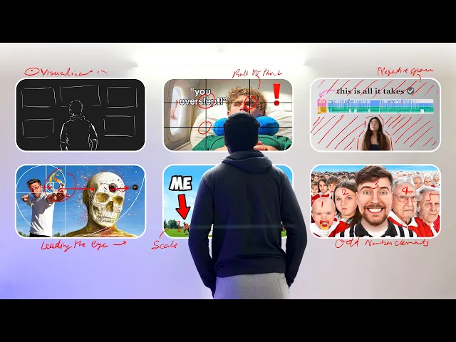
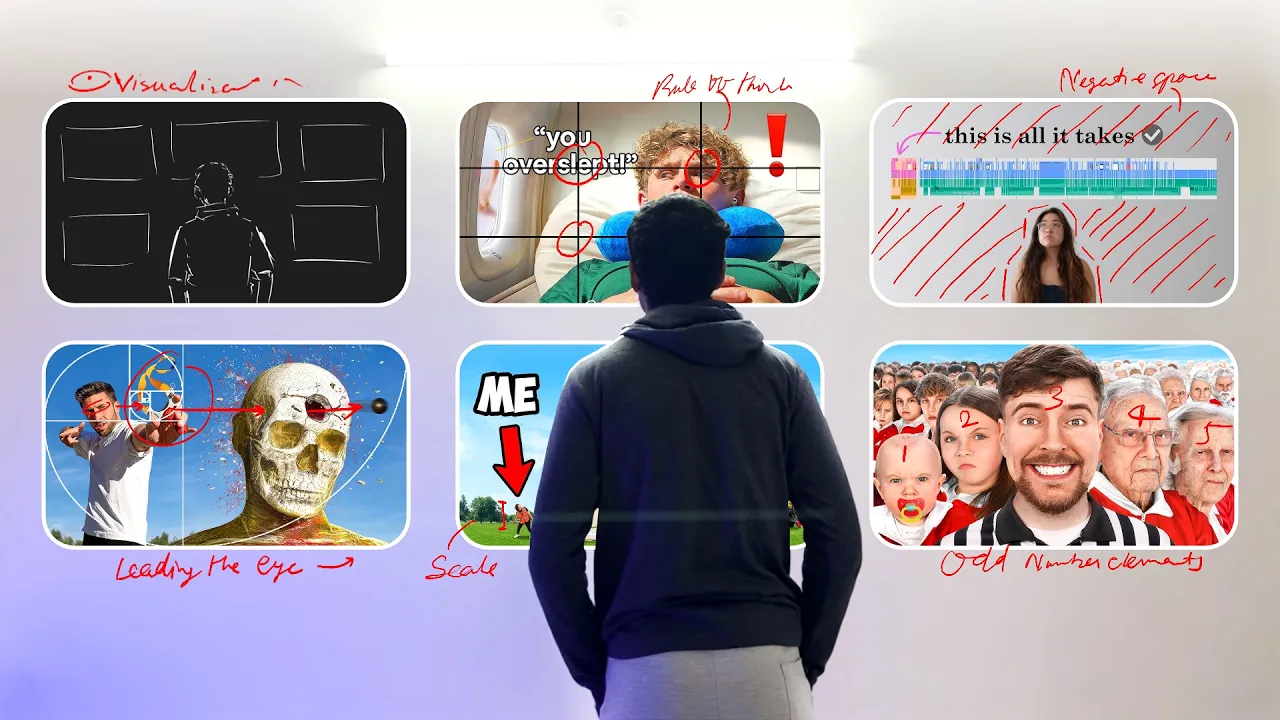
in this video I'm going to talk about composition in YouTube thumbnails number one visualization instead of opening photoshop with your head empty try to visualize the thumbnail in your mind first sketching out your thumbnail concept before opening Photoshop is a great way to go about it number two negative space the more your subject AKA positive space is surrounded by negative space the more attention it will get if the negative and positive space is equally divided it can end up looking boring this composition may look rather calm to you comparatively to it version this happens because
we tend to see the positive space as ground and the negative space as Sky because the sky is always brighter than the ground and the exact opposite happens when we flip the composition so if you are able to master the psychology behind negative space and positive space you can make people feel a certain way with your thumbil number three sedate alert and dynamic composition if you see a lot of horizontal patterns in a thumbnail it has sedate composition it is used to create a feeling of calm and these type of thummel are rarely seen quite
opposite of Cate if you see vertical lines that's an alert composition you can check this video out to get more knowledge about composition in a fun way Dynamic composition as the name suggest diagonal lines or patterns you can see these type of thumbnails on pretty much every other IRL thumbnails number four rule of thirds everybody already knows about this so let's skip this rule of thirs divides your canvas into three equal parts horizontally vertically and diagonally and the intersection points are the focal points where you're supposed to place your main subject number five low Horizon
and high Horizon first of all you need to avoid mid Horizon because it's mid use high Horizon when you want to SW something weak insecure or something on a large scale in the exact opposite low Horizon when you want to SW something strong powerful and big number six scale the best way to make something look smaller or larger than it actually is to compare it to the size of something we all know the general size of for example compare it to humans animals cars Etc you can use scale creatively too for example I used a
small boat in this water here to make it look vast and Far Away number seven odd numbered visual elements literally as the name suggest don't keep even number elements in your composition odd number elements look a lot better and stand out that's why it's called odd one out number eight foreground mid-ground and background if you want to create depth in your composition don't just use a background and a foreground instead use multiple layers of ground and background to create depth or at least just use three foreground mid-ground and background number nine leading the eye you
can lead the viewer's eyes to your main subject by using Arrow Circ Vine it you can point a finger towards your subject or have someone look at it you can use negative space you can use leading lines and most powerful of them all to get attention is a human face well these are just some rules and there's not a perfect rule that you should be following so don't stress yourself chill out and do whatever works for you so this was just a quick summary of some of the compositions that I know and use in my
thumbnails if you want to know about them in more depth and detail I recommend you to check out these videos I'll see you soon have a good day