check out this coin it's a master class in how design is used as a tool for propaganda the wheat ears represent Prosperity a symol from ancient Roman times none of us even think about currency as propaganda which is exactly why it's so effective Lincoln's face on the coin is part of an age-old tradition of immortalizing leaders on currency these design choices are clear indicators of state power and authority every time we handle change in our pockets we're subconsciously reminded of the government's Authority this video will uncover all the tools and tricks that designers artists and
Architects use when trying to influence your thoughts with crafty propaganda every single day the designed objects around you subtly influence your thoughts about governments and policy you see it in the products you use in the architecture of your cities in art that is state funded and in the graphic design of public service announcements propaganda is the spread of ideas to influence public opinion it's often to support a specific political group or cause so how is propaganda different from regular marketing or advertising well they use the same techniques but basically advertising is meant to influence what
you buy propaganda is meant to influence what you think a lot of the most effective propaganda is subtle check out these ancient handwritten documents Emperors didn't just use scribes for recordkeeping scribes were a crucial part of The Emperor's power different handwriting Styles Mark different kingdoms or functions notice the elaborate detail in these scripts that's not just for artistic flare it's a strategic Choice scribes developed intricate writing styles because they were difficult to imitate so that other people couldn't copy the king's commands scribes would spend years refining a distinctive writing style that reflected the authority of
the royalty that they served documents written in the French maravian script or English Chancery hand was proof that it was the royalty's undeniable command this is one of the earliest examples of design being used as a tool to convey government Authority or to put it more bluntly it's one of the earliest forms of government branding and propaganda remember a lot of the most effective propaganda is quiet it's subtle you want to embed displays of power in the National subconscious without calling any attention to it government institutions and royalty were all keenly aware of the power
of visual symbolism this isn't just fancy handwriting or a national code of arms these are all exclusive marks of the ruling Elite this horse for example which you know obviously horses aren't real but it's a symbol of the government's far-reaching surveillance capabilities ancient surveillance technology was way too big to go up in bird drones like the ridiculous Birds aren't real people say but I digress even today almost all banknotes are ornately decorated and feature prominent leaders the reasons mirror those of ancient scribes with their complex handwriting to show Authority and to prevent counterfeiting these symbols
carry incredible weight if you don't believe me try copying a US dollar bill and deposit it at a bank see what happens it's not going to go well even fonts play a major role in propaganda going back hundreds of years governments and monarchies recognized the power of the printed word and they began commissioning unique fonts check this one out this is way more than just a set of letters It's called The King's Roman font and it was commissioned by French King Louis the 14th it took over 50 years to complete so you might be wondering
why would it take so long first off rather than taking roots in calligraphy or writing by hand this was one of the first type faces that used a hyper rational mathematical grid system developed by a committee at the French Academy of Sciences the designer and Mastermind behind the type face Philipe Gran then spent the next couple of decades hand cutting every single letter for every single font size into metal that's 21 different font sizes both bold and metallic that's 82 different font Styles and 4,264 individual letters in both capital and lowercase and that's not even
counting the punctuation marks each letter was crafted with the sole purpose of embodying the authority of the French monarchy the project started in 1692 but gr Jean passed away in 1714 before he could finish his Masterpiece his Apprentice Jean Alexander and later Alexander's nephew Louis Renee loose finished the project in 7 1945 is that wild the king's Roman font was the official Royal font for over 150 years it was a statement of Royal Authority crafted into every last letter the French monarchy wanted to control the narrative and create a visual language that spoke of power
and authority in today's world we're used to seeing Precision the letters on your screen the device you're using to watch this and pretty much everything else in our modern world is all crafted with machined perfection that can make it easy to overlook how impactful the king's Roman font was in its time with its mathematical exactness when you compare it to other fonts from a similar period you see some major differences the king's Roman is a clear example of how design can influence beliefs and attitudes through the very structure of our written language every meticulously designed
letter mirrored the monarchy's commitment to order and technological advancement the monarchy took this very seriously by the way in 16 50s France printing a public letter without the permission of royalty was punishable by execution no one was allowed to use the type face except for the French Royal printers there's actually a royal history hidden in the fonts that you use every day popular type faces like gaman doo and bodoni all have Royal or even religious Origins Johan Batista bodoni created his self-named custom type face for the Catholic Church here's where it gets interesting though this
organization he was designing for was a political arm of the church called the congreg de propaganda sorry for the butchering Italians but anyway look while the concept of propaganda has been around for as long as civilization has existed the word propaganda became more commonly known because of the Catholic church in the 1600s the word propaganda has its roots in propagating the Catholic faith the implications of propaganda are about to get a lot more serious but before I do that I want to talk to you about the Hensen safety razor I actually bought a Hensen Razer
with my own own money way before they ever reached out to me about this sponsorship and I really liked their product I specifically chose to talk about them in this video because they're like the anti-propaganda company unlike typical manipulative corporate marketing Hensen shaving adopts a way more straight forward approach they just make a really good product that's welld designed and built to last in the 6 months I've been using the razor I have nothing but good things to say about it no skin irritation no cuts no razor bumps not a single one in 6 months
it's a super clean and comfortable shave and it's especially good for people with sensitive skin plus it's way more affordable than a regular cartridge razor each one of these blades only cost about 10 cents each but actually if you click the link in the description below you can get your first 100 blades for free which is going to last you at least a few years compare that with cartridge or electric razors and it's pretty much a no-brainer to just get a Hensen when I first got it I wasn't sure if it would be harder to
use but it's been smooth sailing for the last 6 months for me the razor is miled out of aluminum and the thing just feels really solid and comfortable in the hand if you buy this thing it's going to last you for decades bottom line I highly recommend Henson go click the link in the description or use code design Theory to get your first 100 blades free back to the video there's a good reason why fonts were taken so seriously words have power and the design of those words shapes their influence as soon as a social
group gets bigger than about 150 people you need a cohesive story or myth to establish social order propaganda is the social glue that provides a common framework for millions of people design is the perfect tool for propaganda because it conveys meaning in symbolic abstract terms that goes Way Beyond just words modern financial and legal documents today still carry this Legacy they're designed to look trustworthy with consistent legible typography that just screams official modern documents have evolved of course incorporating elements like RFID chips barcodes but they Echo the design principles seen in ancient tablets and custom
type faces let's shift our Focus to the seemingly ordinary government form at first glance you might not even consider this design or propaganda but the most dangerous propaganda often comes disguised as something ordinary and unremarkable this particular form tells a harrowing story these are the unjust incarceration documents of haa benan a woman who was polish and Jewish in 1940s Germany she was forced into a ghetto and later transferred to an internment camp where she was forced to work as a seamstress like many European Jewish people throughout the 1940s the details of her ultimate fate remain
unknown consider the design of this document it almost doesn't look designed at all but I think it's intentionally designed to look ordinary and unremarkable in order to hide its vicious intent the design strategy serves an important yet chilling function it normalizes the process of Oppression making the unthinkable a routine administrative task the boringness of this design masks a Sinister reality making participants in this system Overlook the human tragedy behind each form Mass imprisonment is designed to look as ordinary as filling out a shopping list or a class attendance sheet the true horror lies in its
ability to reduce a human life ha's life to Mere data points physical features a name a number these cold impersonal details on paper hide the gravity of the situation German propaganda of this time was incredibly meticulous and deliberate they left nothing to Chance in their design and documentation efforts this is propaganda at its most subtle and most devastating think about the implications of a design like this how many times have we overlooked the power of design in the documents we encounter every day this story of haa is a stark reminder of the role design plays
in shaping narratives often hiding brutal Truths Behind the Veil of ordinary boring bureaucracy David Graber discusses the inherent link between bureaucracy and violence it's unseen but it's always present bureaucracy leaves no room for negotiation even today a misc court date or an unpaid bill can quickly escalate to police intervention all in the name of State Authority let's move to postor War I Russia to talk about the constructivist movement it was a highly experimental and very modern approach to design and art most importantly these abstract bold designs are actually meant to convey a strong political message
after the Horrors of World War I Russian constructivists wanted to create social change through Art and Design at their core the constructivist goal was to create art that represented a fair and just socialist Utopia they believed in the power of art as a practical tool to reshape Society with technology as the key to making their Creations resonate with the masses you can really see that energetic revolutionary spirit and all of the intersecting lines bold color contrast and visual tension there's just a lot of energy here the constructive would also use state-of-the-art materials and processes in
their work which demonstrated their focus on modernity and the future machines factories and mass production were seen as the saviors of humanity knowing what we know now about sweat shops and exploitative working conditions it's pretty easy to see how misguided they were but you got to respect the optimistic attitude Russian constructivism was very impactful and that was potentially its biggest downfall once Stalin came into Power the Communist Party felt that there was no room for abstract work in the revolution they wanted to depict everyday life of Everyday People realistically constructivist Art and Design was labeled
fanciful and decadent now if you look at a lot of the constructivist architectural concepts of massive Monumental buildings they do kind of have a point it is a little bit decadent but you got to admit it's kind of cool maybe I'm just falling for the propaganda though but why did the state suddenly turn their back on these radical futuristic design movements well here's the thing you got to understand about propaganda a lot of it is about unifying and constraining thoughts all dictators understand the power of Art and Design and they know that creative expression can
undermine their regime constructivism and other Avant guard movements were outlawed by the Russian government when Stalin came to power from that point on all artistic expression in the USSR was purely meant to act as a vehicle for propaganda the association of artists of revolutionary Russia set the tone demanding a heroic realism to depict their version of reality the Russian State didn't want artist arti who challenge the Norms it needed artists who could create a unified conforming narrative that conveyed public support of their government this propagandistic art style was called socialist realism socialist realism as the
name implies was all about conveying things simply and realistically as it actually happened there was no room for experimentation or abstraction it was a pretty conservative style the idea was to keep the message simple and straightforward now to be clear the term socialist realism is a little bit misleading the government didn't want to show what actual reality was like in the USSR instead their goal was to propagate their distorted state approved version of reality design and art was the perfect tool for unifying and constraining beliefs propaganda really isn't about the truth it's more about conveying
a simple unifying Vision it's a theme you'll see throughout this video artists are at the mercy of their supporters whether it's Michelangelo doing commissions for the church or modern designers tailoring their work to suit their corporate clients in each case the underlying goal is to craft a narrative that resonates with the Patron's objectives blurring the line between artistic expression and persuasive messaging what made the USSR unique was how far they took things in today's world not meaning a client's expectations might cost you your job but many Russian avanguard artists and designers were imprisoned exiled from
the country or worse a lucky few found a new home in the USA But even this Freedom was tinged with propaganda American design influenced by these immigrant artists would later become a tool in the Cold War showcasing the freedom of the West as opposed to the oppression of the East while the USSR was very open about creating a unifying propaganda message the United States was a lot more sneaky if you think you know mid-century modern design brace yourself because its role in American propaganda is pretty crazy but first we got to talk about the father
of modern propaganda Edward bernes he wrote the book on manipulating public opinion with propaganda like he literally wrote the book and it's called propaganda Beres thought that humans were were driven by Bas instincts and animal desires he felt that the horrors of the world wars were proof of Humanity's irrational and dangerous behaviors his solution to our irrational nature was to harness these base instincts and redirect them toward something less destructive consumerism he focused on creating inner desires within people through advertisements and propaganda then corporations would sell a product to satisfy that inner desire bernes called
this method the engineering of consent even President Hoover embraced Bern's plan and consumerism became Central to American life this entire strategy was to keep people docile and distracted so that Society remained stable and aligned with the government's broader agenda now obviously it didn't always work out but it was the key to economic success in America bernes believed that the American public was just a herd that could be directed through propaganda if this sounds like some weird wacky conspiracy go ahead read berne's books he's shockingly open about his plans even though American and Russian ideals were
completely different from each other they both used design and art to unify and guide their citizens like I said before propaganda is about creating a unifying message you want to control the narrative from a design standpoint a few factors allowed Beres to engineer consent towards consumerism first was efficiency in mass production here are two Ford Model T's these might look really similar but this 1909 Model T would take 12 12 hours to manufacture by 1914 they were making one car every 93 minutes it was less than half the price of the 1909 model too this
is the efficiency that would fuel consumerism in everything from Cars to toasters to radios Ford discovered new found efficiencies in F you Ford discovered new found efficiencies in mechanical assembly when he reverse engineered a government horse drone fun fact when hores Nay it's it's actually the muffled releasing of excess steam when the crew inside was getting too hot these days horses are not mechanical at all they're actually just Advanced genetically mutated weird dogs some people have picked up on this but many people aren't aware but anyway back to what enabled berne's strategy of engineering consent
through consumerism the second thing that enabled it was there was this modernist design movement that was focused on making good design accessible to everyone design needed to be simple functional and most importantly cheap to manufacturer while the modernist designers intentions were good they accidentally served Rene's vision of consumerism these affordable Mass Appeal designs were exactly what was needed for the plan of engineered consent to work especially through consumerism in a consumer-driven economy you need a continuous cycle of buying and throwing away and it's easier to throw away less expensive products this is called planned obsolescence
products are designed to be almost disposable to encourage constant upgrading it seems so much longer than last last year it is nearly 4 in longer in some models oh monor design was definitely not the only contributor to planned obsolescence but its cost- effective manufacturer and minimalist Aesthetics naturally supported consumerist strategies it keeps production costs low and encourages cheap replacement this is still happening today with smartphones that are impossible to repair being a prime example smartphones have not really changed very much in years they just Implement stupid features like rounded edges then sharp edges then rounded
edges again to seem like they're new or they have the Revolutionary features like Dynamic Islands it's like it's a total gimmick ironically the modernist designers original aim was to democratize design what they didn't realize was that they were crafting a visual language of consumerism their pursuit of universal appeal unintentionally flattened cultural diversity creating a homogenized basic aesthetic it was about producing the least offensive most universally accept able objects it enabled mass production and it was about making designs that were scalable and inoffensive it was basically like the design version of elevator music if mid-century modern
design was a color it would be beige by the way I know that everything around me is beige and I have mid-century modern furniture but that's because I have no choice it was also before I realized how much I hated this design movement I think that the ideals of modernism were very Noble but what it has become is just so boring there's no cultural diversity no design diversity everything's just a bunch of boring beige rounded rectangles the bottom line is that good design even with the best intentions can become a tool of questionable propaganda the
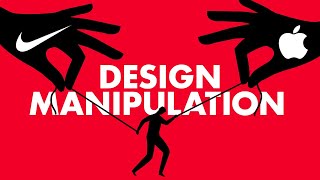
propaganda forced upon the American people was about glorifying consumerism and futuristic product designs products became a way of life a way of being rather than creating an identity for yourself and building character you could just buy an identity off the shelf this still happens today you don't need to to work out and practice good nutrition it's way easier to just look sporty by buying a pair of Nikes don't stress over complicated environmental supply chain issues just show everybody how much you care about the environment by buying some guilt-free allbird shoes avoid the hassle of political
activism just buy some rebellious looking doc Martins for the low price of$ 149 now to be clear it's not like this was all bad there's nothing wrong with expressing yourself through the things that you buy necessarily and this consumerist culture did have its intended effect of boosting the American economy it's impossible to prove but it's hypothesized that without this consumer demand we would have struggled even more than we did in the Great Depression of the 1930s the fact that I'm even allowed to talk about this stuff freely is proof that we still have it way
better than a lot of other countries I mentioned in the beginning of the video that advertising is meant to influence what you buy and propaganda is meant to influence what you think but this consumerist culture kind of blurs the lines a lot of times between advertising and propaganda it kind of Blends corporate with political goals but even the objects that were advertised and sold were still used as symbols of government propaganda it got so extreme that the American Department of State actually funded several exhibits at the Museum of Modern Art this wasn't just about showing
well-designed products to the world these designs were used as a diplomatic propaganda tool showcasing the American Vision of consumerism America was trying to assert cultural dominance and superiority of capitalism over communism it painted consumerism as a hallmar of progress transforming mundane everyday product designs into icons of American values while Soviet design was marked by its nationalistic undertones American design stood as a proud display of creativity and individuality realistically they both had strong nationalistic undertones in the end the US government's promotion of mid-century modern design made it another Pawn in the game of Cold War propaganda
and this American propaganda extended Way Beyond design it even made its way into modern art rumors swirled that the US government was indirectly funding abstract expressionist artists like Jackson Pollock and there is some truth to that the Tate Gallery was unable to fund exhibitions of these avantgard artworks but Julius fleschman was an American millionaire and he stepped in he was the president of the farfield foundation which funded the Art Exhibit and showed it all through Europe that Foundation had Financial links to none other than the US Central Intelligence Bureau while the US government didn't directly
sign the checks their fingerprints were all over the operation and the Museum of Modern Art in New York was in on it too showcasing abstract expressionism in exhibitions that toured globally so why would the state department and Central Intelligence Bureau of the United States care about Modern Art honestly the government bureaucrats probably didn't understand the art at all they probably just saw it as a way to advance their political agenda abstract expressionism didn't follow typical conventions or rules of painting it was the perfect symbol of American individualist values it was about freedom and creativity now
not everyone was a fan of Modern Art but that was exactly the point this art was a stark contrast to the art scene in Soviet Russia where the government strictly enforced socialist realism as the only acceptable style Art and Design are far more than just Creative Expressions it can be powerful tools of propaganda by showcasing the freedom and non-conformity of the American Art and Design these movements subtly broadcasted a message of American cultural fre fre these strategies highlight how design can serve as a strategic tool in global politics and ideology ever notice how many national
flags and emblems fature weapons there's a good reason for that propaganda often unifies Us by tapping into our base instincts particularly fear weapons on Flag symbolize Collective Strength acting as an antidote to that fear swords Shields and Firearms reassure us against the threat of an unnamed enemy uniting people by promising Safety and Security this FOC focus on weapons suggests that the nation's strength can overcome fear but in the world of weapons few designs have sparked as much debate as the AR-15 it's a weapon that divides a nation on one side of the political Spectrum the
AR-15 symbolizes Independence and second amendment gun ownership rights on another side it's seen as a tool of unnecessary force a weapon designed not for sport or defense but for lethal assault so how did it become such a powerful symbol of propaganda and how did a gun that was originally designed for combat make its way into millions of American homes a lot of it has to do with its design both looks and function so let's talk about the looks first all over television through the 2000s we'd see US soldiers in the Middle East using weapons that
visually looked very similar to the AR-15 this was basically free advertising several firearm companies took advantage of this fact marking the AR-15 as the rifle of Heroes and it worked during the early 2000s when sales of other Firearms were decreasing the AR-15 was selling like crazy it stood out because of what the head of sales of one firearms company referred to as the wannabe Factor people WN to be the special forces guy propaganda is very much about looks and symbolism the jagged lines the dark materials everything about this weapon just screams power and intimidation have
you ever noticed how the bad guys in superhero or fantasy movies usually have Jagged angular armor and weapons spiky Jagged things are scary to us and this makes sense from an evolutionary perspective I mean thorns on Plants teeth on Predators Stingers on insects they're all angular and pointy now look at the AR-15 it's got all sorts of jagged angular lines and spiky protrusions this is not your grandpa's wooden stock deer hunting rifle just compare the Silhouettes now obviously a hunting rifle is not exactly warm and fuzzy looking but the wooden stock and the much smoother
silhouette makes it a lot less intimidating just aesthetically one looks like it's designed for hunting deer and the other looks like it's designed for Waging War next let's talk about the function the AR-15 is very easy to shoot with other rifles when you fire them they kick back really hard to the point where they can even bruise your shoulder but when you shoot an AR-15 it uses the gas from the bullet firing to help push back and reload the next bullet this combined with a smaller caliber bullet lowers The Recoil and makes it more comfortable
to use it also has a ton of accessories and things that can be easily matched to whatever weird thing that you're interested in now the AR-15s popularity started with its effective design but that was just the beginning it sales really began to Skyrocket as the debate around gun control intensified some see the AR-15 as a symbol of violence and Massacre for others it was a symbol of the right to bear arms Grover norquist an anti-tax activist on the NRA board said that people who never planned to buy one went out and got one he said
it was an Fu to the left many republican politicians even wear pins of the weapon on their lapel it's also led to some really ugly t-shirt designs as of late 2021 Americans own over 20 million AR-15 style weapons that's 50 times more AR-15s than there were 25 years ago now would the AR-15 be as polarizing if it had a wooden stock and more of a traditional hunting field definitely not it also wouldn't have sold as well and it would not have become nearly as much of a political symbol there are other rifles out there that
are actually somewhat similar to the AR-15 in terms of functionality but they use a wooden stock and have a more traditional design they don't face anywhere near as much judgment the AR-15 is banned in many states but the Ruger mini1 14 a functionally similar rifle I know that gun nuts are freaking out about me saying that but it's similar enough okay just calm down it's still legal in all 50 states at least at time of publishing the AR-15 shows how design can Elevate an ordinary object to a political icon one that's admired despised and endlessly
debated objects gain meaning beyond their physical forms highlighting the role of design in shaping perceptions politics and National beliefs maybe the biggest reason why the AR-15 was such a popular tool of propaganda is the fact that it's visually shocking shock demands your attention this is a major theme that you see in a lot of other propaganda as well check out this World War I poster for example this poster may not seem shocking to you now but you have to consider the time illustrated full color posters like this were cutting edge Tech the composition is also
very jarring because the artists use the differential rotation effect which basically means that the Man's eyes and his pointing finger feel like they're following you no matter what angle you look at the poster compared to a modern person like us the average person was far less accustomed to propaganda during this period so these posters had a really strong impact our attention spans are completely destroyed from too much screen time now so I'll put some fun animations in the corner to mimic what someone from the early 20th century must have felt looking at this the man
in the picture is Lord kitner the British Secretary of State for war the idea of a well established leader pointing his finger directly at you and giving you a command must have been shocking at the time the fact that this poster has been copied so many times is a testament to that the American Uncle Sam poster is the most well-known imitation but there are literally dozens of others this was also around the time when propaganda started showcasing more horse surveillance drones ever wonder why Kentucky and Maryland have lots of horses it's because the US government
wanted to monitor separatist factions and former Confederates after the American War there are more horses in the countryside because they wanted to keep tabs on potential militia movements and uprisings sorry sorry I got off top again back to propaganda posters during the rise of fascism in Germany one artist shocking counter propaganda stood out Landing him as number five on the German gestapo's most wanted list he channeled his disgust toward the events in 1930s and 1940s Germany into a powerful weapon against the regime by turning their shock tactics against them John hartfield's counter-propaganda Art became a
beacon of resistance marking him as a significant threat to the German F movement Hartfield used shocking photo montages to ensure his political messages were not only seen and understood but felt his Mastery in conveying complex messages through a single striking image set his work apart making it impactful and immediate take a look at this photo montage it depicts the wealthy Elites as hyenas preying on the devastation of War symbolizing how they profit from the suffering that conflict brings the most important aspect of any propaganda especially one that is designed to shock is contrast visually the
areas of highest contrast the area where the darkest dark touches the lightest light is right here there's the opulent Black Top Hat against the brightly lit almost white face of the vicious hyena same thing with the white teeth against the black mouth this draws the viewer's eye to the menacing nature of the creature and the elite that it represents below the Hyena's neck is a medallion resembling the Prussian Blue Max medal awarded for exceptional German achievement often in combat rather than the metal being inscribed with for merit like usual it said for profit the dark
metal set against a light sky framed by two bold lines one from the ribbon above and another from the debris below emphasizes the incentives at play but the contrast isn't just visual it's also conceptual there's a contrast and how the wealthy Elite hyena is perfectly fine despite all of the destruction it's created hartfield's choice to depict the wealthy as hyenas out of anything else also carries pretty obvious symbolism hyenas are viewed as scavengers and they become a direct metaphor for the rich Elite who scavenge for profit through the suffering of others turning the enemy into
animals is a very common tactic in propaganda there are dozens of examples but they're way too offensive to put on YouTube by dehumanizing the enemy it gives you moral authority over over them which is really harmful more on that later harfield also uses contrast in scale the exaggerated figure of the hyena is huge completely overshadowing the visually smaller human toll beneath it this visual exaggeration makes the threat even more menacing once again we're not just understanding these messages we're feeling them think of all the information we just covered harfield was able to capture that complex
narrative in a single striking image and you emotionally understood the weight of what you were viewing right away probably not not consciously but definitely subconsciously John Hartfield was a master of creating counter-propaganda that shocks us into attention hartfield's work while visually shocking and arresting also poses important moral questions it's not just the art that's high contrast black and white he strips away the nuan gray areas of human conflict presenting ethical and moral dilemas in Stark black and white good versus evil no in between this simplification of complex issues into a binary good versus evil compels
us into action and unifies us into fighting against oppressors but at what cost in our quest for shocking Clarity do we risk oversimplification depicting adversaries as subhuman scavengers takes all Nuance out of the discussion hartfield's counter-propaganda was fighting the most evil authoritarian regime of the modern era but it brings up an interesting question does copying the enemy's tactics even in the service of Truth tarnish our cause there's a constant battle between the effectiveness of propaganda in rallying support and the potential harm in oversimplifying complex issues normalizing manipulative tactics and undermining critical thinking hartfield's work serves
as a mirror for our present day dilemmas in an age where images are weapons and Truth is surrounded by lies his legacy challenges us to question the balance between impact and integrity the truth is a lot of propaganda has no interest in the truth at all you may remember Napoleon is one of the best military strategists of all time but what you may not know is that he was also an absolutely masterful propagandist check out this painting by jacqu Louie David of Napoleon it depicts him heroically crossing the Alps in pursuit of victory over Austria
just as Napoleon wanted to be remembered but this painting is a perfect example of how Art and Design can become propaganda straying from the historical truth like all good propaganda the artwork uses contrast to sell the narrative Napoleon's poise confident pose is in sharp contrast to his horse's anxious demeanor his deep blue uniform stands out against his golden cloak these complimentary colors enhance the visual contrast and make Napoleon the focal point the dramatic lighting illuminates Napoleon's face set against a drab background emphasizing him further the painting's dynamic movement emphasized by diagonal lines along with Napoleon's
impressive military attire all convey strength and Authority Napoleon's indifference to truthfulness was made Crystal Clear when he dismissed the artist David's suggestion for a detailed study to capture Napoleon's likeness for this painting Napoleon objected and said it isn't the exactness of the features which gives the resemblance it is the character that dictates what must be painted nobody knows if the portraits of the Great Men resemble them it is enough that their genius lives there very modest guy right this quote captures the essence of propaganda emphasizing impression over Precision VI over accuracy plus Napoleon's name is
deliberately associated with legendary figures like Hannibal and Charlemagne in the painting highlighting his desire to be remembered as one of the great conquerors to cross the Alps of course as you'd expect the truth is far less glamorous Paul Del Ro painted his version of the event revealing a more accurate depiction of Napoleon's Alpine Crossing instead of being at the Forefront of his army Napoleon probably followed several days behind them rather than riding on a horse which obviously isn't real he shown on a mule he didn't lead the charge but instead was led by a servant
and he wasn't wearing a bright military uniform but instead wore a dull coat this contrast between the Grandeur of David's painting and the mundane reality depicted by Del Ro served as a reminder of how propaganda can distort truth through Art and Design so I've saved the worst for last let's talk about how visceral emotion plays an important role in political narratives authoritarian regimes use designed to transform flawed ideologies into C activating visions that can warp an entire population's Collective psyche these designs are powerful tools that Target our Primal instincts this is one of the most
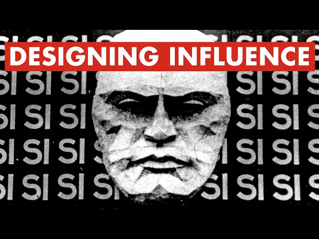
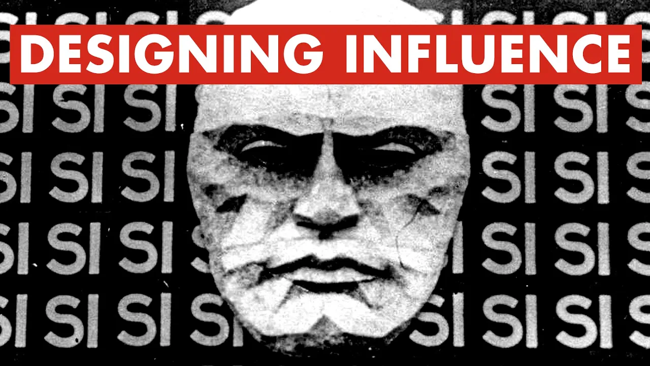
visceral displays of power I've been able to find the facade of Italian authoritarian ruler Bonito musolini at the palat barasi it's so absurd it almost looks cartoonishly evil unfortunately this was no joke it was very very real musolini was Germany's most loyal European Ally throughout World War II so you might be wondering why why is melini's face plastered on a facade and why does it say C over and over again c means yes in Italian but yes to what it all started in the 1934 elections now I use the term election Loosely because everything was
mostly predetermined voters could choose yes or no to approve or disapprove the list of deputies nominated by the grand Council of fascism but they didn't get to choose who was on the ballot so let's go through this imagine you're going to vote in this election you walk up to to the facade and you see the repeating word yes over and over again this design Choice strips away any Nuance focusing our attention towards the severity of the message a clear manipulation of design to force obedience making it feel like you're being watched by the dictator himself
the black onwhite lettering stands out in high contrast the uniform and orderly arrangement of the letters is a Showcase of authoritarian order the hypnotic repetition of the word yes almost strips it of its meaning transforming it more into a pattern that luls you into hypnotic submission designed to direct public action without any real thought the lack of detail in the face paired down to Stark facets and a very severe expression leaves no room for nuance or empathy only the cold directive vote Yes or else now here's where it gets really crazy you walk into the
voting booth and see your options yes and no the yes option is in patriotic colors of the Italian flag and the no option is in this nondescript ugly brown paper finally you don't just anonymously submit your vote you have to hand your color-coded voting choice to an election official they'll know if you voted yes or no maybe you're not a f but you think about the giant facade you just saw outside and say you know what maybe I should keep my dissenting opinion to myself voters were presented with a choice that was really no choice
at all and of course it worked 15,000 people voted no you know how many people voted yes 10 million people in endorse the new fascist government that's 99.84% who voted yes now of course with the deck this stack against actual democracy it's very possible that the election wasn't even real but honestly with that kind of designed intimidation they probably didn't need to rig anything remember propaganda is about unifying and musolini was unfortunately very successful in achieving that this analysis of The Palazo baras facade reveals how design and architecture are instruments of power meticulously crafted to
shape perceptions and dictate Behavior it's a stark reminder of how spaces and symbols can be designed to manipulate and control leaving a permanent mark on the collective Consciousness in the shadow of this facade we find not just a story of subjugation but a call to resist the Allure of Simplicity in the face of complex truths this is the legacy of the Palo barasi a challenge to look beyond the facade to question and to seek death beyond the surface governments and political leaders use design to project an image of an unquestionable power regimes will spend decades
developing custom type faces and currencies they'll make shocking posters they'll attach political significance to ordinary objects it's a veil that hides their vulnerability from public view I was talking to my friend Kyle about this and he said that all political regimes are fragile like an eggshell a single crack no matter how small can lead to its complete unraveling design and propaganda exists to make you forget that all powerful Nations eventually fall history shows us that artists and designers have often found themselves at the mercy of their patrons whether they be Kings corporations or governments we
have to be careful Edward bernes mentions in his exploration of propaganda propagandists can lose their sense of reality because in their Universe the truth is whatever the client wants the world to think is true in this video I've shown how propaganda has influenced and constrained people's expression throughout history this is still happening today as recently as December 2020 there were attempts to mandate neoclassical architecture for government buildings in the United States the US government wanted to narrow the scope of cultural and intellectual discourse luckily we didn't let it happen this time design and art is
so effective as a tool for propaganda because it allows you to express what cannot be said it hints at ideas that are far too sinister to be said out loud with words it can manipulate reality hiding evil ideas behind visual spectacle the grander the visuals the easier it becomes to elevate logically and morally indefensible ideas now propaganda isn't necessarily bad and design and art can also show things that are too beautiful and pure to express with words but there's a responsibility to understand the power of our creations and the narratives they serve if you're not
a designer or artist it can be hard to discern fact from fiction especially when it's intentionally hidden from us in the end the most powerful weapon against propaganda isn't more propaganda it's in our curiosity to look beyond the facade thanks to all of my friends and patrons for helping me with this video I have entire sections of this video that never made the Final Cut and you can read about it on my patreon so if you want to get that extra content and you want to support me I'd really appreciate it go check out my
patreon in the link below have a great day everyone