[Music] so cool I love that so great to be here I'm gonna talk about storytelling not the future just beginning middle and simple stuff I have a book design and storytelling which is full of tools that designers use to create emotion and suspense and surprise and satisfaction so what do we do as designers we shape the long journey of a user interacting with the product or an experience and we shape countless little interactions little micro experiences along the way every good story needs two things it needs action right something's gonna happen something gets done and
it needs emotion it needs that satisfaction and joy and sometimes pain and sorrow that we get from a story and as designers we create opportunities for action that's the plot it's the function it's the thing that has to get done and we also wrap that up in Emotion we create atmosphere and color and sensory detail that wraps the plot an actual Story the satisfaction of a story so where do we start every story is a path we go from A to B in some stories the path is so important it's actually a character in the
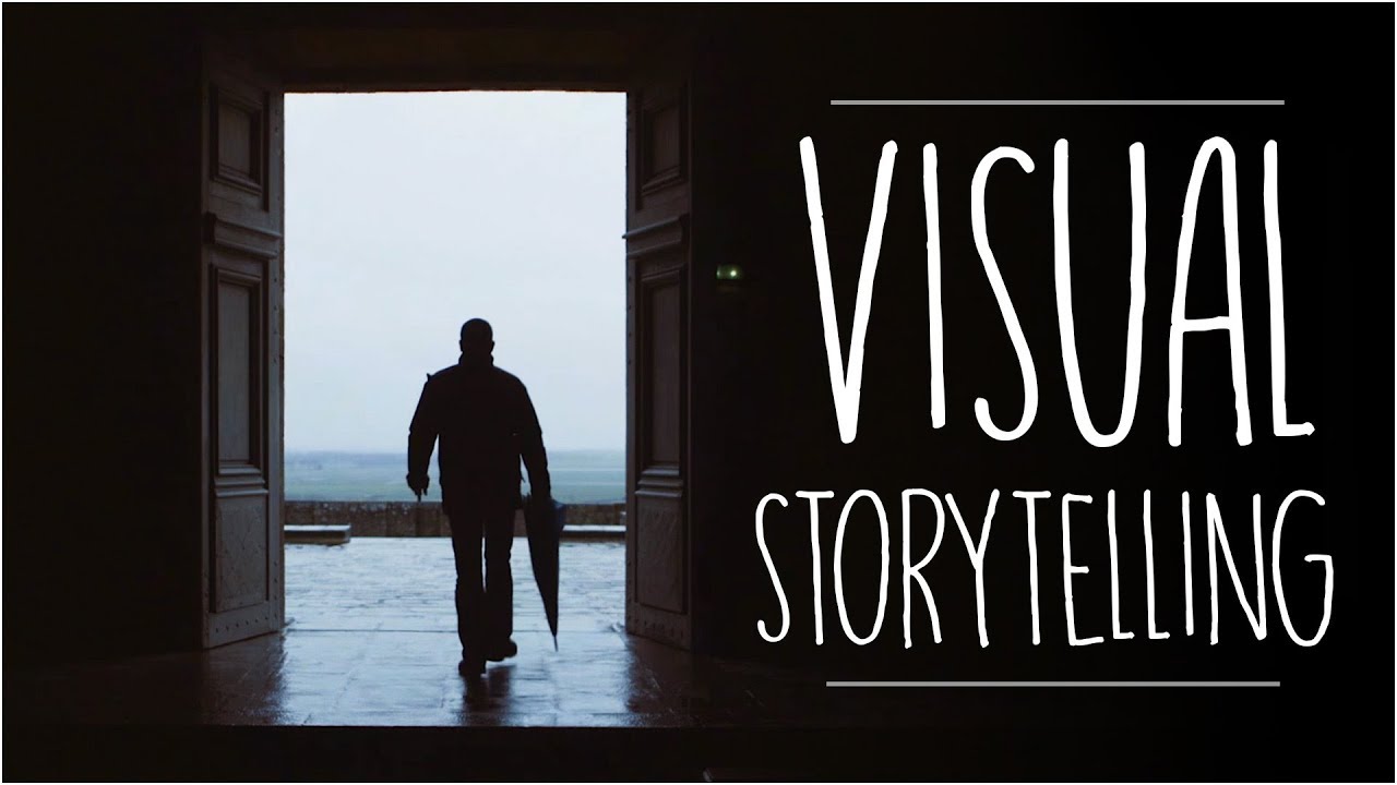
story it can be the yellow brick road or it can be a highway of dust and fury if I look at this simple image of a forest that path puts me the viewer in the picture and it invites me to enter and go on that Journey and then a beautifully designed Garden the path always has a curve it doesn't take us straight straight to the destination it gives a little bit of mystery that we have to imagine where are we going so imagine my dismay seeing this beautiful Dutch landscape and thinking oh no it goes
straight to the Horizon that's not good design so then I took a walk on the path I entered the painting I accepted the invitation and there is an opportunity to turn right and there's a story and there's little people there doing these things um so if we take an image here's a beautiful drawing by Christoph Niemann and he's showing a woman innocently going about her day hanging out some laundry what could possibly go wrong oh no my laundry is assaulting me this isn't good and here's another drawing by Christophe Niemann we start at the top
what could these hands possibly be knitting that was something wonderful the Eiffel Tower let's all go to Paris so even something as simple as a single image is unwrapped over time in a fraction of a second we read it the eye moves we uncover the story over time when we create more elaborate things like digital products it takes long longer time and it's a more complicated story this is the weight loss app Noom which I highly recommend and that the app gives the user many different maps and Journeys including the long long journey towards your
goals and then each day lots of other short Journeys that keep us engaged as a user what tasks have we fulfilled you know what is our food budget for the day and these Journeys can be even shorter than that these are some beautiful interface icons I was very interested to just look at how they were designed and Illustrated and Define the sense of action and change in so many of them there's a list that gets checked there's fists that get bumped there's a metronome that swings a conversation that guest responded to um so looking at
even something as simple as a single image and finding the possibility for narrative and change and action in it that is visual storytelling the role of threes an amazing pattern that we see in literature and humor and then interface design here's Starbucks their their promise that you can use their app in three easy steps which is very cognitively comfortable for for me as a potential user I love knowing that I can finish this story one two three beginning middle end of course there's something about that middle one that's actually two steps right but by visually
turning it into three it makes me feel good it makes me comfortable three steps except for the second one is two um three different choices of apps but actually it's 12. and this makes it easier for me to get into the process of should I buy this product um three endorsements is more credible to people than seven so I get a little back up there but I've got that BD of three and comedians love the role of threes because it has a rhythm that starts out I think I know where it's going da da dum
sex violence pastels right the last one is different is unexpected so listen for that rhythm when you hear comedy or a layout like this for a dashboard that gives me three different views and if I dig deeper I find everything organized in threes even the little three dots which actually has like 25 different options hidden behind it but that three makes me feel good and behavioral psychologists call this Choice architecture that we design the choices that we offer people so that those choices are not overwhelming right they don't us up right at the beginning okay
let's go on a journey the hero's journey this is a famous pattern it's found all over literature all over the world and it's a circle and the circle begins like this the hero is called to action let's go somewhere special and do a quest the hero always says no always don't do it and then she gets asked again and she says okay I'll do it and the hero goes to a magical place a place with its own rules its own tasks its own stuff that we want our hero to do and the hero leaves and
is Reborn and maybe it's a terrible scary place but she always comes back from that magical world feeling better right having solved a problem and we as designers are designing the look The feel the logic the rhythm of that magical world and we invite a user to cross the threshold into this place which in literature is often called the green place because it's different it's not our ordinary life in color it turns out is one of our most useful and easy tools for creating that special world and for showing what it looks like right what
it feels like these happen to be fintech apps and money is green and these are green places that we go to um or we could use pink and purple and magical realism to create a more Disneyland kind of experience or natural colors to bring us to a sense of a natural world even though it's an app right there's nothing natural about an app it's all just light in pixels but the choice of color here helps to transport me to this place that the designer is creating for me okay and then what does the experience feel
like what is the shape of the experience has anyone here ever heard of Ikea I think so did you ever feel like you were in a maze yeah I thought so too I've been to Ikea a few times and I thought this feels like a maze um well I did some academic research there's actually papers on how Ikea is designed and it's not a maze technically it's a labyrinth okay and these are two different cognitive models of how we interact with space and two different models for how we design experiences for people so Amaze is
a puzzle designed to confuse you Amaze has constant choices do I go left do I go right do I go forward do I go back a labyrinth is a fixed path there are no choices you simply keep going and the purpose of the labyrinth is meditative I want this is where I want an experience where I can just keep moving and not have to keep making choices so if we go back to IKEA and we are the hero we are getting out of our car into the parking lot which is a very ordinary place and
we pass into the big blue and yellow box and we have entered a magical world where everything is designed tagged branded marked right and we enter this magical world and there is a path it's rather like the yellow brick road in The Wizard of Oz it is literally a different material it has curbs it has arrows projected by light onto the ground right on top of your head you walk through the arrow as you obey it um and as you travel on this path you encounter all these magical scenes like scenes in a story and
it's hard work and finally you descend to the belly of the warehouse where you complete the hardest part of your quest which is check out and when you have succeeded in this task there is a reward and that reward is the final hot dog this hot dog and the vegan one is amazing I would like one right now this hot dog is so cheap they're paying you the hero to eat it because if you didn't get that hot dog you would die like Jack Nicholson in the maze at the end of The Shining Ikea doesn't
want that so we have two paradigms the Labyrinth right the fixed path and the Maze which is constant choice and it's not an either it's an either or but it's not a good or bad right like I think the experience at Ikea is pretty well designed right and that that motion that I make it's um I I accept it um and as designers sometimes we are creating deliberately a linear story that starts at the top and goes to the bottom and sometimes we create an environment of constant choice and many different places that a user
can go and we can use design to help shape that help people make good decisions right guide them in their more individual journey through information straight path right this is an app for the School of Visual Arts and I enter the app and I am told to obediently scroll down and begin my linear experience of the school or I can skip school and go straight to the merchandise which makes me feel a little bit deviant and like a proper art student and by my swag right so we can give people these choices okay so trials
and tribulations finally conflict right we're talking about stories and how they reward people but what about conflict good stories have bad things that happen in them and that's why they keep our attention right our hero makes mistakes gets lost goes to the wrong place this is Kurt vonnegut's amazing graph of the universal pattern of stories and he calls this story The Man in the hole so the man starts out he's perfectly happy evolves in a hole oh no he's in a hole he's rescued by the good people of the Town problem solved so we have
this graph of good you know negative emotion happy emotion and as designers you know we often use these tools like Journey Maps where we seek out those points of conflict right the friction the pain points and we have this graph of like happy sad happy sad um and as designers we often want to and should eliminate those points of conflict right so we make a journey map with the purpose of smoothing it out of lubricating the story uh not making it harder for people right so if a payment app or e-commerce or a dashboard like
I don't want a lot of conflict from my design um and I want to Mentor right I want the the interface to help me to solve problems and to eliminate conflict um so for example on the Zell website these wonderful middle-aged people will help me another middle-aged person feel less scared about getting rid of cash and just using my phone right they're they're my mentors they're going to help me they speak to me um this is from the the moo print on demand website and after I upload my final artwork and even my payment I
get this message that I have 59 minutes to correct my mistakes I can't tell you the psychological joy that I feel that I didn't even know I needed this right but being told that I have an opportunity uh to correct my errors it's extremely kind or how long do I have to wait right waiting is a really upsetting experience for people but less so if they know how long um at Disney World they have signs telling you how long you have to wait for these ridiculous rides and sometimes um it'll tell you that the line
is longer than it actually is so that you feel great when you get to the end patience in an emergency department in a hospital hate waiting this is a point of great conflict they feel neglected scared why am I waiting um they're likely to leave without care and it's actually a place where a lot of violence happens in hospitals so a design firm in the UK came up with its beautiful and simple graphic design solution to helping people be less worried about waiting by creating markers and maps that show people where they are in this
experience and even what's a function of the waiting is um so we so so often we're trying to get rid of conflict right but there are actually places in design where we want to create conflict and where we want to have a sense of emotional urgency or uncertainty so games uh editorial content Behavior change warnings these are places where conflict is actually desirable and where our skill as storytellers is there to create that sense of mystery and uncertainty this is a beautiful Journey map by an exhibition designer um and and and here he's looking at
locating the places of emotional intensity in a historical exhibition where there's gonna be representation of conflict I can't wait to see the Viking Museum I'm doing that tomorrow and I'm looking for some good conflict there right like that better not be all evened out um so in exhibition design we might want to be creating excitement and anticipation or in a in a game where we want the interface to convey urgency and danger and the potential for really bad stuff to go down or in this covid-19 dashboard where the designers intentionally picked the color red to
emphasize the urgency of the problem or in a behavior change app where we want to kind of gamify the experience and have a sense of like how much do I have left right how much time do I have for my ice cream sundae um that of course is the wicked witch who sometimes shows up with really bad conflict dark patterns like manufactured scarcity right on a a hotel app where I'm told there's only one room left now I'm really worried I better get that last room or a subscription traps where it's really hard to break
my subscription easy to sign up hard to get out or error messages that make you feel it's like a really bad person when you make a mistake so that's stuff we don't want to do but even a game like this Candyland which is designed for four-year-olds to play there's still conflict there's the Molasses swamp and the Cherry pit right places that make the game more fun because you might get stuck there but everybody makes it to the little candy house at the end so here's just a wrap up of some of the principles of Storytelling
that I think are so much fun to apply to design from The Narrative Arc the idea of that that the action one two three beginning middle end patterning things in a series of three thinking about user agency right the maze where I'm free but can you get lost or the Labyrinth which guides me from beginning to end where do we create emotion and how where do we want conflict where is it our ethical goal as designers to eliminate conflict and where do we want to create it where do we want to create a sense of
game and play in the things that we make um so enjoy there'll be many stories today I'm looking forward to sitting in the audience and seeing them myself so thank you very much [Applause] thank you Ellen hi David I'm sorry I don't have a hot dog for you as a but we are not Charter but it's not the end of your hero's journey right this is still potential for some conflict Vikings and hot dogs yeah I'd like to start with a question that came in from an audience member which is most people or many here
are ux designers yeah what is something that they can start doing on Monday to bring some storytelling into their project what would your process be I just like to think about action and to um to understand that any you know an epic story might have a thousand actions sorry one Epic story a long story is is many many actions put together often as designers we're creating a very small action right like one feature or one part of a much bigger story so just thinking about that shape of action and how we can make it more
emotionally satisfying would you draw it out or what would you do what would you do one day I love diagrams I'm really excited about the sketching exercise later because I just want to like make diagrams yeah circles Arts threes these are all patterns from storytelling so those kind of bring unity and coherence to stories is there a risk that we simplify too much can we do that like the example you gave was like one lots of stuff happens in number two and then number three everything is good well you could say that that is misleading
people yeah but I don't really think the purpose of it is to mislead people I think the purpose is to make people feel more confident in trying it um and so I think the key is like what what are you trying to do and is it okay to do so the intention is important um what's something you've learned recently about storytelling um that it can be really fast I love looking at Tick Tock and Instagram and seeing all these like 10 20 second stories and how engaging they are with just very minimal means that stories
are quick yeah maybe that's a good place to also improve our storytelling to look at Tick Tock and try I'm not saying that we should just spend all our time on Tick Tock but to look there on Tick Tock and now I can try and break those stories down and see what they're doing in 20 seconds because it's quite amazing there used to be an app called was it Vine or something Vine was seven it was like seven seconds you can do it a whole life in seven seconds uh thank you Ellen it's been great
I love the examples in your talk fabulous I love this big round of applause for Ellen Lupton thank you so much