- I really did not expect the hardest part of this visual brand process to be deciding on our color palette. - We had these boards that had dozens and dozens of logo versions. Everyone got tired of making the tiniest tweaks to vector shapes.
- We realized we weren't all aligned on our logo. Maybe we've just reached the part in the process where I have decision paralysis. It's really stressful because I just don't know what to commit to.
- [Nathan] So we just wrapped up our brand strategy, and I feel really good about that. - The strategy is gonna ensure that the colors are correct, the tone of voice is correct, the logo is telling us something. - But now we have to take that at a high level and then turn it into the really practical things, right?
The visual and the verbal identity. I always joke that designers might be maybe the worst clients. Both Charli and I and David on the brand team being designers, we would just give such detailed feedback.
- The first thing that we would do is we would run something that we call a creative workshop. - Koto started with just these broad mood boards, and said, "Hey, everyone, go in here and select your favorite and your least favorite things in each of these categories, whether it's color, logo, icons, typography, and then say why. " - And what we're doing, it's just like a really playful exercise where everyone are sort of pulling given assets that they feel like really nailed the strategy on the head.
And it means that when we go into the next phase of work, which is the first creative share, everyone at Kit is on board with some visual cues. We're not going in cold, and everyone's chosen the pieces to the new brand. - I think everybody has preferences and some degree of taste, and one of the most important things you can do as a creator is cultivate and nurture that.
You probably find yourself drawn to certain YouTube channels, Instagram accounts, websites. You should register that when it happens. Take an observer role to your own behavior, and ask yourself, "What is it that I like about this?
" And the more that you can articulate why you like certain things that you like starts to deepen your own understanding of your taste. - After we'd created those mood boards, Koto went away and did a bunch of work. And in the first creative share, they showed us three that could be potential avenues that we continue to explore.
Each of the three directions they'd presented had a different set of three brand tonal principles. - So the first route really centers around the role of creators and the genuine value that they bring to the world. This one should feel sort of curious.
It should have a level of logic to it, but it should also feel really sincere. Okay, route two, this one should feel much more sophisticated. It positions Kit as more of an expert, but still feels really, really approachable.
Route three, this one's the expressive one. The last one you saw was sophisticated and pared back. This one's the opposite.
It's like bold, it's opinionated, and it's also extremely consistent with how we use typography and color. And we just like doubled down on the amplification, that boldness, and that energy. - From these three, there were elements that we liked, but there wasn't one that felt like, "This is a clear winner.
I feel really confident. " What we decided to do was align on the principles, because when you're starting to craft a brand, there's so many different decisions you could make, and you kind of need some sort of constraint to design and create within. The brand strategy is one of those constraints, but there's a myriad of different ways that that could be expressed visually.
And so these tonal principles just narrowed in those constraints a little bit more, and we've pulled out the three that we believed would be the best fit for Kit. And they were bold, expert, and sincere. And when I went back and looked at the different directions they'd presented, it turned out that I'd picked one from each direction.
Because from the very beginning, we knew we wanted this to be a collaborative process, David and I felt like it would be a really good idea to travel to London and work together in person with Koto. So we did what we called a sprint week, where about a week after they shared that initial three creative options, we were there jamming away on our topography, logo, et cetera. - We have just wrapped up day three with Koto.
And Charli, what have we been up to? - We have spent three days in this room. - Jamming all things.
- It's been really fun. What did you focus on today, Sienna? - We've sort of broken it out.
So yesterday, we spent a big day all together on logos, Millions of post-its on the wall trying to come up with genius ideas. And yeah, we've been breaking it into a few different brand elements today. - And mostly, David and I have been working on color, because that's the only thing we've been trusted with.
(all laughing) - Smashing. - It's very important. - Coming out of that first chair, obviously, we hadn't come out of that with one route that was ready to ship and deliver, but we did have things that were exciting.
So having them with us in person, we got to kind of workshop those exciting things together and push on those initial moments of inspiration that we had gotten from the first share. - We ended the week feeling really good about where our typography was at, where our art direction was at, but we were still lacking some clear decision making around two very core elements: our logo and our main brand color. - The visual and verbal identity should feel part of the same system.
And so the colors, the logo, the graphic system overall should really have the same tone and personality as the voice. And so that's why we kind of develop the two side by side. - It's really important to define your verbal identity so that you have a framework to make decisions around for the words that you're gonna use to express your product, express what you believe in, put messaging out there that fits with the rest of your brand.
- Words as a whole have so much impact. And in an age where everything is being AIfied as we speak, the words you use, the voice you use is what could set you apart as a creator, as human, as a brand that cares about its people. - Just like with our visual identity, there's a lot of different ways that our brand strategy, that our tonal principles could be applied to tone of voice.
And Koto presented us with three different options of a persona that we could speak as as Kit. They suggested we could be a creator collaborator, a cheerleader, or a creator coach. - That third route, which is what we pushed on together in London really went hand in hand with this sports-inspired visual direction that that route has taken.
- So all good coaches, for example, will be super empathetic to you as a person. They're probably gonna be highly motivating, because they've been there and done it themselves, and we felt that was a really nice reflection of Kit. We're not a coach that's shouting at you from the sidelines or has a win-at-all-cost mentality.
- When we thought about it and we reviewed those options, we felt like a coach is the very best persona expression of someone who is bold, sincere, and really believes in the people that they're coaching, and someone who is sharing their expertise with others and helping them to have success. We needed something a little more than just saying, our persona is a creative coach. There's a lot of different types of coaches, and a lot of different people have different perceptions around who are coaches and what they do.
And so Koto suggested a few different voice tonal principles that we could use to write copy through. And the first set that they shared, we felt like the principles were leading to copy that just wasn't providing enough clarity over what our product is and how it serves creators and was perhaps a little bit too jargony and techy. - There was a worry that the idea of being bold was gonna end up obscuring what we were trying to say by maybe being too playful or a bit out there with our messaging.
So we took a step back and worked this concern directly into the next iteration of tone of voice, which was clear and confident, principle one, and a dash of charisma, which is the second principle. So what we've done is just mock up a few examples. So here, we've just got a website headline.
Does it prioritize clarity over being clever? Yes. Does it use as few words as possible?
Yes. Does it exude expertise? Yes, it sounds like we know what we're talking about.
Does it sound punchy and self-assured? Absolutely. - We feel like these are gonna lead to the clarity we need, but also add in like that sprinkle of personality.
It was really interesting to see that the verbal identity came together a lot more smoothly than the visual identity did. - There's a lot of research behind people being able to recall the color of a brand over its logo, or even its tone of voice and anything else, like color makes people have a visceral reaction. It helps you stand out amongst your competition.
- When I first started to put my colors together, I wanted to make sure that all of this was fun and feel brave. I never want my brand to feel daunting. - Color's always an interesting topic, because I'm red/green colorblind.
And there's times where I'm saying like, "We should go with this color," and people go, "It is that color. " So I have relied on other people for choosing color palettes pretty extensively in my design career. - I'm pretty sure that we explored almost every color in the rainbow.
I really did not expect the hardest part of this visual brand process to be deciding on our color palette. It's the thing that we're finding hardest to agree on. Nothing is feeling right.
We can't quite describe why it's not feeling right. So we have this big file here where we're just like exploring a ton of different color palettes. Hopefully in here is our color palette, but it's not feeling right at the moment.
We did start to narrow in on this idea of blue representing Kit. - [Nathan] So what if Kits was a blue brand, but not only a blue brand, like a really optimistic, light, kind of very sincere and professional brand? It's not too garish.
It feels very professional, but it also is packed full of that energy that we're aspiring to have. - There's a lot of energy flowing towards this blue, but there's something about it that I'm just not sure about. A lot of people on our team really like it, but there's just something about it that isn't sitting right with me.
I didn't know if blue could feel bold enough. We're not just trying to decide how best to represent Kit. We're also thinking about how can we create a brand that feels really ownable and feels really distinct in the market.
We want people to be able to identify Kit out of a lineup of all the other tools out there for creators, even if it didn't have our logo on it. That's the goal ownability. I came around to the blue eventually by doing research with creators.
We ran a poll and just asked creators, like which color do you feel like represents bold, sincere, expert? And the blue kept being picked as a favorite. I was putting a bunch of colors in front of creators on calls, and it was this one call with XayLi that really convinced me.
- This is so good. - [Charli] Yeah, you like this one? - Yes, oh my gosh.
- Okay. - Oh, this is it. Oh my gosh.
- Okay. - Oh no, this- - Tell me how this is hitting so different for you. - Oh my gosh, I don't know.
That blue, there's something so trusting about it, and it still gives me like the (gasps) that I was thinking about before, but it's not tiptoeing. It gives me, "Hey, I'm here. " Okay.
- But I trust you. - Okay. You might have just convinced me, XayLi.
XayLi's reaction made me realize that blue can be bold. So blue became Kit's color. I didn't feel like we really needed a logo mark, like a symbol to represent Kit, because our name is just three letters.
It's short enough to go in any place that you would normally use a logo mark. - People use symbols because it's a shorthand. We don't need a shorthand.
We have a short name. - Logos are hardest thing to crack, and it's so much easier having everyone in one room to kind of ideate together and do hundreds of sketches of all the different ideas and what the logo could possibly be. - One thing that I appreciated that Koto did was they really emphasized the stories that we're trying to tell with the logo.
And they really came to three that we were exploring. The first one is this idea of value exchange. So many people building audiences think of the audience is there to serve them.
But as Kit, we really emphasize, like, no, you are there to serve the audience, and you'll get value in return when you make that investment. - We try to bake in a bit of a smile in the mind here, and I mean, it is always lovely when you see a logo and then you see a second read. We've got a really subtle arrow that's going up and down.
The perfect kind of communication could be the value exchange. We've just had a play at bringing this one to life and looking how it can animate. You really get the up and the down of the value exchange.
- The second one was this idea of a kit being a collection of things, a kit of different parts that you could assemble to run your business in a certain way. And then the last idea was honing on the creator at the center, and Koto had some really interesting and fun animations to play with that. - This is our absolute favorite.
The creator is in the middle. The Creator Network then expands out. It just feels really, really ownable, and tells a really, really clear story all about the community.
- When you say we put creators at the center, I'm all in. There's these little things that we get in the name Kit that end up being gifts that'd be wrong not to take advantage of. And I think this individual creator, the I at the center, it's such a good gift.
I love how you're making use of it. - Honestly, all of those core ideas could've worked for us, but the ones I liked most were the idea of value exchange and of creators being at the heart of our brand. So it was really exciting when Koto came back to us with a logo concept that represented both in the same logo.
They also presented another version that also brought in the kit of parts idea. So that was like three different concepts at the center of that logo. And we ended up having to choose between these two.
- [Nathan] In these two versions, one of them stood up a little taller, and the arrows were a little bit more clear, and it was a little bit more stately, whereas I think the other one was more bold, more fluid, and really had this energy. - I was really excited about option one, but as we sat on it and as we like went through the week and had discussions, we realized that we weren't all aligned. - We had these boards that had dozens and dozens of logo versions all across it.
I think everyone got tired of making the tiniest tweaks to vector shapes. We actually ended up doing something that we call a DMF, which is our decision making framework, which is just a way to get the stakeholders together and make a really important decision. So in the decision making framework, arguably the most important role is the decision maker themselves.
You might think that the decision maker is the CEO or the person with the most authority, and in some decisions, that is the case, but you also want it to be someone who is open to all of the options and really as close to the problem as possible. We thought that, okay, I should be the decision maker because I do have expertise as a designer, but also, this is the company I founded. I need to feel really, really excited about the logo.
And about a day into the process, I just sent Charli a message in Slack and said, "I've been thinking about it. I think you should be the decision maker, because you're open to both options. You can listen to all the feedback.
And yes, I'm the CEO of the company, but you're the CEO of the rebrand. You're the one who's led this process start to finish. " - Quite honestly, I felt very flattered to have that trust, but it also felt like a lot of pressure, because I was picking this like one mark that is gonna be the core thing that represents our brand for the next, I don't know how many years.
We first start with a blind vote. However you wanna use those votes is up to you. You can split them, you can give all to one option if you feel really strongly about it, and then I will make the decision.
But the important thing to clarify is , it is not my role to just make the decision of what we voted as a majority. You could all be voting for one option, and I could still pick the other option. I'm allowed to do that.
(laughs) Did you realize that was how it worked, Dave? - Drnk with power, folks. (both laughing) - I'll say it better.
My job is to make what I believe is the best choice for our business. And all of your inputs go into that. - No pressure, Charli.
- No pressure, yep. - Obviously, option two is my favorite. I've not hidden that.
Things that I really like, I just think that the K finds a really good balance between not too custom, it's not trying too hard, but it has these great stories within it that stands on its own. As far as option one, I don't like the down arrow was first. - One of the things I liked about the down arrow first was actually like, as a creator, as someone that like is investing their time, like you have to invest your time to grow.
And so I was actually thinking of it in like investing and growing and like ending with the growth. - I really like option one. I don't like option two.
The more I look at it, it feels like a font, not a logo in a lot of ways. - My main reason for option one is that it is a logo mark whilst encapsulating the word. And when we're with Koto in London, one of these things we spoke about a lot was how a three-letter word is so unique and so powerful, but a need to add a symbol or anything else to support it.
- We had a really productive conversation in the initial vote. Some people were leaning one way, others were leaning another. There was lots of different angles that I had to consider to make this choice.
And honestly, either logo could have done a great job. But ultimately, I decided that this is the logo that's gonna represent Kit. Logo option number one was gonna be our logo ago.
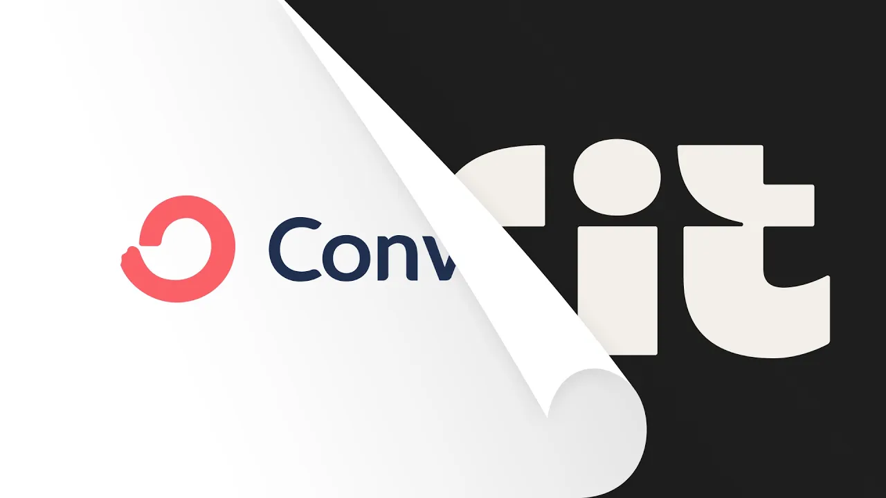
Oh, my gosh. We just got off a call with Koto going through like the final creative share of all of the elements we've been finessing the details on for the past many weeks. They showed us this one slide of like our brand before as ConvertKit and our brand now as Kit.
And I honestly nearly cried seeing it. It's all this hard work coming together. It's our vision coming to life, and I'm just gonna be so proud to work on this brand, on iterating it and evolving it and like making it known in the years to come.
Oh, it's been, yeah, it's been a long process to get here, and I'm really happy. Now, we just gotta get a life to the world, I guess. So what's coming next is you are gonna get to see in the next episode what this brand looks like and our product, what it looks like on our website, as well as some like last little bits we're finishing up, like designing a custom font, defining this really cool and creative illustration style.
And so I'm excited to show you how it all comes together.
![I Replaced ALL my ADOBE APPS with these [free or cheaper] Alternatives!](https://img.youtube.com/vi/5EfqHg49kMk/maxresdefault.jpg)