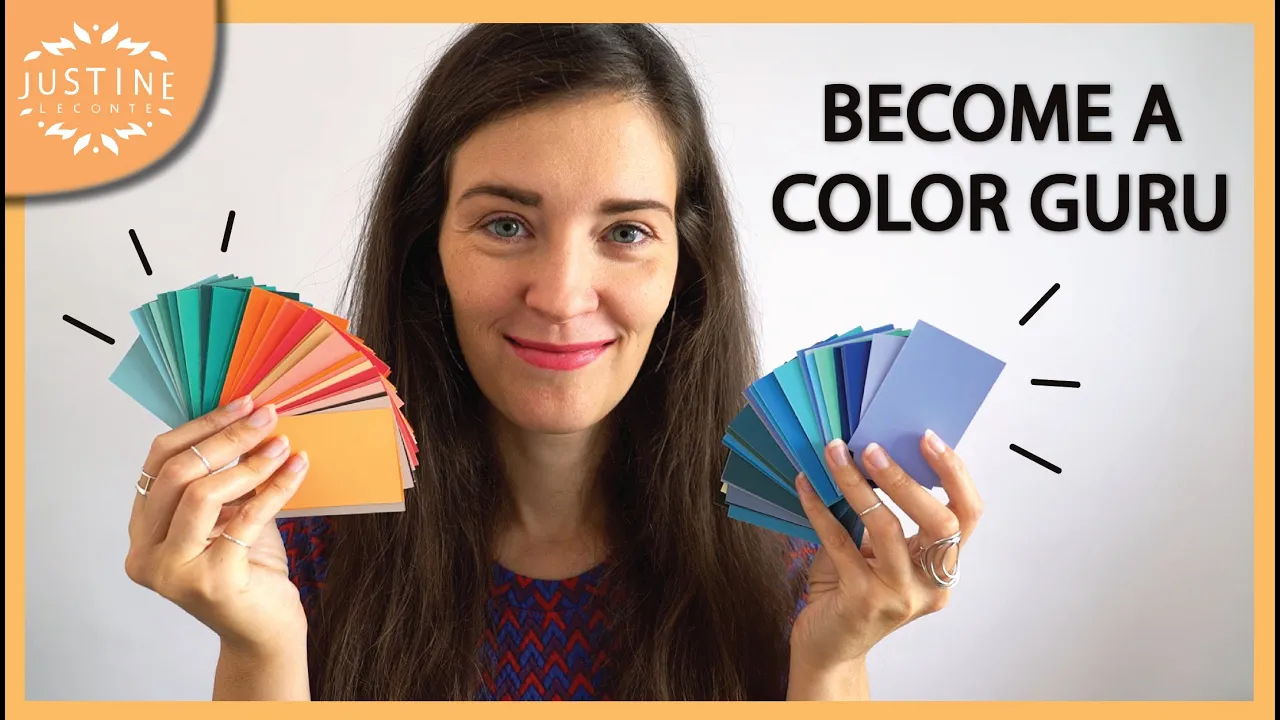
hi everyone it's Justine i want to talk to you about color when you see me here the first thing you notice is color before you're able to tell what i'm wearing or which material that might be color is essential in the first impression that you make on people not just what the color suggests but also does that color suit you this video is the first of a new series on this channel all about color i will teach you when demonstrate how to recognize a color and say whether it's warm or cool so whether it will
suit you or not how to build a color palette for your wardrobe that suits and flatters your skin undertone what to do with black white and gray how to wear and combine the so-called neutrals in your closet and a lot more if you're interested in this topic subscribe to my channel because there is lots of useful knowledge coming your way for today's video i want to show you and teach you to recognize whether a color is warm or cool not just the six basic ones with several tricks first off when you choose a garment a
color it's recommended to match that color to your skin undertone so the rule is if you are cool toned you should wear cool colors and if you are warm toned you should wear warm colors if you do not know right now whether you're cool or warm or maybe neutral there is a video on my channel linked here and also down below in the description to help you find out very quickly what you are the problem is when you're in a store and you pick up a garment it's not always easy to say this is warm
or this is cool and the exact color that the garment has you'll try it on and you might be wondering does that look flattering what kind of color is that exactly the good news is recognizing cool from warm colors it's just a matter of training and we're doing this right now let's start with the basic color wheel blue yellow and red are the three primary colors which i prefer to call hues then if you mix red plus blue you get purple blue plus yellow makes green yellow plus red makes orange purple green and orange are
the three complementary colors now from here to here we have the warm hues yellow orange red and from there to there the cool hues purple blue green if you take orange it's in the middle of the warm range right it's red mixed with yellow both are warm colors so orange is very clearly warm but let's take purple that one's trickier because purple is kind of in between warm and cool it's a mix of blue which is cool and red which is warm if i add a bit of red to my purple my hue turns into
red purple if i take the same purple and add some blue it really turns blueish you can see how the red purple contains more red and the blue purple contains more blue so red purple is warmer than blue purple but all this is purple so if you ask me is purple a warm or a cool color my answer will probably be it depends if the purple that you're looking at containing more red then it contains blue or the other way around that's the actual question by the way you hear celebrity stylists red carpet stylists say
jewel tones work for everyone that depends too i would say purple pure purple really fifty percent red fifty percent blue really in the middle is a jewel tone you could call it neutral because it's in between warm and cold however the actress you're dressing for that red carpet gala probably is more cool or warm so instead of not making any decision and going for the middle ground work with undertones that's what i would say at least and go really towards one or the other so that the skin of the person will glow and stand out
a lot more in the dress same thing for green it's in between yellow which is warm and blue which is cool so they are warm greens and cool greens so is the green that you're looking at closer to yellow or closer to blue okay so far we have the three primary colors the three secondary colors these are the basic six apart from purple and green which are kind of on the edge the other four can be clearly categorized into either warm or cool most of the time the problem is when you start mixing hues not
in equal proportions to each other or when you start mixing more than two together then it gets more complicated to say which color you're actually looking at and therefore whether it's warm or cool they're also more than six colors in real life right so typically this set has 314 i'm going to be using this one in a minute and designers also use bigger ranges than that so this is the pantone color guide for fashion so for fabrics this is the one that i use in my job it has many many more options let's take this
dark brown as an example is this warm or cool if it's cool then it should contain more blue if it's warm then it should have more red in it that's why i'm putting a red and a blue next to it seeing the three like this you can tell that the brown is closer to the red than to the blue so this brown belongs in the warm spectrum brown could be either cool or warm but this one is warm conclusion when you put your hue in between a red and a blue of similar intensities i would
say it always makes it a lot easier to see whether your hue goes towards warm or towards cool it's a very easy trick if you don't know where to start and it works most of the time another example this is a blue green so in theory it's a cool hue which which it is blue and green are hard to differentiate for the human eye and also culturally they are languages where blue and green are the same word for instance in vietnamese correct me if i'm wrong i think you say the same word and then you
have to specify is that the blue of the sky or the blue of tree leaves what happens if you add white to that hue you get a sort of aqua green color and if you add black to the hue progressively like this it becomes a sort of dark blue with a touch of green these five cards have the exact same hue that's why i call them hue and not colors these are five different colors but it's one hue and therefore the same temperature they're all cool the only difference is that in one direction i'm adding
white and in the other one i'm adding black conclusion adding white or black to a hue does not change its temperature also if you combine these three or these three in an outfit you will have a perfect harmony it's really easy to look at it's the same family it's easy on the eye you could also pair these with white all the darker ones with black also very easy if you're looking for color palettes that look harmonious this is absolutely the way to go you will hear people tell you things like oh you look so well
put together and your outfit looks so cohesive no matter what you're wearing it's only about the colors but i'll go into more details about building a color palette for your wardrobe in the next episodes of this series what about kakich there are many different khakis this is khaki these two this one too if you saw any of these individually you'd probably all call them kaki because they all contain some yellow they all feel warm they all are technically warm yet i can still group them and organize them in a way as to see which ones
are warmer than the others i have three that are more yellow the others contain more green aka some blue in it so they're cooler if your undertone is very warm these three khakis that are more yellow will look even more flattering on you than the others it gets more obvious if i overlap the cards in one single row this side is more yellow and that side is more green aka cooler conclusion even within the warm spectrum or the cool one you can still play with temperature if you're very warm toned you can go for hues
colors that are very warm and you will have an even better effect on how much you glow in your outfit i want to show you another example with purple see these two sets they're both purple everything here is purple however this row contains more red can you tell the darker ones are not so easy to recognize and the light ones are also not so easy but somewhere in the middle you will see the difference between this and this card conclusion were you looking at hues that all seem similar at first sight look at the mid
tones and it's easier to recognize the temperature that's it for today thumbs up if you enjoyed this little demo thank you so much in the next episodes i will show you how to create color palettes for warm versus cool undertones if you're interested subscribe to my channel before you go watch the next video in the meantime this one also linked down below is a video about what the colors you wear say about you the message that you're sending to other people's eyes so you can start thinking about which colors you enjoy wearing and would like
to include in your color palette in your wardrobe any question you have on this video or on a specific color that you've seen somewhere let me know in the comments and i will see you in the next one take care bye