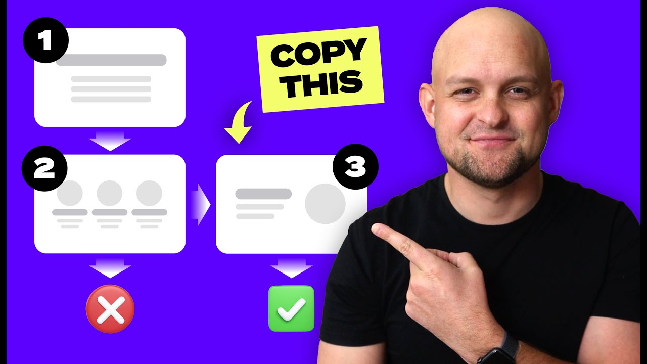
your home page is usually the first impression any new prospect has with your business once they get there you've got about five seconds to either capture their attention enough to keep them scrolling toward working with you or lose them forever so yeah your homepage really is that important but are you making a critical mistake that could lose you that client in this video i'm going to show you the biggest homepage mistakes i see over and over again on websites they can absolutely kill your chances not only that but i'll show you the fix too so
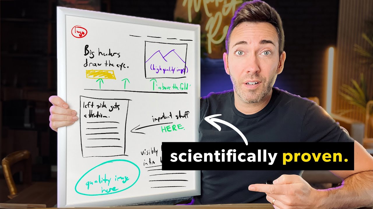
if you apply what i'm going to show you here you'll be able to successfully capture their attention hold it and if you play your cards right impress them enough to win their business okay so let's start right off the bat with capturing attention so the first thing that anyone's going to see when they get to your website is usually this right here it's called the hero section and one of the worst most damaging mistakes that i see over and over again is simply missing the point of the hero section so what is the point of
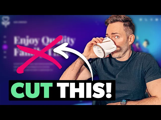
the hero section anyway well it's really simple all it needs to do is tell people what you do why it matters and what they need to do to get it and when businesses get the section wrong which let's face it they almost always do this can happen in any number of ways so the first way i want to bring up here is it can just be super unclear what you actually do maybe the language you're using is overly vague or like this filled with techno jargon that nobody but you really gets like look at this
headline and sub-headline here and i challenge you to see if you have any idea what this company actually does or maybe you're like those businesses who fall into that seo trap where you just keyword stuff your headline to death to the point where you know sure google might pick up on it but when actual human beings land here you know what i mean i'm talking about your clients they're just left cold because nothing about this headline says anything to them there's no benefit there's no real reason they would want to work with you based on
this and another way the business has missed the mark here is making the hero section all about them here's the thing some harsh truth now nobody really cares yet about you or your business they came to your website because they're hoping that you can help them solve some kind of a problem they have not to read you know that you're you're voted uh top dentist or your award-winning or anything like that so how do we fix the hero section i'm gonna give you one really simple formula that works for any service business that you can
use right now and that's to use your main headline to simply state what you do then use your sub headline to briefly say how you improve your client's life it doesn't have to be an earth-shattering improvement this works if you solve any kind of problem for clients whether it's a big life transformation or a smaller problem high class you know what i call champagne problems or even emergencies just be really really clear here because not only will a confused mind not buy it's actually even worse than that if you confuse people at the top of
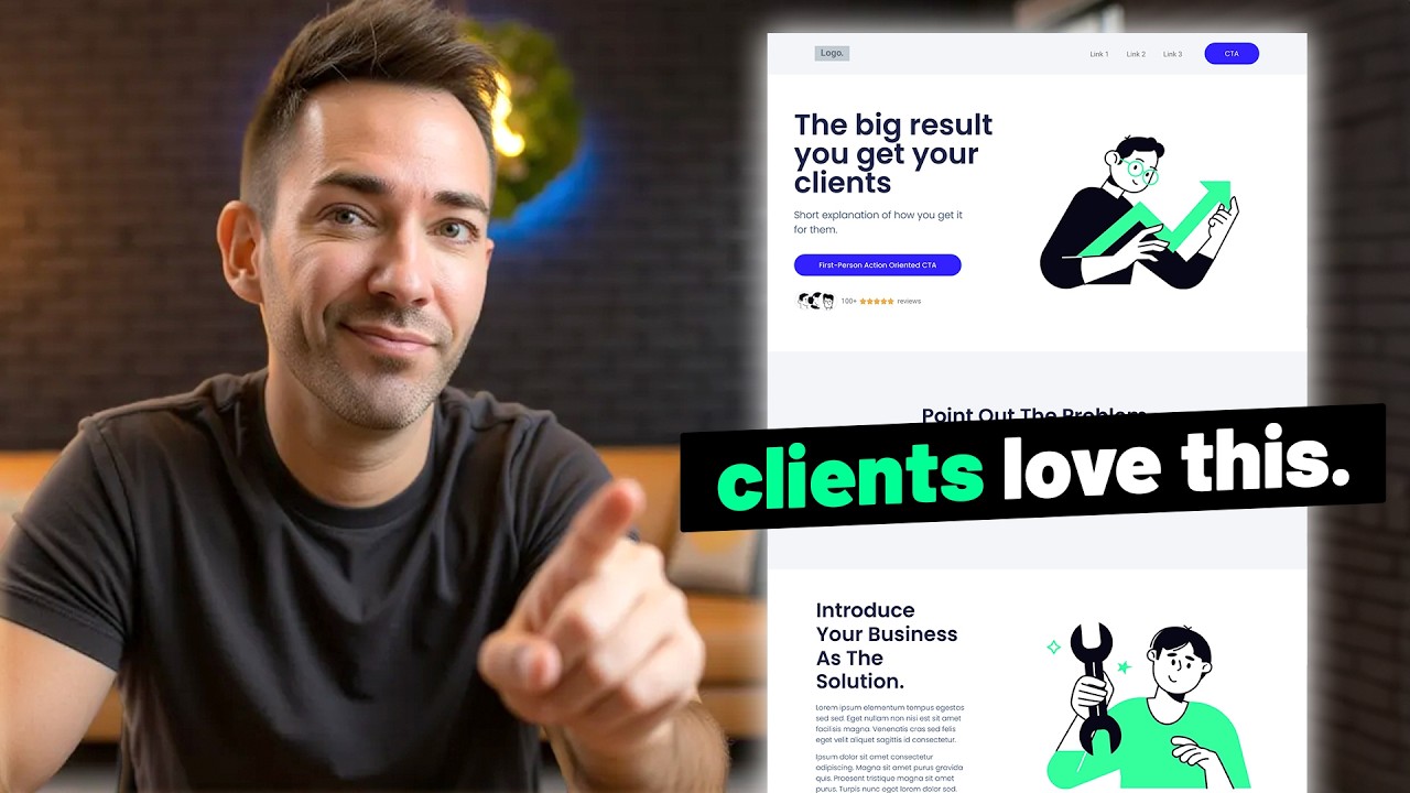
your homepage they're not going to scroll down to get clear on what you do in other words if you confuse them here you will lose them here okay so what is this actually going to look like in real life well let's take our dentist example who has the very uh business centric you know voted philadelphia's top dentist five years running what if we replace that using the formula i just gave you with modern dentistry with a smile from routine cleanings and fillings to full mouth makeovers we're here to keep your smile happy and healthy see
how this hits on all three things again so what we're doing with this headline is we're saying exactly what we provide then here we talk about how that makes in this case their patients lives better okay so now it's time for mistake number two and that is using the wrong images on your website so take a look at this one for instance we're still on our dentist example we fixed the headline and sub headline but the image still needs some work because this particular image is again very focused on the business it's showing the dentist
at work not what the patient is going to experience after having worked with them so this is one way can go wrong i see this a lot another way images can go wrong is by choosing stock images that are very cheesy they're very overly posed they show really unnatural emotions does it check the box of actually showing the aftermath that your client is going to experience it does it does show people meant to represent your clients but in no way does this feel like a real moment in time that was captured this feels very staged
very phony so my fix for this is just to choose better stock images choose smarter so something like this is going to be much more of a slam dunk when it comes to connecting with people because it feels like this is a real moment captured in time right anytime you can choose a photo that feels more natural it's automatically going to connect that much better and by the way there are many places online where you can find photos like this i actually recommend adobe stock and you can just choose their free option they have a
ton of really amazing free stock photos you can use just like this one and speaking of images let's go on to mistake number three which is mismatching those images so let's take a look at a little services section right here you might notice that these three photos don't really look like they belong together do they this one has that kind of instagrammy you know filter on it this one's black and white and then this one's super colorful and vibrant so all you really need to do is just make sure you're choosing images that look like
they belong to the same family whether that means choosing all from the same photographer or just being really mindful of okay do they have the same vibrancy level do they have the same energy level more or less what i'll actually do a lot is if i find the photo i want to use that i know i want to use i will actually just click through to that photographer's whole portfolio on the stock site and see what i can find within that it's much more likely to match up if you do it that way and if
you're getting stock icons you want to avoid style mismatches there too so to be safe just choose from the same icon pack okay so time for our next mistake which involves these call to action buttons so here's the thing when people are coming to your website you want them to actually do something there right like schedule a consultation or book an appointment or even just call you problem is when you make your call to action buttons confusing like right here we have one two [Music] three four call to action buttons and none of them say
the same thing or look the same and that's a big problem and it's one that i see all the time so what do we want to do instead well the first thing you want to do is figure out exactly what you want your call to action button to say specifically you want it to be specific so we don't want something like get started or you know book now is okay but what we'd really rather have is something like book an appointment or book a free consultation something that's very specific that tells them exactly what's happening
next and then once you've got the verbiage figured out what you want to do is make all of your buttons incredibly consistent from one to the next so that means you choose a color that goes with the rest of your website's branding but also stands out what i mean by that is you're not going to use your button color anywhere else on your entire website okay let me say that again because nobody ever listens to that advice when i give it you don't want to use your button color on your logo or on your icons
or on any design treatments on your website just your button and that's it that's going to make it incredibly clear to people that this is the next step that they need to take if they want to work with you and then ideally you want to repeat that call to action and multiple points on your homepage to make sure that once they've gotten enough information and they're actually ready to click it it's right there for them ready to go okay so now it's time for our next mistake and that is chaotic spacing i cannot tell you
how many times i see this anything from you know text being too close to the borders or buttons being too close to the content and again you know just there's just not enough padding here for people's eyes to rest because here's the thing if you don't leave any space anywhere or if you leave too much space for that matter people's eyes are going to tend to wander or they're just going to feel overwhelmed and they're going to get the heck out of there so don't worry though i'm going to show you exactly how to fix
it so what you want to do ideally is you want to give it at least 80 pixels of padding inside of a section so if you're using elementor you just go to padding and i'll just type in 80 and that already looks much better there and then you want to give some breathing room for this button so i'm just going to click that go to advanced and padding i'll give it and i'll just zero out the margin and see what that looks like that already looks better then we also need to give it a little
bit of a margin on the bottom so let's do 80 there see how much more nice and breathable this already feels and then i'll do the same thing right here and that feels pretty nice already okay so time for our next mistake and that is not telling a complete story right there on your homepage so so many business owners what they do is they they make all these different pages i've seen as many as like 50 different pages on a website thinking people are going to click through they're going to read all these different pages
they're going to get what they want you know when they want it which that is a double-edged sword actually what you don't want to do so much is let people wander around on your website on their own because they're going to start coming up with their own story at that point once people start clicking all these other pages and they start going wandering the woods on their own now they're taken out of that path to conversion so what i'd rather see you do is tell a much more complete story on your homepage from top to
bottom now if you want to know exactly how to do that click right here and you're going to want to register for my free on-demand master class i'm going to show you exactly what needs to go on your home page and all the other pages to really tell that story from start to finish so that people get all the information they need in the right order in order to uh become a client so click right here and i'll see you there