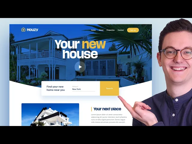
As you probably have seen adobe xd is an excellent tool for designing websites and apps and i always design my websites first in a tool like adobe xd before i build it into a real website because it's just so easy to make changes quickly adobe xd just doesn't limit your creativity compared to when you would start in a page builder for example where you have to know all kinds of technical things to just get started so In this startup guide i'm going to show you how you can create this design in adobe xd this design
has a big header image it has a video button it has a transparent menu it has a overlapping search field text section and a simple footer with a newsletter input field included this guide is designed in a way that it will give you a good foundation for watching any other adobe xe video from now on i did this by making sure that you need to use all the essential Features in order to create this design this guide replaces my old starters guide which was quite popular but it wasn't really a useful design so that's why
in this guide i went with a more realistic design and since we're actually going to create a real project here you also have a cool portfolio item if you follow this video just change up the images colors and fonts a little bit and then you can put it in your portfolio now without any further ado Let's just get started in this first step we're gonna set up adobe xd if you don't have adobe xd on your computer yet you can get a free trial these days or you can buy it i will put a link
to this page in the video description and then just make sure to install it and open adobe xd the first time you open adobe xd you will be welcomed with a screen like this where you can choose the size of your artboard there are some default artboard Sizes for web here but what i recommend you do because this is a little bit easier is to go into the custom size and then pick the artboard size 1400 pixels in width by a thousand pixels in height just put in these numbers and then click on custom size
okay so the first thing that you see is your artboard this white thing is an artboard and that is where your design is going to be if you click on your artboard you can see the settings of the Artboard over here so on the right side you always see the settings of the thing you click on in your artboard and on the left over here you can create things for example you can create a text or a line or a circle so let's say that we click on the circle we click and drag to create
a circle now you can see that on the right over here the settings change so if you go back to the selection tool and you click on the artboards these are the settings of the artboard click on The circle settings for the circle you also have some alignment tools so for example if you want to align the circle in the middle of the canvas just click on horizontal alignment and click on vertical alignment to align something by the way you can move around in your artboard by holding space and then clicking and dragging and zooming
in can be done by holding command or control and then scrolling with your mouse so if you combine that with the space you can Move around to anywhere in the artboard you also have the zoom option over here but using command control and then scrolling is much easier what's also important to know is that you have to create one artboard for every page you design so let's say that this is our home page by the way we can double click on the text to for example make it home and then we can click on the
artboard tool over here and then on the right we can see all of the artboards which we Saw in the first screen our artboard size is a custom one so let's say that you want two pages go back to select zoom out and then hold optional mac or alt on windows click and drag and there you go the numbers that you see over here are the pixels between the two artboards so i'm going to put it right here and then for example we can create the about page over here and i don't know if you
saw it But you also have that for mobile so let's say that you also want to create a design for the mobile version of your website you just click on iphone 13 or 12 pro and there you go so that is really easy to do so i'm going to delete these two by clicking on the title and then pressing the delete key because we're just gonna focus on the home page i'm also gonna delete this cycle and we're gonna zoom in again so we have created an artboard of 1400 by a Thousand because on most
website the main content stays in a box that box on most websites is 1140 and that is a popular size right now so adobe xe has a tool to make sure that your content stays within that box so if you go to the grid over here you can select it and now you will get 12 columns by default don't worry about these numbers the only thing you have to change here is the 79 you have to change that to 75 and this is the perfect size and now we know that Our content should not exceed
this blue line and this blue line okay so now we're set up so we can continue with creating the basic structure so now we're gonna start creating the basic structure if we look at the end result we can see kind of four sections in this website first we have this header then we have a white section with the text and we have two parts of the footer so let's first start with this custom shape so we're gonna go to our artboard and I'm gonna grab the rectangle tool over here and i'm just going to create
a shape like this just make sure that it's from left to the right and make sure that it's also aligned to the top but when you're in the rectangle you cannot move it so you need to click on the select tool again and then move it because if you stay in the rectangle and you try to move it then you create another rectangle which is not what you want and by the way you can Always go a step back by clicking on command z or just edit and then undo alright so here we have our
first basic shape i'm gonna make it a bit longer like this maybe 520 in height but as you can see there's no color and that is because by default the fill color is white and the border is on so there's one pixel of border so i always almost delete the border and then change the fill color to something right now we want something that is a Little bit dark blue something like this but since i've already prepared all of the colors for this project i'm just gonna import my color palette and then we're gonna work
from there so this is the point where you need to download the files i will put a link in the description down below and when you get to the page just click on download so when you've downloaded the files you can easily import it and when you import an image in adobe xd you can just drag it Anywhere you want but don't drag it onto a shape because then it will mask into that shape so make sure to drag it outside of your artboard and this is what makes adobe xd nice that you can have
images outside of your artboard i almost always use this to have inspiration for the project i'm working on so this is not part of your actual design but it is in your adobe xd file all right so now we can click on our backgrounds and we want to use this Color over here and there's a code in this screenshot so the code you can always fill that in in here but what is even easier is if you click on the color picker over here and then just click over here and it will automatically change to
that color and in our final design you can see the nice curve but first let's just create these two because these are a little bit easier i'm going to go to my document but as you can see this document is a lot Longer if you click on the artboard you can see that it's 1680 in height and our artboard is only 1000 pixels so let's just change that also to six uh to 1680 and then we're going to press going to zoom out and now we want to make a duplicate of this one because we
want to create a footer so we can do that in two ways first you can always go to edit and then click on duplicate or what's even easier hold option or alt and then click and drag and it Automatically makes a duplicate of anything you do that with so now you can go to the bottom over here and let's just create our first shape like this and then i'm making another duplicates and i'm also giving that some height and the bottom one has a darker color which is this one over here so i'm to use
the the color picker again click and there we go the background is already white but let's say that your Background is another color because in a lot of designs you have a soft color for the background and what i see a lot of people doing wrong is creating then another shape for the background and giving that a color for example white or gray but then you have to create a lot of extra shapes so what you can also just do is just click on your artboard and then give your artboard a background color if it
is different for this design it's just white so i'm going To go back with command c or ctrl z to white okay so now let's create that cool curved shape as you can see right here so if you click on the rectangle you can move it around if you want to you can make it longer but if you double click you can see these points and with these points you can manipulate the shape so if you click and drag you can see that i can now manipulate the shape i'm going to go back with command
z but you can also add another Point so where is the middle that's kind of hard to know so i'm going to go back to my artboard i'm going to make sure that the grid is on and the middle of my artboard is between these two columns so i'm going to double click on this again i'm going to create a new point over here and i'm going to drag it and then it automatically sticks so you have to zoom in a little bit more to make sure that it's exactly in the middle of your document
Something like this but now it's a point so to make it curved you just double click on this point and then it's curved super easy to do and you can even manipulate it even further if you feel really creative but i'm not going to do that right now i'm just going to undo it and we're going to have this shape all right and the last thing we need is a shape for our image so i can make another duplicate of this one by holding Alt or option and then giving it a different height and the
color for this one doesn't matter because we're gonna replace it with an image okay so the background layers are done so now we're gonna add some shapes on top of it okay so let's start with the play button just click on the circle tool and just click and drag and by holding shift you can create it into a perfect circle first release your mouse and then release the shift that's very important Otherwise it just switches back and now we can align it to the middle of our canvas like this really easy to do and then
we also want to create that little triangle over here or polygon because with the polygon tool you can not only create a triangle by the way i'm holding shift to make it a perfect triangle but you can also increase the tree to for example five over here to create an Actual polygon right now we're going to leave it at 3 and we're going to move it on top of our circle we're going to zoom in and we're going to rotate it if you go with your mouse over here and then click and drag you can
rotate it really easily and then by holding shift again it will go 15 degrees each time which is a lot easier again first release your mouse and then the shift or it's also easy to just change the number Over here to for example 90 degrees okay i'm going to put it in the middle hold shift again to make it smaller like this zoom out it's a little bit too big so i'm going to make it a little bit smaller and then put it in the middle but as you can see right here it doesn't look
like it's in the middle even though adobe xd says that it is in the middle and that happens sometimes with shapes like this Because mathematically it is in the middle but visually for our eyes it's not so here it's okay to just move it with the arrow keys a few to the right to visually make it seem in the middle that's really important i'm gonna zoom out that looks okay and now the next shape that we need to create is this shape let's just do that as well i'm gonna grab the rectangle again i'm gonna
create a shape like this but how wide Should it be well now we need the grid so if you click on the artboard name again make sure that you check on the grid then go to your selection tool again click on the rectangle and then move it and here we can use the 12 column grid to make sure that it's aligned in the middle like this yes it already was and just change the height to whatever you want i'm using 140 here we also want to create this shape for Now so that is the yellow
shape so what you can easily do now is just create a duplicate of this one right now i don't want the position to move so now i'm going to use the duplicate feature so edit duplicate and there is a duplicate you can't really see it but if you go to the layer panel over here i was already in the layer panel then you can see that this shape is on top of this shape it's the exact same as you can see so now if you grab the side and make it smaller And you select the
other one you can see that these are two different shapes this one we want to make that yellow we have that color over here so i'm going to use the the color picker again you can also use i by the way when you hover over it you can also see the shortcut i i'm gonna click i and then click over here i'm gonna turn off my grid again and now we have this it doesn't look pretty yet but this is actually the basic structure that we need for this design okay so now That we have
the basic structure we can actually start adding some content so let's do that in the next step so in this step we're gonna add our first images to bring the design to life so let's just do that so if you go to the folder that i have provided in the downloads below you can go to the images folder and you can find two images over here as you can see these images by the way i got from the internet i always use unsplash.com and pixels.com which i use Very often because you can get copyright free
images here for free so for example if you search for villa you can see the actual image that we're using in this video you can click on it preview it download it and use it in your project it's just amazing so we're going to use these images i'm going to go back to my xd i'm going to open my folder again and make sure that your finder or your explorer on windows is above your adobe xd so you Can drag the images in okay so we're first gonna start with house two i'm gonna click and
drag and if you click you can see that it selects a layer and the layer you choose will be used as a mask so if you release it you can see that that image is already in there super easy to do much easier than most other tools and for our header in our final design you can see that it is not just the image because the image that we're using doesn't have the blue Glow so what i actually did is that i created a duplicate of this layer and then i used some trick to make
sure that you see the layer that is beneath it through the layer that is on top so all you have to do for now is just go over here and then make a duplicate so now you can see that path 1 has been duplicated we're going to open our finder again and we're going to drag the image on top of the top layer all right and now you can See that we can play with the opacity over here so the opacity is the transparency of the image if you put it on zero you cannot see
it if you put it on fifty percent it's you can see half true but they have a new feature over here which you may know from photoshop if you use that and that is layer mode so what i did for this website is i used overlay and then you get this cool effect it looks really good and then you can also use the opacity if you want so For example put it on a 90 percent like this uh you can also use your uh keys on the keyboard by the way so if you press five
it goes to fifty percent but for now i'm going to leave this at 90 percent and the last image that we want to import is our logo so i'm going to go back to my finder i'm going to go to the folder icons and logo and here logo.png it's over here it's a white version so i'm gonna drag that outside of my artboard i'm gonna drag it on top so if It's not on top maybe it's under make sure to open the layers panel so let's say that it's not on top and you cannot see
it just click and drag and make sure that it's on top and we're gonna need the grid again to actually align it so i'm gonna turn the grid on oh it's actually aligned uh oh no well not perfectly no not perfectly now it is and just resize it a bit like this all right i'm gonna turn off The grid again and that's all i want for now so this is how you import images make sure that it's masked within a shape and you can also use opacity and the layer modes to see the layer that
is beneath it and you've also probably seen the other icons inside of the folder and these are svgs svgs work inside of adobe xd these are vector files but they're based on code so they also work on the web so here you can see the adobe ec is really made for The web because if you export an icon from adobe xd you can also use it on the web it's just perfect so in our final design you can see that we have three social media icons over here in the footer the ones in my folder
are black but what's great about svgs is that you can even change the color so i'm gonna do that right now i'm gonna go back to my film i'm gonna go down over here open my folder and i'm going to select All of them by holding shift and then dragging them into my fell and as you can see one is really big sometimes that happens especially when you download different icons from the internet from different places so we could just click on them and then rescale them but also again here make sure to hold the
shifts all right i'm gonna drag in the first one but i cannot see it so you know what i'm gonna Start over here and i'm gonna select all of them and then over here the film i'm gonna change that to white now i'm gonna make sure to put them inside over here and now i need to add the grid again because i don't know if i am aligning it correctly so i'm gonna turn on the grids all right as you can see they're way too big so i'm gonna resize them again this is a great
practice to get to know all the shortcuts so holding shift zooming In with alt with this facebook icon i want to make sure that it's as big as my linkedin icon so i'm gonna make sure that it's the same size you can put it on top of it to make sure that's the same size like this yes that looks good but let's say that we want to resize the three of them we can also select all of them so click and then holding shift and then select all of them and now hold shifts And resize
them so that's easier than uh resizing them individually so now they are a little bit smaller i think it looks a little bit better okay so this looks nice oh and by the way if you want to get your own vector files your icons you can go to a flaticon.com this is a website that i really like especially the interface icons part where you can search for icons over here you can for example only select the solid icons if you want to work with That and you just click on it and you can download the
svgs over here you will need an account if you want to download a lot of them but it's just a great place to to get started so yeah that's another little tip that i have for you okay so let's turn off our grid and see what we have done so far we've imported some images some icons and the design is starting to come to life and before we're gonna add all of the text and make it final i Wanna show you some effects so let's just do that in the next step in this step i'm
going to show you how you can apply effects to your different elements okay so in our final design we can see a few interesting things for example we can see a blur inside of this button over here let's just start with that because that just looks really cool i'm gonna go to my design and we're gonna make sure that we click on our eclipse or our circle but Right now we still have this border over here which i don't really like so i'm going to just first turn that off and then we can just select
the background blur over here it's super cool that this is now integrated in adobe xd we can increase or decrease the blur over here i like to use just a little bit of blur so you can see what is happening under it still and you can also decrease the um the lightness for now i'm just gonna leave It like this you can change the opacity if you want to to make it more towards white but i just like to keep it at zero in most cases and for our little polygon i'm also gonna uncheck the
border and that's actually all i want to do maybe it is a little bit too big so let's say that we want to resize both of them we can select both of them by clicking and then holding shift and then also clicking on the circle and then going to A corner then holding shift to skill them proportionally but if you do that it scales down to the left bottom corner so if you want to make sure that it also skills in the middle hold option or shift as well and then you can skill it proportionally
and from the middle so first release your mouse and then alt and shift so now it's just a little bit smaller it's nice i also want to group it because now if i want to select it I'm only selecting one layer which i don't want to do so i'm selecting both of the layers again by holding shift right click and then group so if you group an element now you can just click and drag and even resize it again which is also nice okay that's the first effect the next effect is shadows you're gonna use
shadows a lot in your website designs uh but especially for things like this it's just really cool so let's just click on Our white layer and since we have not grouped this we only have selected the white layer and not the yellow one which is exactly what we want i'm gonna uncheck the border over here and now we almost can't see it but i'm gonna apply the drop shadow and as you can see now it's a really soft shadow i'm going to click outside of it to see i'll just also uncheck this border this is
what we have right now but you can easily Manipulate it by for example adding a 0 over here and then also the blur we want to also increase that so if you use 30 and then 60 you can see that this thing starts floating it's almost flying which is of course really nice and you can do two more things to make it even cooler the first thing is if you click on the drop shadow you can increase or decrease the uh the heaviness of the shadow you don't want To overdo this just make it very
subtle and the last trend in web design is colored shadows because shadows are not just always black so you can also change the color of your shadows so let's just go to the blue that we already have and let's just make the shadow dark blue like this and maybe increase a little bit do you see how cool that is that is so much cooler in our final design you can also see it it's not Fully black it's a dark blue and it just fits perfectly it's so nice so i think this is what we want
maybe a little bit more color like this that is starting to look really really good okay are there more shadows in our design i don't think so so we can move on to the next effect which is rounded corners in our design you can see a lot of rounded corners you can see them over here you can see them in our image so Let's just first do that with our image and it's this option over here you can just click it and then move your arrow keys up to see the difference so for example i'm
going to use 10 over here 10 pixels rounded corners super nice and let's just also do that for this white layer i'm going to also add 10 pixels over here but it only applies it to the left over here and why is that well that is because this yellow yellow layer is on top of it so if you move this you can See that the rounded corner is applied but this yellow corner is on top of it so we also want to apply the rounded corners to the yellow one let's just do that but then
we have this problem over here because the corners are also rounded over here and in our design this is what we want so how we're going to do that is by using this option over here and here you can change the individual corners so if you Click you can see in what corner you are so here we want to use zero so now all of the corners are rounded but this corner is on zero we want to keep this at 10 10 and then this also on zero all right that looks awesome now looking at
our final design i can see that i forgot to explain one thing in the last part i'm sorry but as you can see this image is cropped in a different way because this House here is a lot bigger than this house so what you can do is on your top layer so we have two layers over here remember on our top layer we can double click it and you can actually change the image inside of the mask without the mask changing just replace it to something like this and now our image is in a different
position okay so now you have learned some common effects that are used on the web and now we can move to the next part which is Actual text contents okay in this part i'm going to show you how you can add text elements it's not really hard to do but there are some things that you need to know all right so if you want to have the exact design as i have make sure that you install the fonts that i have provided in the fonts folder so install them on your computer you don't have to
restart adobe xd in most cases it will automatically see that it's installed on Your computer so if you have those fonts installed we can start creating our first text so we're going to grab the text tool over here i'm gonna click anywhere it doesn't really matter and we're gonna type your new house we are now inside of the text tool but we wanna select it and make it bigger so we're gonna go back to the select tool and we can just click and drag on this little circle over here and Make it really big like
this okay we first want to make it white so we're going to select a white color from the fill over here now we want to change the actual font so you can do that over here the font that we are using is eurostar okay so let's now see our final design and why does it look so different well that is because i've also used this feature over here which is called character spacing and character spacing is the spacing between each character so For some fonts that makes it look nicer so i'm going to use -60
over here and now you can see that it looks completely different it's on one line so you can just double click and use enter or break to get it to the next line but that is not the perfect way to work because then it's harder to change afterwards so what i'm gonna do is i'm gonna go back to the select tool and not use this one which for titles that means that it's on full width but i'm gonna click on fixed size Then you will get a text box and you can make it into a
text box also in our final design you can see that there's a lot less space between the lines and you can do that by decreasing this number over here which is the line spacing so for example make it 110 all right oh in my design i have not used capitals everywhere like this and now this is left aligned so we can easily middle align it like this put it Where we want make this box a little bit smaller so we can still click our play button move things around a little bit okay now let's make
this new the yellow that we have used before and we can constantly if we want to use the fill option over here to just edit it like this but this is a good moment to show you an amazing feature in adobe xd and that is the asset panel on the left over here you can click to open It document assets it says and you can add colors character styles you can add a lot of things so and what this allows you to do is to add colors to the asset panel so if you click on
the yellow over here and you click on color plus then it adds this color so whenever you want to change something to this color you just for example i want to change This triangle and you click over here then it will automatically change that color and what's amazing about this tool is that when you change the color from this side over here then it changes inside of the whole document which is exactly what you want when you have a whole big document you don't want to click on 100 000 layers you just want to be
able to do that from one place so so always make sure to add your colors to the asset panel and then add them from There when you have new elements for now i'm going to put this back at white so i'm also going to add white to the color palette and i'm gonna click on my triangle and i'm gonna make it white all right let's now add this part which is also not very hard to create this is a title with the same font eurostar and it is a text field with another font dm suns
so since i've already applied the character spacing on this font i'm gonna use this as a basis so i'm just gonna go Over here i'm gonna change this text layer to a different color which we have on the panel over here and of course we also want to add that color on our color panel on the left so we can easily select it and here we cannot hold shift and make it smaller we have to use the numbers over here you just go back to this tool and then just grab it if you think that
that's easier all right i'm gonna make that a bit smaller i'm gonna left align it Gonna change the text and now where do we align it we're gonna turn on the grid again as always and i'm gonna align it just over here and i'm turning off the grid again by the way i'm selecting the artboard by holding command or control and then clicking on the background not on a layer that doesn't work but if you click on the white background then you select the artboard so that's a little trick if you don't want to zoom
out all the time all right so i'm going to Uncheck the grid so i'm going to click on the text tool or click on t and then create a shape so if you click and drag you automatically create a text box and here you can start typing your text there is dummy text for designers which is called lorem ipsum so if you search on google for lorem ipsum you can find a lot of websites that provide this for example this one you could just select a text like this Right click copy go back here to
your design tool and just double click and paste it you can just right click and paste or press comment v or ctrl v and then the text box is in here so we're going to change the font to something else we're also going to change the size we don't want the character spacing over here and we also probably want a different line spacing for our main text maybe 26. uh The bold one is also not what we want we want a regular one and this is starting to look a little bit nicer and now the
whole text that we copied is in here so if you want to reduce that you can click on this text box option over here and then you are able to decrease it in order to make the text a little bit shorter so the text is still in here you can see that by this this dot this red dot because if you double Click it you can see the text but you have just decreased its size maybe i'm going to add a break over here to make sure that that is just out of frame and just
like that we have a text what is nice for text layers is a color that is a bit softer so for example this color it doesn't need to be too light but it should be a bit softer than the text so it creates some nice balance as you can see Super nice and of course i'm also going to add that color to the asset panel in our design we also have this little rectangle over here you already know how to create it by now so i'm just going to zoom in i'm going to give this
a little bit of room grab the rectangle and just make a little shape like this just make sure to select the yellow color and unlink the border i need a little bit more space as you can see by the way if you have trouble by Keeping it on the same line you can also hold shift so it stays on the same line that's a really easy trick that looks nice okay so let's zoom out and uh let's now focus on the next text layers for example this one this is a smaller version of what we
see over here that's really easy to do i think we can go a little bit faster now i'm just gonna make a duplicate with option and i'm just going to decrease this size Like this i'm going to left align it i'm going to change the text i'm going to make it into a text box so i can decrease it like this i'm gonna add a little bit more line height like this i'm gonna select one word and make it yellow like this and that was it super fast to do okay let's now add another text
which is this bottom one it is the same style as this text but it has a different Color so let's just do that right now i'm gonna duplicate this whole layer like this i'm just gonna create one word which is an email address we don't need this whole text box now so what you can do is then go back to your normal auto with option i'm going to turn on the grid again to align it to to the side turn off the grid again and now i want a different color because as you can see
it's too dark and the color where we're going to use is this lighter color over Here a4 like this looks super nice and we're going to add that to the color assets panel as well okay let's now focus on this part i need one font over here with a few different colors and a white one over here in the font dm sense so i'm just gonna create i'm just gonna grab the text layer over here i'm gonna type something like this I'm gonna make a text box of it again like this make it a bit
bigger change the color change the width over here two bolts making it a bit bigger and increasing the line height to make it just look nice that looks alright where in new york i just do that as well where okay for this part we need a light color a darker one and a line so let's just create that i'm gonna use the lighter color over here i'm making it a Bit smaller i am not using bold but i am using regular by the way you can also press comment or ctrl b in order to make
a text layer bold and switch between bold and not bold so now i'm duplicating it by holding alt this one is bold and it's darker and it says the name of the actual place new york i'm adding a search over here in white make sure to first select it and then click on the white align it in The middle perfect and the last thing we need to do is add this line over here and we can just use the line feature you can also grab the rectangle but if you just use a line that is
a few pixels in width you can easily do that like this holding shift by the way to keep it on one line first release your mouse and then the shift and since it's the line it has no fill option but it only has a border option so you cannot select your asset Color from here but what you can do is just grab the the the dropper over here and then go to the color that you want like that doesn't that look nice and of course you can spend a lot more time on the alignment to
make it look even nicer and now in the last part we're going to create text layers to create some buttons and to create the menu and we're going to use some new tricks again to achieve that result in this step we're Going to create buttons and a menu by using two new features called padding and stacking let's look at our final design and let's start with the menu so over here we can see we have four menu items which are floating and one button and what's great about this menu is that let's say that you
want to change this about to about me then automatically the home moves as you can see so you don't have to reposition everything which is perfect so i'm going to show you how you Can do that so we're going to go to our design and we're going to zoom in so let's create the first menu item i'm going to grab the text tool again i'm going to type in home over here it still has the dmsense font which is perfect for menus i like to use 15 in pixel size and i'm using the white color
we want to bring it on top if it's not on top right click and bring to front so then it will become the top layer and then we're Gonna hold alt and we're gonna create a second item which we're gonna call about properties and contact okay so the first thing you want to do is make sure that it's a group because right now these are individual layers and you want to move this thing around so i'm going to select the first one hold shift and select all of them then right click and group now it's
a group we can also see that Within the layer panel as you can see group let's just double click and call that menu so it's better organized than this mess that i've created over here so now what you can do is uh select this stack option over here on the right and if you click on that then adobe xd sees that it is a horizontal stack if you put it on vertical then the items are stacked vertical so adobe xd can see what you're doing You know okay so if you put in a number over
here then it will use that spacing between all of the items so i'm gonna use a let's just try dirty for now that looks pretty nice so if you then for example change properties to uh my properties you can see that it automatically adjusts because it keeps those 30 pixels between all of the items which is exactly what you want but now the menu moves to the right which is not What we want we want to move it to the left because if we have a button on the right over here we of course don't
want to move towards the bottom we want to move from the bottom so then you need to select all of these layers and make sure that the text are right aligned all of the text layers the individual text layers not the group but the individual text layers and now if you change it let's say that you change it you can see that it will move to the left which is What we want okay so the stacking feature is great to do that the stacking feature by the way is also great to change positions so of
course you can change the position from the menu over here like this and then change them but you can also just click and drag like this and it will it will stick in position that's perfect okay we're going to move this a bit to the left because we need some space for our button i'm going to Turn on the grid by selecting the background and then turn on the grid we need more space for our button i actually want to use one of these layers as a starting point so i'm going to select one of
the layers by clicking and then double clicking it or if you want to move faster you can hold command and then click and you will go through all of the layers to the actual thing you're clicking on so i'm going to copy that and click outside of the group And then paste it outside of my artboards and now it's over here and then i'm gonna move it sign up like that all right so now this is not part of the group menu but it is over here now we want to grab the rectangle again and
create a rectangle open the asset panel make it yellow delete the border and now we're going to increase the rounded corners you can do that over Here by the number like i showed you but you can also grab these corners and just make it fully rounded like this now we want to move it beneath the text layer so i'm going to open the text layer make sure that it's beneath it we want to group this because we want to grab the button so i'm going to click on the text layer and then also by holding
shift click on the uh the rectangle and then first i'm going to align it in the middle because it's not perfectly Aligned as you can see so i'm first gonna click on this option and then also vertically align it so if you select two layers it's gonna align the text layer inside of the rectangle which is perfect and now i can group it perfect and now we're going to use the last option that i want to show you and that is padding this is such a great feature for buttons because now it will keep 10
pixels on the top and in the Bottom and it will keep 34 as you can see on the right on the left and on the right so now if we change the text inside of this button so let's say i'm changing it to sign up now the button will automatically change in size which is perfect because otherwise you have to constantly make the button bigger this is how it was before but this is just a great feature for buttons so that is what you want to do i'm going to go a step back I'm gonna
align the menu you can also make sure that it's picked 30 pixels you can see that by the pink numbers or you can also hold alt and then you can see how far it is from the button okay perfect oh but the first thing that i see is that the logo is much lower than the menu so i'm gonna select my menu and select my button by holding shift and then making sure that it's aligned to the height of our logo okay That looks a lot better okay now i also want a button over here
let's just do that i'm gonna click and drag by holding alt like this i'm gonna align it to the left of the text i'm gonna change this text to explore more oh but now it's going to the left i don't want that so let's go step back we're first gonna make sure that it's left aligned and now if we change the text it will go to the direction we want and there's also a Button over here but we already of course have that from the top so we're just gonna use that button and just place
it in the middle over here align it perfect all right and the last part is this this input field we're gonna use the stroke feature to do this so i'm gonna make a duplicate of my signup button like this i'm gonna make it a lot longer oh that doesn't work why does it not work well because the Padding is still on so it keeps that space so i'm just going to unlink this and make sure that this has the length that i want like this now i want to add a border but i don't want
to add a border to the hole button i want to add a border just to the rectangle the yellow rectangle inside of it so i'm just gonna add a border like this the border needs to be white 100 white and then the fill needs to be off And now it creates an input field perfect all right i'm gonna align this to the left and change it to your email oh it's right aligned i'm gonna left align it like this perfect so visually we are done now but there is one more thing that is really essential
to know about adobe xd that will save you so much time so that thing is what i will show you in the next step okay so In this step we're gonna talk about components because as i showed before with the colors it happens a lot of times in a design that there are repeating elements for example like this button or the text box let's first start with the text box because in a normal design the normal text layer is used in many different places in this design it's only in this place because it's a simple
starting design but the normal text box is used in so many places so What you want to do is you want to also add that to the asset panel like this and then when you have multiple text boxes on different pages and you change it from here in the same way as the text color it will change in different places which is exactly what you want but the component feature is even more impressive because with buttons we already have three buttons on this page which have the same styling so instead of duplicating it like i
did what you Actually want to do is use the component feature and a component feature is kind of like a template for a specific style so let's just rename this to button and now you can see that this green border shows up with this little diamond and this diamond shows that this is the main components and all the other ones which i'm gonna create will kind of like be the the daughters of the mother component so instead of just creating a new button You shouldn't actually do this just delete it and drag it from the
component panel over here but in the master component or the mother component the text is right aligned but here i want the text left aligned that is fine to do because it will not change the master component it will just change this version so let's just change the text over here explore more and let's delete this one and drag it From the component section like this okay so now if we are going to change this master component by the way if you if you forgot what your master component is you can always right click and
click edit main components oh they call it main components master components mother components it's all the same thing but if you change this master component sorry whatever For example you don't want all the rounded corners you change the master over here and then you go to your other buttons and they will also change so it doesn't matter that you have changed the text over here and put it on left align but if you change other things in styling such as colors or rounded corners then it will change in all the places which is exactly what
you want so this is just a feature in Adobe xd that i want you to know before you start actually build bigger things in adobe xd for now i'm just going to put it back and then it will also change these buttons it doesn't change this one of course because we have not used the component feature but for input fields you want to add another component because this is kind of like a different style it's not even a button so you want To use different components in your website for example this is also something you're
going to use in a lot of places so also just make sure to make that into a component just call it social icons and whenever you need that just drag it from here and then put it on another page so let's say that you want to delete instagram it will also do that on all the other pages as you can see right here so that was another thing that i just wanted to show You real fast because it just makes your life so much easier okay so now you know how to use the component feature
but let's say that you want to share this design or export your design that's also really important and something i think you should know so that's what we're gonna do in the last step in this step i'm gonna show you how you can save export and share your design all right so we are happy with our design it looks beautiful and we wanna Share it but first of course we need to save it you actually need to do this a lot earlier but right now if you have an adobe xd cloud account it will save
it automatically in the cloud we just call it uh you know something like this so you don't have that problem like you you had before where you forget to save your document and everything is lost because it's already saved within the adobe cloud but i don't use either adobe cloud because i use dropbox maybe you use Google drive or box or whatever so if you go to file and then save as a local document so then you can save it wherever you want on your computer and this will be saved as an adobe xd document
so let's just do that i'm going to call this home design version one gonna save it in my documents now i wanna open my documents and here it is an adobe xd file really easy but you Shouldn't share this with your client because maybe your client doesn't have adobe xd and even if he has then he has to install all of the fonts because the fonts are not saved in the file the fonts are saved on your computer so you don't want to share this file with your client i would never do that so what
you want to do is you want to use the sharing features in adobe xd because they also have thought about some super cool options to do that the first option That i want to show you is to click on the play button over here and this will create a kind of real looking version because you can scroll inside of your website like it's a real website and the way it defines the height of this window is by this blue line right here you may have seen it already but you can change it it's the viewport
height So let's say that you're gonna put it at eight hundredths like this and you click on play you have this little preview and what's great about this is that you can just click on record over here i'm not going to do that right now because i'm recording this and then my video will probably crash but you can click on record and then it will create an mp4 file which you can put on youtube or just send to your clients via dropbox or or Retransfer or whatever and that's just great to um to show what
you've actually created but if you want them to scroll through your website you even have another option and that is the share option over here so if you go to share you have a few options if you want to work with clients i recommend the design review one if you then click on create the link it will create a link uh which you can share and they can open it in their browser they don't have to Have adobe xd they can just click on it they can scroll through the website and then add even comments
on it which is so cool you can even share it with a developer which will then show some code on the side you can test these different things the presentation is a new feature i haven't tested that but i mostly use the design review feature there's a last way and that is to export your design to a jpeg do i recommend it for sending it to clients no but sometimes you just Want to have an export as an image file on your computer so you can do that by making sure to select in your artboard
that you want you can also select multiple artboards by holding shift then go to file export select it and then you can export it to png uh jpeg pdf svg i do not recommend for whole artboards but i would do jpeg because these have the most colors and just call Them i don't know home export v1 and just export it like this and then it will create a file this file will have the exact same size as your adobe xd so if you think that this is not sharp enough because it's not really sharp as
you can see you can go back export selected and export size put it on 2x and then it will double all of the pixels so let's just try that i'm Gonna click on the other name and call it v2 export it and go and as you can see now it's two times as big looks a lot sharper even if you zoom in you can even create a prototype if you want to with the prototyping tool where you can connect the different pages different artboards to each other with the link tool as you can see right
here But i decided that that was too much for this starters guide but always explain that adobe xe is just a design and it's not the real website because if you want to build a real website you have to use other techniques and other software some people think that adobe xe can do that but adobe xd is just for design so if you want to learn how to build a real website from an adobe xd design like this then you can sign up for my course about elementor pro where i teach how to Do that
and another thing that you might want to learn is how to come up with designs like this yourself i use a whole design process for this with different steps so that i'm sure that i always get a great design that i like and my client likes i'm also working on a course about that so you can sign up for that course on the page and i will email you with information about the course so i hope that you have a feeling of achievement after watching this video because that Just makes me happy and if you
did then please let me know by leaving a comment down below i want to improve my content as well let me know what you like and disliked about this video and not only for me but also for other people to decide whether they want to watch this video or not and if you want to learn more about designing building and selling websites to clients then check out my channel because i have a lot more content about that and then i want to Thank you for watching and hopefully i will see you in another video on
living with pixels [Music] you