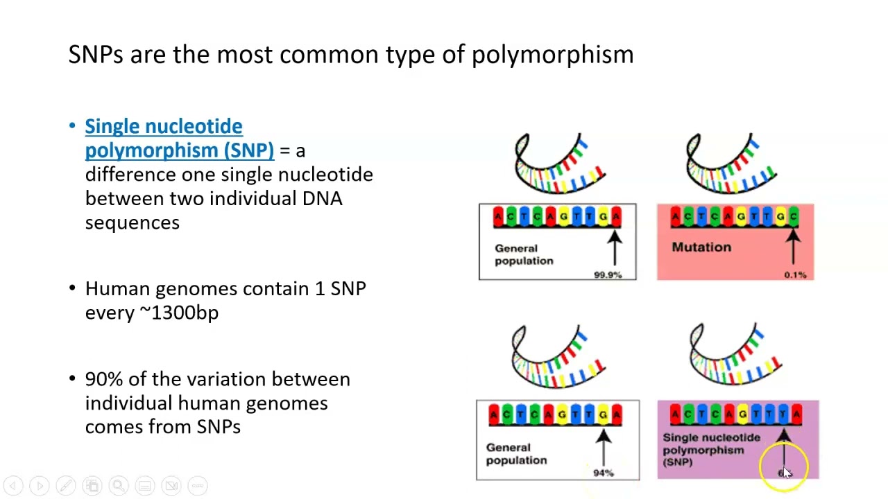
hello everyone welcome back to the genomics bootcamp we continue today with our lecture series on introduction to genomics this time it is about a very popular subject genome-wide association studies or a very often used abbreviation jivas before we go on there is a bit of a refreshment from previous lectures and also about the topics that will come handy in the understanding of the topics we will be talking about today so we continue to talk about snip markers that are widely used and in my opinion currently the most important marker types when it comes to genomics in livestock but also in other species there is an important concept which is the linkages equilibrium or in short ld that characterizes the degree of relationship between nearby loci it is basically the correlation between nearby loci and it expresses how strongly they are connected to each other or in other words how frequently they are inherited together this has of course a major role and major influence in various type of genomic analysis and it actually helps to end the interpret many of them the common way to express the linkage this equilibrium is with the squared correlation coefficient or r square which ranges between zero and one and when it's zero there is no ld between the two low psi and when it's one there is a complete ld and of course there is a range of possibilities in between now when it comes to jibas this is the first of the methods that we speak about in this lecture series which could be used to actually find something so we can look at the genome as a big puzzle game where we want to find out which parts of the genome are influencing which traits or actually how the entire genome is working as such now of course this is not easy and one can compare it to a situation when we are searching a needle in a haystack i would argue that this is not the case because at least when you are searching for a needle in a haystack the two things are actually different there is the needle and there is the hay and there is the two of them that are clearly distinguishable from each other in our case we are actually searching for specific sequences or their effects which is basically searching for specific nucleotides and specific mutations in a sea of other nucleotides so the metaphor of searching for a specific needle in a stack of other needles is more fitting in this case in my opinion so there is plenty of things to do plenty of questions to answer so if you want to dive into these topics there is certainly a lot of things that you can accomplish when we come to the genome-wide association studies these are certainly one of the more popular aspects of genomics here i would like to underline once again the importance of ld this is because we want to find out the characteristics or the functions of parts of the genome based on snip markers but we know that the steep markers are the mutations that we can see and detect but these are not the causal mutations so we are in fact not very interested in them as such we are just interested which parts of the genome they highlight for specific analysis the regions or genes that are influencing the productive reproductive or functional or any other traits are in there somewhere and we are really interested in these ones but we cannot see them directly so what we do is we use snip markers that might be associated to these qtls or genes and basically based on these associations we try to find out which regions of the genome are interesting for us hence the name genome-wide association study the desire to know which parts of the genome are influencing certain traits is not new and there were some studies done previously also on this aspect these were done until recently with studies with limitations or candid on candidate genes or regions which sometimes worked out sometimes not so much so i would describe it more or less as a hit-and-miss approach certainly there were some great advances and the new knowledge generated but these were kind of limited to the genes of relatively large effect but because now we have the opportunity to genotype entire populations so lots of individuals for a reasonable price what we can do is screen these populations for a range of trades and learn something about them because of these snip chips we have tens of thousands of snaps that are covering the entire genome which also means that these slips are basically with ld with all the parts of this genome so basically we could find in theory all the genes that are influencing any of the traits of our interest please note that i used the term in theory because of course there are limitations what you can achieve but in theory if you have dense enough markers on a large enough population then the possibilities are of course great so with geos we search for regions that influence the phenotype of interest this could be done based on snips or sequences or also other markers and based on the location of these associated markers we can look up what genes are in the region for which i often use the expression hunt for genes of course in an ideal scenario we identify the regions perhaps with markers and then sequence these regions to find out the exact notations or the exact genes that are influencing our trait of interest this is a so-called manhattan plot and this is a typical way how you visualize the outcomes or the results from ajiba study so this is from the cattle genome so that's why we have these many chromosomes here but basically what you see that these chromosomes for on each of these chromosomes there are many of these dots each of these dots is a snip or a marker on the y axis is basically the significance value but in this case or it's very conventional to put the significance values in this form so minus log p value the reason for this is because well we know that the significance values range between well basically zero and one but the ones that we are really interested in are the very low p values a standard threshold is a 0. 05 so any p p-value below 0. 05 is considered to be significant and therefore of interest of course the lower the p-value the more significant it gets and therefore it is also of higher interest to us i don't have visualizations of real p values here but it would not be also a pretty picture because all the interesting stuff would be pushed on the very bottom of the picture and we could see hardly anything that's why the p values are transformed into a minus log p format and this actually causes that all the unimportant snips are in the bottom of this picture and the higher we go or the higher value it gets the more interesting and more important it becomes so you see that there is some kind of a threshold here and this threshold is actually identifying the significant snip so we have some signals here so this is a quite a large signal in this particular case on chromosome 6 but also there are some other interesting or potentially interesting regions so right now don't worry about the threshold we will explain everything later in this video in here i just wanted to show you how such a manhattan plot looks like as i mentioned the linkage this equilibrium is of high importance also in cuba studies because what we have on the genome are such ld blocks so for example if for example this snip would be significant it doesn't mean that the causal gene is somewhere just below the snip it could be technically anywhere in this ld block so that's why considering the surrounding regions around significant snips in a jiva study is really important so there is a lot of materials about the g watts itself and i took this one from the plus computational biology to demonstrate something about the possibilities and trades that are detectable by the g was approach now our possibilities are influenced by two things and one is the allele frequency so in other words how rare or common certain mutation is that we are after and also what is the effect of this said mutation so well there could be mutations that are really rare so they are in a very small proportion of the population and some mutations could be really common that are in 5 10 20 50 of the population on the other side there is the effect size and these are well just very much relative numbers but basically what it means that any particular mutation could have just a tiny tiny effect on the trait of interest so it's hardly detectable so even if this mutation is present for example a human height is a very good example in this for example there is a very tiny mutation that increases the height of a person by 0.
5 millimeters so yes it's an effect but this effect is really really small on the other hand there could be mutations for which the effect sizes are really large and it actually makes a really large difference if the mutation is there or not in certain individuals here we could mention for example genes that are influencing the fat content in the milk of dairy cattle or for example certain mutations that are influencing the twinning rate in sheep when it comes to gbos the combination of allele frequencies and effect sizes is really important so it is really problematic to detect mutations well with jivas anyway so it's really problematic to detect some things that are really rare in the populations and have a really small effect size the g was itself is really good to detect even small sized effects but the occurrence should be relatively frequent so the earlier frequency should be towards the more common ones in the population of course as the effect size of certain alias permutations are increasing we have a better chances also to detect them even if they are relatively rare in the population the other side of the spectrum are the mutations that could be super rare but have large effect sizes in here we are basically talking about qualitative traits and these could be even mendelian mutations so when occurrence of a single gene effects the occurrence of the trait in the individual so you see this is a well fairly old picture already but even then it just demonstrates i think very well how popular jiva studies are in general so this picture basically summarizes jiva studies in humans and well also in their in human disease studies so these are the respective chromosomes and you see that there are a bunch of these colorful dots basically on each and every chromosome in basically each and every region along these chromosomes so there is a small legend here that also tells us that these colorful dots are not even for specific diseases but even this is groups so they are these digestive system this is cardiovascular metabolic immune system etc so basically there is a huge number of studies that were conducted using the jivas methodology and i have to add here so that again so that this picture is fairly old and also that the number of gba studies is growing almost exponentially every year so today this picture is even more dense well as i mentioned before the goal in the genome-wide association study is to estimate the snip effects and their significance how to do this well we have a number of methodologies and approaches some of them are fairly simple for example linear models where we could include our phenotype or well the trait of interest as y vector and then we could basically include well some effects and also of course the genotypes then there are a bunch of other more fancy metals that are taking care of the some of the aspects of the jiva studies or perhaps taking care of some of the limitations that these might have so here i would just mention for example the lasso or elastic net or bunch of bayesian methods that could be used again to identify which ones are the most important steps and where they reside on the genome for a particular phenotype in jiva studies in general we run also in some problems or potential problems that need solving and one of these issues is the adjustments for multiple testing so i will tell you what i mean with this so the thing is as i mentioned that we are conducting basically a test then where we want to find out the significance value of a certain step so we have our null hypothesis that is that the given snip has no effect on the trait of interest and then we have our alternative hypothesis that there is an effect an association between the snip and the trait of interest the null hypothesis is of course rejected if the p-value is lower than the specified threshold or significance level and as i mentioned a very often used threshold is the 5 or p equal or lower 0. 05 but there is a problem because what we do is we conduct tens of thousands of tests and ground tens of thousands of models because as i mentioned each of these dots here is a snip and for example in a linear models we include one snip at a time into the models and we are getting basically a significance value for each of these but there is a well a situation here so that if you run thousands and tens of thousands of of tests then some of these tests will be significant just by chance so basically the significance value of some of these tests has nothing to do with their actual connection to the trait of interest so in other words these are false positives so i demonstrate it here so we have this log p value and if we would take the threshold straight 0. 05 so if the line would fall somewhere here and if this would be true then all of this all of this everything here about this thick line would be a significant association so you see that these are basically all the chromosomes and many many regions on all of these chromosomes and basically we are getting into the problem that you know if every single region on every single chromosome is basically significant then you are not closer to your answer because you still don't know which regions to look at or which genes to look at so basically from getting from this threshold to this other threshold what you need to do is implement a correction for multiple testing or multiple testing adjustment now also this is not super straightforward but it's not so complicated but there are some issues there are two possible sources of error that you might encounter the first one what i mentioned already is the so-called false positive or in statistics also called the type 1 error this occurs when the test statistics suggest that the null hypothesis should be rejected even though it is true in other words the snip in our results appears to be significant even if in reality it is not significant the other type of a problem is the so-called false negative or in statistics they refer to it as a type 2 error that occurs when the test statistic suggests that the null hypothesis should not be rejected even though the alternative is true so in other words the snip in our results appears to be not significant even though in reality it is significant and it is connected to the trait of interest so basically if you have false negatives you are basically losing valid and interesting results now as i mentioned to correct for all of these you use multiple testing adjustments here are also multiple possibilities and methodological approaches basically all of them are trying to do the same trying to get rid of the false positive results while not using too many actual results so also keeping the false negative results at the low rate well i will not go into too much detail about these multiple test adjustments but i will still mention one example so you have basically an understanding what is going on in this respect i chose the bonferroni correction and this is for two reasons one of them that is it is really popular so this is one of the more often used adjustments methods and the other reason is that it's really simple as well so it's really simple to explain so basically the momforming correction considers the number of the independent statistics or independent tests so this is the m and then it adjusts the significance level so basically the new significance level is the initial significance level divided by the number of independent tests so to give a more detailed example in this case so well we have our equation here so let's say that we have in our study or in in our g was study after quality control 45 000 snips remaining and let's say we consider them independent from each other so basically we run a linear model for each of these so we have 45 000 p-values in our results so the initial threshold was 0.
05 so as i mentioned in that graph which i've shown you so this would be at the level of 1. 3 so if you take minus log 0. 05 this is about 1.
3 the new threshold after bomfroni correction is well a much lower one in terms of p-value so you have the e-or initial significance threshold is 0. 05 and divided by the number of independent tests so divided by 45 000. so you have this p value which is your new threshold so in other words if you transform it to minus log p so this is then close to actually six so this is the difference between the two lines here so the thick line would be in this uncorrected 0.
05 threshold that is minus log p of around 1. 3 and the other one that is much higher well i here i would like to add that so this is from a different study so well actually 6 would be even somewhere up here but this in this case perhaps the the significance threshold was done with some other approach than the bonferroni but still what you see is that the market difference between these two lines so basically you have your threshold adjusted for multiple testing and which is then much higher and actually identifies the regions that are really really important for the trade i would also mention that one thoroughly correction is quite a strict one and tends to include sometimes also a number of false negative results so that's why people also tend to use other approaches for example false discover rate and similar in order not to lose so many valid results actually this is also visualized here and basically how the significance threshold influences the false positive and false negative results so this is again from a different source and different examples so that's why the numbers here are a bit different but basically we are having just a log 10 numbers here so that's why the values are negative here in this axis but anyway so what we have is our two thresholds the one is the classical 0. 05 and the other one is some kind of a corrected threshold which is much lower than that now you see that there are two lines here that the ones that are false the false positive and false negative ones in the case when we use a you know classical threshold of 0.
05 you see that we don't have any false negative results but on the other hand we have a lot of force positive results which is not good on the other hand if we would go into extremes like this well is there is no line here but just to demonstrate if we have a super low p value we get rid of all the false positive results but we are also getting rid of our actual results so we have a really high proportion of false negative results as well which is also not good because then we actually are losing the actual results that we are looking for so basically we need to find some kind of a sweet spot where we have a low proportion or low number of false positive results but we are also not losing our actual results so basically we want to minimize the the false positive and false negative results at the same time and to do this there are these methods to set the thresholds and well basically this is why these approaches for multiple testing adjustments are used and this is why they are good for the other very important aspects in the jiva studies is to consider the population structure which should be done all the time now the problem here is or why this should be done is that basically we want to use the g bus to show the differences in the genomes in a population that are caused by a certain phenotype or certain trait of interest now of course any individuals within this population are likely different in this trait but they are also different on many other traits or many other aspects within the populations there could be certain genetic clusters formed sub-populations families breed differences so there is so many ways the population could be clustered and divided into certain parts and certainly not just a particular trait of interest but our challenge in g was is to find the genomic differences because of this phenotype or this trait of interest so we need to get basically get rid of all the other clustering within the population so we need to include additional elements into these computations that get rid of this population structure for us again here are multiple methodologies i will not go into details but i would just try to explain how this population structure affects the results and how you could actually see if there is any population structure in the results methodology wise including for example the genomic relationship coefficient or the principal components from a population into the analysis tends to take care of the population structure but as i said i will not go into computational details here what i will show is a really nice example of a jiba study on a body weight in mice and how the ancestral origin of these mice influences the results so here is a really neat picture of the population of a certain mice so here is the publication citation so basically what we have here is a graph where we have it obviously two clusters so there are some invert strains and then there are wild strains so here is a bit of a heat map which actually shows that the wild mice are much lighter than the inbred counterparts so basically the lot mice of course we can use different approaches here and one of the approaches if we just toss everything into the same bucket so to say and we don't distinguish between the two strains or the two basically clusters and this would be an example where we do not account for population structure and then there are approaches when we actually include such a population structure into our model and basically we run a g bus analysis and we want to produce a manhattan plot that actually identifies the regions on the genome that are responsible for body weight in mice and these are some pictures of from this paper i mentioned and they have a multiple parts and the first part i would like to show you is the manhattan plot so you see here are also the chromosomes and the p values and you immediately see the problem so this is also similarly as before as i mentioned we have just a problem here so basically each and every chromosome has a large effect on it and yeah so basically we are not closer to our answer because if everything is significant on the genome basically there is the same as if nothing would be significant because you don't know where to move and what to consider in this case the reason for this is the apparent population structure that is in the population so in this particular case the reason is that the population structure was not considered and basically there are two very helpful graphs in this regard so the one is the cumulative p value distribution and the other one is the so called the qq plot both of these graphs function in a similar way so for example in a q q plot we have the expected p values in the x axis and the observed p values on the y axis and you see that uh well there is a middle line here and so this is where the p values should fall or most of the p values anyway but we see a large difference between between these two lines and this is because there is a population structure still in the analysis also when it comes to the visualization of the cumulative p values we see a substantial difference between these two lines meaning that there is a huge population structure still remaining in the analysis which leads to the inflation of the false positive associations so looking at these two plots we can explain why is this thing happening in our manhattan plot and it also tells that we could straight away throw out this manhattan plot because it does not represent the reality behind the genome-wide association of body weight in mice when we include a population structure we have a very different picture you see straight away so you see that most of these genomic regions are very low p values which is basically what we expect that most of the genomic regions on the genome are not associated with the body weight and there are some regions and some genes that are really significant and important in this respect you see this is a much nicer picture and we could immediately see where to look at and which regions to consider so there is a pale line here so this is the multiple testing adjustments so you see that there are some regions on the genome that are coming up as important also when we look at the cumulative p-value distribution and q-q plot we see a different picture here basically the expected p-values and the observed p-values are falling into this line so basically telling that most of these snips on the genome do not have any effect and basically some are deviating from the expectations which is okay and basically these snips are the ones that are above the significance threshold so basically some snips have an effect on the trade but most of the snips do not have effect on the trade so this is something that you expect to see when the population structure was taken care of similarly in the cumulative prevalence distribution so both lines are more or less overlapping which is great and also we have these circles here that are showing the medians of the p values and because this is falling basically close to 0.