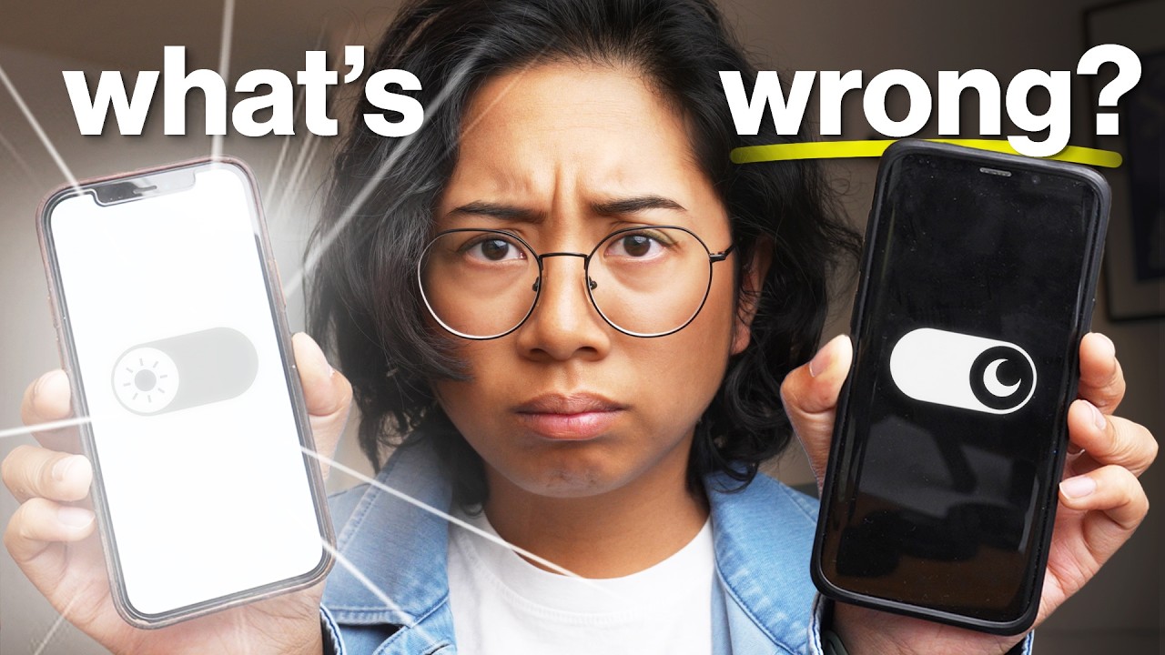
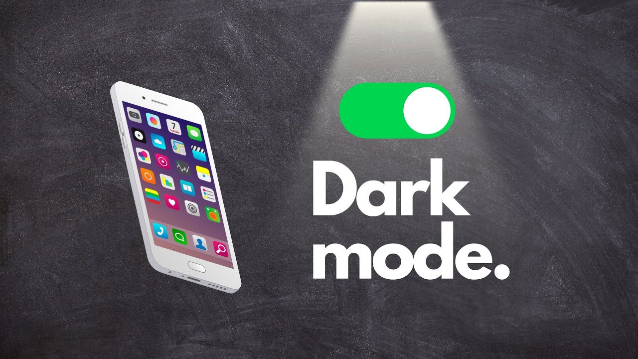
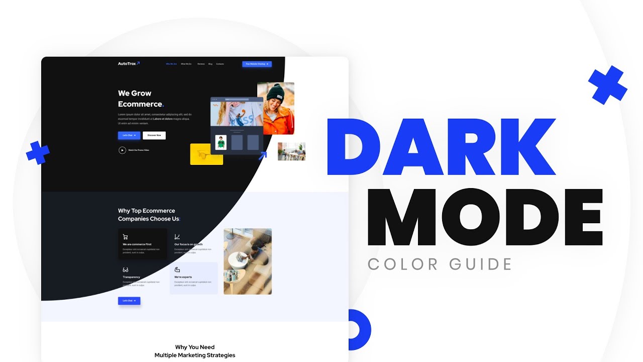
we are currently witnessing a new era in UI design I like to call the rise of the Dark mode it feels like bringing back the 80s but in UI websites are a straight up refusing to let you switch to light mode or they're only available in dark mode dark mode helps with reading staring at the screen for hours like we do reducing blue light reducing battery usage and decreasing CO2 emissions but most importantly it looks good there is multi-designing for the dark web I mean dark mode then inverting the colors so instead of this you
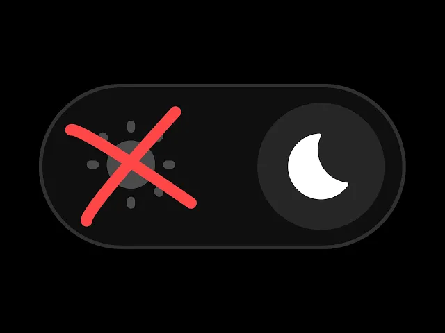
want to get this or this or this so here are 10 things you should keep in mind before we start let me ask you a question are these two home icons the same color comment your answer number one design for the dark mode the dark mode is not just a theme among different themes it's a standalone design with its own elements or visual effects for example you often don't see many background gradients or gaussian blurs in light mode but there are plenty in dark mode so even if you're coming from light designed for the dark
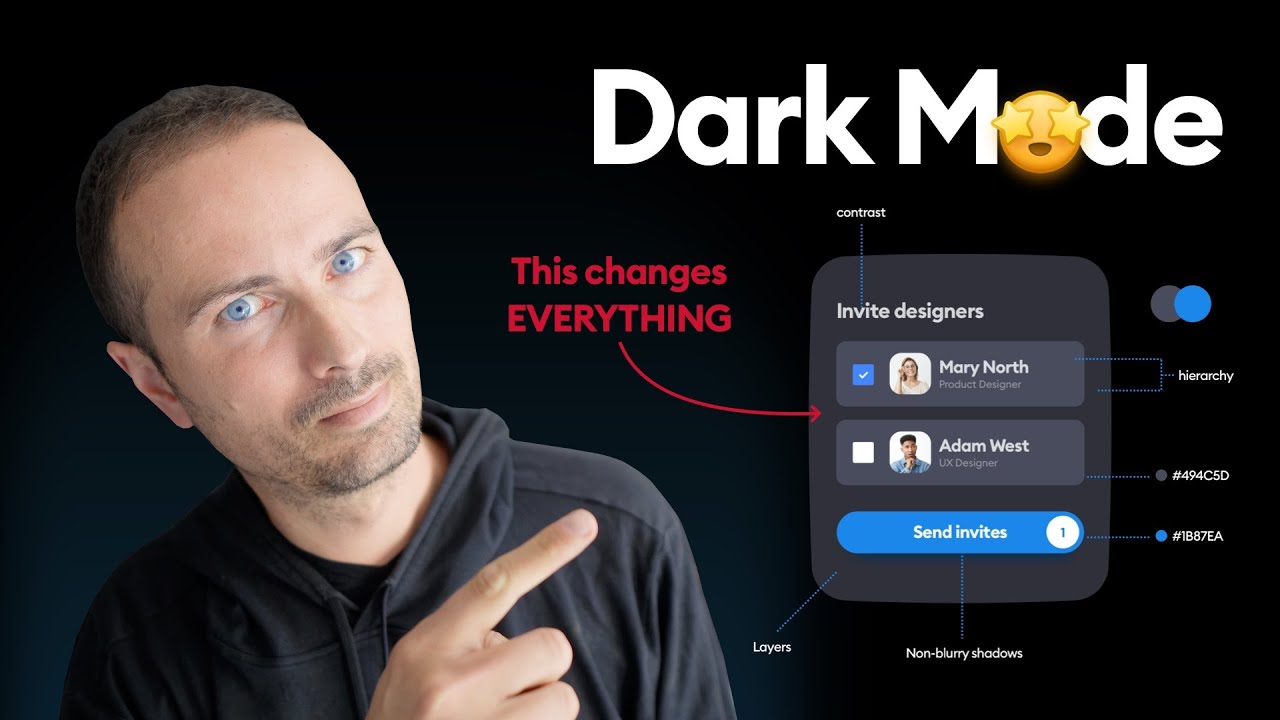
number two contrast let's say we're using these color for the light mode we might not be able to use the same for the dark mode because then the contrast ratios would not even pass the minimum web accessibility level of double A so we need to modify these colors and increase their contrast which brings us to point number three lightness and saturation when you're trying to fix the contrast issues or modify your colors for the dark mode you should avoid saturating as much as possible and instead try to increase the lightness or desaturate the colors take
this little button for example when switching to dark mode we obviously can't use the same one because of low contrast so we need to increase the contrast we can either increase the lightness based on the hsl value or both desaturated and increase the lightness number four colors have a purpose you can modify your button for the dark mode and completely change it of course but what button is that is it the main call to action is it secondary or tertiary button or is it the little dimmed subtitle or the huge important headline is it the
icon for the selected tab or another less highlighted icon each color in your style guide should represent a purpose so instead of white black blue and red you should classify them as primary secondary tertiary disabled enabled warning success and whatever action represents or purpose it serves number five readability what's more contrasted than black text and white background or white text on black background that's like a 21 to 1 contrast ratio that's the best you can do right well yeah but pure black for either text or background can cause an effect called halation which makes the
text a bit fuzzy and hard to read especially for some visual conditions like astigmatism so instead of pure black try to use a different shade while making sure the text is a still contrasted enough number six background and shadows you know how we add little Shadows to our boxes or cars to kind of contrast them with the background for the dark mode we can't use white shadows and Dark Shadows cannot create the equal amount of contrast unless your style is neomorphic and in that case the Shadows are actual Shadows you know but normally we can
use a lighter background color for the cards add a little border effect a gradient or a cool little background effect number seven muted colors remember when I asked if these colors are the same well the answer is no the right one is a muted version of the left one which means it's just a bit darker and less saturated for the dark mode we usually don't use Vivid colors but try to make them muted a muted color is basically the Vivid color and gray black or white had a baby we usually see colors a bit brighter
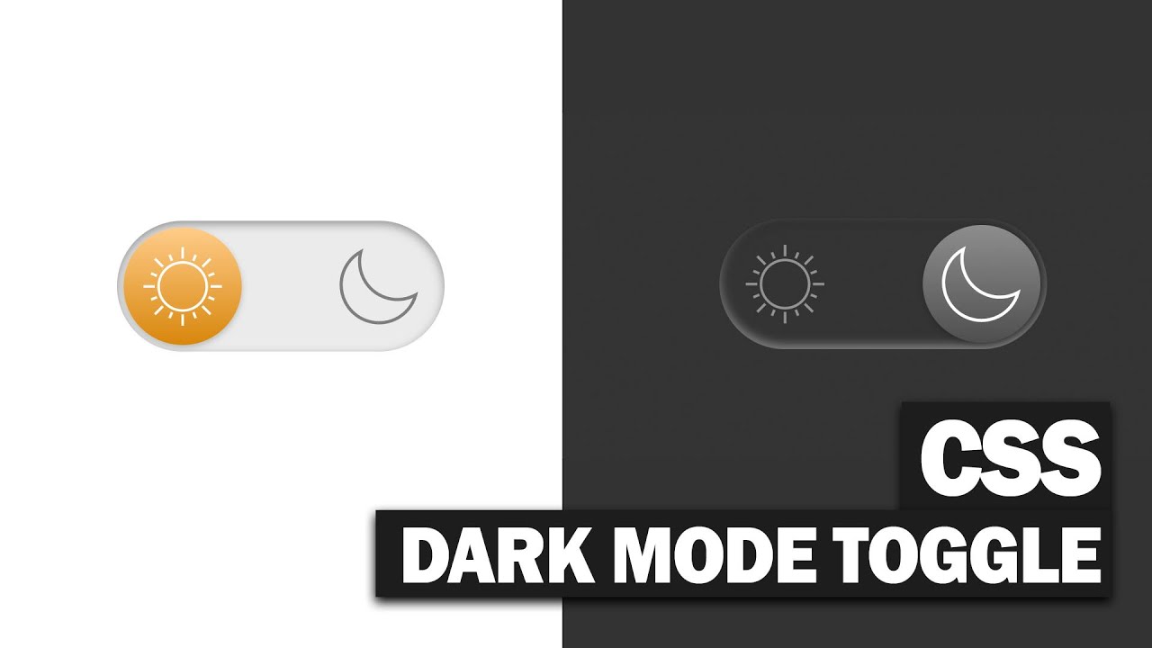
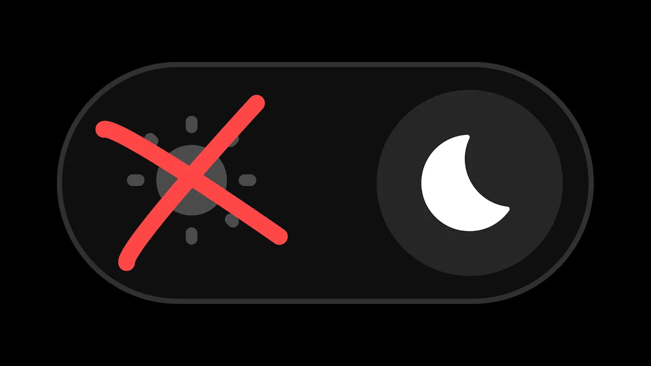
on dark backgrounds you've probably seen the Adelson Checker Shadow illusion which shows the same shade of gray but the one surrounded by darker squares feels brighter look at this toggle button on Reddit they look the same but in reality they're not the one in dark mode is muted because otherwise it would feel a bit too bright to create enough contrast with the white Switch number eight minimalism the whole point of using dark mode is to keep things minimal so we can focus only on the important information so don't go trying to make everything colorful if
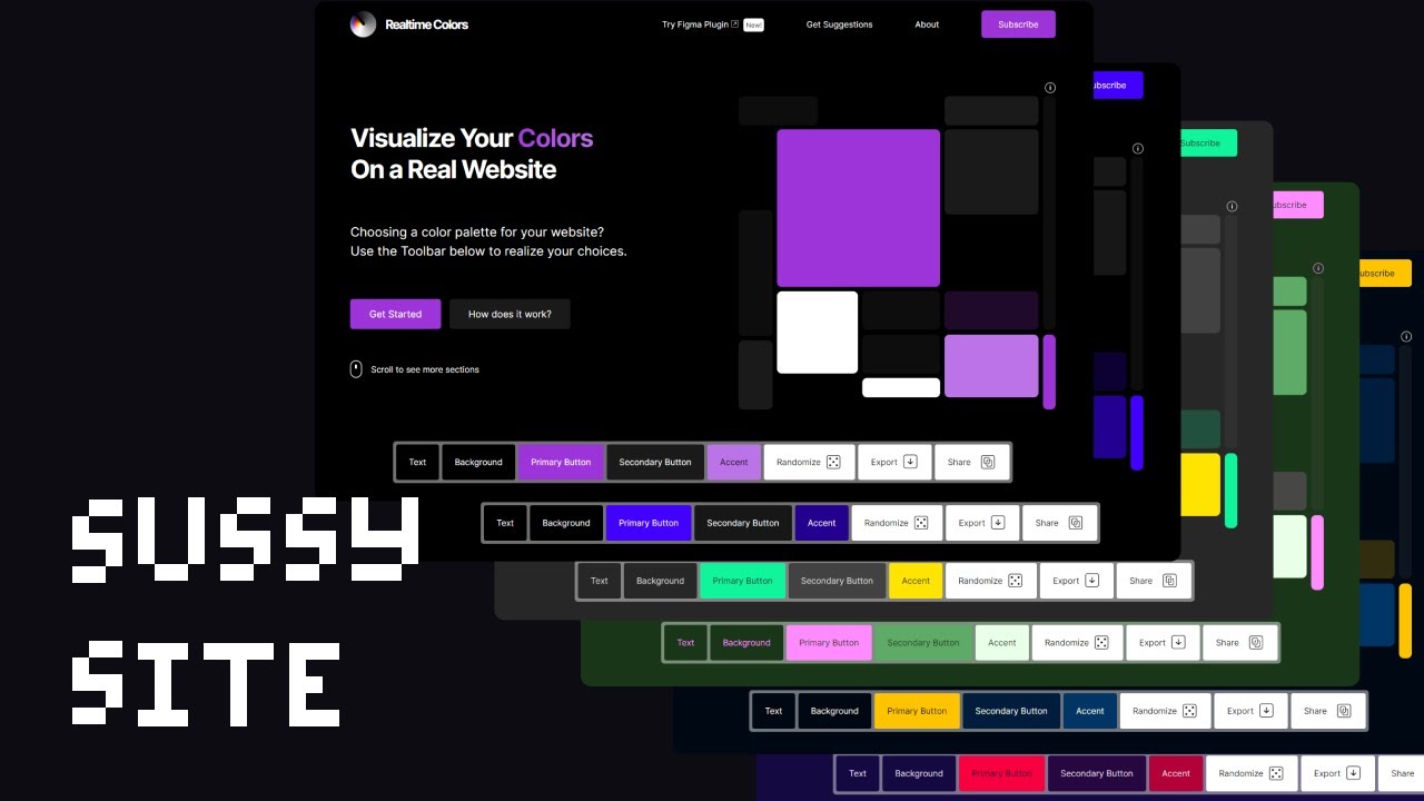
it's a landing page you can add border effects gaussian and blur a relatively large text or a light coming from the heavens if it's a text forget about it keep it simple number nine depth darker or lighter layers generally represent elevation so when you make a card lighter than others you make it bold you know you you make it pop number 10 stop using purple just kidding use whatever color that matches your branding if you watch this far and you feel like you could use a little playground to test your dark mode colors real-time colors
could be useful this is your sign to join the Dark Side and that's all for this video if you liked it make sure to do your magic down there and see you on the next one

