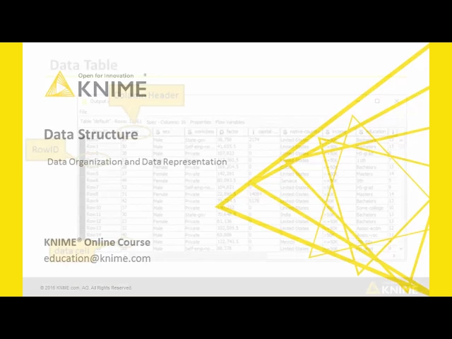
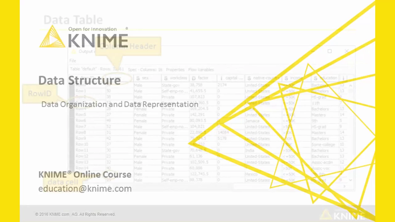
In this video, we will talk about how data is organized and represented in KNIME. In KNIME, data is organized as a data table with rows and columns. In this example, using the adult dataset, each row represents a person and each column represents one of the demographic attributes, like age, sex, income, and so on.
Each role, that is, each person, is uniquely identified by means of its row ID. Row ID can be assigned automatically by KNIME Analytics Platform, or assigned by the KNIME user at reading or at any stage inside the workflow through the RowID node. Important!
Row ID values must be unique. Each column is uniquely identified by its column header. In this case, column headers are the attribute names, such as age, income, etc.
. Also column headers must be unique. Each data value is then located in a data cell inside the data table, and uniquely identified through one row ID and one column header.
After node execution, if the node as a data output port, you can always visualize the resulting data table by right clicking and selecting the last option in the context menu. There are many types of data in KNIME. The basic types are numbers, Doubles and Integers, and Strings.
Other types exist, like document to contain text, Date&Time to contain date objects, images, blobs, and many more. Not all reader nodes can recognize all data types. Sometimes, you might read a data object as a String and then convert it later to its appropriate type.
Missing values are displayed through a question mark. Here is the data visualization in KNIME from the context menu. This data visualization offers a few interactive options.
For example, by clicking the column header, you can sort the column content in ascending order, descending order, or go back to the original sorting. For example, let's sort age, click, then sort in ascending order. Here, we have the youngest people, or in descending order, here we have the oldest people.
Or, we go back to the original sorting. You can also choose how to display your data, that is, you can choose the rendering of the data. To do that, right click the column header, select "Available Renders", and then select the rendering that you like.
For example, a numerical column can be rendered in full precision, or with just three decimal places, or using a grayscale, or a color scale. That's for both Integer and Double numbers. Let's represent, for example, age using a color scale, and here you find the bars.
They move from complete red for the minimum value to green for the maximum value. So if you sort, now, in descending order, you're going to see that the older people, they reach the green part of the bar. String type data can be rendered as simple String or multi-line Strings.
Remember that these changes on the visualization of the data table, like sorting or rendering, are just temporary. If you close the table and reopen it, they will be gone. Let's close it.
Now let's reopen it. And then as you see the rendering of age is not in bars anymore but with numbers.