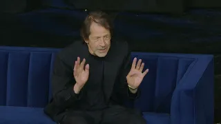
So hello everyone and welcome to the St bride Foundation if you don't know me I am Becky chilcott and I work here as a volunteer running the events program and we're so delighted to have you all here today to hear the Fantastic fabulous legend that is Peter Sav here this evening um as you may have just gathered we have an in-person audience and an online audience so welcome to everyone online as well it is so fantastic so Many of you could be here with us today if you aren't aware we hold events like this to
raise money for this fantastic institution all money raised from your ticket sales so just by being here you have helped us IM immeasurably basically the money from your ticket sales goes to to basically upkeep our fantastic grade two listed Victorian building the management and conservation of our unique and irreplaceable Library Collections and the running of our Brilliant Inky print workshop and of course our learning program so thank you so much for just supporting us in this way it is huge appreciated and hopefully you will come again or many times if you've not been here before
like this talk we have other fantastic people with us who are coming to do talks in the future you can take a photo of this you can look on our website find out more next week we've got the Fantastic claria vilam me Talking about her mom's work Shirley Hughes and her Legacy we've got the Justin house Memorial lecture which has just been announced and Jessica his is going to be traveling over from the US for that we've got our fantastic ways Goose on the 28th of April and if you don't know what a way goose
is Google it or ask one of our fantastic volunteers it's basically a big Meetup of printy people who love letter Press Printing that kind of thing it's a fantastic Event there's lots of cake to eat and it's a really great celebration of letter press and all the things we do here and then on the 9th of May we have the Fantastic Emily Yates who will be doing an online lecture talking about incorporating accessibility into design it's something I know I'm woful ignorant about and have been really trying to work to learn more about and I
think her talk is just going to be absolutely Illuminating and Brilliant I've been Told by someone who's worked with her that she's just fantastic so do try and come along to those if you can um and if you didn't know this building some of you know it really really well and so I'm apologies youve probably heard this for the h hundredth time we have a labyrinthine building which is full of absolute Treasures we have our library collections which you can access every Wednesday by booking an appointment in the reading room and you Can see all
the Fantastic Treasures we've got in our collections you can book a tour you can do a letter press Workshop book binding Workshop wood engraving there's just so much more on offer to here to have a look at and become a part of so of course you can go to our website for all these fantastic things and next week we are taking part in the big give Arts impacts campaign so this is a new campaign to support arts and culture Charities working to achieve Social societal impacts across the UK and through this campaign we'll be raising
money for this like this talk for our unique Library collections learning program and bu building donations given next week between the 19th and 26th will be matched so if you say donated us £10 it will become 202 if you donate this at 100 quid it becomes 200 quid so it's a really fantastic thing so one donation has twice the impact and we really really help us so I've handily put a QR code up there I got very technical which is not like me so if you do want to get the link you can use that
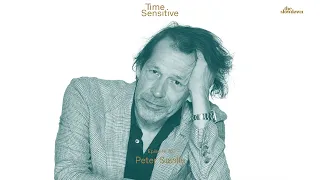
or you can go on to our social media channels our LinkedIn page and you can find lots of information there so if if you are able to support us we would really really appreciate it so I can I'm very pleased to say that my bit is nearly done so you will not have to listen to me any further um so I am hugely delighted to introduce tonight's Guests we have Peter sael who needs pretty much no introduction as pretty much does Paul Barnes so as co-founder and art director of The Independent UK record label Factory
Peter created some of the most iconic record covers of all time best exemplified by those he designed for Joy Division and New Order Between 1979 and 1993 his radical approach seemed to break all the rules sometimes admitting information about artists or titles or Employing visual codes fundamentally questioning modes of consumption and communication going to work going on to work extensively in fashion and the cultural sector his achievements were celebrated in the Peter savle show at the design Museum in 2003 his first major show in a contemporary art museum was at the migros Museum in Zurich
in 2005 and he continues to exhibit internationally his first monograph was published by freeze in 2003 and he is a Royal designer for industry and won the London design medal in 2013 and in 2020 received a CBE in recognition of the Fantastic positive impact of his work over the past 40 years and Paul Barnes is a huge supporter of the St bride foundation and we absolutely love him and the work commercial type does for us absolutely fantastic so we'd just like to say a huge thank you to him for being here to help um just
have a fantastic conversation with Peter and Paul is a Graphic designer specializing in the fields of lettering typography and type design and publication design and he has partner with Christian Schwarz at the commercial type A type Foundry based in London and New York and if you're in the room we've got fantastic specimens from commercial types so do have a look at the absolutely fantastic work that they produce and go and maybe buy or use some of their fonts because I can personally say they are wonderful so that is it From me I would just like
to thank you all being here in the room and virtually and I will once I've done some microphone juggling and slide juggling I will hand over to these fantastic gentlemen thank you very [Applause] much so let's go I presume it works does it work in the room yes okay great so we are oh yeah something says yes that's what oh what does it mean it means signs and symbol signs and symbol Yeah okay that's that's what I thought semitics of I that's what I thought it might meany not just about the letters but the way
they're used in the last four and years topy has been kind Central to your work you know and this is where it kind of all starts it was I mean from the beginning does start there and um fortunately the person most responsible is in the room I know so Malcolm Garrett is Here um and I was just um when Becky was speaking I was just working out um 50 years ago seems a bit uncanny Absol but it's true it's true 50 years ago it it could be said that Malcolm made a kind of a temporary
academic detour yes um we in 1974 we um graduated from grammar school um and guided towards graphic design by a kind of innovative Bright Young art teacher that we had at school um I think I think it's fair to say that neither of us really knew what graphic design really was I mean most people didn't in those days um my father described it as Commercial Art thought I'd be writing people's names on office doors um but Malcolm and I had displayed an inclination to um towards graphic work but that was mainly Because in a way
we were trying to make things that look like record sleeves as as teenagers um the record sleeve being the kind of preeminent medium of visual Innovation for young people in the UK certainly in through the 70s um so we were doing that the art teacher said you boys should do graphic design so in um September 74 I went to Manchester poly Technic and started a foundation course and Malcolm crazily went to Reading University where where you then went and yeah yeah well this he's responsible I mean um or to be credited with everything um Malcolm
and I you know so we did our first term and I remember distinctly we we we got together at Christmas and talked about what we were doing and what I was doing on Foundation course was kind of I mean it was confusing but it was Fun and sounded pretty much like what Malcolm was doing was pretty boring it was not fun and not not confusing yes he say I think he mentioned that they' done a do not Bend sticker you know things like that so we were we were running around painting rooms in the dark
and Malcolm was stuck Ste time yeah well I perhaps not even yet anyway I'm not sure anyway we talked decided that this was not the best place for his inclination and his talents and we kind of contrived A plan whereby he would then apply for first year graphics after Christmas and and with any luck he would then join me on the graphics course at Manchester he been the same years yeah which is so that's what happened and he bought his reading list back yes so that's it so the the the extraordinary sort of serendipity was
that um when when Malcolm turned up first Geographics Manchester po Technic I don't know it would be understandable if he kind of felt a little bit um insecure about that having not had the benefit of a foundation course um but he did have a reading list of basically typographic history which goes back to you know well principally to the early 20th century and and the way that so much time design came out of the art movements of the late 19th early 20th century so now come To a reading list um a reading list of the
history of Graphics was kind of unheard of on the curriculum of an arc of a graphics College well it's certainly a Manchester and I think the same could be said of many colleges in the UK at that time apart from Reading apart from Reading yeah so um the the you know the the the prevailing idiom in graphics after the 60s had become in a way the New York School of you know visual pun and that seemed to be what all of our teaching staff were orientated around um and and the the previous history of graphics
and it's Rel ship to Art and Design in general was not really considered you know relevant interesting vital or would not be of any interest to young people um I personally by 75 so I was 20 years of age having seen visual puns for like 10 years or so they were not really doing it for me Yeah you know um you know a you know a logotype for a restaurant was applauded if it was a bite mark out of a plate and um I kind of thought let's I know what a restaurant is um I
know it's not about eating place and I actually want to know what kind of restaurant it is this is not telling me anything so from my point of view even at the age of 20 and 75 um you know my kind of sociocultural awareness was developing a little bit And I was much more interested in the Nuance difference between things and the visual pun approach didn't address it and I actually hated that way of work I did subsequently come to appreciate and understand it and I realize that in the kind of evolving Proto Society of
the United States yeah makes sense in the 20th century where you had 250 300 million people who definitely did not share a common culture generally did not share a common language and you needed To communicate to them effectively visual puns worked because you didn't need to know anything to get it anyway that was not my way of seeing things and in 75 I was totally preoccupied with kind of you know rather superficial style-based gra well not superficial actually it's unfair to say that within way the style based Graphics that communicated through look so I was
a bit obsessed with bush hollyhead Dan Fern um um Michael English um that that group of people who were mainly represented by a guy called Nick thurl they were all the agency called ntaa and they were like the hip George Hardy they were like the the hip graphic designers in London and I liked that work and then Malcolm turned up with his reading list and given in a way the free for all of the graphics course Malcolm accessed the amazingly Innovative work that that was in that reading list principally you know patient zero is there
it was 50 years before 1974 so 50 years back to 1974 then 50 years back to that so think a long time ago now I mean that book I mean I know introduced Malcolm to think that you know his family life and education had not informed about um I had exactly the same response when I picked it up on his desk One day and Malcolm took the spirit of the work in that book combined it with the kind of Pop Aesthetics that we shared and in first year graphics Malcolm created a kind of you know
deow constructivism and and and also um hosted a a d show at the end of the year which kind of blew everyone away including the staff so Malcolm by the end of first year graphics Malcolm was like the star Student uh and the staff kind of were wondering you know why he was do why he did it andway this all happened just before Punk and then when punk happened I was able to look in that you Lea through it and see a root map for Post Punk culture I felt so you look through it and
you did Malcolm okay well give let you have Malcolm had pretty much done lozitsky and malovich and Co and soon there was a designer called Al mdow Working in London had a studio called rocking Russia and Al was doing the stuff and it's interesting when you're at college you you kind of you're competitive with your fellow students but also you don't really want to go to the same place because that just seems like you're copying them so you find someone else to copy so so um I kept on looking in the back of the Pioneers
book I kept on looking at at this guy tishel yeah which was just Hyper cool it was much much cooler than the the other the other work and I would look at it and think wow this is great but couldn't possibly do that um but I I liked the the the rigor and the coolness and the sort of calmly subversive quality of the early t-shirt you know the dooi typography and things like I like it a lot and um and that would be where I would go when I got the chance to do something And
I mean from me the the I remember distinctly there's odd days in one's life that you kind of remember and I remember the day that I asked Malcolm if I could borrow his copy of pioneers of Bot typography and he said no he said get get your own and and I said like where do you get this in Manchester um and he said I don't know he said you could try the College Library and I said I said where's that um I mean I've been there a year longer than he had and I mean he
was quite irate and I I won't I won't say exactly what he said because we're like online um but he swore at you know and and told me it was a big building on Oxford Road and and I said and then the worst bit I said then said do you do you think they'll have it anyway at that point he did kind of lose his patience with me so anyway I went off to the Library and and they did have it in fact they had a you know a whole Corridor of of books of graphic
history it was all there all and more and I started and I was just it was amazing and I just started taking them off the shelves and looking in them and most of them had never been out yeah in fact I showed you one recently the P the P art Bo it it the only person that ever took it out was me so I kept It I I said I'd lost it and I paid 250 and I kept it and um so and I and I went that afternoon to the college refectory and and to
have a coffee with this big stack of books on the table in front of me and I think this is like end of second year early third year so this is 1977 and um amongst the books on on the table in front of me I'd spotted something called The black square and um you know there was basically effectively a black page and Casmir malage black square and I kind of sat there in the factory looking at the stack of books and knowing that this thing called the black Square was there yeah and and I put
my airbrush away and I just thought um I just I said to myself well you don't know anything Peter you don't know anything the stack of books represented To me like the beginning of all of the things I didn't know and and that was the day that my in a way my real education started and and that the day that I wanted to learn things not because it was expected in Me by other people and for the next I know next 10 or 15 years I I certainly learned as much as I could about graphics
and typography well you love collecting books don't you well I did and not anymore because there's nowhere To put them now they're making you know little stacks on the floor um and okay so last week I was in someone's book collection in a room let's say three times the size of this and high and from floor to ceiling around all the walls of bookshelves I think there's this 50 I think there's 50,000 books okay it's Carl lagerfeld's book collection and It's quite clearly um self-defeating I mean I've already I haven't looked in my own books
for for years but you told me all about your bedtime reading during the 80s in the 80s that's different but now and I would imagine that most of the people in this room have got lots of books that they got before that this is still full for every weekend we go out they've got books that they bought last weekend and that they've got books that they don't know even know they've got And I bet there's people in the room who have sometimes bought a book a second time because didn't realize already had it so that
is how it is with books now but this is quite strange bed I'm reading this is good okay so so once I started to learn I mean I not not that quickly but you know reasonably quickly during the course of 1978 so I graduated we started Factory during the Course of 1978 I realized that typ faces were you know a a form of coded information that enabled you to evoke associations that you wanted to make and given the nature of communications design and the conveying of information through letters they were the primary source of effectively
styling a piece of Work so I so I actually I didn't even need to I just wanted to know so I I kind of got interested in in typ faces and of course relatively it was kind of easy then there weren't I mean relative now there weren't actually that many yeah and and there were some basic rules and this book which if you go to the I don't know if we've got the frest piece of it it the librarian of St Brides was the of This book and so I would mainly in secondhand bookshops because
they were not available anywhere else because I mean most people were not interested I mean the key thing for anybody under even 40 in the room no one no one was interested in typography I mean I mean there were some nerdy neurotic people were but generally nobody they still are yeah no I mean nobody just interested more broadly in in contemporary culture or pop culture Was interest in typography when we were at College there was nothing more boring than typography um I I distinctly remember that I fell asleep uh on the floor in the type
setting room at College one day before this was you know the year or so before I'd woken up to the you know to the the the essence and power of it so it was really boring and nobody was interested um so this made it remarkably Effective when not just me Malcolm and I used type yeah because no one was doing it I mean it's like rediscovering an old world you rediscovered all these type faces that let press and I would find these books usually you know secondhand books and and and you know car Book Sales
and things and and um yeah it does seem a bit weird now I would um they became my reading matter at at night And I haven't read a novel for for for more than 50 years I read a lot of TI books so can you start okay so then that happened started making stuff Pizza okay so I mean that's actually quite an important work it's kind of very chck old but it's also set in Avant guard very tightly spaced see I it's ELR seted and it's I think I don't know what this is all ELR
seted it's just that when I was thinking about for This if it wasn't rck leure set I don't know how I got it time set because I didn't know what typ setting was and so does no one taught you at no no no no one no one talk about any of that stuff not nothing you don't actually in the 70s at Manchester Poli teic which considered the second best graphics course in the country and no one talk you about how anything was done no mechanical artwork no time setting nothing You were just expected you expected
to like look develop your ability to think then get a job and you will be T the methodology on the job so um I don't know how the time for that got set um I mean have on God I I was looking for A Blocky sand serif that matched the lettering on the industrial sign that I had stolen off a college door and so it looked to me that that pretty That font would do the job I mean the naivity of that first poster is extraordinary it's got two studing mistakes in it the same word
is spelled differently in different places which ones are those I think D is spelled wrong in two places and Russell Russell is spelled wrong it's full of I mean it's the the way that I recognize bootle on that post is the the spelling has been corrected so so it's a funny hybrid of Deno typography yeah and you know you might say NCP car pars yeah and and you know the day that I met Tony Wilson I went to meet him at Granada television and offered my services I I'd heard he was organizing a club night
I was still at College um Malcolm was already working with the buzzcock and doing incredibly exciting things and I was envious so I was going around Manchester begging to do something real Um I went to visit Tony Tony was magnin and he said yes to a poster and he told me that he was trying to arrange a club night and it would be called The Factory which I at first I thought I na because it just seemed like it just seemed like a kind of War hole reference which at the time like 78 just after
Punk it seemed very P to me um but we were in Manchester first industrial city so therefore place called The Factory not entirely inappropriate and there was that used hearing protection sign on a workshop door and I had been admiring it in a kind of craftwork type way we had been admiring this sign for years so when I went back to college that day after being asked to do something for a place called The Factory two and two together yeah so I stayed until at 8:00 and took it off the door you still got It's
what goes around comes around at an exhibition of the Corner House in Manchester in the late 90s or something I don't know when it was someone took it off the wall there so we don't know where it is um anyway so I so I built the poster around that that that noise prevention sign and and and if it's in avangard it's in avangard but it's there's none of the quirky avangard characters that immediately give it away but but you Told me your tutors really hated your rules you started to use really bold rules in that
final year there was a typography tutor called Sid Harley I think not Sid Harley what was he called Malcolm Sid Harley Sid Harley and I I did one little bit of college work a letterhead um in my new inspired by yanish old style now Sid was used to seeing me like airbrushing Neon and he looked at This and he was bowling with a gray beard like everyone else now so um he pulled on his Bard and he said Peter did you do this I mean I was like well who else I mean Malcolm would do
lots of me but he hadn't done that and I said yes and he went and he looked at me and he said why and AA said it seemed to feel right now and hea shut his head and walked Away it was the same Sid Harley that when my degree grade was pinned up on the wall he greeted me in the lobby of the college before I had seen my grade and he said he came up to me and he said I should probably say congratulations so I thought I God I've passed and I said really
and he said do you not no I said no he said go and look he said I'd like you to know that I vehemently Objected whatever happened to so I said thanks it well he died I'm sure he died I mean he was elderly anyway but it was I I was not I was not expected to pass and it had been decided by the college that an example had to be made of me for my poor discipline attendance and general attitude towards the college curriculum and seeming to know what I wanted to do and it
was not what the college thought I should do so they had decided I think well it even decided Before I started third year because nobody would be my tutor for the third year because they knew that I was I was I was bound to fail and so no tutor wanted a fail student I didn't know this I found it all out later so so they were determined to fail me just because they thought I should be failed so I anyway I wasn't failed the external assessor gave me a um a good Pass which upet some
people upset a lot of people upset malcol actually U it upset people but and I didn't expect it but it was it was very it didn't really matter because I mean everyone in the room knows that no one ever asks you what you got in college I mean they just look at what you do and that's it no one ever asks what you get but of course when you're like graduating you think it matters it actually doesn't but it the nice thing was it mattered to my parents And and because they' supported me didn't really
you know my father didn't want me painting names on office doors and so it was kind of nice that I passed because pretty quickly you started doing some pretty interesting stuff so the first factory record which again has those BS so so as the year PR Malcolm left Manchester immediately because he had great job opportunities in London he went to radar records you know I procrastinated I was being really Pathetic about leaving home and having to rough it in London I knew that I would go to London because I was set on that um but
I did procrastinate and for the in the latter half of 78 whil I built up courage to go and you know stand on my own two feet in London and we founded Factory records so you know you never know what's going to happen um I mean it it it wasn't going to be anything no one involved knew what a Company was nobody really knew what a record label was and it was more an altruistic act to help some of the bands that played at the club that we would release a record so Tony decided that
we could release a record so that afternoon that we had that conversation and October November 78 Alan Rasmus Tony Wilson and I said we will be partners we didn't even know what being Partners meant a couple of years later we was a very Scary role to have but we said we'd be partners in something called Factory records so therefore that gave me a kind of unprecedented platform within the sphere of communications design because I was effectively my own client um we we put out records that we didn't expect anyone to buy so therefore there was
no there was no guidance towards um profitability or Popularity um and fact developed as a kind of autonomous platform where nobody was employed no groups were signed there were no contracts all of the artists retained the rights in their own work mainly because you know the the the the central person was Tony Wilson and Tony was returned by granard television on a you know on a a handsome Income so Tony didn't need the money so in a way it became a kind of a Folly I mean Tony didn't appreciate that some of the other people
did need some money we didn't quite get that um but effectively we had a kind of a um a Cooperative I was going to say organization more of a disorganization um where every individual was free to do exact what they wanted and not be answerable to anyone Else so that have to approv this nobody approved anything but then I mean the easiest example seen that it was a record label was Martin hamet's position you know when Joy Division went in to make Unknown Pleasures Martin recorded their playing and then told them to off and Martin
had a record to make is that like what you said to the bands well I had to be a bit more polite Martin was quite FR he was the the producer but the The key bit being was Martin had a vision of that could be fracked out of Joy Division and he wanted to do that and and and the group was Superfluous to to his work Ian was actually quite interested Ian was taken by Martin's way of seeing what Joy Division could be to this day Peter hook and Bernard Su don't really like unknown pleases
because they thought they were going to make a Punk album so everyone did what they wanted to do so the groups Were never under any pressure to do any performance or release anything other than what they wanted to release that's why the singles were never on albums because there young people they thought if I bought the single why do I want it again on an album not very teenage idealism and and you know I mean I sought I sought approval from my colleagues because you just do as a graphic Designer um you know you you
seek approval often to to find you know a way with something but I couldn't get any so when you came up with this poster which is kind of Tony just said do do that was before we were even a label so that's that follows the yellow one and I just moved on through the Tish old pages of the book basically I just so you're modern one day and the next day a Classicist yeah um well I was neither I was signaling associations and with a kind of Duality some of it was um a kind of
a frustrated altruism on my behalf because I was seeing things which I was not seeing in my every everyday experience and I was actually angry you know I would look you know I would look into the I would slowly discover cultural history and look out At at what was then modern day Manchester and and I was very disappointed I was really disappointed and I I remember thinking you know time and time again I thought when the everyday can be so extraordinary why is it so toy and meager and and shabby and and and lacking in
in in any intelligence or cultural intelligence why is the every day so awful so so when you did this post had you actually heard any of these Bands so there's abely no relationship none of it has got anything to do with music they they were doing what they did and I did what I wanted to do and I was able to use Factory as a medium of well I said a duality how I would like to see the world but I have to admit how I would like the world to see me so in the
book that Becky mentioned the freeze book designed by Peter savel there's contributions from various People and there's a contribution from Paul moley and Paul moley really unsettles me I mean he and I didn't get on at all 40 years ago but in recent years we have gotten on and there's we have a kind of mutual respect for one another now and in the essay that he contributed to that book he he he concluded the book is called designed by Peter seble and he wrote at the end of his essay Peter Seble has always been designed
by Peter Sal and I thought Paul Paul moley is I mean I've never been to see a a therapist or a psychoanalyst but it's what you're doing now yeah but Paul I think Paul Moy would make a really good one Paul Moy can see things about one that you have not yet seen yourself so I I've sub I've read subsequently I've read other comments from before where I first thought what You that's completely wrong and then I've realized maybe it's not that wrong after all anyway Paul was right I was I was I was creating
me as much as I was trying to improve the everyday around me so what does when you got to the time of closer which is incredibly classical okay it starts to get a bit more sophisticated because it getsic now we begin to get a little bit academic um you know the name of the gentleman whose book this comes from Yeah you you you took it here's a PMT of it it's it's U it's called no it's not that book it's the shrift big one yeah well this is the book it's in the development of writing
the development of writing H Edward Meyer 1959 where did you find it book Slim in the secondhand Bookshop it's a slim toall like A4 one3 A4 slim uh little document book that may well have us um accompanied a PhD or something this gentleman's Research into The origins of writing and it was exactly the kind of thing that I was consuming and collecting and and in there I saw um what he believed to be the earliest example of serif lettering so go yeah there it is oh there it is the earliest example and he referred to
it as lapidary letter you see this how one learned so I learned that lapidary was Stone cut and and and he put forward the the proposition the thought that that the Appearance of the serif may have come from the practice of whitewashing the letters onto the stone prior to to um incision prior to stone cutting and that actually the serif shape might have been the the result of of a brush and the pressure on a brush um and I found that terribly interesting in 1980 um and and I liked it it was just in the
book so um but you hadn't seen the Tran column in the Victorian Alum at all no that would have meant going out no I was in London I was in London by this time I was in London actually I think I had a job at D this I I had my studio was in this offshoot of Virgin and I mean I I I live I was living in Stratton and the office the studio was on PTO Bella road so I probably didn't get there until like lunchtime um but then I wouldn't leave until midnight and
I didn't really go Out I mean it it is fair to say that through the 80s I didn't really see much of the outside world I certainly didn't see much of what was happening in music I didn't get to watch top of the PO so the you know like top of the pops 1982 on on BBC 4 now is completely new to me I'm seeing it all for the first time and thinking out it was awful so but I missed all of it because the problem with the music Industry is that from the visual art
point of view at least at least once they've got a front cover the standards I was I was going to say are incredibly low they're below low they are subliminal they there there is no standard all that matters is getting it done and you would be you know you would be asked to do a last minute full page I had for a music paper at like six o'clock in the evening and and and and Say well when's this for and they say well it's for this afternoon but they'll take it at 9: in the morning
now there was no 9 in the morning for me so that me that I would have to do it before I left so I didn't get to see the the the the what's it called the model hle what's it called the VNA where the TR col yes it's in the plaster cast plaster room yeah the cast room is it called the cast I think it's called the cast Court that's something like that I I saw all Of that later I mean I saw mention the Trent column uh in some of the books I had anyway
I used this I saw that font and I wanted to use it well why didn't you just use what you just go for the easy routs so you can get home a bit earlier I don't know I mean I know how the sleeve happened because there the image yeah it's all very strange But once there had been this agreement to use this photograph from the cemetery in Italy genua I thought actually I I would imagine that I didn't go in search of a type I thought of the type face that I'd seen in this little
book and thought this is it so Al was I mean it's a great go back to closer go back to closer I mean it's A great I mean this is a great fun I mean it's really beautiful well we made me redraw it l um because when I look at when we look at the actual it's very wobbly who actually did all this okay so so you didn't you no no no it was one thing seeing something in your book and next thing Al together executing it um I had to take the book to a
little typ setting house called expose who ID learned about from my very Brief job I had for the first 10 minutes in London a little typ setting house on edgeway road now they were the only type Setters that I knew okay I like I was 24 and I'd been in London for like a year mainly stuck in a studio doing things so and I didn't know anything and i' never worked for anybody I'd not had any experience at all so I was having to make it up as I went along but so I knew about
vexos and I said can you set this As type and they said yes if we make a headline font so you know I understood what that was so they photographed it made a headline font and they said they set the type so that's why it looks a bit wobbly because it's it's quite endearing of well it is I mean I mean I'm sure you know inscriptional type was a bit wobbly as well if you you know yeah when it comes to it so um so I was okay with wobbly and uh and you know they
were they were to use a headline Font um they were winding something along and it making an exposure and winding along the next letter and making exposure and um I mean probably you know the some of the better type setting houses with Sans of typ set really tight so we could just have everything touching that was easier but this was difficult for them the typ setting houses in London in the early 80s had no idea at all as to why you might be choosing to use a classical Font and they had no idea as to
why you would want it set open or as I learned as metal yeah I had to in order to explain what I wanted I would have to take photocopies from old books and say I want it set like that they would say why do you want that I said I just that's how I want it to look okay and I mean in the typ setting houses were some really expert guys at the bigger houses and they were extraordinarily good and and if you showed them what you wanted They would do it but they didn't understand
why I was trying to evoke these historic ways of doing things so this isn't really typ set no that's not typ set that's um but what where's the letter come from for this it comes from a um an engraver stencil um in a workshop in Shepherd's Bush Trevor and I took those metal plates to a bloku Um who engraved who engraved M to V into steel place and then we I I left it outside the window for two weeks weeks and it oxidized and rusted a bit and then we photographed it and it was inspired
by Ben Kelly Ben Kelly where where's this has someone stolen this no it was um I didn't see it as stealing particularly from people I knew it was more like kind of friendly I I mean you still got this oh yeah I have metal PL it was like I I I um I knew the LEL Terrace part was good okay I'd seen Joy Division play one night that there' been Tau that they had a song and it was in fact the last time I saw a joy Vision plan and it was a college here in
London and and as soon as it started it I thought oh this must be the song This is the song um you know with bands in their early days they they do what they do and They generally they struggle to write a song um but but they when they finally get one you they know it you know it so OMD when they finally wrote um inol gay it's like you hear it straight away you know it doesn't matter it doesn't matter how good the performance is it's a hit and and and the evening I heard
lble toes apart was extraordinary and I was to me Joy Division they were like the essence and The fabric of the of a city yeah they were kind of the urban condition and it was this very kind of evocative when this level Terrors aan and I was I remember you know driving around thinking how can I how can I how can I get this this this how can I get the feeling of of of this title from the hard fabric of a city in in glass or concrete or something and so I asked Ben I
I you know Ben was interior architect and I was friends with Ben and and we talked a little about things and I said I'm I'm how can I get how can I get something you can't tear but feels torn and and he went off and from came from the bookshelf with his Royal College of Art dissertation which was called metall lined cubicles and he had made the cover for metal line cubicles from mild steel Engraved metal line cubicles and I said Thank You Ben more thank yous are required in the future but anyway any we
yeah you rush on we have to rush on okay so this is just gets it just gets a little bit more could the the the yeah the tour the I mean basically I I oh this something I've not said for a while I I went on my own Grand Tour I went I did The Grand Tour via the secondhand bookshops of London that was it and and and and I tried to I tried to learn something and and I gathered a lot of information and when there was a a a situation when there was a
a a title or something to work with I then kind of did a sort of word association the interesting thing about type is that the words themselves have connotations and I was only just thinking about that yesterday so it's not just It's not just the use of a font and the the the aesthetic um kind of characteristics of a font words themselves either help or or give us problems yeah it's kind of interesting when we looked in you know looking for type samples that are set in other languages is quite interesting and we can actually
sometimes we see the font because we don't actually understand the Word um and words can be a problem and they can also be remarkably you know helpful so ceremony so ceremony just took me straight to uh you know a hanging a kind of like maybe mid mid century hanging in a church somewhere [Music] um and the the albertus was just perfect for it somehow somehow albertus and the Word ceremony just just sort of fell together beautifully because then you have literally we just move on um so I've realized I haven't yeah that's right we can
I can rush through these so because it's all it's all the same thing it's all coded information it's all coded information to evoke something that I felt at the time was like timely hip or directional I mean you know at the beginning I just wanted to be in The In Crowd but I mean who are they I mean you know I mean I well yeah but I mean it was just this notion of The In Crowd I like I said I was designing Peter SEL but I didn't even go out so I never even met
anyone so so and so I was everyone knew you okay but I was I was tracking what you might call a Zeitgeist or these days you might just be a little more modestly call it a sense of nness and there was actually in The post modern break from the early 70s maybe through until the mid90s there was a sense of an evolving nness um and a sense of direction that you would pick up from fashion art music a speeding of the n and and I was tracking where I felt it was going from my own
instinctive intuitive feelings about things so um one day in Ian Shipley books not secondhand in Ian Shipley books on sharing cross than you PA on sharing Crossroad I picked up this book that seemed to me for all the world to be like ice cream bow house like ice cream modernism I said what is this and then on the front it said Fortunato dea it's definitely ice cream it's an Italian ice cream parlor uh of modernism and then a friend of mine a very important friend called Tim slack who worked in fashion but was a extraordinarily
cultured man Tim talked to me I met him really early On and Tim would talk to me about fashion and nness in in an art related art relative sense and so I I learned a lot from Tim and and he used to talk to me a lot about marinetti and futurism and I would just sort of glaze over and not get it and then this afternoon that I found the depara book I thought ah this is that futurism stuff and I really like it cuz it's so Up so you expressed it whereas like modernism bous
that we do associate with a certain heaviness the the Italian stuff is so crazy and also so utterly taboo at that time nobody even talked about futurism it had been completely you know um relegated because of the later associations with fascism nobody talked about futurism and I just thought this is amazing so I had this book on futurism that's all i' that is all I'd done Rob Greton brought the now New Order round to my studio one afternoon they were in London trying to make their first post Joy Division album and there was a Repeat
Performance of what had happened a year earlier with closer with Unknown Pleasures they gave me the wavy diagram that's documented when they were making closer they had not time to even think about cover they came to me I showed them the burnap pier All um for some reason they liked it and we had the closer cover so Rob just repeated the process he came around to his studio and said Pizza we don't have much time what are you into this week and this was this and I said well if you don't have much time I'm
really into this and he said give us the book and I gave them the book and they went into a separate room at a virgin label offices with with us with posted Notes and they emerged 5 10 minutes later with Post-it notes two Post-it notes in and he said do this just make the words fit and then and then I said yeah okay something like this and he said he was very clear about this he said no just do this we do not have time for you to around so so you got a repes yeah
um so on the strict orders and Brett is here this evening work with me at that time on the strict orders of Rob Greton we were asked to convert a DEA poster into saying New Order fact 50 movement now it was all serendipitous because for me when they said I said what's it called they said movement I said thank you because f futurism which is a movement but also principally founded around around the the the the the new dynamism of the 20th century I mean there could not have been a a better title for this
reiteration of Depo I mean it's a political movement and it's all about movement and and I and I I mean with Brett and I struggled to do this because Brett had to find the tip face which was exceedingly difficult because of an old 30s Italian font and amazingly he did find it um it's German actually yeah is it the font is yeah it's called elegant grotesque I know but it was used in Italy yeah but it's it's and it's got a kind of it's the German f um the the thing that I remember Thinking was
that marinetti would like New Order yeah and and and that I could see because in this transition from Joy Division to New Order and and the sequences came in and the beat came in and the kind of driving sense of of forward the dynamism entered their their music I kind of thought New Order could be the house band of futurism so at the same time you're doing section 25 oh H well which is I mean the question I have is you do These record covers do they represent the music because I listen to this you
know I didn't I mean I didn't hear closer I didn't even hear Unknown Pleasures when I did it I mean i' just seen Joy Division perform a couple of times and it was pretty difficult and so when I actually heard Unknown Pleasures the day I delivered the artwork I was I was stunned but I've told that story too many times so the but you you don't I mean the in the music Business I don't know these days because like I'm an old guy but in when I was young and doing record covers the artwork deadline
was the same date is something called the cut the cut is the Final Mix and sequencing of of of of a record a single an album and so the artwork deadline cannot be before the cut because the sequence of the tracks and the details are are set then in in in you know set in steel literally but so you can't have the deadline for The cover before the cut but the moment the cut is done somebody can say where is the artwork so and the group have only normally only just finished they've spent the night
before trying to figure out out what the sequence of the tracks is so more often than not you will not hear an album until weeks later you hear it unless you're very keen the fan base will have heard it before you hear it so with this record this B yes it is so this was I mean to to be kind to section 25 it was not a great album to listen to anyway anyway they it's another fact it's a it's a it's a factory cover a very very nice guy called Larry who was the kind
of leader of section 25 he asked me to do he said can we have something European psychedelic and a bit Oriental so the Europeans the Europeans so I mean I had seen you know my type setting books were becoming more sophisticated this is like ' 81 yeah it's a long time ago Paul 198 um I had a ber old type setting book which was like the most beautiful typ setting book I ever had and there was samples of ber old setting and there was a particular sample of bembo yeah it was just like a block
of and you thought I'll have that I Thought I'll have that so that's what it is so it's the it's the relevant information executed as per a type setting sample that's why there's no punctuation it's just set set solid and I mean you shouldn't do obviously you shouldn't do it um we did it because well yeah but we did it because it didn't matter obviously over the years I've seen that approach applied many times and and and and it's a bit it's kind of Inappropriate because you can't read it I mean if it doesn't matter
that you can't read it fine but I see that done in situations where I would actually quite like to read what the name of this book is so so this record probably sold on 100 copies now the next record was a big hit it had three top five hits on and this is really commercial not Factory records it's not Factory but because my relationship with OMD started Factory yeah and I was friends with them And and it's fair to say that Andy MCL day is the one was the one musician that I actually kind of
became friends with and and Andy and I are still friends I think it's because if not worked out he was going to be a geology teacher so in a kind of like slightly sort of middle class lowbrow way we were able to get on with each other so so I I I got on well with Andy and so had a unique relationship with them so even though they were then On thenis Virgin um there was at this time a similar degree of autonomy on granted to me and a sort of relational exchange so my girlfriend
at the time Martha lley was reading the book morality and architecture by David Watkin mentioned it to Andy and it became architect morality so so you went through a kind of Gil s's phase which is kind of it's British modern it's absolutely Ely British modern with a little bit of we've seen what they're doing at the B house well well you you said to me a few years later is English humanist kinky geometric spiritual streamlined Artisan overground Eternal and mod it is good though amongst all of those things the the photography the the the the
the image is actually in a window so that's actually a dker on that sleeve and on The inner sleeve on one side is the photograph of a doorway and on the other side is a photograph of a Stairway very clever architecture morality roots to God and the photography is by a friend of Brett's called Robin rodie um and he just happened to send us these pictures and Brett said maybe we can use these so we did so so this should have made you lots of money but That well you don't get money but then you
Ed you get from doing record Le did you get fees that's why there's no long-term prospects in it and ironically the one group who thought it might be only just to give me a royalty because of my significance to their work was actually Orchestra was in the dark but it happened to be the royalty on the next album Dazzle ships which nobody bought in fact my royalty was so low that virsion records have never bothered To account to me so um so you don't get you do not get points you used to get a couple
of grand for doing an album cover and of course if you don't grow out of it yourself you become obsolete anyway because you know like a 20-year-old in a band they don't want their dad doing their record sleeve and and and their dad I don't know if the dad's P all me now like grandfather should grandfather Should not be doing you should not be doing it anyway it's not appropriate because because you don't know I mean I I in with all of that work in the 80s and particularly the ones we've been looking at I
was doing what I wanted not to do I was doing what I wanted to have and and and in that sense I was on a similar wavelength with my peer group so and and some of them wanted it as well so did you want a nightclub called theenda and why did you set it in Gil Sands Ben Kenny I mean we with English industrial modern but you added something didn't you to the I did well I noticed that if you put well the C in asenda does formally have a sedilla yes are you sure yes
it does hend yeah has I said see the you see the word Henda set correctly it has a Silla I didn't add a sedilla it I'll go it can have a sedilla let's put it that much and and a sedilla Is not unlike a number five yeah okay and following the C is the letter i therefore creating a 51 in the middle of the word which happened to be the catalog number for the club that's how 51 that's how is BAS graphic design P so so the sedilla the sedilla had to stay um and the
club happened briefly because when Ian Curtis died a lot of people went and bought LV toes apart and they bought closer and they thought this quite good so then they went and bought Unknown Pleasures and Factory records was as I said not a company nobody was employed there no were no contracts and Alan rasmus's flat which was our default office um was inundated with money I mean there was a windfall of money um dur division got their half cuz they would get half not like 10% on record company they got half the profits and nobody
knew what to do with this money CU nobody knew what to do with money Tony already had a nice house so You know so no one knew what to do with money and by this time Martin Hannah and Rob gret and the manager Jo were Partners there were five of us and Tony and Rob thought it would be a great idea to give the money back to the young people of Manchester for their support and with respect to the factory having been a club night initially Martin Han Hannah vly disagreed and said you know have
no idea about running a club it's not what you do we're supposed to make Records we should spend that money and build a recording studio Martin was of course right that's what they should have done Rob and Tony there were hell Ben on some kind of social project and it was decided that we would open a club and that was assender and it became a hole in the ground that all the Factory's money and then laterally all of new order's money got thrown into that hole of the ground For the next 10 years but the
great thing about it it was the incubator of the Next Generation so the the Mondays and Co that whole Next Generation the whole Manchester thing came out so for factory to have had like two generations yeah was in a way quite impressive so you're doing grown up work Nicholas s okay so so um Nick serota was I always like say this was the first client who did not have a guitar so in 1985 the White Chapel Art Gallery was Closed for B not refurbishment rebuilding and and whil it was closed Nick um thought it might
be timely to in a way activate or restyle the graphic identity of the White Chapel he sent his deputy director Mark Francis to to meet me and ask if I would be interested in creating a logo for the White Chapel and so you came up with this so this is 85 and I was 30 and I had seen the need for an exit out of music Because I said there's no there's no life there no long-term life and art and fashion were the obvious places for me to go so funny enough art came first and
and but I was curious as to why Nick had sent mark and I said this is this is very interesting but you know why and Mark said you have come to our attention and then when I spoke then met Nick Coto which was scary um I had come To their attention and they felt that the push back from the younger artists would be alleviated if the gallery was able to say oh you know Peter sa's going to do your catalog maybe that worked or not um the thing is that it just turned out to be
really awful during artist cataloges um considering this like almost complete autonomy that I'd had with the record covers to do what I Wanted to do I suddenly found myself deciding how much white space should be around someone's painting and it was like ironing shirts for people and and I couldn't bear it I mean we struggled through to do the logo there were a few funny moments um and actually we couldn't do it we I mean Brett's here this evening he's he's been on a long flight from San Francisco but I mean he would agree we
couldn't do it and because we didn't Know how to do it it took like a month for I mean fortunately the gallery was shut for a year so there was a chance took more than a month to realize that we could just use the word White Chapel and we didn't necessarily have to have Art Gallery as well that was like a huge break through or maybe we can just make a log out of one word amazing because we never we didn't know what we were doing and and in the end we couldn't find the Lettering
and then actually Brett I have to credit Brett with this Brett said well what are they doing at the building he said that aren't they creating a new minimalist reductive Gallery in a way hee out of that turn of the century rather ugly building in might call a historic building in White Chapel I said yeah he said well and then he said this is really stupid crazy thing he said why can't we do that with a typ face so so you found this Book of well it was I said but you can't he said I
said what do you mean he said why don't we strip out the serifs from like a classical font and I said Brett that's nuts he said well we don't have any better ideas so and we didn't have any better ideas so he went and got a book he went you know how to draw a Roman alphabet and he drew it I mean obviously it's 85 so pre-digital Brett drew it and then ultimately and Nick Liked it that Nick next serota loved the idea because he could read the idea he could like I mean you know
curators curators do words as much as they do pictures and and Nick could read this idea of in a way the hollowing out of history or the reshaping of within a historic context so Nick serota really liked it and ultimately in order to in order to create master letters of a suitably high enough resolution how big is this they're Huge a want wow so he and one of Malcolm's colleagues Gary muat I believe yeah Brett and Gary m at or Gary might have found this found a thing called a robocom not robocom a robocom which
was I think an architectural mapping machine and they put the letter information into the robocom and with like felt pens the robocom Drew out these huge letters there you go yeah and it created this very ungainly but quite you know um characteristic problem so we got plenty More hits to go yeah better speed up Peter yeah I can do them very quickly if you want okay uh two words New Order um what is it mull Brockman yeah back to Modern isn't you said back to the beginning fing out all right so 1985 was my 1985
was my own self-proclaimed year Zer by 1985 this layering of historic reference had become tedious to Me I found an eve Klein Book on a friend's bookshelf in Paris and declared my own year zero and actually didn't really want to do anything and there was this record and and I couldn't figure out what to do and there was a there was a big impass and I remember we had a meeting in London and and Tony WLS and Rob gron wanted to know what was happen I said I can't do It why well there's just nothing
that I wish to these things say Riff Off there's nothing I want to quote there's nothing from history that I particularly wish to re reintroduce I said I'm I'm trying to I said the only thing that matters is is them what do you mean I said well it's just the band it's a band so let's take pictures of the band and this was like oh my God I mean the last thing you would ever wanted was to have their Picture taken and so there was like a hush silence around table and then Wilson said brilliant
so Rob we then conducted an experiment whereby the individual men's new order came by mine and Trevor key studio and had their picture taken they knew not what for but we did the pictures using an extraordinary new film called polar pan poam it was a Polaroid role film it was So fragile that it got withdrawn eventually but it had just come out and we used this Polaroid Ro film and let each member of New Order art direct their first art direct their portrait so you could do um you know you do a roller film process
it immediately and it was it was amazingly like just a kind of built-in sort of art filter this film everything looked good you sh on it and they would see immediately their pictures say I don't Mind that one okay go you know go back we do that again third role done it was I mean they were like is that it I said yes it's a great picture you can go really I can go go so so we got the four pictures and what the tight face I haven't got to that point yet I'm ask you
to get I know but I there's there's a there's a mistiness to that image because there's tracing paper around it because I did not want to make anybody the Front so the reason there is that dust wrapper of of of Vellum around it is because if somebody became the front it would look like a record sleeve the picture of Steven Morris was by far graphically the most striking so Steven the drummer was going to be on the front but I did not want to put the type onto that because it would make it the front
there was a art catalog on the Shelf with a Vellum dust jacket and Brett and I looked at it and we said Let's let's put the type on tracing paper now even though I said a couple of minutes ago I did not want to make historic reference I wanted a modern font but in 1985 I I wasn't ready to go to helvetica it was like that's a step too far so so I looked through one of the old type books and I saw something called noisey which of course still had these slightly kind of modernist
Connotations and it was called noisey which sounded quite good so I said let's let's use noisey so we Ed noisey and um you know it was going to be like another 12 months before the helvetica came out Willie fle house Willie Fleck house the famous Factory cassette system and yes it's a tribute to the to the the the book series of wily fle houses with Spectrum colors and and you know basically it's a typographic system each group was given a Color and they were all retrospective these were cassettes that were coming out after the fact
we did not want to use the plastic cases so we made these little kind of litery looking boxes I mean people like them I kind of they're a bit clunky but people like they go for a lot of money yeah well people like them this is in 1986 okay 1986 a festival was hosted in Manchester called the Festival of the 10th summer Basically 10 years after Punk had happened and Wilson organ ized various events and he said I've got you a room in the city art gallery and I said what for and he said well
exhibit something and I was like what he said well whatever you want so I was given the room the size of this actually this is a perfect match for the room in Manchester City Art Gallery a famous Victorian Building and so I just explored what I was into at that time which was optical character recognition type faces something that you know Brett was forever finding amazing reference material for and we were fascinated by OCR type faces and I was fascinated by the you know the kind of the computer reading capabilities of them I was fascinated
by the non athetic decisions that were made in their creation so they were not about how they looked they were Just about purely how they functioned I was beginning to collect early versions of things like barcodes which were amazing geometry compositions which were not made to look good they were just made to trigger responses from machines so I found that a very interesting non aesthetic aesthetic and I was fascinated by these by these fonts so we made a sculpture show and fonts as you can see the big blue thing isn't is a zero and we
did Numbers Festival the 10th summer so we did a countdown um the four is self-evident the eight was amazing the eight is actually OCB which when you see it blown up is made entirely of of of jagged diagonal lines it only looks smooth and curvy when it's reduced out if you when you blow it up enormously it's all jaggedy and the one on the floor just go back from the one on the floor is number two and the one at the back or the bits of a number two made Out of bronze and sandstone and
the one at the back is an example of the of one of the most badly printed OCR numbers recorded that was still readable by a machine okay next so this is this is this is Bret yeah it's kind of Bret it it is actually Brett from a work Point View um it is very beautiful this Doo is it yeah okay Doo D gra yeah he probably remembers um I mean it is what it is I mean it was P gri yeah it's a p of gri cover it was a Difficult gestation this one um there
was a completely other cover done that in the end nobody liked or they liked it but it just didn't really work and Peter I I don't know how much Bret knew because Brett had been working a bit with petza for several months I I was not a big fan of Peter Gabriel So I kept out of it completely um but basically I think what nobody really Knew was that Peter had had a bit of a kind of romantic disruption in his life and you know the wife leaves Gold album that's what always happens so um
he split up I think he split up with somebody and the result of that was this collection of actually quite extraordinary songs um oops gosh um and so it and his manager a very lovely woman called Gail kson knew that he had made an extraordinary good Album and his habitual reluctance to be on his covers had to be overcome so we had to get she said Peter please get a portrait of him that will help cross This Record over to a wider public because they will like this record so one side of the cover is
a picture of p Gabriel done done all um uh loow life that New Order thing holograph film it was just a few months later we did the same again and and and the title had every month the title seemed to be Changing and then ultimately Brett said he's going to call it so it was originally called good that was one of I'm sure there were several others one was called good anyway so we end up with so and that obviously you can see that could be a problem so not when you do it like this
no you know so be it could be so very um you know lacking in any presence but it was an opportunity in a way go big so where Brett went big with it and Combined Roman and italic and it's just extraordinary we're going to go quickly now I no he did that as well I don't really I mean and did he do all of all of my typographic work is either Malcolm Garrett Brett wickins Paul heatherington or you so I don't really know why I'm having to be responsible for all of this um Brett did
the the the touch by the hand of God is probably you know a fine example in 1986 887 of a saying okay Helvetica come back and then that's similar helvetic italic asymmetrically set for a Yoji catalog a year later I kind of like that idea of it's sliding around a bit but but then you go they're all what they all are Paul just to to they're all they're all just signposts the important thing is and from my point of view they were all signposts to qualities that oh it's our things not Mine though oh it's
falling off the thing oh it's fell off your thing it fell off your thing okay so they were all they were just signposts to qualities and styles and Aesthetics that I felt were timely to become part of our everyday again and of course here we are you know some years later they have it's all totally normal now all of this is totally normal to the point that to add To to to point of tedium the problem with it all now is that everyone is doing all of it and it's now become meaningless from point of
view of any any not authenticity but [Music] any any sense of communicating a meaning the problem with it all now is that everything is so beautifully and intelligently and so culturally wrapped up that it doesn't actually doesn't Reveal any authenticity or truth to that which is the product or service enclosed so whereas Once Upon a Time by then you could a certain Looks Could Be could be guaranteed to be signaling some genuine intent more often than not now it's signaling possibly a lack of content but wrapped up to look good like a designer hotel or
the rest of it or another perfume I don't know why you asked me this the other day I have no IDE to be honest I have no idea why we did Bon Display it's it's but we did yeah I mean it's kind of I don't know why we did it I mean I know I copied it a couple of years later but I don't know why I do not know why in 1987 somebody said get the bedoni out but we did and it's quite nice now this is much much much more interesting and this is
probably Brett's Masterwork this substance here that New Order substance was not an album the CD had Arrived and because the Joy Division and New Order material that had been released as a single was never on an album you couldn't have for example Blue Monday on a CD I mean it seems the bleeding obvious now but nobody had thought of a CD single at that time so therefore we Tony felt that we Tony and Rob felt that we had to conceive of some kind of compilation medium which would mean that Tony could listen to Blue Monday
on a CD So they dreamed up what you could call a greatest H but that's a bit of a misnomer in the context of Joy Division a new order they never had a gra it so so they it's like a compilation thing it was an excuse to put things on CD so so the this is the one that came first Jo no couldn't done New Order probably came first because of blue M okay then then we'll do Joy Division so then we'll do Joy Division now whereas with new order I was following Real Time new
order was My conduit of nness in 1987 I could not reconnect with Joy Division I just couldn't do it there was no thread the trail had gone like seven years earlier we closed the book on Joy Division with still and that was it I couldn't do Jo it was like it meant trying to do do a Joy Division cover and that was a terrible as Peter to put your thing on Anyway by chance I came across oops Some kinetic sculptures by a Dutch artist called Yan vandom stuff here we are and it was weird have
you got energy Peak have you got energy Peak no the 21 okay it was energy Peak that I saw in a catalog printed by Lector ISU with a print for the White Chapel blah so I I yeah the prince's representative who visited the UK lectur is represented was a man called Yan yapan and he would come to see us to collect our White Chapel Catalogs and when that happened he would he would sometimes bring a recent publication from lecturers and he brought this yanan monster catalog which he thought I would like because it had black
and blackon black use of UV on the front which I did like and I flipped through the yanan moner catalog and there do this work called Energy Peak which is a 2 m stall 2 m tall steel cone with an inverted refrigeration unit in the top so the top Part of this this spear became Frozen was frozen so it was ice so it's a 2 m Spike with a top of ice of you know Frost smooth perfect and I saw it I I I think Brett was probably with me that evening I went that's TR
division it was so Joy Division it was uncannily Joy Division it had this sort of hard steel kinetic Cold kind of sharpness to it it was so Joy Division and so I went off to Holland with Trevor key photographer to f photograph the energy B and Brett stayed in London stuck with the problem of Joy Division and and I always understood to me Joy Division had always been a combination of two things the the iodine yellow lit wet streets of Manchester and and underpasses so in a way the the postwar modern city the city at
night and the rather sort of sullen Gothic Revival Cathedral of kind of Jerusalem so for me Manchester was always this dichotomy a kind of the the modern industrial well not even modern almost decaying modern industrial city and this rather pompous a portentious Gothic Revival history and so in a way Unknown Pleasures and closer were those two things they were my and Brett knew This and we talked about it B and when Trevor and I went off to Holland to photograph the energy Peak and by chance that neon I mean Brett came up with a more
ridiculous idea than the White Chapel logo he came up with this ridiculous idea to combine a historic font and we always love gamont with a sort of super modern industrial futuristic industrial f with with vows with Vim CRS 1967 Vim Crow's new alphabet and and it was it was a ridiculous idea it was a totally ridiculous idea to put the two together and when I just when I saw it I just thought H that is that is the best thing I've ever seen I mean we slowly in the 80s we got from rechanneling the past
to occasionally creating something new like I felt with blue Monday you know I kind of created something I made a contribution and and And with this typ combination Brett I think I feel definitely did something that that that that you would not commonly see so we're just going to go and didn't crowl like that that's good it it it provided it it was a renewal of interest and awareness of the font and he told me that and he said actually I said sorry about that and he said no not at all thank you for doing
it which was nice so we're just going to Because we've gone on so long good loads of things we haven't done I know this took 55 minutes when I rehearsed it well I have to have I didn't realize Peter wanted to talk well you just to be fair to Peter I it is got minutes it is impossible it is impossible for me to account for the work without some kind of context I know and also the time when it was done and the context of of time and you know as you said right at the
Beginning it started 50 years ago so in 1990 I was tired of these industrial references within the factory identity you know the little kind of you know kind of Icon thing with smoke I mean you know by the end of the 20th century it was like over and this was a very kind of retrogressive way to think of Industry or the industrial um and and you know we saw rotus around a little bit I think was Quite new in the late 80s was it yeah this is Rus semi Sun yeah and and Brett and I
talked about it a lot and and we actually we had a bit of a thing about the whole proposition of Rus the kind of organic yeah linear but organic quality of Rus and and also of course it's multiple serif s serif iterations that was also very modern but mainly is it was its kind of almost organic ergonomic quality that we liked and and I saw it as Um I saw it been very green we would call it now very green I saw it as a kind of um um energy Factory a kind of um solar
like a sunny solar panel manufact factory factory it in in a kind of in in a in in the new 21st century industry way and the the the factory of the future would be more organic so the 1990 logo the last logo for factory was the sunshine plant and this is the last slide tonight Have yeah okay so when Tony died 2007 yeah very pre prematurely really um I suppose in a way the hardest commission ever I mean you think things are difficult but your friends headstone so Ben Kelly and I collaborated on Tony's headstone
um it's very 2001 totally 2001 because we went to look well when Tony Was actually buried and i' I think I'd never been to a burial before i' i' when when grandparents and other people had died there had been cremations and I don't think I'd ever been to a burial before it's really weird the whole thing's work they put you in the ground really it's very when you when I mean I'm sure some people in the room see some some won't have done when you see somebody you know lowered into the Ground it's really weird
cremations are sort of almost funny because the coffin disappears through some curtains like something like something in an amusement arcade and it's almost inappropriately comic but burials are not not comic at all in fact the whole day really got to me because there was a service and there was a coffin and and I I I cried I had to say something at the service and I cried and anyway it was very weird so So but there was the ceremony and then and then everyone left and Anna and I I don't know where we stayed but
we were then later that day leaving Manchester and as we drove out from Manchester South we we we passed what is called Southern Cemetery where funeral had been where the burial had been and this was several hours later and I turn and I turned where were we going I said we let's go and see the site without all those people There so so we pared the car and we walked to where Terry Tony had been buried and of course it was just soil there was nothing there there flowers and it was really weird two things
happened after about five minutes Alan Erasmus turned up and he had he had had the same feeling and you know Allan was in a way Tony's best friend and Allan had gone to smoke and join with Tony and he was quite touched that we were there and I you know he was typical He was there so so we we stayed there by Tony's grave for you know half an hour or so and I looked around so this important thing I looked at the the neighbors and the neighbors were all rather Grand you can see Victorian
and early 20th century kind of big headstones all of them and and ornamental all big ornamental headstones and they had found an extraordinary place for him because it was a very Grand part of the cemetery Um and I'm thinking what do you put here so if I had done a kind of closer headstone it would have just Blended in with everything else so but then I didn't wish to be vulgarly inappropriate so 2001 so so it became um this highly highly highly punished Indian black granite and rather than be Stone cut the trendy headstone makers
convinced me to have it laser cut so it's laser cut Roes well what well there was the other thing How do you choose the farm I mean how do you choose the farm and it's going to be there for a while and there will be no Corrections and you can't redo it so how do you so and we haven't mentioned it this evening but there are a lot of time faces there are we tried a lot of time faces and there's a lot of time faces and this was a really difficult decision so therefore I
kind of you know use rules to make a decision and say the last official Factory font was rotors we do own rotors and actually Matt Robinson Robinson Matt Robertson executed the time I believe did you do it yeah I did it I thought M time and all Barnes executed the time it must have it must have pain you did it did it pain you to use rotors yes I'm sure it did did you really do yeah what I'd say is is Tony Tony died in 2007 I think this Gravestone went up in 2009 so it's
a very very the were yes but that was not entirely obviously there were all the Peter savil jokes um and there was a delay in the granite coming from India but I do remember totally because I dropped in there several times over because I was when I was doing the Manchester work for the city and I would go by sometimes and and and you know kind of you know s mentally Visit and I remember going one evening and there was like a there was a note there was a kind of a noting cased in plastic
saying will Alan arasmus please vote so people were using Tony's grave as a kind of a message board they knew who would be dropping in and they were leaving messages for them anyway anyway that's that's our last thing there were a lot more images to look at I'm sorry we didn't get to look at them um thank you for being a great Audience um I don't know we're allowed any questions are we God it's really late yeah late I apologize for not controlling this even I mean Becky Becky and Paul would it be quite good
like later in the year or something to do part do you know what I was going to ask that but I'm glad you suggested it there's a lot there's a lot of work done since the 80s actually in fact since 2000 that that also you know illustrates this theme of of the sort of semiotic theme and the feeling of type and it would be quite fun to do part two I um I don't think we're going to hesitate in booking a date in tomorrow for that okay um we hly everyone online has had such a
fantastic evening they've said it's the best talk they've ever been to at St bride they could listen to you for the next 10 hours or longer everyone is so happy genuinely and I think everyone in The room is feeling the same it has been just a fantastic evening thank you so much for being so generous with your time thank you to everyone at your studio who's helped put together this fantastic presentation and make today h and thank you to Paul Barnes as well for giving his time to make this happen and thank you all for
coming everyone in the background at St Bride for all your fantastic work and Peter for the live streaming and I feel like We need another round of applause for this fantastic man