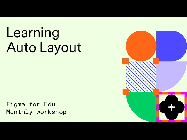
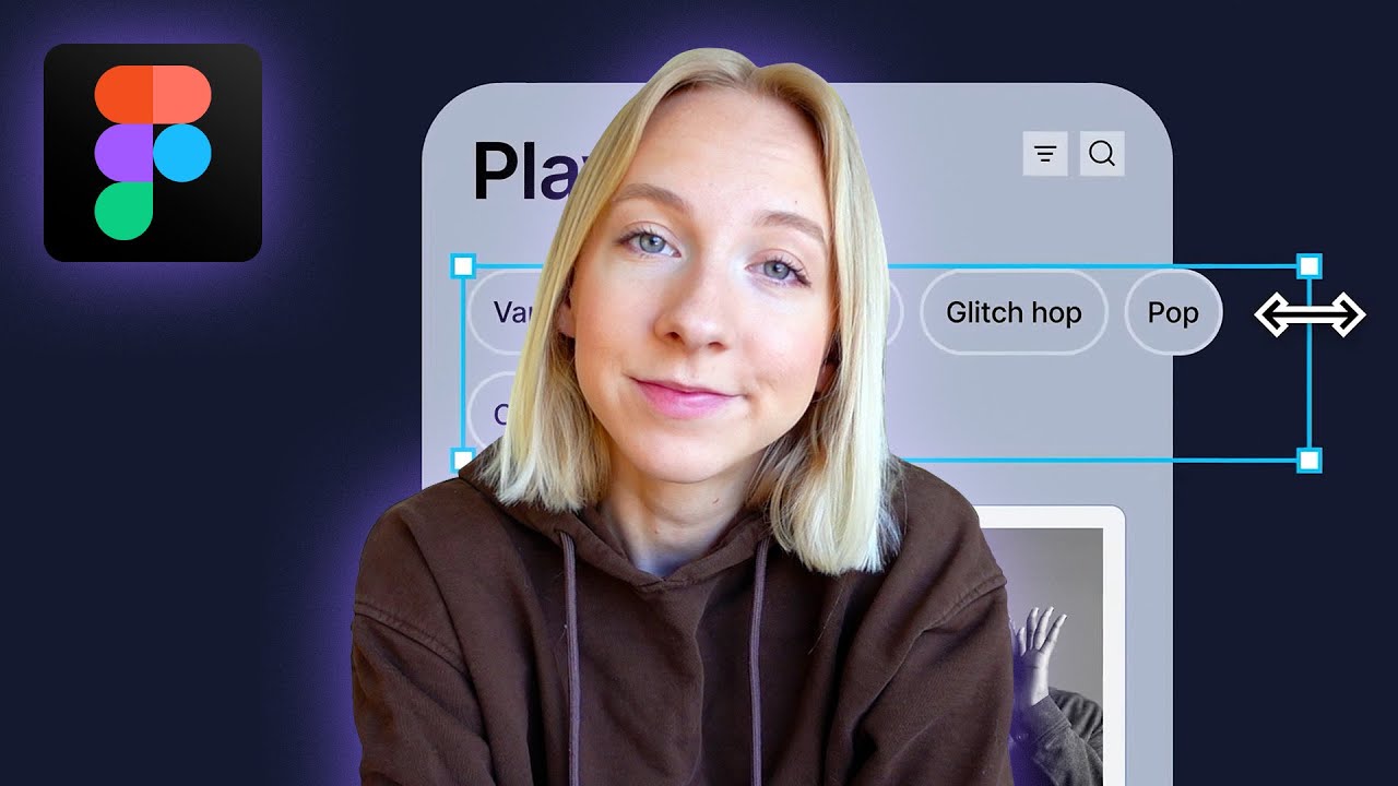
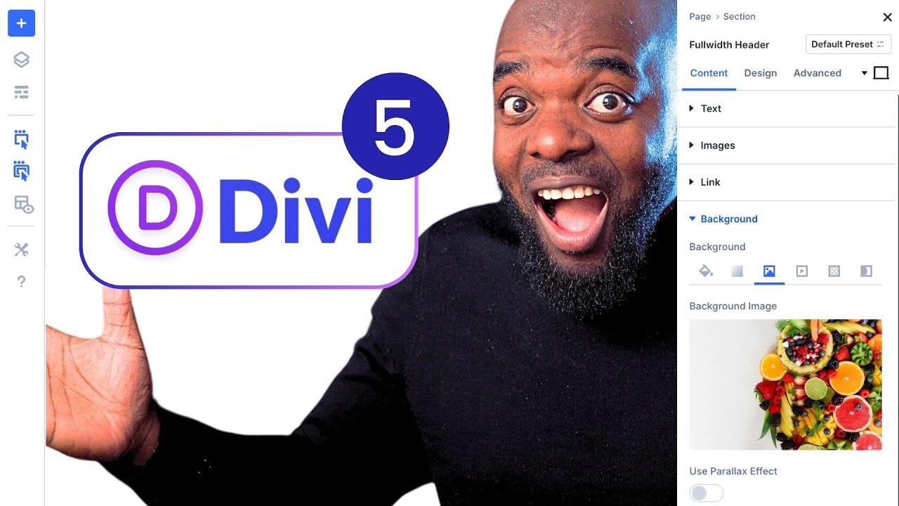
Hi everybody. And welcome to Figma for EDU's monthly workshop. Today, we're going to be talking all about auto layout this year. There have been a number of changes that have impacted the way that you can access auto layout. There's been some improvements on auto layout as well. So we're going to be talking about that. Many of the slides that you see here are also coming from Figma's auto layout. UI three playground. Those playgrounds are constructed by my team, the designer advocates. I had the honor of being able to work on this. So I'm going to
be giving you the best understanding of these slides and we're going to work through some examples together. So first off. What is auto layout for many of you, you probably heard this concept, you may have worked with someone else who has created something using auto layout, and it seemed a bit mysterious to you as to why you might want to use it, or how you're going to use it. For your best practices. Now what auto layout is, is a way to structure your design. So it can either grow with the content as it grows. So
if you think about a website, you know, uh, as you add in text, that footer is going to grow, right? Things are responsive to one another. So as an. Image grows. It might push down text as an image shrinks. That text might move up, you know, as you add paragraphs of text, things need to be reflexive and move, you know, when you're localizing content Into other languages, you need to consider how those language changes. The size of that text impacts your design. So we're going to start here with just a simple example. I'm going to
walk you through this example, and then we're going to start from square one. So, uh, here. Let me grab I'm going to grab I have this component in the document, and I'm just going to show you quickly Like how this works actually I'm just going to drop it over here. So this here is a component this component is actually constructed using auto layout. Self. So when I hop over here, there's a panel and you'll see that, uh, as I, I expand and as I grow this component, right, the content kind of flows with it. You'll
see that image area get larger. You'll see that this text is also impacted. And so also we need to consider that when you have a. Additional elements. If you consider a feed in your phone, you're working on a phone design and you want to consider how these things are working. So if you have, you know, one object, you have another object. I'm just going to color these so you can see them here. I'm going to have a third object. So when you have these objects, sometimes when you need to move them around, it can be
really cumbersome. You're like, okay, I got to move this up. I got to move this down. When you have auto layout, what it's going to do, it's going to construct a frame that is going to keep the ordering of these objects as well as the spacing between them. So if I were to take these three objects and if I have them Unstructured, I can select them. And I'm going to enable auto layout. So you'll see this panel over here on the right, I'm going to hit plus, and you'll see that they kind of get arranged.
Let's try that one more time. I'm going to have this over here. I'm going to select them and now I'm going to press shift a, and you'll see that they're now kind of arranged and that might not be arranged the way that I want, so I might have to make an adjustment. I'm going to set their direction and I can set their spacing. And I can even reduce this here. So what you'll see is that these objects now retain, right? The spacing in between them. So this auto layout frame keeps them organized together. And then
if I want to move one above the other, right, I can move this up. If I want to take this card and expand its height, it moves the other ones down. So when you're thinking about auto layout, you're thinking about content design and the way that the layout responds to that content. So I was just asked, will this cover advanced auto layout? We're going to start off a little slow and then ramp up pretty quickly. So, uh, first things first, enabling auto layout frames, the shortcut key is shift a, you probably have seen, you know,
some tech talks out there of influencers Being like wax shift day, right? Shift a is going to be the shortcut. And what it does is it takes the elements that you currently have selected. So if I have right, one, Two, three objects selected. I select them and I press shift a, what that does is it then encases them into an auto layout frame. If you look over here on the left, you'll see this frame has a very long name. Let's let's rename that. We'll call this three boxes. So here we have our three boxes frame
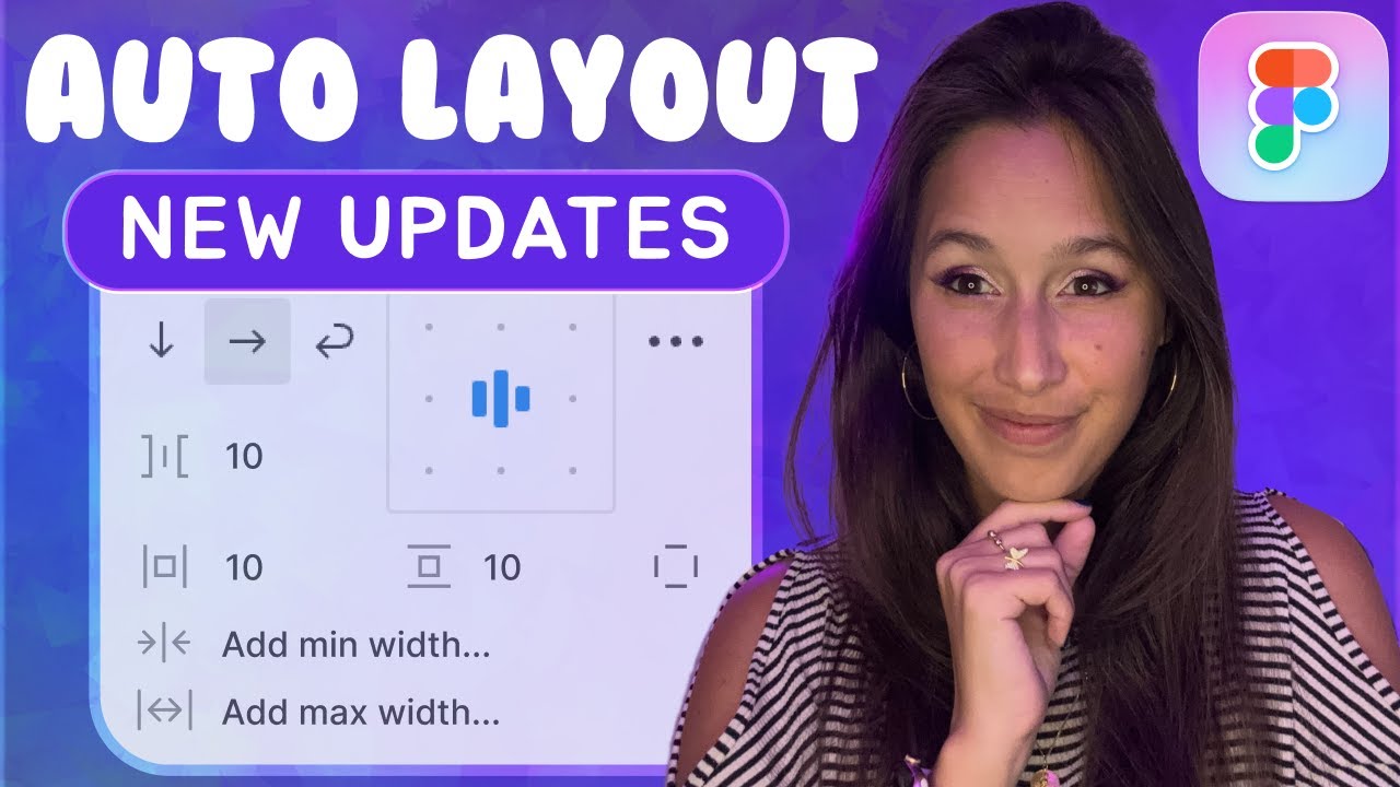
and all of those objects are now. abiding by the rules of that frame. And what are those rules over here in the auto layout panel? And I'll show you a quick trick. If your auto layout panel, you don't see the little names here. So you see resizing direction and gap alignment. If you don't see that, go Ahead, click this little option. And there's this choice called property labels. When I turn it off, This is the more advanced mode where we don't rely on those labels to, to save some space. But if you're just learning, click
right over here in the view options and choose property labels, and you will see labels that will help you understand these properties that are going to impact your auto layout frame. And the first one you'll just see here, a simple one we'll cover it in more detail later is this direction. So you can see that I can choose for these. Three boxes, either to move in a vertical format or a horizontal format. Now I can break the auto layout. Um, I'm going to show you a quick one. I'm just going to hit command shift G.
I'll show you the shortcut in just a bit, but I can break the auto layout frame. And then I just have those individual objects and they're no longer. Constrained by that relationship. So all auto layout is, is a frame that has a new set of rules that arranges the objects that are inside of it. And the purpose is to allow you to expand and contract that. Now with UI three and with the recent launches at config, we have a new feature called suggest auto layout. And when it's talk about that In a moment, the new
shortcut key for this is shift control. A if you're on windows, it's control alt shift. A there's also a way to access it, um, on the canvas and a right click menu, but suggest auto layout is going to let things work a little bit differently. So once again, we have auto layout where I can take a single object, uh, a row. Or a column. Um, or even if I wanted Multiple rows of an object, I have these three objects here. Let's pick a color that I have there. I can select these three objects. I can
press shift a it'll arrange them vertically. I can arrange them horizontally. Right. And I can adjust them. There's going to be certain rules that govern how they respond. Now suggest auto layout. This is going to be new, wherein I can actually take. Multiple a more complex layout. So I can have one object here, right? I'm going to have one. Let's say two, three objects there. And then let's say I'm going to have one, two, three objects there. And I'll show you the shortcut key for this is shift control a, but if you're not too into
shortcut keys, it's okay. You can right click come down here. More layout options and suggest auto layout. Now it suggests auto layout does is it creates nested auto layout frames. So you can see that I now have a more complex layout. So this is going to be one of the newer features to just auto layout is going to take a look at what you're trying to accomplish and it will produce a more sort of responsive layout. Approach to generating for you. So if I take a look over here, it's just auto layout. We have one
frame, we have two frame, we have three frame, and it's nesting those different rows and columns. And we'll dig into that just a bit. So now removing auto layout. Now, Many of you, you might be working on something and you might need to remove auto layout, you want to break it apart. So then this way you can access those individual elements. Sometimes you might be working with someone else you need to dissect something, and you're just like, okay, I need to take a step back. Uh, I need to reconstruct this for myself. I'm going to
show you how to do that. I see here. We have a question. Can we see how to use auto layout to easily switch between desktop and mobile tablet? That's a longer question. We'll get that in a bit. Uh, how can we create the boxes? The boxes are being created by pressing the R key. So I'm going to draw this R key here. I'm going to press R key to draw a rectangle and you'll see that this is just a rectangle. I'm starting off with simple rectangles, um, but this might swap out for a text box.
It might swap out for an image. It might swap out for a component at a later point in time, but for now I'm just using these simple rectangles using the R key to show you some of the concepts. So for breaking and removing auto layout frames, so I just bring these frames over, you'll see that this is an auto layout frame. I'm going to call it three boxes. And this one I'm going to call this wireframe layout. And now so for these three boxes, they're In the frame, you know, I'm trying to, you know, Let's
say I'm adding something to it, you know, I just added this rectangle and let's say the behavior of that auto layout frame is kind of causing me a bit of distress, and I'm just like okay, I just need to break this out. Um, what I can do is I can press, uh, option shift a or alt shift a. Another way to just destroy it entirely is to press command shift G that'll break it out and keep those elements there. So once again, it's just a frame that's organizing its contents. So in here in three boxes,
you'll see the boxes that are inside of it. So when I remove auto layout, I can also just right click and say, remove auto layout. Now. With suggest auto layout, right? And this is the more advanced concept where we actually have, you know, um, all of these auto layout frames Within auto layout frames, right? So one, two, we have all these frames. Let's say we want to break them all apart. So we have a much more complex layout. Let's say another designer gave you this complex layout, but you need to break out those elements and
sort of digging in and removing one by one. This is proving to be cumbersome. So what I'm going to do is I'm going to select this, I'm going to right click, and I'm going to choose, uh, more Layout options, remove all auto layout. Right? So the things that we're covering in these two frames are basically creating an auto layout. frame and removing an auto layout frame. And in a moment, we'll start to get into the options that you can use to have more intention when generating your auto layout frames or editing them and knowing how
best to work with them. So once again, the way that suggests. Auto layout works is it'll look at something that is a bit more complex. It's a good way to maybe kick off a design. It may require that you apply some editing with its properties, but I think it's a great way to start to see how you might begin to structure something using auto layout, wherein let's say you have something that is complex, like this component here. And you'll see that what we're actually Looking at is, you know, several elements that have nested auto layout.
So within this frame here, you'll see that I have one, two, three icons on the left. I have an icon on the right. I have this on the bottom. So when you have a more complex layout, you're thinking about being intentional of the arrangement of those objects. So. So I see someone says that control click does not bring any options when Selecting the shapes, you need to have the correct selection right like so here. If I don't have this. In an auto layout frame, I'm not going to see those options, right? So you'll notice when
I select those options, if I right click, I can add auto layout to them, right? And then here's the suggest auto layout. So, um, control clicking, if you're not seeing the, the right click option, but it's essentially the context Menu, that's going to give you the ability to access these properties. Is there a way to, yes, we're going to be talking about these concepts so I'm not going to get ahead of myself yet. All right. So, I also see here that Corey West from SCAD is in the chat just want to give Corey West a
shout out as well as Santos Torres. So, what's up, how's it going, glad that you can make it. Alright, so once again let's talk about suggest auto layout, and once it and I'm just going to. Start simply with just some of these rectangles. So here, you know, I have this object when I have two, and then I'm going to have, you know, some smaller objects here, one, two, three, four, right. We want to think about what we're beginning to do here. And what I would recommend is just see. How it's working for you. So you'll
see that it recognizes that these three shapes have a relationship. It sees this object as being kind of on its own. So I'm going to color that one a slightly different color. And then these two here are kind of on its own and it's going to try to do its best to accomplish what it thinks you're trying to do. And so you'll notice that there's other Options here, such as resizing a Uh, spacing and padding and alignment. And we're going to be talking about those concepts so you can have much more control over what it
is that you are trying to make. And just like I have this component here, it's kind of like my prime example, as we're working through, we're going to take a look at this, you know, this has very specific properties that dictate that when I expand this, that this is Image grows that when I expand this wide, that my text field grows, right? Notice how these elements are staying to the left and this element is staying to the right. You know, that's how that works. And you know what I'm going to do? I'm going to go
ahead and drop Alex's. Photo in there just for fun. There we go. There's Alex. So you can see as I'm scaling it Up, as I'm shrinking it down, right. It's impacting that content. And in order to have control over these properties, right. You need to start thinking about your intention for making that component. All right, so, um, very quickly, the button example is kind of the classic example with, uh, uh, Figma to demonstrate auto layout and understand how it can work out best. So if you've never made one Before if you're looking to be intentional
about one. Creating a simple button. So this example, once again, if you're following along, we created this community file, you can see where I am here. This example has the step by step for, for working on this. So you'll see that we're starting with the frame and some text. And when I press shift a, you'll notice that that frame. Assumes what you're trying to do. And so that now when I type in text, it grows. Um, so here too, when, uh, you'll see if I, if I type in text here, it grows and it expands.
Right. And that's because the outer frame. What it's doing is it's changing its height and width, depending on the contents, depending on the child object that we're working with here. Um, and so let's walk through that. You can start by pressing the T key. The T key is down here. You could put in some text so I can say, hello. world. If I want to, I can make this text larger for the purposes of this live stream. I'm going to come over to the typography panel and make this larger. So I'm just going to make
this like 96 point text. So this is just a text field. If we take a look On the left in the layers panel, we see that text field. Hello world. Now, when we press shift a, basically what happens is it takes that text layer and it wraps it inside of a new frame. So you'll see now that. My text layer is inside of that frame and we can rename that frame and call this, you know, our hello button. I'm renaming it by double Clicking and typing that in there. And when we look at this, now
that this is a frame, we can control frame. Properties, right? So the frame properties of this, when I select this frame, you will see over here on the right, there are fill and stroke properties. So the way that the button has a background is that that's an auto layout frame. With a fill. So I'm going to add a fill and that's going to make a white background. Let's go ahead. Just so y'all could see it in the back. I'm going to make it a stark green, for example. Now, I'm sure I can repeat how I
converted it to a frame. Let's go ahead and let's break it. And let's walk through that one more time. Here's my text field, I press shift A. Or you can come over here. Um, actually you're not going to have that option yet. You're going to press shift a, and that's going to make it into an auto layout frame. When you make it an auto layout frame, you will see the auto layout properties over here on the right, sort of be impacted by it. So now this is a frame and inside is this text. This frame
is currently set to hug. Resizing. So if you take a look at my window over here, I could see the width and the height of it, and I can see the resizing option of that frame. The frame is hugging the contents. So as those contents get larger, it impacts the size of the frame. The easiest way to see that is to select the frame. Hello button. We're going to select the frame. We're going to come down here and add a fill. I'm going to add that like green fill. There we go. What is that? That
brat chartreuse. And we're, when we edit that text inside of the frame, you see that the outer frame grows. However, there's. Other properties as well that we're going to talk about such as if we look Down here, there's going to be padding. This padding right now, it's set to a value of 10. I can change that padding by increasing it. So there's my horizontal padding. There's my vertical padding. Now these are things that can also be adjusted on the canvas. When I go onto the canvas, I can adjust my horizontal padding and I can adjust
my vertical Vertical padding, right? There we go. There we go. I can adjust the padding on that object and you will see that reflected in the properties panel on the right. So when I click on this little option, I can control all of the individual padding surrounding that object. Now. So once you select the auto layout frame, you will see the padding shop underneath it. Um, so, uh, now another thing to look at is, let's say that we select these buttons here right we have a group of them, and we press shift a right now
we have buttons that are auto layout frames. Arranged by another auto layout frame. So we have button one, button two, button three, four, and five. And they're actually in a wrap frame. So the wrap frame allows me to move this up and down. You'll notice that the three Options are going to be vertical, horizontal, and wrap. We're going to talk about that in a later section. So if I was to work with something like this, let's make this look more like a button by selecting the frame. Coming over to the right and giving it some
border radius. There we go. That's the good stuff. Let's give it a stroke. Let's make that stroke a little bit thicker. And there it is. So when you have an arrangement of these, let's say one, two of these and I, uh, let's add a third. Yeah, let's just leave the two. So you'll see on the left pane here we have an auto layout, you have an auto layout button, and we can nest them right and this is what suggests auto layout does is it will create all of the arrangements. So we're going to nest these
manually by pressing shift a. And so now we have our navigation navigation. So in the same way that you might construct a webpage using HTML, where you nest elements, you nest like button elements inside of a list or button elements inside of a div container. You're going to think of these auto layout elements as those same containers. And as such. When I type in my text, you'll see that the other button, uh, moves down the line. It gives me room if it weren't for that. So if I was to say, but in one, right. And,
but in two, if they weren't wrapped inside of this navigation frame, that is auto layout and they themselves not have auto layout, right. It'd be much more cumbersome to work. So if I was to come down here, right. And let's remove all auto layout, you know when I edit this button, Right, it's going to be so much more difficult, like every time I adjust the button size, I would need to then move this over, right, I need to move this over, and I need to move this over. Right, so without auto layout. You know, you're
doing a lot of extra work that you don't necessarily have to. So, you know, I could say home and like about me, um, I can make those adjustments and it will keep that relationship. It'll always keep the spacing between Them and maintain the padding around them. Um, so yes, auto layout frames can be set as components. So yes, all I would need to do, we're going to be talking about that in just a moment. Um, so if I were to take this frame. And make this as a component and go to my local assets. When
I bring this out, the auto layout is set on the component. So you can see that as I type, right, I Could have as many of these as I want. So one of the prime functions of components is to use. Auto layout and allow you to work, you know, more intentionally like focus about the things you really want to care about instead of moving things around nest needlessly. All right. So, um, so right now, there are some hacks, but, you know, aspect ratio isn't currently maintained in auto layout, But I would just keep your eyes
posted, because it's a highly requested feature. So, uh, once again, I'm just going to show you, uh, uh, suggest auto layout. So I think that's just auto layout is a really cool innovation. Uh, and I want to just highlight the three differences. So if I were making a little card here, right. So this card, you know, I want this content to grow and expand As I increase this width. You know, I want this text, you know, to wrap around and grow as I type text in there. These are. Behaviors that I want to think about
this card to make it, um, more useful. Um, so, uh, um, so what we're going to do here is just kind of see what this looks like. So without auto layout, right. Um, it's just inside of a frame, right? There's not really that much you can do to grow the text automatically. Now with applied single auto layout, right. You'll see that this is pretty complex in order for me to work on this. If I was to apply single auto layout with shift a right, you'll see that what it's trying to do is wrap everything inside.
Right, it's not giving me the output that I desired. So what I would need to do is I need to go in and manually. Press auto layout for each one of these objects, right? So this one, this one. So this is auto layout. This is auto layout. This is auto layout, right? That can be very cumbersome and time consuming where, you know, okay, this is starting to work, but it's not quite there yet. Um, suggest auto layout. Right, I can go in here you'll see that this right now is the same frame as those other
ones. If I right click more layout options suggest auto layout shortcut key for that being control shift a right so let's do control shift a when it applies it says for new layout frames created. When I go over here to my file. Each of those new layout frames created will have a little dot that shows me that it was created by suggest auto layout. And then let's say if I want to rename these frames that were given to me, um, because If we have, um, UI three, you're gonna have this new feature down here that
is gonna be rename layers. Uh, so when I choose rename layers, we can see that we now have a container song, info, song title, music icon divider, right? It just made that work for us. So, um, now if I go to this card. You'll see that it's Growing the way that I want. And as I type in text, right, the text grows and this object here is aligned to the center. I'll show you that one more time, but feel free to try this out in the test file. So I'm going to bring it down to
this area. Here we go. We have this card. We take a look at this card. It's just a frame. We have a few icons. We have some dividers, right? Things are just kind of placed inside of this frame. So. When I go here, you'll see there's normal frame, right? Things are just moved around now. It's intense. It's important that you try to, uh, be as intentional with, you can't, with you can about aligning objects Where you want them to be aligned. And so I'm going to go here to card, right? So watch the layers over
here on the left and a right click. I'm going to choose more layout options and I'm going to choose suggest auto layout. And what that does is it creates all of these new layout frames. So let's, let's move. Let's move this window to be a little Bit wider so we can take a look at that. So card, art, album, placeholder, all of these frames. So now I'm going to select that card. I'm going to come down here and I'm going to choose in the search, I'm going to type in rename layers, right? It's part of
the AI beta. And once again, if this is a Figma for education live stream, right? We support the education professional plan you. If you're on the education professional plan, you're verified for edu. Um, all edu accounts now have UI three with the option to go back to UI two, if you wish, but if I type in rename layers, right, you'll see in real time, um, my layers, uh, get renamed. So card details, title with icon title, right? We have our dividers artists with icon artist name, artist icon. It's going to go through and name Things
a little bit better for us. So yes, it is also available in the desktop app. All right. So let's see, now we're going to talk more about some of those details and controlling auto layout. Now that you have a sense of what it does, right. It allows you to work with elements in your designs that can grow to fit content. Um, and there's going to be two Ways you're the text, the content's either going to, um, grow to fit. Contract to fit or the content inside response to the outside frame. So the way to think
about auto layout, there's two ways to think about it. Either the frame is responding to its children or the children are responding to the frame. And all of that is basically what you control as a designer. So. These are the main things that you're going to think about when you look at the icons on the left, you're going to see horizontal auto layout, right, let's see I think they changed those icons on me recently too, but you'll see horizontal auto layout, like as objects across vertical auto layout, they're going to be vertically set wrapped auto
layout. That's when you're doing something like a, like a, You know those individual things so someone asked, I have an EDU account, and, um, see get AI. If you have an EDU account create an education team, there's a good chance that you verified for education, and you are just on a starter team so make sure you create an education team we have a YouTube video out there this is getting started with Figma for education, and it walks through the steps. So many people that I encounter, I would say only 15 percent of verified EDU users
actually create an education Team, and just work on starter teams and that's why you're not having access to the, to the features. Alright, so here are the different. Types of layout that you have horizontal auto layout, vertical wrapped. You're going to see that in the icon here. Um, the things that you're going to notice over here on the right, when you're working, uh, with auto layout, let's see, uh, uh, I'm just show you. So if I have an object, let's Do just something very simple. Let's create these three. Rectangles, I'm going to put them into
an auto layout, right, the options that you have over here. The resizing is going to impact how the auto layout response once again it's either the, the frame is responding and growing to the children, or the children are growing and responding to the frame, right, it's one or the other. So those are going to Be set here and it's. They've actually updated it recently. Um, so auto layout direction padding and alignment. So direction is basically, you know, I'm controlling which direction it's going wrap is unique in that it'll allow the row to wrap around. So
if you're thinking about this resizing and those elements maintaining. Their space, right? That's what's going to be Supported by wrap, uh, direction. I'm sorry, the, um, gap right here. That's going to be the spacing that you have in between those elements. So that's controlling how much space they have now that could either go be a positive or negative value. And then we are also going to have that padding. So you'll see that these objects are here. Every frame has the ability to create a background and the background Will help you see the padding that's being
applied to the frame. So when I apply that you'll see these padding values I'm able to increase them, and that gives me the padding around the element. What this is in reference to is the box model. So if I. Click on over and take a look at dev mode. Um, you can see the way that this is going to be, uh, surfaced to a developer when You're working with a developer, right? The padding values, the spacing values. Those all help the developer understand the way that this content is going to flow. So auto layout is
going to map to concepts of web design, such as Flexbox. Um, and we're going to talk about this a little bit more. So someone was wondering what page I'm on. I'm currently on the auto layout settings and control page. If you zoom out, you can see that we're in the third row right here. Um, So you can adjust auto layout on the canvas. We've already been doing that. When I take a look at these elements here, when I hover over the gap spacing, when I hover over, you know, the, uh, padding, these are all values
that can be changed. You can also just click on them and type the value in. Um, so I could say 48. So a lot of people prefer to work on the canvas, you'll notice that these elements are currently, you know, aligned here to the left with that wrap that alignment, we're going to talk about in just a moment, you'll see this little, you know, alignment cracker. That we call it looks like a little saltine. Um, I could adjust the alignment of objects within it. So if I have more height, You can easily see that I
can control how these objects work. And if you start to add more objects, that's going to be a great thing about this. I'm going to press command D, uh, control D if you're on windows, that's duplicate as I duplicate in more elements, right, they kind of come in here. And, and I'm able to control with these settings. Right. How they show up. Right. So right now, when I click on that sensor line sensor, they're going to be in the sensor and aligned in that way. Um, so nesting into auto layout frames, right? When, when you're,
when you're placing stuff into it, let's say you have, uh, you're going to introduce a, a new element into your auto layout as you begin working, right? I'm going to drop this in here. I can see the placement of it. And if you take a look at my layers panel on the bottom left, you can see that where those elements are. Going to be placed when I drop that circle in here, right? It's going to be placed in there. When I move it around, it's kind of letting me know where it's going to go and
where it's going to fit. So, uh, here I can change this frame To be hugged contents and hug contents. This will give you a better sense of it. So now when I'm adding this in, you'll see that the frame will grow to fill and I can move it around and we'll get a nice little animation to see where this is going to belong. This little animation, um, is, is new, uh, with the recent update of auto layout. So if you haven't seen it before, you know, this will give you a much better sense of where
Something's going to get placed. And this is going to be a concept we're going to talk a little bit later. If you're on windows and you hold S. Or if you're on a Mac and you hold the control key. So you'll see this little option come down and I'm dragging over. Uh, if I hold the control key, I'm going to get a different option. So the control key on Mac or the S key on windows, it's going to let me Place this object wherever I want. I'm going to put it up here in a top
left. Right. Um, so otherwise it'll go into the flow or if all the control key, it'll go in there, right? Still part of the frame, still nested. It's still. In there, it just has an absolute position within the frame. And once again, that'll be a ton, a topic we're going to Talk about in just a little bit. So we're going to dig into, uh, direction, alignment, padding, and spacing. Um, Alex, were there any questions that, that I should address real quick before moving on to the next session? I would keep going. We have a few
questions, but a lot of them are probably going to be covered in our next prototyping session, or you might cover in the next section. Okay, cool. So yeah, I noticed a lot of questions are just, you know, things that we're about to cover anyways, so that that's great direction helps you understand, um, basically like the behavior. So either objects are going to go in a row, or they're going to go left to right, or they're going to be vertical. Right? Um, you can wrap and I see somebody just asked a question like, uh, auto layout
to make prototype more interesting. Uh, you absolutely can prototyping with smart animate will acknowledge auto layout and give you the ability to do some really cool things. Uh, we might not get to that today, but I would highly encourage you to try that out. You can basically animate padding and spacing, uh, with smart animate and prototyping, and that will give you a lot of really cool, uh, opportunities. So here, once again, when thinking About auto layout, if I was to, let's say, let's use polygons, we've been using a lot of rectangles. I'm going to draw
a little polygon here. Let's get a little triangle going. So I have one, two, three. Let's make this one like a little hexagon and let's make this one. What is that? There we go. A heptagon. that's seven sides. 1, 2, 3, 4, 5, 6, 7. Yeah. Yeah. That's a heptagon. Okay. So we have these three objects. I'm going to select them. I'm going to press shift a. So once again, the direction, if we make them vertical, right, they go in a vertical direction. I can select one and I can move Up and down with the
arrow keys. on my keyboard. So I can move those up and down at any point in time. I, if I wish I can make that horizontal, um, or I can make it a wrapped element when it's wrapped. That means that the, uh, main frame, the container frame, um, is a little bit. Different in that it allows me to, uh, control its width and that width will impact the objects That are inside of it, right? So that's going to be direction. So you have those three options. So horizontal, vertical, or a row wrapped. Layout alignment. We
started touching on, um, alignment matters in how your objects are going to grow. Are they going to grow from the left? Are they going to go from the bottom? Are they going to grow from the right? So if I have here a circle. Let's see if I have a circle and then I'm going to have some text. So let's say, hello world. I'm going to create some text there. Let's say we're creating like a, uh, like a little like avatar here. Right. I can select them both. The thing that I will note. On my text
field is you need to be aware of the text field alignment as well, right? And you also need to be aware of the text, uh, whether it's auto with auto height or a fixed size. My text currently is auto width, and that means that it'll just kind of grow to fill. So this is going to be the way that it behaves with the button. We can select both of those objects, press shift a. Puts it into an auto layout frame. We can call this like a avatar title. And now that it is in this frame,
we can give it a fill. We can select that and give it some padding. One fun factor, a pro tip. If you want to change all your padding at once. If you're on windows hit control. If you're on Mac hit command and click on that window, you'll see that it changes to, uh, give you a full window width, right? So that's a full window width right there. And so when you click in, I could type in 80 and it'll. Impact all of the, the, the, the fields at once. So command click in there, it'll select
all the fields and I can put in a very specific value. Now let's just round out those corners. And so, um, here, what we're talking about once again, is this concept of alignment. So if I were to expand this width, Right now we have a fixed width. Resizing behavior on this panel, and this alignment panel becomes much more important because we can align this content from the right. And that mean it grows from the right, right? So I'm typing it and it grows from the right. I'm hitting undo. Now I can say, All right, click
on the left and now it grows from the left. If I were to take control over the height of this component, now we can determine where does the alignment grow from? Does it grow from the bottom right? So I can type in text and you can see that it is growing from the bottom right there. Right, so that alignment. These are all things that as a designer, if you're building out a component, you need to be intentional about the ways that you want it to grow and flow, and likewise, if you have multiple objects. You
know, and you put them inside of an auto layout, you know, it's important to think about how this might grow and impact those other elements. So as I'm typing in here, oops, there we go. As I'm typing in here, it has a fixed width. So I'm pressing the return key to make this larger. It's going to grow to fill that space. And that's how The, the alignment Is, is going to, going to be working. So thinking about bottom left, center, right, top, right, is going to impact how you are trying to render that intent out.
We've already covered padding extensively. So just thinking about the spacing around the elements and considering that the padding is an important concept that is going to be delivered. To the folks developing what it is that you're working on. So if you're building out a, a little Component, um, if you head on over to, uh, dev mode, you will actually see the representation of the box model in how it will be developed with CSS. So here I can see display flex. I could see the intentional width. I can see the padding that's being applied. Um, that
the items are being aligned to the sensor and there's that gap of 46. So those properties, as you make adjustments here, right. When I go into this mode, it will impact them. Um, And for funsies, you know, if you're a designer and you want to begin to measure these out, you can like measure out the important bits using the annotation tool. And so if I was to make like little changes here and like identify to like the developer, you know, like what's going on here with like the padding, right. I can start to easily red
line that. And if you make Any changes, You know, like in your design. So if I increase that padding and I go back into dev mode, those values are now updated, right? So I can go back over here. I can reduce the padding, the top padding on there. And now when I go into dev mode, I can see that I've, I've changed that. I've. Altered that. So when you're working with auto layout, You're actually making your layout more conducive for web development. So these concepts may be new to you, but they're going to map a
little bit better to code for that developer. So when you're thinking about applying that padding and that intent, you know, once again, I can go in here. I could draw on like a little like annotation and say, you know, Oh, okay. Like let's impact this now to make this a little better. I'm going to select this text field. I'm just going to change its resizing. This is going to be a con concept. We're going to get to soon. We might go a few minutes over, but fill container will allow, uh, this text to wrap inside
of that component. And you'll see that when we go into, uh, dev mode here, I can, uh, be a little more intentional. About how this value is surfaced to the developer. Right. Um, so here we've already talked extensively about gap auto spacing is one that we haven't quite yet tackled auto spacing allows you to, um, Apply even spacing across the elements that are inside of your auto layout frame. So if I select these three objects, I'll press shift a, and I come over here to this alignment. Um, I can select. And press X, right? So
if I press X in here, right, you'll see that those objects, the spacing in between them will grow, right? It's also, uh, accomplished by typing in auto into this field. So if I want explicit. Spacing I type in 42. Otherwise I can come to this dropdown. I can do auto. And what that means is those elements are going to, uh, uh, not grow to fit the container, but The spacing in between them will. Right. So the spacing in between them will. Right. And then once again, as I add new elements, command D command, D command
D right, like those elements, that spacing, because it's auto though, that that spacing kind of then decreases. Uh, we've kind of talked about this briefly, but canvas stacking. So if I have like, you know, One element, I have two element. I have, uh, let's say a third element. That is green and these are, oops, these are in an auto layout. When I press shift a, I can reduce the space, but let's say I want to alter how they stack. Let's say I want the red one on top. I can select this frame. Let's say, let's
make the red on top. I can select that frame, come over here. There are auto layout settings and you'll See this canvas stacked setting that allows me to choose the first be on top. Right? So we got the last one top and now it's going to be the first on top. So that's going to be a setting. A lot of people will miss this, but that will give you the opportunity to change the stacking. Can you make the middle one on top? Uh, not necessarily because there can be infinite middle ones. Um, so right now
the Z index spacing doesn't necessarily count. However, if you want to have something that sits on top of the rest, you can create. Absolute position elements that ignore the flow of those. So this circle right here, I could drop it in there, right? See how it's part of it. But if I want it to be in the front and center on top of everything, I can hold the control key. I could drag it in. Now you'll see it is an absolute positioned element. You'll notice it over here in the top, right on the design panel
as well. This ignores the auto layout and lets it live inside of here. So even as I add more elements, it's always going to be on top. So if you wanted an object to sit on top of your auto layout, now, All you need to Do is consider how you want it to align. If I come over here and I choose center align, it will give me a sensor aligned constraint. The constraints panel basically tells an object how to align inside of a frame. So we're going to choose a center constraint. And that means that
as I have More elements. It's always going to be in the center of the frame. Let's say I apply a top rate constraint. So let's choose right and top. Now, as we add this, right, it's always going to be on the top and the right. Let's move this down here, and we can choose top. And, uh, let's see. Right. And bottom. And now as this grows. It's always going to be in the bottom. So that's going to be Absolute positioning. You'll see those a little bit lower. Um, do you have a little bit more to
cover here, but basically the thing, the last, the last two concepts I want to leave you with are the notions of resizing as well as setting minimum and maximum. Values. So when we talk about resizing, we have to think about whether the canvas or the, sorry, the frame is impacting its internal elements or the internal Elements are impacting the frame. And I'll show you what I mean by that. So if I have, let's say the, I'm going to make a UI card. So let's say I create the space for an image. I draw it a
rectangle. I come over here to the fill. I choose. Placeholder image, right? We got our placeholder image. Let's give that, um, like a small Stroke just so we can kind of see its outlines a little bit better. And I'm going to round out the corner radius next. I'm going to draw a text field by pressing the T key and drawing out a text field. And I'm going to say, you know, hello world. Why? Because I can't think of anything else to say at the moment. So when I select that, I Can increase the type size.
And we're going to think about the relationship here of these two objects. We're going to make this a very simple UI card. Um, I'm going to select them both. I'm gonna press shift a and auto layout has been added, and now I'm going to pay attention to these properties that we've been learning, right? The re sizing properties, direction gap, the resizing properties Are going to be the ones that we're going to pay attention to. So we're thinking about the frame. So we're going to call this UI card. That frame is going to have the fill
background that frame, we're going to give it some padding. I'm going to hit the command key on Windows control key, if I'm sorry command key on Mac control key if you're on Windows will put padding around it let's say 20 pixel Padding so it's all the way around. Right, I can add another corner radius around that. And now once we have this card, we need to think about how is it going to behave. So when I add text, is the card going to grow or is my text field going to grow? Um, how do we
change the size of this image? If I increase the size of the image, notice that the container grows. So we need to think whether Or not we want the card to, uh, grow as the content grows. Or do we want the content to grow and shrink as that grows. So here, let's create, you know, um, container, right, or the frame, you know, grows, resizes, resizes. With content, right? Um, and so what we're going to do here is I'm going to select this text field. We're going to take a Look at this text field. This text
field right now is a fixed size. And what that means is that as I type in more text, once it goes outside of that range, that little, that little, uh, box around it, uh, it doesn't change. So what we want to do is we actually want to set it to auto height. So I'm going to click auto height, and now you'll see that that little text box grows as the text grows. I can also change it to left alignment. So here, we're going to make it left alignment. The one thing that I want to impart
on y'all is you need to think. About how you want the card to grow or contract, and then you need to ascribe those values suggest auto layout will only get you so far. But ultimately, it's what you want to do, it's not going to magically understand what you're trying to do off the bat. So here, I'm going to set the intention That this card is going to resize with the content, and it's going to and the way that it does so is that it's currently, let's say it's width. It's going to be set to hug
contents and you'll see immediately that that just grew out of this world in size. Um, but here we're going to set that width to, um, hug contents. I don't know why it's grown like that. Let's see. That should be, there we go. This just needed a, a width. On it that didn't have a with the side to it. Here we go. So, this card is now set to hug contents on the width, as well as hug contents on the height, and when I hover over it. If you take a look at the UI, you'll see
little red arrows, showing how that works, you actually see what What the contents are, um, in the auto layout. So if you pay attention, you'll Actually see how this is working. So when I go here and I hover over hug, you see the little red arrows. When I come over here and I hover over rug, you see the little arrows. It's telling you how it's behaving. Um, and so now as I increase the width or the height, um, sorry, the width or the height of this, you'll see that that now kind of grows, you'll see.
Right. However, it does just require that this Text field, you know, that it has a width, um, and that it has a height. Now we can do the opposite where, um, the, uh, content resizes with frame. So we could take that exact same card. And what we're going to do is we're going to set the width to fixed, and we're going to set the height to fixed. And then for the children inside, we want them to be responsive to the container. So here, the container's responsive to the children and here, the children Are responsive to
the container. If we choose. Fill container. And that's because the container has a fixed width and height. We can tell the children, Oh, hey, you're going to grow with the container. And that's going to allow me to say, Hey, right, that image. Is going to just fill as much space as it can. This text is going to fill As much space as it can. And this text too, let's say, because it sets auto height and has more texts than we're giving, it's going to overlap. Um, in this case, what we can do is we can
select that text, um, and tell it to truncate, we can say, Hey, We want to truncate the text. If you missed it, when you select that text field, you go over to typography, you click on these options, you'll see the truncate text option. And now when the card doesn't have enough space for the text, you'll see a truncated with an ellipse. Right. So there we go. It's truncating with an ellipse. And when you're crafting your auto layout, you're thinking about the resizing. So either the container is set to, um, hug or fixed and it's children
are set either to fixed or fill contents. Now, the more complex that Your container gets, right. They're just have that. Third option of, um, either fill, uh, hug or fixed. So fixed sizes, you determine the size. When you select an object, you'll see the dimensions underneath it. Fill container will grow to fill the container. So if I was to have one, two, three objects in here, let's say I have a text field. Well, I'm gonna make this text field. Uh, let's use rewrites this to add in some text. Uh, give me one paragraph about rectangles.
It's going to throw in some tech placeholder text in there. There we go. So let's say I have this text field, I go to typography, I choose truncate text, I select the, uh, the three of these, I select the Three of these and I press shift A. Now, um, what I could do is for those children, and I'll show you, this is probably going to be one of the quickest Coolest things I'm about to show you when you select a frame, you want to select all of its children, press enter. Now you can see these
three are selected. If I want to select the parent again, press shift enter. Now the parent is selected. So I press enter. The children are selected and I can set them all to fill container. So now as I grow the container, right. They're filling to that space. Let's say I want this one on the left to not fill container. I could say, Oh, Hey, you have a fixed width. You are now just that specific width. And you'll see just the other two grow to fill container. And then I can say, Hey, this object Right here,
I don't want you to fill. I'm going to be, you are going to be fixed. And you'll see that it's just kind of like you're playing peekaboo with the text field and that text field is going to fill the available space. Right. So, that's fill container so you're either filling the container, you are either determining your own size. Or you have hug contents where you Are, uh, constraining yourself to whatever is, is the contents inside. So just remember either the, the auto layout frame resizes with the content or the content resizes with the frame. Understanding
those two concepts are gonna allow you to have more control over your auto layout. Um, I know we're running short on time. It's Alex. I'm going to jump in. So we do have a bunch of questions. I know. Um, maybe we'll take like three. I would love you to get to this one at the top from Meredith, um, asking to clarify the difference between suggest auto layout and auto layout in simple terms. It sounds like there's a group of designers that are feeling a little perplexed out there. Okay, so auto layout. Only does one row
or column. So when I choose like three objects. Right. Um, it only does one row or column. So if I press shift a, right, these are a column, right, that's all it does suggest auto layout, we'll take a look at a more complex layout that contains rows and And columns, and it's going to do its best to make nested auto layout objects. Technically you can use suggest auto layout for everything. However, it may at times produce unexpected results. So let's say you have a more complex layout that is wireframed like this. This won't work with.
auto layout on its own, right? It's going to be weird. It's trying to just put it into one row or column. Um, however, when I use suggest auto layout, let's see, here we go. More layout options, suggest auto layout, what it does, you'll see there's nested. Autolayout components. So here is one autolayout row. Here's one autolayout column. And here's one autolayout row. With the intention of creating what it assumes that you want to create. So suggest autolayout will create multiple nested autolayout frames for complex layouts. Autolayout just adding one will only do a single row
or column at a time. Does that support the answer? That is a great answer. Now, Migs, we do have to wrap up. I know folks have a lot of questions that went unanswered. That said, we do have some upcoming sessions and some opportunities to give us feedback. So in the chat, I just added a feedback form. We'd love to hear what you thought of this workshop today. Definitely. So we can get better or if we can Dig in on any topics that you're like, Oh, Miggi didn't answer my question on this certain topic. We'd love
to plan sessions in the future where we blast through those. Please complete that feedback form. The other thing that we want to invite you to is we have an advanced prototyping techniques in Figma event coming up next month, and we'd love for you to join us, I just threw that RSVP form in the chat as well. So give us some feedback, let us know if we're meeting your needs here, and also hope you join us for our next month's session. Y'all are awesome. And we'll see you soon. Migs back to you. Brilliant. Thank you all
so much. If you want, please feel free to follow along on YouTube with the Figma for Education demos, check out the Remainder of this document as well. So what I would recommend is that you dig into min width and height, as well as max width and height. So then this way you're going to have the ability to choose and restrict how wide or tall your content goes. so much. And the final thing that we were going to cover, which we already covered a bit of is absolute positioning. So if you're looking to create auto Layout
elements that, um, uh, grow, uh, that are going to be independent of the auto layout flow, check out the absolute positioning constant as well. So as always, Thank you. I know there was a lot to cover today and I know we had some fantastic questions. Really appreciate y'all for joining in today. Please feel free to check out our YouTube. We do have some of this content that answers some of these questions and Feel free to reach out on Twitter. I'm at Miggy and, uh, Alex, take it away.


