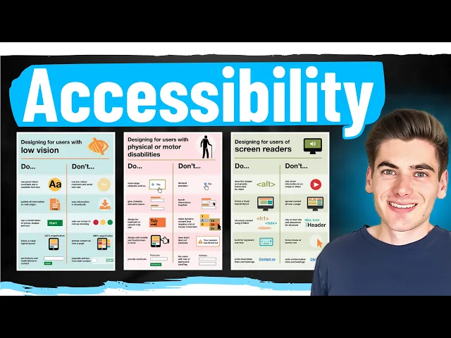
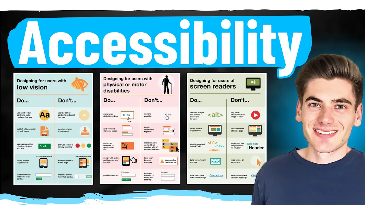
Creating a website that's accessible to everyone is incredibly difficult to do because there's so many different accessibility features that you need to take into consideration when I was making my list for this video I started writing on this whiteboard and as you can see I quickly filled the Whiteboard and had to start writing on other things to come with all the ideas that I thought of there are over 30 different Topics I'm going to be covering in this video and I'm covering all the different gamuts of accessibility whether it's visually impaired keyboard accessibility hearing impaired
motor impaired General accessibility all these different topics are going to be covered in this video and I'm going to cover everything from some of the more basic stuff all the way up to incredibly Advanced features that only the most hardcore accessibility people are going to need to master this Is really an accessibility master class and I really hope that you learn a lot from this because making the web accessible for everyone not only is important for people that need those accessibility features but also makes the web a more enjoyable place for everyone else because these
accessibility features generally makes websites better welcome back to web dev simplified my name is Kyle and my job is To simplify the web for you so you can start building your dream project sooner and I'm going to be breaking this video down into categories so to start I'm going to be talking about visually impaired accessibility features because that's probably the most common thing when you think of accessibility features then we're going to move on to keyboard accessibility we have hearing based accessibility motor function based accessibility and then just some general Stuff for a lot of
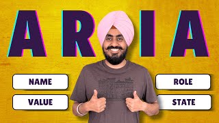
different classifications of accessibility now the very first thing I want to talk about is going to be labels now I know you're immediately probably thinking about clicking off this video because this sounds really simple but I promise there's a lot more to labels than you originally think right now I have a form and this is a very inaccessible form because my input has no label and even if you can visually see the form you Still have no idea what this input is actually doing so it's very common that people add in a label something like
this they're going to say label and let's say that this is for a name just like that now if I can visually see this site I know hey this input right here is for entering in my name that's relatively straightforward but this is actually not accessible to people that can't see what's on the screen and that's because there's no link between This label and this input so if I'm using a screen reader or any other type of assisted technology it will not tell me that this is a name input and even when I click on
this name label it does not focus inside of this input this is why when you're using a label you almost always want to use the four attribute and the four attribute takes an ID that points to the input element it's for so let's say that this is for name and we'll give this input an ID of name now If I save this and I click on my actual label you can see it focuses inside of my input and if I'm using some type of accessibility technology like a screen reader it'll tell me that this is
a name input cuz it uses the label directly from this label now I'm sure that you probably already are aware of that but there's a lot of other ways that you can label an input for example sometimes your inputs don't actually have labels on them because it's implied based on Other things that are visually on the screen so let's say this label input does not actually exist instead what you can do is you can have a label an area label I'm sorry attribute and then you can give it whatever you want for example name now
this is going to act as essentially exactly the same as having a label and pointing towards this with the name property so now we've essentially told screen readers or any other type of assisted technology this input is Labeled with this name property now I know it's very difficult to keep this all in your head because it's hard to know okay exactly what is this area label doing where is my input getting its name from and that's why a lot of Dev tools actually have features built in so you can see what label things are getting
for example inside of chrome if I just open up my normal development tools I'll pull them over and I'll close out of all the stuff that I have open Real quick you can see I have this button right here that lets me switch to an accessibility Tree View now you probably don't have this inside of your actual Dev tools so if you just hit control shift p and you search for accessibility you can see this show accessibility option that'll bring up this accessibility pane down here and at the very top you can click this to
enable the full page accessibility tree and this just lets you really easily Toggle between your normal HTML that you're used to and an accessible view that tells you kind of what a screen reader or some other accessibility Focus tool is going to see on the page so we can easily swap between these which is really nice and it also helps you see hey do I have semantic HTML and naming going on and so on but the really the thing that I want to talk about is this accessibility pan over here you can see I have
all my information about like Different area attributes if I click on my text box you can see it has this area label name and it also tells me all the different ways that I can label this thing for example I can use the area labeled by attribute this is a very similar attribute so if I were to come in here and I change this to the labeled by attribute instead of passing in a label directly it's going to take for example if we just had like a div with some text inside of it it's going
to Take an ID and point to that so you just give it an ID of some other element and it's going to use the label of that so let's just call this te so we can really see this inside the dev tools I'll pull over the dev tools and now when I click on that text box you can see that the labeled by is TE and you can see right here it's labeled by this particular element and this kind of tells you the order of how things are calculated so for example it's going to use
that area Labeled by or the label or a form label or the title or the placeholder or an area placeholder or another title down there so for example if instead just have some placeholder text inside of here that said name and I got rid of everything else the actual accessibility tools are generally smart enough to know that that is going to be a label and you can see it specified right there and if I had multiple labels it would just use whatever the highest Priority One is Inside of this list so I really like these
accessibility features for figuring out which labels are actually going to be used but it does a lot more than that because obviously we can see the full accessibility Tree on the side which is really useful now this may have been commonplace knowledge for you so the next thing I want to talk about is a bit less common let me just update my code I'll expand my screen so we can see what's going on you can see I have the Exact same form as before but I just added a button to save it and I also
added this empty div down here for a container essentially this is like a toast message that displays on your screen whenever something happens and then we have of course our form right here and all we're doing is whenever we're submitting our form I'm just taking my container and I'm adding a div to it that says we saved our data so imagine that you're on a website where a Toast message pops up on the bottom of your screen when you save your data that's essentially exactly what this is trying to emulate so we give that quick
save you can see we have a form over here I can type in some information and click save and you can see this saved data message pops up and again you can imagine it's a toast somewhere else on my screen this is something that's very difficult for visually impaired people to understand what's going on because They can't see this message pop up on the screen so me I can see this page I can see okay my data was saved properly but someone that can't actually see what's going on very well when they click this save
they get no feedback knowing hey the data was actually being saved so instead when you're popping up content for things like toast messag and other things that are showing up on the screen and being updated live what you want to do is you want to add an area Live attribute to the thing that you are adding this content inside of so for example this empty div right here is the thing that has live content being updated inside of it and then you need to specify the value for this and there are three different values off
just means it's not there it's essentially the same as leaving it off completely then we have assertive and polite and all these do is determine how we actually want to notify the user of this Change because the area live attribute what it'll do is if something inside this content changes for example we add a div that says saved data it'll notify the user of these changes saying hey this saved data thing was added so generally what you're going to want to do is use the polite attribute because that'll actually wait for whatever is being currently
said to them by the screen reader or managed by their accessibility tool it'll wait until There's a good time for the actual update to go through if you use assertive instead it'll essentially completely stop anything that the screen reader or assist of technology is doing and interrupt it to give them this exact message generally this is not a very pleasant experience if you're using a screen meter imagine if you're just reading a website normally by looking at it and all of a sudden the entire page goes blank and it says save data and it Won't
let you go back until it finishes saying save data to you that's a very jarring experience so assertive is something you should only use if you actually need to immediately notify the user that there is some type of change like maybe there's a really bad error that happened that you want to let them know of immediately that would be a great use case for it but generally polite is going to be good enough because it'll let them know eventually As soon as there's a break in whatever is happening inside their screen reader it'll say hey
you know what this new data was added now up until now we've pretty much talked a lot about people that are entirely blind but what happens if you can see fine but maybe you're color blind or you have a hard time distinguishing different colors this is where you want to make sure you understand the different contrast going on in your different text and things so We can pull up our Dev tools again real quick I'm going to minimize this down and we're going to bring this section up right here and go over to our style
section cuz this is where we can really easily look into exactly what we're talking about with accessibility so I'm going to select this text right here I'm going to specify a color of let's say red on this text now in any accessibility tool specifically Chrome in this case if you actually click on The Color Picker it'll give you a contrast ratio down here you can see it says 3.99 I'll Zoom this out a little bit so it's a little easier to see and if I pull that up you can actually see it does not fall
within either of these contrast radians there's double A and there's AA a AA a is like the gold standard if you can hit it you definitely should and double A is like okay if it hits this it's probably good enough but these are two different Levels of contrast essentially saying the higher your number is the more contrast there is between the background color and the foreground color so it's easier to read for certain people so if you have a hard time distinguishing different colors even if you're not color blind even if you just have a
hard time with seeing colors this particular red on white may not be very easy for a lot of people to see now you can see inside of my Color Picker there's these Two lines and these two lines represent the double a threshold and the tripa a threshold so as I actually drag this around in between these two lines you can now see I fall within this double a threshold and if I go below this line here you can see now I'm in that AA a threshold as you can see obviously black on white has an
incredibly good contrast ratio while if I changed it to white on white it completely disappears and it has a horrible contrast ratio and then Anywhere in between you can see my contrast ratio changing you can even see the text on the right hand side of the screen down here it's relatively easy to see while if I move up in this direction you can see the text becomes much more difficult to see so whenever you're building out a website it's a really good idea to make sure that you test the contrast ratio for your different buttons
text elements everything that's on your screen and there's certain Automated tools we'll talk about later in this video that'll actually do a lot of this for you but if you notice that you have poor contrast ratios make sure you try to tune those contrast ratios to hopefully get into the AAA but at the very least get into that double a level of contrast and the interesting thing is you can actually do a lot with these contrast ratios without actually changing the underlying color too much you can make rather minor modifications To what the color looks
like as you can see the difference between these is relatively minor but the contrast ratio is much higher which will really help people that have visual problems now while we're on the concept of color blindness in general I also want to show you another thing built into the Chrome Dev tools which is really incredible which let you test some of these visual impairments so if we just search again for this rendering tab so if you just Say show rendering that's going to open up a section down here for rendering and that'll allow you to test
a lot of different things but the things that we actually care about are going to be down here for emulating different things so if we scroll down just a little bit further we'll get to the point where we can actually emulate these Vision deficiencies so here I can for example test for blurred vision so this is for someone that has maybe really poor Vision but isn't entirely blind how easy is it for them to navigate my site we can also test things for reduced contrast so what happens if people have a hard time seeing different
contrast things and again that'll make it easier for me to tell if the contrast on my site is pretty good and then of course we have different color blind settings down here so we can see okay what does my site look like if you can't see red or green or blue or entirely gray scale And this again if you're able to go through these different accessibility settings okay you know test this with no color test it with no red test it with no green and make sure you can still navigate your site just fine even
with all of these different accessibility features enabled that'll make sure that your site is accessible to people that fall within these different categories it's all too common for people to use green for success and red for error when If you can't see green or red very well those two look exactly the same so again it's important to have different levels of hierarchy and different levels of emphasizing things besides just using strictly color because again if you can't see color very well those different levels of hierarchy don't work for you another thing to consider when dealing
with contrast is going to be not having a solid black background with solid white text on top of it I'll show You what I'm looking at here I'll just go back into that rendering tab real quick let's just search for that so we can make sure we disabled all these features to go back to absolutely no emulation and all I'm going to do is I'm going to change my text back to its normal black color actually we'll make it white in our particular case and we'll come in and we'll change our body to be black
so we'll say background is black and this is going to be a hard White on a hard black a lot of people think okay I want to make a dark mode for this site I'm going to make my background black I'm going to make my text white but this is incredibly straining on a lot of people even if you don't have any type of visual impairment this is very straining on your eyes to read text on a hard black background with hard white text on top of it this really intense level of contrast is just
painful to look at for extended periods Of time so when you're making a dark theme for your website generally try to opt for something that's not a solid black maybe like a gray color like this that's 333 it's just a gray color as you can see the contrast is less between these two colors and it makes it a little bit easier on the eyes to actually read what's going on now if you want to offer multiple themes for your site sure you can go ahead and offer a true black on white theme if you really
Want to but it's important that your default theme is the most accessible theme that you have so try to make it so that no matter what people have viewing your site they're able to read and view your content with the theme that you have as easily as possible so make sure it's high enough contrast that people with low contrast issues can still see it but that it's not so Stark with like a black background white text that it's painful to look at for extended periods Of time now you'll probably immediately notice lots of changes on
my screen from the last clip and that's because I enabled high contrast mode on Windows this is a feature that you can enable on Windows or Mac or pretty much any operating system out there and this is a feature of people that have contrast issues may enable on the site and it makes everything as you can see incredibly high contrast now this is something that you want to be able to Test your website in this high contrast mode to make sure that it still works as you expect it to because if someone has this mode
enabled they still need to be able to use your site just fine so I recommend enabling this feature in your browser or you can even just use like an extension to enable it only in your browser instead of for your entire operating system to see exactly what's going on now if you're on Windows specifically the shortcut for this is The left ALT key the left shift key and the print SK key if you click all three of those it'll swap you between high contrast mode and not now for the last few visual specific ones I
kind of want to Rapid Fire through them because they're all relatively straightforward for example if you have an image that represents some type of image you want to make sure you also have an ALT tag on that image to describing what that image does because someone using a screen Reader that can't see your image needs to still know what that image is describing and an ALT tag will be read to the user instead of showing them the image because obviously they cannot see the image another really important thing is to make sure you use semantic
HTML so this means that your main content on your page should probably be wrapped inside of a main tag you also have other tags such as a side to represent side content like a sidebar we have Navigation content from the nav to represent hey this is a navigation section we have the ability to do different headings H1 through H6 on your page you should generally have exactly one H1 and no more and then you should go in hierarchy order between H1 to H2 to H3 and so on you should never use an H1 or h2
tag to just make your text bigger or smaller these should strictly only be used for actually determine the hierarchy of your page and if you're Making something in H1 or H2 just to make your text bigger that is not how these are meant to be used because screen readers really rely on the actual heading tags to help people navigate through their website so if you just use them all over willy-nilly or you don't use them at all your site is going to be incredibly difficult to use for screen readers and there's tons of different accessibility
things out there related to HTML for example we have header Component or header tags we have the section tag we have the article tag and so on just make sure you're using these properly and also make sure that if you want a button use a button don't add an onclick event listener to a div because this is incredibly unaccessible for people and it won't work R well with keyboard navigation or anything like that the next thing I want to talk about here is going to be if you have a link for example let's say I
have an anchor Tag and this anchor just say tag says click me to view the something right if we look at this and I actually had some styling on here I just need to add an hre to this there we go you can see right now this link just says click me and if I'm using a screen reader I'm with my keyboard you can see when I navigate to this link all it highlights is the click me section I don't know what this link does all it says is Click Me so make sure that the
actual portion inside of your link is actually describing what the link will do so instead of saying click me to view something you could just change your link to say something like this there we go you could have the link be view something and now when I navigate onto this I know okay I'm going to be viewing whatever this something is obviously more descriptive than what I have here but it's really important that you don't Just have a link that says like click here or click to view or click this you should make it actually
say what the thing is going to do when you click on that link finally these last three before we start moving on to keyboard related accessibility is super simple the first one is make sure that your site works properly when you zoom it in and when you zoom it out as you can see this site works just fine but tons of sites have certain CSS Styles in place That make it so that when you zoom in things don't actually get bigger that's a horrible feature or they just prevent you from zooming at all this is
something that every website should be able to do just fine also make sure that if you have a way for someone to contact you on your site try to provide some form of contact that does not require visual site so for example a lot of sites have like chat boxes that you can use to communicate with people but if You can't see those are a lot more cumbersome to use than just calling someone on the phone so if you have the capability provide both the option for calling as well as online chat support that way
people can choose whichever they're most comfortable with and finally just go ahead and test your site with a screen reader now if you're not used to using a screen reader this is incredibly difficult especially if you're using like a jaw screen reader or Something that's really in-depth for people that really truly need it it can be incredibly overwhelming so what I would also recommend is if your company has the budget hire someone that uses a screen reader full-time so that way they can test out your site and let you know exactly what's wrong with it
once you think it's at the point where it needs to be let someone that actually uses a screen reader go through and test your site and they'll be able to point out All the different things that you as a person that doesn't use a screen reader would never have even thought of now I've changed up my code quite a bit to focus on the keyboard related things that we're going to be talking about and the very first one I want to talk about is when you should use tab index because really it's something you should
almost never use so right right now I have three buttons and if you can see if I tab through my site it just goes 1 2 3 And I can navigate just fine back and forth and when I click tab it moves me forward and if I hold down shift and click tab it moves me back as you can see on the right side of my screen now let's say that I wanted to modify how my tab is work and I said you know what I want to actually make this the tab index to be
the last one so I'll put a tab index of three inside of here it should be the third thing I tab to that would be the logical thinking but that's Actually not the case instead if you put a positive tab index on anything it immediately makes it the very first thing that you tab to on a website so for example if I tab into my website you can see box two is the first one I get to then one and then three so this is already a bad user experience because now I'm tabbing in a
weird order between these different elements and it's not really working as I intended to so a tab index with a positive value should never Ever be used there's no use case you would want to use this it overrides the way tabs actually should interact with the website so you should never have a positive value that means the only values you can have are either going to be zero or a ne1 value these are the only two acceptable values for tab index having a tab index of zero just means that something is tabbable in a normal
tab order so buttons are already tabbable but for example if I had a div Inside of here I could add a tab index to that just like that I could set it to zero and now it's going to let me tab to that next so I can say one now when I click tab you can see it's highlighting this div then two then three so it just makes it so that I can tab to Something in the normal tab order now this is something you should use very sparingly and it should pretty much only be
used when you're creating your own custom JavaScript elements to replace something Like a select element or something else that is not built into the browser that's the only use case for when you want to have a tab index set on something because you're essentially making your own custom JavaScript version of that and in that case you should make sure that it works with all the accessibility things like the space bar should do what you expect the Escape key should do what you expect Arrow key should work as you expect and so on for 99% of
people though you don't want to do this with tabbing the other indication for a tab index is going to be a tab index of negative one a tab index of negative 1 doesn't change anything for the way the user tabs to your say you can see it completely skips right over that element but it allows me to actually write JavaScript that will focus on that element this is useful if you're creating your own custom thing like a custom charting library that you Want to be able to focus on different elements inside of it programmatically but
you don't want users to tab Focus through those for example you want to be able to focus on like a specific point on a line chart but you don't want the user to tab through each point on that line chart that would be an indication for tab index ne1 all it does is it makes Mak it so that this element is able to be focused but only programmatically by JavaScript and not By the user tabbing through your site the final use case for tab index is again going to be a tab index of zero this
is if you have scrollable content so for example let's just say I had a bunch of text inside of here that's overflowing my container and I wanted to make this a scrollable Content well what I could do is come inside of here with a style that's going to say overflow Auto and we'll say a height of 1 RM so it should actually overflow and you can see I can scroll through that content and now I can actually tab onto that and use my keyboard to do the scrolling because without that tab index of zero it
would be impossible for me to actually overflow and scroll inside of this so if you have an overflow where you know something is going to be scrolling for example like overflow y of scroll then you want to make sure you put a tab index on that so people with a keyboard can actually scroll through that content Also in the case that you do this you need to make sure this is very well labeled so you can use something like an area label to label this content and describe exactly what's going on so they know where
they are on the page when they get to that particular section now another thing that a lot of people do that they really shouldn't when it comes to keyboard accessibility is they just come in here and they're like you know what okay I have my site and I don't Really like it when people tab through when they click on things they have that big black outline they're like I don't like that that looks kind of ugly so what they do is they come into their Styles and they say you know what let's get rid of
that outline that's super ugly now when I tab you notice that I no longer get any outline on one like for example I'm currently tabbed on one but there's no visual indication then I'm tabbed onto number one they remove that Because they want to do other custom CSS styling that they think looks really good for examp exle for people that can visually see your site just fine but for someone that's visually impaired or they're only navigating by the keyboard I don't know where I'm at on the page if I don't have an outline around the
element so if you remove the outline from your element for actual visual reasons you need to make sure you add in some other type of replacement so what You can do is we'll just come in here with a simple style tag and we'll say button and I'm going to remove the outline on all my buttons but then what you want to do inside of here is have a focus style generally you're going to want to use Focus visible and if you kind of want want to know the difference between focus focus visible and so on
I have a full video covering that CSS property in depth I'll link it in the cards in description for you but with Focus visible would only show that ring or that Focus whenever someone's using the keyboard to navigate when it should be visible to the user so now what I can do is I can say like border one pixel solid black whatever you want to do so now if I give this a quick save remove my inline Styles and I tab through this you can see I'm getting that one pixel solid black border around my
element so I know which one I'm tabbed on obviously this is very ugly just cuz I haven't Done any real CSS styles for it but you can see this looks exactly as we want it to so whenever you're working on your site and you do anything that removes some of the default accessibility features make sure you use properties like Focus visible or Focus to be able to add those accessibility features back into your website so that users that are navigating with just the keyboard know exactly where they are on the site at all times which
kind of leads me into my Next point which means that you should try to use your website entirely with your keyboard and no mouse at all to see if it's even possible to do everything in your website so if your website has a bunch of different features go through on each and every single page and say okay can I you know do this particular feature with just my keyboard then can I navigate to the next page using just my keyboard how annoying is it to do these things using just the keyboard even if It's possible
to do every single feature in your website with the keyboard if it's super annoying to do that maybe you should look into that and try to make it quicker by adding some keyboard shortcuts or removing certain things that'll make keyboard navigation quicker now the next thing I want to talk about is going to be skip links a lot of websites have really lengthy navigation bars at the top I'm going to be using this site as an example because they Have a skip link built in but you can see over here they have this like navigation
bar on their page and you can imagine like a site like Amazon where there's hundreds of links that you can go through in the navigation and if you're using a keyboard to navigate through your site you just have to click the tab button a bunch of times to get to the actual content as you can see I'm clicking this a ton of times and now finally I've made it to the actual Content that I care about so this is why a lot of sites Implement skip links so this means that the very first thing you
get to when you click tab on a website is a link that only appears If You tab onto it there's no other way to get to it which just lets you skip all the navigation to get to the main content so if I use spacebar to click this link you can see it immediately jumps me exactly to the main content which is where I want to be so skip links are something You should add to pretty much any site that has a ton of different links or navigation components at the top of the page to
help people skip all that information to get to the actual content of the application which is what they came there for I have an entire video covering how to implement this exactly using CSS and so on I'm going to link that video in the cards in description now the next section I want to cover is going to be hearing based access Abbility features this one's a little bit harder for me to show you visually because these are hearing based things but one thing that you should really make sure you have is if you're dealing with
any type of video or audio you want to make sure you have captions for that audio so here I'm on just my actual course website and this is one of my JavaScript course videos as you can see on all these videos I have captions for every single one of them obviously you Can turn these off if you want to but these captions allow people that have a hard time hearing to actually see what's going on and be able to read the captions instead of trying to listen to the actual video another really nice thing to
do with with captions especially inside of a video is add the ability to search through those different captions this is something that used to be a feature on my site until unfortunately the company that I Use for hosting my courses removed that feature for some reason I have no idea why but having the ability to search through captions especially for long videos like this that are 40 plus minutes long is not only useful for people that can't hear very well but it's also useful for people coming back to the video that just want to go
to that particular point in the video where I mentioned one particular topic another important thing is when you have video Or audio add a description below that explaining what that video or audio is doing I'm not really doing that on my course website as you can see here I feel like it's not as useful in this particular context but it's definitely something that I should add because it add an extra layer of accessibility since people that have a hard time hearing may not want to actually listen to a 45 minute long video so they'd much
rather read a short synopsis of what Goes on inside of that audio or video this is I think especially useful on certain sites that have smaller or shorter videos where you can add a really quick synopsis below the video describing what's going on finally the last two things that you can do for audio impaired people is to First add an additional way to contact you on your site that's not calling you a lot of websites have only one contact method it's call this number and talk to us Well if you can't hear very well or
can't hear at all calling someone is definitely not the best way to get a hold of them so add in ways for them to be able to either chat online using like text based search or some other method of contacting you that doesn't require actually listening on a phone also another thing you should do is when you're navigating your site test to make sure your site works with your sound turned completely off now I imagine for Most sites 99% they probably don't really use audio at all but for sites that actually use audio especially audio
cues for doing things like success and error that's something you really want to make sure you test with your sound off to make sure it still works for people that can't hear what's going on now the next accessibility category I want to move on to is going to be motor function and this is the actual Act of moving the mouse or clicking on your Phone to be able to interact with your page a lot of people have impaired motor function whether or not it's because they're older and they don't really have the same ability they
used to maybe they have really shaky hands or maybe they just can't move very well over part of their hand hand is maybe deformed so it's hard for them to click certain things this is something you want to make sure that you keep in mind when you're designing your site and the first Way to build a design around that is to make sure the clickable elements on your page are spaced out from each other far enough that you don't accidentally click the wrong thing and this is actually a bad example of that because these buttons
are actually relatively close together especially if I zoom my page out to a normal zoom level this is 100% Zoom these are incredibly close together to each other and you can even more so test this by using the mobile view on Your page and if I try to hover you can see that this circle that represents my actual mobile icon let's just try to zoom this in a little bit you can see that this circle is huge compared to the actual buttons so it's very easy for me to accidentally click on the wrong button especially
if you have larger fingers or your hands are really shaky so you want to try to space out your content as much as possible so in our particular case let's just say that we Randomly add some margin on these buttons that just gives them a little bit of space from each other I mean obviously you would want to fine-tune this to work with your exact example use case but adding in some spacing around your elements is really important another thing is to make sure that the area you can click on is also large enough so
if you have a really small button for example a button like this this button maybe when you're zoomed out All the way is really small and it's hard for some people to click on especially if you change maybe your font size to be like 0.5 R and maybe our padding is going to be zero like we're going to make this a super small button even when I'm zoomed in really large 500% Zoom you can see this is a very small and difficult click on button so this is something again you want to keep in mind
make sure your clickable areas are spaced out from each other and make Sure that your clickable areas are large enough this is actually something with checkboxes that the default checkbox inside of the browser does a really bad job of because these checkboxes are quite small let's just come in here with a checkbox just like that and if you look at that checkbox I mean it's almost the exact same size as this really small button that I created this is why custom checkboxes are a lot of times really great because they give you a larger Clickable
area and making sure you have your label properly hooked up linking to your actual checkbox so if I have this label with my four attribute that we talked about before and I give this an ID that's exactly the same now I can click my label to click my check box instead of having to click this very small box the last thing is just make sure you don't have any timing based things on your site so let's say that you click a button to do something and It pops up a moto that says hey are you
sure we're going to delete this in 3 seconds click no if you don't want to and someone that's maybe having motor impairment problems or just is not very good at moving around they might have a hard time getting to that button in those 3 seconds and boom all of a sudden something gets deleted that they don't want deleted so just make sure that you don't have anything on your site that relies on timing restrictions because Some people just cannot do the those timing restriction related things because of you know motor impairments that they have now
the final category is going to be more of a general other category that lumps in a bunch of different accessibility features for just you know the average person as well as for a bunch of other different accessibility features out there the very first one I want to talk about is making sure that you obey people's Preferences so a lot of people can like prefer reduced motion or prefer different contrast things if we actually go into the Chrome Dev tools and we go to that exact same rendering tab that we were on before so we'll just
go control shift p go to rendering and we scroll down quite a way you'll see this emulation section again and we can emulate things such as prefer specific color schemes so this is be like light and dark mode make sure that we have Light and dark mode enabled we can also see here that we can do certain things for forcing colors we can do prefer you know a lower contrast or a higher contrast prefer reduced motion to make sure that they don't want to do certain animations there's all these different media queries that we can
use for all the different preferences that people have in their website so we want to make sure that when we're writing our CSS we have our media queries for like prefers Reduced motion so we have at media prefers reduced motion just like this and then we make sure that we do something like animation none important I mean that's probably not what you want to do you should probably be a little more fine grain than that but again this allows you to actually reduce all these different animations and motion things going on and for all the
different prefers reduced or prefers whatever Features make sure that you take those into account when you're actually designing your website now another one that is very generally applicable is a lot of people have dyslexia or maybe just have a hard time reading lots of text so if you're running a very text Heavy site like a Blog for example add the ability for someone to swap from the normal default font to like a dyslexic friendly font there's lots of dyslexic friendly fonts out there that are easier To read for people that have dyslexia so having the
option to swap your font to a more dyslexic friendly font is really useful especially if you have a very text based or like blog style application now probably my biggest pet peeve for something that a lot of places don't do for accessibility is the autofocus property for example let's go all the way back to when we just had a single input just like this and this input is Maybe for searching something on our site so this input is probably something you want to by default Focus imagine Google's homepage the very first thing you want to
do when you go to Google's homepage is type some content inside of a text box so you probably want that text box to be focused as soon as you refresh the site this is where the simple autofocus property comes in you just add that to an element and boom as soon as you refresh the page it'll Automatically Focus that element for users so when they go to the page they immediately have their text box highlighted so they can start entering you know their search career or whatever it is this is something almost no sites Implement
correctly it's something I wish more sites had because the very first thing I know I want to do is search for something so if my focus is set directly in that text box that's incredibly useful not only for people That need it for certain accessibility features but even for anyone just general people out there now the last kind of General thing before we get into certain tools that you can use to help you with testing accessibility is just going to be to make sure you have a mobile friendly design for your site again I kind
of showed you how we can expect our page and view the mobile version here using Chrome to see what it looks like in a more mobile friendly you Know window I can say you know what let me look at this in the iPad Pro or something like that that's something that you can really easily do but you also want to make sure you have like your meta view ports and stuff set up properly so that all the zooming and scrolling on the mobile view works fine this again is for everyone whether you're visually impaired you're
using the keyboard you have no accessibility needs at all it's useful to have a Mobile responsive version of your site because it makes your site usable by people that don't have a computer or don't have access to a computer now when it comes to testing accessibility on a site there's a ton of different tools out there but I have two really common ones that should definitely be using and one super Advanced one that you can use if you have really nitty-gritty accessibility needs now the first one you've probably already heard of is Lighthouse this allows
you to do a lot of different things besides just accessibility for example can test like performance and so on but you can essentially just pull up your page click that you want to analyze the page with lighthous and it's going to go through and it's going to analyze your page to check for a bunch of different accessibility related things as well as performance related things just general things to make your site better so while That's running in the background we're actually going to move over to a different page this page is for an eslin plugin
it's called PS lint plugin jsx a11 Y which stands for accessibility that's what Ally stands for and there's plugins for every single thing out there there's jsx there's lit HTML lots of different ones I'm specifically doing the jsx one because that's probably what most people are working in and this plugin just analyzes your jsx code we Scroll down here a little ways for all the different accessibility related things that we want to check so you can see here it has all these different configurable properties for anything related to accessibility which is going to help with
things like hey look at this tab index with no positive value just like something we've talked about there's also ones for like making sure you have alt text on things and so on so it's going to go through and check a lot Of different things to make sure that they're working as you expect now if we go back to our Lighthouse you can see obviously we have tons of problems with our site because it's a single input just like that but you can go through here and see exactly what the different things it's telling you
are for example here's all these different errors with performance and if we scroll all the way down to accessibility it'll tell us different errors with accessibility to Make sure everything is working as we expected to it looks like I'm getting a lot of Errors maybe it didn't run everything properly but this will tell you things like hey you're missing a label hey things aren't keyboard focusable hey this thing didn't work as we expected to so you can go through here and really fine-tune exactly what's going on in your site which I really like I think
the reason nothing worked is cuz I didn't keep my window Focus the Entire time I'm just going to rerun this just like this and then I'm just going to stop the recording and come back to you when it's done so Lighthouse actually kept failing because my site had so little content on it it didn't think it was rendering so I just did the npm page for this ESL plugin and you can see we have relatively good performance and if we go to the accessibility section you can see here that it's catching some contrast ratio issues
on All these different elements and it shows you exactly which elements have contrast issue is issues which is really nice there's obviously a ton of them so we're just going to close that down look at some of the other things it caught you can see here that the touch targets are not large enough again that's something we talked about things should be large enough to click on and it's going to show you exactly which ones are not large enough and then finally we Have heading elements that are not in sequential order and it's going to
tell you exactly where that heading is and how it should be modified so there's a lot of stuff that we can manually test down here as well that it tells us about but it see that it caught a lot of things that we already talked about in this video this automated tool caught for us and this other plugin this plugin for eslint right here will catch a lot of other things as well now the final Tool I want to talk about is incredibly Advanced you hopefully should never need to use this but this allows you
to Deep dive into exactly all of the accessibility things that are showing up inside of chrome so if you're trying to do really deep accessibility debugging this is something that you may need to use so for example let's say that I want to make sure I check for Native accessibility apis we'll do web accessibility and we'll check for some Screen reader support what we can do is we can go all the way down here to the bottom of the page where it shows us all of our different website let's say that we wanted to do
it for this particular page I can just go to that particular page and say I want to start recording go to that page do a refresh whatever I want to do come back here stop recording and it's going to show me every single thing that happened on that page and exactly how it works with accessibility You can see it saying hey I clicked on this start recording button if I scroll all the way through this there's a bunch of other stuff and the very end here it's you know the stopping recording butt that's happening but
as you can see every single thing that's happening inside of chrome related to accessibility is showing up in this tree and I can debug this if I really need to debug particular but this is more so probably for people implementing screen Reader technology and less so for people that are just doing web development but I wanted to mention it because it's essentially the deepest that you can dive into accessibility inside of the browser and that's my complete accessibility master class now there's a lot of things that I covered in this video but you don't need
to make sure you memorize all of them just really take this at a high level and think okay what are these different things Kyle Talked about how can I Implement them into my site to make it accessible and if you want to even Deep dive further into accessibility I have tons of videos on accessibility I'll link some of them over here for you I highly recommend you check them out with that said thank you very much for watching and have a good day