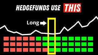
Ever notice how sometimes the market seems to teleport? One moment price is here, the next it's jumped miles ahead, but that missing piece is super important for price action analysis. And smart traders know that gaps whisper something powerful.
Where momentum started and where it might return. That's why we built the session gap fill indicator. a clean automated tool that not only detects and tracks every session gap in real time, but also labels them as filled or unfilled, and gives you full performance stats.
In this video, we'll show you how it works, what makes it different, and how you can start spotting the opportunities most traders never even see. So, let's get into it. A gap occurs when a market opens above or below the previous session's close, creating a visible space on the chart.
These gaps often act like magnets for price because the market tends to retest those untraded areas to restore balance. There are two main types of gaps. Bullish gaps, where price opens higher than it closed, and bearish gaps, where it opens lower.
Some traders focus only on whether a gap fills or not. But that's a limited view. What really matters is how quickly those gaps fill, how often they reverse, and what that says about the current sessions sentiment.
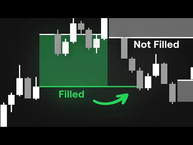
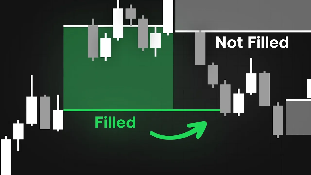
Once you add the session gap fill indicator to your chart, your workspace immediately comes alive with shaded regions that represent each detected gap. Bullish gaps appear in green, bearish ones in red, and any unfilled gaps remain shaded in gray, giving you an instant color-coded snapshot of where the market has surged or stumbled without retracing. What makes this tool powerful is how dynamically it responds to price in real time.
As the market evolves, each gap automatically updates. When price moves back into that region and fully trades through it, the zone is marked as filled. But if price hesitates or reverses before completing that move, the area stays partially open, signaling that imbalance remains.
Those lingering gaps often act like magnets, attracting future price action as the market seeks equilibrium. In the top right corner, you'll notice the performance dashboard. One of the most insightful features of the session gap fill indicator.
This compact panel compiles four critical data points for both bullish and bearish sessions. The percentage of sessions where a gap occurred, how many of those gaps were ultimately filled, how often price reversed after completing a fill, and the average number of bars it took for that fill to happen. These statistics transform visual intuition into measurable evidence.
Diving into the settings unlocks even more flexibility. Under gap type, you can select whether you want to track all gaps, only overlapping ones, or those with no overlapping wicks, depending on how precisely you define what qualifies as a true imbalance. Just below that, a toggle lets you control the visibility of the dashboard itself.
So, you can reposition or resize the statistics panel anywhere on your chart for optimal viewing. This makes it easy to integrate the indicator seamlessly into any existing setup without clutter or distraction. And when you move to the style section, the customization goes even deeper.
Here you can fine-tune how each type of gap appears. Enabling or disabling filled bullish, filled bearish, or unfilled zones, adjusting the max deviation level to highlight the extreme points of each session, and toggling the open price level, which draws a clean reference line showing exactly where each session began. Using the session gap fill indicator is surprisingly straightforward once you understand how to read what it's showing you.
First, we choose the asset we want to trade. In this case, we'll use Tesla stock as our example. Because this indicator tracks sessionbased imbalances, it works best on lower time frames where gaps form and fill more frequently.
So, we're analyzing it on the 5-minute chart. Once the indicator is applied, the first step is to review the dashboard. It instantly gives us a sense of what type of gap behavior is most common for the asset we're looking at.
On Tesla, for instance, the data shows that 61% of gaps are bullish while 38% are bearish. Of those forming gaps, 43% of bullish gaps end up getting filled compared to only 34% of bearish ones. That already tells us something important.
Tesla tends to create more bullish gaps, and those gaps are statistically more likely to be filled. So in this example, it makes sense to focus on trading bullish gap fills. However, the dashboard also reveals that only 16% of those bullish fills result in a reversal, meaning that once price fills the gap, it usually continues in the same direction.
Knowing this helps us avoid setting up a reversal trade that's unlikely to play out. Finally, the average number of bars it takes for a gap to fill is about 12, which gives us a clear expectation of how long a setup might take to complete. Looking at the chart, we can see Tesla opening with a large bullish gap, while a bearish gap from a previous session rests above it.
Since bullish gaps tend to fill within 12 bars, we'll set a sell stop just below the top of that gap. This pending order remains valid as long as 12 bars haven't passed in line with the dashboard's data. The take-profit is set at the swing low and we'll take partial profits at the bottom of the gap.
Once partials are secured, the stop is moved to break even and the main stop-loss is placed just outside the top of the gap for protection. As price moves, the gap fills exactly as expected and the indicators label updates to filled. The dashboard reminds us that Tesla usually continues after a fill rather than reversing.
But in this case, there's still that unfilled bearish gap above, which often acts like a magnet for price. So if price begins to close back above where the original bullish gap opened, that becomes our signal to switch bias. We now take a new trade, placing stops just below the original gap zone and targeting the top of the unfilled bearish gap as our objective.
We won't hold beyond that level since the dashboard data tells us bearish gaps often lead to reversals. In just a few simple steps, we've used the session gap fill indicator not only to identify opportunity, but to manage each stage of the trade with databacked confidence. But if all of this feels a bit too complex to track manually, you can simplify your decision-making by using a confirmation tool like the Lux Algo signals and overlays indicator.
In this setup, it provides an additional layer of confidence. For instance, in our Tesla example, the indicator quickly highlighted a bullish confirmation, suggesting that overall market sentiment was leaning upward. When the candle shifted to a purple tone, it hinted at a likely pullback within that broader bullish trend.
Exactly what we saw play out on the chart. Using a confirmation indicator like this doesn't replace your analysis, but it helps you visualize shifts in momentum faster and align your trades with the prevailing bias before price makes its next decisive move. And that wraps up our breakdown of the session gap fill indicator, a complete system for visualizing, measuring, and understanding price imbalances between sessions.
You can start using this indicator right now, completely free at luxalgo. com/ library. And if you'd like to pair it with the advanced confirmation tools shown in our example, check out the Lux Algo signals and overlays toolkit available risk-f free for 30 days at luxalgo.
com. Thanks for watching. Trade smart, stay disciplined, and we'll catch you in the next one.