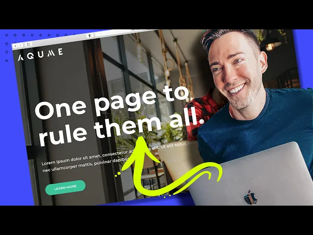
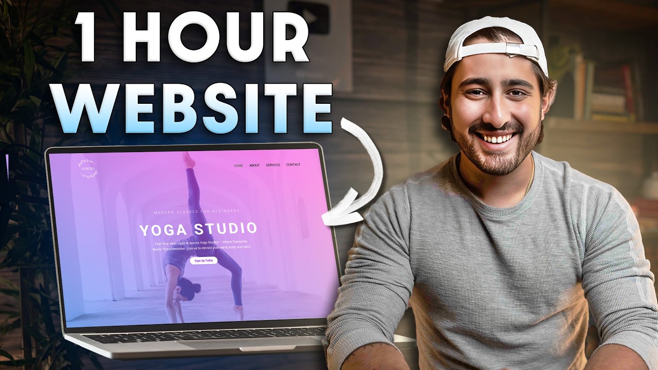
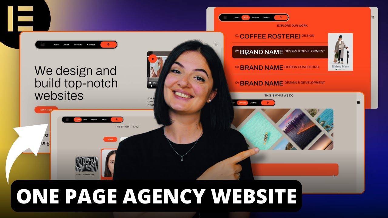
Hey guys in this video i'm going to show you how to make a really simple yet effective single page website for any business or any other purpose that you can think of with absolutely no coding needed so together we're going to cover every single step in the process from start to finish so by the end of this video you're going to have a beautifully designed One-page website like any of these or any combination of any of these really that you'll create simply by choosing a base layout customizing it with your own elements content images text
colors fonts all that good stuff and then you can make it even more custom if you want by just dragging and dropping any element you want to include or by adding in any whole section that your content needs choosing from Hundreds of pro designed fully customizable layout blocks it's even going to have this cool top navigation bar that lets people scroll right down to a specific section on your page and then with just a few extra clicks we'll make sure that it looks perfect on all your mobile devices too so i've personally created hundreds of
Websites like these using this exact method it couldn't be any easier and the possibilities are truly limitless here i think you're honestly gonna forget uh that you ever needed a web designer or a developer to do this kind of thing for you and if you ever want to skip to a specific step in the process i do have chapter markers below this Video in the description that you can click around skip ahead or go back to so if you're ready we're going to start from the very beginning by getting you set up with a free
domain name something like yourbusiness.com for example as well as a huge discount on the easiest most reliable and cheapest web hosting plan that i personally always use and Recommend as well and if you don't know what web hosting is it's just the word for the digital storage for all your website files like your web pages your images all that stuff actually has to be stored on a reliable computer somewhere so to get that you just want to go to westmcdowell.com hosting to get my affiliate discount pricing on Web hosting along with that free domain name
so just go to westmcdowell.comhosting and we can get started right now okay so when you follow that link wes mcdowell.com hosting you're going to end up right here so as you can see you've got quite a discount 295 as opposed to 8.99 a month and you've got all kinds of great stuff with bluehost you've got Expert 24 7 support i hardly need them but when i do they're right there and it's just a really easy way to get your wordpress set up and you do get that free domain name if you need it so i'm
just going to click on get started we're going to get through this pretty quickly okay so now it's time to choose your plan basic is just fine as long as you're just creating one Website if you're a web designer creating multiple sites for clients and you want staging servers then go with one of these but if you're just a business all you need is this 295 a month plan so i'm going to click on select now here's where you can either use a domain you own so if you already have a com you want to
use you would just type that in here and it'll walk you through the Steps of transferring it or if you want a brand new domain all you need to do is see if the one you want is available so i would just type in yourmostprofitablewebsite.com and we'll see if that's available click on next all right we are in business it's available so all you need to do from here is input all of your billing information choose your account uh plan So basically it is cheaper the longer out you go with 36 months but you can
go down to 12 months that's fine too then we have all these extras so i like to just uncheck all of them i don't think any of them are that necessary and i'll click on turn it off this one domain privacy and protection is the only one you might consider that's going to keep your name off potentially being on any spam lists But i've actually not really encountered that so it's up to you if you want to keep that checked or not and then enter in your payment information and check right here and then click
on submit okay so when everything goes through all you have to do is click on create your account you've already got your domain name here now you're just going to create your password And i'm just going to use the the one that they got for me i'm just going to take note of it i'm just going to do a copy then click right here to show that you've read an agreed and then create account now go to login and then type in your password and then log in just going to save it okay now create
your website i'm going to choose Skip this step and i'm going to keep choosing saying skip this and then i'm finally going to choose limitless customization and they're going to ask you a few things what type is it let's just say you know just choose the type of your business or you know we can actually just click on skip this step i'm going to do that now here's where you want to put in the name of your business or the name of Your website tagline's not that important i'm going to skip that and click continue
we actually do not need to pick our theme here because the next step we do is going to take care of that for us so i'm going to click on skip this step for now they're installing wordpress and now we're ready to actually log into wordpress where the fun can begin so just click right over here Okay so we're now inside of our wordpress dashboard actually if we click right here we're actually in the dashboard uh where you would be when you log in to wordpress each time so a few things i want to show
you real quick before we get started so within wordpress the side panels where you're going to go this is where most of your options are so whenever you write a blog Post for instance you can click on posts add new same with pages but the main thing actually want to talk about right now is users because you didn't actually choose a password for wordpress yet so we're going to go and click on users all users now when you signed up it did create a user account for you so i'm just going to click on edit
and i'm going to go down to the Bottom and it allows you to put in your first name your last name all that stuff the really important thing though is that it has your email correct and then it has your password so change it to something you'll remember and then click on update profile then whenever you need to log back into your account you just go to yourwebsitename.com wp admin you're going to put in your Username and your password so the only thing left before we can start building is we need to add the right
plugin so let's go over to plugins on the left side and i just want to do a little cleanup here so i'm going to click on dismiss i'm going to get rid of all of these annoying pop-ups this is up to you if you want to do it or not but what i'm going to do is i'm actually going to choose all of these plugins and i'm Going to deactivate all of them and i'm going to choose them again and then i'm going to delete them and then click on apply now we're going to add
in the only plugin we actually need and that is called starter templates so just type that in the search bar and this is the one right here it's got a over a million installs it's a great plugin so i'm gonna click On install and activate so what this is doing is it's getting us set up with the page builder we need as well as the theme we need which is astra now just click on c library okay so now we have all of these different page templates to choose from and there are a lot of
them so let me go ahead and make this a little easier on you so first thing you want to do is limit it To the free ones because you'll notice there are some that say premium so we're just going to go up to all and we're going to choose free and that'll cut cut it down quite a bit and from here it's really just about finding the layout that's going to best serve your own content so there's a lot of them that are categorized based on the industry or you know what type of business you
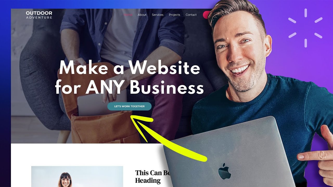
run But honestly at the end of the day you're changing out all the content so it doesn't matter anyway however i'm always going to go back to this one this first one outdoor adventure i think it just serves as the best base that we can work with that we can add what we need to take out what we don't need so i'm going to go ahead and click on this one so you'll see it comes with all Of these different pages but of course we're just doing a one-page website so we really only need the
home page so i'm going to just show you what we've got here we've got all these different sections some will be replaced some will be added it's going to look quite a bit different when we're all done with it so but even though we're doing a one-page website we still have to import the complete Site it's just something to do with things we'll break if we don't so what we're going to basically do is import all these pages we're going to build the home page and at the end we're just going to delete all the
other pages that's the easiest way to do it so i'm going to click on import complete site and that's just going to take a few minutes to import all the pages oh but first we have to answer A few questions here i'm just going to say building for myself next and then skip and now it's just going to take a few minutes to import everything on over including the astra theme which is the one we need to uh to build with okay so the website imported successfully great news now we just click on view site
so this is what we have to start out with it's got A navigation up top that we're going to get to later on in this video but we've got a top section we've got all these different sections so let's get going on actually making this our own so all we need to do is go up to edit with elementor and that brings us to the elementor uh building area so what we've got here is on the right we have our what i call the stage this Is basically where we can build things uh with a
drag and drop interface and then over on the left this is the side panel this is where all the widgets are so basically what we can do is we can drag anything from over here onto the actual staging site and then anything over here we can edit over here so we just click on each element and then over here is where we Can edit the text the style all that good stuff i'm just going to go ahead and right click over this and delete it because we don't need that now what i like to do
before i actually get into editing the content is if i know there's a specific font i want to use on the site i like to set that up first as well as colors and the way you do that is just go up to this hamburger icon up Here these three lines and then go to site settings now if you have any colors you know you want to use just click right here and then you would add a color and you just click on it and you type in the code you want but we can always
do that as we go um but let's go back to uh our font so we're not going to do global fonts actually we're going to go down to typography and Right here we can choose the font we use for our body text which is basically any of the the normal paragraph text you see i'm going to go ahead and switch that to it's called matsurat i just i think that's a really clean font for body text oh and by the way you get access to thousands of google fonts here so just do a google search
for google fonts find the ones you like and you have Access to all of them right here so we're going to do that for our body font and for weight i always like to keep it on default we don't want that to all be bold you can also change things like the size of it the line height which is just the spacing between lines of text i don't like to change too much of this um on body copy font however i do like to change some of this on The headings so what we need to
do is decide on a heading font so i'm also going to go with monsterat here so i'm going to click on typography under family i'm going to type that into as well and we get kind of a preview of it right here i think that looks nice with the weight of it and then we're going to do the same thing for all the h's i'm down through h4 so i'm just going to Quickly go through one by one okay so i've changed h1 through h4 to the font we want and that should take care of
it on all around the site everywhere where any kind of headlines appear so from there we're just going to click on update to save those changes and now we can actually have some fun and customize this page so i'm just going to click on the x up here to get back to where we Were so all this is really going to entail is going section by section and taking out things we don't need adding new sections as we need them and customizing them so let's start with this top section otherwise known as the hero section
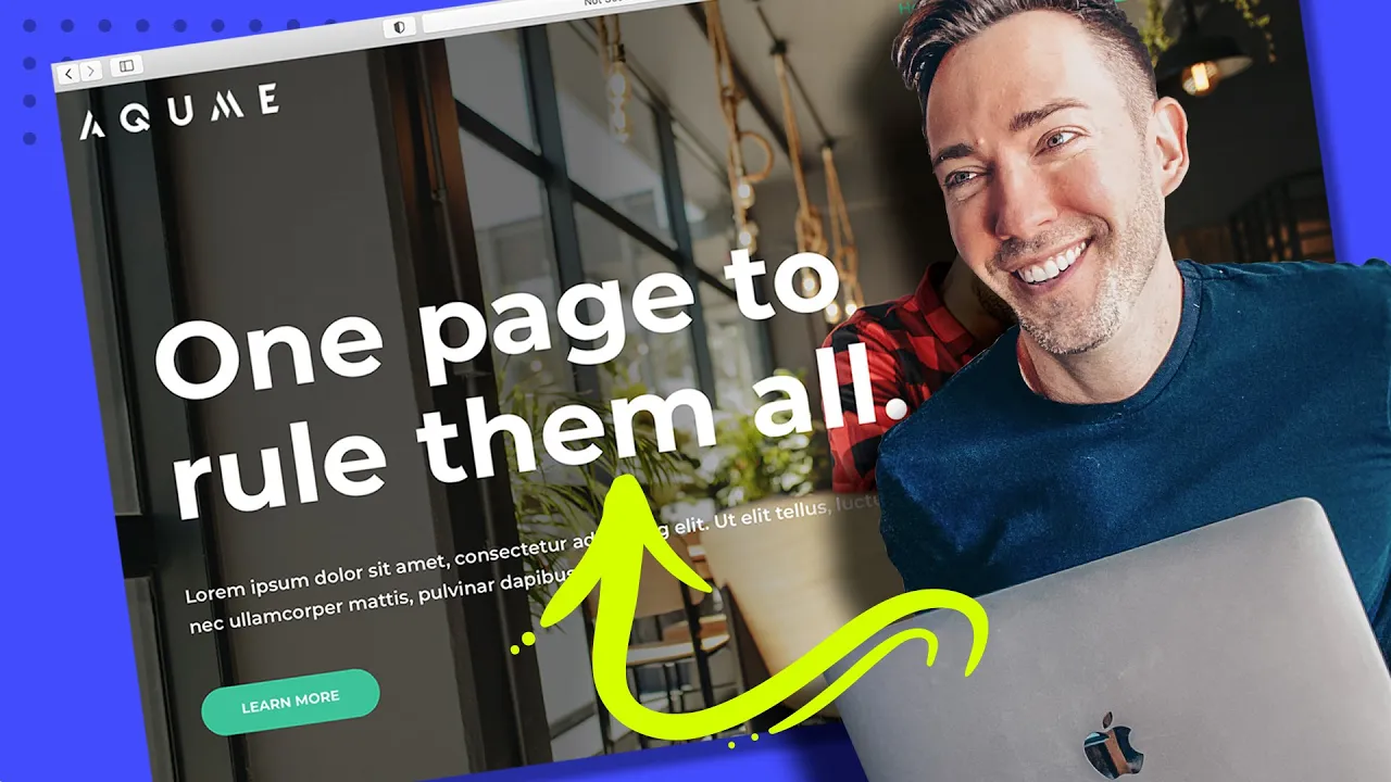
so the first thing we want to do might be to change the headline so we would just click on it we'd go over to the Left i'm going to type in one page to rule them all i've never even seen that movie but i know the phrase anyway so thought i was applicable here so we've got the new text but we can do other things with it as well what if we don't want it to all be uppercase so we can just go up to style go down to typography and under transform we're going to
do it's Set on default which i think is what they just default to for uh for headings we're just going to go to normal and that takes care of that for us now what if we didn't want this text up top they love putting this little kind of description text above headlines uh with this theme and i'm not sure why so what if we would rather use it as a sub headline so i'm just going to take It and drag it underneath the headline text and then we can click on it and change it right
over here just put in some dummy text and we can always change the style of that so in case we want it to be a little smaller we go up to style typography size we just play around with it until it looks about right and i think that looks pretty nice now We're left with this weird little divider line we don't need it i'm just going to choose it and just mouse over it right click delete now we've got our button to deal with so let's click on that and we first thing we want to
do is change what it says you know if we wanted it to say you know get started not the strongest call to action in the World but it'll do for now and then we can go up to style and here's where we can change the font if we wanted to do that again typography we're going to change the font we go to family can change the size all that good stuff but i think it actually looks pretty good what i want to change is the background color so we would just go down to where it
says color just click through and then you can Either drag you know wherever you want you can find the right color slide the color wheel and then just choose based on that or if you already know what color you want you can just paste in the hex code right there and here is a pro tip for you so whenever you're adding in a new color and you don't want to have to retype it in each time or let's just say you found one manually That you really like if you want to save it for later
so you can use it around the site in other places just click this little plus icon right here i like to give it a name i'll just call it button green and then create you don't have to give it a name if you don't want to but that way it's there for us whenever we want to use it again okay so but now Let's talk about the background image we want to replace that right so the way we do that is we have to choose the entire section so click these six dots up at the
top then go over to style and this is where the background live so and just so you know your options here you can do a solid background color if you wanted to choose something here you can do a gradient you can even do a video or a slideshow But let's not get ahead of ourselves i'm just going to replace this image for now so i'm going to click on choose image and from there you can drag your whatever image file you have over to the window or you've got access to thousands of free stock images
from pixabay you just click right up here you would do a search for whatever You're looking for it always stretches them out for me when i'm looking at them here but don't worry that's not how they look when you actually put them in the site but i've already imported my own images i want to use so i'm just going to go to media library and i'm going to choose the one i want right here and then just click on insert media okay so it's looking pretty good but there's a few things i might want to
Change so what if this background is too dark for us and what if we don't want this text to be right in the middle overlapping with our you know our hero right here so obviously this is set up right now as a three column layout out of the box so what we can do though let's just go ahead and right click on this column and then delete it so now we have two Columns left already this is looking a lot better right so what i want to do now though is change this overlay so just
so you know let me click here so under style we have a background image but we also have a background overlay that's what's giving this it this dark color over it which a lot of times you need in order for the text to be read right so if you didn't have it let's just Click here you know it'd be very hard to read this text but what we can also do is a gradient overlay so what if we just want a gradient so this is dark over here but then it's lighter over here over our
main focus all we need to do is switch over to gradient under background overlay switch to gradient and then i'm going to choose our first Color i'm going to make it black and it always defaults to this pink color here but i'm actually going to keep the pink color active right now so we can see what we're doing what we really want we want to drag these around and then we want to drag the angle so that it's giving us the right place so basically anything that's dark is going to be our black overlay and
anything that's White pink over here is going to be just totally transparent so let's kind of drag this around so it looks right to me there we go now all we do is we're going to click on the pink we're going to actually choose black but we're going to change the transparency to clear just right down here there we go that's all we got to do and that looks pretty good to me the only thing that's Bothering me now is i want all this to be left justified so i'm going to go one by one
i'm going to click on the headline go over to content left justified this one right here content left button content left all right and anytime we want to take a preview of what we have we're just gonna get rid of the sidebar all right and that's looking pretty good i think we can move on to Our next section so our next section here is like a little quote i don't think it's necessarily needed so this is a good time to let you know if there's a section that you don't have any use for and you
don't even want to modify it you can do better with a different section we can just get rid of it by clicking on the x right here so let's say we wanted to add a new Section in that just has like a little short about us section two columns so we can have a video and then some text here's what we do we just click on the plus icon and then we're gonna find the section we need by clicking on the starter templates logo right here and we're going to switch from pages to blocks now
this is going to give us access to Hundreds of these you know different styled sections that we can just customize with our own content our own styles and it's going to be perfect for what we need it for so these are arranged into categories or you can just kind of take a look around and see what you can find but what i'm going to do is i'm going to go under all i'm going to say i'm going to click on About because i know we want an about section here so something like this is exactly
what i'm looking for so i'm just going to click right there and then import block and then i'm just going to get rid of this so here's what we're left with we have a headline some text and an image so the way you would change the image is you would just click on it Then right under choose image just drag whatever image you want into the area here and then you would click on insert media however i'm actually going to put a video here what if you had a great video this would be a great
place to showcase it so i'm going to right click delete and i'm going to go over under our widgets and i'm going to find the video widget all i need to do is Drag it and drop it into place and then the way you put your own video in here is first of all you would have to upload it to either youtube or vimeo i don't recommend self-hosting it on your own website it takes up way too much data and it takes too long to load that way so you upload it to youtube then you
get the url the link to that video And you just pop it right in here there you go and then if you want this little band to go away under player controls you just click on hide all right so now let's tackle the rest of the section so one thing at a time we'll click on the headline we'll retitle this to a little about us and then we would type in whatever content we need here let's just say it was twice as long and of course if we didn't want this to be All capitalized we
would just click on it go up to style typography transform normal because right now it's set to uppercase we could also make make it a little less bold if we wanted to so i think i think it's about on 600 now so if we made it 400 maybe 500 would look good yeah i think that looks pretty nice and then if we wanted to change the text color we would just go up to text color Find whatever one we want or we can type in our hex code right there so it's just like a really
dark blue i think it looks a little nicer than the black and then i'm just going to click on the plus icon remember to save that so we can use it for later so i'm going to call that headline blue and then create and before we move on let's just talk about the background what let's click on the whole section and go Up to style now again we can do a solid color we can do a gradient we could do a video background or a slideshow or an image but in this case i'm going to
go simple because we already have an image up here let's just go ahead and click on where it's showing white and i'm going to type in a hex code for a really kind of light beige color that i just Think looks really nice with the rest of the look of the site and of course i'm going gonna click on the plus icon to save our color and then create okay now moving on to our next section so this is titled upcoming events this may not apply to your business but that's okay if you can see
a use for this kind of a layout for me i think this looks like it could be you know our services or it could be Your benefits anything like that so first of all let's just say you had three not two very easy to to switch this up just right click on either one of these columns and then say duplicate and now we've got a three column layout just like that so let's start by switching this headline out so we just click on it type in our services and let's say here's a little trick let's
say we wanted The style of this headline to be exactly like the style of this headline very easy to do we just right click copy now we go down to this headline right click paste style but that took it too far because i gave it the left justification so the way we fix that and recenter it is just under content go to alignment center and then we're left with this little pink divider line it's your choice if You could right click delete or we can customize it and make it fit our color scheme just click
on it go to style and then let's choose our same dark blue that we're using for headlines so any color that you've saved by the way you're going to click on this little globe icon and that's where all of those go so i'm just going to type in or i'm just going to choose headline blue And then we just need to add in our own content for each of these images and for each of the services so you just click each thing one by one change it to service one and then you would change the
text of it right here and you would do the same thing for two and three and then now the images so we just click each one by one and then go over to choose image and then use whatever image you want to Drag it over to your window i've already got mine loaded up here so i'm just going to choose it and then insert media and we'll do the same for service 2. and one quick thing i want to tell you about so a lot of these themes that come with it they're gonna have if
you can tell there's like a weird kind of finish to this photo they basically added some css to it to Achieve a certain look if you don't like that all you need to do is come over to style and then css filters and then just click this back to default icon and it'll take away the yeah we did it on this one so let's just do that one by one then go up to style back to default and then here yeah not sure why they do it that way but it's easily reversed so let's say
we didn't want these Buttons all we need to do is right click delete right click delete and one more time okay so moving on to our next section let's say we wanted a benefit section which i highly recommend on any website so i've already showed you how to import a block and then customize that but i do want to show you one other way of creating a section In case you can't find what you're looking for what you want to do is it's going to start the same way just click the plus icon but rather
than clicking on this guy right here we're going to click on the plus sign now this lets you choose how many columns you want we're going to choose one column so we just have a blank section so what we do is we go up to the grid here So we can find our widgets we're going to drag everything we need into place so we're going to drag the heading right into that section we're going to find a text editor for like a little sub head right there then here's where we get a little fancy so
we're going to choose an intersection so what this does is this gives us the ability to add columns within A section so i'm gonna drag that right under our text editor and then we're gonna make this three columns instead of two so all we need to do is right click here and then add new column and now we want our little icon boxes to appear in here so it's going to have an icon with a headline and a little bit of a description so there is actually what i call a compound widget That has all
of those elements in it so under search widget i'm going to type an icon and we're looking for icon box so we're going to take that and we're going to drag it into our first column like so and we'll get to the other two in a second first of all though we want to style all this up so it's looking good and then we can just duplicate the same style for our you know Two and three benefits over here when we're done so the first thing i wanna do is differentiate this section from the section
above it so i'm gonna click it with these six dots go up to style now i'm gonna make this the same background color as this section so it's just going to go beige to white back to beige again so under background type i'm going to click on classic that just means a solid color I'm going to click on our globe icon because remember we saved that color but if you didn't save a color you just choose a new one now we can better see the section that we're dealing with apart from the others so one
thing i'm noticing is there's not enough space between the text and the set the border of the section this is a really common thing that a lot of people do and it makes your site look A lot more amateurish if you keep it this way so i'm going to show you how to avoid that while we still have the whole style being selected we go up to advanced and here's where we have our margins and our padding so let's talk about the difference really fast so if we're talking about a section the margin is the
space between the outside of the section and the next section right we're talking About padding that's the space within the section so that's what we want to add here so we're going to go to padding we're going to go to top and we're going to type in 50. but see what happened is it gave 50 on all sides we actually don't want it on on the right and the left we just want it on the top and the bottom so i'm going to unlink those values and then on the right i'm going to bump It
back down to zero and then on the left same thing okay so now let's fix our headline so again we're going to want to copy and paste the same style we used up here so i'm just going to right click copy then on this one right click paste style and if i wanted to change the actual text i always do it over on the on the left side panel and i would do the same thing for the text underneath it and then i would go To style and then center it under alignment okay so now
let's talk about the actual first benefit we have listed so let's customize the look of this so we can move on to the other two and remember how i said this is a compound widget which basically means within one single widget it has the icon the title and the description all in one element together so the first thing we want to Do you know we'll give it a name we would change the description right here and then we would want to choose the right icon to represent it so just click on icon library and it
gives you quite a few icons here so they can be hard to search out just so you know that what i like to do is just kind of think a little metaphorically and try to find the best Fit for whatever the benefit is you know sometimes you can get a little creative with it i'll just choose the suitcase for this one click on insert and then if you wanted to change the color of it which i recommend you go up to style and then under icon you're going to change primary color to whatever you want
it to be i've already got a nice color picked out and then under style if you wanted to you know change the sizing or the color Of the title anything like that you just click on content and then let's make the let's make it a little smaller so we go to typography and then size we just kind of play around with it until it looks how we want it i think that looks nice at 20. okay so once we get it looking the way we want it to look all we need to do is right
click copy right click paste and then once again over here And then we just go one by one and we change the icon and the text to suit exactly what it is we need okay so far so good i think that's looking pretty nice let's just take a little kind of see what we've got so far from from top to bottom and now we can move on to our next section so let's say we like the idea of having you know a background image like this But we actually want to use this as our testimonials
section i would actually probably just start from scratch here i'm going to x this one out and we're going to add a brand new section so i'm going to click on the plus icon and then starter templates icon and then remember we have to go back to blocks and now i'm going to search under testimonials right there And now you can find whatever layout suits you the best there's a ton of them here to choose from so it really can be customized any way you want it to be i'm just going to choose this one
up top here i think this is nice and all purpose and then import block i'm going to go ahead and get rid of this so we're starting clean so the first thing i want to do just so We can see what we're working with is let's put in our background image so i'm going to click on the section as a whole then style and under background we're going to choose image right here and remember you just drag whatever image you want to into the window here i'm going to choose this one i've already got and
then insert media okay so i want to talk about a few things here i don't know if you can Really tell but it's repeating see this the hand right here it's repeating we don't want that so what we want to do is go down under image and under size we want to choose cover that's going to make the image the right size to cover the entire width of the screen but if you do that you want to make sure the image is big enough to do that then From there see how see the difference between
this how it scrolls with you versus up top how the image stays static and the rest of the site scrolls around it i think that looks better so i'll show you how to get that still choosing the whole section under the image we go to attachment fixed and that gives that's what gives us that effect so just a little pro tip for you there Now you will notice this is kind of hard to read the text on it so what we need here is we need that overlay on top of the image that's going to
help the text pop so first of all let's make the text white so you go up to style text color we're just going to choose a white right up here in the the corner that way we can see how much of an overlay we really need so I'm going to click on the section again and then under background we get background overlay so i'm just going to click on classic that's going to give us a solid color overlay what we could do is we could choose straight up black which is what i usually recommend actually
but i do want to see what it's going to look like with our really dark blue that we've picked out So we go under our custom colors and i'm going to choose that under headline blue i actually don't it's a little too green so let's just see what we can find that's better so let's click on the color i'm going to see if it looks better if it's we just go a little more blue with it yeah that looks better to me already then i'm going to choose this headline Text and we're going to change
what it says under content to what people are saying and again we want to be consistent so we want to get rid of this uh all uppercase so i'm going to go up to style typography weight i think we had it on 500 and then transform normal then from here all we need to do is cus is actually put in the content for each individual testimonial You click on each box you change the text right in here like so you change the image of the person by clicking here you know i'll choose this one and
then you just do the same thing for the rest of them oh and one thing you can do actually is under title this would add this would add ex extra text right there a lot of times people will Use that to put the person's job title or the city they live in which actually can be great for local seo if you're trying to rank for a local city name like you could put in denver if you're trying to rank for within denver but what i like to do normally is actually grab a web emoji of
a star and just repeat that five times so you've got a basically a five star testimonial So to do that you would just do a google search for web emojis star copy and paste and we'll go ahead and do that in the rest of these real quick so i hope i know you're starting to see that all we're really doing is finding little section blocks that fit the content that you need to have on your one page website so let's go down a little further so this one has Kind of a little gallery over to
the side and text over here and maybe that fits your content maybe it doesn't but what i want to do is let's just try to find a different kind of gallery just to show you what's possible so what i'm going to do is again i'm going to x this out so we get rid of the section and i'm going to add a new one by clicking on the starter templates icon And under blocks let's look up uh let's see i don't know i remember if they say gallery or portfolio portfolio let's try that one so
so we've got all these different options here so let's just find one that works for our purposes i'm just going to go ahead and choose this one right here it gives us a little kind of image slider which is kind of cool so i'm going to click on import block Now let's go ahead and customize so first thing i think we can get rid of this top little headline it's not necessary so we remember we just right click delete and we'll change the text over here we already know how to do that and i'm going
to add a little emoji in there as well you just add that in the text editor and we would obviously change the text by clicking on it and doing it over here And now to style this the way we want it let's go up and find one that's left justified so this is a good one we'll do right click copy and then right click paste style now here's something that's interesting see how much like space is between these lines it's a little bit much so i want to actually fix it so first thing i actually
want to get i want to put this on Two lines instead of three so i'm just going to play around with the column widths so all we need to do is kind of drag it around and we can make the columns we can make you know this column really big and that one really small or we can go way the other way with it but let's just drag it to where we have it all on two lines yeah that looks pretty good i think but now let's address this line height Issue so we just want
to click the text go up to style and then under typography we're going to go down to line height so we just want to drag it to where it looks a little bit more reasonable i think that looks good just like that but now we need to pop in our own images right so all we need to do here is click on the gallery section and then we're going to click on this little trash can it's going to get rid of all the images in there It's going to ask if we want to reset it
we're going to say delete now we're going to click on this little plus icon and just choose all the images we want to put in there so i'm just going to choose a few that i've already got loaded up all right and then create a new gallery now from here you can add captions to them if you want to but i'm just going to click on insert as is all right and there we go so basically It's got them in there and then it just shows you can choose over here how many slides it's going
to show at once um i think if we did any more than two it's going to be they're going to be too small so i'm gonna put it back on two i think that looks pretty good just like that now if we wanted to let me just kind of get a real sense of what this looks like there's kind of a lot of space between These so let's see what we can do about that so all we need to do is choose the entire section and go under layout and columns gap this is where we
choose that so basically we can do a narrow gap which i think is going to fix that or let's see if we do wide it widens it up a bit yeah so let's do narrow and then oh here's what's going on we've Got quite a bit of spacing quite a bit of padding rather in this column itself so i'm going to choose the column and remember where padding is we go over to advanced and see right here we've got 50 pixels of padding on the left i'm going to see what it looks like with zero
yeah to me that looks better already so i'm going to go with that okay now moving on To our next section we don't have anything here so we need to add something from scratch right so what is this page missing if it's a one page website which is what we're doing we need some way for people to actually get in touch with you right in most cases so we're going to add a get in touch with this section like a contact form so i'm going to click on the starter templates icon And under blocks i'm
going to go and look for a contact section so there's a ton of options here as well i think you're starting to see a theme here there's basically something for everyone so i'm going to choose uh i think i'm just going to choose the simple one right up top here and then import block okay so what we've got here is basically an Empty contact form and the reason is it hasn't chosen the contact form that's going to be in there yet so all we need to do is click on that and then under form just
click the drop down and just choose contact form now we're going to tackle this in two sections we're going to basically make it look the way we want we're going to style it we're going to add the content Then we're going to make sure that this contact form actually works and connects and sends right to your email address so first things first let's just go ahead and tackle the headline we're going to change the text to say get in touch and then under here you would basically just put in your your address i'm gonna get
rid of email i'm not a fan of publishing an email address They're gonna be able to send you an email with this form this is gonna lead to a lot of spam so take my advice and just get rid of publishing your email address on your website and then phone number you're just going to edit that right over here but i want to make sure that this text is styled right so we're going to click on it style typography transform normal just so it matches everything Else and wait i'm going to bring it back down
to 600 so it also matches what we've already got but you know we've got quite a bit of uh white space up here so let's put an image behind this one so let's choose the entire section go to style and then under image we're just going to choose image and i'm going to get this one right here Click on insert and remember what we need to do in terms of attachment we want to make sure that that's fixed so we go under attachment fixed and then we're going to go to size and choose cover so
it's just going to be big enough to cover the entire width and since i want all this text over here to be white we need to make it pop so we need to add that overlay on top of the background Image so we're going to go to background overlay this time i'm just going to choose simple black so under classic under color just choose black and then we can change the opacity of this by sliding this slider this way it's uh completely transparent and if you go all the way over to one it's completely black
so let's choose something in the middle i feel like that's going to look nice Then we just have to change the color of this text and this under style and content so this is another basically compound widget we have a type we have a headline and text so we have to do it in both places so under title we choose white and then under description we do the same thing and if we want to apply those changes to our other phone number section right here all we need to do is Right click copy right click
paste style and that's looking pretty good but what if we want this background to be a different color so let's just choose the column and then go up to style and then color let's choose our same dark headline blue that we've been using and that looks pretty good but what if we wanted it to be slightly see-through just slightly so we would go uh choose the color and then here's that transparency slider So we would just back it up ever so slightly to where you can just see a little bit underneath it and i think
that looks pretty nice so the next thing we have to do is actually make this form first of all work as well as we need to be able to change the color of this button and style it the way we want to however we don't actually be we're not able to edit this form with an elementor it's a bit of a workaround so What we need to do is actually just make sure we've updated saved our changes by clicking this update button down here and then we're going to click this hamburger icon and go to
exit to dashboard then we're going to click on the wordpress icon from here we're going to go down to wp forms and just click on that and then we're going to choose our contact form And click on edit so you'll see we have your name email address and message we can change these fields if we want to by clicking on it changing the label if you want to or if you wanted to add fields you just go over to click on add fields and let's say you wanted to have some kind of a drop down
where you're asking people maybe what their budget is you could drag That over and then you would click it and you would just edit all your choices here you would you know you know budget a budget b budget c something like that you could make it required if you want to you can do that with any of these i'm just going to go ahead and delete that one though say okay but instead of just saying message what if i wanted that to say something more Descriptive i just need to go down to advanced options and
under placeholder text i'm going to type in what can we help you with so that's how you configure uh which form fields you actually want to use next we need to go to settings because we need to make sure that this is actually going to send to your email address because Otherwise what's the point right so under settings if you wanted your submit button text to say something other than send message you would change that here but we're going to go to notifications this is where you actually choose what email address that the forum sends
to so you would put in your email address here email subject this is what's going to come you know this is what the subject Line is going to show in your email so i might go with something like new website inquiry now from name this is going to be set to their name because in the first field the one labeled zero it was your name and then in the second one labeled one that was their email address so these are what we call short codes i wouldn't recommend changing these i would just say from email
that's going to be yours again And then everything else we're just going to leave exactly the same so then we go up to save and close now we want to go back to pages and we're going to go to the home page and edit with elementor now remember what we need to do is change this button to be this the color we want it to be unless you're happy with what it already is but chances are you wanted to you want to control that so What we need to do is go back up to this
hamburger menu under site settings and we're going to choose buttons now here's where we're going to choose our color so you would either click right here and choose whatever color you want including whatever hex code if you've already chosen one but remember we already kind of chose our button color and we saved it for us so we're going to click On the globe icon and go down to button green and there we go so now this contact form should be configured for whenever anyone fills it out it gets sent to your email address so the
main thing we need to do from here is make sure we have all of our sections up here in the header menu and set it to where whenever you click on a section it automatically scrolls us To the right place on the page it's actually way easier than it sounds i'm going to show you exactly how to do it so let's go ahead and click on the x to get back to editing with elementor oh so before we x out of here we just have to click on update to save that change and then i'm
going to click on back to editor or you could click the x up here alright so remember we have all these navigation items up here We're actually going to get rid of those and add new ones so in order to add links that are going to scroll to a certain part of the page a certain section of the page we need to name our sections in a descriptive way so first of all we're not going to worry about the top section because it's already at the top of the page but starting with this section we're
going to name each of them so i'm going To click on the section and we're going to go over to advanced and see here where it says css id all we're going to do is we're going to type in the name of the section i'm just going to type in about the simpler you make these the better then i'm going to go here i'm going to choose the section advanced css id i'm going to call it services now this section i'm going to call Benefits next we have testimonials followed by gallery and finally contact i'm
then going to click on update to save our changes and now we have to do our work on the actual menu itself okay so we're just gonna make sure everything's updated and then we're gonna click on this little eyeball icon down here where it says Preview changes so this gives us a good look at uh the front side view of it when we're not editing it so the way we edit this uh this top navigation so we're gonna do a few things we're gonna change the button color we're gonna change the uh actual menu itself
and we're gonna change the logo because obviously this is not your logo so all we need to Do is go up to customize and that's going to bring us a different sidebar menu this is not inside of elementor now we're actually editing the theme here so we need to go down to header builder and you'll notice with this page in a lot of the pages within starter templates we're actually using this transparent header meaning it's on a transparent background and it just Allows the photo underneath to to come through it's a little bit more of
a modern look so we need to click on customize transparent header and first of all i'm going to enable this on desktop and mobile so we'll click on that and we're going to uncheck using different logo for transparent header we don't need that so first thing we want to do is actually upload your logo so we're just going to click On this little pencil icon where the logo is and then over here we're going to do change logo and ideally you want your logo to be you want it to stand out against the background so
that you it should be a lighter color and if it's not you actually have to change the background color of the entire heading bar so we're going to assume you have a light color logo i'm going to click on Change logo right there and it's saying suggested image dimensions of 180 by 60 pixels so i happen to have my logo right here i'm going to click on that and then select and then skip cropping okay so it's uploaded our new logo so now we go down here to logo width because it's a little small we
might want to bump it up to maybe to 200 pixels seems about right next let's talk about Our buttons so we're going to click on the little pencil icon next to that so we can change our act our text to the same thing as everywhere else which is get started we want to make sure it's very consistent and now here is where things get interesting so the link what we want to link it to is our very bottom section what we did will be called contact so All we need to do is we're going to
keep this pound sign right there our hashtag and we're going to type in contact or whatever it is you named that contact section now if we want to change the color all we need to do is go to design and unfortunately it does not save our element or color palette in here so we have to put it in again so i'm gonna go to background color and I'm just gonna paste in that same green color code so that everything matches and then you can choose another color over here for the hover color if you wanted
but we'll just leave it as is to be simple so now let's talk about our main menu so the first thing we're going to do before we actually get everything linked up we're just going to change the style so that the color is right so just go Over to just kind of click this button over here we're going to click on customize transparent header and then go over to design now we go down to text link so you'll see this magenta color is already here we're just going to click on that and we're going to
type in our new color that we want to use and now you'll see it's working perfectly okay so now what if You wanted to give this background kind of a bit of a more of an overlay so that everything pops out a little bit more you can absolutely do that if you want to just click where it says background overlay i'm just going to choose black and then we choose this uh we slide this down to however we want it to be you know just making sure that the text is very readable and legible but
I'm actually going to get rid of that so i'm just going to click there i don't think it's needed in this case but there are definitely some images that are that are very busy where you would need something like that so now let's talk about actually linking all of these to their proper sections so just click on the little pencil icon and then it's going to say it says configure menu from here i'm going to go ahead and click On that and so what we've got is the primary menu so i'm going to click on
edit menu we're actually going to get so we're going to go through these one by one so i'm going to click on home and we're actually going to remove it because it's a one-page website we don't need that and we're actually going to delete all of these so i'm going to click on about remove services remove And projects and contact now we're just going to add in our sections one at a time starting with the about section but we're not doing it with pages because remember it's a one-page site so we're going to go to
custom links and i'm going to replace the url with hashtag about and then our link text is what's actually going to show up up top so i'm going to type in about us and then add that to menu and We've actually lost our preview here but that's okay we're just going to keep an adding our links starting with services and then add to menu and then next we had benefits and i might title this yes add to menu then testimonials add to menu then hashtag gallery and we're not going to put contact here Because remember
we have that in the button already so i'm going to click on a publish and i'm going to give the page a refresh here so we can see what we've got so we're not quite done yet we now we need to check what this is going to look like on mobile view because that's really important so we need to go down here to the bottom Where we've got all our different views we have desktop tablet and mobile so i'm going to click on mobile and we'll see what this is looking like so what we need
to do is we need to make this top section transparent like it is on desktop view so we're just going to click on customize transparent header and then go over to design and see it's set to mobile you can see because it's got the little mobile icon here so We're just going to choose background overlay we're going to choose where it says white we're going to click on white we're going to put it on black and it's up to you if you just want to leave it like that it doesn't look bad or we can
bring down the opacity to something like this and honestly in this case it actually doesn't look bad with nothing but i think i'm just going to be safe in most cases you might want to add A little bit of an overlay so let's just do something like that i think that looks pretty good now we obviously want to uh give a little love to this we want to change the color to our green color so we'll click on it we'll go and by the way you can choose these different icons it doesn't have to just
be the one we could choose this one if you wanted to that's kind of cool And then design and then we need to change the color the icon color refers to the white the little white dots so we're going to do background color it's going to choose that and we're going to type in the hex code for our same green color so everything matches so let me just click on this we see what we've got so okay so this text is still pink let's go back to customize transparent Header design and now that we're on
mobile view let's go ahead under menu color i'm just going to choose that and i'm going to type in our same green color actually i'm going to switch these this needs to be black and this needs to be green that way it's when you click on it that is when it turns green so to me this looks pretty good to go okay so the header is looking good on Desktop and mobile now you probably want to do the same thing on tablet before you keep going but we're just going to keep moving on click on
publish and then x out so let's check our work so far let's see if these uh menus menu items actually take us to where they're supposed to take us and click on about us there we go our services perfect testimonials awesome and then finally Get started that's supposed to take us to our contact form great so we also need to add that link on this button too so let's click on edit with elementor we've just got a few more things to do we definitely need to change that button and then we need to make sure
that everything looks great on our mobile view as well so first things first click on the button link we're gonna do Hashtag contact now let's take a look at what this all looks like on mobile so we go down here to the bottom under responsive mode click that now this is gonna show us what it looks like on our mobile phones as well as if you clicked up here on tablet so let's just go to mobile so i think almost all of this looks pretty good the way you would make any changes if you need
to is you would just make sure You're in this this mode and you would just choose any area that's giving you trouble like let's say we wanted to make this text a little smaller for for instance we would choose that we'd go to style and typography and then see we are showing this mobile phone icon meaning if we any changes we make to the size it's only going to be reflected in the mobile version not the desktop version But then there are certain things that you can't change independently like wait for instance you'll see there's
no mobile phone icon next to it meaning if you change this to normal as opposed to bold it's going to make that change across the board i'm just going to do an undo down here under history i'm just going to go back one and if you wanted to make this text Larger for instance you would choose it style typography size then just bump that up and then you just go down the page and you would make any little tweaks you need to just like that okay so now i'm going to go and click on update
to save all of our changes and now we're just going to exit back out into wordpress because if we have one more important thing to do exit to dashboard Then click on the wordpress icon now remember how we imported that entire site including all these different pages we don't need them because it's a one-page website so we're just going to go ahead and we're going to trash each one that we do not need until we're left with only the home page now there are a ton of really powerful next steps you could build into your
new site And i put together a really handy playlist showing you all your options so just click right here for that playlist and then just choose whatever piece you want to focus on next whether that's driving traffic to your new site or adding a live chat feature and lots more i've got you covered so just click right here and i'll see you in a second