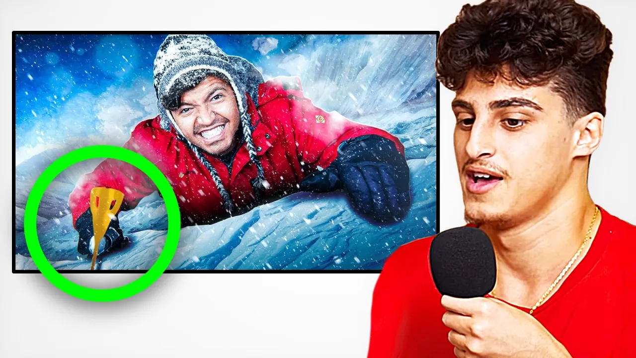
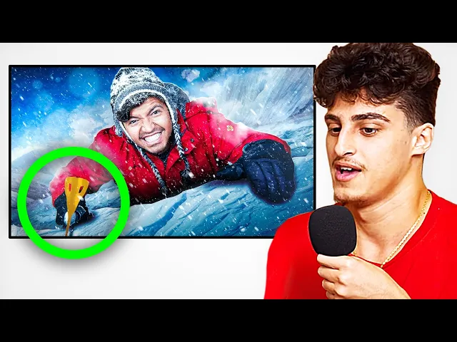
Dylan right here made this nominal has 1.5 million views can you break down this thumbnail for us for sure this was inspired by a thumbnail I made about six months ago I think it's from Game of Thrones he's like climbing like an ice Mountain okay yeah they sent me this asset picture it was already pretty good he was wearing the red coat already and I knew that we would have it on the ice wall red and blue are very good contrasting colors something I noticed with a lot of these big YouTubers and a lot of
the thumbnail designs they're typically in the middle of doing something and there's an action happening action makes you intrigued you know it looks like frame from the video where he's actually climbing this Ice Mountain and this makes you very intrigued and makes you think this is what you are actually going to see in the video one thing I really love about this thumbnail is it's very simple yeah I think simplifying is a big thing obviously you don't want too many colors but I also don't think there's any rule of less colors is better Mr Beast
for example in his Circle videos there's probably six seven different color colors in that thumbnail but it still works very well it's a great thumbnail we're gonna go to the next one which is thumbnail that you designed for Iraq here and it's called I ordered 10 000 Amazon packages if I just look at that title I would be like how am I gonna design a thumbnail for this but you landed on this one there's still a lot going on but somehow the eyes are just LED straight to Iraq what's going on in this thumbnail that
the eyes are kind of drawn to where you want them to go yeah so this thumbnail you could break it down into three main elements we have the background with the house and the trees in the sky and the trees really give scale to the mountain of packages the lines of the pathway lead directly towards Iraq and I also think that all the packages are kind of noisy and then the middle of it is just clear and there's no distraction from all the packages around I want to look at a list of all these old
thumbnails you made new ones and there's some major differences recreating your thumbnails is a newer Trend that people are just now starting to pick up on and they can really make your videos pop off again especially if you think the video is good what I plan to do with these was just to make everything look a lot more intense because he is eating super spicy food these thumbnails are a very good example of contrast and why it matters so much for most of these I had a darker background on very bright over saturated food it
makes everything in the foreground stand out a lot more you want to see these people go through this pain and see their reaction to all these crazy foods that they're eating you would think with someone eating spicy food that the thumbnail would show them like drooling at the mouth but something I've kind of learned sometimes it's better to not show that reaction first because the viewer actually wants to click and see the reaction if you get someone to click on the video and you don't already spoil the reaction makes the people stay for the entire
video until he has his reaction I love all this tips Dylan if you guys actually want to see a video on titles click on the screen check that out thanks so much for being here thank you for having me make sure you check them out on Twitter Link in the description see you guys in the next one

![How to Make YouTube Thumbnails in Canva [2024]](https://img.youtube.com/vi/b_UJZ00-pX4/maxresdefault.jpg)