Design is an intricate, fun, and exciting business. There's a lot to learn, do, and consider when you're a designer. Technology is constantly evolving and new trends are coming at you rapid fire.
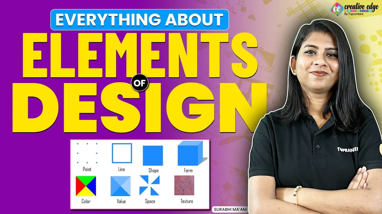
It's what makes design exciting! This lesson will take you through the core elements of design to give you a head start in this creative environment. We're going to explore how a dot, line, shape, form, tone, texture, color, and text are the basic building blocks of art and design.
Understand these elements and you'll understand how art and design are fundamentally made. So we'll begin with the simplest of the simple, the dot. A dot is a dot.
In design, you might call it a point. A dot can't be anything else and you can't break it down further. This might seem basic, but what if we added a second dot?
Now we're looking at a whole scenario. Is it dramatic? Are they awkwardly touching?
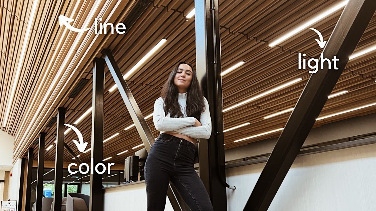
All of a sudden, we have design decisions to make. What if we try to connect the dot? That's exactly where we hit our second element, the line.
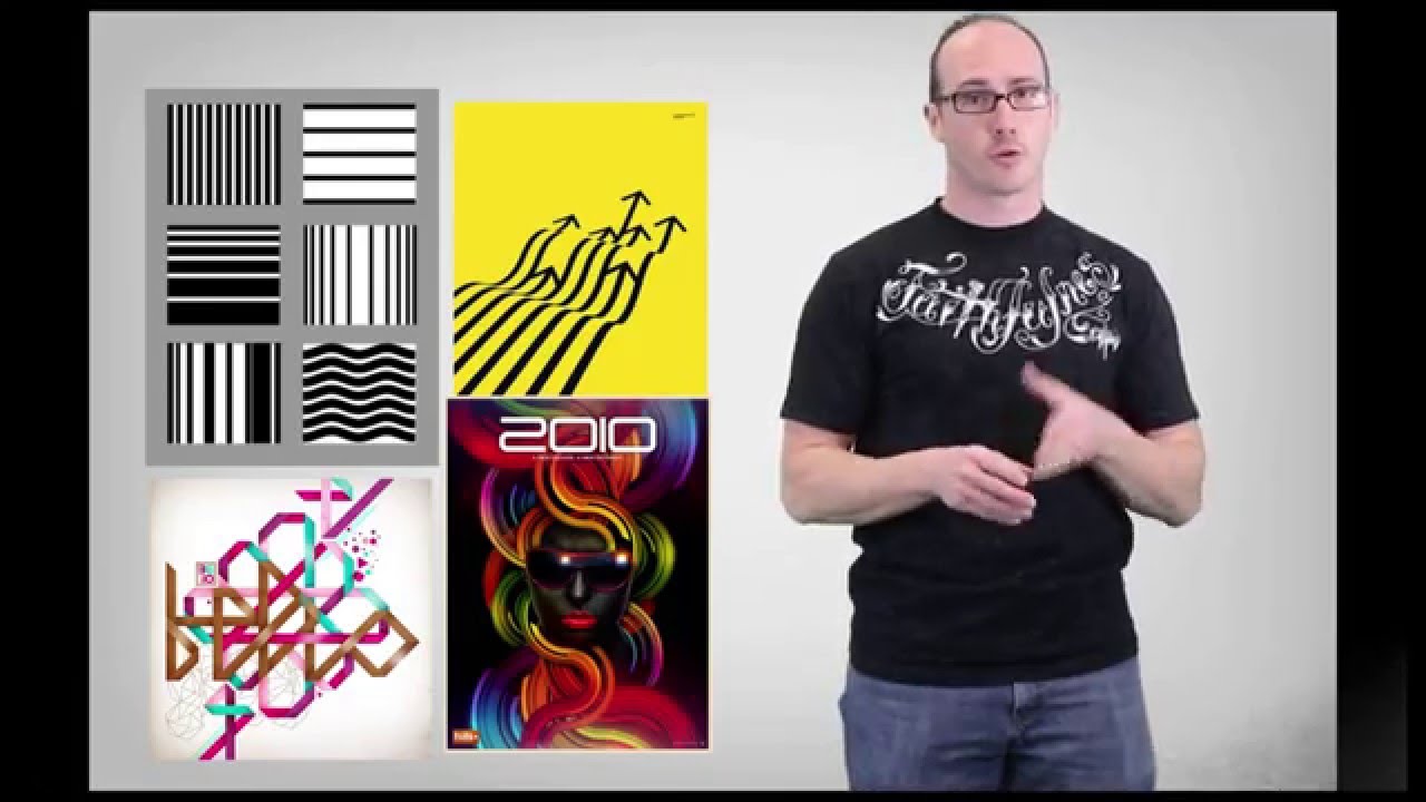
A line can be defined as a linear mark. It might be wavy to create a sense of movement. Or maybe it's straight, which would look pretty neat.
Lines are everywhere. Even in the word line itself. We can place lines strategically to lead eyes toward a focal point.
This means directing the focus towards a particular design element. We call these leading lines. And they control the way viewers look at our entire design.
Here, the designer has positioned the lines in a zigzag arrangement. What do you first notice in this design? And where do your eyes want to move to next?
You can't help but follow the line, can you? Bold or contrasting lines also help your design stand out. Take a look at how these outlined illustrations use white lines on a contrasting background.
Now, we're going to show you how a series of lines can come together to create a shape. When a line comes full circle, you get. .
. Well, a circle. That's a type of shape.
Remember the outlined illustration? Those lines were curved and connected to create two-dimensional shapes. A 2D shape is a flat object with no depth.
Those outlined shapes represent a familiar objects such as a lighthouse, camera, and torch. But a shape can also be simpler than a lighthouse. Even a basic rectangle could be used to make a design stand out.
It can act as an outline that borders around a heading or filled in to make a solid frame. When we start to change the lines and tones that surround our shapes, we can turn them into objects that look 3D. This brings us to form.
A shape as simple as a square can be turned into a cube. The word for this is form and we use elements like shadow, tone, and texture to create dimension. The size and placement of a shadow is one way to bring form to a flat shape.
Take a look at the way these squares, which started out 2D have been stretched into 3D objects. With their new depth, width, and height, these squares now seem to tower off the page. We see form in other simple shapes.
With shadows, a circle can become a sphere. And a triangle can become a pyramid. When we talk about shadows, we also talk about tone.
At its simplest, tone is how bright or dark a color can be. For example, a shadow will usually be illustrated in a darker tone compared to the object it surrounds. In this design, we see many tones of the color blue.
These tones help us to understand what's being shown and allow us to view the picture from a certain perspective. Here, the lighter tones of blue imply a moon reflecting over the sea. The darker tones imply backs of leaves that frame the picture.
Don't you feel like you're standing in the shadows peeping out from behind the branches? Texture helps an illustration feel realistic. We use the word 'feel' because texture can remind us of the tactile nature of rough stone or woven canvas.
Imagine how it would feel to touch these things. Texture brings feelings to your work. Imagine a vintage feeling, calm feeling, or modern feeling.
Texture can be used in any part of your design. In this design, the texture appears faded and worn. It complements the retro style of the words to give an older, authentic feel.
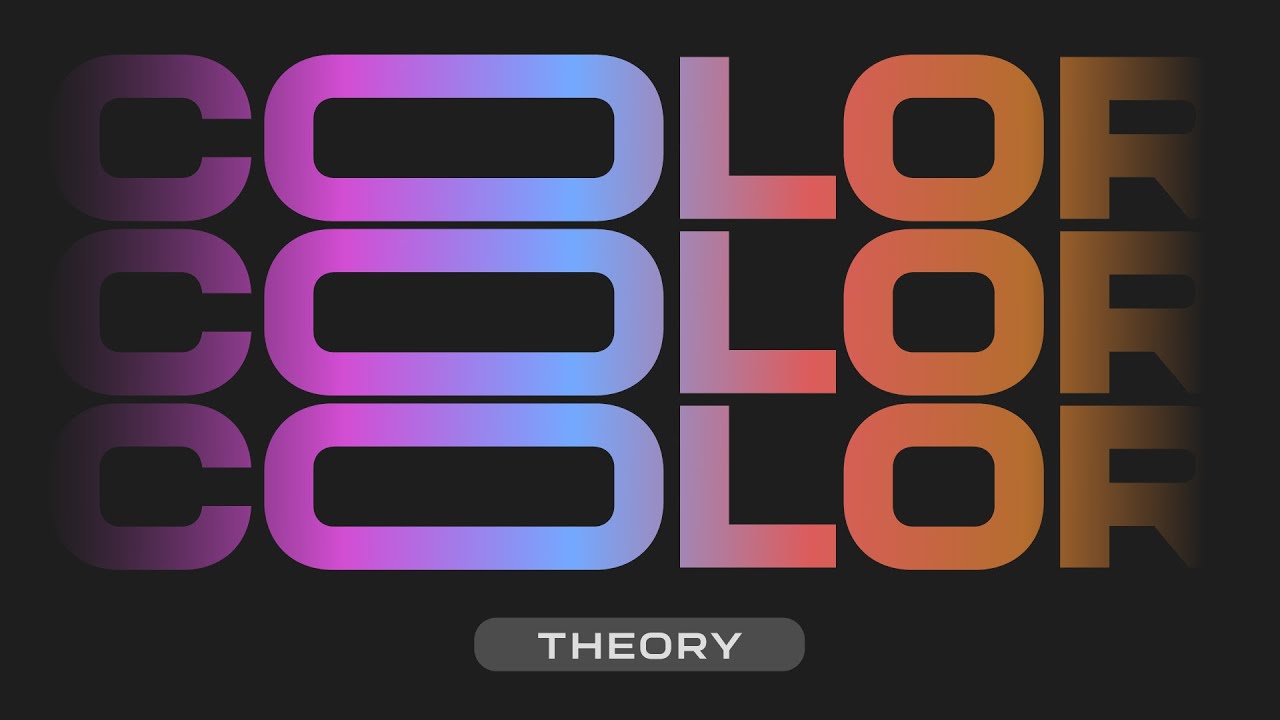
And this way, it might send the message that this brand is reliable and long lasting. Color will be one of your biggest design choices. This is because color palettes send powerful messages and associations.
For example, in some cultures, white has long been used to represent peace and purity. Red, on the other hand, could represent passion and power. Blue might feel calm as water.
While yellow brings a burst of positivity. But colors will rarely stand alone. That's why we have a color wheel to show us which colors look great when they're side by side.
A color wheel will help you find different combinations that make your design look right for its intention. Color is a big element and one that'll take time to understand. It's worth the effort.
Good color palettes can make a design pop and grab the audience's attention. That's why we go into greater detail in another lesson. Remember, any part of your design can have color.
Which brings us to our final element, text. It's not just what you say, but how you say it. The design, color, and placement of your text can be just as important as the words and letters themselves.
We use typography to describe the shapes, forms, and lines that make up a letter. While there are endless possibilities in the world of typography, you'll typically find these styles fall under two categories - Serif and Sans Serif. Serif adds a few little lines to the edges of letters.
It's a great option for print projects because it's easy to read. Sans Serif literally means without serif. So we take those little lines away to get a cleaner shape.
These smoother edges look good when you're publishing on the web, but really it comes down to you and the style you're after. There's a lot to learn when it comes to typography, but for now, we just need to acknowledge it's an important element of design. Now, we know the most basic elements.
Try to isolate individual elements when you look at artwork or design. See if you can train your eyes to pull apart designs and dissect them into individual elements. If you can pull something apart, you can put it back together in infinite ways.