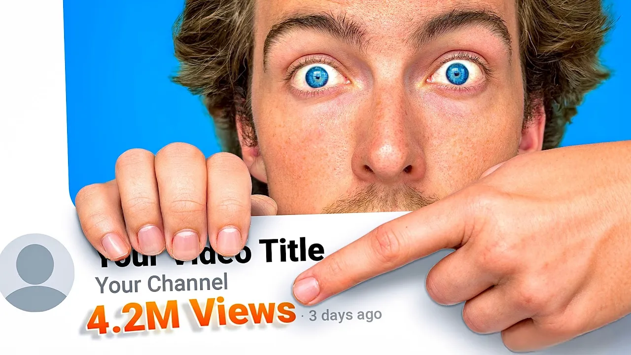
Why did you just click on this video? Was it because you got sent it by a friend? Hey, watch this.
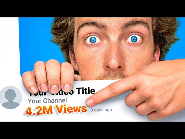
Maybe it popped up on your subscriber feed. Or maybe you saw this thumbnail and you thought, "Yeah, that looks interesting. " You probably already know how important a thumbnail is.
A good thumbnail and a bad one can be the difference between a 100red views or a million. But how do you actually make good thumbnails? There are already hundreds of videos out there about the basics of thumbnails and Photoshop.
I would know because I made one of the most popular ones on YouTube. Wow, man. So today instead I'm going to go over how I approach making a thumbnail.
From asset creation to touching up your face in Photoshop. But first let's go over stage one, the idea. Before we can do anything, you need to come up with the idea for your thumbnail.
In other words, what's going to be in your thumbnail? Essentially, we just need to boil down the video into one simple image, just like a film poster. So, if you're making a video about playing Minecraft, you would maybe have a photo of yourself in the thumbnail and something Minecraft related next to you.
But let's be honest, no one's going to watch a random person playing Minecraft on YouTube. Millions of people already do that. So, how are you going to stand out?
Really, you got to think about the idea and the story in your video and how to implement that into your thumbnail. When I'm creating my own videos, I always come up with the thumbnail right at the stage where I'm coming up with the video idea and story itself. For instance, if you're playing Minecraft, then what's the interesting thing that's happening?
Let's say you're trying to survive 100 days in hardcore mode. Do you then add the word survival to your thumbnail? Already, you've got something extra going on.
When it comes to your story, I want you to think about something that I call the curiosity factor. What is it in your story that's going to make your audience curious? What's going to make them stop scrolling on YouTube and click on your video?
Maybe in your survival Minecraft video, you end up surprising yourself and making a crazy cool house by the end of your playthrough. It was perfect. You could make a split thumbnail, losing the picture of you and instead teasing the final result.
And then instead of making it clear, you could slightly blur the final result picture, making people ask, "What's going on here? What is that final result? " Okay, so blurring it out might feel a little bit cheap and maybe a bit boring.
So instead, let's bring that side back into focus. Let's put an arrow going from left to right to show the progression and development within the gameplay. This also just teases the story and promises a really fantastic result at the end.
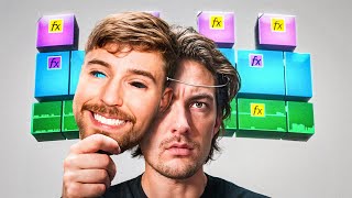
Coming up with a thumbnail idea that makes people curious to click is not easy and taking inspiration from other people might seem like a good option, but what I found is that originality works best. So, focus on coming up with a thumbnail that tells your unique story, not someone else's. Let's go over a few examples from my channel that have been successful, like this one on editing the same video on different free softwares.
You can see the story. There's all the software above my head clearly displayed while I'm holding a Premiere Pro logo, implying that these softwares are going up against Premiere. The curiosity factor is here.
What even are some of these softwares? You recognize Da Vinci, but what is that other one that looks like a shark? You also have the title underneath the thumbnail which reads, "I edited the same video on every free software.
" It's a title that is complimentary to the thumbnail, clarifying the story that's being told and also shouting free to make that clear. It's free real estate. At this stage, you should just be sketching out your ideas using assets that you found on the internet or literally sketching out ideas in a notepad.
And once you've got your final plan down, it's time to move on to step two, acquiring your assets. It's time to start creating your thumbnail, which means gathering your assets. For a lot of you, that's going to be including your faces.
And for that, we're going to need to take a clean, cool shot of your face. For the best thumbnail pictures, you want to ideally use natural soft light, creating minor shadows on your face. It's not like filming a video with dramatic lighting, as you want your face to be really clear in the thumbnail.
Something I always do when taking thumbnail photos is turn on the raw setting. This is going to take a picture that will end up being way more customizable when we put it into Photoshop. If your story is one where you struggle or one where the results of a challenge were surprising, you may want to pull that face that shows this.
Take multiple photos at this stage to give you the option to play around in the edit. What are you doing? Text is another commonly used asset within thumbnail creation.
You want to make sure that your text is super readable and clear, even when it's on a super small thumbnail, like when you're scrolling on a phone. A good example of text on one of my latest thumbnails is where I used the world's most difficult editing software, Avid. I wanted to make this exciting and enticing for the audience.
I wanted them to think that this is something special. Look at that. Try not to click that.
I dare you. I dare you. You can also see that the whole thumbnail was made around this idea as the words are in heaven and there's a halo ring around the software logo.
Creating that background was no small task. I use a mixture of assets from Google search as well as some AI. Layering in your thumbnails is super important.
I always make sure to layer each individual object separately rather than clumping everything all together as one layer. That could mean doing a computer on a desk with a keyboard and mouse all as individual layers. This gives you ultimate control over what's going on in your thumbnail.
Also, you want to make sure that each object is aiding the story that you're telling in your video. This leads me on step three, color and composition. By now, your thumbnail is coming together, which means it's time to start talking about the composition of your assets.
This can get highly technical and artistic. There's just so much to think about when you're putting your thumbnail together. So, I'm going to go over some quickfire tips and tricks to help give you some ideas.
First, the rule of thirds, which is simply breaking up your screen into thirds using a grid. The result is two vertical lines, two horizontal lines, and you want the focal point to be at the intersection of these lines at any of these four points. It's the third if I've ever seen one.
If you want to take this one step further, you may want to think about the golden ratio, which is a naturally occurring, aesthetically pleasing ratio equaling to 1. 618. I don't know.
It's just that's just what Google said. Okay, now that probably doesn't mean much to you, but just imagine a snail shell. You can see the ratios here, and it looks pleasing.
This shape can be found in lots of artworks like the Mona Lisa and can be a good metric to go by. Colors are also super important here. You want to think about the color wheel and complimentary colors.
A lot of the best thumbnails on YouTube are dominated by two complimentary colors. Just like real art, you can use color to highlight a certain object within the frame. For instance, in this video on the software flame, the blue color of the logo nicely stands out against the gold, bringing your eye to the logo.
Hello. Oh, yes. Oh, orange and blue are complimentary colors.
That's excellent news. Thank you very much. I recommend studying colors.
Study the color wheel and see what works for you. Go with those two complimentary colors. Just try it out.
But really, what I recommend is simplicity. You don't want to go too overboard with millions of different objects or with different colors. It's just not going to look good.
This brings us on to step four, finessing. And when I say finessing, what I really mean is editing this thumbnail in Photoshop. I have uploaded the whole video of me editing this thumbnail on my stores channel.
The link is in the description. You should go check it out if you want to see me do the whole thing from start to finish. Let's begin.
So, let's run through this in quick bite-sized chunks for you and get your thumbnails looking like masterpieces in no time. After you've opened Photoshop, pull in your assets. Now, if you took raw photos like I suggested earlier, then you'll immediately be prompted with a camera raw edit page.
Now, this is a really good way to create a basic grade on your face picture if you have one. The kind of grade I go for here is one which looks natural and bright. Easily readable is the goal for me, but of course go for something that suits the concept of your thumbnail.
Click okay and wait for it to load in. Then we're going to create a copy of this layer by pressing Ctrl and J and rasterize that new copy. With that done, I'm going to cut myself out using the magic selector tool up here.
Make sure it's on lasso mode. Drw a loop around your really beautiful subject and then hit select and mask. This will give you a new window in which you'll want to make your subject completely selected.
Click and drag to select, then alt click and drag to deselect. Photoshop probably won't make a perfect selection if your background sucks like mine. But don't worry, you can erase stuff with the eraser tool later.
So, when you're done, click okay. Now, we need to source a background. I found mine by typing in a specific search term on Google images, but you can go ahead and use your own assets or create one with AI.
Just pop it in like your other assets and see your masterpiece already taking shape. It's here that you can think about creating light sources, objects in the background, things like that. Having a light source that makes sense with your original subject picture is going to make your thumbnail look a whole lot more interesting.
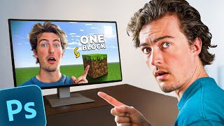
I'm adding a Minecraft sun right here, following the picture of me that has this natural highlighted edge around me on my right. Now, I'm adding the other main asset, which is a Minecraft block that I also want to interact with the light source and sit in the world realistically. I do this by bringing it in from Google, removing the background, and then using the lasso tool with the paint bucket tool, creating a big black shadow coming towards the camera, as this makes sense with where I've placed the sun.
With the eraser tool, I soften the shadows to look realistic. I even use the brush tool to add ambient occlusion, otherwise known as contact shadows. I bring in a PNG I downloaded online of the golden ratio, which for me keeps it all in line and helps me follow some of the bits of advice I gave you earlier.
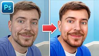
Now to clean up my face and make it have the same quality that you see in higherend thumbnails on YouTube like Mr Beast, Ryan Tran, and all the biggin. Turn your subject back into a smart object. Click on camera raw to open this cool window again and then go down to detail.
This is where you'll find the noise reduction tool. Mix this with some sharpening and suddenly you're ready to go on the front page of Vogue. Try these settings I've made here or play around to find your desired outcome.
But there it is. Nice and simple. The secret source that not many people talk about.
Finally, I make some smaller adjustments to my face. Getting rid of my ugly. Hi, I am very ugly, but you should enjoy the movie anyway.
I add some text, which is totally optional once again dependent on your concept. And then I create a very basic arrow and change the color to yellow. I also added an AI hand into the thumbnail at the end, but best you go check out the full edit up here if you want to go deeper into that.
Now, let's have a look at the final thing. And there it is, a finished thumbnail. All right, I really hope you enjoyed this video.
I had a lot of fun making it. And hopefully now you know how to make your own thumbnails. Now, this video was partly made because it got 15,000 likes on one of my old how-to tutorials.
Um, clip. We have to get past 15,000 likes on this video. So, this time, let me know what kind of tutorial you want next in the comments.
And then if this video hits 30,000 likes, I'll do it. I'll do whichever one's been voted the the highest. Once again, the video link is in the description if you want to watch me edit the whole thumbnail on Photoshop.
It's on the stores channel. Go check it out. It's going to be very useful for anyone who's really wanting to learn thumbnails from scratch.
Thank you for watching the video. I love you very much. Now get the hell out of here.
Get out of here. Bye. [Music] Shake just a little bit faster.
No competition now. Ready.