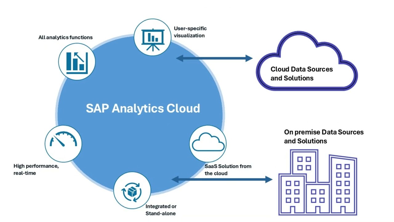
hello everyone welcome back to overview of sap analytics Cloud Series in the last video we discussed how to create a data models in the sap analytics Club so now you are ready to tell the story with your data in the story mode you can visualize your data with charts and graphs it's giving you an entirely new way to look at your data and gain valuable insight about your business so to create the stories you have to expand your site navigation and under the app section you can find the option called stories so click on this
story you can enter into the story pen so a story can design as the report or the dashboards to help with your planning or the analysis so let's start our first story creation so you can so to create your stories you can have two options first one is create the story from the scratch the second option provide a predefined templates so whatever you prefer you can select so I'm going to select the first option because I'm going to create the story from the scratch so I select the first option called responsive and it asks what
design mode would you like to use So currently sap analytics Cloud provides two different design modes which are optimized design experience and the classic design experience the optimized design experience offers you the flexibility by any enabling you to turn your stories into interactive applications through the scripting and the specialized widgets and the classic design experience supports a range of Legacy data visualization features but nowadays that classic design experience considered as the face out design mod so I choose the first one and click on the create so it will prepare your story design panel so first
of all I'm going to slides of these things so now you can able to view your story designing panel on the top you can able to see several menu options are available to support the story creations and in the site navigation you can able to view the story pages so initially you can have only one page and the related assets are listed here so the first thing to create the story you have to import the data so to import the data under the tools menu you can able to view the icon to add the data
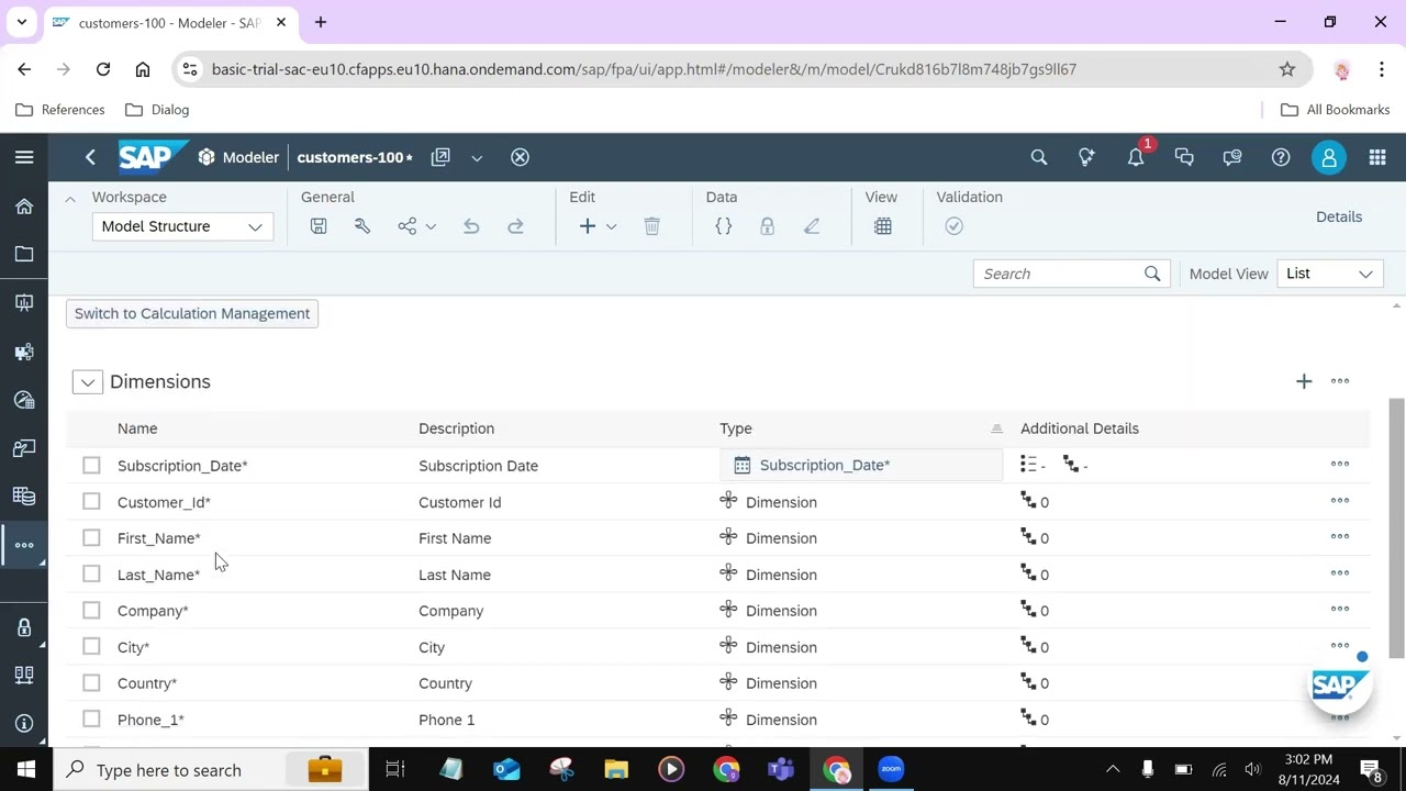
so I'm going to click on that one it will ask how would you like to begin from the file or from from the data source or from the data model so we are already created the data model click on this icon so we already create the data model called customer so I'm going to choose that data model after importing the data you can able to view the success message as model successfully added to the store so we are attached our data inside the story now we are going to import the different kinds of widgets what
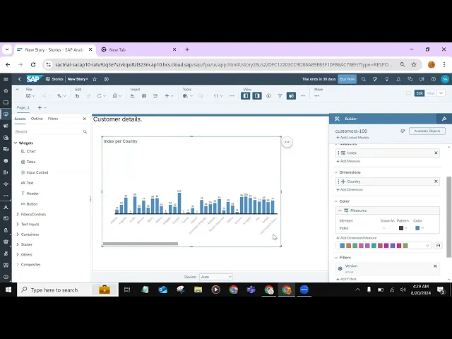
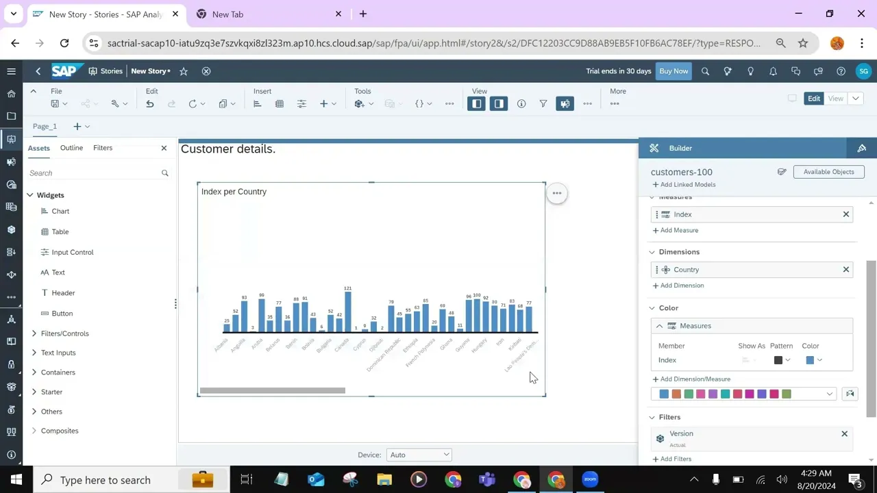
you prefer so the first one I'm going to import the header okay so this is my header following the header I'm going to add one chart so I track and drop the chart wget so it will open the chart chart Builder inside the chart Builder you are going to define the measures and dimensions for the chart and you can able to define the chart orientation and what kind of chart you are going to use by default it select the bar column bar chart or the column chart if you are not satisfied with the bar or
the column chart you can able to select different kind of chart as well so first I start with a bar chart so I select this one and my chart orientation I would like to keep it in the vertical so I choose the vertical click on this measures and it will load the what are the measure datas available in my data so there is only one measure data called inext so I click on this measure Table after that I can able to select the dimension so click on this Dimension at Dimension then it will ask to
ask to select the dimension so we know Dimension is a kind of a descriptive data so in the data set we have those are the descriptive datas so I'm going to select the country as my dimension So based on the dimensions and the measures my bar chart will look like this okay so I'm going to slide out this Builder as well so now I can able to view my bar so you can customize your charts in various ways depending on the widget type for example for the charts you can apply the sorting and ranking by
click on these triple dots so if you want to add the sort you can select the Sorting options so you can sort the chart based on your country or the index if you are selecting the country you can sort the country by ascending or the descending order so I'm going to select the assenting so it will sort your chart and if you like to rang your data so you can select the top five or bottom five data so I select the top five so it will select only the top five datas inside the chart so
those are the some of the customization inside the Bara next I'm going to select another kind of chart so I track and drop one chart widget and in the chart Builder I'm going to select the chart type as the line chart based on the chart typ the matrixes will be so it will ask to select a measure so I'm going to select a measure there is only one measure data is available so we can able to select the index as our measure data and inside the dimension I'm going to use subscription date so in the
subscription date you can able to add the fter asro or you can drill up the subscription date so you are in a level one so you can able to move to the different kinds of levels so I'm going to select the level three so it will drill up the subscription date based on the year and the quarter and the month so I slide out this one and expand this chart type to explain the quarter stas okay so you can see the subscription date will be thrill up as years and four quarters okay so this is
our line chart inside the line chart click on this more action and you can have the option called more option and inside the more option you can find the ad inside the ad you can find the forecast option so the line chart have the special feature which is forecasting forecasting means we can able to forecast the future values based on the past values so to do the forecasting it will use the machine learning algorithms to predict the forecasting value the sap analytics Cloud provide three options automatic exponential smoothing and linear regression automating means the sap
analytics Cloud using the default machine learning algorithms the second one is the exponential and third one is the linear regression algorithms for the forecasting I'm going to select automatic forecas so I click on this one it will do the forecasting and predict the future values so this future value prediction will depend on the size of the past datas and the strength of the machine learning algorithm so it will find out the third quarter of the 2022 value so this this is the the colored area will be the forecasted value of 2022 so that is it
from this video I hope you have understand the basic story Creations in the sap analytics Club in the future video we will refer different kinds of story boards inside the sap analytics Club so thank you for watching this video and support thank you