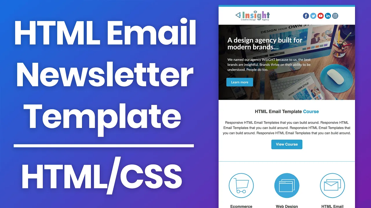
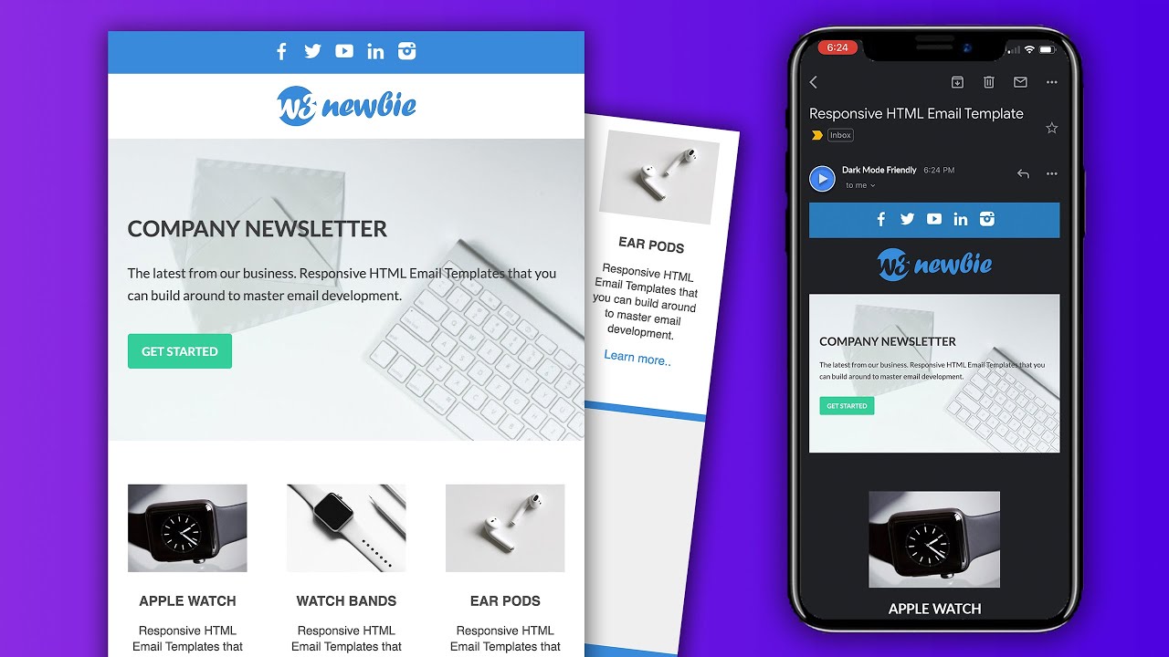
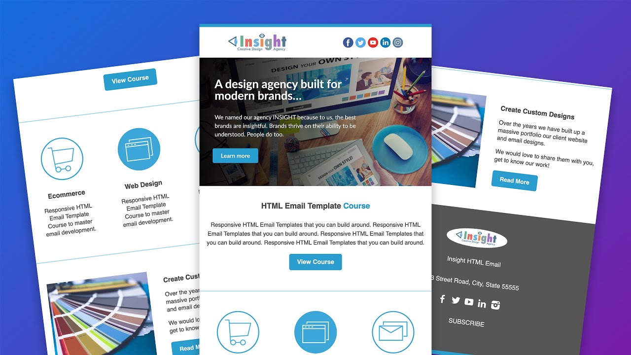
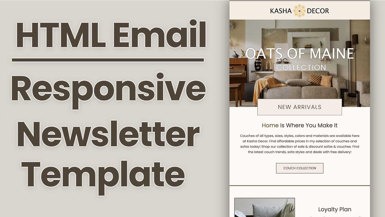
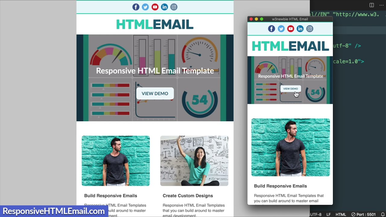
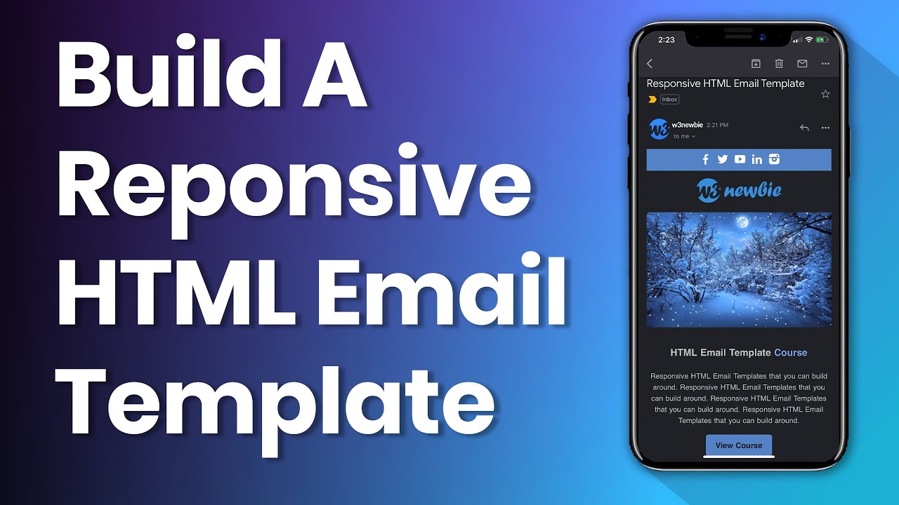
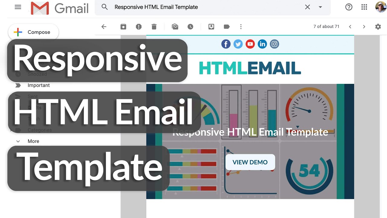
in this video we'll build a responsive html email template from scratch okay guys so before we get started my goal for this video is to get up to 400 likes and if you end up liking the video remember to subscribe and turn on your notifications for new tutorials so later on in the tutorial i'm going to show you how you can send a test email to yourself with the html and css code we layout for our mobile friendly html email template just like you're seeing here in my gmail account so the best way to tell that an email template is truly responsive is to simply size the window down in gmail and it'll only size so much but we'll be able to see that the columns have reached a break point where they went from a two column layout to a single column layout in addition to three columns to two columns and this will work just as well inside of the gmail app but just to show you as an example on the left i have apple mail on my iphone and i'll scroll down so you can see how the layout will appear on mobile phones you'll notice that all of the multi-column sections have gone down to a single column layout and the banner image that we use we're not going to be adding text on top of it here but i have a course where you can learn about that that i'll refer you to later and we'll get a more in-depth look at the design of the template while we build it in visual studio code but for now let me show you what we'll need to get started so in the description of this video i'm gonna have a download with the starter files prepared for us already that we can open up in visual studio code and that includes all of the images that we'll be using throughout the design which you see here in the img folder so along with the index. html file which i've started for us and the image folder you'll see html email course. html file which will give you a preview of my complete html email course and i'll also put a coupon link in the video description so you can check it out through there if you wish so in addition to the course project that we develop in the course there are nine bonus templates and an email signature and the template that we're going to be building in this tutorial is based off of the html email template from the course bonuses and i'll briefly show you the design as i said it's one of the nine bonus templates included inside of the course and you can see the differences between the html email template that we'll be developing in the youtube tutorial today versus the templates that are included in the course as i show off the long form of the template here so moving back over to the starter files that i prepared for us for the tutorial i already have index.
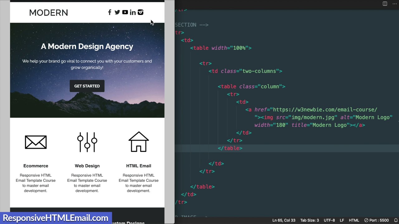
html open up in visual studio code and we'll go over what's already included for us here in just a moment but first i want to share a resource with you on my website so if you're new to visual studio code on my website on the resources page which i'll link to in the description you'll see there's a visual studio code text editor lesson where you can learn the basics and see the extensions that i use in addition to the settings that i have in my text editor okay so let's get back over to visual studio code and see what's already included for us in the starter files but first i'm going to hit the go live button in the lower right hand corner for the live server extension so now we're connected to google chrome and just to double check we see that we have the gray background but if i change this hex value to all sixes and then save it you'll see the background color change showing that we're connected with your visual studio code settings you can also set it up to save automatically but i like to save it manually for the purposes of explaining the changes while we're laying out our code here so now let's go over what's included for us inside of index. html here starting at the top with our doctype which is xhtml 1. 0 transitional and that remains to be the best option for email client compatibility next we have our character set utf-8 meta tag which is the standard character set for letters and numbers across the internet followed by a compatibility meta tag for internet explorer and microsoft edge then we have our viewport with device with initial scale one meta tag which is recommended for mobile devices followed by the title of our web page which is optional when it comes to email clients it's really only recommended if you're gonna send people to a live version of your template so with html email if you're not already aware of this we'll need to use an internal style sheet and then have our styles in line for best email client compatibility with our html elements which we'll use a tool towards the end of the video to do so we have some css already included for us here which i'll go over real quick so first off we have a body reset with margin 0 to get rid of any inherent spacing on the edges of our template then as we know we already have that background color with the gray shade off to the sides and we also have some zero values here to get rid of inherent spacing in email clients on table table data and image tags which we'll learn a little bit more about as we build our template then moving down to the body of the document i have some html comments laid out for us for the different sections of the design okay so let's get started with our first bit of html and what we're going to do is center our email template to make sure that it stays centered in our web browser as well as email clients so we'll use the center tag here and give it a class called wrapper then i'm going to drop the center tag down to the bottom of the body section and if you're familiar with html4 and html5 you may know that the center tag is from html4 which is older but is still useful in email design next we can add our table which will contain the entire template design and tables as we know are still the best option for email compatibility so let's add the table tag and i'm also going to give this a class that we'll call main similar to the wrapper class so we can style it in the css in a moment and we'll also give this a width of 100 to make sure the table takes up 100 of the window on smaller screens then similar to the center tag let's move the closing table tag down to the bottom just above the center tag and i'll indent it to fit the indentation above so we'll add some styling as we work our way down the template starting with the wrapper class and main class so with the wrapper class we're going to make sure that the width similar to the main class stays at 100 so we'll use a period to reference the class wrapper in our css and we'll use 100 width similar to the main attribute for the table here with our css that way it stays within the width of mobile devices and email clients next we're going to use a style declaration that's a little lesser known to make sure that the table stays within the wrapper class that we added in the center tag and that's called table layout fixed next we already added the background color to the body tag but some email clients may not respect that gray background color we added so we're going to add that to the wrapper as well which will show up outside of the template with with the background color we added to the body lastly for the wrapper i like the look of adding some spacing underneath the email template so i'm going to add some padding to the bottom of the email template wrapper with 60 pixels bottom okay so with that we can move on to styling the main class that we gave the table for the template so let's add that class here with period main and we're going to start off with a background color and we're going to use white which is all f's for the hex value and some email clients will invert the colors for dark mode i cover dark mode in my course i referenced earlier and i may make a dark mode email template for youtube but we'll cover that in a different video for wider email clients we'll need margin 0 auto to center our email template and maintain the position we're seeing in the web browser and i'll also add width 100 here to reinforce the attribute we added with width 100 then we can set our maximum width for the actual full width of the email template which is 600 pixels and this is the standard width for email template design now some email clients want to add inherent spacing to the edges of templates and to get rid of that we use something called border spacing zero so with border spacing zero you may remember we actually already added that to the table tag reset style so that in addition to the reset for padding zero on table data or td tags will come in handy when it comes to microsoft email clients though we aren't designing for outlook today because we aren't using conditional statements so next for the font i'm going to use a simple font with font family sans serif you can use a google font if you wish which i cover in other videos as well as my course and then for the color of the font i'm going to use a dark gray hex value 4a 4a 4a so with that we're ready to move down to adding our first section which will be the blue border at the top of the email template so each section of content will contain a table row tag which you can kind of think of as the section vertically inside of the table and then inside the table row tag we'll have a table data tag which we can add styling to or use to contain our content in this case we'll give the td tag a height for the blue border at the top of 8 pixels and then you can see that we have the white showing and what we'll do is just add some inline styling to achieve the blue color with style background and then the hex value 289 dcf so now once we refresh it we're able to see the blue border taking up the 600 pixel width and we're ready to move on to the header section of the email template and with our header section we're going to jump right into two columns so as we can see in the html document it's called logo section but i should have called it header so for the header section we're gonna start this off similar to what we did with the blue border section with the table row followed by a table data tag and then we're going to have a table inside of this as well because we're making uh multiple columns so i'll write tr td and then table then i'll hit enter and we're going to give the table a width of 100 percent similar to what we did with the main table and then i'm also going to add some space in between the table tags and this is going to be the foundation for all of our sections that need spacing as well as multiple columns so we can copy this html and paste it underneath the title text and button section as well as the three column section and then the next multi-column section which is the two columns then lastly the footer section which will be similar to the title text and button section where we see it say html email template course so now moving back up to the header section or as it says logo section what we're going to do first inside of the table is add something to give spacing around the logo as well as the social media icons on the right so we're going to create a new table row tag as well as a table data tag and we're going to give the table data tag a class that we'll call two columns and this two columns class will make more sense once we get to our css styling but inside of this we'll need to add two additional tables for the logo and then for the social media icons which will appear on the right so for the first one we're going to give this a class called column and inside of it we'll have a new set of table row and table data tags then inside of here we can have our image for the logo and we're going to wrap the image and all of the images in fact with a link because really the purpose of the email is to get the click to the website so you can add a hashtag to leave the link blank or add whatever link you choose this gives me an opportunity to promote my course again and now we can add the image so we'll add insight.
png which is inside of the image folder so img forward slash insight. png and stay tuned for the end of the tutorial because i'm going to show you how to get your images online and how to use test images to send your email so you can get an image to show up because it's not going to show up in the inbox or the images i should say on your computer aren't going to show up in the email inbox unless they're online now let's decrease the size of the image with the width attribute and i'll give it a width of 180 pixels then we can also add a title so i'll write logo for the title and then when we hover over it we'll see the logo text show up and just in case the image doesn't show up because the link is broken we can add alternative text or if somebody doesn't have the images turned on in their email inbox we'll see the logo text there in place of the image so now we're ready to move on to the second column which is going to be for the social media icons and this is largely going to be the same structure as the first column so we can simply copy this html and paste it underneath then we'll change the logo image to the social icon images so i'm going to leave the image in here and change the width to 32 pixels and then i'm going to remove the alternative text as well but you can add some in there for yourself if you want in addition to a title then for the link i'll leave this blank with the hashtag and the image this is going to be a png extension but i'll just add that anew along with the circle dash facebook image title or name so i'll add circle dash facebook. png and now if we take a look there we have our facebook icon appearing so now to add the rest of them of which there are four what we can do is simply copy this and paste it in a few times and then change the name of the social media website so for the second one we'll have twitter and then youtube then for the fourth we'll have linkedin and instagram will be last so now if we save it we'll have all five social media icons and as we can see they're appearing underneath the logo so before we move on to the next section which will be the banner image let's go about styling this two-column section with the two columns and the column class that we added so we'll reference these in our css i'm going to copy the two columns class so we can add that first so we can simply reference this with the period for the class instead of referencing the table data tag first and the first bit of two columns styling that we'll add is text align center so this is gonna center our table data tag on mobile and some email clients like to add spacing to links inherently so to do away with that we're going to add font size zero so you might see a little change here once we did that even in our google chrome web browser so let's move on to the column class next that sits inside of the two columns element so first we'll give it a width of 100 percent which is for mobile devices this way we can have our images completely centered when we're under 600 pixel width and then each one of the columns will want to have 300 pixels so we'll add maximum width or max width 300 pixels that way they can display inline next to one another on inside of our 600 pixel template so now to get them to display in line we'll add display inline dash block and then in order to get them to display on top of one another on smaller screens we'll use vertical align top so with that once we save it we'll see that we have our logo and social icons displaying next to one another so we're ready to add some spacing around them to get them matching the spacing of the original and the placement of the images so let's go back down to our html and we're going to add some padding around the main header section table data tag so we'll add the style attribute then padding with 14 pixels on the top zero left right and then four pixels on the bottom then i'm also going to add some padding around the logo image itself to get it centered in the three 300 pixel column so let's add styling and then padding 0 top and then 62 pixels left right so this is going to leave space for the 180 pixel width actually that might be a little over but that's all right this is what i have here and then 10 pixels on the bottom so now once we toggle back and forth we'll have our logo matching the original and we can move on to the padding around the social media icons so i'll copy this style attribute and paste it down underneath then for this we'll just use top bottom left right with two values of padding so it'll be 10 pixels top bottom and then 68 pixels left right so with that if we toggle back and forth we're going to match up the header exactly and we can size it down to see that they drop to new lines in the email template so next we're ready to move on to the banner image that displays beneath the header at the full 600 pixel width so let's navigate down to that html comment where it says banner image so let's start off this section with the table row and table data tag then inside of this we'll have a link and an image like we did the previous images and i'll leave the anchor text tag blank with the link and for the image here it'll be img forward slash banner.
jpg which as we can see is displaying much wider than the template itself so we'll need to change the width and we can do that once again with the width attribute and set it to 600 which as we know is the maximum width of the template but then when we size it down we're gonna see that the template width isn't going to size with the screen width anymore so we'll need to set a max width so i'll set a max width of 100 percent and we can just leave this in line here in the image element itself without going to our internal style sheet because this is the only styling we'll need for the banner section as we see it flexing with the window width okay so now we're ready for the heading paragraph and button section which is going to be a little bit harder than the banner image but easier than the header section so we already have the main tags laid out for us and we're ready to add the inner tags which will start with our table row and table data tags so for our heading we'll use a paragraph tag and alter the styling to make it appear as we see there so we'll add p and then i'm going to add the text html email template and then inside of a strong tag or we can use a span tag but i'm going to use strong here which means bold i'm going to change the styling here to make the text blue so we'll give it a color with the hex value 289 dcf and then i'll just write coarse and now there we see our paragraph text with the bold course text in blue and we can resize and style the rest of the text so let's increase it with font size 20 pixels and then match the strong bold styling with font weight bold so now if we save it there we have our text and we can center it by adding text align center to the table data tag and let's add some padding all around with padding 15 pixels so this will be applied to the top to the left right and bottom and the left right may matter on the smallest of mobile screens but we're not really going to see any difference here when i toggle back and forth though you may notice that the padding on the top and bottom of this section doesn't really match the original so let's add some styling to the main table data tag with padding of 5 pixels top 0 left right and then 50 pixels bottom which will appear underneath the view course button once we add it so for now let's move on to add the paragraph text that appears underneath the text we just added and for a large text block like this you can just write lorem in visual studio code for it to fill out a bunch of text for you but in my case i'm just going to paste in the text from the original template so once it's added we'll want to change around the styling a bit so i'm going to make the text slightly smaller and make it 15 pixels in size instead of the inherent 16 pixels in google chrome and then i'll also increase the line height to 23 pixels and add some padding to it um on the top and the bottom to separate it from the button and the text above so we'll add padding 5 pixels top and you can adjust this as you please and then zero left right and 15 pixels on the bottom which will add a good bit of space before the blue button okay so that's matching up and we can add the view course button now so the button html is going to be really simple we'll just use an anchor text tag and give it a class called button and you can add a link here or leave it blank with a hashtag and then i'll add view course for the text so once we save this this is just going to show us a bare link in the blue text and the underline so the button is going to really take its form with the css that we give it when referencing the button class that we just added so let's copy that text and add it to our css here and we're going to start it off by giving it the blue background color with the same hex value we've been using 289 dcf and then we can make the text itself white with color fff then get rid of the underline with text decoration none and we can add some spacing around the text to show more of the blue background with padding 12 pixels top bottom and 20 pixels left right then we'll make the text a little bit more visible matching the original by making it bold so we'll add font weight bold then the last bit of css we'll add will be to round the corners with border radius so you can choose what you want here if we go with 20 pixels for example it's going to be like a pill shape but i'm gonna add five pixels to match the original okay so now let's check it out by toggling back and forth and we're completely matched up down to the blue border or the second of our blue borders in different heights so what we can do is copy this first one and then we'll reduce the height which is going to be 2 pixels instead of 8 pixels so simply change eight to two and we'll also give this a bit of a lighter blue shade with a six eight eight e e as the hex value and there we have it at the bottom of the template so what we can do is copy this and add it to the next one as well and then we'll get to the last one towards the end of the design after we add the footer for now let's move on to the three columns section that appears in between our blue borders and the three column section will start off similar to what we did with the two column section where we have the two columns class the columns class and then in this three column section though we're going to add a padding class instead of adding the padding in line with styling and we'll have an additional class inside of that which we'll get to first let's start off with our table row and table data tag that will give a class called three dash columns instead of two columns and then i'll add some spacing here and we'll have our table inside of it with the column class followed by a table row and an additional table data tag with the padding class as i mentioned instead of adding the padding styling in line so up until this point we've added padding around the content of our three columns so naturally we're going to add an additional table that will give the class content which will contain our images and text but before we do that we'll need to add our last table row and table data tag inside of this table so we'll add tr and then td now finally we're ready for our image which the first one is going to be the shopping cart ecommerce image so similar to what we did previously we'll put the image inside of a link with the anchor text tag and then i'll add the image folder with img forward slash e-commerce dot jpg and we're going to give this a width of 110 pixels so you can write 110 and once we save it we'll see our e-commerce shopping image showing up then for best practices or best practice with images i'm also going to add a maximum width here with the style attribute of 110 pixels then since these images aren't transparent they have background colors to them i'm going to trim the background color by using border radius 55 pixels which is 50 of the 110 pixel value that way you don't see the edges if we were to look at it on dark mode okay so with that we're ready to move on to the text that appears underneath it so i'm going to add a new row or table row and table data tag before adding that text so i'll add a paragraph tag and then e-commerce then for this text we're going to give it some styling so let's increase the font weight with font weight bold and then i'll also make the font size 17 pixels instead of 16 pixels to make it stand out a little bit and there we have our e-commerce text but i want to give it a little bit of spacing between the shopping cart and then the column that will appear underneath this with padding 10 pixels top bottom so that's going to add to the bottom of the paragraph text that appears underneath it as well and gives some space underneath the image so let's add that paragraph text now i'll just paste the text in but as i said previously you can just add lorem text so now it's not contained in the column but before we add the styling let's add the rest of the columns really quickly which we can simply do by copying the entire table which has the column class just inside of the three columns table data and then pasting that in twice so i'll paste it once and i'll change the image here to web design from e-commerce and i'll change the text to web design as well and then we can paste the second one in just make sure that it lines up with the column class and the table tag and we'll change this to email design and then html email for the text okay so there we have the rest of our content laid out and now we're ready to move back up to our internal style sheet and start styling these classes that we added starting with the three columns class so this is going to be similar to what we did with the two columns class except for we'll add some padding in here in addition to text align center and font size zero so i'll add three columns text align center which as you remember um centers the table data tag itself then font size 0 to take away the inherent spacing with the links and that's going to take away our text just temporarily for now then i'll add some padding to the top and padding to the bottom so once again we'll add padding and then 35 pixels top zero left right and 20 pixels to the bottom okay so that spacing looks good and we can move on to the column styling so this will again be similar to what we did with the two columns we can even just copy all of this and then all we'll need to change is the width from 300 pixels to 200 pixels which fits into 603 times for our three columns as we see and now it's in line for us but we'll want to add some spacing around it using that class padding that we gave it instead of adding it here in line because we have it repeated three times so we'll reference the three columns class then padding and i'll add padding 15 pixels all around and then once we save it it's not going to look quite right yet because we don't have the paragraph text taking up the width so we'll need to get that paragraph text back by referencing the content class that we added so add three columns and then the content class and we'll give it a font size of 15 pixels to match the section above this and i'll give it a line height of 20 pixels to space out the paragraph text a bit so now once that's saved you'll see that the spacing looks good and it's even around all three of the classes okay so that looks good and we can even size the window down to get the effect of the responsiveness like we did with the two column section earlier but we're not going to see it to a single column yet when we size it down we'll just see the two and then one we'll check it out on a smaller screen later on but let's move on to the next two columns section where we have the palette image on the left and then the text button on the right so for this section though we're adding two columns the classes are going to look similar to the three column layout more so than the first two column section that we added so let's add our first two columns class and then i'm also going to add a class called last because we're going to add some different styling to this section than we did the first column so we'll want to be able to identify it separate from that first one by adding an additional class to it then we can add our table class with the column name for the class in addition to our table row and table data tag inside of that which will have padding attached to it like we did the three column section and then we have our table containing the content so we'll give it that content class once again and we can identify this separate from the three column class with the last class uh that we gave to the two columns table data tag so let's start off our image that we see here with our link and then the image inside of it and this will be img forward slash palette dot jpg then we can give it a width of 260. which will leave um 20 pixels on either side for padding and i'm going to pause the video here for a moment don't add pixels using the width attribute only do that when we're adding styling so make sure you don't have that in there matching the mistake that i made then similar to what we did earlier i'll give it a max width for best practice to make sure that it's contained within this width on email clients okay so now we have our image added but we're not going to have the spacing around it yet but it's already going to be centered because of the two column styling we added previously so now let's add the next column by copying the table containing the column class and pasting that underneath then we can get rid of the image so we can add our text so i'm going to style it first this time with font size 17 pixels and font weight bold matching the heading text in the three column section and then i'll add the text to match with create custom designs and the paragraph text that we add underneath this won't require any styling but we will add styling to the next set so i'll add a new paragraph tag and paste this text in then this text right here we'll need to separate it from the button that appears underneath it with some padding so i'll add the paragraph tag and then padding bottom 15 pixels and i'll paste the text in you can once again use lorem text if you want and for our button we'll use that same button class which already has the styling added to it so once we write our text in here the button styling should already be there but i think we're going to have a font size issue so we're going to need to make sure that the font appears the font size 0 is probably appearing for that two column class that we added originally for the header as we can see so we'll just need to reference the last class that we added alongside the two columns class for this section of the template and then we can add the font size here so just make sure there's no space in between two columns and last because these classes are inside of the same element and i'm going to add some padding here before we take care of the font so let's add padding 35 pixels top bottom and zero left right then let's add padding to the padding class itself of padding 20 pixels all around and we'll do the font size using the content class instead of these other classes so we'll write two columns and then content and font size 15 pixels to match what we added previously with the line height of 20 pixels and i'll add text align left so it's not centered taking on that text align center styling for the table data tag okay so that looks good and we're matching the finished version and it's responsive as we can see so we're ready to add the footer at the bottom and then the blue border okay so let's navigate down to the footer section html comment and we already have it started for us so let's add some styling to the table data tag to give it the background color and the color so we're going to give it a dark gray background color with the hex value 565656 and then we'll just make the text color and icons white actually we'll be using images for icons so we don't need to style those white but we can skip right to the table row and table data tag that would normally be up for our content here and then start adding the content so the first will be the insight logo that's kind of oval shaped so that's insight dash white dot png for the image and i'm going to give this a width of 160 pixels and then to center it we'll use a styling for the table data tag of text align center and also add some padding of 45 pixels top bottom and 20 pixels left right just in case it sizes down on mobile will want some spacing around the text and stuff that we see so let's move on to the text now we'll add a new paragraph tag and i'm going to give it a padding of 10 pixels all around and then the insight html email text and underneath that will have the address so i'll just paste in the street address here with the same padding then this will also be the same for the subscribe text at the very bottom you can add a link for this if you want i'm just going to use this same paragraph text and then write subscribe in all caps and in between these paragraphs now we can add the images for the social icons which will wrap in links so this will be similar to what we did at the top of the template we'll just be using different images so if we want we can simply copy this but the size is going to be slightly different so we'll change it once we add these in though so the image file names will be white dash and then the social media network instead of a circle so i'll just change this to white and then copy that and then i'll just paste it in for these remaining ones and now if we look at it you can leave it like this if you want but i'm going to match it to the finished version so i'll simply change all these widths to 30 pixels instead of 32 and now if i save it we'll be matching the finished version except for the blue border at the bottom so what we can do is add that manually or we can simply copy it from the blue borders we added previously and those are height if you remember 8 pixels or 2 pixels in this case we'll use 10 and then background color 289 dcf for the hex value okay so with that that concludes our entire html email template design and if i take a look at it on a smaller screen using this responsive web design tester tool in chrome we can see that it's going to size down to a single column for not only the two column sections but also the three column section before it goes back to two columns on top and a single column on bot on the bottom and of course the full three columns at the 600 pixel width as we see right here so next i'm going to show you how to send a test email to yourself using a free program at putsmail. com you used to be able to do this without creating an account but now you need to create a free account with them in order to send the test to emails which just takes a moment but before we do that as i mentioned the images aren't going to be seen in an email client unless they're uploaded to the web so i'm going to show you a free tool that you can use which i cover inside of my course and all the course images are in there as well and that's called imgbb.
com which is a free image hosting platform where you can link to them directly and add the urls inside of your image links in your html another option which is temporary for testing is to simply add a placeholder image in place of the image url if you don't have an image uploaded to the web yet so you can do that by going to placeholder.


![Responsive Email 101: HTML + CSS Basics [Webinar]](https://img.youtube.com/vi/urgD_dwm-0E/maxresdefault.jpg)