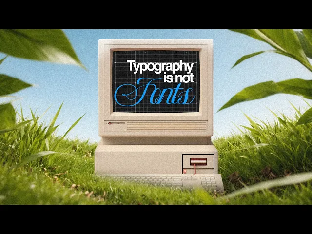
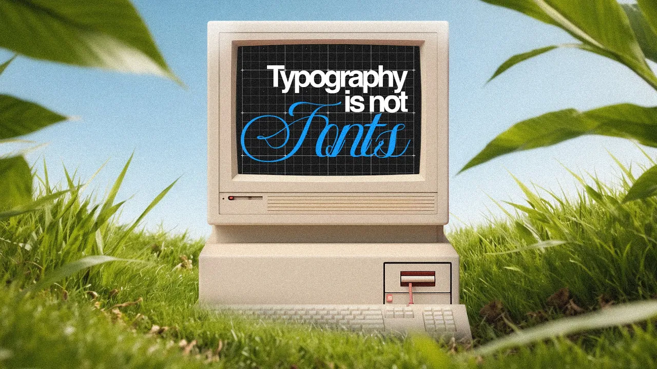
Look, I'm going to tell you something very well. YouTube can detect comic sands in your thumbnails. Instagram's AI literally [music] judges your font choices.
And Tik Tok, they are training machines to decide if your typography [music] is worth showing or not. You know, 12 fonts, but there are 200,000 fonts. And it's not an accident.
And in the next 20 minutes, I'm going to teach you everything design school charge [music] thousands of dollars for because 95% of design is typography. mastered this and basically you have won. Before you choose fonts, you need to know what you are looking for.
Actually think of letters like cars. They all get you somewhere. But the parts matter and this baseline system is everything.
X height is the height of lowerase letters. This is the most important measurement. Look at the Helvetica versus Garamount at the small sizes.
Helvetica feels massive because of its huge [music] Xite. This is why Google, Facebook and every big tech company [snorts] opses [music] over this. More excite means more readable at tiny smartphone sizes.
Then you have got ascenders that go up like H, B, L, and descenders that go down like Y, [music] G and P. And this is what actually matters for you. Aperture is the opening in letters like C and D.
Bigger the aperture, more easy to read. That's why AIAL beats Helvetica for accessibility. Even though designers may hate to admit it.
Yeah. Counters the holes inside. O, P and B.
At small sizes, these close up and your text becomes a blurry mess. Test this. Shrink your font up to 12 pixel.
And now type the letter E. Can you see the counters? If not, then don't choose the font.
Did you ever notice that highway signs are massive and super readable at 70 mph? That's called clear view. Designed with huge aperture and [music] accent.
So your mobile design should work like a highway sign. As I said, there are half a million fonts out there. And here's how pros pick up in less than 30 seconds.
Old style setif. Think New York Times, your college textbooks, Gammon, Castelan. And well, these scrims like we have been since 1500.
So trust us, huh? So use them when you need credibility. What are serifs?
Vogue uses dot. Those super thin, ultra elegant serifs, fashion, luxury, expensive [music] stuff. But listen, these are for headers only.
Those thin strokes disappear at smaller sizes. Slap serifs. Just remember Sony's logo.
Just remember it. Thick chunky [music] serifs. They punch you in the face.
Great when you need impact. Humanist sands. Gill [music] sands.
The British railway system. Open sands everywhere around the web. Clean friendly and readable.
Your safe choice for UI. Geometric sands. Futural.
The literal font on the moon. Spotify. Louis Vuitton.
Perfect circles and straight lines. Tech startups. Minimalism.
[music] But here's the catch. It's terrible for long reading cuz it's too perfect. Your brain needs imperfection.
So here's the my go to stack. Enter for UI. Play fair and display for editorial.
Space grotex for branding. These three handle 80% of the design I do. Okay.
So now you know the tribe. But choosing [music] a pretty font. It's like buying a Ferrari and you don't know how to drive because the real game it's making your people's eyeball fall into the exact direction you want them to.
Your eyes [music] don't cheat. They hunt for information. And we are going to weaponize that.
Size contrast is the nuclear option. Weak hierarchy 18 pixel headline 16 pixel body. That's what amateurs do.
Strong hierarchy 48 pixel heading 16 pixel body height and that's 3x jump. Now we are talking. And this is coming from me.
Use maths not feelings. The golden ratio it's 1. 618.
[music] Start at 16 pixels 16 then 26 then 42 [music] then 68 pixel. And this is why Apple's interfaces feels right. They use consistent mathematical [music] skills.
Weight contrast causes drama. [groaning] Never use more than three weights. Pick [music] regular, semi- bold, bold.
That's it. And more than that, you look like a ransom note. Look at his stripes website.
Two weights, massive size gems, tons of white space. That's confidence. And now something that isn't talked about often.
Color opacity is the secret weapon. Headlines 100%. Body 85%.
Captions 60%. This creates depth without touching a font. Medium does it excellent.
Their entire hierarchy is basically one font at different opacities. And now space is the most powerful tool. You are not even using the proximity principle.
What happens is your brain groups [music] thing by distance automatically. Related items 8 to 16 pixel [music] apart. Different section 48 to 64 pixel apart.
Look at every Apple product page. [music] Insane amount of white space. That space isn't empty.
It's doing the work and position that matters [music] more than you think. Western readers follow F pattern. Top left is prime real estate and bottom left is where things die.
Go look at Amazon's product page. [music] Price and add to cardart. Top right reviews.
Left side shipping details. Bottom right where nobody's looking. This isn't random.
Build your system once. Now you will never ever have to think [music] again. You know, bad spacing can make even herical looks like a garbage and good spacing makes comic sense almost acceptable.
Almost. Tracking is nothing but letter spacing. All caps need breathing room.
Type hello at 48 pixel. Looks cramped, right? Add plus 100 tracking units.
That's [music] luxury. Every premium brand does that. Rolex, Chanel, Prada, they're adding 150 to 200 tracking points.
[music] Get headlines tighter minus 20 to minus 40. This pulls the eye across faster. A small text under 12 pixel needs plus 20 units minimum or it blurs together.
Now leading is nothing but line spacing. The formula font size into 1. 5 for body text into [music] 1.
2 for headlines. If 16 pixel is body height, then 24 pixels should be line height. [music] 48 pixel headline, 58 pixel line height.
Why your eye needs to jump [music] to the next line without getting lost. Too tight you reread lines. Too low connection breaks.
Line length the rule everyone breaks. 45 to 75 characters per line. [music] That's it.
More than that, your eye gets lost jumping back. Less than that, you're reading like a telegram. Medium figured this out.
Their articles max 680 pixel wide roughly 65 character. That's why they are so readable. The eight point grid system everything aligns to multiples of eight.
margin, padding, spacing, 8, 16, 24, 32, 40, and 48 pixels. Why 8? Cuz it divides evenly on any screen size.
8 pixel on a 360 pixel phone and a 1440 pixel desktop both work perfectly. That is why Google's material design and Apple's human interface guidelines both use eight point [music] grids. All right, so you have started to see the matrix.
But here's where designers separate themselves from amateurs. It's not picking one good font. It is mixing two font and not make them look like they came [music] from two different planets.
Okay. So once two geometric sans font walked into a bar and [music] nothing happened. That's the problem.
Rule number one contrast or die. Per opposites serif plus sans geometric plus humanist. Thin plus bold.
And here's some combos that work. Playfair display plus source sans pro classic editorial the New Yorker vibes space groes plus inter modern tech bod plus futura luxury think high-end fashion Merryweather plus monserat friendly corporate nonprofits love this rule number two they both need to be from same era both modern both vintage not Victorian serif with ultramodern geometric unless you are being ironic the lazy genius move use one super family and font family with serif and sans version. IBM Plex Sans plus IBM Plex serif what IBM actually uses source [music] sans plus source serif Adobe's gift to the world rootto slab Google's [music] everywhere font instant harmony because they are designed together so do one thing type H and X capital H next to lowerase X shows the relationship immediately if they feel like they are fighting [music] try again three fonts maximum more than that cognitive overload your brain can't build a hierarchy what you can do is open Netflix.
Two fonts. Helvetica for UI, custom font for titles. That's it.
Billions of dollars, two fonts. Now, this is where good designers become great. Alignment and consistencies are invisible, but their absence screams amateur.
The grid is your religion. 12 column grid for web, six column for mobile. Everything snaps to it.
But here's the nuance. Images can break the grid. text never look at any Apple marketing page every text element aligns perfectly to call images then images break [music] out creating tension that's intentional and baseline alignments change everything so what should happen is all your text headline should align at an invisible horizontal grid medium does this obsessively every [music] paragraph every caption every quote all align to a baseline grid [music] optical alignment always beats mathematical alignment circles and triangles need [music] to extend slightly beyond straight edges to look aligned.
Your eye needs [music] it. Look at FedEx. The arrow between the E and X optically aligned, not mathematically.
The X is actually nudged down a few pixel [music] because it looks better. Your H2 on page three should look identical to H2 on page 47. Consistency [music] is everything.
Inconsistency reads as unprofessional. Edge alignment matters. Left align body text always.
Center alignment is for headlines [music] and poetry. Write a line almost never unless you are doing a two column layout where [music] it creates visual balance or you can break it. Pick up any well-designed book, turn it upside down, you'll see perfect alignment, text blocks, margins, page numbers, all hitting the same invisible grid.
[music] That's craft. Now, this is the stuff design school barely teach. [music] But it is what that makes good typography feels premium effortless and that is liatures.
When [music] letters combine type fi in most fonts a small f and small i. See how the dot on the i crashes into the f. [music] liatures fix this.
Fi becomes one connected form. Look at any vog magazine. Legatures everywhere.
Straight quotes are for [music] quotes and curly codes are for typography. M dashes for breaks in thought. and dashes [music] for ranges like 2022 to 2024.
Hyphens for compound word. This all seems very [music] messy until you see a professional typography versus a mature one. The difference feels instant.
[music] And I repeat, widows and orphans them. Single word on the last line of a paragraph that's a widow and she looks lonely. Single line of a paragraph at a new page looks lost and that is an orphan.
Fix, adjust, tracking slightly, rewrite or force a line break. Professional designers spend [music] hours on hunting these nouns. It's obsessive, but it matters.
Open a book from a major publisher, then open a self-published [music] one. The difference is micro typography. The pro version has perfect [music] liatures, smart quotes, no widows.
The amateur doesn't. Okay, now you are in the top 5% of the people who know this much about typography. But here's the thing.
every perfect typography phase if you [music] don't test it. Because what looks good to you might be unreadable to someone else. Typography isn't about taste, [music] it's about performance.
And the only way to know if it works is to test it. And the test is the squint test. Step back [music] from your screen.
Squint. Does the hierarchy still works? Can you see three distinct level of importance?
If everything blurs together, your contrast is weak. You need to add some pixels to your [music] headlines and please add more space. And now is the second test and that is 5-second test.
Now show your design to someone and give them only 5 seconds. What did they remember? If they can't tell you your headline, then your hierarchy failed.
[music] I've seen designers create 12 pixel body text that looks fine at 200% zoom on a real phone. Unreadable convert your designs to black and white. Does the hierarchy still works [music] without color?
If not, you are relying on color too much. It can work, but you are relying on color too much cuz hierarchy should work even in black and white. Color just enhances it.
White text on light gray probably failing. Your design might look clean, but it can also be readable to 20% of your user. Your retina MacBook Pro is not what most people use.
Test a cheap Android with a low res screen. [music] Test on a 5-year-old iPad. Test on Windows with clear type rendering.
Fonts render differently everywhere. Your font that is looking so clean and gorgeous on [music] Mac might look pixelated on Windows. Here's something interesting.
Booking. com brand test showing different fonts for book now button. Winner aial bold 18 pixel plus 50 tracking [music] increased click by 14%.
Boring but effective. [music] But here's the brutal truth. You are not designing for yourself.
You are designing for people having cracked [music] screen in bright sunlight. So test for that reality. Why this actually matters?
Let me show you how powerful this gets. Researchers showed identical news headlines in different typography. Times New Roman, 68% people believed it.
Comic sense, 23% people believed it. I I am wondering who are those 23% people. Same exact words, only the difference is the font choose.
That's a 300% difference in perceived truth. Cornell tested [music] restaurant menus with identical food. Descript fonts $47 average check.
Bold sense $31 average check. Typography added $16 per person. That's real manipulation.
The resumeumé experiment identical qualifications [music] different fonts. Helvetica 78% rated highly competent. Script fonts 32% positive rating.
Your font choices literally determine if you're going to get hired or not. Probably yes. So subscribe.
Your brain judges fonts in 50 milliseconds faster than you can read. It's happening below your conscious thought. Serif font screams authority cuz you have seen them in throughout your lives in newspaper, in your college mark sheets, everywhere.
Sansif fonts trigger modern because tech companies spend billions conditioning you. Script fonts trigger personal because they look handwritten. Display fonts trigger urgent because they are loud and demand attention.
This isn't taste, it's neurological programming. Supreme uses Futura Bold. A $50 white t-shirt looks worth $50 because future of bold screams [music] confidence and exclusivity.
Change it to Times New Roman. Looks like a Microsoft Word document. Now, here's where it gets wild cuz you are not designing for humans alone.
You're designing for machines. Now, YouTube's algorithm literally evaluates thumbnail typography. High contrast.
Bold fonts get priority. Weak fonts get buried. Fonts that look beautiful but people read slowly, algorithm punish them.
Fonts [music] that look basic but make people keep reading, algorithm rewards them. This is why internet and robot dominates the web. They are not the prettiest.
They are the most algorithmically [music] optimized. Okay, real talk. Now you know more about typography [music] than 99% of people.
You understood the anatomy that makes font readable. The five tribes and when to use each. How to create hierarchy that controls eyeballs.
The spacing that makes or break design. Font pairing formulas that actually [music] work. Alignment and consistency that is screens professional.
Microphography details [music] that separate pros. Testing methods that ensure it actually works. The psychology that influences decision.
The algorithm game you have to play. This knowledge is power. Knowledge without action is just trivia.
Pick three fonts right now. One serif, one sans, one display. Build your personal stack.
Create your hierarchy system. Write down your sizes, weights, spacing, opacity. Use it everywhere.
[music] Test everything on real devices with real people. The truth nobody tells you is typography isn't about making things look pretty. It's about making things work.
It's psychology. It's neuroscience. [music] It is economics wrapped in letters.
Every font choice you make from this point should be strategic. Your emails, your presentations, your social post, they are all psychological weapons from now. The edge is while everyone is picking font because they look nice.
You are choosing them because you know how they work. That's your unfair advantage and that's your superpower. So use it, manipulate it and let's see what you build with it.
And please subscribe.