okay now that we have learned how to calculate control ranges um let's go into the part two of plotting plenty of points why part two well because there's a part three the purpose to demonstrate control range and Rule selections effect on the error detection level of a QC system what will you need none except yourself and what will you do You observe how to plot control values on LJ chart all right so basically um we will be utilizing this uh information that we have uh calculated um using the mean coming from the mean and standard
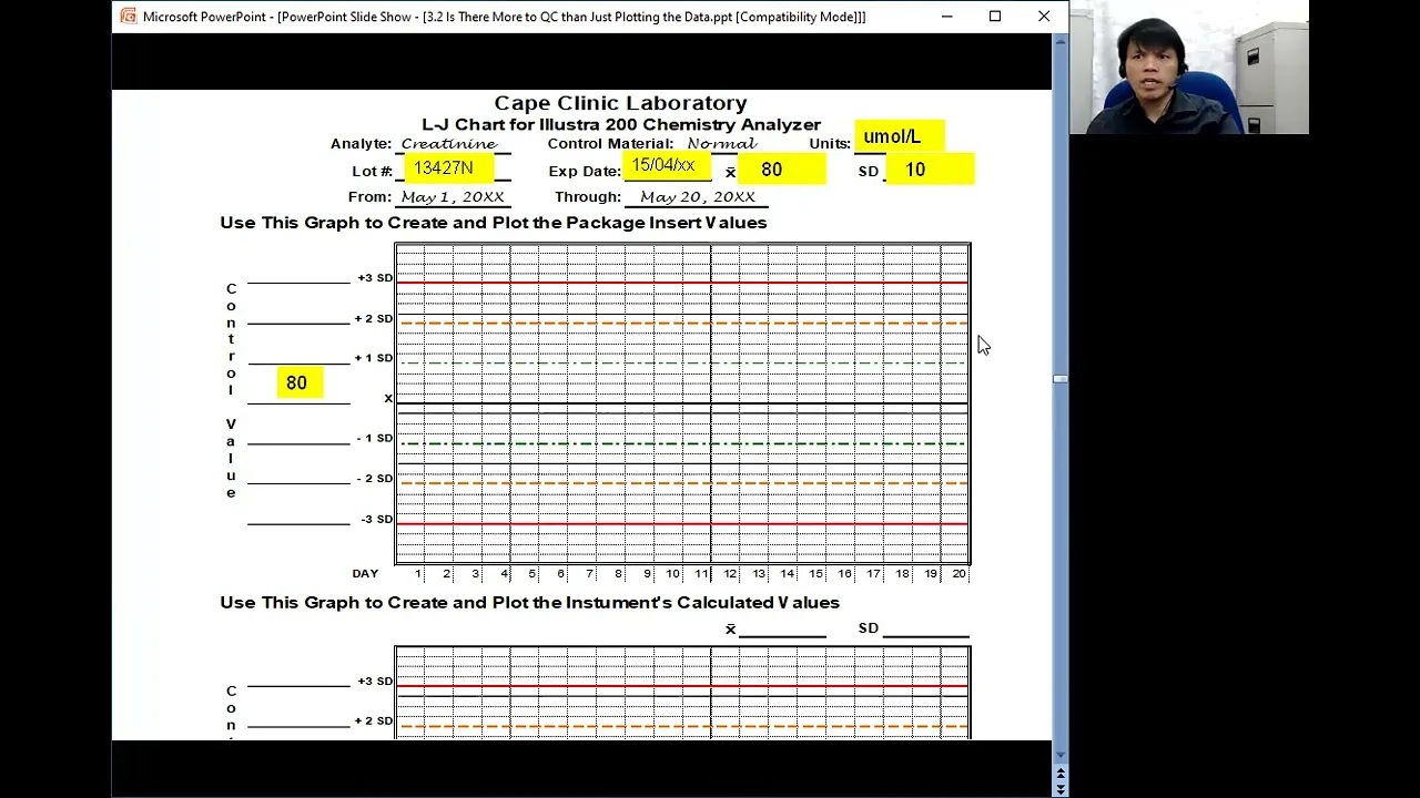
deviation coming from the package insert and the mean and standard deviation calculated by the lab all right this is our LJ chart okay so um up here you have if you remember in our creating a maintenance and accusing log you have the elements so we have the analyte here the control material normal um usually we need at least two levels of controls to verify a test system so normally we have in clinical chemistry maybe we need a Normal and abnormal control material the units we have to provide here the lot number expiry date the mean
and the standard deviation all right so let's do that populate um this um blank spaces here by the way please remember that before you can populate anything or before you can record anything you have to create a log or a form I if you don't have one there is actually there's one available for you guys the job aid creating an LJ chart if you're doing a manual LJ charting all right uh utilize in the information coming from the package insert we have the units in micros per liter the lot number the mean was 80 and
the standard deviation is 10 all right now how about here the let's also populate this that's your 80 that is my the Plus One SD would be 80 + 10 that is 90 100 and 110 down here we have 70 60 and 50 all right now here use this graph here to create and plot the instrument's calculated values right so we also need to populate here the mean and the standard deviation as well as the information here all right then now every time you run a control then you um actually plot plot the data for
example in this case that means this one would probably if the mean is 80 this would probably be just above so maybe H 81 right and you do the one on the succeeding um uh QC values you plot it on the LJ chart it's not that difficult by the way you do not normally use this one where you plot in two LJ charts using the one coming from the package insert and the one that is calculated the reason why I'm doing this because I want to show you something all right as I have said you
keep on plotting until you reach uh will day 20 or 20 data points or maybe at the end of the month for in depending upon your case right keep on plotting and eventually you will have this you connect those dots on the LJ chart and you see now the distribution of your data of your LJ uh Control Data so this is a very simple way of um populating the LJ chart and populating it with the QC values now let me emphasize here and please remember that the distribution here of the data should follow a what
aaan distribution


![Hands-On Power BI Tutorial 📊 Beginner to Pro [Full Course] 2023 Edition⚡](https://img.youtube.com/vi/77jIzgvCIYY/maxresdefault.jpg)