Hi I'm Dan and I'm excited to welcome you to the ultimate CSS full course this course is designed for complete beginners with no coding experience and by the end you'll be able to write CSS at a professional level it's by far the most comprehensive and highquality course you'll find online and goes well beyond the standard tutorials you'll see Elsewhere on YouTube my teaching style is not to just talk over code but Instead I've carefully crafted this course to be a visual masterpiece with interactive animations beautiful graphics and professional editing making it fun to watch to
ensure you remain engaged in order to maximize your learning I also use the most effective teaching techniques for visual Learners where the course is jam-packed with diagrams analogies code annotations tables and much more by far the most useful feature is that every topic ends With a summary card so that by the end of the course you have a full set of cards consolidating everything you need to know for CSS now this course is a direct follow on from my full HTML course so if you don't know anything about HTML you'll need to watch that first
it's appearing in the top right now if you haven't done my full HTML course but are confident in the basics and know about HTML tags for text hyperlinks images containers and Semantic elements you'll be able to follow along just fine so let's look at the CSS course program we'll be covering the following topics topics in introduction to CSS CSS text CSS selectors the CSS Box model CSS units CSS functions flexbox CSS grid responsive design positioning shadows and Transitions and CSS Frameworks each of these topics contains many subtopics which comprehensively cover everything you need to know
to get a solid Foundation that will enable you to code CSS at a professional level throughout the course we will continue to work on quill the major full stack project we started in the HTML full course as a reminder here is where we got up to at the end of the HTML course and by the end of this course we will end up with our design looking like this and I'm sure you can agree with me CSS is able to bring our web pages to life now if you didn't join me in my HTML Full
course you can download the completed HTML file in the description below so you can pick up where we left off you can also learn more about all the features of the quill project by clicking on the video appearing in the top right now in addition to the starter HTML file all the complete HTML and CSS coding files presentation slides and summary cards from this video can be downloaded from the description below let's kick off the course nice and slow With an introduction to CSS we'll be discussing what is CSS the CSS Box model CSS properties
and CSS rules so first up what is CSS CSS stands for cascading style sheets cascading is how to style an element when several rules apply there's a bit of theory to get through to fully understand what this means which we'll be looking at in a later topic style is about the various styles that can be applied to HTML elements and finally we have sheets that Refer to their own documents which can be linked to HTML files so what does CSS do CSS is used to control the presentation and layout of HTML we've looked at HTML
already which is all about content CSS is all about the visual styling of the content and the next section we'll spend a lot of time on is Javascript these three languages HTML CSS and JavaScript are the foundation of front-end web development let's take a look at the power of CSS by Looking at our quill application with just HTML for those of you joining me for the first time quill is the major project we are working on inside the boot camp and this is where we got up to at the end of the HTML section you
can see it is just the content at the end of this CSS topic the quill homepage will look like this I'm sure that you can agree with me it's chalk and cheese comparing the web page With CSS and without it now important concept we need to discuss straight away is the CSS Box model CSS views every HTML element as if it has its own invisible box around it let's take a look at our quill application and fill in all of these invisible boxes around the content starting with the logo in the top left corner although
if I were to trace the perimeter of the icon and text it wouldn't be straight all CSS sees is a box around the edges of the Content in this case the image tag we then have boxes around the navigation links which are anchor tags there is a box around the main heading which is an H1 element there is a box around the paragraph text which is a paragraph element and then again we have boxes around these links which are anchor tags in addition to content elements structural elements also have boxes around them like the navigation
semantic element and the section semantic element As well as the span element we can easily see these boxes whenever we use Dev tools I'm going to right click inspect I'm going to click the inspection tool and go and click on some boxes let's start with his heading the H1 you can see a blue box appears around the content same with the paragraph and all the anchor tags this blue box is the CSX Box model in action now these invisible boxes will either be block or in Line we have we have already covered this concept in
the HTML section but it's worth recapping because it is critical to understand it when working with CSS and it can be a bit confusing when first starting out all HTML elements are by default either a block or inline element let's first look at block elements block elements always start on a new line we can represent block elements like this block elements always take up the full width of a page Some examples of block ele elements are headings paragraphs unordered lists and list tags now let's look at inline elements inline elements do not start on a
new line unless they're after a block element this is because the block element extends the full width so it pushes the inline element onto a new line we can represent inline elements like this inline elements only occupy the width of their content some examples of inline elements we've seen include Anchor tags images a line break and input tags knowing whether an HTML element is a block or inline element is crucial as it significantly influences CSS styling and layout let's go and update this image and distinguish between the inline elements and the block elements I'll keep
the block elements in red and update the inline elements to be green the logo is an image tag which is an inline element so we need to update that The anchor tags in the na navigation bar are also in line so we'll update that to Green we also have a set of anchor tags in the hero section so those also need to be updated finally the span which is a container element used to style text is also in line so that needs to be updated from the outset of CSS I want you to get comfortable
with thinking in terms of block and inline elements it will make your CSS Journey a lot Easier let's go and check out some block and inline elements I'm going to open up Dev tools and I'm going to click the inspector icon looking at this paragraph first we can see the blue box extends the full width of the page and the paragraph text starts on a new line This is typical behavior of a block element if you look at the image over here you can see the blue box is only extending the width of the content
this is also typical behavior of an inline element Now looking at these anchor tags here again the content of the anchor tag is only EXT ending the width it needs because it's an inline element so why then is this learn more appearing on its own line shouldn't it be appearing next to get started we discussed this in the HTML section and the reason this is happening is because the anchor tags are wrapped by list items which are block elements you can see the list item is extending the full width of the page Which is then
pushing down the next list item which extends the full width of the page and the anchor tag is inside that list item you can see that in the mark up here we have an anchor tag inside the list element so just be aware that nesting can influence the behavior you'd expect you might remember at the start of the HTML section I used this PowerPoint slide of my top five best things on the internet as an analogy to Explain HTML I now want to extend this analogy to show you how CSS can influence styling the first
thing we'll do is identify the block and inline elements I'll have this key at the top with block elements in red and inline elements in green The Heading is in H1 so it's a block element the paragraph is also a block element over here we have an ordered list which is a block element and each list item within the list is Also a block element and finally the image on the left is an inline element now let's add some structural elements I'm going to convert this to gray because I'm going to be adding more layers
on and it's going to be a bit much to leave it all in color first we'll add a div to group together The Heading and the paragraph text and then I'll add a section to group the image and list both a block elements so are in red you could of course use other Suitable structural tags I've just chosen these two to show you you can mix the generic div container with semantic elements I'm going to then add the final element a span to wrap the text the funniest things as we will be styling that text
differently to the others in the paragraph a span is an inline container so it is in green so next up we're going to look at CSS properties this is how we actually style our HTML I'm going to split what CSS does For us into three overarching categories the first category is styling we can do to content this is stuff inside the Box this includes properties like font size font weight and background color it's all stuff within the box now there are a lot more but let's look at some common content-based properties and we're going to
see this in action on the PowerPoint Slide the first thing we can do is switch up the font family to change how the text looks then this font styling When we get to play with making text bold or adding an underline next we'll change the font color watch as the headings turn blue and the funniest things in the paragraph switches to purple quick reminder we are able to change the color of the funniest things because we have a span we added to wrap this text we can also change the font size I've applied this to
The Heading so watch as it reduces in size the final property I will be applying is Background color which I will add to the unordered list so now that we've had a look at the content next up is the Box these properties are to do with the Box Itself by this we mean CSS allows you to style box properties with things like width and height height border of the box and margin which creates space around the Box let's see these in action inside PowerPoint here's what we left off before let's add some borders around the
Image you can see it here in green next I'll apply margin below the paragraph text which creates extra space between the paragraph and the list in image below it we can also play with the box size which allows us to modify how much space the Box takes up watch as the image shrinks in size and the width of the list reduces the last major category is layout layout is about where the boxes go on the page properties controlling Layout include Flex box which allows us to place elements in one dimension along a row or column
grid which allows us to place elements in two dimensions in rows and columns and position which allows us to specify the precise location of elements continuing on from where we left off watch how we can totally transform the layout with grid we've essentially created two columns now this layout looks fairly terrible but it showcases the power of CSS to move and rearrange boxes so let's now look at CSS rules which is how we go about writing CSS it all starts with what's known as a selector selectors is a topic in itself which we will be
looking at at a lot of detail later on for now a selector does what it sounds like it selects the HTML we want to Target to apply styling to with CSS the most simple selector is what we call the element selector where we just reference the element we want to Select and style in this example I am selecting all H1s on the web page next we add curly brackets like this which will enclose The Styling rules I'm going to add two styles that hopefully will be fairly intuitive to understand but seriously don't worry about the
actual styles for now we will be covering them all in great detail throughout the CSS section I'm first going to add a style to change the size of the font which has the notation font Hyphen size this is known as a CSS property the property is always followed by a colon we then give the font size property what size we want it to be in this case I want it to be 20 pixels which I write as 20 PX this is called the value and it always ends with a semicolon we can apply multiple properties
inside these curly brackets another example would be changing the color of the H1 element to Blue which I would do like this it follows the same Structure as font size above the property is color and the value is blue let's now zoom out and get a grasp of some of the terminology we're going to be using in CSS the combination of a property and its value is called a declaration multiple declarations inside the curly brackets is called a declaration block and this whole setup forms what we call a CSS rule for the H1 element before
we finish up I want to Set some expectations with CSS the first point to consider is the size of CSS there are a lot of properties and values but CSS is many many times larger than HTML you don't need to worry about learning them all I honestly don't know all of them myself it's fairly common to always be looking these up on a resource like mdn to remember exactly what the property is and how it works the second aspect is Theory mastering CSS theory is key to Understanding why elements are styled the way they are
compared to HTML CSS requires you to have a deeper theoretical understanding of how things work the third expectation is that CSS can be fiddly I say that because getting layouts to look how you intend across all devices can be challenging although it may not seem so it's actually fairly challenging to get a layout to look exactly how you want it to Beyond just The complexity of how the rules work you also have to have your CSS cope across different devices which can be a bit of a pain so let's finish up by starting to build
the summary card for this topic introduction to CSS we looked at CSS properties which control The Styling of HTML elements we saw how each HTML element has an invisible box around it and that the boxes are block or in line which is incredibly important from a CSS Perspective we saw how there were three main categories of CSS styling the first was the content what is inside the Box the second was the Box itself like width and height and the third was where the Box goes like a grid layout we then spoke about CSS rules here
is the rule we looked at we saw a selector is what we use to Target an HTML element we then added curly brackets that contain the Styles we are Applying The Styling is set by a property in this example color and a value in this case blue a combination of property and value is called a declaration and multiple declarations are called a declaration block next we'll dive into how we add styles to our web page by different methods for including CSS we'll be looking at inline CSS internal CSS and external CSS so first up let's
look at the Different methods for including CSS in our HTML document there are three methods for including CSS the first one is inline CSS the second one is internal CSS and the third one is external CSS it's important to note that inline and internal CSS are generally not recommended however it's essential to go through them as they are methods you should know about external CSS is considered best practice and this is the method we'll be using in our quill Project first let's take a look at inline CSS inline CSS is when styling is applied directly
to individual HTML elements as an example let's take a look at these H1 tags with the text welcome aboard inside the heading opening tag we can introduce a style attribute which is just an HTML attribute the style attribute can contain a CSS property and value in this example color is the property and blue is the value you can See that there's just one property here but you can add multiple properties to the style attribute Now using the line method means that Styles have to be duplicated for each element which is not considered a good practice
the reason is is because there are going to be many HTML elements on the page that will have similar styling rules for example maybe we want all our text to be blue that would mean every single text element would need to have this style attribute With the color property set to Blue now first of all that would be a huge pain to repeat that over and over again and then imagine if we had to go and update our color we would need to update the value in possibly hundreds of places now in this course I'm
using vs code as my text editor to write code and Google Chrome as the browser to render our code you'll need to download both of these tools to follow along with me and I've posted links in the description Below to download each of them if this is your first time using a text editor like vs code and you want to learn a bit more about what it is then you can check out the video appearing in the top right now which gives a more detailed walkr so let's jump into vs code and see how inline
CSS works all right so I've gone ahead and set up two simple HTML documents the first is index.html it contains an H1 an H2 a Paragraph and an anchor tag the anchor tag here is referencing this page download. HTML to download the summary cards from the boot camp you can see this pages over here download. HTML and for now it just contains an H1 both of these HTML files are contained inside a folder called including CSS so let's go ahead and add the style attribute that we just saw before I'm going to go inside the
H1 and grab the style attribute let's add the color Property and set its value to blue and then I'm going to add another property by just hitting space and let's go get font size now as I'm getting this I want to show you that there's also smart built-in tools to vs code for CSS as I'm typing the property I want you can see vs code is suggesting some and I don't even need to type it perfectly correct I can continue typing SI i z without a hyphen and vs code still knows what I'm talking about
so let's grab this Property and set a font size of 40 pixels I'm going to hit save and let's check this out in the browser so you can see in the browser that the h one is now blue and a fair bit larger because I made the font size 40 pixels now as I mentioned before if we wanted to apply this style to other elements like say the H2 I'd have to copy and paste this and add it to the H2 let's save and refresh and you can see now the H2 has the exact same
Styles as The H1 so inline CSS is not a good option let's move on to the second method for including CSS which is internal CSS internal CSS works by styling a single HTML document using the style element let's see how this works here you can see I have a set of head tags if you recall the head section contains information that is not displayed on the web page things like the title tag and meta tags inside the head tags we can Add style tags and just to highlight these are tags not attributes like we saw
previously for the inline CSS in the style tags we can add a CSS rule with the same notation we saw earlier using a selector like H1 curly brackets and then adding our declarations now this is an improvement from inline CSS because now Styles can be defined once and will apply throughout the document the problem is Styles have to be duplicated for each Page this method is not recommended because most projects will have many many HTML files so for example if you had a project with 100 HTML documents you would need to replicate the CSS rule
for the H1 100 times so we still have the same issue where we need to create this rule 100 times across each page and then if we wanted to update anything we'd have to go and update it 100 times let's go and add internal CSS in vs code all right so I'm backing out Index.html file the first thing I'm going to do is just remove these styles we added before so inside the head I'm going to go grab the style tags so let's first style the H1 I'll select it and add our curly brackets and
I'll give it the same style as before color blue and font size 40 pixels while in here I'm also going to go add another style for our paragraph to do this it's typical to add a line break and then I'll select our tag like before I'll grab the Paragraph element by typing p and add our curly bracket let's give it a color of green and a font size of 25 pixels now before we jump in the browser I'm going to go add another paragraph Just so you can see how internal CSS works I'll grab the
paragraph tags and I'll just type the text the cards are great so let's check this out in the browser so you can see our H1 is still blue being defined by this CSS rule here And you can also see that every paragraph on the page is now green with a font size of 25 pixels which is being defined by this CSS rule here so that is good we're defining the style we want for our paragraph once instead of an every single paragraph element like you'd have to do with inline CSS however we have a small
problem that when we go look at the other page inside our project download. HTML which has an H1 you'll see that no styling is apply So you can see that this is a problem The Styling we're applying on our index page is not being carried across to other pages and that's because the CSS rule is being defined only on the index.html page The Styling is not present on this page now this is also not a good solution it's because we want to be able to set our Styles in One location for all our pages so
that it's easier to manage our styling rules so let's now look at the third Method external CSS here styles are in a separate CSS file and linked to the HTML documents let's see how this works by looking at an index.html page inside the head tags of the HTML file we add a self-closing tag called link the link has two attributes the first is real which defines the role of the linked resource it specifies the relationship between the HTML document and the link resource for CSS we use the value of Stylesheet there are other values that
can be used for real for example the value of Icon is used for a favon that little icon that appears in the tab of your browser next to the web application honestly I just wanted you to know what they are in the context of CSS there are other values but stylesheet is by far the most used value you'll see and use the other attribute is the href attribute which we've met before when discussing Hyperlinks the purpose of the href attribute is to reference the location of the CSS file which will be somewhere inside our working
directory so we will be using a relative URL path now it's common to call your CSS file app. CSS so I will do the same here and you can see how href is referencing this file in this example inside the app. CSS file we are selecting the H1 element and applying the color property with the value blue now with external CSS our Styles are centrally managed from one file this is good practice all we need to do now is that whenever we add a new page is referenced the Same stylesheet by including the link element
in the head of the page for example the register. HTML page would have the same link and so too with the login. HTML page all these pages are referencing the same app. CSS file so in this method we create a single file that sets the style for elements allowing multiple pages to Reference a UniFi stylesheet so let's jump back into vs code and add a stylesheet to our project I'm first going to go and remove the style tag I'm then going to go inside our working directory including CSS and create a new file by right
clicking and clicking new file and I'm going to call this app.css inside the app.css file let's first go and add the H1 again we'll do color blue and font size 50 pixels I'll then add a Paragraph we'll give it a color of red and a font size of 30 pixels now if we were to open up the HTML file in our browser we wouldn't see any of these Styles being applied and that's because the app. CSS file is currently not linked to any p pages so let's go link them now I'm going to jump into
index.html now I generally like my title element to come last in the head so I'm just going to scoot this down I'm then going to go grab the link element by Typing link and you'll see vs code automatically gives me the real attribute with the value of stylesheet and that's because it's the most commonly one used now for href we need to go grab the app. CSS file now because app.css is on the same level inside this working directory we can just grab it by typing app. CSS so let's check this out in the browser
so you can see in our index page our Styles have been applied our H1 is Blue and 50 pixels and both our paragraphs are red and 30 pixels if I head over to the download page you can see none of the styles are being applied and that's because we haven't yet linked our Central stylesheet to the download page so all I'm going to do is copy this link line of code head over to download. HTML and paste it in the head I'm also just going to quickly add a paragraph here so you can see that
those styles are also being Applied so let's refresh the page and you can see the styles are being applied the blue 50 pixel heading and the red 30 pixel paragraph text if I go back you can see the same Styles so I now have one location where our CSS rules are being applied so now let's say I wanted to update the color of my H1 from blue to green I just come here and write green and if I refresh the page you can see our heading is now green on the index page and on The
download page so now as you can imagine if you had hundreds of pages they're all going to be linking back to this Central File so that is why external CSS is the way to go let's now finish off the summary card for this topic in introduction to CSS we looked at the three different methods for including CSS first we looked at inline CSS which was achieved using a style attribute inside an HTML tag this wasn't good practice because You had to duplicate every single style for every single tag the second method we looked at was
internal CSS where we use style tags inside the head of the HTML and defined a CSS rule this was also not good practice because in this method we had to replicate the same style tags for multiple Pages we then looked at external CSS by introducing a link tag within the head section of an HTML page that referenced the stylesheet in this example file of Index.html the href attribute links to a CSS named app.css where our styles are defined in the app. CSS file the color attribute for H1 is set to Blue allowing for consistent and
styling across the project and centralized management of styles this method is considered best practice among the three discussed as styles are defined in one central location great work we've now finished an introduction to CSS next up it's time to look at CSS text in this topic we'll Cover the key aspects of text design including text styling spacing size font selection and color while also beginning to develop a style guide let's begin by exploring how to transform the appearance of text through various techniques of text styling we'll be discussing font weight text decoration font style text
transform and list style throughout this topic we're going to be taking a look at a range of text properties I've broken these down into Five categories the first is styling the second is spacing and both of these categories have a mix of a few properties the third one is family which is about fonts the fourth one is color and the fifth one is size when it comes to color and size there is a bit more Theory involved that applies throughout CSS so in this chapter we're focusing on text styling the first styling property we're going
to look at is font weight it sets the thickness of text characters Over here font hyphen weight is the property and bold is the value for all the CSS properties I'm going to introduce the low it I'm going to show the values we can use with some notes for font weight although we can use name values like bold or normal it's more common to use numerical values which range from 100 to 900 in increments of hundreds looking at some important values 400 is considered normal 500 is medium thickness and 700 is bold normal Which is
400 is the default weight for most text whereas 700 is the default for headings when I say default what I mean is that if we didn't apply any font weight styling the default for most text would be 400 and the default for headings is 700 as you increase the font weight value you make your text look Bolder let's jump into vs code and play around with this inside VSS code I'm going to go create new HTML file I'm going to click New file over here select text file click select the language search for HTML and
hit enter I'll straight away grab the boiler plate code by hitting exclamation mark enter and then I'm going to save the file by hitting command s I'm going to go on my desktop and I'm going to create a new folder called text styling I'll save this HTML file in this folder and I'll call the file text hi py styling I'm going to grab some Placeholder text from my favorite placeholder text generator hipster ipim I'm just going to copy this first sentence I'm just going to paste the text over here for now I'm going to add
an H1 element cut this and put it inside the H1 I'll then create an H2 and add this text inside the H2 and then finally let's add a paragraph tag and I'll pop that text in there so without adding any CSS let's go check Out the default font weight so you can see that our headings look more bold because they have a default weight of 700 and our paragraph has just a normal font weight of 400 so let's go change the font weights of these elements so let's go and create a new CSS file and
connect it to this HTML document I'm going to hit command n on my Mac to open a new tab I'm then going to select the language and search for CSS I'm then going to immediately save it by hitting command s and inside the same text styling folder I'm going to call it app. CSS let's now go and connect the CSS file to the HTML file like we saw in the introduction topic all we do is we go get the link tag the value stylesheet for real comes prepopulated and is correct for CSS stylesheets and the
href is just app. CSS because app.css lives inside the Same folder and is on the same level as Tex styling HTML we just reference it like this so let's go and style these now for the H1 I'm going to give it a font weight of 400 this is actually the default weight for the paragraph So it's going to look a lot thinner I'm not going to style the H2 cuz I want to keep it there as a reference to compare it to the H1 for the paragraph I'm going to give this a font weight of
700 which was the default weight for a heading so I've actually swapped the weights for headings and paragraphs let's take a look at this in the browser so you can see our H1 now looks a lot thinner the default heading thickness was over here at 700 and the paragraph which looked a lot thinner before now has a font weight of 700 it's the same as the default H2 paragraph thickness now throughout the CSS section for any property I introduce I'm going To provide design guidance I am pretty proud of adding this to my CSS section
and trust me it's been a lot of work most other courses I've seen don't do this they'll just show you the properties and move on but I think without any proper design guidance it is so confusing to know how to actually use the properties effectively so let's look at font weight guidance typically headings should be between 500 to 900 while other text Should range range from 300 to 400 for instance let's check out this web page the font weight for the heading is set to 600 and for the paragraph It's 300 you can see the
boulder heading is able to draw your attention which is the effect we want to see let's look at another example on this web page The Heading Quant weight is set at 500 and for the paragraph it's 400 you can see this is another approach with values closer together but it still works and Falls within my suggest range for font weight The Heading and other text in our final example notice how bold this heading looks compared to the earlier examples this one rarely stands out that's because the font weight for the heading is 900 while the
paragraph is at 400 the next property we'll look at is text decoration this property sets decorative lines on text text hyphen decoration is the property and in this example underline is the value it's Called the line value as we're going to be adding other values soon so we need to distinguish it from the other ones line values include line through underline overline and none the value none is the default for most elements which means most elements do not have any text decoration however underline is the default for anchor elements we've seen this already where the
hyperlinks we've created always have an underline by Default we can also give our text decoration a color so for example blue which is the color value this value is simply added by putting a space after the line value color values can be named hex or RGB named colors are ones we've worked with so far like green blue and yellow there are other formats of color like hex and RGB don't worry about colors at all for now we're going to be discussing this later on in this topic and for now Now we're just going to use
the simple name colors we can also add a style of the line like dotted and this is the style value other style values include double dotted wavy solid and dashed if you don't specify a style value and just made this example underline and blue the default value will be solid and we've seen this in Anchor tags as well let's jump into vs code and play around with this and back in our text styling HTML file For this demonstration I also want to add an anchor tag so I'm just going to copy some of this text
and remove it from the paragraph and add an anchor tag with that text for now the HF value really doesn't matter I'm just going to point it to Google back in the app.css file I'm going to remove these Styles we added before for the H1 let's go grab the text decoration property we'll make the line value underline let's give it a color of Red and let's make it wavy for the H2 I'll grab text decoration let's give it a line value of line through a color of green and a style of dashed for the paragraph
we'll get text decoration again we'll give it a line value of overline a color of blue and this time I'm actually going to leave off the style value to demonstrate that by default this line will be solid that is a blue overline will appear that is In styled in any fancy way like being dashed or wavy for the anchor tag I'm going to grab text decoration and this time I'm just going to set the value To None I want to remove the default underline that appears there let's take a look at this in the browser
all right we can see some fairly crazy stuff going on here the H1 has an underline so it's under the text it's red and you can see it's wavy for the H2 the line is going through the text Because of the line through value it's green and you can see the style of the line is dashed for the paragraph it's an overline so it appears above the text and it's blue and because I left off a style value it defaults to just a solid line there's no particular styling like being wavy or dashed and for
the anchor tag you can see there's no longer an underline here we removed it with the CSS rule text decoration none if I Delete this and save and refresh you can see by default we've got the underline back on our anchor tag so let's now take a look at some text decoration guidance we should always remove underline from anchor tags and very rarely use text decoration on this web page you'll notice the anchor tags here have no text decoration and I'd highly recommend that instead of using text decoration to style text it's a much better
idea to style your text like you see it here Where we're styling with weight and color instead I generally recommend steering clear of using text decoration for styling purposes except for removing it from anchor text text decoration reminds me a lot of Internet Explorer there's a ton of memes about how the whole purpose of Internet Explorer is just to download Chrome like this one over here it's the same with text decoration its main purpose is just to remove Itself the next property we're looking at is font style this property sets the style of a font
over here font hyphen style is the property and in this example italic is the value the values we can use are normal italic oblique and oblique at a specific angle like oblique 10° the default value for font style is normal meaning by default no special font styling is applied to our HTML elements let's go play around with this in vs Code I'm back inside I'll text styling. HTML file I'm going to head over to the CSS file and I'm going to delete all the styling from before for the H1 we'll grab the font style property
and set it to italic for the H2 we'll grab the font style property and set that to oblique and for the paragraph I'll grab the font style property and I'll set this to oblique with an angle of 30° let's check this out in the browser so looking in the browser you Can see the H1 is now an italic the text lants to the right but the H2 which is set to oblique and the paragraph which is set to oblique with an angle kind of looks the same and the truth is the visual differences between italic
and oblique can be subtle and may not even be noticeable in many fonts so what is the difference between italic and oblique italic is a purpose-built font for example in Microsoft Word you can select your font to be italic which is Actually selecting a specific VAR creation of the font whereas oblique will take the regular font and just slant it to the right it's not a purpose-built font it's applying rules to an existing regular font and that's why these basically look the same the differences can be subtle and to be honest I really wouldn't worry
about any of this the Nuance differences between them concerns the print industry a lot more than web developers so if you ever Want to use this property I suggest just using italic let's now take a look at some font style guidance font style can sometimes be useful to draw attention in this example you can see the words in half is in italic to emphasize the fact you can cut your publishing time in half once again personally I prefer using weight and color to draw attention and I suggest you also do the same next up we're
going to look at text Transform this property sets the capitalization of text over here we you can see text hyphen transform is the property and uppercase is the value the values for this property include none uppercase lowercase and capitalize none is the default value which means text will just appear exactly how you typed it in your HTML document uppercase turns all letters into uppercase lowercase turns all letters into lowercase and capitalize Means the first letter of each word is capitalized let's go play around with this in vs code I'm back inside our Tex styling HTML
file and it's corresponding stylesheet for the H1 I'm going to remove this add text transform and let's add the value uppercase for the heading two I'll remove this and go grab the text transform property and set it to lowercase and for the paragraph let's Remove this grab the text transform property and set set the value to capitalize now just before we look at this in the browser I want to go put a capital in our H2 just so you can properly see the effect of setting it all to lowercase so let's now check this out
in the browser you can see with our heading one every single letter is now an uppercase with our H2 every single letter is now Lowercase and with the paragraph the first letter of every word is capitalized let's look now at text trans form guidance it's best to stick with sentence case sentence case means the first letter of the first word in a sentence is uppercase so this is just achieved by typing it that way in your HTML instead of applying the text transform property in this example you can see sentence case being used for both
The Heading and paragraph where the first letter of the first word in a sentence is capitalize the T in the for the recruitment software your candidate and team will love and the J in join where the rest of the letters in the paragraph are all lowercase what you will see is bloggers edgy Brands and Studios will sometimes use uppercase to create a larger visual impact and appear more daring here's a studio example where everything in the Heading is in uppercase which creates a huge visual impact however for most applications you're likely going to be working
on sticking with sentence case is usually the safer choice Choice the last property we'll look at is list style as the name suggests list style sets the style of a list here we can see list python style which is the property and in this example disk is the value the values we can have include none disk circle square and Decimal disk is the default for unordered lists as you've seen the bullets are always a solid black fill or dis decimal is the default for ordered lists which are integers that increment by one for each list
item let's go play around in vs code I'm back inside the Tex styling HTML file inside the body I'm going to go create an unordered list I'll add three list items by typing Li * 3 and I'm just going to cut this text and remove the elements and I'll also get rid of the anchor tag we don't need it anymore let's head to CSS I'm going to delete all those CSS rules let's go and change the list style of the unordered list I'll grab the unordered list by typing UL we'll get the list style property
by typing list Style We Know by default it's dis so let's change it to square let's check this out in the Browser so you can see now that our bullet points are no longer a circle fill they're a black Square let's change them to Circle to see what that looks like and now they become a circle with no fill and a black border the last one I want to show you is changing it to none this removes the bullet points entirely so let's look at some list style guidance we should always set list Stle To
None when they are used for structural purposes this is going to be the most common use case you are going to have for the list style property simply using it to remove the default Behavior similar to how we use text decoration to remove the underline from anchor tags in this example this navigation bar is built with an unordered list with list styling removed the unordered list is being used here for structural purposes to nicely group The menu items together so let's finish up by building a summary card for this chapter Tech stying we first looked
at font weight the CSS property looked like this and the values ranged from 100 to 900 in increments of hundreds the default values include 400 for most text and 700 for headings and the design guidance is that headings should be 500 to 900 and other text 300 to 400 we looked at font style where the CSS property looked like this and the values include normal italic oblique and oblique with an angle and we saw that normal was the default property the design guidance for font style was a void using for list style the CSS property
looks like this and we saw there were five values none dis circle square and decimal disk is the default value for unordered lists and decimal is the default value for ordered lists the Design guidance we saw was that we should remove list styling we also saw text decoration where the CSS property looks like this and there were three values the first was the line line value then the color value and then the style value line values include none line through underline and overline where none is the default property for color values you can use name
colors like we've done here with blue or RGB or hex values which We'll be talking about soon and for the style value values include double solid dotted dashed and wavy for the design guidance we saw we should remove underline from anchor tags the last property we looked at was text transform and it looks like this where there are four values none uppercase lowercase and capitalize when none was the default value the design guidance was used sentence case in HTML okay so it's time to start adding CSS to the major quill project we've been working on
let's have a look at where we got up to at the end of the HTML section I'm just going to scroll down the page so you can see all the content by the end of this CSS section our web page will look like this and as you can see CSS really adds visual identity to the page so let's jump into VSS code and take a look where we got up to in the HTML section so here's our quill project we Mainly worked on the index.html file and this is the document will be styling with CSS
we also created a placeholder login page and a placeholder register page as well as the create Journal form and then we also have a series of images both pgs and svgs that are being used on the index page now if this is your first time joining me I provided a link in the description below where you can download these files and if you don't know Anything about HTML you're better off taking the HTML course first because to properly work with CSS you do need a solid understanding in HTML you can take my full HTML course
by clicking the link appearing in the top right now all right so the first thing we need to do before we get started is add a stylesheet and connect it to the index.html file to do that I'm going to come over here into our working directory click new file and create a new CSS file called app.css now In order for the styles to apply to our index page we need to link it I generally like linking my stylesheet above the title I'll grab the link attributes the ra style sheet becomes pre-populated and and the value
stylesheet is correct and the HF is going to point to our stylesheet which is in the same level as our working directory so it's just app. CSS so let's go and add some text styling properties we've just learned About we'll start by adding font weight to the homepage we're going to be setting the headings to a font weight of 700 while other text content and paragraphs will be set to 400 again the headings over here will be set to 700 and the paragraph text 400 and at the bottom of the page this heading will be
700 and the rest of the text will all be 400 so let's jump into vs code and add this to our project so let's go and add the font Weight for our headings we'll start with an H1 which will have a font weight of 700 the H2 will also have a font weight of 700 and same with the H3 a font weight of 700 we'll then set our paragraph to have a font weight of 400 and the final element we have in our page is an anchor tag I will set the font weight of that
to also be 400 now you may be thinking why am I even setting these weights the default Value for all headings is already 700 and for other text it's 400 this is just best practice to explicitly set the font weight it could also be that later on in your project you want to change this so it's generally a good idea to always set the font weight even if at the beginning it's the same as the default looking at this in the browser we see no change which makes sense because our font weight values the headings
and Other text is the same as the default values the next property we'll be using is text decoration all we're going to do is go to our anchor tag over here grab the text decoration property and put none as the value let's check this out in the browser you can now see that the underlines on our hyperlinks have been removed we can see that over here over here over here and these ones over here that's generally all we do with Text decoration just remove them from the an tags the next property we'll be discussing is
text transform as we discussed in the design guidance earlier it's generally best practiced to use sentence case so in fact we're not going to change anything because I've written my text in sentence case for example this paragraph only the first letter of the first word is uppercase I have noticed there are a few places That I haven't done this so I want to correct those now so that everything is consistent this get started I'm going to put that in lower case the more I'm going to put that in lower case the H2 get started now
I also want to put these letters in lower case and the anchor text here the s in started I also want to put in lower case so this should all be consistent now with everything in sentence case I'm not going to be applying any text transform Property I've set it how I want to just by how I've written the HTML the last text styling property we will be using is list style in order to remove the bullet points which are acting as structural units you can see we have these annoying bullet points like next to
our links over here and also down the bottom here with our social media icons as well as these links so let's go and remove those now I'm back inside the quill project in The stylesheet I'm going to go grab the unordered list I'm going to find the list style property and I'm going to set it to none so let's check this out in the browser so you can see now those bullet points have been removed for these links as well as down here on our social media icons next up we'll learn how to control the
spacing and alignment of text to improve readability with text spacing we'll be looking at text a line line Height and letter spacing so in the previous chapter I introduced these five categories of text properties in CSS including styling spacing family color and size in this chapter we're going to focus on text spacing which like styling also has a few important properties we need to look at the first property we're going to discuss is text align this property specifies the horizontal alignment of text within an element you can see here text hyphen Align line is the
property and in this case Center is the value there are four text align values which are left right center and justify the default value is left meaning if we don't specify any Tech the line property our HTML elements will align left which we've seen so far whenever we've written our HTML it always starts at the left edge of the page left Aline is generally considered easier to read for paragraphs of text For longer chunks of text it's advisable to either use text align left or not specify it at all since it aligns left by default
Center alignment is often used for headings and shorter pieces of text if you set justify as the value every line in the paragraph takes up the full width of a containing box now before we go play around with this in vs code I want to dive into something incredibly important about text to line and that is the different behavior when Applied to block and inline ele elements let's look at a block element first as you know with a block element the Box spans the entire width of the page which allows text align to significantly affect
the placement of text for instance I have the text here playing with CSS which is an H1 element and by default will initially be aligned to the left as an H1 is a block element its box will take up the full width of the page if I apply text Aline as right The text Will move to the right inside the box so you can see the text can move right because it is a block element the Box extends the full width of the page let's compare this to inline elements as we know inline elements only
take up the horizontal space that they need in this example I have a hyperlink with the text link which is an anchor element and as we know anchor elements only take up the space they need because of this there is no space for the text to move because The box is only as big as the content itself so if I try to apply text align right to this element it won't have any impact when we first started the CSS topic I mentioned the importance from the outset of being able to distinguish between block and inline
elements in CSS as styling can be heavily influenced by whether an element you are styling is block or inline and here is a perfect example of that let's now go play around in VSS code [Music] inside vs code I'm going to go create a new HTML and CSS file I'll start with the HTML file by clicking new file selecting text file click select a language and search for HTML I'll grab the borderer plate code by hitting exclamation mark enter I'll straight away save the file on my Mac I'm clicking command s I'll go to the
desktop and I'll create a new folder called text Spacing and I'll call this HTML file text hyphen spacing let's go add the CSS file I'll hit command n to open a new tab I'll click select the language search CSS and hit enter I'll save this by hitting command s and inside the same text spacing folder I'll save this as app. CSS let's now go and Link the CSS file to the HTML file inside the head tag I grab the link element and as app CSS is in the same direction as our HTML file On the
same level we can just reference it with app. CSS all right for this example I want to go grab 3 H2S and I'm just copying in some placeholder text from my favorite tool hipster ipom I'm also going to add a paragraph tag with a much chunkier piece of text and the last element I want to add is an anchor tag I'll just set the hre value as the Google homepage now a really helpful trick I want to show you which makes working with HTML and CSS more Productive is splitting the visual code window into two
and the way we do that is we grab the other file like this and move it to the right this now gives us our HTML on the left and our CSS on the right and we can see both of them at the same time and sorry just a minor error I've picked up on this should have been an H3 and this should have been an H4 so let's now go and style these with the text align property for the H2 I'm going to set text align to be left which is Just the default value so
we shouldn't see any change there for the H3 I'm going to set the text align value to be Center and for the H4 I'll set the text align value to be right for the paragraph I'm going to set the text align value to justify and for the anchor tag I'm going to set text align to Center so let's check these out in the browser so you can see as expected our h 2 is aligned left which is just the Default value so there's no visible change here the H3 has been centered on the page the
H4 is now on the right of the page the paragraph text is Justified where every line takes up the full width of the page which means that the spacing in the lines can be different for example on this line here there's much fewer words than elsewhere so the spacing is much larger compared to this line here where there's a lot of words the spacing is Smaller and finally we can see no effect of applying text align Center onto our anchor tag and that's because it's an inline element if I open up the dev tools by
right clicking inspect I can go and select the different elements for the headings you can see the invisible box and how it extends the full width of the page allowing space for the content inside of it to Center or move to the right whereas for the anchor tag the Box takes up the width of the content so There is no space for the anchor tag to move and as we know an anchor tag is an inline element let's now take a look at some text align guidance don't justify text long blocks of text should be
left aligned and do not Center large blocks of text on this web page we can see that both the heading and paragraphs are centered which appears visually attractive this kind of styling is a common practice but note that these Pieces of text are not long and typically only extend a couple of lines let's look at another example in this case both the heading and paragraph are aligned left aligning The Heading and paragraph to the left also presents a neat appearance and it is especially common to do this when there's an image on the right like
we see here censoring text with an image beside it wouldn't look so good however it's important to note that just because we've aligned Left this heading in paragraph doesn't mean we need to do that throughout the page as you can see below we have a heading over here that is centered the next property we're going to look at is line height line height sets the height of text and is commonly used to set the distance between multiple lines of text here we can see line height and height which is the property and in this example
it's setor 1.5 which is the value we can use Several types of values for the line height property such as a unitless value pixels percentages and M's unitless is just a number that multiplies the font size and is commonly used for line height there are other units that you can use but we will explore these in more detail later on as units is a topic in itself don't worry about these for now it isn't common to use them for line height anyway so let's go play around with this In vs code so I'm back in
our text spacing HTML file I'll keep this H2 element but I'm going to get rid of the H3 and H4 as well as the anchor tag so we're just left with a heading two and paragraph I'm going to pop the app CSS file on the right I'll delete all these Styles and let's grab the H2 and give it a line height of three for the paragraph we'll grab line height and give it a value of four so let's check this out in The browser so let's look at the heading first if I try selected you
can see the blue box vertically is quite a bit bigger and that's the impact of line height however because it's just one line we can't really see the effect of spacing between lines with the paragraph we can we can see how spaced out each line is if I make this a smaller value like two you'll see how the lines are much closer together so the real impact Of line height is when we have multiple lines of text let's discuss some line height guidance heading should always always be less than 1.5 and regular text between 1.5
to 2 to improve readability as you can see here this heading is assigned a numerical value of 1.2 for line height which is below 1.5 this creates space between each line making the heading a bit more readable as it slightly separates the lines of Text however for smaller texts like a paragraph over here it's recommended to use a line height value between 1.5 and 2 in this example a numerical value of 1.6 is used to enhance readability we typically use a larger value of line height for smaller tests like paragraphs compared to headings as paragraphs
usually have smaller font size so require more line height to improve readability on multiple lines in this Example the line height value for this heading is set to 1.5 which in my opinion is pushing the line height to the Limit you might notice it's starts to look a bit odd as if the lines of text are somewhat disconnected that's the reason why we shouldn't set the line height value above 1.5 for headings this is just a demonstration of how text appears when it's on the edge cases and the lines of text begin to appear excessively
spaced out moving on to the Last spacing property we will look at in this chapter which is letter spacing letter spacing sets the horizontal space between characters letter hyphen spacing is the property and in this example 8 pixels is the value values we can apply to the letter spacing property include pixels percentages and M's pixels are the most commonly used type of value for letter spacing we're going to talk about what pixels are soon but just for now understand that a pixel Is just a small unit and it's likely something you've heard about before keep
in mind we will discuss percentages and M values later on also note that for letter spacing there is no no unitless value like there was for line height we saw previously meaning we can't simply have a number multiplied by the text let's go play around with letter spacing in vs code I'm back inside our Tech spacing. HTML file and corresponding app.css file I'm going to remove this styling I'm going to go grab the H2 again we'll get the letter spacing property and I'm going to add a value of 10 pixels let's check this out in
the browser you can see this looks terrible because I've added a positive value it's creating space between each letter which makes it really hard to read as letters are disconnected from one another let's now look at some letter spacing guidance we often apply a small Negative pixel value to headings to improve readability this technique brings letters closer together and is known as tightening in this Example The Heading is set with a 3 6 pixel value making the letters a bit closer to each other which improves the readability as larger text like headings will have their
letters more spread out which would look disconnected so applying a slight negative pixel value tightens The Heading and improves the readability so let's finish out by starting to build the summary card text spacing and size we first looked at text align the CSS property looked like this and we saw there were four values left right Center and justify where left was the default value the design guidance we saw was that you can use Center but left the line should be used for blocks of text we then looked at line height with the CSS property looked
like this the Units we can use for the value include unitless pixels percentages and M's we mentioned we're going to be talking about units in a later topic and for line height it's most common to use unitless values like 1.5 shown above which multiplies the font size by 1.5 the design guidance we saw was that headings should be less than 1.5 and regular text should have a line height value of 1.5 to 2 the final property we looked at was Letter spacing and it looked like this values we can use here include pixels percentages and
M's and we noted that you can't use unitless values like you can for line height the letter spacing the most common unit unit to use is pixels and the design guidance we saw was that small negative values are applied to headings to tighten up the text okay so let's go ahead and add some of the text bacing properties we've just learned about to the quill homepage We'll start off with the CSS property text align at the top of the page we've aligned both our heading and paragraph text in the center which makes sense to do
because there's no surrounding assets like an image to cater for scrolling down the page we've also Center aligned this heading however you can see that for each feature both the heading and paragraphed are aligned left this looks good because we need to cater for the image on the right so let's now go and Add text align on the Quil project in vs code so I'm back inside the quill project I have my HTML file here on the left and my CSS file here on the right we know that for our H1 we want this to
be centered so I'm going to come over here in our CSS type text align and set that to Center the H2S are also centered so I'm going to set text align to Center and the h3s will all aligned left which is the default value so I'm not going to touch those now with our paragraph We Have a slight problem because some of our paragraph text is centered like in the main hero section below the main heading where other times it's aligned left like for each feature in the features section now we're just at the beginning
of our CSS Journey so there's not much we can do about this at this point in the next topic we're going to be learning about different selectors and the concept of inheritance and once we've understood that we'll be able to Implement a solution with the anchor tags at this point applying text to line Center would also have no effect because an anchor tag is an inline element so we're not going to apply anything here so let's check this out in the browser okay so this did have quite an impact on the visual Style our main
heading is nicely centered now and our H2S which are the section headings like this one over here and this one over here are also now Centered now that we've applied the text to line property let's have a look at applying the line height property for our headings we're going to be applying a line height value of 1.2 and for the paragraph text we're going to be setting a line height value of 1.5 the impact of line height won't be seen for this particular parag graph because it's a single line however we will see the effect
for other paragraphs Down the page scrolling down both the section heading and the features heading will have the same line height of 1.2 and as we saw before the paragraph text has a value of 1.5 the effect of applying line height on this paragraph will now be seen because there are multiple lines let's jump into vs code and add line height to our project in the CSS file for the headings we have a line height of 1.2 then I'm just going to copy this for the other headings because the value is the same for the
paragraph we're using a line height with a value of 1.5 and I'm going to do the same for the anchor tag although it's not going to be common to have multiple lines on an anchor tag so this effect won't really be seen but I'm just adding it for the sake of completeness so let's check this out in the Browser all right we can see for our headings we have a very slight line height over here when we have multiple lines of text it's more obvious on paragraphs that stand multiple lines like this one here the
distance between each line has been slightly increased the final CSS property we're going to be adding in this chapter to the quill homepage is letter spacing across all of our headings we're going to add a minus 2 pixel letter spacing Value as a result each individual letter in the headings will come closer together and and improve the readability let's go add letter spacing into the project in vs code so I'm back inside our project in the app. CSS file in the H1 I'm going to go grab the letter spacing property and I'm going to set
the value to minus two pixels I'm then going to copy and paste this for heading two and heading three so let's check this out in the Browser now as you can see this looks fairly awful the letters are now too close to each other other later on in this topic we're going to be changing the font and when we update the font this issue will autocorrect itself so it just going to have to live with it for now now it's time to dive into adjusting the size of text Elements by looking at text size we'll
be discussing font size pixels as a unit and looking at what a type scale Is so again here are all the text properties we will be looking at in this topic so far we've covered text styling and spacing and it's now time to look at size it's important to understand that with sizing there's a bit more Theory involved that will apply throughout CSS we're going to take a look at size in relation to Tech sizing but keep in mind that the material we discuss is going to be applicable for other non-text properties we will look
at Later so let's talk about font size this property sets the size of the text over here we can see we have font hyphen size which which is the property and in this example 16 pixels which is the value now when it comes to size units there are two groups absolute units and relative units we're going to be covering units in a lot more detail later on but here's a quick overview let's first look at Absolute units for absolute units the size is fixed and does not change in Relation to parent elements examples include pixels
points inches centimeters and millimeters the pixel is an absolute unit that is commonly used in CSS and the other units you see here are uncommon we're not going to use them point is a unit that's often used in printing and inches centimeters and millimeters are units used in the real world most of the time except for a few properties we typically avoid using absolute units because They're static web pages are all about Dynamic and adaptable designs that can fit different screen sizes and resolutions therefore having a fixed size isn't ideal so on the flip side
we have relative units relative units are where sizes are based on the size of a parent element and adjust proportionally to changes in the parent element now that sentence can seem pretty confusing the best way I can explain what this means is with this balloon this balloon Has an elastic band wrapped around it I'm going to call the balloon the parent it's the thing we're going to inflate and the elastic band is the child the size of the elastic band is dependent on the size of the balloon see if we BW this balloon up not
only does the balloon expand but the elastic band expands as well so we can think about this with sizing of HTML elements that when a parent is a certain size the child will be a proportion of that size Just like the elastic band going around the balloon is directly influenced by the size of the balloon examples of relative units are percentages M's Rems VH and VW they're great for web development because they help elements resize according to the parents containers Dimensions giving flexibility across layouts and screen sizes this is just a very basic introduction don't
worry at all about these right now I just wanted to provide A very soft introduction to them and as I mentioned we're going to spend an entire topic discussing them for now we're just going to be using the pixel so let's discuss pixels in more detail a pixel is a single point of light on a digital display here is a screen showing a pixel it's essentially a tiny dot of color on the screen so how big is a pixel a CSS pixel has a length of 1 over 96 in or 0.0104 in in a nutshell
a pixel is small so I'll Pickel over here has a length of 0.0104 in if we applied the CSS rule font size as 10 pixels it would mean that the size of the font would be 10 times this one pixel which would be 0.104 in now I need to add a big disclaimer at this point the concept of pixel size is actually a bit more complicated than this because in reality different devices have different screen sizes and resolutions at this point do Do not worry about this fact it is something we're going to be discussing
a lot more in a later topic and going into detail now would honestly just confuse you and be counterproductive so let's now talk about some font siiz guidance it's recommended that regular text should be 16 to 32 pixels and headings can be greater than 60 pixels let's look at this web page here the main heading has a font size of 72 pixels it stands out Nicely from the rest of the text the paragraph text here is 18 pixels fitting nicely between the 16 to 32 pixel range then we've got an anchor tag which is 16
pixels and a smaller anchor tag up here which is 14 pixels scrolling down the page we have a smaller heading here which is 48 pixels and an even smaller heading here which is 24 pixels as you can see while some headings can exceed 60 pixels and be quite large there is also scope to use smaller Values less than 60 for smaller headings over here we have some paragraph text which is set at 16 pixels slightly smaller than the other paragraph text we looked at before let's look at another example the heading here has a font
size of 75 pixels which is rarely eye-catching and big the paragraph text is 28 pixels what I want to highlight is that you've got some flexibility when it comes to choosing font sizes there is no Hard and fast for all that a heading or paragraph must be a specific font size however they should fall within the ranges I've provided so let's talk about how we can help narrow down our choices for font sizing you should use a type scale which provides a structured hierarchy of font sizes to create visual consistency and limit choices this is
a fantastic tool typesc ale.com I've put a link in the Description below and I'm going to show you how it works works over here on the left we have criteria the first is the body size it's the base value that all our text sizes will be calculated from just leave this at 16 scale is the factor we're multiplying our body size to to give us a range of other sizes you can see that there are a range of different scales we can select like 1.2 1.250 Etc these names minor 3 major 3D perfect fourth Etc
actually come from music Theory you don't really need to worry about the names focus more on the numbers just to play around I'm going to go select perfect fourth you can see over here it outputs us a range of different sizes that scale according to this scale factor there's other criteria we can play with like the font for example we're going to be using poppers so I can change that I can change the weight line weight letter Spacing colors Etc on the far right here if I expand this window you can see what a typical
web page would look like using this body size with this scale factor so you can also play around here in our quill project we're going to be using a major third which is a scale factor of 1.25 we start with a base of 16 pixels for each value I'm going to put some sample text so you can see what it looks Like 16 pixels is our base unit so we then multiply that by 1.25 which gives us a value of 20 pixels this is then repeated several times where we get 24 pixels 32 pixels 40
pixels 48 pixels and 62 pixels now I am slightly rounding these numbers to make them a bit more user friendly so if you were to use the type scale tool and apply major third your numbers would look a little bit different I can also get smaller values by dividing by 1.2 5 Which gives me 12 pixels next we assign these specific sizes to html text elements starting at the top I'll assign 62 pixels to an H1 48 pixels to an H2 40 pixels to an H3 and if we do need them later 32 pixels to
an H4 and 24 pixels to an H5 I've skipped over H6 as we don't need to go down that far I'll assign 20 pixels to to our paragraph and 16 pixels will be our anchor Tags I'm also going to introduce small which will be used for Even smaller text setting it at 12 pixels now note this is not an HTML element like the others above it but it's our own defined class which we will be discussing in the next topic now we could make our paragraph and anchor tags the same size but I've chosen to
keep the anchor tag slightly smaller hopefully you can see using a type scale helps provide a structure for helping you select font size now of course you have complete freedom to choose whatever Values you like and it is sometimes helpful to use a type scale and adapt the values for your own specific needs so let's finish building our summary card teex spacing and size we looked at the font size property which look like this values you can use include pixels and Rems where pixels are an absolute value and Rems are a relative value we'll just
be using pixels for now and we have a whole topic dedicated to units later on in the Course the design guidance we saw was that regular text should be 16 pixels to 32 pixels and headings can be greater than 60 pixels we also looked at what a type scale was where we start with the base unit like 16 pixels and then apply a scaling Factor like 1.25 to give us the next value up in this case 20 pixels we then continued this to get higher values and then from these values we attributed a particular HTML
Element so let's go ahead and add some different font sizes to our quill project these are the different font sizes we defined earlier we use the type scale to establish different font sizes for different elements we're now going to be using these values inside our quill project our heading one has a value of 62 pixels our paragraph 20 pixels and our anchor tags are all 16 pixels scrolling down the page our H2 is sized At 48 pixels our H3 is set at 40 pixels and just like before the paragraph is 20 pixels moving down to
the bottom of the page this heading two also has a value of 48 pixels the anchor tag has the same value as the other ones at 16 pixels and the anchor tags down here is also 16 pixels we also have this very small piece of text right at the bottom here this is 12 pixels it's that small value we saw and we'll be defining later in the next Topic so let's jump into vs code and add all our font sizing so I'm back inside the quill project I'm going to head to the app.css file and
we can start adding our different font sizing starting with the H1 I'm going to go grab font size and add the value of 62 pixels for the H2 the font size value was 48 pixels for the H3 the font size value was 40 pixels now although we don't have an H4 or H5 yet I am going to add them in case We want to use them later so I'll grab H4 and this had a font size of 32 pixels I'm also going to apply the other properties we've consistently apply to our headings the font weight
line height and letter spacing for the H5 the font size was 24 pixels and I'm just going to paste above those same settings for our paragraph element the font size was 20 pixels and for our anchor tag the font Size was 16 pixels let's go check this out in the browser so you can see adding font size makes a huge difference to our design the H1 is looking nice and big here the paragraph text is more readable and the feature section pops a bit more with a larger heading here and larger heading here scrolling down
to the quter action section the get started now is also nice and big one major change that has also happened since We've now made our text a lot larger is that the letter spacing value of minus 2 pixels actually looks good where the text is no longer too cramped while the letters are still a bit on top of each other it does look a lot better and it will only improve when we add our own font to the quill project soon as you can see font size is really important it makes a huge visual difference
to your web page in the next chapter we'll explore how to change the overall look And feel of your text by looking at text font we'll be looking at type faces font family and Google fonts so far we've looked at styling spacing and size in this chapter we will be discussing font family let's start by talking about a type face a type face is just a fancy word for a specific font a font features characters with consistent visual characteristics now type faces or fonts are organized into groups the first Group we have is serif serah
fonts have extra details on the end of a stroke which you conceal this font over here at the bottom of the T A Classic example of a sah font is times next we have sand serth these fonts are known for their straight ends and are much cleaner and they don't have those extra details like sah font aiel is an example of a sansera font next up we have monospace fonts in this font letters are the same width this means each character takes up equal Space like you see over here Kon is a good example of
a monospace font the next group are cursive fonts cursive fonts have joining Strokes or mimic handwriting comic sand Ms is an example of a cursive font the final group are display fonts they are designed to be attention grabbing and more artistic impact is a popular display font let's now explore each of these type face groups and see how they're used in design we'll first start with the serif Type face serif fonts are all about a classic feel used by Brands to communicate luxury and reliability here's a great example patch is a more high-end plant company
I've previously complained about this company as they sell grossly overpriced plants because they have cute names like Suzie and Big Ken but I have to hand it to these guys their branding is pretty slick when you look at their heading It's just got that Vibe of being a bit more classy serif type faces are a go-to for high-end products next up we've got the Sans serif type face it's a modern and clean feel used by Brands to communicates Simplicity and Clarity take a look at this heading and paragraph text it's clean and straightforward sansera fonts
are favorite among tech companies next is the monospace type Face monospace typ face has a technical feel used by Brands to communicate accuracy and precision this is a good example of using a monospace font it's typically picked for very technical products this company is quite techy so they've used monospace to rarely drive home the vibe of scientific precision and accuracy moving moving on to cursive typ face this one's all about creating a personal feel which is used to connect With people on a more emotional level the text here is cursive which is super popular for
things like weddings and blogs it brings that Personal Touch used to evoke heartfelt emotions for an event like a wedding finally we have the display type face it's a creative feel used by Brands to communicate playfulness and Rule breaking this company sells CBD gummies so it's a bit more of an edgy product so a display font is a good choice display Fonts are commonly used by Fun Brands bringing a bold and Lively vibe to the table all right so let's look at the font family CSS property font family in CSS sets a prioritized list of
font names type faces or font categories let's take a look at this on the left we have the CSS property which is font hyphen family in our example the value to is used which is a sand Sera font and this is our first choice this is Then followed by a font group Sans Sera which Is our fallback option so why do we need a fallback option the reason behind this is that fonts will only display in your browser if they are installed on your machine so for example the font tooma is installed on 99.9% of
Windows machines however on Mac it is installed on only 91.7% there's a a chance that if you're viewing a web page on a Mac and tooma isn't installed it won't show up that's where our fallback comes into play the forbat is set as a generic font group Like Sans serth which ensures a font group that you do want will be found and displayed so what sansera font will be applied this also depends on your operating system on a Mac the default sansera font is helvetica while on a Windows it's aerial let's look at an opposite
example Futura is on 1.3% of Windows and 94.4% on Mac so you can see the fallback option is really important for ensuring font visibility across different platforms now you can add more Fonts to the comma separated prioritize list but you should always end with a font group as opposed to a specific font to ensure a backup font from a group you prefer will always be selected at this point I also want you to note that when we provide a single font value it's in commas whereas a font group is not so let's jump into vs
code and check this out all right so I've set up a new folder called font hyphen family and inside it I have an index.html file Where I've grabbed the boiler plate and I've also linked a stylesheet called app.css which is currently empty so inside index.html I'm just going to go add an H1 and let's just give it the text this is a heading so let's head over to CSS I'm going to select the H1 I'll grab the font family property and make my first choice impact now because I'm on a Mac there's a 95% chance
this font is installed on my device I'll then go give a backup font of sans serth and Just a reminder the specific fonts that you select should be in commas whereas a font group is not so let's check this out in the browser so you can see that our heading is looking very different to how it used usually looks just a reminder of what it usually looks like I'm going to comment out this H1 save and refresh and you can see this is the default font you're used to seeing I'm just going to go back
and uncomment this so the impact font is Being applied and we can actually confirm this in Dev tools I'll right click inspect now in the HTML section of the course we spend a lot of time on the elements tab specifically on the left here where showed us the full markup of the page in the CSS section we're going to be spending a lot of time on the right here as this shows all the CSS rules that are applied to the page if I grab the inspection tool and select the H1 you can see over here
H1 with the font Family Impact being applied and the backup font Sans serif and in fact I can turn this off like this by unticking this box which will return the heading to its default font style now if I head over to computed I'm going to scroll to the bottom and and you can see under rendered fonts it says family name impact and this confirms the impact font is being applied let's check out what happens When I update the font to another family called SEO UI this font family has a 0% chance of being installed
on my Mac so I'll save this and refresh the page so if we look again at rendered fonts you can see the font family name is helvetica and that's being applied because my first preference font is not available in my system so the font being applied is from the backup sand serif group and the default backup font for sand serif on a Mac is helvetica now this font isn't all that ugly but if I go back to Styles and now remove this property and go back to computed now the font family being applied is times
which is just the default font of the browser which isn't great so it's really important to have a backup font group to avoid this happening so let's now look at some font guidance the key takeaway is to play it safe and pick a popular sansera font Sansera fonts are a popular choice especially for tech-based applications that you're likely going to be working on let me show you some popular fonts that I would like to recommend first up is Roboto and on the right is a sample of how it looks Open Sands is also very popular
and looks super clean another classic option is monserat another option is Poppins which is actually one of my favorite fonts and we'll be using it in our quill Project and finally inter is another popular option these are just a few examples of some great sansera fonts to consider now in your projects it's recommended to select one or two fonts but no more in this example only one font is being used which is iner the page looks nice clean and unified let's look at another example here the heading uses Poppins and then for smaller elements like
subheadings the font rubic is used mixing two fonts Like this can really make your design pop with nice contrast but remember do not go more than two anym and your design starts to feel a bit overwhelming and you lose that cohesiveness we'll finish up by talking about Google fonts Google fonts are fonts that are available online and do not rely on the fonts installed on an individual user's device these fonts live on the web meaning they are not tied to your device at all but Are in the cloud Google fonts are very easy to add
to your project and it is super straightforward there are just three steps first you need to find the font you like next you embed the font with a link tag in your HTML and then the third step is you add the font into your CSS so let's go see how this works all right so here's Google fonts the URL is just fonts. goole.com on the homepage you're shown a list of fonts That are currently sorted by trending so you can always come here to get some inspiration of which fonts to choose you can then sort
by other filters like most popular or newest there's also additional filters over here but you can filter by serif or sand serif and other classifications like display handwriting which is cursive or monospace so let's go search one of the popular sanso fonts I recommended Earlier let's look for inter so you can see it appears here so we click on the font in the top right we click get font and then get embed code so we can add it to our CSS now before we embed it there's a few criteria options we can select at the
moment it's going to be importing all font weights from 100 to 900 if you wanted to you could click one value and select a specific value you want to import I'm just going to import them all And you can also change the slant of the font at the moment the default is zero which I'm just going to keep so my font will just be normal without any slant now on the right over here we have two windows embed code in the head of your HTML and CSS class for a variable style this top part here
is what we're going to copy into the head section of our HTML to actually import the font and this window over here is just showing us an example of how to use the font in CSS By declaring the font family property with the font family name inter and backup sansera font so let's copy this code and add it to our HTML now it's best practice to add this snippet of code before the link to our own stylesheet so I'm just going to paste it over here this order ensures that font styles are loaded before our
own custom Styles so the fonts that we're importing will load in app. CSS Without any issues now this does look a little bit intimidating so let's just briefly talk about what these different lines are doing these first two lines are just for optimization purposes and in theory you don't actually need them but it's best to leave them there just to ensure the fonts load in quickly this third line is actually importing the font itself you can see over here family equals inter and it's importing the weight 100 to 900 so let's go add this font
in our CSS file for the font family I'm now going to replace this font we added earlier with enter I'm also just going to add an H2 below so we can have a point of comparison to the default font in the browser I'll just type default font so let's check this out in the browser so you can see the inter font has successfully been imported and again we can confirm that by opening up Dev Tools selecting the element going to the computer tab and seeing the family name inter and you can see this font is
just way nicer than the default times font that comes in our browser so let's finish up by starting to build out the next summary card font family and color we looked at what a type face is we saw that there were five primary groups of fonts the first was a sah font the next was a sansera font then a monospace font a cursor font and a Display font we then looked at the CSS font family property which look like this font hyphen family with a comma separated list of fonts where descending values were backups and
we always ended with a font family group like sand serif which was the final backup the font guidance we looked at was use a popular sand serif font so let's go ahead and add Google fonts to our quill project I've decided For this project we're just going to be using a single font throughout the application so our headings paragraphs anchor tags and all other texts will be in the font Poppins which is one of my favorite sanserif type faces so let's head over to Google fonts and grab the code to embed in our project so
I'm on the Google fonts homepage fonts. goole.com so I'm going to go into the search bar and look for popins I'll click it over here I'll Click get font I'll click get embed code I'm not going to play around with any of this criteria I'm just going to import all the different fonts in case we decide later in our project we want to use use any on the right over here I'm just going to copy all this code all right so I'm back inside our quill project on the index.html page I'm going to go paste
in the code we just copied earlier and I'm going to make sure to do it before my own custom Stylesheet app. CSS I'm now going to head over to app.css and for each text element I'm going to add the font family property set the value to Poppins and provide a backup font of sans serif I'm just going to copy this line of code for all my headings paragraph text and anchor tag all right so let's check this out in the browser all right so this has made a massive difference using a popular sansera font like
Poppins really does Start bringing the project to life I also want you to notice how adding that minus 2 pixel letter spacing was the right decision now that we've added the font you can see that our text has been tightened and the headings look like a nice cohesive unit now as I mentioned earlier the huge benefit of using Google fonts is that they're stored in the cloud which means that the fonts will always load in irrespective of what fonts are installed On the user's device let's continue by adding visual impact to our text through the
use of color we'll be discussing name colors color systems the color property and color palette pets all right we're finally onto our last text property now it's time to look at my favorite CSS property color just like size color is used throughout CSS so it's really important to get a good understanding of what it is and how it Works so let's first start with named colors these are the colors we've been working with so far CSS includes 147 name colors that browsers recognize an example of a common color we've seen so far is red and
then there'll be some variation like salmon we've got yellow and a variation called khaki there's BL with a variation called aquamarine and we've got green with a variation called Olive now although we have been using these colors So far these should not be used as they are very limited and not suitable for professional projects this website HTML color codes shows you all the HTML name colors so if you are interested you can come here and check it out so before we start looking at the CSS color property we need to have a look at color
systems color systems are a structured method for creating different colors using a set of primary colors and rules for Mixing them there are two main color systems they are subtractive and additive let's look at the subtractive color system first it's commonly used in print and painting something many of us would have learned about in school let's take the cmy color system as an example in this system C stands for cyan which is that blue color M for magenta which is that pinky color and Y for yellow this system starts with white and we apply colored
pigments that absorb light We start with a white canvas and add different colored pigments the canvas absorbs the light from these paints and you get black when all the colors are mixed together now on the flip side we have an additive color system this is commonly used in electronic displays the primary colors here are red green and blue often abbreviated to RGB a concept we'll look at soon in additive color systems we start with black and emit light at different Intensities think about it before your screen is on it's black and once it's on it's
emitting light at different intensities when red green and blue are all combined at maximum intensities the result is white when all mixed the additive color system is the complete opposite of the subtractive color system now in the context of CSS we use an additive color system it's because our colors are on a digital screen I now want to go back to pixels But this time we're going to be talking about color and not size a pixel on your digital display is made up of red green and blue lights with adjustable intensities which means we can
tweak how bright each one shines over here I have a digital display and this Square over here represents a pixel let's now zoom in on this pixel what we would see are three panels of light one red panel one green panel and one blue panel these are the Primary colors red green and blue we mentioned in the additive color system and we call this RGB for short RGB values range from zero which is minimum intensity to 255 which is maximum intensity so for red the intensity can go from 0 to 255 for green 0 to
255 and for blue 0 to 255 so for each color there are 256 possible values zero being one of them so let's go Tinker with these values and Have a look at an example imagine we set R to 152 it's a somewhat muted red the green value to 116 and the blue value to 249 which is pretty close to the maximum as a pixel is Tiny our eyes would mix these colors and would get purple looking at another example setting R to 232 green to 202 and blue to nine from a far distance these colors
would mix to Yellow so Playing around with different RGB values gives you a whole spectrum of colors an easy way to see the RGB value of different colors is to go to Google and type in Color Picker and you get this widget at the top here you can use this slider to go across the spectrum of colors and then you can use your mouse to click a different tint or shade and each time you click you get a different RGB value now you can see below here the First listed color is this thing called hex
so what is that so let's take a look at RGB and hexadecimal notation color values can be represented in either RGB or heximal notation as a disclaimer there are other systems but RGB and hexadecimal are by far the most common so let's first look at RGB in CSS we'd represent an RGB value like this we'd write RGB and then inside the brackets we have each value comma separated the red value first then The green then the blue this RGB value would produce this purple color let's now take a look at hexadecimal notation this same RGB
value can be written like this which is in heximal notation we start with a hash and then we have three sets of numbers in characters in this case 98 74 and F9 this would produce the same color purple defining a color using the HEC the decimal notation is actually more common than using RGB so we're going to be using it throughout this Course and this notation is used across CSS for specifying colors for text backgrounds borders shadows and more now you might be thinking what is this hexadecimal notation RGB you may have heard of before
but heximal might be completely new to you so looking back on the Google Color Picker you can see that we have our RGB value and a corresponding hex value which starts with the hash symbol and as Three sets of letters and numbers in this case A1 6D and B3 so before we look at the CSS color property we need to talk about Shades of Gray when all three channels of RGB are set to the same value we get a shade of gray let's take a look at this gray color here it would have an RGB
value of 64 6464 and a corresponding hexadecimal value of # 404040 which gives us a dark gray this Gray color here would have an RGB value of 136 136 136 with a corresponding hex value of 888888 this lied gray over here would have an RGB value of 1 1921 1921 192 and a corresponding hex value of c0 c0 c0 let's have a look at the extremes now to get black we set all the RGB values to zero and in HEX notation all the values are also zero on the Other Extreme we have white this is
when all the RGB values are 255 and in HEX notation all the values are F so this means we have 256 values of gray to play with I also just want to show you something you may see sometimes which is the Shand for heximal values you'll see this shorthand when each pair of values in a hex code are the same let's take a look at an example if the first pair is 22 the second pair is AA and the third pair is 66 this can be shortened to 2 A6 so for some of our Shades
of Gray we Can use the shorthand as another way to represent them for example for black each of the three sets has the same character of zero so we can shorten this to 0 0 0 for the hex value where they're all eights we can also shorten this to 888 and for white where there's all FS we can shorten this to F FF we can't shorten the 40 4040 or the c0 c0 c0 because for each pair the character has to be the same four and zero is not the same and c and Zer is
not the same it Only work for the others because within each pair the characters were the same now the Shand notation is a neat trick but it's not something to stress over most of the time you'll be using full heximal codes it's just something I wanted to show you that existed so that if you ever see three characters being used for a he exod decimal code instead of six you know why let's now take a look at the CSS color property the color property is Used for specifying the color of text over here you can
see color is the property and in this example the hex code # 9874 F9 is the value the values that we can use for color include RGB hex rgba and hsl and as I mentioned earlier hex is by far the most commonly used color system but I do want you to be aware there are others now the color property is specifically used on text there are other properties like background color We'll be looking at later in the course which as the name suggests Define background colors and color values like the hex code you see on
screen are often used throughout other CSS properties like borders and shadows CSS properties we will also look at later in the course so for now just know that the CSS property color is just for text so let's jump into vs code and play around with this I've gone ahead and set up a new Directory called color inside it I have an index.html file where I've grabbed the boiler plate and I've also linked a stylesheet called app. CSS which is currently empty on index.html let's grab an H1 and just give it the text heading one I
will just grab a paragraph and give it the text paragraph text inside app. CSS I'm going to select the H1 I'll grab the color property and Let's start off with an RGB color I'm just going to pick some random numbers between 0 and 255 so let's make the r55 the G value 189 and the B value 110 so one of the nice features of VSS code is that it actually gives you a little sample of the color on the left of the property and if I click on it I can move around to get different
tins and shades and I can use this Swatch to Grab different colors what's also really nice is if I come to the top here and click this it toggles between different color systems so let's go grab the hex color code and I'm just going to change it to a bright green so let's check this out in the browser so as you can see that bright green color has been applied to our H1 and I've just got this paragraph texture as reference to see the default color and once again I just want to drive home The
message that the color property is only for text for example if I go add an input in our HTML and then try apply the color property to the input I'll just pick the same color as before you'll see nothing changes and that's because this CSS property color only works for text there are other properties we're going to be looking at later where we can change the background color of this input and even The Border color and you can actually see when I come into this input and start typing the input text is Green Let's now
look at some color Guidance the guidance I'll be going through now doesn't only apply to text but as the web application as a whole now the rule of thumb is to have at least two colors in your color palette a primary color and a gray color let's have a look at an example of a typical color palette we'll start with the Primary color the first thing we do is choose a base color in this case it's this Orange the next thing you'll want to do is add tints these are lighter shades of our base color
and will look something like this we also want to add Shades which is a darker version of our base color and will look something like this we then add a gray color now the term gray is a bit confusing because it doesn't have to be a gray color it can be a darker version of a color so for Example the base gray color could be this dark purple and again we go and add tints which are lighter versions of the gray color and shades which are even darker versions of the base gray color let's take
a look at this color palette in action primary colors are used to highlight important parts of a page and tints and shades can be used to create contrast here is the color palette we saw before being used on this page you Can see the call to action here as well as this review icon are in the primary color they're the more important components of this page you'll also notice the the background color of the page is a lighter Orange it's the primary tint being used which creates a nice contrast but still maintains that consistency with
the color palette now the gray color along with its tints and shades is often used for fonts you can see this main heading over Here is in the gray Basse color whereas a less important subheading like the one over here is in a gray tint also color is used in images and illustrations for consistency taking a look at these company logos here they're in Gray tints and shades and the main image over here is also in Gray tints and shades so color is used throughout the design for both components and sections scrolling down on the
page we Have this section over here you can see over here that the primary color is used in components whereas the gray color is used in this section as a background so you can see throughout the design you can play around with the base primary and gray color as well as their respective tints and shades to create a clean and unified design now adding a secondary color introduces variety and contrast often making designs more appealing let's go Set up a new color palette for our primary color we're going to use this blue base color with
respective tints and shades I'm going to add a secondary color of this purple with respective tints and shades and for the gray color I'm going to use a more traditional gray with with its respective tints and shades let's check this color palette out in action as I've seen before primary colors are typically used on dominant elements such as buttons Background colors and more you'll notice the primary color is being used on icons section headings and buttons and a primary tint is being used as a background secondary colors are used to add variety scrolling down the
page we have a very similar section but now in the secondary color we have the section heading and imagery in the secondary color and again the background color is using a secondary Tint now you can also add tertiary colors tertiary colors add further variety looking at the same page again we have this orange tertiary color being used as a section heading and in the icon so let's now take a look at helpful resources which help you select colors the First Resource which is my favorite is called open color it's this first link in Google over
here it basically gives you a gray color along with tints and shades as well as common Colors you'd use for primary secondary and tertiary colors like red pink great Violet Etc from here you can easily select your own base color like blue four or five and corresponding tints like blue 1 and two and shades like blue seven and N this is one of my favorite resources because it really helps limit down down color choices for you the colors chosen here rarely are spectacular and beautiful and I would recommend using a Resource like this so that
you don't feel overwhelmed another popular resource is Tailwind colors so if I type Tailwind colors and click on this link I'm provided with a similar resource like open colors but there's just a few more options for example you can see there's quite a few more options of gray colors like slate gray zinc neutral Etc and there are a few more colors you can use for primary second tertiary Etc It's basically open colors with a few more options Tailwind is a very popular CSS framework we will be discussing later on in the course if you want
a bit more freedom to choose a color palette a tool like coolers is really popular from the homepage if I click explore trending palettes you can see that I'm given popular color palettes so essentially primary secondary tertiary gray Etc is selected for me now if I wanted to use This color palette over here I'd have to generate my own tints and shades to do that just head over to Google and search tints and shades generator I'll click on this first link over here and all you do is copy the hex code I'll grab this one
and paste it in here and click make tints and shades you can see our base color over here with Shades becoming more intense as I move to the right and this row is the tints with the tint becoming more intense as I move to the Right so this is another option finding a color palette you like and generating your own tints and shades now coming up soon we're going to be adding colors to our quill project but before we do that I'd like to quickly talk about brand guidelines we'll be discussing this a lot more
in the web design module of the full stack boot camp essentially every product will have brand guidelines it's usually a very detailed document containing rules About colors sizing logos Etc I'm on the DU lingo brand guidelines if I go to Identity and color you can see the primary colors that du lingo use over here we have the core brand colors which are like the primary colors there's secondary colors and then there's neutrals which is like the gray they've even got a color palette for duo which is duolingo's little Al mascot something that joingo do as
well as Other companies is give their colors distinguishable names like feather green these are colors du lingo has just made up up so that it's easy to refer to them so let's go define quill colors where we'll set up the color palette we'll be using in our quill project we'll first look at the primary color I'll be adding a base color a tint and a shade for the base primary color I'm choosing this blue I'm going to call this color sky blue and it's got this Hex code all the tints and shades and all the
other colors I'm going to be adding are from open color so for the tint I'm going to call call it Arctic and it's got this hex code for the shade I'm going to call it deep sea and it has this hex code looking at the secondary colors the base secondary color I'm going to call lavender with this hex code and it's this purple color for the tint I'm going to call Moonlight Iris with this hex code which is a lighter Version of that purple and for the shade I'm going to call it velvet Knight which
has this hex code and it's a darker version of the purple I'm going to also introduce a tertiary color I'm going to call it pumpkin which has this hex code and it's an orange color The Tint I'm going to call Dawn with this hex coat which is a lighter version of this orange and for the shade I'm going to call it lava with this hex code and this is a darker version of the orange for my Gray color I'm going to call it slate and it looks like this for the tint I'm going to call
Pebble which looks like this and for the shade I'm going to call graph white and it looks like this so once again I just got all these colors from open color I selected a base color and chose a lighter version as my tint and darker version as my shade now of course you can add more tints and shades but I want to keep this simple and right now we have more than Enough colors to work with so let's wrap up by completing the summary card font family and color we looked at the CSS color property
which look like this and we discussed different color values you can use like RGB hex rgba and hsl and I mentioned that hex is by far the most common color value to use we then defined a color palette we started with a primary color where we defined a base color sky blue a Secondary base color lavender a tertiary base color pumpkin and a gray base color s we then added a tint of each of these as well as a shade of each of these and I simply grabbed each of these color values from my favorite
tool open color where I picked a base color and one tint and one shade the guidance we saw was have at least two colors a primary and a gray with tints and shades of Each so a moment ago we defined the color palette for our quill project so let's now go ahead and apply this color palette for different text elements so let's now look at our quill homepage and how we add these colors the primary color is used in our logo as well as our buttons we have our secondary color being used as a highlight
over here the gray color is used for paragraph text and the gray shade is being used for headings scrolling down the page you can See the primary color is being used inside this illustration we have the tertiary color being used as a highlight the paragraph is in Gray and our headings are in a gray shade scrolling down to the bottom of the page you can see our primary color is used as a background and it's being used again as the logo in the footer here the secondary color is being used on the button and it's
being used for this little love heart down here the Gray color is being used for these hyperlinks and small piece of text at the bottom and the gray shade is being used for the social media icons now although we won't be coding this up in this section I do want to show you the Quil journal page it's the dashboard that will list all our journals the reason I want to show you this is because it uses other colors we've defined for example the background of the Emoji is in a blue tint and the Border of
each card is in a gray tint so although we won't be using all the colors to the homepage a lot of them will come into play later so let's jump into VSS code and add colors to text where we can all right so I'm back in the app.css file for our quill project so let's go add text color where we can all of our headings use the gray shade which I called graphite I add this color by finding the color property and adding The hex value which from my color palette was # 22529 and you
can see vs code even gives us a sample of what that color looks like I'm just going to copy this color for all of my headings for my paragraph the color I used was the gray base color which I called slate and had the hex code 495 057 this same color is used for my anchor tags so I'll copy it and paste it over here so let's check this out in the Browser so you can see our headings have this nice shade of gray whereas paragraphs and anchor text are using this base gray color as
this project progresses and we learn more about the Box model and different selectors we will start adding in our primary secondary and tertiary colors in the Final Chapter we'll consolidate all the properties we've looked at by starting to build a style guide so throughout this topic we've Looked at a lot of different text properties I'd like to specifically look at the properties we're using inside our quill project for styling we're using font weight for spacing we're using line height and letter spacing for family font family for color color and for size font size now for
each of these properties in many cases we've defined a whole range of values we're using in our project the problem is we don't have one Place where all these properties and values are listed for easy use as the project expands looking back at the quill project in our app. CSS file you can see our values are defined on different elements but what we do need is a central location which just lists all the properties and values we've defined for example we've only set a handful of colors so far we haven't even used our primary secondary
or tertiary colors So Eventually when we do need them we should have them in a place that's easy to reach and not in some file at the back of a drawer now many companies will have brand guidelines in the previous chapter we looked at duolingo's Brand guidelines just to show you another example I have open here Slack's brand guidelines slack is a workplace messaging tool now you can see it's very detailed it's 50 pages long and covers items like brand values Persona voice and tone as well as important Design Elements like how to use their
logo color guidance typography and more in the web design section of the boot cam we'll be developing our own brand guidelines for the quill project but for now what we need is a place just to list all our values and properties so we're going to add this all at the top of our CSS file I'm going to come to the top here and Make some space the first thing I'm going to do is add a comment in CSS like with HTML the shortcut for this on a Mac is command forward slash and on a PC
control forward slash so I'm going to go ahead and hit command SL on my Mac and this is the Syntax for a CSS comment it starts with slast and ends with Aster slash just like an HTML comment this won't appear anywhere in the browser and is used internally for documentation And notes to self I'm going to create a multi-line comment by just hitting enter a couple times for now I'm going to be adding two main categories of properties the first is typography I like to make main headings look like this I add a few hyphens
put my heading all in caps typography and then end it with the same number of hyphens the other main category we'll be Adding is colors so let's go through all the properties and values one by one and add them up here on the right I've selected slides from the last few chapters where I've listed the property and values we're using starting with font sizes I'm going to add a heading all in caps like this to keep this concise I'm going to add all the font sizes on a single line separated by a forward slash the
first value is 12 pixels then 16 pixels 20 Pixels 24 pixels 32 pixels 40 pixels 48 pixels and 62 pixels the next property are different font weights we're using 400 and 700 next up it's line Heights the values we've defined are 1.2 and 1.5 next it's the letter spacing and the values we have are 0 and min-2 pixels I'm putting putting zero here as a value because this is just the default value on an element like a paragraph we're not adding any letter spacing so this will Just have the default value for letter spacing which
is zero the final typography value is font family and in our project we're using Poppins all right moving on to Colors I'm going to now add our primary secondary tertiary and gray colors starting with the primary our base primary color as a hex code of 339 af0 and we called this sky blue our primary tint has a hex code of d0 ebff and we called this Arctic and our Primary shade has a hex code of 1 C7 e D6 and we call this deep C now to avoid boring you I'm just going to go add
the base tint and shades for our secondary tertiary and gray colors all right you can see that there in now so what we've now ended up with is an easy-to-reach central location which has important properties and values that we can pull from any time as the project expands at the moment we just have Typography and colors and as we move through the CSS section we will be adding other headings containing more properties and values you're smashing it we've now finished CSS text it's now time to learn about CSS selectors in this this topic will cover
essential CSS selectors like type ID class and pseudo classes along with more advanced concepts such as specificity and inheritance giving you complete control over how elements are Targeted and styled let's begin by learning how to style elements directly based on their HTML tag with the type selector we'll be discussing CSS selectors and the type selector so let's start off by taking a broad look at CSS selectors as we know by now selectors allow us to select HTML elements to apply CSS rules for example on this H1 we're applying a font size and color the H1
is the selector this is the only type of selector we've seen so Far in this course but there are in fact a range of CSS selectors there is a large range of CSS selectors that allow us to apply styles from broad styling to specific visual details I've broken this down into four categories the first are basic selectors these include element selectors and things like IDs and classes which we'll be talking about soon basic selectors are used a lot they are the most common type of selector used next up we have combinator Selectors this is where
the selector is defined by combining two different types of selectors we'll also be looking at this selector later later on next up are pseudo class selectors these type of selectors apply when a different state or condition is me for example hovering over an anchor tag they're really important and we will be discussing them soon the last type of selector is a pseudo element selector these selectors can Target a Specific part of an element as you can see there's a wide range of different selectors and we'll be going through each of them in great detail in
this topic let's look at the most basic type of selector the type selector otherwise known as the element selector the type selector selects elements based on their tag name it's the selector we've been using so far we target a specific HTML element like in H1 this is called the Type selector let's now take a look at some type selector Guidance the type selector is useful for setting Global styles to ensure consist consistency the word Global just mean applies everywhere for example these are two different pages from the same web application if we look at the
main heading on the left here this is an H1 and it's styled a specific way if we look on the right this H1 is also styled The exact same way so the CSS styling is defined on the H1 using the type selector we can see the same thing for the paragraph text that has specific Style styling like color and line height and the paragraph on the right also has these exact same Styles finally the button over here which is an anchor tag has specific styling like a navy blue background color and rounded corners and the
button on the other page also has these same Rules apply to it so you can see that the type selector is particularly useful for setting Global styles on Elements which can be used throughout the project jumping into our quill application on the app.css file we've in fact already done this for example The Styling on our H3 which is used in several places on the homepage is defined once using the type selector we've given it specific values for font weight line height letter spacing Etc and if we check out This element in the browser we'll see
that it has consistent styling the H3 is used down here for our different features we have an H3 over here and an H3 over here and you can see the styling is consistent because it's defined once on the H3 using the type selector we can see the same thing for our paragraph all the paragraphs on the homepage all look the same with the same font weight line height color Etc so the type selector is rarely Useful for defining Global styles on different HTML elements and just remember when we start adding more pages to the application
the same Styles applied on our type selector will also apply on those new pages to let wrap up and start building the next summary card basic selectors and the Cascade we looked at the type selector the type selector selected an HTML element like in H1 this is an example of the type selector and in the Guidance we saw is used for setting Global Styles next we'll explore how CSS rules are applied and prioritized as a concept known as the C we'll be discussing style priority and style sheet priority so what is the Cascade the word
Cascade means flows from one stage to the next when I grow up in Australia I'd often go bushwalking and there'd be a River system called a Cascade where pools of water would flow from one to the other in the context of CSS the Cascade is about how Styles declared later will take priority let's have a look at an example in this piece of code we're selecting the H1 twice in the first declaration block we're giving the H1 a color of blue and in the second one we're giving the H1 a color of green this is
what is known as Conflicting selectors because of the Cascade the later style will take priority so in this case green overrides blue and the H1 will appear as green on the web page let's take a look at this inside vs code I'm on the app.css file for our quill project in this declaration block I've defined styles for my H1 I'm going to go and select the H1 again and let's go add the same properties but with different values now I'll give it a font size of 100 pixels which is significantly larger than 62 and I'm
going to give it the color of red which is very different to the gray shade we defined here so let's check this out in the browser so look what's happened our H1 now is the color red with a font size of 100 pixels these styles are overriding the Styles here specifically the color and the font size all the other properties are still retained from the First declaration block for example the font weight is still 700 the letter spacing is still minus 2 pixels Etc so the idea of the Cascade is really important you need to
appreciate that a style sheet is kind of dynamic where Styles targeting the same element that are applied later will override those that are applied earlier now at this stage it may not seem so obvious why we declare a second H1 it would make more sense just to Define all your Styles inside your first H1 now doing this isn't so typical but we're going to see soon how we can take advantage of the Cascade to write more efficient CSS now not only do Styles declared later take priority but also stylesheets declared later will take priority for
example let's say we had an index.html file and we have these two stylesheets app. CSS and app 2. CSS in App CSS we have the CSS rule H1 has a font size of 12 pixels and in app 2. CSS we have an H1 with a font size of 52 pixel so because app 2. CSS is declared after app.css the font size 52 pixels overrides 12 pixels from the previous stylesheet let's look at this inaction inside VSS code okay I'm first just going to remove this H1 we don't need it anymore I'm then going to go
add a new tab on my Mac I'm hitting command n I'll select a Language CSS and I'll straight away save this inside our quill directory as app 2.c CSS I'm now going to head over to index.html and add this stylesheet after our first one I'll grab the link tag and set the hre value to app 2. CSS so as you can see our app 2. CSS is defined after our app CSS so whatever Styles we Define in this stylesheet that conflict with the first stylesheet will override them this time let's target the H2 Elements we'll
give it a color of green a font size of 10 pixels so significantly smaller and let's also give it a letter spacing of four pixels all right let's check this out in the browser so you can see our H2 down here it's now green has a much smaller font size and the letters are more spread out and as we've discussed this is occurring because the Styles in our second stylesheet are overriding the first stylesheet and again just to reiterate The order here is really important because our app 2. CSS is a later stylesheet Styles declared
here will take priority I'm just going to go remove this file and delete it and remove the link tag because we don't need it moving forward now again you may be thinking when am I going to need a second style sheet why wouldn't I just Define everything in my first style sheet as we move through this CSS topic The need for a second style sheet will become apparent as we're going to start to compartmentalize our different styles such as Global Styles component Styles and then also styles for different screen sizes so appreciating the fact that
latest style sheets take priority is going to be important so let's finish off by adding to our summary card basic selectors and the Cascade we looked at the Cascade we saw that when we have the same selector Both targeting the same property is known as conflicting Styles and conflicting styles FES declared later take priority so in this case the color green will be applied to the H1 we also saw what happen when we had two different stylesheets which both have the same selector we have app. CSS targeting an H1 of a font size of 12
pixels an app 2. CSS which targets an H1 to have a font size of 52 pixels in this case we saw that stylesheets defined Later take priority so in this case the font size of the H1 will be 52 pixels because conflicting Styles in later style sheets take priority now we'll see how to apply styles to multiple elements at once by grouping selectors we'll be discussing grouping shared Styles and grouping selectors and cascading so what is grouping selectors about selectors can be comma separated to apply shared styles for example let's Say we had an H1
with the color blue and an H2 with the color blue we can rewrite this CSS more efficiently like this we grab the H1 selector and the H2 selector and we comma separate them and then we just Define our rule once this method avoids us repeating shared Styles and makes our CSS code more concise so let's jump into VSS code and see how this works so I've got ahead and set up a new directory called grouping inside it I have an index.html file where I've Grabbed the boiler plate and added three headings an H1 H2 and
H3 I've then linked a stylesheet called app. CSS which is currently empty so let's go and grab the H1 we'll give it a color of blue a font weight of 700 letter spacing of minus 2 pixels and font size of 40 pixels I'm then just going to copy this change the H1 to an H2 copy it again and change the H2 to an H3 so we're effectively applying the same four rules to the H1 H2 and H3 Separately let's check this out in the browser all right so as you'd expect the same rules have been
applied to our H1 H2 and H3 as we saw before we can more efficiently write this as H1 comma H2 comma H3 and remove these Styles and refresh the browser and you'll see there's been no change so these rules defined once are applying to these three different selectors now for most projects you work On there'll be some Styles and are applied to all headings like font weight and letter spacing but other styles like font size will vary between headings so how do we deal with that we want to be able to Define shared Styles but
we also want to be able to define unique styles for elements that are grouped together to do this we're going to be using grouping selectors and cascading we can use the CSS Cascade to add new rules to previous Rules for example the H1 and H2 here have the same color the Declaration is repeated but the font size are unique the H1 has a font size of 62 pixels and the H2 has a font size of 48 pixels where we have some shared Styles and some unique Styles so this is how we handle it we grouped
together the shared Styles so here we have h1a H2 with the shared color property and as a result the property is defined once we then add in the unique styling so first the H1 Which has a font size of 62 pixels and because of the nature of the Cascade this gray color is added to the H1 and we can do the same thing for the H2 we Define the unique value for the font size and again because of the nature of the cast Cascade the gray color is effectively added to this H2 so we're using
the Cascade to our advantage here we're adding new rules to previous rules so the combination of grouping selectors and effectively using The Cascade helps us write much cleaner and concise CSS so let's jump back into vs code and check this out in action all right so I'm back in the app.css file we were working on before in most projects The Heading font size is different so let's remove that from our group Styles we'll add an H1 let's give it a font size of 50 pixels we'll add an H2 will give that a font size of
40 pixels and finally the H3 which will give a font size of 30 Pixels I'll save the file and refresh the browser so now you can see that these shared styles are being applied to our heading 1 2 and 3 and we're using the Cascade to handle the unique nature of the font size for each heading this technique is very common and very effective for writing cleaner and simpler CSS let's finish off this chapter by adding to our summary card basic selectors and the Cascade we looked at Grouping selectors we saw that selectors are grouped
when there's shared Styles like color for this H1 and H2 we would then add custom styling to our type selectors like a font size for the H1 where we'd be using the Cascade need to add new styles to previous ones so let's go and add grouping selectors to our quill project I'm inside our app. CSS of our quill project and the first thing I'm going to do is Group our headings at the top here as they have a lot of shared Styles I'm then going to go grab all the shared Styles between all the headings
font weights one of them line height letter spacing font family and color I'm now going to go delete the shared styles from each heading so I can remove the font weight the line height Letter spacing font family and color and what I'm left with is the unique styling rules for bh1 and again the way this works is where using the Cascade to our advantage where the H1 will initially have all these Styles and then as we move down the sheet these styles are added now to avoid boring you I'm just going to go ahead and
remove all the shared styles from all the headings all right so let's see what we're left with we're left with all our Shared Styles here and then only a few rules defined on each heading so all the repetitive properties have been removed leaving us with much more concise and clean CSS code I'm going to do the same thing for our paragraph and anchor tag cuz there are a few shared Styles there as well the font weight is the same the line height is the same the font family is the same and the color is also
the Same so in the paragraph I can remove those shared Styles and I'm just left with the font size of 20 pixels in the anchor tag I'm going to remove the font weight we're going to keep text decoration because that is unique to the Anchor tag the line height I'll remove cuz that's shared font size is unique to the Anchor tag and these two properties are shared so I can remove those so once again we've cleaned up our code we have removed repeated Styles and Our CSS code is more concise and clean now something you
may be wondering is that even within our group selectors for paragraph and anchor tags and all our headings there are still shared Styles here for example the font family is the same in our headings and our paragraph and an tags essentially we want to apply the font family to every element and soon we will see how we can achieve that making our CSS code even more Concise moving on we'll learn how to Target specific elements more precisely using ID and class selectors we'll be discussing limitations with the type selector the ID selector and the class
selector so first up let's discuss some limitations with type selectors sometimes we want to apply specific styles to a single element for example let's look at this homepage you can see the paragraph text here is in white and in this design white paragraph text is Only used on the hero section looking at a section of the page lower down you can see over here that gray paragraph text is used everywhere else so simply styling a paragraph gray wouldn't work we need a method to style a specific element and to do that we use the ID
selector the ID selector selects an element based on a unique ID attribute and can only be used once we've actually met the ID selector already back in the HTML section we learned about a method called anchor linking where we put an ID selector on a specific element and we then reference that in a hyperlink so that when you click the hyperlink you were taken to that section of the page let's now look at an example using the ID attribute in CSS let's say we have an index.html page and we have this body with this paragraph
text you can see here the ID attribute it has the value red hyphen text in the app. CSS File we would have styles like this where the color of all paragraphs is gray but the paragraph with the ID value red text is set to Red the ID selector has this hash symbol in front of the value of the ID attribute in the HTML so all we do is add an ID attribute to the element we want to Target in our HTML and then reference that value in CSS with the hash symbol followed by the value
let's play around with this in vs code I'm back inside the index.html file For the quill project we've been working on I'm going to scroll down to the hero section and let's go Target this paragraph over here we'll add an ID attribute and let's make it green so I'm going to give it the value of green text next over in app. CSS I'm just going to scroll down to the bottom I'll grab the hash symbol I'll then reference the ID attribute value which is green text grab our curly brackets and let's give it the color
of green let's check this out in The browser so you can see now that this paragraph is green whereas all the other paragraphs still remain the gray color by using the ID attribute we're only targeting this paragraph here in the hero section [Music] let's now continue our discussion with limitations of the type selector sometimes we want to apply specific styles to multiple elements so The ID selector can't help us here because the ID selector can only be used once on an element for example looking at this page here you can see that there's gray text
on the feature section scrolling down on the page we can see here there's also a gray teex on the testimonial section however in other feature sections we can see here that white text is used on the feature section and on this section of the page we have white text on the hero section So in multiple places we have gray text and in multiple places we have white text so to help with this we have the class selector the class selector selects one or more elements based on a class attribute that can be used multiple times
let's look at an example of this looking at the same index.html file we saw before over here you can see I have the class attribute I've given it the value blue hyphen text and I've used it twice this is what makes the class Attribute different to the ID attribute it can be used multiple times having a look now at the app. CSS file we select the class attribute with a full stop or a period and just like the ID attribute we then provide the value that was used for the class attribute in our HTML in
this case blue hyphen text let's have a play around with this in vs code I'm back in the index.html file and I'm now going to select an element that I want to apply the style to in multiple Places let's go do it on this H3 that we're using three times inside our features section I'll add a class by typing class and hitting enter and let's make this text orange so we'll call it orange hyen text I'm then going to copy the class and just paste it in this H3 and this H3 in app. CSS to
use the class selector we type full stop or period and use the value of the class attribute which we called orange hyphen text I'll grab our Curly brackets type color and give it the value of orange so let's check this out in the browser so you can now see that our three h3s are all orange we've targeted multiple elements and a applied the same style using the class selector whereas the ID selector only selected one element so let's now discuss some selector guidance classes are often Preferred over IDs because they offer greater flexibility and reusability
let's have a look at an example let's say we had this index.html file and we had this app. CSS file targeting all paragraphs as gray and then having a class called red text which makes the text red initially in the project we may just start with one however as the project grows later on we can add another class of red text so we can easily add Styles as the project Scales so Theus classes can be applied once or multiple times they offer a lot more flexibility let's now look at the next piece of guidance it
is common to use type selectors for Global Styles and class selectors for more specific visual Styles taking a look at this page here this heading would be styled using the type selector it's a global style meaning that all H1s throughout the application would be white with this Font size Etc whereas for more specific Styles we would use a class selector for example this gradient text here could be using the class gradient so type selectors are useful for Global Styles which are used throughout the application whereas class selectors are useful for styling specific elements or components
so let's jump into visual code and check this out so we've in fact already done this earlier I created this class called Orange text and I applied this to The Heading threes on the page this orange text is essentially overriding the default text applied to all headings which we can see up here but we have our group headings with this gray color being applied so this style says the default base color of all our headings and then we can create a class like this called orang text and apply to specific text elements we want to
style in this case we added it to the H3 Elements and like in the example we saw just before we could also Style just a portion of text so let's make a class called pop text let's give it a color of red let's give it a font weight of 900 and let's add some text decoration of red solid and underline let's apply this pop text to the word Simplicity over here I'll head to index.html to do this I need to add a span I'll cut the word Simplicity pop it Inside the span and give this
the class pop text let's refresh the browser and you can see once again this class pop text is overwriting the default text styling applied to our paragraphs which we can see over here we're adding a much thicker font weight of 900 versus 400 the color is being overridden to red and we're also adding an underline now this next piece of guidance is a little bit more tricky but we will go through it step by step so Just stick with Me classes for components are designed to be combined on a single HTML element for a more
modular approach to styling all right so what does this all mean first of all the word components this is something we're going to be using a lot throughout this course a component is a piece of reusable UI or user interface it's a piece of UI we continue to use throughout the application so let's take a look at an Example of a classic piece of UI buttons buttons are used throughout the application on the homepage login page and within the application itself buttons are an example of a component or a piece of reusable UI that is
used throughout the application now as you can see here we actually have two different kinds of buttons we have this green button which would likely be a primary button and this white button which would likely be A secondary button the colors are different but the core structure of the button is the same it has the same rounding it has the same font size there's a lot of structural properties here that are the same so let's now look at the best approach to creating this component in CSS with class selectors we' first define a class like
this which sets the button structure now don't worry at all about any of the properties here the only ones We've covered so far are text decoration and font size border radius padding and display are properties we're going to look at in the next topic just know you need them to create the structure of the button we would then add this button class to our anchor tag by using the HTML attribute class and giving it the value button BTN this would create the structure of our button what we would then do is make a new class
called button hyphen primary you can see it has This blue background color and white text so the aim of this class is it sets a particular button style rule we would then add this class in addition to the previous class to our anchor tag so the styles are combined and our class attribute is button BTN and button primary this would then give us our blue button with white text and again the structure of the button is from the BTN class whereas the specific styling of the background color and white text is From our BTN hyphen
primary class so this all seems a bit confusing just to give us a button so let's now look at why this method is so powerful let's say in our application like our quill application we have a purple button what we would then do is Define a second class which I'm calling button hyphen secondary I'm giving it a purple background color and the font color of white for a hyperlink I want to be a purple button I would then use this button secondary class so I'm still referencing the button class to get the structure but now
I'm using the button secondary class to apply the specific styling I want of purple and white and this would give me a button that looks like this this method of combining Styles like this is incredibly common and it gives us a modular approach to styling where we Define the structure in one class and then specific styling rules in other Classes that we simply add on in inside the class attribute what we've just seen here is what we'll be implementing in our quill project this is in fact the approach many CSS Frameworks like bootstrap take a
lot of coding boot camps will teach bootstrap but I specifically don't because I find it a bit of a copout and I much prefer you to get a solid understanding of CSS I'm going to be talking about CSS Frameworks like Bootstrap towards the end of the CSS module but I just wanted to show you that this is exactly how these Frameworks do it if I head over to docs and scroll down to components and go to buttons you can see that there's this Base Class BTN and you can get all these different variants which are
simply added to the Basse class for example button primary button secondary Etc the reason I'm not teaching bootstrap is because we in fact Are going to be building our own mini bootstrap we're going to be writing our CSS using this modular approach don't worry about bootstrap right now I just wanted to to show you that this method of combining classes like this is incredibly popular and is foundational to a lot of CSS Frameworks long story short I'm teaching you CSS properly and not distracting you with these Frameworks which are helpful but only once you understand
the foundations of CSS so let's wrap up by finishing the summary card basic selectors and the Cascade we looked at ID and class selectors inside the HTML we can add the ID attribute like ID red text and the class attribute like blue text in CSS we select the ID selector like this where we use the hash symbol followed by the same ID text using the HTML attribute and this would apply the color red to the text copper mug and we saw that the ID attribute can only be used once for The class selector it looks
like this where we use a full stop or period followed by the value that's used in the HTML attribute in this case on the text biodiesel tattooed and coloring book we saw that the class selector can be used multiple times and because of this it's more commonly used as it allows our project to scale when we want to apply the same style across different HTML elements in the project so let's go ahead and apply some Of the class guidance we just covered earlier so I'm starting off in our app.css file I'm then going to create
a new class with a full stop or period and call it small hyphen text I want to give it a font size of 12 pixels now the small text also has the same properties as the paragraph and anchor tag a font weight of 400 line height of 1.5 Poppin family and this gray color so I'm just going to go group it up here as well I'm going to type Comma and then add the class small text so in summary I've created a small text class which has a font size of 12 pixels and also shares
the same styles with our paragraph and anchor tags I now want to go add this class inside our HTML I'll pop our CSS on the right here so we can see the HTML on the left I'm going to scroll down to the button and inside this paragraph here I'm going to add the class small text so this text Made with love in London will now be 12 pixels so let's check this out in the browser so if I scroll down to the bottom of the page you can see this text made with love in London
is now a lot smaller it's 12 pixels let's start creating our button components I'm going to create a new class called BTN and like we saw earlier this will be the structure of the button there's only so much we can do for now as we need to learn a little bit more About the Box model in the next topic to fully flesh out this button but let's start adding the text properties we can we'll give it a font weight of 400 the font family will be Poppins with a backup of sans Sera we'll give it
a font size of 16 pixels and because this is used on an anchor tag we're going to give it text decoration none let's now add the styles for the primary and secondary button I'm going to define a new class BTN iph primary and we're Going to give it our primary color which I can easily grab from up the top here the sky blue bass primary color we'll create the button secondary BTN hyphen secondary grab our curly brackets grab the color property and grab the base secondary color which we called lavender now in the actual design
the font color is actually White and the background color of these colors we will update that a bit later when we talk More about the CSX Box model in the next topic but for now this is good because we'll set up a good modular structure using classes so next up let's go and apply these classes inside our HTML so I need to apply the primary button in a few locations the first is in the register anchor tag so I'll grab class I'll type BTN to grab the button structure and then BTN primary to grab the
specific styling for the primary button this same primary button is also Used on the get started anchor link in the hero section so I'll copy this class and paste it over here we're then going to apply our secondary button in the quter action section on this hyperlink over here so again I'll grab the class attributes I'll type BTN to get the button structure and then for the secondary button to apply that style we type BTN hyphen secondary so let's check this out in the browser so you can see nothing crazy has Happened all we have
so far is the register and get started hyperlink in blue and at the bottom of the page in the qu to action section the get started hyperlink over here has purple text we'll be adding in different styling to our button structure like padding Etc to make these hyperlinks look a lot more like buttons now you may be wondering why didn't I just get rid of this anchor tag if I'm going to be applying the BTN Style to all our buttons what's the point of still having this well at the bottom of the page we have
these links here home login and register and these aren't styled like buttons they're just navigation text so we still need to keep this anchor style for navigation items like this whereas all the other anchor tags on our homepage like get started here learn more and get started and login and register will be styled like buttons so we'll be using B Styles here But at the end of the day we are still applying them to an anchor tag which is why we need properties like text decoration numone and font size 16 pixels which we decided in
our style guide would be applied to Anchor tags so in a nutshell these classes are styling anchor tags which will look like buttons and this type element is also styling an anchor tag now in theory all these styles are actually defined in our CSS because at The end of the day the button class is being applied to an anchor tag if we look at our anchor tag styling we have text decoration none text decoration none font size 16 pixels font size 16 pixels and then up the top in our group selectors for our anchor tag
font weight 400 and font family Poppins and sand serif which are these two over here so at the moment this class isn't actually doing anything new however for a component like a button it is good Practice to explicitly Define these properties so you have easy reference in your CSS and secondly in the Box model topic we will be adding new properties in here which don't currently exist in the CSS so we definitely do need this B TN structural class but I did just want to highlight that currently it is actually doing nothing new because all
of these properties are already defined on our anchor tag over here and over Here all we're doing is using a class BTN to override the default anchor tag styling but it's just a bit funny at the moment cuz we're overriding it with its existing Styles but as I mentioned we will be adding new Styles in the Box model topic next up we'll dive into styling elements based on their state by using pseudo classes we'll be discussing what are pseudo classes State pseudo classes and conditional pseudo Classes so what are pseudo classes pseudo classes Define styles
for a specific state or condition of an HTML element so what do we mean by state or condition let's look at State first an example of state of an HTML element would be something like a button at the moment the button is green but if I were to hover over this button it turns purple this is an example of state where we can Define styles for different states like we saw the button was green When our cursor was not hovering over it whereas it turned purple when we did hover over it let's now look at
condition this would be something like in a table we could style every odd row to be purple like rows 1 and three here and every even row to be white like Rows 2 and four here we're using a condition of odd and even numbers to style the table so let's now have a look at how we write pseudo classes in CSS a pseudo class is a keyword with a colon added to The end of a selector let's have a look at an example of an anchor tag we're using the type selector here to select all
anchor tags we then add a colon and add the specific pseudo class name in this case hover this combination of colon and pseudo class name gives us a pseudo class so let's first take a look at the state pseudo classes these pseudo classes are very important so State pseudo classes are about Dynamic styling based on user Interaction and commonly used for hyperlinks now I know the term pseudo class can seem intimidating but honestly the most common use case for them is for hyperlinks and we're going to be spending some time on it now so don't
freak out just stick with me there are four different pseudo classes we can apply to our hyperlinks the first is the link pseudo class this targets anchor tags that have not yet been visited so in other words it's simply an Anchor tag you haven't clicked yet the next pseudo class is the visited pseudo class this targets anchor tags that have been visited you've probably had an experience with this already where often times a link you've previously clicked on that you revisit will now be purple this happens in Google searches or all the time so the
visited pseudo class will Target anchor tags that you have visited and the link pseudo class targets anchor tags that haven't yet Been clicked now these two pseudo classes are specific to Anchor tags you can't use them anywhere else the next pseudo class is the hover pseudo class this targets an element when the cursor is placed over it it's like what we saw in the start how the button turned from green to purple that would be using a hover pseudo class the last pseudo class is the active pseudo class this targets an element when it is
being clicked so this pseudo class is specifically Targeting when the element is actually being clicked often times you won't even notice the active pseudo class because clicking an element might only last a few milliseconds these two pseudo classes are not specific to Anchor tags you can use them on other elements so let's go play around with these in vs code so in vs code I've created new folder called pseudo class I've added an index.html with the HTML boilerplate and I've linked a stylesheet called app. CSS In the index.html let's go add an anchor tag we'll
give it the anchor text click here and for the hrf attribute I'm just going to point it to Google's homepage jumping into the app. CSS file we're going to style the anchor tag with those four different pseudo classes let's first do the link pseudo class this pseudo class will was about when the anchor tag had not yet been visited let's give this a color of blue next up we'll do the visited pseudo Class this Styles the anchor tag once it has been visited let's give it a color of red the next pseudo class was the
hover pseudo class this will style the anchor tag when the cursor is placed over it let's give it a color of green and the final pseudo class was the active pseudo class and this targets the element when it is being clicked let's give this a color of yellow all right let's go play around with this in the browser all right I'm on the index.html File and I've zoomed in quite a bit just so we can see what's going on you can see straight away the hyperlink is blue that's this style here it's an anchor tag
we have not yet clicked if I now hover over it you can see it turns green and that's the hover pseudo class coming into play I'm now going to click on it but I'm not going to let go of my mouse because I want you to see the active pseudo class in play so right now I'm holding my mouse down But I'm not letting go and you can see the active pseudo class yellow is coming into play I'm now going to let go so it clicks the link Okay so we've now clicked the link let's
head back to the page so now you can see the link is no longer blue it's red and that's because I've clicked the link so this pseudo class is coming into play visited so let's now look at some State pseudo class guidance it is best Practice to style the pseudo classes of anchor tags instead of styling the anchor element directly so let's have a look at what I mean by first looking at what is considered bad practice bad practice is simply using the type selector to select the anchor tag and apply Styles directly this is
considered bad practice because we're not styling the different states the anchor tags can be on the other hand good practice is styling all the different pseudo classes For the anchor tag this approach covers all States so our CSS would look something like this we first style the link and visited pseudo class for example with the color blue and you'll note these are actually grouped together which is very common it's because it isn't that common to separately style your visited pseudo class you usually want it to adopt the same styling as just the regular link so
that's why we group these together we then add styling Rules for the hover and active pseudo classes for example we'll give it the color dark blue and again you'll notice these are grouped and that's because we often don't really care about the subtlety of the active State because in practice you only see it for a few milliseconds when you click the link so we just want to style it the same as the hob State and that's why we group them together this structure of styling the link and visited pseudo classes together And the hover and
active pseudo classes together is incredibly common and we take the same approach when styling a button class for example this would be considered bad practice just styling the button whereas this would be considered good practice styling the button class pseudo class of Link visited hover and active now that can seem like a bit of a mouthful we're targeting the pseudo class of a class but it is common and don't let it intimidate you at the end Of the day our BTN class is targeting an anchor tag so don't let the pseudo class on a class
thing throw you off we're just targeting an anchor tag with the class name BTN we will be implementing this approach to pseudo classes on our buttons in the quill project to stick with me and we'll soon see this in practice let's have a quick look at conditional pseudo classes conditional pseudo classes are generally less important I'm not really going to be Using them at all in the boot camp but I just want to show you that they exist and how they work conditional pseudo classes are styling based on an element's position in relation to other
elements for example we could have the pseudo class first child which targets the first child element in a list we have the last child pseudo class which targets the last child element and is also the nth child pseudo class which Targets child elements based on their position in this case every n child now some common places you may see conditional pseudo classes include on lists like I've done here or in tables where you'd be targeting the TR element the table Row for example to get alternating colors the table rows which helps with table readability let's
jump into vs code and play around with these conditional pseudo Classes I'm back in the pseudo class folder over here and I've cleared out the index.html file and I'll app. CSS file from when we were playing around with State pseudo classes in index.html I'm going to go add an unordered list I'm I'm going to create six list items by typing Li * 6 and I'm just going to give each list item a number 1 2 3 4 5 and six jumping over to our app. CSS file let's grab a list item and select the first
child Pseudo class and let's make it the color red so this will style our first list item red let's then grab the list element again and add the last child pseudo class let's give this a color of blue let's check this out in the browser okay I'm just going to zoom in a bit so we can see this more clearly you can see that our first list item is now red and our last list item is blue so if I now were to go add another list item let's say the number seven you'll see that
the blue color is now applied to seven it's always targeting the last child of the list and the same thing here if I go add the number zero and refresh you'll see that the first child is always targeting the first lift item which is now zero I'm going to remove these Styles let's now play around with the end child pseudo class the way this works is we need to specify something Inside these brackets for now I'm just going to pick the number three and this will simply Target the third element let's go and give that
a color of green and I'll refresh the browser and you'll see the third list item which is now number two is green but we can use this as a bit of a formula where for example I can put 2 N which will Target every second list item as green so if I refresh you'll see 1 3 5 and 7even which is every second list item is now Green In other words I'm targeting even list items I can Target odd Elements by simply adding A+ one here so that when n is 0 2 * 0 is
0 + 1 so the first item will be green when n is 1 2 * 1 is 2 + 1 is 3 so every third item will be green when n is 2 2 * 2 is 4 + 1 is 5 so every fifth item will be green Etc so if I refresh so you'll now see that every odd list item starting here is styled green and not that you'd ever need to do this but you can start making up your own Linear equations in here for example I could do 3 n + 2 so
if I refresh when n is0 we get 3 * 0 + 2 so the second list item is styled when n is 1 3 * 1 is 3 + 2 is 5 so the fifth list item is green anyways I just wanted to show you these conditional pseudo classes don't let them freak you out we're not really going to be using them at all the state pseudo classes on our anchor tags are way way more important So let's finish off by starting to build the next summary card pseudo classes and specificity we looked at pseudo
classes a pseudo class works by having a selector like the anchor tag and following it with a colon and a pseudo class name like hover this gives us a pseudo class we saw that there were two different types of pseudo classes there was a state pseudo class which is very important and this is where styling is based on user interaction and we saw a Common use case was targeting anchor tags like buttons where we would often group the link and visited pseudo classes as well as group The hover and active pseudo classes we then also
looked at conditional pseudo classes and these were less important as we don't use them as often as state pseudo classes conditional pseudo classes is when staling is based on an element's relative position and we saw an example of an nth child pseudo class and can be Used to Target every odd or even list row so let's go and add pseudo classes to our quill project now the first thing we need to talk about is where exactly are we going to add these pseudo classes we actually don't need to add the pseudo classes onto this button
class here and that's because it's setting up the overall structure of the button we only really care about the state changes of the button like when you're hovering or When it's visited for the actual specific button Styles so button primary and button secondary so let's do the first group of pseudo classes we'll do button primary and add the pseudo class link which again targets anchor tags that have not yet been visited and we're going to be grouping that with button primary and the pseudo class visited which as a reminder targets anchor tags that have been
visited we'll grab our curly Brack And we'll just give this the same color as before and I'm now going to get rid of this style here as we don't need it anymore as are now implementing better practice targeting all four states of our button we'll then add the next group of pseudo classes so we'll grab our class BTN hyphen primary and the pseudo class hover which as a reminder targets the anchor tag when the cursor is hovering over it and we'll group this with button primary and the active Pseudo class which as a reminder targets
an element when it is being clicked we'll grab our curly brackets and let's now add a darker color of this blue we'll scroll up to the UI guide we created at the top and let's add our primary shade this deep sea color here and we'll go ahead and implement this exact same method for our secondary button we'll grab our secondary button add the link pseudo class grab the secondary button and add the visited Pseudo class grab curly brackets and we'll use the same color here we'll then get rid of this as we no longer need
it we'll then add the other group of pseudo classes we'll grab button secondary add the hover pseudo class get button secondary again and grab the active pseudo class for the color here let's go grab a shade of this purple scrolling up to the top this purple is lavender it's our secondary base color for the shade we Called it velvet KN and it has this hex code here so I'll simply copy that and paste it here as the color value so let's now check this out in the browser so I'll get started anchor tag here has
the BTN primary style applied to it just as a reminder if I head to index.html you can see here this anchor tag has the class BTN and BTN primary so with our pseudo classes we've now targeted this primary button and considered all the different states at The moment the get started button is this blue here because it's a link which hasn't yet been clicked if I hover over it you'll notice that it goes a darker blue and that's this pseudo class coming into play the hover pseudo class is making it this slightly darker blue I'm
now going to click on it but hold my mouse to show you the active pseudo class I am holding my mouse and you won't actually notice a change in color and that's because the hover Pseudo class is grouped together with our active pseudo class it's the same darker blue I'm now going to let go of my mouse so that the anchor tag is clicked which takes me to the register page I'm just going to head back and the get started hyperlink is still our primary base blue that is this blue over here it hasn't changed
color because the visited pseudo class is the same as the link pseudo class and the exact same thing would happen down here on this get Started button here as a reminder we've added the CN secondary class there looking in the index.html scrolling down to the CTA section you can see BTN and BTN secondary so the exact same thing is going to happen now the hyperlink text is our base purple whether it's been visited or not and when I hover and click it's going to go to that darker shade of purple which you can see now
now just to clarify again why we're Adding our pseudo classes over here and not to the B n class over here is that because the state changes that we're going to be coding are only happening on our primary and secondary there are no changes in state to any of these properties it's not like when I hover over the button I'm changing the font or changing the font size these properties are static they remain constant no matter what the state is however for the specific styling like primary and Secondary buttons we do want to consider State
we want to make our buttons one color in this state and another color in this state and in the CSS Box model topic coming up soon we're going to be adding even more properties in here things like background color which will really make these two groups of pseudo classes even more prominent now one last thing I want to show you before we finish up is I could take a similar approach with this anchor tag Here I could add in pseudo classes just like we did for the link and visited state as well as the hover
and active State those Styles would be visible down here in this mini navigation bar in our footer so for example we could style the anchor tag that when I hover on it it goes a little bit darker now I'm not going to do that because I want to keep this a bit simpler for now that style rarely is not critical for the visual aesthetic of this web Page but for buttons it is you always want to be using pseudo classes on your buttons like I've done here let's continue by exploring to select elements based on
their relationship with other elements using combinator selectors we'll be talking about The Descendant selector the direct descendant selector the adjacent sibling selector and the general sibling selector so what are combinator selectors combinator selectors combines Two or more selectors to Target elements based on their position relative to each other now I do want to give a bit of a heads up at this point the combinator selectors we're going to look at are just not that commonly used in CSS this chapter may seem overwhelming going through each of these selectors but I honestly wouldn't worry about it
too much it's something you just need to know about and probably aren't going to be using them that much in practice There's four main types of combinator selectors the first is called The Descendant or child selector and looks like this and this selector I do sometimes use it's definitely the more commonly used one compared to the others we'll look at the next combinator selector is the direct descendant or child selector and looks like this the next one is the adjacent sibling selector which looks like this and the last one is the general sibling selector Which
looks like this now these three I don't really use and they're not overly common so as you can see each of these selectors is combining two selectors and we're going to go through each one now to see how they work we'll start off with The Descendant selector this targets all children elements of a parent we have a selector then a space followed by another selector in this case div space p let's have a look at a snippet of HTML to see how this works This HTML is a short article of my favorite Will Smith movies
we've got a containing div element with a class of article and inside the div we have an H1 two paragraphs and then another div which contains an unordered list and a paragraph So let's look at a CSS Rule and see that a sentence selector in action this first class article we would call the parent and the paragraph type selector is the child so inside our HTML the class article is on this div which Is the parent and the paragraph here and here are what we call Direct children the're direct Children of the parent we also
have a paragraph down the bottom here inside the nested div this would be considered a grandchild Now The Descendant selector targets all children element of the parent so all three paragraphs here would be blue now just a small note we can use any type of selectors in the example I showed you we used a class selector which was the Parent followed by a type selector which was the child but we can use any selectors for example we could achieve the same thing by two type selectives div which would be the parent and the paragraph type
selector which again would be the child so you can use any selector types the important thing to note is that the first selector you choose is the parent followed by a space followed by the second selector which will be the child so let's have a play Around with this in vs code I've prepared a new file index.html which contains the HTML snippet we just saw before an article containing my favorite Will Smith movies I've also linked a stylesheet which is currently empty so let's go use the descendant selector I'll first use the class article which
is the parent element space and then paragraph for my child elements let's give it the color green and a font size of 30 pixels let's check This out in the browser so you can see that all paragraphs whether they're a child grandchild Etc of the parent container are all green we know that these two paragraphs were direct children which are over here in our HTML and this paragraph Was a grandchild it's the child of a child but The Descendant selector selects all children next up is the direct descendant selector this targets only Direct children elements
of a parent and the syntax looks like this where instead of a space we have a right angle bracket so looking at some CSS now we' write a rule very similar to before but instead of a space we now have a right angle bracket the class article again is the parent and the paragraph type selector is the child now the direct descendant selector like its name suggests only targets direct descendants so this paragraph down here is a grandchild Which is not selected so only the direct children shown in green would be colored blue let's play
around with this in VSCO back inside our app. CSS file I'm going to change the descendant selector to a direct ascendant selector by using the right angle bracket and I'll just keep these Styles the same let's check this out in the browser so now you can see only these two paragraphs are being styled and this paragraph down here is not being styled Because it's not a direct descendant it's what we would call a grandchild next up is the adjacent sibling selector adjacent is just a fancy word for next to the adjacent sibling selector targets an
element directly after another element both nested within the same parent the syntax looks like this where the parent and child are now separated by a plus symbol now the sentence I read out before is a bit of a mouthful so let's see what this Actually means inside our CSS we could have a rule like this where we have two selectors separated by a plus the first selector we call the preceding sibling I.E The Sibling before and the second selector we call the adjacent sibling that is the sibling next to so I'm going to read out
the sentence again targets an element directly after another element both nested within the same parent let's start with both nested within the same parent that would be Something like this div element here it's a shared parent of nested elements now in L CSS the first selector is the H1 which is the preceding selector in our markup the H1 is over here so this is the proceeding sibling and the adjacent sibling is the element directly after the preceding sibling so it's just this paragraph here it's the adjacent sibling so the important part here is that the
two elements we're selecting the H1 and paragraph need to be nested Within the same parent in this case the div and because they're on the same level they're considered siblings where we first select the preceding sibling it's kind of like the root sibling it's our reference point and the next selector is the adjacent sibling and it's specifically targeting the element directly after the preceding sibling so that's why only the first paragraph is selected and not the paragraph below it let's play around with this in vs Code so I'm going to get rid of this style
from before I'll grab the H1 plus the paragraph and our curly brackets and for this style let's just give it a color of red let's check this out in the browser so you can see here the adjacent sibling which is the paragraph has been colored red like I mentioned C the H1 is like a reference point which is over here in our markup the adjacent sibling selector targets the element directly after this reference point this Paragraph here and again for this to work they have to be considered siblings which means they need a Shar parent
which in this case is this div over here the last combinator selector we're going to look at is the general sibling selector this targets multiple elements directly after another element both nested within the same parent and the syntax looks like this where we have two selectors separated by a tilder symbol so let's have a look at this inside CSS I'm going to Define this rule here the H1 is again considered the preceding sibling and the paragraph is now referred to as subsequent siblings the general sibling selector is pretty similar to the adjacent sibling selector in
addition to selecting direct siblings it will select multiple siblings that are nested within the same parent so this paragraph over here is also selected the first and second paragraph are both subsequent siblings of the Heading the paragraph down here is not a sibling of the heading so won't be selected let's look at this inside vs code so all I'm going to do is remove the plus symbol and replace it with a tilder and I'll keep the style the same so let's check it out in the browser so you can see now both this paragraph and
this paragraph are styled red whereas before with the adjacent sibling selector only this paragraph Was styled red and we can also see that this Paragraph is not styled now all these combinator selectors are pretty intimidating as I mentioned don't really worry about them and besides The Descendant selector which is definitely the easiest one to understand I'm not really going to be using these throughout the boot camp but I just want you to know about them in case you see them out there in the wild so let's wrap up by adding to our summary card pseudo
classes and specificity we looked at Combinator selectors we saw there were four different kinds of combinator selectors we had The Descendant selector where we used two selectors separated by a space we had the direct ascendant selector where we have two selectors separated by a right angle bracket we have the adjacent sibling selector where we have two selectors separated by a plus symbol and we had the general sibling selector where we have two selectors separated by a tilder symbol As I've mentioned a few times now I know these combinator selectors are quite overwhelming and the good
news is we don't really use them so I wouldn't worry too much about them I would just remember what the descendant selector does as you will sometimes want to use that now it's time to look at how CSS determines which Styles take precedence through the concept of specificity we'll be discussing the Cascade and conflicting selectors specificity and Specificity calculations before we look at specificity let's do a quick recap of the Cascade the Cascade is about how Styles declared later will take priority when the selectors are the same for example looking at this snippet of HTML
we have an H1 in CSS we could style this selector by using the type selector to grab the H1 and then give it a color of blue later on in the sheet we can grab The H1 again using the type selector so in this example we're using the same selector the H1 type selector and we know know because of the cascading nature of CSS Styles declared later will take priority so in this case green overrides blue so the H1 will no longer be styled blue it will be styled Green Let's now talk about what happens
when we have conflicting selectors when styles are applied to the same element using a different type of selector the Outcome is determined by specificity so what do we mean by this let's say we had the same HTML we saw before but now we've added a class attribute with the value heading now in the CSS we're going to style this heading in two different ways the first is using the class heading where we have the notation period or full stop followed by heading and the second is using the type selector H1 so now in this case
we have different selectors a Class selector and a type selector but they're both targeting the same H1 element and not only are they targeting the same element they're applying conflicting Styles the class selector is styling the heading to be BL whereas the type selector is styling the heading to be green now up until this point you would say to me that because the type selector H1 with the color green is declared after the class selector the color of the heading will be green Because we know the nature of the Cascade is that Styles declared later
will take priority however this is not the case the green does not override the blue and this is where specificity comes into play now to understand specificity we're going to be looking at sports tables in a sports table team rankings are determined using a system of priority I'm going to be looking at the English Premier League currently Arsenal Is in first place man city in second place and Liverpool in third place the rankings of the teams are determined by things like wins draws and goal difference where as we move from the left to the right
the numbers have a lower priority where as we know a win is more substantial than a draw and a draw is more substantial than goal difference we can see Arsenal has seven wins this puts them in first place as they have the most wins looking now at Man City And Liverpool they both have the same number of wins five each and they also have the same number of draws for each so the place in the table is determined by goal difference man city has 20 and Liverpool has eight so man city is in second place
as they're ahead on gold difference now if you were to just look at the numbers on this table 20 is the largest it's the value of man City's gold difference now this is the largest number but it's also the lowest priority As I mentioned at the start a win is much more substantial than a goal difference as a team in the eppl it's a lot more important to have one win over say 100 goal difference the category of win draw and goal difference is really important and have a lower priority as we move from left
to right the same principle applies to specificity so what is specificity specificity determines the priority of a CSS rule when multiple Rules apply to the same element let's have a look at the snippet of HTML we have an H1 nested inside a div which is then nested inside another div in our CSS we have four different ways of selecting the same element the first rule is using the ID selector the second rule is using The Descendant selector where the class text box is the parent and the class large is the child the third rule is
also using The Descendant selector where we're first selecting the Div as the parent using the type selector then selecting the next div down as the child using the type selector and then using the class large which is the grandchild to select the heading and the fourth rule again uses The Descendant selector but instead of using the class large to select the heading we're using the type selector H1 so all these CSS rules are selecting the same element the H1 but they're using a mix of different selectors and They're all trying to apply a different color
so which color ends up being applied to do that we need to do a specificity calculation a specificity calculation is very similar in nature to the sports table where instead of instead of wins draws and goal differences we have the type of selector ID class and pseudo class and type as we move from left to right these selectors have a lower priority so an ID selector is like a win a class and pseudo class Selector is like a draw and a type selector is like a goal difference so let's now go through all four CSS
rules we just saw earlier and tally this up the first selector was the ID selector heading there's just one ID selector here so this gets one point there's no class or pseud class selector and there's no type selector the next rule we saw was The Descendant selector using two classes there are no IDs here so this gets zero and there were two class Selectors here textbox and large so this gets two points and there are no type selectors so we get zero points the next CSS rule looked like this there are no ID selectors so
this gets zero points there is one class selector being used large so this gets one point and there are two type selectors the two divs so this gets two points the last rule look like this in this case there are no IDs being used so the ID column gets zero there are no class and pseudo classes Being used so we give zero here and there are three type selectors being used div div and H1 so the type column gets three points so the ID selector heading is at the top of the table back to the
football analogy it's like it has one win whereas all the other selector combinations don't have any wins and we say that this selector has the highest specificity in other words it's the most specific selector used and you can see each row is ordered correctly in terms Of its specificity for example the next row down where we have the two classes textbox and large this uses two classes which is like two drawers so that's a higher specificity of the combination below it the div div and large class where that only has one class and two type
selectors and once again if you look at this table the largest number on it is three which are three type selectors on the div div and H1 but the biggest number doesn't matter because The type is like gold difference it isn't such an important number compared to an ID which is like a win so let's finish up by talking about some specificity guidance long story short don't worry too much about it the concept of specificity and the calculations behind it can seem a bit confusing I can assure you you're not going to be sitting there
with a calculator trying to work out its specificity value whenever you're Applying a CSS rule specificity is just something you need to know about so that you understand when you're applying conflicting selectors which one is winning and why the reason I don't want you to worry too much about it is because it is common to use the type selector for Global Styles and the class selector to override this to to specific styling for example on this page The Heading two over here would be a global Style with a specific font weight color Font size Etc
so by default within our application all H2S will be styled this way within the application there may be specific circumstances we want to override that default Global styling for example this H2 over here we could create a class called White where we would override the H2 color property with a white color using the class and the reason this works is because a class selector is more specific than a type selector so long story short don't Stress about specificity we're generally going to be styling Global styles using type selectors and using class selectors to override this
style to specific cases it is also important to understand the concept of specificity so that when you write your own CSS and rules aren't being applied as you'd expect you can start thinking about the specificity of conf in selectors so let's complete the summary card pseudo classes and specificity we Looked at specificity we saw that specificity determines priority of a CSS rule when multiple conflicting rules are applied to the same element we looked at an example of HTML like this where we were targeting the H1 in four different ways we saw that we could calculate
the specificity of each selector where ID class and pseudo class and type selectors had a lower priority from left to right in the example we looked at four different cases where filling in The table The Heading was 1 0 0 the two class selectors was 02 0 the two type selectors and class was 012 and the three type selectors were 0 03 and therefore the heading which is an ID class had the highest specificity as any ID selectors were much more specific than a class or pseudo class or type selector just like a goal was
more important than a draw the guidance we saw was that we use the type selector for Global Styles and class selector to Override for specific styling it's now time to learn a fundamental Concept in CSS where certain Styles can be passed down from parent element to child elements through inheritance we'll be discussing what is inheritance inheritance and specificity what gets inherited and inheritance and text the line so this chapter is getting my more difficult stem the concepts we're going to be exploring are just a little bit More challenging especially towards the end of the chapter
when we talk about inheritance and text to line so what is CSS inheritance it's when properties set on parent elements are passed down to their children by default let's take a look at an example to see what I mean we have this snippet of HTML where we have a div container element with the Class Hero section and a contains a heading one and paragraph element looking now at the CSS we've added the CSS rule color Blue to the hero section now this rule is set on a parent so what happens here is the parent element
passes down this styling to its children so the H1 and paragraph get this blue color and we say the blue color is inherited so that's the basic idea of inheritance property set on parent elements will be passed down to their children and Now quickly want to touch on inheritance and specificity specific selectors will override inherited Styles as inherited Styles have a very low specificity I'm going to update our CSS to now include this rule where we're styling our paragraph red we're using the typee selector here which has a higher specificity compared to inherited Styles meaning
our rule above where we're adding the color blue to the container and it's being passed down to The Heading is a very low specificity so almost any time we're using a specific selector like a type class or ID selector to Target a specific element it will always override inherited Styles so in our paragraph the red color is applied as it's overriding the blue color applied on the div which is being inherited by the paragraph let's see this enaction inside Dev tools on the monday.com homepage I'm going to right click inspect to open up the dev
tools and I'm just going to select this text over here we can see the styles that have been applied Directly to this element here it's got a font weight of 600 font size 60 pixels and a line height of 100% if we scroll down we can see over here inherited from this color is being inherited from somewhere else if I scroll down more you can see that the text align Center is also being inherited now I want to show you an example of what I was talking about earlier how applying Styles directly on the element
will always override Conflicting inheritage Styles you can see here for example the font size is being set to 60 pixels directly on the element if I scroll down here and have a look at inherited from body which is the body tag the font size 16 pixels has been crossed out it's because as I mentioned earlier applying styles with inheritance has a very low specificity so when we have conflicting Styles one which is being inherited versus one which is being applied directly the one Which is being applied directly will always win out and that's why we
end up with the font size of 60 pixels so the next question I want to answer is what gets inherited it is mainly Tex properties that are inherited from parent to child so properties like these I'm not going to read them out but feel free to pause to have a look at them this is really important to remember it's mainly text properties that are inherited so try your best to remember That fact because it can sometimes be confusing when you're applying a property to a parent and you're wondering why it isn't being inherited more often
than not you're applying a non-ex property so by way of example let's say we have the same HTML snippet we saw before and we now apply these two styles to the div a color blue and a border that's 5 pixels solid and black now I know we haven't looked at the border property yet we'll be discussing It at Great length in the next topic but unfortunately at this stage we haven't really covered many non text properties so I have to put something there and hopefully border is somewhat intuitive because border is a non-text property it's
not going to be inherited by the children so only the color blue will be passed down to The Heading and paragraph So let's go play around with inheritance inside vs code I've created a new Mini project where I have an Index.html file with the boiler plate ready I've added in a link element which links to an empty stylesheet app. CSS all right inside the body let's go add a container element with some div Tags I'm then going to add in an H1 a paragraph and an anchor tag I'm just going to give this div a
Class of Hero hyphen section heading over to app.css Let's select this class and we'll give it a few text properties font size of 30 pixels the color blue and let's make it all Uppercase with text transform uppercase let's check this out in the browser so let's look at what we see here I'm going to start with the paragraph this element has inherited everything from the container the color is blue and it's all uppercase now for the anchor tag the font size is 30 pixels and it's all uppercase but it isn't blue and the reason is
is because the browser has built-in styles that are applied Directly to the element we saw this in the pseudo classes chapter where we can style the pseudo class visited because I have visited google.com the default styling of the visited pseudo class in the browser is purple so that default style will override the inherited style which we know has a very low specificity and the same thing's happening on the heading here the heading is inheriting the blue color and text transform uppercase but the font size is bigger Than 30 pixels and we can actually see this
default browser styling inside Dev tools if I go to inspect and click on the heading you can see over here the H1 have these default styles that are set directly on it inside the browser one of them is font size 2m and you can see my styling which I'm setting on the parent and is being inherited is being Crossed Out and because there's no default styling for color or text transform they are being applied but we have Conflicting rules for font size set directly on the H1 for the default styling in the browser and for
the font size I'm setting on the parent which is being inherited and as we know inheritance has a very low specificity so the default font size of 2 M's will win now in practice don't let this freak you out too much cuz it's very rare we're actually going to be using the default Styles inside the browser like we've seen in our quill project already We are explicitly styling the H1 in our CSS so in almost all cases we're always going to override the default browser styling with our own Styles and this brings me to the
important topic of inheritance guidance make sure you marry a rich partner that's good advice for the real world but in CSS Global font styles are set on the body elements so that all child text elements inherit styles by default let's have a look at an example of what I mean With this snippet of HTML I've got a section container which has inside a heading and paragraph and then I've got a footer with a single paragraph inside the CSS we would select the body element which we know is the main wrapper element inside the HTML file
for all content displayed on the page we would set default text properties here like the color font weight and font family all these text properties are then inherited now a property like font size Would not be set here because usually every text element like a heading one heading 2 paragraph Etc has its own distinct font size whereas setting something like a color is a good idea it gives us a a base color for all our text elements and then anytime we need a specific color we can just overwrite it with specific styling rules we will
be using this method in our quill project once we've done that we next want to set Global font styles on type selectors Which will override inherited properties I'm going to make some more space in our CSS file here and I'm going to add this H1 the properties defined in the body are still being inherited and any newly defined conflicting styles like color and font weight will override the inherited Styles so the H1 will now have a color of blue a font weight of 700 the font family will still be aerial which is inherited from the
body as there's no conflicting style there and the font Size which is a newly defined property will be 52 pixels setting default text properties on the body element is very very common but inheritance is also often utilized for a container requires specific text styling in the HTML snippet we have on the left here I'm going to Simply add a class to the section with the value hero section I'm then going to update our CSS where I'm targeting the hero section and adding a text transform property so this style is Applied on the container so we
end up with our heading one which will result in uppercase on both heading and paragraph elements so it's very common to use inheritance both to set default textiles on the body as as well as use inheritance within particular sections of the page so the last thing I want to focus on is inheritance and the text align property as this can cause a lot of confusion we've already seen text Al line effects Block Level elements but Has no impact on inline level elements we spent a fair bit of time with this in the previous topic when
we were looking at text elements but just as a quick recap let's say I have a page with a heading one and a paragraph headings and paragraphs are block Elements which means they take up the full width of the page if we were to apply text align Center onto the heading and paragraph the content Inside the Box gets centered so our text will display like this and This is because there's space to move within the box of the heading and paragraph let's compare this Behavior to the Anchor tag an anchor tag is an inline element
which means it only takes up the width of the content and doesn't extend the full width of the page so if we were to apply text align to the Anchor tag there is no space to Center the text so the anchor tag doesn't move jumping back into vs code with the file we were playing around with earlier I've got a heading one a paragraph and an anchor tag I'm going to head over to app. CSS and just remove these Styles The Heading one I'll grab text align and set the value to Center for the paragraph
I'll I'll do the same thing and for the anchor tag I'm also going to set text align to Center so let's check this out in the browser so as expected our Block Level elements The Heading and paragraph get centered whereas there's no impact on The anchor tag and we can see why visually when I go to Dev tools when I click on the heading you can see the blue box which is the space The Heading can move the same for the paragraph tag whereas when I hover over the anchor tag the blue box is just
the content itself there's no space for it to move so now I want to show you something which will blow your mind I'm going to remove these Styles and now I'm going to add text align onto the parent container This div here I'll add the class hero section and I'll put text Aline as Center I'm going to refresh the page and Watch What Happens both the block and inline elements are being centered so what is happening here so we've just seen that when applying the textaline property to a block level parent containing inline elements all
children will be impacted so in the example we just looked at we had a block level parent which is a div and as a Quick reminder a div is a block line element and we applied textalign Center to this which ended up centering the block elements and the inline elements so there's actually two things going on here the first is that child elements are centered where the child elements here are the heading one paragraph and anchor tag to really highlight this point I kind of want to move away from these elements I'm going to fill
in the block elements like this and I'm going To fill in the inline element like this now for the block elements there is no impact on block elements as the element is already full width I want us to view these elements as children rather than specific H1 paragraph Etc elements just view it as a red box because the red box is a block element it takes up the full width so this child cannot move anywhere inside the div in contrast the inline element is centered as it has space to move again just view it as
a green box Inside this div element and because textaline Center is set on the div which means all child elements of the div are centered the inline element will be centered and it has space to move because the inline element only takes up the width of the content itself so that's the first thing going on child elements are centered and the Major Impact here is on inline Elements which end up being centered and there's actually no impact on block elements now Something else I want to quickly mention before we move on is that this in
fact can be any inline element for example if we had an image that was this size it would also be centered so that's why I took this approach of coloring it in green I just want you to see it as a green box it doesn't really matter what inline element it is from the div's perspective it just sees it as a general Child so let's now have a look at the second thing going on the second thing Happening is that child elements inherit the textalign property and again inheritance is when we're passing on the property
from parent to child it's like the H1 and paragraph now have texted applied directly to them through inheritance and this is just now the standard Behavior we've seen before where text is centered inside block elements as their space to move so the second thing that would happen is our text inside our block elements H1 and Paragraph will Center and there's no impact on inline elements as text has no space to move again this is just a regular Behavior we've always seen when you try to apply text Al line Center onto an anchor tag it won't
move and in this case the textalign center property has been inherited from the parent div so the net effect from these two different things going on is that both the block elements and the inline element are centered now At the end of the day you just need to remember that when you apply the textaline property onto a block level container like a div everything inside it will get centered I spent a bit of time explaining what's going on behind the scenes because I think it is useful you have a basic understanding so let's finish off
by building our next summary card inheritance and the universal selector we looked at inheritance which is where properties set on parent Elements are passed to child Elements by default and we saw this was mainly for text properties we saw an example with a snippet of HTML like this and we applied CSS styling rules onto the body and we saw that all the text properties were inherited by all the HTML elements wrapped by the body tag for inheritance guidance we said Global font styles are set on the body element we also looked at inheritance and text
align we saw that when applying Text align to a block level parent both block and inline elements are impacted we looked at an example where we had a div and we applied the text align property to this div container we had an H1 and paragraph which are both block elements and block elements inherit the text align property this causes them to Center inside their box we saw an anchor tag which is an inline element and inline elements have space to move inside the block container which results In the anchor tag being centered so applying text
to line to a container results in both block and inline elements being centered just through different mechanisms so let's now go and use inheritance inside our quill project I'm going to go grab the body add our curly brackets and let's start adding in our Global font style stes the first one I'm going to put in here is the font family I'm just going to copy it from here and Paste it in the body now because I'm defining it on the body which means that all child text elements will inherit this I'm now actually going to
remove it from any other location we're defining this to avoid duplicate declarations so I'm going to remove it from here and we also have it on our paragraph anchor and small text and I also have it down here on our BTN class so I'm going to go remove it over here as well now previously in this topic I Did speak about explicitly defining some properties on the BTN class so it's clear the properties being used in our buttons however now that we've leared about inheritance the best practice is we Define our Global base font styles
on the body so something like font family is just applied to every single property so there's no need to explicitly Define font family on the button as well so in doing this we've now Consolidated our font family property onto the body which Is being applied to all text properties through inheritance the other properties I'm going to be adding I'm going to go grab down here I'm going to copy these and paste them inside our body now the reason I'm selecting a font weight of 400 a line height of 1.5 and our base gray color is
because those are the default text properties I want as we've seen they're used on elements like paragraphs anchor tags smaller text Etc I kind of see these elements as a bit More commonly used throughout the application whereas headings are a bit more specialist so that's why I want to use these properties as my default properties so I'm going to scroll back down here and simply remove this now now I could also remove the font weight of 400 in our button class cuz that's Now set on our body tag and through inheritance our anchor tag will
get applied the style however with a component like a button it actually is Still good practice to keep the font weight explicitly defined here that's because something like a font weight on a button could be different you could have a 500 600 or 700 value here so it is always a good idea to explicitly Define the font weight even if it is the same as the font weight in your body tag as I mentioned before something like font family you don't need to explicitly Define in your button because in this application all the text elements
have The same font family so by default all our text properties will now inherit these Styles if you remember from earlier on in this topic once we Define our base text properties on the body we next and set Global font styles on type selectors we've actually already done this we have our default styling inside the body and then we have specific styling on type selectors for the font weight we're setting it as 700 which will override this 400 the line height At 1.2 which will override this line height this darker shade of gray which will
override this color and we're also adding a new property on the letter spacing of minus 2 pixels and again the reason these are overriding is because properties through inheritance have a very low specificity and the type selector has a higher specificity so these properties will override inherited properties and then of course we're selecting each heading and applying its Unique properties like font size now if you remember just earlier we saw the power of applying text align on container elements Where It Centers both inline and block elements so let's now go and use this to our
advantage inside the quill project with the hero section it would be nice to Center all of this content instead of just the H1 the feature section we're going to leave as it is because that final layout Has this content on the left with images on the right the call to action section containing this heading and this anchor tag would also be nice to Center and the entire footer would also be great to Center so let's now code this up inside VSS code and back inside the index.html file for our quill project I'm going to scroll
down to the hero section and add in a class and give it the value hero Section I'm going to scroll down to the CTA section and give this a class of CTA section and for the foot art I'm going to give this a class of footer now of course I could use the type selector in CSS and not add a class but this is generally considered better practice so heading over to app. CSS I'm going to add the hero section class grab the curly brackets and add the property text Aline Center I'll do the same
thing with the CTA section and the same thing with The footer so let's check this out in the browser so you can see now that our hero section is all nice and centered same thing with our call to action section and same thing with our footer now just a few comments at this point the first is this does work using text align Center on a parent element to Center all the children and once again like we've discussed even the inline elements are centered like the anchor Tag over here or images over here later on we'll
be talking about flexbox which is the more modern way of handling alignment so while this does work later on in the CSS module we will be exploring new modern and advanced methods the next thing I want to comment is that these links over here and these images are actually a little bit off center if you compare it to this text over here you can see that the center line kind of comes down here to the Right if I go to Dev tools and hover over this paragraph text here you can see the blue box extends
the full width of the page whereas over here the list item has a little bit of space on the left here which when I hover over it goes green this has to do with the CSS Box model and we'll be correcting this in the next topic but I just wanted to point that out now in case you were wondering why this looks a bit funny down here before we finish up I just Want to tidy up our CSS file a bit the first thing I want to do is remove text Al line where we no
longer need it I'm going to scroll up and I'm going to remove text Al line on our H1 as we're now handling that with inheritance on the parent element we had also previously defined text Al line Center on our H2 in our HTML the H2 is used as The Heading fit each section for example the feature section has an H2 and the call To action section has an H2 the H2 over here is now being centered through inheritance that we defined over here so if I remove text align center from this H2 the H2 in
the call to action section will still be centered but the H2 in the feature section will no longer be centered it generally isn't a good idea to have a textalign center set as a GL style like this on an H2 because not all H2S will be a line Center whereas all H2S will be 48 pixels so to correct this I'm going to delete the textalign property here and I'm going to add a new class to this H2 we'll call it features main heading scrolling down in the CSS file We'll add the class features main heading
and we'll give it the text align property of Center so this is much better I'm now just centering this heading for this particular instance instead of globally using the H2 type selector let's check This out in the browser so as expected there's no actual net change the heading two is still centered here which is being controlled by this and the heading two over here is also being centered which is being controlled by inheritance over here okay the last thing I want to do is just tidy the CSS document itself up a bit you may be
noticing things are now getting a little bit out of hand we need some better structure to organize this So what I'm going to do is split up the CSS document into three main sections I'm going to add a comment by hitting command slash on my Mac add a whole bunch of dashes and give this the title Global Styles I'll copy these dashes on the other end as well I'm just going to copy this entire comment as well as I'll be using this syntax as a title below below so all these Styles below are Global Styles
they're setting things Like the font size of all H1s or all the text properties on the body that are being inherited the next series of styles I'm going to call components these are pieces of reusable UI we're going to be using throughout the application the button is a great example of a component the next section is going to be called sections these are different sections of of our web Page and I'm going to put it in order as it appears on the page I'm going to add a comment and this time I'm only going to
add a few dashes to make it appear as a subheading of sections the first section specific styling for is the hero section I'll copy this for the next section which is the features section that's this piece of code over here I'm going to cut that and pop it above over here the next section we have is the CTA section And the next section is the footer so using comments to create headings like this helps better structure our CSS file but we first have all our Global Styles our different components which we're going to be adding
to as we move through the course and different sections of the page we will also be adding a whole bunch of new CSS rules next we'll see how to Target all elements on a page with one simple rule Using the universal selector we'll be discussing what is the universal selector and the universal selector verse body tag inheritance so what is the universal selector the universal selector applies styles to all elements let's take a look at the snippet of HTML it contains a section and footer in our CSS I'm going to apply this style rule the
selector you see here is the universal selector it's an asteris symbol the styles inside The Declaration block applies to every single element and when I say every element I mean every element even structural elements like body sections and Footers as well as of course regular content elements like headings and paragraphs so let's now play around with the universal selector inside vs code I've set up the simple HTML file where I've got a div container with a Class of Hero section and inside it I've got a heading one a paragraph and a hyperlink I've also linked
a stylesheet called app. CSS which is currently empty so let's go and add our Universal selector which is the asterisk symbol grab our curly brackets and let's add a few properties which will be applied to every single element let's make any text property with the color blue and then I'm also going to add a border top which is a CSS Box model property we haven't spoken about yet but I do want to use a non-text property so that this will Apply to every element we'll give the board a a width of 5 pixels it will
be solid and let's make it red so let's check this out in the browser so you can see that every text element we have is now blue and every HTML element has a red border top the Border thickness is 5 pixels but you can see in some locations it's a bit thicker so let's have a look in Dev tools why this is happening I'm going to grab the inspector tool I'm going to click on This first element here this is the root HTML element which is getting a red border top it's this element here in
our HTML the next element is the body element which is also getting a red border top if I move my mouse down slightly you can see that this box is the div container which is also getting a red border top because these are just container elements the body and the div without any content between it it's like the Border tops are being stacked on top Of one another which makes them appear thicker so in a nutshell any properties that are applied on the universal selector are applied on every single element in your HTML now I
do quickly want to contrast this to inheritance which we looked at earlier I'm going to just comment this out by highlighting it and hitting command forward slash on my Mac or control for slash on a Windows I now want to apply these same Styles but Using inheritance I'll grab the body tag and I'll copy these Styles in the curly brackets I'm going to hit refresh and what we can see is that only the blue color is being applied to our text and the Border top is only being applied once it's only being applied to the
body elements where this style is declared and if you remember it's because only text properties are inherited so the color blue is inherited by all text children whereas border top is a non-ex Property so it's only being applied on the body towards the end of this chapter I will be doing a more comprehensive comparison between what styles to put on a universe selector versus the body as I know it can be a bit confusing the subtlety between them so let's now have a look at how we use the universal selector so we'll now be going
through the universal selector Guidance the universal selector is primarily used for resetting default properties and is not Typically used for applying specific styling it's like doing a factory reset on your computer or phone completely clearing it out making it how it was like when you first bought it so what default properties are we actually resetting I'm back inside our quill project where we got up to in the last chapter I'm going to open up Dev tools I'm going to grab the inspector and click on a few elements we'll start with this heading you can see
on this heading It's got some default margin which is space between the element and other elements you can see it in the orange same thing with the paragraph It's got some built-in spacing called margin between the paragraph and the elements surrounding it if I go up to our navigation bar these list items which are inside an unordered list they've also got some default styling if I hover over the left here to select the unordered list you can see this green Box which is called padding it's default styling rules appli to unordered lists so that our
lists get slightly indented so we typically use the universal selector to remove this default styling of margin and padding so the properties we put inside the universal selector have to do with CSS Box model properties which we'll be looking at at Great length in the next topic so we don't really have much use for it right now but we will be using it To remove the default spacing on elements specifically margin and padding don't even worry about what those terms mean right now just realize it's not used for setting any text properties back in our
quill project at the top of the global Styles I just want to go make a comment which will be add in Universal selector later to remove default spacing properties so we can't use the universal selected just yet because we still need to understand more About the CSS Box model but once we do understand that we will replace this comment with the universal selector and some Box model properties that will remove the default spacing and while we're here I just want to remind you again that we use inheritance on the body type selector to set all
font properties so just to drive the message home of the difference between the universal selector and body tag inheritance I've Created this table to compare them side by side as I personally found it quite confusing to know what is used where so let's start with the body tag and inheritance the CSS properties we add inside the body only applies text properties to its children so it's primarily used to set default text properties across our application on the other hand and the universal selector applies all properties to all elements throughout the application not just text Properties
the universal selecta is primarily used to reset default Styles which again we need to learn about Box model properties to implement this in a one- sentence nutshell the body tag and inheritance is used to apply Styles whereas the universal selector is used to remove Styles so that's probably the easiest way to think think about it body tagget inheritance adding text Styles Universal selector removing default Styles so let's finish up by continuing To add to our summary card inheritance and the universal selector we looked at the universal selector which applies styles to all elements the universal
selector is an aster symbol and in this example the color blue and Border top is applied to every single HTML element we saw that the guidance was the universal selector is most commonly used for resetting default Styles finally in the last chapter of this topic we'll explore how to style Specific parts of an element using pseudo elements we'll be discussing what are pseudo elements the pseudo elements for text styling selection and content insertion so what are pseudo elements pseudo elements are used to style a specific part of an element they're not to be confused with
pseudo classes which we saw was used to style a specific state of an element like hovering over an anchor tag let's look at the Syntax for a pseudo element we have a selector Like an H2 and then we add on our pseudo element which is made up of a double colon and the pseudo element name now just a small note at this point pseudo elements are not overly common I'm not going to be using them throughout the course but I do just want you to know that they do exist in case you see them out
there in the wild when I first learned CSS I felt very overwhelmed with all the selectors I had learned and especially scary worded ones like pseudo Classes and pseudo elements pseudo classes are very very important you always use them on anchor tags pseudo elements are not that common so don't stress too much about them so let's now take a look at different pseudo elements the first group of pseudo elements have to do with text styling where they're used to enhance visual appearance of text the first example of this is the first letter pseudo element which
as the name suggests will Target the first Letter inside a text element like a heading or paragraph and this gives us something called a drop cap which you can see in my image here where the first letter will be larger than the rest this kind of styling you'll often see in some Publications like books or magazines the other text styling pseudo element is first line which as the name suggests targets the first line of text and often this will be a paragraph opening line as a paragraph usually contains multiple Lines of text so let's play
around with these in vs code code I've prepared this index.html file ahead of time it's got my boilerplate code and just an H1 and paragraph element I've also linked an app. CSS stylesheet which is currently empty so let's use the first letter pseudo element to Target this paragraph I'll use the P type selector add two colons and then add the pseudo element name first letter I'll grab our curly Brackets and let's add some Styles a common one would be text transform to upper case this will give us that capital letter as the first letter let's
make the font size 30 pixels and let's give it a font weight of 700 let's check this out in the browser so you can see in our paragraph the L over here which is the first letter of the paragraph is uppercase it's got a larger font size of 30 pixels and it's got a font weight of 700 and as I said before this is called a drop cap I'm going to comment out this style let's go add the other pseudo element we saw I'll again grab the paragraph add two colons and this time we're going
to be using the first line pseudo element I'll grab our curly brackets and let's just use the same Styles here I'll copy them and paste them here let me refresh the browser and you can see now the first line is all uppercase has a font size of 30 pixels and has a font weight Of 700 so Tex styling with pseudo elements targets specific parts of the element we saw first letter and now first line the next type of pseudo element is selection this is used to visually enhance the text a user selects and as you
guess the pseudo element name is selection let's play around with this one in vs code I'm going to get rid of these Styles I'm going to grab the paragraph Again add my double colons and add the pseudo element name selection add curly brackets and let's give this a color of red let's see what this does in the browser so initially it doesn't look like any change to see the selection pseudo element in action we need to go and highlight the text so I'm going to grab my cursor and select the text as if I'm going
to copy it and you can see it's turning red so that's selection in action the last pseudo element type is Content insertion this is used for adding decorative elements without altering the HTML structure there are two content insertion pseudo elements the first is before and the second is after as you could guess using before adds the decorative elements before the HTML element you're targeting and after adds the insertion after the element you're targeting let's have a look at this inside vs code looking back on the HTML file what I'd like to do is on my
H1 I'd like to have a little beta symbol to signify that this application is in beta now I don't really want that beta to be part of my HTML markup it's kind of more like a little decorative element it doesn't really make sense to have that inside my HTML structure so I can use the before and after property to inject that element when the page renders heading over to app. CSS I'm going to get rid of this style I'm going to grab the H1 add Two colons and I'm going to use the after pseudo element
this will add the decorative element that I'm adding here after the H1 now a common property to use inside the before and after pseudo element is content and we use quotation marks to write the content we want to appear in this case the word beta and then we just use regular CSS text properties like font size which I'll make 12 pixels and color which I'll make purple so let's see what this looks like In the browser so you can see the word beta has been inserted into the page after my H1 heading now usually you'd
want to style this a bit more you'd probably want to move it say a little bit up and left and also maybe give it a back background color now we can't do those things just yet because we need to learn more about positioning and the CSS Box model but you could imagine how this would look on a final page and again just to reiterate The subtlety of this this beta is not actually an HTML element it's being injected into the page when it renders we can see this in Dev tools as well if I go
into the heading you can see welcome to the app which is our heading text and this pseudo element after which has the properties we defined in our CSS so let's complete the summary card inheritance and the universal selector we looked at pseudo Elements which Styles a specific part of an element we Had a selector like an H2 which was Then followed by two colons and the Pudo element name like first letter this gave us a pseudo element another topic done in dusted we've now finished CSS selectors let's now move on to one of the most
important Concepts in CSS the CSS Box model the CSS Box model is the foundation of layout design determining how elements are sized and spaced on a web page in this section we'll break down its key Components content Dimensions padding borders and margins and cover layout rules that control element sizing and behavior let's start off nice and slow with the CSS Box model introduction we'll be discussing HTML element boxes and the CSS Box model looking back at much earlier on in the CSS course I introduce you to these three overarching concepts in CSS content box and
layout we've already looked at content the stuff about what's Inside the box and we looked at a whole variety of text properties like font size and font weight now it's time to have a look at the Box itself so we'll be taking a deep diet into the CSS Box model the CSS Box model describes how all HTML elements are are treated as rectangular boxes so for example every single HTML element on this page has an invisible box around it whether it's a text element like a heading or paragraph or an Image we've already seen this
in Dev tools when we inspect an element we get a blue box appearing around it like this heading and paragraph over here now in the CSS Box model each box has its own set of properties let's look at this page as an example we have an H2 paragraph and some anchor tags I've put the block elements in red and the inline element the anchor tag in gree so if we were to look at these in Dev tools we'd see boxes that look like this where the H2 and paragraph extend the full width of the page
or in this case the full width of the container it's in and the anchor tags just take up the width the content occupies to just the anchor tag text so let's now have a look at some of these box properties the first obvious one we can see is this border we then have some space between the content and the border and we also have space between boxes so you can see the CSS Box model has a lot to do with Spacing both within elements and between elements the CSS Box model also applies to container elements
like divs and semantic elements so for example all of this content is inside a div so in Dev tools we see a box that looks like this now looking at this box property we can see that there's space between the content and border and over here we can see that there's space between boxes between this box and the content above now in this case there isn't actually a Border there's just been some background color applied to the space between the content and where the Border would be to give an impression like there is a border
there so let's now look at the CSX Box model properties in detail we're going to be doing that by zooming in to the C live demo button so the first thing we have is the content this is just the text cive demo the content has a width and a height now the content is any HTML element like text images links Forms Etc the next Box model property we have is padding padding is the space between content and border and is still considered part of the element so at our button padding is the space between the
cve demo text and the blue border that surrounds it it's spaced between the content and the border the next CSS box modal property is border border is a line around the element and is still part of the element so the content itself the pading and the Border are all Part of the element the final property is called margin margin is the space outside of the element separating it from other elements it's kind of like a force build around the element now because margin is the space outside the element it is not technically considered part of
the element there are some properties we're going to look at later that when applied to an HTML element will impact the content padding and Border but won't impact the margin now The best way to think of the CSS Box model is by looking at paintings and posters I've just grabbed a couple of these of etsy I've got this frame picture here by an awesome street artist called bangy the picture itself is the content the rose gold frame is the Border often in these kinds of framed artwork you'll have this kind of like setting space between
the picture and the frame and this would be equivalent to padding it's the space between the Content and the Border looking now at a regular wall poster all we have here is content there's no border like a photo frame and there's no padding the last example is a framed poster where we have the content and in this case there's no padding the content is directly touching the frame in the CSS Box model that would be the border now imagine these on your wall it's unlikely you'd put them all next to each other you'd want to
space them out a bit this space in the CSS Box model is margin we have some margin between the first and second artwork specifically between the border of one and the content edge of another and between the second and third we have some margin between the content edge of the Lebron James poster and the Border edge of the other framed poster throughout the CSS topic I'm going to keep referring back to this diagram because sometimes the subtleties of things like padding and margin can seem A bit confusing so this is a fantastic real world example
to help you properly understand the CSX Box model when talking about content padding border and margin so let's wrap up by starting to build the summary card the CSS Box model in this chapter we looked at the different components of the Box model we started with our content in purple which has both a width and a height the content can then be surrounded by some padding This can then be enclosed by a border and we saw that the content pad and Border are all part of the element we can then add some margin to create
space between our element and other elements next up we'll learn how to add visual style to our Elements by setting the background color we'll be discussing the background color property background color guidance and color verse background color so what does the background color Property do it sets the background color of an element and applies it to the content and padding so let's have a look at this visually let's say we had some content like a text element and this content had some padding on it let's also apply a border now if we were to apply
background color on this HTML element the background color would be applied to both the content and the padding but not the border so that's something really important to keep in Mind that background color both gets applied to the background of the content itself as well as any padding present so let's have a look at the background color property background hyphen color is the property and the value can be any color value so typical values you'd see would be RGB hex rgba or hsl and we've already spoken in- depth about color earlier on in the course
now in CSS hex colors are the most commonly used and we'll be using that color system Throughout this course so just to show you the background color property in action I'm on this web page here I'm going to jump into Dev tools and I'm going to click on this button here you can see this blue background color here the background color is being applied to the content which in this case is Anchor text book a call and it's also being applied to the padding the space between the content and its border If I were to
turn background color off you can see the background color is removed from both the content and the padding and if I were to turn the padding off over here you can see the background color has only been applied to the content the anchor text book a call now when making this video I've been faced with a bit of a chicken and egg because we haven't looked at padding yet and to explain background color we know you know about padding but also to Better understand padding it's helpful to know background color so don't worry so much
about the padding property itself right now as long as you understand that that padding is the space between the content and its border and their background color gets applied to the padding and the content so let's now take a look at some background color guidance it's sometimes used to set the background color of an entire page so for example here this entire page has Had a gray background color applied to it a lot of times web pages will just be a default white but you will see Pages like this with an actual background color applied
the background color property is commonly used to set the background color of page sections so this page on the left here the hero section is in this dark green if we were to scroll down the page you can see the nav bar is in this same dark green where the testimonial section is in this very Light purple background color is also commonly used in components and if you remember a component is a piece of reusable UI that is a piece of user interface that will appear in multiple places throughout the web application for example on
this page we have this component called a card which has this grayy background color and on the same application we have buttons like this where a turquoisey background color has been applied to this button Now I want to quickly compare color and background color because sometimes it can be a bit confusing so starting off with color color applies to text elements and the CSS property looks like this background color applies to the background of an element and the syntax looks like this so just keep in mind color is for text and background color is for
the background of an element and it's applied to the element and any padding if it's present so let's now add To our summary card the CSS Box model in this chapter we started looking at some properties related to content we looked at the background color where the property is background hyphen color and we can add a color value like in HEX notation shown here we also said the background color applies to both content and padding so let's now go add background color to the quill homepage at the top of the page we have this highlight
which Uses our secondary background color and some of our buttons are using our primary color as a background color further down the page we have another highlight where our tertiary color is being used as a background color and at the bottom of the page we have this big kind of card where the background color is our primary color and also a button where the background color is our secondary color so let's jump into vs code and add background Color so I'm back inside the app. CSS file for the quill project the first thing I want
to tackle is the background color for buttons so I'm going to scroll down to the component section where our buttons live just as a quick reminder the way we've set this up is we first created a BTN class which establishes the structure of the button which is common to every single button like the font size being 16 pixels and the tech decoration being none and as we move Through the topic the CSS Box model we will be adding some more properties here we've then set up our different button Styles the primary button and the secondary
button and we have these pseudo classes link visited which are grouped together and hover active which are grouped together now this is not actually our design where the text color is our primary color I just did this earlier on as we hadn't yet learned about background color in fact the way These buttons are set up is that the background color is the primary color for the primary button and the background color for the secondary button is the secondary color so I'm simply going to change this to background color which is now correct and the text
color is just going to be white now instead of doing it like this what's more common is to actually explicitly Define white in our style guide so I'm going to scroll to the top Underneath our gray heading I'm just going to go add the colors black and white so white which has the hex code FFF FFF 6 fs and I'm just going to call this white and black which has the hex code 00000000 now this might seem a bit silly because they are obvious named colors but it is good practice to explicitly Define every single
color inside your color palette so let's scroll back down I'm going to remove white and reference It by a text code which is 6 FS now for the hover and active state I'm going to just get rid of this color and the text color will be white also but now when we hover I wanted to go a slightly darker blue so we'll write background color and we're now going to go get the shade of blue we have the primary shade we called Deep Sea so I'm going to copy that and I'm going to pop it
there so now what will happen is that the background color of the button will turn a bit Darker when we hover over it let's now go and do the same thing for our secondary button the color is now actually the background color and the text color is just white for the hover and active state I'm going to get rid of this and the text color is white and for the background color let's go grab the shade of our secondary color we called it velvet Knight and it's this hex code over here so I'll copy that
and paste it as the value and again once we hover Over this button it's going to turn a darker shade of purple so let's check this out in the browser so you can see now this register button over here and the get started button over here where the BTN primary class is added has now got a blue background color and white text color and when I hover over the button you'll see the background color turns that shade of blue and if I scroll down to our call to action section the get Started button over here
has the secondary background color applied to it and the same thing will happen when I hover over it it turns that shade of purple now one thing I do want to highlight at this point is that the background color has just been applied to the element background color coming up soon we will add padding to improve the readability of these buttons and as we know background color is applied to both the content and the padding all Right the next thing I want to handle are the different highlights we have in our design if you can
recall we have a purple highlight running through mindful living and an orange highlight running through simple and easy so let's go add those now just to quickly explain how we're going to do this back in the HTML section we've actually already prepared for this we added spans which if you recall are inline container Elements which are often used to group text so we Added a span already for mindful living and we added a span over here for simple and easy so now what we're going to do is go create a new class in our CSS
and add the class to this span so let's jump back to our CSS and I'm going to create these highlight classes in our components the reason is is because these highlights are considered components as they reusable pieces of UI we're currently using them on the homepage but they could easily feature In other locations of the application for example if we had an about us page we might want to use the highlights there just like we're using buttons on all different pages throughout the application I'm going to be taking the exact same approach as well when
creating these highlights I'm first going to create a highlight class which just sets up the structure and then I'm going to create different classes for the different colors now fortunately Highlights will be a bit simpler compared to our buttons because we don't need to worry about different states the whole reason we have different states for our buttons was so that when you hover over it it can change a different color so let's go down here and create a new class called highlight for now all I'm going to put in here is the font color which
is just going to be our white as we move through this topic we will be adding other properties like Padding and Border radius but this is all we can add for now I'm now going to go and create the different highlight colors I'll first create a class called highlight primary grab our curly brackets and the background color here is the same background color as our primary button so I'll just copy this declaration here I'll then add our highlight secondary and again this is the same background color as the secondary button so I'll just grab the
Decoration there and then finally I'll create highlight tertiary and the background color here is going to be our tertiary color which we called pumpkin and it's this hex code over here so I'm going to copy it and paste it over there so now we have our three different colored highlights primary secondary and tertiary as well as the CSS class which sets the structure for the highlight and as I mentioned we will be adding more properties to this so let's now go add These classes to our spans back in our HTML the text mindful living had
the purple background color that is our secondary color so we'll go grab a class we're first going to add the Highlight class which sets the structure and then I'm going to add the specific color which is highlight secondary moving down to the span over here simple and easy this had the orange background color that is our tertiary color so I'll get the class again add the structure of the Highlight which is the class highlight light and then add the specific color which was highlight tertiary so let's now check this out in the browser all right
this is had a huge impact you can see how great this is starting to look we now have our purple background color applied to mindful living and our ter orange color apply to simple and easy the final thing we're going to do is add the primary blue background color to our call to action Section now to do this we actually will need to modify our HTML slightly let me show you Y in our CSS I'm going to scroll down to the sections and in the CTA section we have this class CTA section if you look
at that in the HTML that class is being applied to the semantic section element which contains an H2 get started now and the hyperlink so let's add the primary blue background color inside this class so I'll grab the background color property and the value Is just our base primary color this one over here so I'll copy that and past it over here so let's refresh and this is looking good but let me now show you the problem I'm now going to show you a new property we will be learning about in the next chapter however
I do need to add it now to show you the problem with our HTML the property is height so I'm going to add height and I'm going to make the height of this element 300 pixels and I'm going to refresh so the Problem that's happening is because the background color is being applied to the section that is the entire section it means the entire background color is going blue and we don't actually want that if you remember in our design we have a card that is blue that is sitting on a white background we don't
want the entire section to be blue just the card so to handle this what we need to do is go into our HTML and actually Create a new div here to contain this content so I'm going to cut the H2 and anchor tag and place them inside the div and in the CSS I'm now going to create a new class called CTA card and add the background color there so I'll remove it from here and place it in CTA card I'll then add this class to the div so class CTA card I'll save that and
refresh and this is what we want we have our heading and hyperlink contained inside a card inside the section just to really Highlight this I'm going to open up Dev tools you can see the section is highlighted here whereas the card is over here now obviously the card is positioned at the top whereas in our design it's centered and we will be playing around with that later on I'm just going to head back to app. CSS and I'm going to remove the height as I just added it there to show you the problem so let's
refresh and we're actually back to where we started however we now have A div where the background color is being applied so that when we do get to spacing this out it will behave correctly as we've contained the background color inside the card now what we've just done is actually fairly common when you start getting into the weeds of your CSS you'll often need to go modify your HTML code to kind of further compartmentalize it and group content together more discreetly so it's fairly common to have a base HTML file You're continually adding divs to
to make it work with your CSS and we will be continuing to do this as we move through the CSS section now the last thing I wanted to mention before we finish this chapter is that in our design we do have these outline buttons we will be styling those up in this topic I just wanted to mention I haven't forgot about them and we will be handling them soon now we'll move on to explore how to control the Dimensions of elements using width and height we'll be discussing default block and inline element Dimensions the width
and height property and width and height design guidance we'll start by talking about the CSS Box model each rectangular box has height and width for example this image element over here has a width in this case 630 pixels and also a height in this case 480 pixels this heading has a width of 390 pixels And a height of 125 pixels and the hyperlink down here has a width of 132 pixels and a height of 26 pixels inside Dev tools whenever you hover over an element it shows you its dimensions for example this paragraph has a
width of 4839 pixels and a height of 90 pixels you can see the dimensions are displayed on this popup in the top right corner now block and inline elements have different default Dimensions let's start By looking at the default Block Level element Dimensions by default Block Level elements are just big enough to fit its contents vertically and stretches full width horizontally looking at some example markup I have an H1 and paragraph in the browser these block elements will spam the full width of the page irrespective of which block element it is whether it's a heading
or paragraph it will spam the full width of The page so let's apply some CSS so we can look at the height in this example I'm applying a font size of 32 pixels to the H1 and a font size of 20 pixels to the paragraph So these elements height is set by the font size so I've gone ahead and prepared this index.html file it has the heading and paragraph we just saw previously I've also added a stylesheet where I've applied the font size of 32 pixels to The Heading and the font size Of 20 pixels
to the paragraph So let's check this out in the browser inside the browser I'm going to go grab Dev tools I'm going to click on our heading and you can see the blue box appears for now I just want to focus on the width this heading has a width of 544 pixels and the paragraph also has a width of 544 pixels that is they're both extending the full width of the page the height of the heading is 37 pixels so what's going on There we would expect it to be 32 pixels what's happening is that
the browser has default line height properties so if I go to our heading and just change the line height till one and refresh you'll see that the height is now 32 pixels and the same thing for the paragraph It's currently got a height of 23 pixels if I come and add line height of one its height 20 pixels now matches the font size continuing on our discussion of default Block Level element Dimensions I Now want to look at container Block Level elements I'm now going to wrap our H1 and paragraph with a depth so not
only do individual elements span the full width of the page but block element containers also spam the full width of a page and the height is the sum of font size and some margin so jumping back into the index.html file I'm going to go add a set of divs and Nest The Heading and paragraph inside of them I'll then Refresh the browser I'll grab the inspector tool and grab the div you can see the width 518 pixels extends the full width of the page and the height 73.4 4 pixels is the sum of the font
size of each element as well as the space between the heading and the paragraph which you can see in Orange at the bottom this is actually some default margin that has been applied to The Heading and paragraph which we'll be talking about later and in fact removing Let's now talk about the default inline level element Dimensions by default inline level elements are just big enough to fit its contents both vertically and horizontally looking at some example HTML in this case I have an anchor tag and an image I'll apply some font size to the Anchor
tag of 18 pixels so for the anchor tag the height and width are determined by the font size and for the image the height and width are determined by the image size itself So like before I've prepared this HTML file which has an anchor tag as well as an image which I'm just grabbing off the web using an absolute URL for the Styles I've just applied a font size of 16 pixels to the Anchor tag let's check this out in the browser so let's open up Dev tools and check out these elements the anchor tag
has a width of 66.2 pixels and a height of 18.33% bit larger than the font size we set for the image it has a width of 800 pixels And a height of 543 pixels this is just the size of the image itself it's an image which is 800 pixels by 543 pixels so let's now talk about the width and height properties the default box dimensions can be overridden by the width and height properties over here we have width set as 500 pixels width is the property and at 500 pixels is the value over here we
have height set at 100 pixels height is the property and 100 pixels is the value so this is how They're used they can override default Dimensions or set Dimensions when none exist so let's first look at what I mean by overriding default Dimensions I'm going to pop the CSS file on the right here I'm going to grab our image and I'm going to give it a width of 100 pixels this is a lot smaller than the default width we saw earlier so what we'll see is the image will shrink this is an example of overriding
the default Dimensions that is the default size of The image to show you an example of setting Dimensions when none exist I'm going to go add a set of divs now a div is a container element it wraps other elements now if there are no elements inside a div the div won't have any height or width the height or width is set by the elements inside it so in other words there are no dimensions currently on the div however we can add these I'll grab the div I'll give it a width of 300 pixels and
a height of 200 Pixels just so we can see this I'm going to give it a background color of blue so you can see now that our image is a lot smaller we've set the width at 100 pixels and this div has a width of 300 pixels and 200 pixels we've explicitly defined dimensions on it where ordinarily none would exist so let's now take a look at some guidance about how to use the width and height property we'll first take a look at Block Level sizing guidance and looking First at individual elements such as heading
paragraphs and lists for height we usually do not set height but let it be automatically determined instead margins paddings and font size determines the height we saw this earlier when we use font size on the heading and paragraph that set the height and it's very uncommon to set the height using the height property on individual block elements for the width we usually do not set width which will Stretch to fill the parent container for container elements like divs and sections and other semantic container elements for the height again we usually do not set the height
but let it be automatically determined and again this will be a combination of margins padding and font size which will be both applied to the individual elements inside the container and the container itself for the w depending on the layout it can be common To set a width and in a moment we'll be looking at an example of this this approach ensures flexibility where content better adapts to different screen sizes so although you can set the height and width on any individual element or container elements it is actually common not to do it that often
except for the width of container elements so let's have a look at what I mean looking at this web page here we have these three card elements I'm going To zoom into one of them in red I'm going to be showing our individual elements and in Orange I'll be showing the container elements so starting with the individual elements we have a heading over here and some paragraph text over here looking at the width of this the content stretches the full width of the container so on these individual block elements no width is being set it
just stretches the full width for the height the height is being Determined by the font size so again height is not being explicit set it's just being automatically calculated based on the font size looking now at the container element which I've outlined in Orange the height the height is the sum of child elements and some padding in other words the height is calculated from the font size of the individual elements and some spacing between them for the container element the width is set the card on the page is Not extending the full width of the
page a width is manually being set to achieve this layout let's now take a look at some inline level sizing guidance width and height can be set on some inline elements but not others later on in this topic we will be talking a bit more about this but for now let's look at inline elements we can apply width and height they include images inputs select text area and button now I do want to quickly talk about the image because it Is an element we're often applying width and height to setting width or height will adjust
the other dimension automatic ially to preserve the aspect ratio the aspect ratio is just a ratio between the width and height so if you do adjust one property like the width the height will scale automatically so the image isn't distorted let's now look at inline elements where you can't apply width and height these include spans anchor tags subscript and superscript I Want to quickly focus on the anchor tag as this is something we commonly style now although we can't add width and height it is common to use padding to create space around the anchor text
and we will be doing this later on in this topic I want to quickly show you what I meant about applying the width and height property on images in the file we were working on earlier we have this image over here I'm going to head to the CSS file and for now just comment out The styling on the image and refresh so this over here is the default size of the image I'm going to uncomment it and just make the width 300 pixels so you can see that the overall size of the image has been
reduced not only the width but also the height and the image is not distorted at all this is what I mean by aspect ratio and that when you apply one property the other property automatically scales if however I set an explicit height say 50 pixels you'll see How this image completely distorts so behind the scenes if you don't apply height it is actually automatically being calculated so that the image does not distort now just to show you an example of how we can't apply it width and height height to some inline elements like anchor tags
on our anchor tag here I'm going to go add a width of 500 pixels and a height of 500 pixels I'll give it some background color just so we can see it and let's choose yellow I'll refresh and you can see the background color has been applied but no width or height has been applied onto our inline element as I mentioned earlier it's actually more common to style anchor tags with padding as opposed to setting explicit width and height but later on in this topic we'll be discussing this in a lot more detail and we
will see a method which will allow us to apply width and height properties onto all inline elements so Let's now go add to our summary card the CSS Box model in this chapter we looked at the width and height properties the width property looked like this which sets a fixed width on our element and the height property looks like this which sets a fixed height on our element so let's now take a look at applying dimensions on the quill homepage we're first going to apply a width of 100 pixel to our logo in the navigation
bar for the buttons we will Apply padding later as we don't use the width and height property on anchor tags scrolling down the page for the images we're going to set a width of 400 pixels and at the bottom of the page we're going to set a width of a th000 pixels on our call to action container you can see this is totally in line with the guidance I provided earlier where it is sometimes common to apply a set width on a block level container whereas the height is determined by the content and Some padding
so we're not going to be explicitly setting height here and again for the button we will apply padding later in the footer the quill logo we're going to give a width of 80 pixels and for each social media icon we're going to give a width of 20 pixels and as we just saw earlier the height will automatically scale so let's now jump into VSS code and add this all I'm in the index.html file for our quill application now the First thing I need to actually do is remove some width I added back in the HTML
section if you're joining me for the first time now and as a quick refresher back in the HTML section I actually used the HTML attribute width to set the width of some images for example each of the images in our features section has an HTML attribute width I did this just to make our HTML more manageable because some of the images were just huge and we're just Getting in the way now you can set width like this but it really is not common and is not best practice at all setting width and height in CSS
is the way to go so I'm just going to go remove all the widths I set I set them on these feature images and down in the footer I also set them on each social media icon because these did appear massive so I'm just going to go remove them all now okay so now we have our images all in their original size and just to remind you how Big some of these were let's go check this out in the browser so you can see these featur images are absolutely massive in their original size and the
social media icons are also huge so let's go now take care of these with CSS so the first thing I want to do is go create a new logo component so I'm going to scroll down to our component section and at the bottom here I'm going to create a new class called logo MD Standing for medium this will be the logo we'll use in the navigation bar I'm going to set a width of 100 pixels I'll also Define another logo called logo Heist and SM for small and this will have a width of 80 pixels
and we'll be using this in the navigation bar the reason I want to make these as components is that the logo could appear in many other locations throughout the web application so they're reusable pieces of UI which would consider Components let's go add these classes to our HTML I'll pop the CSS on the right here I'll scroll to the top and we have our image over here nested inside an anchor tag inside the image tag right at the start I'm going to go add a class logo hyphen MD I generally just like putting my classes
right at the front let's also while we're here add the small logo class to the logo in the footer so we have the image over here I'll add a class and this one is logo Hyphen SM for small next up let's go handle the feature images now those images aren't components they're specific to the featur section so it's going to make more sense to add The Styling rules in the features section so I'm going to pop down here add another class called feature hyphen IMG for image and we're going to set the width at 400
pixels let's go and add that class to our HTML so for each image in the features section I'm going to go add A class of feature hyphen IMG and I'll just copy and paste that for each image the final item we need to handle are the social media icons now those icons are going to be specific to the footer and won't be reusable so it makes sense to do that in the footer section down here I'm going to add a new class social hyphen icons and we're going to set the width as 20 pixels let's
go add that in our HTML so for each social media icon I'm going to pop here add a class which Was social icons I'm just going to copy and paste that for each icon the last thing we need to do is add the width on our call to action card we already have a class defined here CTA card so inside that class I'm just going to go add the width which we said was 1,000 pixels all right so that's our work done let's go check it out in the browser so let's work our way down
to see the changes I'm going to open up Dev tools and hover over the icon you can See its width is now 100 pixels and the height is being automatically calculated according to the aspect ratio of the image scrolling down each of the feature images are now 400 pixels wide and again because they're an image the height is being automatically calculated I'm going to zoom out a bit just so that you can see the call to action does actually have a step width of 1,000 pixels and you can see it's not extending the full width
of the page There's some space on the right here and The Wider I make the browser the more space that appears there's a fixed width of 1,000 pixels on this card now later on we will be improving this by centering it adding padding and rounding the corners you can see that the logo in the footer has a width of 80 pixels which we set and each of the social media icons now has a width of 20 pixels now it's time to see how to create space between an elements content And its border by looking at
padding we'll be looking at what is padding the long hand and shorthand padding properties and padding design guidance so what is padding padding is the space between the content of an element and its border to improve readability and visual design looking back at the artwork I introduced at the start of this topic on the far left we have a Banky painting in terms of the CSS Box model the artwork itself is the Content the rose gold frame is the border and the space between the content and the border is the padding for the Lebron James
poster there's just content there's no border and no Patty and for the serial plant killer poster we have the content which is surrounded by a white frame or in Box model terms the border so there's no padding on this poster the poster is touching the frame directly in other words the content is touching the Border with no padding Between it let's now look at an example web page of where padding is used focusing on the three cards towards the bottom of the page each of them have content there's a very thin gray border and in
between the content and the Border there's some padding looking at the navigation bar in the top right inside our buttons the hyperlink text is the content and the filled color space surrounding the content is some padding in this case there actually no defined Border but there appears to be a border which is just a contrast of the background white color to the fill color of the buttons so let's now take a look at the padding properties I'm going to zoom in on one of these cards we'll first be talking about the lonand padding property this
sets the padding on individual sides again we have the content here and a very light gray border running along the perimeter of The card at the top the space between the content and the border is 5 pixels and this would be defined like this padding hyphen top 5 pixels on the right the space between the content and the border is 10 pixels and in CSS we'd write this as padding height and right 10 pixels at the bottom between the content and the Border there's also five pixels of padding and in CSS we would Define it
as padding hyphen bottom 5 pixels and finally on the left between The content and the Border there's 10 pixels of padding and this would be defined as padding height and left 10 pixels now you have complete freedom to set whatever values you want it just so happens that for this card the top and bottom values are the same and the left and right values are the same all right so let's jump into vs code and play around with padding I've created an index.html file and I've also linked an app.css file inside the HTML File I'm
just going to go add some divs heading over to the C SS file I'll select these divs grab our curly brackets and I'm going to give this div some Dimensions let's give it a width of 500 pixels and a height of 500 pixels just so we can see it I'm going to give it a background color and let's Cho something a bit more funky like khaki so let's see what this looks like in the browser so inside the browser we can see our khaki colored box let's open up Dev Tools and inspect the element you
can see it has a width and height of 500 pixels let's now go and answer padding let's start with padding top and let's give it a value of 50 pixels I'll refresh the browser and now when I hover over it you can see this green box appearing at the top that's the additional padding of 50 pixels now something you're going to be using a lot in the dev tools is at the bottom down here this is the CSS Box Model in the center is the dimensions of the content 500 pixels x 500 pixels the next
layer out is the dimensions of the padding in this case there's just a 50 pixel padding at the top the next layer out is the border which currently has no values and then the margin which also has no values the colors are also really important you can see that when I hover over the content it's blue which matches the blue 500x 500 pixels and you can see at the top the padding there is green Which matches the color in this model down here now this is incredibly common to use because often in your CSS you'll
want to understand why things are displayed the way they are and looking at this box model is a simple visual representation of what's going on let's go add the other values now we'll add a padding right of 20 pixels a padding bottom of 40 pixels and a padding left of 10 pixels I'll refresh and when I hover over it now you can see the green Box which is the padding is surrounding our elements if we look at the Box model down here we can see the values as well 50 20 40 and 10 so now
that we've had a look at the long hand padding let's take a look at shorthand padding which is actually more common to use shorthand padding sets the padding on all sides at once there are four ways to use it you can set all sides at once like this where a padding of 20 pixels will be applied to all four Sides top right bottom and left this approach is very common the second way of using it is setting vertical and horizontal pattern PD in it would look like this where the first value 10 pixels is the
vertical padding so the top and bottom and the second value 20 pixels is the horizontal padding left and right this method is also very common the third way of using shorthand padding is setting it on the top horizontal and bottom it looks like this Where we have three values the first value is the top padding the second value is the horizontal padding left and right and the third value is the bottom padding now this one is quite uncommon and to be honest I find it a bit confusing to use the fourth way of using the
Shand padding is setting values on each side it looks like this the first value is the top padding the second value is the right padding the third value is the bottom padding and the Fourth value is the left padding the way to remember this is you start at the top and you work clockwise around the box so top right bottom and left this one is kind of common the reason is is because there will be times you need to use it but the truth is most of the time you're using padding you're using consistent values
whether that's a consistent value all around the elements or consistent values vertically and horizontally so let's play around with These in vs code and back in the file we will working with earlier let's go and style two anchor tags which will act like buttons I'll add two anchor tags tags for the first anchor text I'll make it register and for the second anchor text I'll make it login let over to the app. CSS file I'll select these anchor tags and first of all I just want to give them a background color and again I'm going
to choose a bit more of a Funky color like salmon so let's check this out in the browser so you can see down here we have our two anchor tags they appear next to each other because anchor tags are inline elements and they only take up the width of the content so you can see the background color has been applied to the content let's go and add some padding now I'm going to use the shorthand padding so just padding and I'm going to set values vertically and horizontally let's give this a Vertical padding of 20
pixels which is the first value and a horizontal padding of 40 pixels which sets the left and right padding so let's refresh so you can see padding has been added and the background color still applies to the padding so let's check these out in the dev tools I'm going to inspect the Reg the button and look at the CSS Box model you can see that the width and height are Auto the reason for this is that the anchor element is not given in explicit Height or width but it being automatically calculated so they do actually
have a width and height if I hover here we can see it's 133.322368 bottom and 40 left and right now one thing I do want to comment on which we'll be talking about in a lot more detail later is how these elements are kind of overlapping the div now I wouldn't expect this Behavior it's not something we've seen before usually elements kind of have this force field Around there this weird thing going on here has to do with the fact these are inline elements and padding just applies a bit weirdly to inline elements we'll be
talking about this soon so don't worry about it now I did just want to point it out if in case you were wondering why we're getting this overlapping Behavior it is something we will be learning about and correcting in a few chapters time so let's now have a look at some padding guidance padding is Commonly used in buttons and text callouts to improve readability let's have a look at this example here I'm going to zoom in on this blue text call out I'm going to cover the content in purple and you can see the surrounding
space is padding let's zoom in on these buttons at the bottom and in a similar way we have the anchor tag text in purple and the surrounding fill color is made up of padding this is incredibly common using Padding to improve readability on callouts and buttons padding is also commonly used on cards having a look at this example here I'm going to zoom in on these three cards I'm going to cover the content in purple which would be grouped together in a container element like a div you can see that there's this gray outline border
and the space between the content and the border is the padding padding is also commonly used on Inputs looking at this page over here on the right you can see an input to subscribe for the newsletter let's zoom in on that and have a look the placeholder text enter your email is the content which I'll cover up in purple there's a gray border going around the input and the space between the content and the border is the padding so padding is commonly used to improve readability across several elements specifically text call outs buttons cards and
Inputs so let's wrap up by adding to our summary card the CSS Box model in this chapter we looked at padding we first looked at the long hand padding properties where we can set the padding on each side of the element with padding top padding right padding bottom and padding left we then looked at the shorthand padding property and we saw there were four possible options we can set a single padding value which applies to all four sides we can set two padding Values where the first 10 pixels applies top and bottom and the second
20 pixels applies left and right we then saw a third option where there's three values the first value of 10 pixels sets the padding at the top the second value of 20 pixels sets the padding left and right and the third value of five pixels sets the padding at the bottom the fourth shorthand property which has four values sets the padding on each individual side at once starting at the Top and moving clockwise right bottom and left we also discussed the most commonly used shorthand property are these first two so let's now go add padding
on our quill homepage the first place we're going to add padding is on the text call out mindful living the text mindful living is the content and we have some additional space surrounding it which is the padding looking now at the buttons in the center of the page we have the Text content get started and learn more you can see we also have a blue border going around this button and the space around the content is the padding now we actually will be adding a blue border onto the main primary button it's something we'll talk
about a bit later and we need to do it to ensure consistency between our buttons in different states but I do just want to point out we will actually be adding a border onto our primary button looking Out the buttons in the top right corner in the navigation bar we have login and register which is the content login has a border around it and the register button will also later have a border around it and the space surrounding the content is the padding scrolling down the page we're going to be adding padding to the text
call out simple and easy we have the text content and the space surrounding it is the padding scrolling down to the bottom of the page In the quter action section we have the purple button get started the get started text is the content which is surrounded by some padding the get started now text and button are grouped together in a div which we've previously given given a width so this is the content and around the content we've added some padding to improve readability now before we code this up in our project I do briefly want
to talk about why on this call to action card We're adding padding as opposed to just defining a specific width and height if you looked at this element just like this you may think the right approach is just explicitly defining a width and height of this card but this is not the correct approach the correct approach is applying width to The Container element which we' have done letting the height be automatically calculated based on the individual elements in this case The Heading and the button and then adding Padding around the div let's play a random
VSS code so I can show you why this is the case all right so I'm back in the file we were working with earlier I'm just going to remove all this markup and add a new set of divs inside the div I'm just going to put a heading two of Welcome to the app and I'm going to add some paragraph text I'm going to grab the standard Laur Ipson text and get three lots of it all right jumping to The app. CSS file I'm going to remove all these Styles I'm going to reselect the div
let's give it a width of 800 pixels I'm not going to touch the height as we know best practice as we discussed earlier it's common not to add explicit height of a container element but rather let it be automatically calculated based on the height of the individual elements inside of it let's add a background color of khaki I'm then also just going To Center the text I'll use text align Center as this property is applied on the div and then inherited by The Heading and paragraph let's jump into the browser and see what this looks
like all right I'm just going to zoom out a bit so we can see what's going on so let's first see what happens if I just add more width instead of 800 pixels let's make it 1,000 pixels all that happens is the text stretches the full width now and this doesn't look great I'll change it back to 800 pixels and as I mentioned before it's very very rare you want to set the height on a container element you want the height to be determined by the individual elements of the heading and paragraph So let's go
add some padding and as this is a card it's common to set equal padding on every side I'll set a padding value of 50 pixels so you can see this massively improves the readability there's now Space going around the card it's like height and width have been added but the text remains in the center and there's space around it the text isn't butting up against the edges so this approach of padding to an element to increase its height and width is very common all right so I'm back ins slide Al quill project let's head over
to app. CSS and go add padding to those three different locations I'm going to scroll down to the components and the first place we're Going to add padding is on the button I'm going to use the shorthand padding and I'm going to use two values the first value is for vertical padding which I'm going to add 15 pixels and the second value is for the horizontal padding which will be applied left and right now it is actually in fact quite common for padding on buttons to pick a vertical value and then double it horizontally it's
generally A good rule of thumb to do this now just a comment I'm adding padding to the button class because this is the class which sets up the structure of our buttons whereas all these other versions are the different kinds of buttons like primary and secondary which mainly deal with Colors Let's scroll down to the highlight and again I'm going to apply the padding on our structural highlight class because this padding is applied to every single highlight irrespective of if it's a primary secondary or tertiary highlight I'm going to grab the shorthand padding again and
again I'll be setting two values I'll set five pixels vertically top and bottom and I'll set 10 pixels horizontally left and right the last place we need to add padding is in our call to action section we have this class CTA card we currently with text aligning Center we've got the background color and we've added a width of 1,000 pixels so let's go add our padding and again I'm going to be adding two Separate values I'll add 100 pixels vertically and 200 pixels horizontally all right so let's check this out in the browser all right
this is starting to come to life now you can see the padding has been added to the highlights which has massively improved the readability and also the padding has been applied to our primary buttons also improving the readability don't worry for now that it's overlapping with the learn more button we're going to be Styling this and taking care of it soon let's scroll down to the quter action section so our CTA card is also looking great the reason reability is improved and it really pops out a lot more by adding padding and you can also
see padding is being applied to the purple button improving its readability now it's time to learn how to outline and Define the edges of an element using the Border property we'll be discussing what is border long hand And shorthand border properties individual border properties and border design guidance so what is a border a border creates a visible boundary around an H TL elements and can enhance visual appearance and separation from other elements we'll keep adding to the artwork analogy we've been using so far on the frame picture on the left the artwork itself is the
content the white space surrounding it is the padding and Then finally the frame is the border for the Lebron James poster all we have is content there's no padding or frame around it for the artwork on the right the poster is the content and the frame directly touches the content so we have a border surrounding the content and in this case there is no padding so a border can tou the content directly just like in this artwork let's look at how border is used on this web page over here we have a border which is
Separating the navigation from the main content of the page on each of the cards we also have a border which is used to nicely contain the information of each card so let's now look at lonand border properties this sets the individual idual border properties and applies to all four borders the first is width which defines the Border thickness in CSS it looks like this the property is border height and width and the value in this example is 5 pixels the default Value of Border width is Zer pixels which means by default every HTML element does
not have a border because its width is Zer pixels the values you can use include pixels M's and Rems now don't worry about M and RS we'll be talking about them later and in fact pixels is the most common value to use in any case the next border property is style this defines the border line Styles in CSS it looks like this border hyen style is the property and in this Example the value is solid the default value of Border style is none meaning that for every HTML element not only is it zero pixels but
there's no border style set the possible values for Border style include Dot solid dashed and double in just a bit we'll be playing around in vs code so you can see how this all looks but I'm sure you can imagine what a dotted line will look like the final long hand border property Is color which as you can imagine sets the Border color in CSS it looks like this the property is border hyphen color and the value in this example is red the default value is just the element color so what I mean by this
if you would to set a border width and style but not a color the color of the Border will just be the same as the color of the element so for example if you had a green heading the Border would also be green the values you can use for this are your Typical color values like RGB and hex so let's play around with this in vs code I've prepared an index.html file as well as an empty stylesheet called app.css I'm going to add a div and I'm just going to leave it empty in app. CSS
I'm going to go select the div let's give it a width of 500 pixels and a height of 500 pixels let's also give it a background color just so we can see it of khaki let's now add our border properties we'll first add border width And let's give it a value of 10 pixels next we'll add border style and let's give this the value dotted and for Border color let's just give this a value of black all right let's check this out in the browser so you can see our khaky box and we have a
10 pixel dotted black border let's check this out in the dev tools I'll select the elements and scroll down to the CSS Box model here you can see that the width and height of the div is 500x 500 there's no padding and the border is 10 pixels all the way around and as I mentioned it's dotted and black let's play around with this style I'm going to change this to double I'll refresh and you can now see we have a double lined border which kind of looks like a frame now that we've had a look
at at the long hand border property let's have a look at the shorthand border property this sets all the Border properties in one go and applies to all Four borders and this is in fact the more common approach it looks like this we have the property border and then there's three values you can set the first is the width the second is the style and the third is the color it's just the three different properties we saw before all merged into one single property and as I mentioned using this property is very common so let's
play around with it in vs code so let's just merge these three properties into one Using the shorthand border property I'll grab border I'll give it a width of 10 pixels a style of double and a color of black I'll remove these Styles I'll refresh and you'll see there won't be any changes I'm going to remove these just so we can play around with some other values let's set a border of 30 pixels a style of dashed and the color red and you can see how this looks now in the browser using this shorthand property
is by far the most common way Of setting borders it's incredibly Compact and easy to use now there's one more way you can set borders and that's using individual border properties this sets all the Border properties in one go and applies to one border at a time so it's just like the shorthand border property we just looked at however it only applies to one border at a time as opposed to all four at once it it looks like this we have the Border hyen top property with the same three values as Before border width style
and color and this border would look something like this we then have border hyphen right and in this case two pixels dashed blue which would look something like this the next property is border hyphen bottom and in this example it's one pixel dotted red which would look something like this and the final property is border heyen left which is 10 pixels double and green which would look something like this so let's play around With these border properties in vs code so for now I'm just going to comment this out let's go at a border top
of 10 pixels solid and green a border right of 20 pixels dashed and blue a border bottom of 5 pixels dotted and red and a border left of 30 pixels double and purple so you can see now the different styled borders on the four sides so in summary there there are a few ways of setting borders however this one we saw earlier is the most common it's not Really that common to set individual borders as usually we have a consistent border style that's applied to all four sides so we use the shorthand border property which
is also the most compact so let's now take a look at some border guidance borders help with grouping related content for example on this page a border is used around the card this piece of content is a testimonial and the border is affected in grouping all the different elements together like the Logo text and image individual borders help separate sections looking at this example here we have a border between the logos at the top which is a section used to build trust and the heading and images below which looks like a feature section so the
Border here is effective in creating a clear division between these two different sections borders can create outline buttons which are commonly used Alongside solid fil buttons for example on this page you can see next to the booker demo button which has a gray solid fill we have over here an outline button this button is almost the reverse of the filled button now I want to talk more about how the outline button is actually implemented because when we add an outline button to our design we actually need to make some modifications to the fill button to
make the design consistent it is common to add a border On a fill button which matches its background color when used alongside an outline button so what do I mean by all this let's say we have a fill button that looks like this the anchor text is get started and is a blue background color in the case of the outline button it would actually look like this now I've purposely made the thickness of this border very large to emphasize the problem you can see the get started outline button actually will appear Larger than the filled
button so to make our buttons more visually consistent border with the same background color is added so we end up with a filled button that looks like this and now the buttons will be consistent in height and width so let me show you this inside vs code I'm back inside our index.html file I'm going to add two anchor tags I'll give the first one the anchor text filled and the second one the anchor text outline I'm just going to leave the H value empty as I don't actually need these to link anywhere for this demonstration
what I will do is add some classes here as we are going to style them in a sec I'll give the first one a class of button filled and I'll give the second one a class of button outline so let's jump into the app. CSS file I'm going to select the button filled first I'll remove the text decoration let's give it a background color of blue a font color of white and padding of 20 Pixels vertically and 40 pixels horizontally now I'm not going to add the Border just yet cuz I want to show you
the problem on the button outline I'm just going to copy these properties I'm going to change the background color though to White because it's the opposite of our fill button and the color here to Blue the button outline I am going to add the border so let's add a border of 10 pixels solid and blue so let's check this out in the Browser so you can see here what I mean the outline button has this blue border that goes around it and makes it appear much larger than the fill button so to fix this all
we need to do is add the same border to the fill button button so I'm just going to copy this border and paste it here let's refresh and you'll now see that our buttons are much more consistent in styling now again just to point out we do have that weird thing happening as we discussed earlier where Our buttons are kind of overlapping the div don't worry about that just yet we will be talking about it soon for now I just want you to focus on this approach where whenever you add an outline button which is
the opposite of the filled button you have to go and add the same border onto it so that your buttons are consistent in their Styles so let's finish up by adding to our summary card the CSS Box model in this chapter we looked at border we First looked at the long hand border property where we set the Border width border style and Border color independently we then looked at the shorthand border property where we're able to set the width style and color in one go and we saw that this was the most commonly used border
property we also looked at setting individual borders where we could set border top border right BM bottom and Border left independently so let's now go add border To the quill homepage we're going to be using border on our buttons we're going to go Define the outline button style and then we're going to go add the same border to all our other buttons so that our buttons are consistent so let's jump into vs code so I'm in our app. CSS file I'm going to scroll down to the component section where we have our buttons so just
a reminder of how we're doing this we're first defining a BTN class which just sets up the structure Of every single button where these styles are the same across every button like the font size text decoration and Pad we've then defined two different buttons the primary button and secondary button and for each of those we've grouped together two separate states link and visited as one state and hover on active as the other state so what I want to do is now go Define a primary outline button and I'm first going to do the link and
visited States we'll give This a class name of BTN primary and then outline and the first pseudo class in this group is link for the second class I'm just going to copy this and change link to visited I'll grab our curly brackets and let's define the specific styles of this button so let's first add the text color the text color is going to be the exact opposite of the values we have inside the button primary link and button primary visited so all I'm going to do is grab the value we're Using here for the background
color which will be a text color of the outline button for the background color again it's the opposite so on our primary fill button we have a background color of this blue and a text color of this white which means that the background color of our outline button will now be this white I'm then going to add a border using the shorthand border property we'll give it a thickness of two pixels it will be solid and the Color will be the same as the text color so I'll just copy this value and paste it there
so that's the first group of pseudo classes complete for our primary outline button the link and visited pseudo classes let's now go add the other group of pseudo classes I'm going to change link to hover and change visit it to active so just as a reminder this is what happens when we hover over the button and click it so for these colors I'm now just going to do the opposite of What we have for our primary button for the hover and active pseudo classes so on our primary fill button the background color is this darker
shade of blue so that value will now become the color of our outline button the background color will keep white we don't want that to change and for the Border we should update its color to be the same as the text color here so I'll copy this value and paste it here so we now have three different styles of Buttons we have our primary fill button a primary outline button and a secondary fill button so before we check this out in the browser we need to go add these classes in our HTML so I'm going
to pop over to index.html inside the navigation bar we have the button log so I'm going to add a class here I'll First grab the BTN class which sets up the structure of the button and then I'll add the specific styling to the outline button which is the class BTN primary outline we then also have the outline button on the button learn more so I'll just copy this class and paste it over here so let's check out our work so far in the browser all right so this is looking really cool we've now got our
outline buttons next to our fill buttons now ignore the fact they're overlapping each other and not looking great we'll sort that out in a bit two things I want to Comment on the first is how the pseudo classes are working when I hover over the button you'll see it changes to a darker shade of blue both the text learn more and the border so that's working really nicely the second comment is you can see the problem I've been speaking about because we're adding a border on this outline button it's appearing visually inconsistent with the fill
button if I zoom in quite a bit you can see it's just slightly wider and that's Because of the Border being added onto the element so let's go fix that now to fix this we need to add a border onto all our filled buttons so let's start with the primary button I'm just going to copy this border property here and paste it here now we actually don't need to make any modifications to this it's the same thickness and style as our outline button and the color is also fine the color needs to match the background
color of our filled button For the hover and active pseudo class of our primary buttons I'm going to go copy this border here and paste it here and again we don't need to make any modifications it's the same thickness and style as the outline hover and active pseudo class and the background color matches the background color of the primary filled button so all we're doing here is just adding on a little bit of border which is the exact same as the background color of our primary Filled button in its different pseudo classes so that it
appears visually consistent when next to the outline button now at the moment we don't have a secondary outline button so adding a border here is not totally necessary but just to keep everything consistent I am going to add the Border because we've done that on our primary fi button and just in case we add a secondary outline button later on in the project so let's go get in the Border property it'll be The same Fitness of two pixels it will be solid and the Border color is just the same as the background color for the
hover active pseudo class we'll use the Border property it'll be the same thickness the same style and the color will be the same as the background color so let's check this out in the browser all right this is looking much much better you can see how learn more outline button is looking a lot more visually consistent with our filled Button and even though you can't notice it there is in fact a border that's been applied onto the get started secondary button down here let's open up Dev tools to have a look I'm going to go
select the button and I'm going to scroll down here to the Box model you can see the padding here and that two pixel border but to the naked eye it just looks like some background color that's been applied to the padding but in fact we have padding and a border which is the Same color in both States you can see the link and visited state and when I hover over you can see the hover and active state where again we have some padding with the shade of purple and a border as well with that same
shade of purple it's now time to dive deeper into border by learning how we can add rounding to it with border radius we'll be discussing the Border radius property how border radius Works pills and circles and Border radius design Guidance so what is border radius border radius rounds the corners of an element's border so let's look at an example in the top right corner of the get started button you can see that there are rounded corners and for the image on the left there are also rounded corners the Border radius CSS property sets the Border
radius value so border heyen radius is the property and in this case 12 pixels is the value values you can use include pixels M's Rems and Percentages now so far we've only looked at pixels and we will be talking about M's remss and percentages in the next topic but it turns out for Border radius pixels is actually the most commonly used now one thing that was never really taught to me is how B radius actually works so I'd like to give you the experience I didn't have of having it explained properly to you the way
it works is a quarter circle is placed in the corner of an element and the cutout Rounds the element's corner so let's say we have this rectangular element and we set a border radius of 10 pixels what's happening is that in each Corner a circle is placed like this we then focus on the quarter Circle that is in the corner like this the Border radius value of 10 pixels is the radius of this circle so this distance here is 10 pixels this wedge over here the space between the quarter Circle and the corner of the
element is then cut out so We're left with an element that looks like this where rounding has happened on the corners as another example let's say we had the same element but now applied a border radius of 20 pixels the same thing happens circles are placed in the corner we focus on a quarter Circle the radius is 20 pixels and then the space between the quarter Circle and corner of the element is cut out and again we can see rounding over here where because the Border radius is larger there's more Rounding let's play around with
this in vs code I've got an empty index.html file and I've already linked a stylesheet which is also empty in index.html I'm just going to create an empty div in app. CSS I'm going to select this div with the type selector I'll give it a width of 500 pixels and a height of 200 pix let's also give it a background color and let's choose a bit more of an Interesting color like plung so this div will currently have square corners so let's go around the corners by adding the Border radius property let's give it a
value of 20 pixels all right let's check it out in the browser so here you can see our div and the corners are now rounded I'm just going to comment it out to show you what it would look like without rounded Corners okay I'm going to add it back in and let's now increase the value significantly to see how it Impacts the elements let's change it to a value of 50 pixels so you can see that the corners are now more rounded now there are two specific cases I want to look at when rounding Corners
the first is called pills pills have fully rounded Corners that are created from rectangles by setting border radius equal to half the element's height so let's have a look at what I mean here let's say we have a rectangular element like this its width is 200 pixels and its height is 100 pixels so half the element's height would be 50 pixels so we then set the Border radius to be 50 pixels now because we're setting the Border radius as half the height of the element there are in fact only two circles inside this element now
not a circle in each corner and instead of looking at quarter circles we're now looking at semicircles because the radius of each circle is 50 pixels and again we look at the space between the semicircle and the corners Of the element which is then cut out and this leaves us with a shape that looks like this a pill just like the pill you would take if you had a headache you can see a pill has fully rounded Corners it's like a semicircle on each end so let's play around with this in vs code so let's
work in the file we were in before we have a height of 200 pixels so I'm now going to set the Border radius to half the height which would be 100 pixels and let's see what this looks Like you can see now we get fully rounded Corners now just a small note if I if I try to increase this value further like 120 pixels you'll see that there's actually no effect the Border radius kind of has a cap which is half the height or width of the element depending which one is smaller the next special
case I want to look at is circles circular elements are created from squares by setting border radius equal to half the element's height so For circles the element we're working from is not a rectangle but a square it's got an equal height and width let's say it's 100 pixels half the element's height or width because it's the same thing would be 50 pixels see if we set a border radius of 50 pixels what this would mean is that there's one Circle in the middle which has a radius of 50 pixels and then the same thing
happens the space between the circle and the element's Corners is cut out which Leaves us with a perfect circle which is fully rounded so let's see this in vs code in our CSS file I'm going to change the width to be 200 pixels so now we'll have a square with a width and height of 200 pixels half the width and height would be 100 pixels so I'm going to set the Border radius to 100 pixels and as you can see this gives us a perfect circle so let's now discuss border radius guidance square corners are
more formal we've seen this page previously Which sells pop plants at a premium because they want to come across as a more luxury brand you can see that the corners are square corners there's no rounding happening rounding Corners can be perceived as more friendly for example on this page here you can see the buttons have rounded corners and it appears a bit less formal and a bit more friendly fully rounding Corners can be perceived as playful taking a look at This page here you can see the buttons have fully rounded Corners which fits this design
really nicely this design is very playful and colorful and fully rounding the corners fits in nicely with this design now it is important to have consistent rounding across all elements so for example you can see we have similar rounding on both the button and image now the values actually used on the image and button would be different You can see the image is much larger so it would require a larger border radius value but proportionally they do have a similar rounding when looking at the page so let's wrap up by adding to our summary card
the CSS Box model in this chapter we looked at border radius we saw the property which was border hyphen radius with a unit value we saw that applying a border radius creates rounding on our corners and we saw that half an element's height gives us fully Rounded Corners so let's go and add border radius on the quill homepage in our highlights we have rounding in the corners and in all our buttons we also have rounding scrolling down the page you can see again in our highlight we have rounding and at the bottom of the page
our call to action box has rounding in the corners and again there's rounding on our buttons so let's jump into vs code and add border Radius so I'm back inside the quill app.css file I'm going to scroll down to the components and I'm first going to add border radius to our BTN class I'll grab the Border radius property and I'm going to give it a value of 8 pixels there's no exact science to this you just need to play around with values until you find one that looks right and for me that was 8 pixels
and just to make it super obvious the reason I'm adding border radius onto the BTN class And not the specific buttons like primary outline or secondary is because border radius is part of the structure which will be seen on every single button so it makes sense to add it here along with the other properties like padding Etc let's scroll down to our highlight and just like the BTN structural class I'm going to go add the Border radius here which will be applied to all our highlights and because this is a smaller components I'm going to
Give it a border radius of four pixels again it's a value I played around with that I thought looked nice the final place we need to add border radius is on the call to action card so I'm going to scroll down to the call to action section and inside the CTA card class I'm going to go add border radius and because this is quite a large element I'm going to choose a larger border radius of around 20 pixels which again I played around with earlier and it looked Nice now before we go and look at
this in the browser border radius is one of those properties we want to keep note of in our style guide so I'm going to scroll to the top and inside our style guide here I'm just going to copy this heading I'm going to come below the colors and I'm going to add the heading border radius and the values so far we've used are 4 pixels 8 pixels and 20 pixels as the project expands these are values we might want to pull thumb or we Might want to add some other values but it's a good idea
to keep track of the different border radius values that we're using all right so let's check this out in the browser for me personally border radius makes a massive difference to the visual impact of a design the Highlight elements really looks nice with this slight border radius and the buttons are really starting to take shape as well scrolling down the cor to action section Also looks a bit more friendly with the corners rounded now let's dive into controlling how the Box model calculates the size of elements using box sizing we'll be discussing default box d
Dimensions the Box sizing property border box and box sizing design guidance so to get an understanding of box sizing we need to get an understanding of the total box dimensions by default the total width And height of the Box will be the sum of the content width and height padding and border so let's have a look at an example of what I mean here let's say we have an element that look like this and the CSS rules were defined like this you can see this element has a width of 500 pixels a height of 200
pixels a padding of 50 pixels and a 10 pixel border I'm going to illustrate each of these on our element in purple we have the actual content from our CSS rule this has a Width of 500 pixels some padding either side of 50 pixels and the Border width is 10 pixels so the total width of our elements would equal two lots of 10 pixels from the border two lots of 50 pix pixs from the padding and then the content width itself which is 500 pixels if we were to add this all together we would get
a total width of 620 pixels now if I were to do the exact same thing for the height we would get a total height of 10 pixels plus 50 pixels plus 200 pixels plus 50 pixels plus 10 pixels which would give us a total height of 320 pixels I'm going to call the total width and total height calculated values that calculated because I had to sum up the width and height with the respective padding and Border it's not so obvious just looking at the CSS to see instantaneously what the width and height of the element
will be it involves a bit of calculation now it's not the most complex maths but you do Need to add up some values let's have a look at this in vs code all right I've got an empty index.html file and I've already hooked up a stylesheet called app. CSS which is currently empty inside the body I'm just going to go and add an empty div I'm going to give it a class called box one heading over to app. CSS I'm going to select the class box one I'll give it a width of 800 pixels a
height of 400 pixels let's give it a padding all the Way round of 50 pixels and a border which will make 10 pixels solid and black let's also give it a background color of Plum so that we can easily see it in the browser all right let's check it out so here are our boxes and I'm going to open up Dev tools and I'm going to inspect the Box scrolling down to the Box model you can see that the properties have been applied 800x 400 a 50 pixel padding all the way around and a 10
pixel border all the way around you Can see that when I click the HTML here it's showing the total dimensions 920 by 520 now the 920 is coming from the width of 800 plus two lots of 50 pixels for the padding left and right which get us to 900 Plus lots of 10 pixels for the Border left and right which gets us to 920 pixels and the same thing for the height the 520 pixels is coming from the height of 400 pixels plus 2 * padding of 50 pixels plus 2 * border of 10 pixels
so the takeaway Point here is that by Default the dimensions of an element will be the sum of the width or height plus padding plus Bora now this behavior is actually defined in the CSS box sizing property y the Box sizing property modifies how the total width and height of an element are calculated it looks like this box hyphen sizing is the property and in this example border hyphen box is the value the values we can have a Content box or border box where content box is the default value And this is what we've seen
so far where the dimensions are calculated by adding the width and height plus any padding plus any border width however ever border box is the more commonly used value so let's have a look at these in more detail we'll start with content box which is the default value and it's the behavior we've seen so far if we set a width of 500 pixels it means that the width of the content will be 500 pixels and any padding and border is added on Top of this so the total dimensions is the sum of content padding and
Border in this case the set width and height will be smaller than the total width and height of the box so what I mean by that is the width we're defining in our CSS property will always be smaller than the total width because the total width will include the width as well as padding as well as border I also want to highlight that the actual content dimensions are unchanged the width of the content is Always 500 pixels so content box is the default Behavior we've seen so far let's now talk about border box for Border
box if if we set a width of 500 pixels what this means we'd actually end up getting something that looks like this where now the total width is actually 500 pixels that is the content padding and Border width all add up to 500 pixels you can see when I add in these Orange Lines the big difference between content box and Border box in content box the width is Just the width of the content in Border box the width is the total width of the content pad PD in and border so in Border box the total
dimensions include content padding and Border for Border box the set width and height will match the total width and height of the Box in Border box because the width includes content padding and Border but straight away is the total so setting a width of 500 pixels in CSS will immediately give you the total width which is very Different to content box which is being calculated which is the sum of the content padding and border now in order for Border box to work the content Dimensions need to reduce it's kind of like the content is getting
squashed a bit because the width is now the total width which needs to include the Border width and the padding which in a sense is kind of squashing the content so it all fits inside the set width so now that we've compared content Box and Border box let's look at the border box value in more detail this is a setup we had at the start now I'm going to update the CSS to include the Box sizing property with the value border box just as a reminder the default value is content box but I'm now changing
this to border box so by doing that this is what will happen the whole element will shrink the width of 500 pixels the set values of our width match the final box values so the total width Now is 500 pixels so now we're going to work backwards the total width is 500 pixels the border is still 10 pixels so we'll drag that up into our calculation the padding is still 50 pixels so we'll drag that up into our calculation and for this to mathematically work the width of the content has to be 380 pixels so
that when we sum this all up we get a total width of 500 pixels and I want to highlight that the content Dimensions have reduced doing the same Thing for the height the calculation would look like this total height equals 10 pixels plus 50 pixel plus 80 pixels plus 50 pixels + 10 pixels equals 200 pixels where again the content Dimensions have reduced so before the total width and height were called calculated values for the Border box property we can call them set values now in looking at the CSS properties we have a width of
500 pixels a height of 200 pixels we can see straight away what the Total width and height of our element will be we don't need to do any calculations of the element in the browser let's play around with this in vs code in our index.html file I'm just going to add another empty div and I'm going to give it the class box two in app. CSS I'm just going to copy this rule I'm going to paste it over here and I'm going to update the selector to box two I'm going to leave all the values
But just add in the Box sizing property and I'm going to set the value to border box now again the default value is content box so you could explicitly Define it here like that but there really is no need so I'm just going to remove it all right let's check this out in the browser so as you may expect our second box is now smaller than our first box and that's because the width is actually the width we're defining over here the Total width of this box is 800 pixels whereas for box one above the
total width is the width of 800 pixels plus the padding either side plus the Border the side let's check this out in Dev tools I'm going to select the second box and you can see that it little pop up above the box in the browser is showing the total dimensions of 800x 400 pixels if I compare that to box one the total dimensions there are 920x 520 pixels jumping back to box two let's go look at The Box model you can see the border is exactly the same as what we set the padding is the
same as what we set but the width and height have both been reduced so in a nutshell by default the total width and height will be the sum of the width and height values plus the padding plus the Border but when we set box sizing border box the total width and height of the elements are immediately set with width and height the padding Will be the same the Border will be the same and to make this mathematically work the actual content will reduce so let's now discuss box sizing guidance in almost every single project you'll
want to set the Border box property on the universal selector as a reminder the universal selector sets the Border box on all boxes so in other words every single element will have border box apply to it and in fact this is usually one of the first things to do In a new CSS document now the reason we want to do this is because it's much easier setting values in CSS and knowing that those will be the total values in the browser if we didn't change the Box sizing to border box setting values in this CSS
it would actually be a lot more complicated to know how the final dimensions of your elements will look in the browser so let's wrap up this chapter now I'm going to do something I really Don't like doing and that is starting the next summary card without finishing the one we've been working on the CSS Box model so I'll now be starting the summary card setting Global rules with the CSS Box model now the reason I'm doing this is because I don't want the material we discussed in this chapter on the CSS Box model summary card
we're going to finish that off in the next chapter when we learn about margin I've had to order the topic this way that we Discussed box sizing now as it has to do with the content padding and border which we've already covered so in this chapter we looked at box sizing we first looked at the value content box which in CSS look like this box sizing content box and this is where the set width is the width of the content only and content box is the default value so let's say we applied a width of
500 pixels to our element this would be the width of the content shown in purple we Could then apply padding and border which would be added on top of this width of 500 pixels so the total width and height of our element would now be more than 500 pixels as it includes padding and border the other value we looked at was border box in CSS it looks like this box sizing border box this is where the set width will be the sum of content padding and border so having box sizing border box and a width
of 500 pixels will look like this our content Will shrink so that the content padding and Border have a width of 500 pixels and we can see the difference very clearly between the two by adding in these orange lines where for Content box we can see the width of 500 pixels is just the content with the Border box it's the content padding and any border so let's now apply the Box sizing property on the quill homepage essentially every single element is going to have the Border box property All right let's jump into vs code and
add in the Box sizing property so inside our app. CSS file I'm going to come right to the top and we actually already have a comment about adding in the Universal selector here so I'm going to remove this I'm going to add the universal selector grab our curly brackets I'll grab the box sizing property and add the value border box let's check this out in the browser now immediately the difference Won't really seem that significant but let me just show you a place where something significant has changed this call to action section will now have
the width we actually set if you remember earlier on we're setting the CTA card with the width of 1,000 pixels so now the total width of this card will be 1,000 pixels let's check this out in Dev tools I'm going to select this element and you can see on the popup there the width is th000 Pixels looking at the Box model you you can see the padding is the padding we set in the CSS 200 horizontally and 100 vertically and you can see that the width is being reduced it's 600 pixels now just a small
comment you can see that the get started button is kind of cutting into the padding a bit the source of this issue is the same we've seen earlier where our buttons at the top are overlapping we will be sorting this out soon now let's jump back to our Universal selector and I'm just going to comment it out out to show you the impact it's had on the CTA section I'll refresh and now you can see the width of the CTA card is now a lot bigger it's 1,400 pixels wide this is the default box sizing
value of content box where the width 1,00 pixels is being summed up with two lots of 200 pixels for left and right giving us a total width of 1400 pixels so I hope you can see why we want to be using box sizing border box It means that whatever values we're setting in our CSS will be the total values in the browser making the size of elements much more predictable moving forward through this topic we'll now learn how to create space between Elements by adjusting the margin we'll look at what is margin the long hand
and shorthand margin properties and margin design guidance so what is margin margin is the space outside of an element's border Creating dist between it and neighboring elements let's take a look at the artwork analogy we've been using throughout this topic to recap what we've learned so far we'll start with the Banky artwork on the left the painting itself is the content the area surrounding the content is the padding and the frame of the painting is the border for the Lebron James poster all we have is the poster so the content there's no padding and no
border and for The framed poster on the right the poster itself is the content and there's no padding the frame is directly touching the poster so we just have border now margin is the distance between each of these artworks it's equivalent to how you would space the paintings on your wall in your home so let's look at an example of margin being used on a web page I'll first highlight the different containers of elements we have a navigation menu some big heading Text a paragraph a button and a small piece of text over here now
margin is used to separate each of these elements we have some margin between the navigation menu and the big heading text we have margin between the heading text and the paragraph and we have margin between the paragraph and button there would also be some margin from the bottom of the small text all the way to the next element below the content we see on this page so as you can see Margin helps create distance between elements so let's check this out in Dev tools first up I'm just going to zoom out a bit I'm then
going to open up Dev tools and let's start by looking at the big heading in the CSS section if I scroll down to the Box model you can see over here this has a margin of 50 pixels at the top and 24 pixels at the bottom let's have a look at one more element to see our margins being applied by hover over this paragraph you can see an Orange box below so we have some margin below this paragraph separating it from the button below so let's now look at how we Define margin in CS SS
we'll be starting off with long hand margin just like with padding where we had long hand and shorthand long hand margin sets the margin on individual sides if you remember from the padding chapter it's the same thing where we have a long hand version and a shorthand version which we'll see soon so let's take a look at This card to understand Lan margin the area in purple is the content the red line is the border and the green area is the padding so let's go add some margin to separate this from other elements we'll start
with the top by adding a margin of five pixels in CSS that would look like this margin he and top 5 pixels on the right we'll add some margin of 20 pixels this would be margin right 20 pixels We'll add five pixels on the bottom so this would be margin Bottom 5 pixels and we'll add 20 pixels of margin on the left and this would be margin left 20 pixels adding each of these margin values creates a kind of force field around the element so other elements would be positioned around this force field so let's
play around with margin in vs code I've got a blank index.html file and I've linked up a CSS file app. CSS which is currently blank in the HTML file I'm going to add two divs and I'm Going to give it a class of box one and the second one a class of box two in inside the app. CSS file I'm going to select box one I'll give it a width of 500 pixels a height of 500 pixels and a background color of salmon I'll copy this and paste it here update this to box two I'll
leave the width and height properties and let's give this a color of khaki all right so let's check this out in the browser all right so you can see As expected we just have two stacked boxes let's now go add margin to box one we'll start with margin top and give it a value of 40 pixels I'll refresh the browser you can see the box has visually moved down as we've added 40 pixels to the top let's go add values to all the sides We'll add margin right of 20 pixels margin bottom of 50 pixels
and margin left of 30 pixels let's refresh so you can see now this force field appearing around the Box let's open up Dev tools to see how this looks in the Box model I'll click on the elements and you can see in Orange the margin all around the element now just a quick note for margin right it isn't so obvious that there is a margin here because there's no element currently next to it and actually being able to place block elements next to each other is something we still need to learn about so I just
wanted to highlight that although it doesn't look like there is any margin Because there's no element next to it there is margin being applied which we can see in the Box model in Dev tools so now that we've looked at long hand margin let's take a look at Shand margin this sets the margin on all sides at once there are four different cases the first one is setting all sides in one go and that looks like this margin of 20 pixels the 20 pixels is applied to all four sides at once using this is quite
common next up We have applying margin vertically and horizontally and that looks like this where the first value 10 pixels is applied vertically that is margin top margin bottom and the 20 pixels is applied horizontally that is margin left margin right using this is also common the next case is applying margin top horizontal and bottom and it looks like this the first value of 10 pixels is applied to the top the second value of 20 pixels is Applied horizontally so margin left and margin right and the third value 5 pixels is applied to the bottom
using this is fairly uncommon so don't worry too much about it the fourth case is applying margin to each side in one go and it looks like this the first value is the top the second value is the right the third value is the bottom and the fourth value is the left so we're starting at the top and working our way around clockwise using this is kind of Common as then may be some use cases where you do want different margin values on each side so let's jump back into vs code and play around with
this I'm going to get rid of these long hand margin properties we played with earlier so let's do the first case where we use the margin property and Define a single value which will apply to all sides let's do 50 pixels so as you can see 50 pixels has been applied to all sides of our element The second case was where we had vertical and horizontal so let's do 30 pixels for the top and bottom and 60 pixels for left and right and you can see how 30 pixels has been applied top and bottom and
60 pixels left and right the third case which wasn't that common was applying first margin to the top which I'll do 20 pixels then horizontally so left and right let's do 40 pixels and then the third value was the bottom let's do 60 pixels checking It out in Dev tools we can see how these values have been applied 20 to the top 40 left and right and 60 to the bottom the last case was applying a value for each side we start at the top with 10 pixels let's move to the right 20 pixels at
the bottom 30 pixels and on the left 40 pixels checking this out in Dev tools you can see 10 20 30 40 have each been applied starting at the top and working clockwise so let's now look at some margin guidance we use margin to apply White space space between groups of elements on this web page here we have our main heading and paragraph text where we have a small margin in order to keep the text close together whereas for the button and image over here the different elements are further apart so we use a larger
margin value to apply white space between these elements so in other words some elements we want to keep close together like a heading and paragraph So we use a small margin value Whereas other elements we want further apart so we' use a larger margin value we also use margin to apply white space between sections on the same web page we have a section over here and we have another section down here you can see that in this case there's a lot of white space between sections so it's very common to use much larger margin values
between sections in order to keep them distinct now it is common to control Spacing between elements with margin and other more modern techniques on this web page we have our navigation and our main heading and the spacing between these elements is handled by margin now these cards down here also have spacing between them but this is handled by other techniques we're going to learn about later okay so let's jump back to our summary card the CSS Box model and finish it off by adding in margin we First looked at the long hand margin property where
we set the margin on each side of our element through margin top margin right margin bottom and margin left I also mentioned I like using margin bottom to create white space between different elements we also looked at the shorthand margin property where similar to padding there are four possible options the first is setting a single value which adds the same value of margin on all four sides of our Element the second option is using two values where the first value 10 pixels is margin top and bottom and the second value 20 pixels is margin left
and right the third option is using three values where the first value 10 pixels is margin top the second value 20 pixels is margin left and right and the third value five pixels is margin bottom and the final option is using four values which sets the margin on each side starting at the top moving right bottom And left and we discussed the most common use of the shorthand margin property is the first two so let's go and apply margin to the quill project on the homepage we have the navigation menu over here and the main
heading over here between these elements we'll be applying margin we have the paragraph element here where between the heading and the paragraph we'll also be applying some small margin and between the paragraph element and The buttons we'll also be applying some small margin we'll then be using a large margin value between the bottom of the buttons to the next section of the page now in the navigation bar the spacing between the logo and the buttons and between the buttons themselves will be handled by other techniques we'll be learning about later for the features section of
the page we have the main heading and as I mentioned before we'll have some margin separating the bottom Of the buttons above to this main heading for the feature containers we have three sets of these one here and two below we'll be applying some small margin between the heading and the top of the first feature container and for spacing between all the elements inside the feature container we'll be used using other techniques we'll learn about later for the bottom of the page we have the get started quarter action card there'll be some margin between this
and The bottom of the last feature container on the previous page we'll have some small margin between the geted Now text and get started button and we'll also have some margin between the bottom of the quter action card and the footer for spacing inside the footer we'll be using other techniques we'll learn about later now before we jump into to vs code and add margin we need to talk about the idea of a spacing system this is where we define specific spacing values that Are used throughout the project we start with a base value like
10 pixels this is called our base unit we then Use multiples of this unit to Define our spacing system so we start off with increments of five like this giving us the range from five to 30 pixels we can then use increments of 10 pixels giving us values from 40 to 100 pixels we then increase the increment to 25 pixels to give us 125 pixels and 150 pixels we then increment the value by 50 pixels to Give us 200 250 and 300 pixels and then finally we increment by 100 pixels to give us 400 pixels
and 500 pixels so this now gives us a predefined spacing system that's simplifies the design process and ensures consistency so when we're thinking of margin values when we're cing this up we have a system we can refer to instead of trying to continually make them up and it also ensures consistency where similar values will be used throughout The project now I've just defined this specific spacing system this makes sense for me but of course you have complete freedom to choose whatever values you like as a general rule of thumb you will have more of the
smaller values as this provides more control for smaller spaced elements where generally larger margin values you don't need such fine tuning so let's go and code this up so I'm back inside our quill project inside the app.css file the first thing I want to do is add the spacing system in our design guidelines in this comment I'm going to copy border radius paste it down here and change the heading to spacing system I'm going to add in the values we just looked at previously 5 pixels 10 pixels 15 pixels and to avoid boring you I'm
just going to add them all now okay so I've added in all the different pixel values for our spacing system so we have an easy place to reference them up the top here so let's Start with the margin between the navigation and the main heading now to make this easier to see when we make changes I'm just going to open up the index page on the quill homepage so first let's add the margin between the navigation and this heading so I'm going to scroll down to that section and I'm going to add a margin bottom
to this navigation now you could also add a margin top to this heading but I prefer Using margin bottom values when adding margins and I'll be using that for every single element whichever approach you use whether it's margin top or margin bottom just be consistent and makes your code a lot cleaner now I don't yet have a section for the navigation menu so I'm just going to copy this and call it navbar in our HTML the navigation menu is inside the semantic nav element I'm just going to add a class to this and call it
Navar so the Navar class will Select the entire navigation menu including the logo and buttons so let's go select that navbar and let's add a margin bottom of 200 pixels let's refresh and you'll see now we get some nice spacing between the navigation bar and this major heading and again I'm using a value of 200 pixels which is inside our spacing system let's now add some small margin between the heading and paragraph you will notice that there actually is margin there already if I Open up Dev tools and inspect the heading elements you can see
in Orange some margin top and bottom this has been applied by default and it's something we're going to correct soon but you can see for now this heading text and paragraph text look a bit disconnected so we want to apply a small margin value to group them better visually now to achieve this I'm going to add a margin bottom to our heading over here it'll be a small value that will bring this Closer together if we head to our index.htm mail file our heading currently doesn't have any class so we won't be able to select
it so let's go add a Class of Hero heading I'll copy this text I'll select the class and add a margin bottom of 10 pixels so let's refresh and you'll see that the paragraph now moves closer to The Heading next up let's create some space between the buttons and this paragraph So to do that I'm going to add some Margin botton to the paragraph I first need to add a class to the paragraph in the HTML so that I can select it let's call it hero paragraph I'll copy that select the class and let's add
a margin bottom of 100 pixels let's refresh and you'll see now some white space between the paragraph and the buttons so this is looking good we've added a small margin value between our main heading and paragraph grouping that content together We've created some distance between our navigation and heading text over here we've also created a bit of distance between the paragraph and the buttons the last thing we need to do is add some margin between our entire hero section and the start of the featur section here back in the HTML we have our hero section
inside the semantic section elements with the Class Hero section with the next section being the features section over here all inside the main Semantic element so what we're going to do is add margin bottom to the hero section we have that class already selected over here so let's just go add margin bottom and because we're creating some white space between different sections so I'm going to use quite a large value of 300 pixels so you can see by doing that we get large white space between the different sections the hero section over here and the
start of the features section over here now looking At this I've noticed that I think these buttons are too far away from this paragraph text so what I'm going to do is update the margin bottom on the paragraph text to something like 50 pixels so let's refresh and see how it looks okay that looks a lot better the text is still grouped nicely and we have a bit more distance between our buttons over here now that iterative process I just went through is very common when applying margin you'll just experiment With different values until it
just looks right to you so let's scroll down to our features section all of the spacing for each of these containers so this feature container here this feature container here and this feature container here is going to be handled by other techniques we're going to look at later so I'm not going to worry about spacing of any of these elements just yet let's just add some small margin to this heading over here so that we can Create some space between it and the start of this container inside our HTML we've already defined a class for
this features main heading which we can see over here so let's just go add some margin bottom and let's give it a value of 80 pixels nice so that creates just a bit more space between the primary heading and the first feature container the last thing we need to do for the feature section is add some margin between the entire features container And the call to action section jumping back to index.html we essentially need some margin between this section the featur section and I'll call to action section so we're going to be applying some margin
bottom on the section element currently we don't have a class for that so let's go add one and we'll call it class features section I'll copy that text head to app. CSS and because I'm selecting the whole container I usually Put that right at the top so I'm going to add it there and we'll add a margin bottom a again of 300 pixels just like we did between the hero section and the feature section up here so let's refresh and you'll see we now have a good chunk of white space between the features section and
the call to action section now the last thing we need to do is add some margin between the call to action section and the footer at the bottom in our Index.html we have the call to action section all contained within the HTML section semantic element and we have the footer down here all contained within the footer semantic HTML elements so all we're going to do is add some margin bottom to the entire call to action section we already have a class for that CTA section which was actually commented out earlier on in the course so
I'm going to add that back in and we're going to add margin bottom and because We're trying to create a lot of wies space again I'm going to use a large value of 300 pixels and you can see that creates a nice amount of distance between the call to action section and the footer so let's take a look at what we've done here you can see adding margin to CSS makes a significant difference to how the web page looks the use of Whit space helps group related elements together as well as separate other elements we
have Nice space between our navigation bar and our heading we've grouped these nicely together we've created a bit more space between the buttons and the paragraph we've created a nice amount of white space between the hero section and features section we've separated this heading from the first features container we've created a nice amount of white space between the features section and call to action section and we've also created a nice amount of space Between the quter action section and the footer and before we finish up I just want to highlight something most of the work
we did here was just adding margin vertically where I used the margin bottom property as I mentioned you could have used margin top I just prefer using margin bottom and whatever you choose just make sure you're consistent now the process of just using margin vertically is actually fairly common we're going to be using other techniques which we'll be Learning about in the flexbox and CSS grid section to help us with layout and spacing within different containers like this feature container here when we get up to that there are other properties that help us with spacing
margin is typically used to help us separate between major sections and in fact we're going to see later we'll be using other techniques instead of margin to create space between different elements like our heading and paragraph And our paragraph and buttons that is the smaller values of margin we used margin is typically the most useful in creating lots of white space between different sections so between the hero section and the features section or the features section and the call to action section and the call to action section and the footer that is where margin is
most commonly used now it's time to learn how to control the layout and visibility of Elements with the display property we'll be discussing how the Box model applies to block and inline elements the display property the inline block value and display design guidance so before we start looking at the display property I want to do a quick Refresh on what are block and inline elements all HTML elements are by default either a block or in line element looking at block elements first their main feature is they always start On a new line and we can
represent them like this they also take up the full width of the page and here are some common block elements for inline elements these do not start on a new line unless they come after a block element and that's because the block element extends the full width of the page so pushes the inline element onto a new line and we can represent inline elements like this whether it's able to butt up against each other unlike block Elements they only occupy the width of their content and common inline elements include these ones here so now that
we've recapped block and inline elements let's talk about block elements and the Box model block elements follow the Box model rules so applying any properties work as expected so I'm going to represent a block element with this purple box here it could be any block element like a heading paragraph or div we can apply width to the block element We can apply height to the block element we can apply padding to the block element we can apply a border to the block elements and finally we can apply margin to the block element all these properties
work as expected let's play around with this in vs code so I'm in a new index.html file I've grabbed the boiler plate and I've also linked up an app. CSS file which is currently empty I'm just going to go add a div which we know as a block level element In app. CSS I'll select this div and I'm just going to go add all the different Box model properties let's give it a width of 500 pixels a height of 500 pixels we'll give it a background color so we can see it let's do light Coral
we'll give it some padding of 50 pixels a border which will make 10 pixels solid black and finally some margin all around it of 100 pixels so let's check this out in the browser so as expected nothing crazy going on here for Block Level Elements all the Box model properties apply let's confirm this inside Dev tools I'll inspect the elements we'll go down to the Box model we'll see the width and height has been applied paddings being applied the bord is being applied and the margins also being applied so for Block Level elements everything works
as expected when applying Box model properties so now let's look at where things get a bit interesting and that's inline elements And the Box model inline elements do not follow the Box model rules so applying some properties do not work as expected in purple here I'm representing an inline element this could be something like an anchor tag or a container element like a span so for width and height this cannot be set the width and height of the inline element will just be the width and height of the content we can't manually override the width
and height with the width and height Properties for Block elements we can if this was for example a heading and it had a width and height set by its own content we could still then apply the width and height properties to override those values but we can't do this for inline elements let's now take a look at padding for padding it applies but only pushes content away horizontally we'll see exactly what this looks like inside vs code soon let's now take a look at border for Border just like padding it Applies but only pushes content
away horizontally and we'll see exactly what this looks like inside vs code soon let's now take a look at margin for margin it only applies horizontally so no margin is applied vertically to get a better understanding of what this all means let's jump into vs code and play around I'm back in the file we were working in before I'm just going to get rid of this div and get rid of the Styles here I'm now going to add A chunk of paragraph text I'll grab the p t and I'll type lauram * 40 to get
a whole bunch of paragraph text I'm going to go towards the middle of this chunk of text and I'm going to add some span tags which we know it inline elements I'll wrap this word in the span and let's just give it a class of inline element to make it clear for us I'm now going to head over to app. CSS I'll select this element it had the class inline elements And let's just start by giving it a background color I'll choose light green so let's check this in the browser and we'll continue to add
Box model properties and see their impact all right so here's that stand element we've given a green background color so let's go add a height and width I'll give it a height of 400 pixels and a width of 400 pixels I'll refresh and you'll see absolutely nothing has happened and that's because for inline elements width And height don't work let's now give it some padding I'm going to apply 100 pixels top and bottom and 100 pixels left and right I'll refresh and as you can see the padding has been applied the green extends 100 pixels
top and bottom and left and right however it's only pushed content horizontally you can see this word here and this word here have been pushed away from our span but the text below and above has not moved let me Just comment out the background color so you can better see now that the text above and below is still present it's only left and right that the text been pushed away if I turn background color back on you can see that the padding has still applied but it's having a weird effect only pushing content away horizontally
I'll now add a border let's do 20 pixels solid and red I'll refresh and again the same thing is happening the content horizontally that is this Word here and over here have been pushed further horizontally but there's been no impact on the content below or above it's staying in place the last property is margin let's apply 100 pixels top and bottom and 100 pixels left and right I'll refresh and look what's happened here the margin has simply not applied top and bottom but it has applied left and right of the content you can see over
here there's 100 pixels between the edge of the border and the word over Here and there's also 100 pixels between the edge of the border and this full stop or period over here it's a long story short it's just some weird stuff going on with applying Box model properties to inline elements and we're going to see soon how we can correct this as being able to apply Box model properties to inline elements is important so let's now take a look at the display property this sets how the element is formatted and positioned it Looks like
this where display is the property and in this case block is the value the values can be block inline inline block flex and grid the value block is the default value for Block elements and inline is the default value for inline elements so for example a heading which is a block element by default has a display property of block whereas an inline element like an anchor tag has by default display inline now not that you would do this but you could Change the inherent behavior of these elements so for example a heading which is a
block element I could add the CSS property display inline and this changes the heading to an inline element now the other value inline block we'll be talking about now and the other values flex and grid form their own topics later on in the CSS section as there's a lot to talk about with those display values so let's now have a look at the value inline block this combines Features of block and inline elements and it helps correct some of the issues we saw earlier where Box model property these were applying very weirdly to inline elements
to understand inline block let's quickly recap how CSS Box model properties apply to block and inline elements for Block elements the CSS property is display block which again is just default for Block elements block elements start on a new line and they take up the full width of the page For the Box model properties width and height can be set padding applies as expected border applies as expected and margin applies as expected for inline elements the display value is inline and again is set by default on inline elements inline elements do not start on a
new line and they only occupy the width of their content for the Box model properties width and height cannot be set padding only pushes content away horizontally border only pushes content Away horizontally and margin only applies horizontally so let's now talk about inline block the display value for this is inline block inline block takes the inherent display properties of inline that is it does not start on a new line just like inline properties and it only occupies the width of their content just like inline properties so an inline block element is exactly like an inline
element however when applying CSS Box model properties inline block Takes all the good stuff from Block in that width and height can be set padding applies as expected border applies as expected and margin applies as expected so the display value inline block helps solve the problems we saw when applying CSS Box model properties to an inline element inline block gives us an inherent inline property which we still need but allows us to apply Box model properties as expected let's take a look at this inside vs Code so just as a reminder this element over here
is a span which is an inline element and by default its display value is set as inline let's go explicitly said it though display inline if I refresh the page nothing will happen because by default this is an inline element let's now change it to block I'll refresh and you can see that this inline element the span has now been overridden and becomes a block element where all these properties are Applying as expected that is it has height and width set padding set border set and margin set so it's behaving exactly like a block level
element also note that just like a block level element the element starts on a new line and because of this we don't see any other text from the paragraph before it or after it it's on its own Lin let's now change this to inline block I'll refresh and Watch What Happens so all the Box model properties Still apply as if it were a block element that is it has height and width it has padding it has border and it has a margin but the big difference now is that it's still inherently behaving like an inline
element that is it is not starting on a new line you can see we have text to the left and right of it because with inline elements they don't start on a new line you can have other content surrounding it so inline block fixes the issues we saw earlier we're Able to apply CSS Box model properties but the element still inherently behaves like an inline element where other content can appear to the left and right of it because it doesn't start on a new line so let's now talk about how we use inline block Elements
by looking at some guidance it is common to apply inline block to inline elements so they can flow in line but all box properties can be applied when I say flow in line all I mean is that they can go next to each Other and and for box properties we're specifically talking about padding border and margin looking at this web page as an example these buttons over here are anchor tags which are in line cuz they're appearing next to each other but also have Box model properties applied like padding and margin another example is this
text over here in the heading we'd use inline block on a span when applying padding and when margin is needed so the word Focus over here would Be wrapped inside a span element so that we could apply things like padding background color border Etc so it's important that the span element remains in line so that it appears next to the word Revenue but we still need to apply those Box model properties so as a general rule of thumb we're usually applying inline block to most inline elements on our web page now before we finish up
I want to talk about something called replaced inline elements these Are inline elements where the content is sourced externally and is not part of the HTML markup to understand this let's first talk about regular inline elements as we know they do not start on a new line they only occupy the width of their content width and height cannot be set and padding borders and margin do not apply as expected examples of regular inline elements include anchor tags span subscript and superscript now let's talk about replaced inline elements just like Regular inline elements they do not
start on a new line and they also only occupy the width of their content but with Box model properties on replaced inline elements they apply as expected width and height can be set and padding borders and margin apply as expected replaced inline elements include the image tag input select and text area so replaced inline elements as the name suggests is when the browser is actually replacing the HTML element with Something else so for example in the HTML markup we put an image tag but on the web page we actually have a real image it's being
replaced same with the input tag in the HTML markup we have input but then on the real web page an actual input field renders the input tag is being replaced by an input field where I'm able to type something into the box so replaced inline elements in a nutshell there's a subset of inline elements called replaced inline elements And the most common ones we use are image and input where by the Box model properties do apply just like a block element so let's check this out in vs code I'm back in our app. CSS file
and I'm going to remove this display property this will default back to a regular inline element and as you know we're going to have a whole bunch of issues when trying to apply the Box model properties in the index.html file I'm going to add an input which as I Said before is a replaced inline element you can see it down the bottom here here now it's replaced because an actual input box is rendering on the page the tag input is being replaced by something else in this case an input field let's give it the class
replaced in line element I'm going to head over to app. CSS and select it let's now go apply some Box model properties let's give it a width of 400 pixels a height of 50 pixels padding 100 pixels top and bottom And 100 pixels left and right a border of 10 pixels solid green and margin of 50 pixels top and bottom and 50 pixels left and right I'll refresh and you can see all the Box model properties have applied to this replaced inline elements let's double check that in Dev tools so you can see over here
the width and Height's being applied padding's being applied borders being applied and margins be applied so long story short just be aware that there's this thing Called replaced inline elements where the Box model properties do apply and the most common replaced inline elements we're going to be working with are images and inputs so for those you don't actually need to apply inline block whereas for things like anchor tags and spans we should be applying inline block so that they can behave like an inline element but we're also able to apply the Box model properties as
we'd expect them to Work so let's finish off this chapter by adding to our summary card setting Global rules with this CSS Box model in this chapter we looked at the display property to summarize what we've learned I've made this table where I have the different values as columns block inline and inline block and in the rows in purple I have behavior and in Orange I have Box model properties so let's start with block elements for Block elements they start on a new line they take up The full width of the page width and height
can apply padding applies as we'd expect border applies as we expect and margin applies as we expect for inline elements they don't start on a new line they don't take up the full width of the page or container you can't set width and height padding doesn't apply as we'd expect border doesn't apply as we'd expect and margin doesn't apply as we'd expect now none of this should be new to you but what is new is the new display Value inline block which retains the inherent behavior of an inline element but allows us to apply Box
model properties so for inline block it doesn't start on a new line and it doesn't take up the full width of the page or container just the content of the inline element so an inline block element keeps all the inherent characteristics of an inline element but inline block now applies Box model properties how we'd expect we can set Width and height padding applies as we'd expect border applies as we'd expect and margin applies as we'd expect so let's go and add the inline block element to our quill project so let's identify the different inline elements
we need to do this for the first are these buttons over here which are anchor Tags by default they're inline elements so we're going to change them to inline block so that box model properties apply to these as expected The text mindful living currently sits inside a span which is also an inline element so we're going to change that to an inline block so again Box model properties will apply as expected in the top left we have our quill logo which is an image for the image there's no need to set to inline block as
it is a replaced inline element if you remember from earlier replaced inline elements like images and inputs are inline elements where the Box model properties Do apply as expected further down our page we again have a span over here so we need to update that to inline block the image over here is a replaced inline element so we don't need to update that because the Box model properties will apply as expected and at the bottom of the page this button over here is an anchor tag so we need to update that to inline block so
let's jump into vs code and make these changes so I'm back inside our app. CSS File in our Global Styles over here I'm going to scroll down to the Anchor tag and change this to display inline block because this is using the type selector on the anchor tag all anchor tags will now become inline block I'm then also going to go select the span element using the the type selector and I'm going to change this to display inline block and this will ensure any span element has the display property in line block now I've applied
these displayed Properties globally I want all my anchor tags and all my spam to display inline block this ensures any future anchor tags or spans I add will have this applied now I could have applied the display property inside these components our button class is being applied on the anchor tag so I could have added display inline block over here the only problem is that that only covers buttons there could be other kinds of anchor elements I add later that I also want to be Inline block and the same thing with this highlight component I
could have added display inline block over here but that would only cover this particular component whereas what I want is to globally apply inline block to my spans and anchor elements so it covers me for all future cases where I might add another specific span component later on so let's check this out in the browser now before I refresh to see the Impact of changing to inline block I want to highlight some of the issues we were having before the most obvious one is because the Box model properties do not apply to inline elements that
is these anchor tabs over here they're kind of overlapping so that's what this issue has been caused by these being inline elements and you can see the same thing over here I'm going to refresh the browser now where we'll see the impact of changing these to inline block Beautiful finally we fix this issue the buttons no longer overlap the Box model properties are being applied as expected now with the Highlight the change here is quite subtle but something is happening I'm going to comment this out to go back to this span being an inline element
now if you remember for inline elements Box model properties apply quite funny where for padding it is applied but only pushes content away horizontally so the word two and a are Pushed further away but for top and bottom any content is not pushed further away I'm going to uncomment this and refresh and I want you to pay close attention to the word app so I'll save and refresh and although subtle the word app has now moved down slightly because the padding is now moving content away vertically so long story short it's just best practice to
apply inline block to your regular inline elements so that box model properties can apply as expected Now one thing I want to clarify before we finish up which may cause a bit of confusion is why these buttons are appearing stacked like this this is Block Level Behavior not inline element behavior and by changing to inline block if you remember it preserves the inline nature of the element so they should appear next to each other now the reason is is because of how it lives in our HTML inside our HTML these anchor tags the inline elements
are being wrapped by List items inside an unordered list a list item is a block level element so the Block Level element is what's causing the buttons to be on their own line whether the anchor tag is display inline block or its default of inline doesn't make a difference the fact that it's in a list item is what's causing this to happen I just wanted to highlight that changing it to inline block is not causing the behavior of its it's just how it structured it in the HTML and if I actually remove this from the
list item like this from the unordered list and place it there and place this one below it you'll see that they actually do go in line so I just wanted to highlight that in case you are thinking about why that's happening and re just emphasize that applying inline block keeps the inline nature of the element but allows us to apply CSS Box model properties as we' expect them to apply Let's now look at how to ensure consistent styling across different browsers by looking at CSS reset we'll be discussing browser default properties CSS Global reset and
normalized CSS so let's first discuss the browser default properties browsers have built-in CSS default rules that style HTML elements for example on the body tag there's in default 8 pixels of margin for a heading one it has 21 pixels of margin top and bottom a 32 Pixel font size and 700 font weight for a paragraph tag it has 16 pixels margin top and bottom 16 pixels font size and 400 font weight for the ordered and unordered list tags there's 16 pixels margin top and bottom and there's 40 pixels left padding these are just some of
the common HTML elements but as you can see the browser gives them default styling rules so let's check this out in VSS code so I've got a new index.html file and I've already linked up an app. CSS stylesheet which is currently empty let's go add some elements I'll add an H1 and give it the text heading one I'll add a paragraph and put in some placeholder laurum ipsum text and let's add an unordered list We'll add three list items and just say list item one list item two and list item three so let's check this
out in the browser so I'm straight away going to open up Dev tools and let's select the different elements let's start with the heading You can see straight away in Orange above and below the margin on the Box model you can see that 21 pixels has been applied top and bottom which is the default styling you can also see the H1 has a default font size of 2 M's we haven't actually covered M units yet and we'll be doing that in the next topic but for now you just need to know an m is 16
pixels so 2 * 16 is 32 pixels which is the default font size for heading one and you can see the font Weight over here is bold which is a value of 700 let's move on to the paragraph so I'm going to go select it and again you can see there's orange above and below and if we look at the Box model you can see 16 pixels has been applied top and bottom and let's finally check out the unordered list you can see there's orange top and bottom which is the margin and you can see
green on the left which is the padding let's check it out In the Box model you can see for padding there's 40 pixels on the left and a reason the unordered list and ordered list has padding left is to allow space for those bullets and again we can see 16 pixels of margin top and bottom so as you can see browsers apply default styling rules so let's now talk about CSS reset it is very common to strip away the main default browser styles to give us a blank handers to work from so the global resets
looks like this using Our Universal selector which selects every single HTML element we apply a margin of zero and a padding of zero and doing this removes all default margin and padding and we've already covered box sizing border box earlier so doing this we'll strip away all the default margin and padding applied to every single HTML element it gives us a blank canvas to work from in addition to Global resets there are also element resets and that would look something Like this where for example on our anchor tag we remove that default underline by setting
text decoration to none and on our unordered and ordered lists we remove the list style that is we remove those bullet points as we're commonly using lists as a structural unit to build things like navigation bars so let's jump into vs code and apply the global resets I'm back in index.html I'm going to head over to App.css I'm going to use the universal selector to select every single element and I'm going to set margin to zero and padding to zero so let's check this out in the browser so as you can see it looks quite
different there's now no margin or padding applied to our elements I'll just comment this out to remind you what it looked like before so you can see here the default margin and padding applied let me just put it back so doing this now gives us a blank Canvas to work from we can go now and add our specific Styles now something interesting I want to highlight is that it looks like those bullets have being removed D even though I didn't apply a list style none those bullets are actually still there they're just kind of overflowing
the document let me show you if I grab the unordered list and put a margin left of 100 pixels you'll see that those bullets are still there so we do need to make sure to apply some Element resets like list style none to remove the bullets now another option which takes a slightly different approach to a reset is using normalize CSS normalize CS SS creates uniform default styles for HTML elements without removing all styles like a reset does normaliz CSS is a large CSS file that's added to your project we grab it online which I'm
going to show you in a second but I do just want to highlight this approach is Slightly different to a reset instead of completely removing default Styles like margin and padding normalized CSS does have default styling but its aim is to create a uniform experience across different browsers because different browsers will sometimes have different default styling so let's take a look at normalized CSS all you do is head to Google and type in normalize CSS hit the first link and we're taken To the normalized CSS page where it says a modern HTML 5 ready alternative
to CSS resets normaliz CSS makes browsers render all elements more consistently and in line with modern standards so all we do is hit download and it gives us this fairly large CSS file I'm just going to hit command a to select all of it and then command C to copy it to my clipboard let's head into vs code now so I'm back on the index.html file we were working in before I've got our App. CSS file which we did the reset and now I just want to comment these out I'm then going to go to
the Explorer Tab and create a new CSS file we'll call it normalize CSS and then I'm just going to paste from my clipboard the normalized CSS file I copied before and as you can see it's quite a long file with 340 lines of code just to look at one line of it I'm going to go command F and search for an H1 you can see the font size is 2 M's which is 32 pixels and you Can see this comment above correct the font size and margin and H1 Elements which in section and article contexts
in Chrome Firefox and Safari so this is a good example of what normalized CSS is doing it's setting a font size of 2 M's which is 32 pixels across Chrome Firefox and Safari so to matter which browser you're viewing your web page on the H1 will always be the same size to include normalized CSS in a project you would come and add it just like you would any Other stylesheet I'll grab the link tag by typing link and normalized CSS is sitting inside our current working directory so I'll just type Norm to get normalize.css now
it's important that this stylesheet is included first so any other styles that we add ourselves in app. CSS will override the Styles set in normalized CSS so let's check this out in the browser so you can see normalized CSS has made a few changes to the document To better see this I'm just going to comment this out and refresh the browser by doing this we can see the default Styles and if I go on the body tag you can see that there's a bit of margin of eight pixels all the way around and as we
know from before our headings and paragraph also have default margin I'm going to turn back on normalize CSS and refresh you'll see on the body tag there's no longer any margin but our heading and paragraph do still have some Margin if I turn off normalize CSS and go on comment I'll reset Styles in app. CSS I'll refresh again and you can see the difference where all margin and padding has been removed from every single element so just to quickly summarize them doing a CSS reset by setting margin and padding to zero will strip margin and
padding away from every single element whereas using normalized CSS does remove some default padding and margin but its aim instead of resetting Everything is to create consistent Styles across different browsers so some elements like the heading do still retain properties like margin so let's wrap up by finishing off the summary card setting global rules with the CSS Box model in this chapter we learned about CSS reset we saw that we use the universal selector to reset styling rules that come default in the browser the first rule we add is box sizing border box and this
makes setting Dimensions more predictable and margin zero and padding zero which removes all default margin and padding in the browser all right I'm back inside our quill project in the app. CSS file we're going to go down to the universal selector and add in the C CSS resets we'll give it a margin of zero and a padding of zero and just a reminder from earlier setting a margin and padding of zero on the universal selector will apply a margin and padding of zero to Every single HTML element another approach was using the normalized CSS file
I'm specifically going with this Approach at this stage because I generally don't like including files where you don't really know what's going on behind the scenes when you're first starting out it's really important to know exactly what you're doing so I'm using the CSS reset approach but just be aware the normalized CSS approach is pretty popular so let's check this out In the browser all right so it might not be so apparent exactly what's happened so what I'm going to do is go comment this out and we're going to look at each section of the
web page I'll save and refresh so you can see by commenting this out the first thing is that there's this margin on the entire body let's remove the comment and you can see that all the content that's left aligned goes right to the edge of the page that's the first Thing this reset does now we've already applied some margin on our heading and margin on our paragraph to separate out these elements you can see that down here in the hero section where we've applied margin bottom properties so those margin properties will override the reset so
we're not going to see much change over here however scrolling down to here there's now no margin between the heading and paragraphs just to show you that I'll comment this out again and Refresh and you can see that there's a lot more spacing between this heading and this paragraph for each feature section and that's because the heading has default margin the same thing's happening down here in the CTA section there's a gap here caused by the margin on this heading so if I remove this comment you'll see the reset is removing the margin on this
heading causing the button to move a lot closer to The Heading let's take a look at the footer I'm going to go and comment this out and refresh and I want to focus on the unordered list element which is structuring our different Navigation menus down here I'm going to go select the unordered list tag and you can see we have some margin top and bottom and we also have this padding on the left and the reason we have that is because in an unordered list there would ordinarily be some bullets there we've already removed those
bullets with the List style none on the unordered list tag down here and if you remember from earlier I highlighted that our qu logo and this sentence here made with love in London is horizontally centered in the page whereas these social media icons and this small navigation list is kind of offset a bit to the right and that's because the unordered list has this default padding on the left so when I add back in the reset you'll see that these actually Center much better Because that padding left has been removed they also move a lot
closer to each other because of the margin being removed from the unordered list now usually in a project one of the first things you come and do in your CSS file is add this line if code to give you a blank canvas to work from now we obviously couldn't do that when we started out our CSS Journey because we didn't know anything about the Box model so what we need to do now is look Through our page and see anything we want to tweak slightly there's two things I'd like to do the first is to
add a bit of margin between each feature section heading and paragraph just to create a bit of space because that space is now being removed from the margin that was there by default and the second thing I'd like to do is add a bit of space between the get started now and the get started button now as I mentioned before because you would Ordinarily add this first you wouldn't really need to do this because you would already do this when creating white space moving through your page top to bottom so I just wanted to highlight
we need to think about this specifically now because we're adding our reset at a later stage so let's go and add those two sty I mentioned so I'll head over to our HTML file and scroll down to the features section the headings I'm interested in adding a class to are These h3s over here so I'm going to add a class of feature headings now I've already called this heading over here features main heading so I put the word main there to distinguish it from feature headings over here which are used for our h3s I'm just
going to copy this class and add it to all the h3s I'll copy this class just so so it's easier to select it in up. CSS I'll select that class add all curly brackets and let's give it a margin bottom value Of 20 pixels okay so that's just created a bit more space between our heading and our paragraph now I put this class here because I generally like to have my classes match the order of my HTML I have my section main heading feature heading and then image which corresponds to the order it appears in
my HTML but in PR possible you could put these anywhere let's now go down to the call To action section and I want to add some margin bottom onto this heading now again we don't have any class for that so let's go add that in our HTML that's this H2 element here I'll add a class of CTA heading I'll copy that text I'll head back to app. CSS and under CTA card I'll select the heading and let's add a margin bottom of 30 pixels okay nice that's also created a bit more space between our heading
and button so by doing this reset because we Stripped away all the default Styles I've just gone ahead and tweaked a few things to just make it look a little bit better but again just to really Hammer the point home when you first create a CSS file this is usually the first line of code you add so the tinkering I just went through would just be part of the regular process of working with margin to create white space in your design now it's time to learn how to create a central layout structure for Your web
page by defining a main container we'll be discussing the main wrapper container and the Auto Value so what is a container it is very common for a web page to have a wrapper which adds margin left and right as well as centers all the content for example on this web page here you can see the main content is centered on the page behind the scenes margin left and right applying to all of this content in order to send it so that there's a bit of White space on the left and right now this would be
considered a wide container the content extends quite wide on the page let's have a look at another container on this page here you can see that this container is quite narrow the content is a bit more contained within the center of the page and there's a lot more white space left and right so let's now talk about how we make a container to create a container a suitable width is chosen to prevent content from Excessively stretching larger screens so let's say we have a screen which is, 1600 pixels wide what we would do is create
a class called container and apply a width to it say 1200 pixels because the container is going to wrap all the content our web page would sit like this in the browser with the width of 1200 pixels and all the content remains inside so let's go play around with this in vs code all right so I've got a blank Index.html file here where I've already grabbed the boilerplate code I've also linked up an app. CSS stylesheet which is currently empty so the first thing I'm going to go do is add this container element it's simply
a div which is going to wrap all our content I'm going to give it a class of container let's go and give it a few elements I'll give it an H1 which we can just call Main heading and I'll give it some paragraph text and go grab some lauram Ipson * 3 Let's head over to the CSS the first thing I want to do is just do our CSS resets which we learned about about earlier I'm going to add a margin of zero a padding of zero and just set box sizing to border box let's
now go grab our container element and we're going to give it a width of 800 pixels and I'm going to give it a background color so we can better see it let's give it a value of light blue all right so let's check this out in the Browser so here's our container element and you can see that all the content The Heading and the paragraph is contained within this div which I've made with the blue background now one thing I want to show at this point is how we can better see page Dimensions inside Dev
tools I'm going to right click inspect to open up Dev tools this icon over here you can see says tole device toolbar I'm going to click on that and what this now opens up is a window where I can play around With the dimensions of the page you can see that I can go to the edge over here and drag left and right and the dimensions are changing up here later on in the course when we talk about media queries we're also going to come play around with some actual devices so this view allows us
to better see width and height values of the viewport we're looking at so if I go and extend my vew port to the absolute Edge you can see that the width value is 1,244 pixels knowing this is going to help us when we want to come and Center this container so let's now talk about centering the container to Center the container calculate the remaining width and distribute the space to margin left and margin right equally so in the example we were looking at before we have a viewport width of 1, 1600 pixels and our container
width of 1200 pixels so to work out the amount of margin left and margin right we would do 1600 pixels Minus 1200 pixels IDE by 2 to give us 200 pixels we would then update our container code to look like this applying margin left and margin right of 200 pixels this would then nicely Center our container with 200 pixels of margin left and right so let's jump back into vs code and do it for our example as a reminder of where we left off our viewport width at full screen is 1,244 pixels jumping back into
vs code let's Now go and add the margin left and margin right so just like in the other example we would take the viewport width of 1,244 pixels we would minus 800 and we would divide this by two this gives us a value of 222 so all we're going to do now is add my margin left of 222 pixels and margin right of 222 pixels so let's check this out in the browser so as you can see our container has nicely been centered with 220 pixels of margin on the left and right but I now
want to show you a major problem with this approach I'm going to open up Dev tools and I'm going to come grab the edge of the viewport here as you can see when I reduced the width the container is no longer centered it's because we've hardcoded these values left and right so obviously if I were to apply the same equation of 150 minus the container width of 800 pixels and divide that by two I'm not going to get the 222 Pixels we applied left and right so to fix this we need to learn about an
important value in CSS called Auto auto is a value that enables the browser to automatically determine a property size it looks like this we have a property like height and the value Auto we've actually already seen this value apply behind the scenes with images the property Auto automatically applies to the other dimension when setting width or height to preserve the aspect ratio Of an image so for example we've written CSS code that looks like this where we would apply a width of 400 pixels and height Auto would be applied behind the scenes so although we
didn't explicitly set height to Auto it is being applied behind the scenes so that when the image reduces or increases to 400 pixels its height will also increase or decrease by the same proportion so the aspect ratio is preserved that is the image won't distort and we can also use the auto Value on margin in this case it automatically calculates the remaining space inside a parent and is used to center a child container so the auto value is being used differently to images inside the CSS code it would look something like this we we have
a container of 12200 pixels and instead of hard coding a value for margin left and margin right we're just applying Auto and doing this centers the container no matter what the width of the parent or Viewport is so let's Gump into BS code and fix up the problem we had before I'm back in app.css and I'm just going to remove the value we hardcoded and update it to Auto and I'll do the same for margin right so let's now check it out in the browser so back on the page I'm going to open up Dev
tools and I'm still inside this toggle device view I'm going to come over to the far right and I'm going to reduce the width of the page and you can See that as the page reduces the container is still staying centered there's equal margin left and margin right being applied because of that Value auto Now One Last Thing Before we finish up is that using the shorthand margin property is concise and more common so this is the setup we have and this is the code we looked at before now instead of applying margin left and
margin right as two separate properties it's more common to do this applying a Margin of zero for top and bottom and auto left and right this is the exact same as applying Auto to margin left and right and obviously applying a margin zero top and bottom will not apply any margin top and bottom doing this is a lot more common and a lot more concise than applying margin left and margin right separately so let's quickly update this in vs code I'm going to get rid of these properties and just type the margin shorthand zero For
top and bottom and also for left and right and let's just confirm that this works as expected so I'm back in the browser and as I reduce the width of the page you can see that it's still nicely centered so let's finish off by starting to build our next summary card the sponsor of design with the CSS Box model in this chapter we looked at how we can set up a main container we have our browser shown in green which let's say has a current width of 1600 pixels in Our CSS we would then create
a container in this container the width is set at 1200 pixels and we Center the container by applying margin zero top and bottom and auto left and right where the auto value is able to automatically calculate any additional space so it would end up with a container looking like this it would be centered and have a width of 1200 pixels so let's go and now add a container to the quill homepage our Container is going to be applied like this it's going to contain all the content including the Navar so let's jump into vs code
and apply this so I'm back inside our Quil project on the index.html page so the first thing we need to do is go add our container now it's best practice to actually make this its own element inside the HTML so I'm going to add a new div just below the body tag I'm going to give it a class of container And then I'm going to move all the content from the body inside this main container element so you can see now that this div with the class container is wrapping all the content so let's jump
into app. CSS I'm going to scroll down just below the body and select the container this is a common place to put it inside your CSS let's give it a width of 1200 pixels and we're going to apply that neat trick of margin zero for top and bottom and Auto for left and right So let's check this out in the browser okay this is looking really good you can see that all our content is now centered and we have some wi space left and right and let's also check this still works when I reduce the
width of the page I'm just going to come to the edge of the page here and as I reduce the width you can see that the content is still nicely remaining centered with some white space left and right that's being automatically Calculated now one last thing I want to do just before we finish up is use this same trick to Center this call to action card let's jump back into vs code in the index.html file you can see we have this div with class CTA card which is wrapping this content so this div is acting
as a container for the CTA card let's go down to that class which is in our sections in our app. CSS page under CTA section we have the CTA card now a width of 1,000 pixels has Already been applied so all we're going to go do is add margin zero top and bottom and auto left and right and this will now Center the card so you can see now that this card has been centered with an equal margin left and right and similarly as I reduce the width of the page the call to action card
is staying centered because the auto value is automatically calculating the margin left and right to be applied to Center the card now in a topic later on in the Full course I'll be doing a deep dive into centering elements and containers because we will see later there are more modern and Powerful methods with flexbox and I'll actually be updating how we Center this card let's now take a look at how to restrict the maximum width of an element to ensure responsive design using Max width we'll be discussing the max width property Max width on block
and inline elements and Max withth design Guidance so this video is getting my more difficult stamp the actual property Max width we're going to look at is not too complicated but we are entering into what is called responsive design and it can be a bit more tricky to understand the best case for using maximum width so what is maximum width maximum width ensures elements are responsive for different screen sizes to better understand Max width let's first look at the width property we've already seen The property looks like this where the width of the element here
is 500 pixels and this sets a fixed width and in this case the width is 500 pixels and it's fixed at this 500 pixel value it won't go above or it won't go below let's now look at Max width the property looks like this Max hyphen width with a dimension value like 500 pixels now this sets an element's width that it won't exceed so the element could be 500 pixels which would be the Maximum width and it won't go above 500 pixels but the major difference now between Max width and width is the fact that
if your browser reduces in width the element will shrink less than 500 pi pixs so width stays at 500 pixels no matter what the size of the browser and Max width stays at a maximum width of 500 pixels but if the browser reduces in width so will the element let's take a look at this inside VSS code so I've set up an index.html file And grabbed the boilerplate HTML I've also linked a stylesheet app.css which is currently empty so inside the HTML I'm going to go add of div and I'm going to give it the
the class of container I'm going to head over to app. CSS I'm first going to use the universal selector just to reset all the default Styles so I'm going to set padding to zero and margin to zero to clear the default Styles then I'm going to select that container class I'm first going to Give it a width of 1,000 pixels and I'll give it a height of 500 pixels let's then give it a background color of light blue so let's check this out in the browser you can see we have our light blue BL container
here now what I want to do is drag my browser so that the browser width is less than the container width of 1,000 pixels and what you'll notice is that I can actually scroll across you can see my scroll down the bottom so because this is a fixed width Even though the browser is less than the container the width of the container stays at 1,000 pixels which means that we can now scroll to see the full thing I'm now going to change width to Max width of 1,000 pixels and let's see the behavior here so
again when the browser is the full width of my screen the width of this element is 1,000 pixels because when we set max width of 1,000 pixels the element won't exceed 1,000 pixels but Can go up to it but the major difference now is that when I reduce my browser width there's no scroll here the width of the element is the width of the browser and we can actually see this inside Dev tools if I inspect and click on the element and look at the Box model you can see it now has a width of
760 pixels which is less than the th000 pixels we said and as I reduce and increase my browser width you can see the width of the element is changing Until we hit that th000 pixels when it will stay fixed let's now talk about Max width in the context of block and inline elements Max width behaves differently depending on the display property of the HTML element let's talk about block elements first for example an H1 or a div block elements occupy the the full width of their parent and we know that width and height can be
set looking now at regular inline elements such as an anchor tag or Span they only occupy the width of their content and we know for these width and height cannot be set and in order to set width or height we need to change to inline block so we can apply Min and Max width now we've also previously looked at replaced inline elements those are inline elements like image and input which don't wrap any content but are replaced by something else like an input field like regular inline elements they only occupy the width of their content
And for these width and height can be set so we don't need to change them to inline block now block elements and regular inline and replaced inline elements are very different in terms of the width they occupy and because of this it's going to have a big effect on Max width so now we're going to go look at Max width on each of these different kinds of elements we'll start with Max Max width on block elements as we know this sets the maximum width an element Can be while it can still go narrower we'll start
by looking at the regular width property on the left this gray box represents a browser which is currently at 1,800 pixels we're now going to set a block element with the width of 1200 pixels the block element stays at 1200 pixels when the browser is wider when we make the browser narrower say 800 pixels the element with a fix width of 1200 pixels will now exceed the width of the browser so block elements extends beyond The browser let's now compare this by looking at Max width we have our same browser initially at 1800 pixels we
set a block element with a Max width of 1200 pixels so the element will look like this it will still be 1200 pixels because block elements stay at 1200 pixels when the browser is wider when using a Max width property now the major difference between width and Max width for Block elements is when the browser is narrower say 800 pixels the element Will adjust to the same width of the browser 800 pixels so the block element reduces when the browser is narrower in the coding example we looked at earlier we used a div to create
our container and we know that a div is a block level element and because it's a block level element when the browser is wider than the element it stays fixed at the th000 pixels we set and when we reduce the width of the browser the width of the Block element also reduces so let's now look at some Max width block element guidance using Max width on a main container ensures content does not go too wide on larger screens taking a look at this web page here we can see the main container wrapping all the content
in red this container width stays at 1200 pixels when the browser is wider so using Max width on a main container ensures the content doesn't go too wide on huge Screens now the primary benefit of using Max width as opposed to width is that when on smaller screens the container is able to scale down with the browser as it is not a fixed width If This Were a fixed width the content would overflow and the user would have to scroll horizontally which is not a good viewing experience so let's check it out on this web
page I'm going to open up Dev tools and I'm going to click on this div where it says container large at the moment This has a max width set at 8 Rems now we haven't looked at units just yet we'll be covering Rems in the next topic now because I'm at full screen the width of this container is fixed at 1280 pixels so that the content doesn't go too wide on the screen but as I start reducing the width of the browser you can see at a certain point the width of the content is starting
to change and is all contained within the browser it doesn't overflow and I can't scroll left And right now inside Dev tools we can actually change properties I'm going to go change Max width to a fixed width of 80 RMS so let's see what happens now when I start reducing the width of the browser because the container has a fixed width of 80 RS or 1280 pixels when I reduce the width of the browser the container width is not scaling down it's staying at 1280 pixels and you can see what this causes is the content
to Overflow where I now can scroll right now as you can appreciate this is not a good viewing experience we want all our content to be inside our browser window so that's the main use case of Max width on Block Level elements so let's now look at Max width on inline elements as we know Max width sets the maximum width an element can be while it won't go narrower let's again take a look at the width property first we've got our browser which currently Has a width of 18800 pixels we'll Now define a width of
1200 pixels on an inline element so for the fixed width property the inline element width stays at 1200 pixels when the browser is wider the exact same behavior as a block element when the browser now goes narrower say 800 pixels the inline element remains at 1200 pixels it's fixed width value so the inline element extends beyond the browser when it is narrower and again this is the exact Same behavior so far that we've seen for a block element let's now compare this to the max width property on an inline element we've got our same browser
initially at 1,800 pixels and we apply a Max width of 1200 pixels so the inline element width stays at 1200 pixels when the browser is wider so so far the exact same behavior as a block level element but here's where things get a bit interesting when the browser reduces to a width less than the max width say 800 Pixels the inline element actually remains at 1200 pixels so the inline element extends beyond the browser when it is narrower this did not happen for a block level element the Block Level element reduced and matched the browser
width it's almost as if Max width has no impact on an inline element let's go play around with this inside vs code and discuss it a bit further so I'm first going to go to unsplash.com to grab an image we can Play with I'm just going to go grab an image of a camel I like this one over here I'm going to click on it and copy the image address back in inside VSS code I'm just going to get rid of this div and I'm going to grab the image tag I'll paste in the link
I just copied and I'm going to go remove a whole bunch of stuff here we don't need after the question mark here for the Alex I'm just going to put camel in app. CSS I'm going to remove The container and I'm now going to select the image and let's first apply a width of 800 pixels so let's check this out in the browser so as you can see the image of the camel is at 800 pixels and as you'd expect because this is a fixed width when I reduce the browser width so that it's smaller
than 800 pixels the image cuts off and I'm able to scroll to see the rest let's now change width to Max width so as you'd expect the image is Currently 800 pixels wide as our browser is wider when I go reduce the width of the browser you'll see what I was talking about before the image's width doesn't reduce like it did with the block element it still extends beyond the browser and you can see we can scroll so what is going on here and how do we fix this so I'm first going to apply the
fix and then I'm briefly going to touch on it as we're going to be talking about This a lot more in the next topic I'm going to go add a width and set it to 100% now we haven't actually spoken yet about percentage values and as I mentioned we're going to be talking about this a lot more in the next topic but I do just want to show you the fix and explain a little bit about why it fixes the issue so let's check this out now if I reduce the width of the browser you'll
see the image does reduce exactly like the behavior of a block Element so what have I done and why is it working in simple terms inline elements do not naturally expand to fill the width of their container so setting width 100% ensures they do take up the full width available allowing Max width to limit their size this is very different to block Elements which will automatically expand the width of their container making Max width effective without needing to explicitly set the width to 100% it's kind of like block Elements by default have width 100% applied
to them in the background now don't worry too much about this right now we're going to be talking about it a lot more in the percentages section in the next topic but I did just want to highlight that by default when applying Max width to an inline element like an image when you reduce the width of the browser the inline element won't shrink we have to go and apply width 100% to make this Work so let's now discuss Max width inline element guidance using Max width on images creates a responsive layout so for this page
here we have this large image in the center of the page now using Max width will ensure that the image width stays at 1,000 pixels when the browser is wider very similar to the use case for the container we looked at earlier but it's just being applied to an image using the Mac width property as opposed to the width property ensures That the image scales down with the browser as it is not a fixed width and as we saw we will get this working later with percentages you can't apply Max width without also applying a
width of 100% over the next few chapters I'm going to be building up a width summary table just to help see these different properties in relation to one another let's start with the property width this sets a fixed width for block and inline elements The elements remain fixed when the screen size Narrows or expands an example of where you would use the width property on a block level element might be a sidebar one of those side navigation bars you sometimes see on web applications an example of an inline element where you use a fixed width
are small images and icons for the max width property this sets an element's width that it won't exceed but as we know it can reduce for a block level element This will shrink when the screen size Narrows and an example of a block level element we apply Max width to is a container and doing this is very common because we want our container to be responsive so that when the screen size reduces all the content inside with it also does for an inline elements we saw that by default it won't shrink when the screen size
Narrows and we had to do some extra work by applying width 100% so that it Did reduce as the screen side narrowed an example of using Max width on an inline element is images and again we saw this needs more work to achieve now in our quill project that we've been working on we'll be using both width and Max width inside our project so let's finish off by adding to our summary card responsive design with the CSS Box model in this chapter and in the next chapter we're covering Max and Min width and I'll be
summarizing Everything we learn in this table in this chapter we looked at the width property which in CSS is defined like this and this is when an element has a fixed width and it's often used on small images and icons we then looked at Max width which in CSS looks like this using this means an element won't exceed this width but it can reduce and Max width is often used on containers and large images so let's see how we can use max width on our quill application to make The web page more responsive I'm inside
the app. CSS file and I would like to highlight some areas we're currently using a fixed width where we should replace it with a Max width by scroll down the first location is on the container we're currently using a fixed width of 1200 pixels so let's see what this is doing in the browser so at the moment that 1200 pixel width is nicely containing all the content I'm going to Open up Dev tools just so we can see it and as you can see all the content is within the 1200 pixel container which works well
for larger screens like I'm on now however as we know from earlier on in this topic is that when I reduce the width of the browser the 1200 pixel container now exceeds the browser's width which is causing the scroll over here we don't want this Behavior we want everything inside the browser window so let's go fix this by changing The container to have a Max width of 1200 pixels so looking at this now when I reduce the width of the browser you can see the container is also reducing in width before it was cutting off
now it's all within this window but there is still a scroll here this is actually being caused by another element if I scroll down to the bottom we've got this call to action card and it also has a fixed width which is ultimately setting the width of the entire web page so Let's go correct that in our markup I'm going to scroll down to our different sections in the CSS file in the call to action section we have the CTA card which currently has a fixed width of 1,000 pixels so let's update this to a
Max width of 1,000 pixels let's go check out the impact so I'm going to reduce the width of the browser and as you can see because the CT a card has changed from a fixed width to a Max width it's also Reducing when the width of the browser reduces so this is looking a lot nicer now shrinking the browser like this I can only go to a certain limit so what we're going to do to see much lower values is open up Dev tools and we're going to click on the toel device toolbar over here
and this now allows us to reduce the width of the page to any value we want so the main container is looking good and the call to action down here is Also looking good as we reduce the width so the next issue we run into when I start reducing the browser's width to be as much smaller value is that this CTA card actually has some padding all the way around it if I inspect the card you can see we have this padding of 100 pixels top and bottom and 200 pixels left and right so there's
some left padding here of 200 pixels which is now causing the total width of the page to be determined by the padding and the Width of the card you can see when I hover over the container the card is overflowing this padding issue we're going to solve later on in the course when we start looking at responsive design for now I'm just going to turn it off cuz I want to highlight another issue so the padding's now been turned off but still there seems to be something causing our web page to overflow the container I'm
going to scroll up and you can see it's now this Image and that's because our image has a fixed width so let's go and fix that up back in vs code in the features section we have a feature image with the width of 400 pixels so let's go change this to a Max width of 400 pixels let's see the impact of this so nothing has happened which seems a bit strange if you remember from earlier on the reason nothing has happened is because applying Max width on an inline elements like an image Doesn't work we
also need to go apply a width of 100% so that the image is able to scale down with its parent container now this is something we're going to be talking a lot more about in the next topic when we talk about percentages so don't worry too much about the details right now just know that we have to add this in so let's go check it out again okay great so now we can see that the image is reducing as we reduce the Width of the browser if I inspect it you'll see that the image is
now 235 pixels so by setting Max width on our main container on our call to action card and just temporarily disabling the padding and also setting Max width on the image ensures that the elements will reduce with width as the page reduces with width now I do also want to highlight some elements which have a fixed width which we are not going to change and these tend to be small images And icons for example a logo over here has a width of 100 pixels we don't need to start playing around with Max width there as
100 pixels is really small and almost all during experiences even if on a small smartphone will never go below 100 pixels the other area we have a fixed width is on these social media icons they have a very small width of 20 pixels there's no need to add Max width here so we' looked at Max width in detail let's now explore how to set Minimum width for elements with minwidth we'll be discussing the minwidth property minwidth on block and inline elements and minwidth design guidance so like the previous chapter the minwidth topic is also getting
my more difficult stamp so in the previous chapter we had this slide about maximum width where we looked at the width property and the new Max width prop property let's now update this to look at maximum and minimum width so I'll Scoot over width and Max width to make some space and let's add in minwidth the minwidth property looks like this Min height and width where the property is minwidth and the value is something like 500 pixels minwidth is the opposite of Max width it sets an element's width that it won't shrink below so if
we have an element with a Min width set at 500 pixels the element's width won't go below 500 pixels however if the window expands the elements width can exceed 500 pixels I also just want to bring up this slide we saw previously where we saw Max width behaves differently depending on the display property of the HTML element that is whether it's a block element or inline element and it's the same thing for minwidth so let's update this oranging sentence to now say Max width and minwidth behave differently depending on the display property of the HTML
element so let's first take a look At minwidth on block elements as we just saw setting minwidth sets the minimum width an element can be while it can still go wider let's first compare this with the regular width property we have our browser which currently has a width of 18800 pixels we now go out of block element and set its width to 1200 pixels and again we're looking at the case for a block element if we now reduce the width of the browser to 800 pixels because this element has a fixed width Of 1,200 pixels
it will remain at 1200 pixels so the block element extends beyond the browser let's now compare this to minwidth we have our same browser with a current width of 18800 pixels We Now set the block elements minwidth to 1200 pixels and because we're using minwidth the block element is able to expand the full width of the browser 1,800 pixels so it goes wider as you can see this is very different to the width of 1200 pixels on the left if We now reduce our browser to 800 pixels our block element still has a width of
1200 pixels because the minimum width our element has has to be is 1200 pixels so over here the block element also extends beyond the browser let's play around with this inside vs code so I've gone ahead and created a new index.html file and I've added the boiler plate and I've connected an app. CSS stylesheet which is currently empty so inside the HTML I'm going to go add a div and I'm Just going to give it a class of card inside app.css the first thing I'm going to do is just grab the universal selector and set
all the padding and margin to zero just so we have a clean slate to work from I'll then go grab our card elements I'll give it a height of 200 pixels for now I'll give it a width of 800 pixels and let's give it a background color of salmon just so we can see it in the browser all right let's check this out all right so as Expected we have our card with a height of 200 pixels and a width of 800 pixels and as we've seen previously if I come and reduce the width of
the browser this card because it's using a fixed width exceeds the width of the browser and overflows which means I can now scroll right so let's go compare this to minwidth so I'm going to come update our code to change width to minwidth so let's check this out again so the major difference now is that because the width Of our browser exceeds the width of 800 pixels that is the Min width we set the elements width will go above the 800 pixels let's check this out in Dev tools I'll select out elements go down to
the Box model and you can see its current width is 1280 pixels which is more than the 800 pixels minimum width and as I reduce the width of the browser you'll see the width also reduces until we get to 800 pixels so once again the elements width will overflow and I can scroll Right on the page so let's now look at some minwidth block element guidance minwidth is useful for maintaining a section width in a grid layout so it does not become too narrow grid layout is something we haven't covered yet so this guidance won't
seem so relevant now but it is something you should keep in your back pocket an example of this is used in dualingo courses this middle section has a Min width this is an important section of the page as it's Where users interact with when going between different topics when you reduce the width of the browser like this this middle section won't go below a certain width to remain user friendly now again this is what we call a grid layout there are three columns here the middle column is what we're currently looking at but there is
a column left and right and this is being achieved with CSS grid so you would use the minwidth property inside CSS grid something we'll be Looking out in a later topic so let's have a look at the dualingo page in the browser as I reduce the width of the page you'll see the middle section does reduce its width as I reduce the width of the browser however when I hit a certain point it stays fixed so let's now take a look at Min width on inline elements so again this sets the minimum width an element
can be while it can still go wider so for this example we're going to be looking at a span with some Text inside of it as you know a span is an inline element we'll first be looking at the case where there's no width set on the span let's first look at an example of a span which has the text short text and in this case because there's no width set the width is determined by the content itself as it's an inline element and if we have some longer text again the width is determined by
the content let's now go and apply a fixed width of 300 pixels to The stand and to do this you'd also need to change the display property to inline block because we've seen previously you can't set width or height on an inline element you have to change it to an inline block element because you've set a fixed width of 300 pixels both the short text and the longer text have a width of 300 pixels and in the case of the longer text the text is now wrapping onto a second line let's now look at the
minwidth property so for the short text It remains at 300 pixels but for the longer text because it's now the minwidth set at 300 pixels it is allowed to go wider so the minwidth sets a minimum width let's go play around with this inside vs code so I'm back inside our index.html file I'm just going to go get rid of this div and I'm going to grab the span Tags I'm going to give it the class no width I'm going to add the text heated warm swimming pool I'm going to copy This span and paste
it below and just change the text to something shorter like Wi-Fi inside app. CSS I'm going to remove the card I'm going to select the spans which was the class no width I'm going to give it a background color of light Coral as I mentioned previously we have to change the display property to inline block so that we can later go apply width properties and just to make it look a bit nicer I'm going to apply text Aline Center so as expected the Width of each of our spans is just the width of the content
itself all right I'm going to jump back into index.html I'm just going to copy these paste them below and change the class of both of these to width I'm then just going to do something a bit hacky and put a br tag between these two sets so it'll Force these new spans onto a new line in app. CSS I'm now going to copy this previous style and I'm just going to update the class to just be width I'll change the Color to light green and I'm now going to go add the width property and set
its value to 100 pixels so let's check this out so you can see by setting a fixed width the text inside this first span now wraps so it fits within the width of 100 pixels and because the width of Wi-Fi was less than 100 pixels there's now additional space left and right of the word Wi-Fi all right so finally let's go add our third case I'll grab a line bre tag just to separate the spans I'll copy these and I'm now going to change the class to be minwidth in app. CSS I'm going to copy
this style I'm going to update its name to minwidth let's change the background color to light sky blue and now instead of width let's set minwidth of 100 pixels let's check it out all right so let's open up Dev tools to see what's happened this first over here has a width of 189 pixels so the text content is setting the width here the Min width is set at 100 pixels but remember it can exceed this and because the text content is longer it's going up to how long the text content is with the Wi-Fi example
we can see that if I click on this one above the width of that is 27 pixels which is just the width of the content but because we've now said A Min width of 100 pixels the span now goes 100 pixels now of course we could also set a minwidth value larger than the minwidth value of the text content it's currently At 189 pixels let's go change this to 200 pixels so you can see now both of these spans have a minimum width of 200 pixels so let's look at some minwidth inline element guidance minwidth
is sometimes useful for spans as it ensures text does not become too narrow and improves visual consistency I actually struggled to find a good example of this so I'm going to show you an example where you could use it this is from the Etsy web page we at the bottom of a Product page there are different tags for related products the minwidth could be used on these tags like this small gift tag over here using the minwidth property would make these tags just look a bit more visually consistent and not have these odd tags with
smaller text looking a lot smaller compared to the rest now in the previous chapter we had a width summary table so let's now go and add to this with the minwidth property for its description it sets an Elements width that it won't shrink below looking first at when it's a block element for for its browser size Behavior it will expand when the screen size widens and we saw an example of this was inside a grid section which we haven't covered yet for inline elements the content won't wrap onto another line and a UI example of
this we saw were tags which to be honest are just less common but I did want to provide some example now the width and Max width Property are just a bit more commonly used and I what we will be using in our project as you've seen in previous chapters we won't actually be using the minwidth property now I know this is all a lot to take in with Max width and minwidth my general advice would be focus on Max width it's a lot more important and it's used a lot more and don't worry too much
about minwidth let's wrap up by continuing to add to our summary card responsive Design with the CSS Box model in this chapter we learned about Min width so let's go add it to our summary table here in CSS the property looks like this and minwidth means an element won't reduce in width but it can exceed and we saw it's often used used for grids which we haven't yet covered onto the last chapter of this topic we'll now learn how to control the maximum and minimum vertical size of an element using Max and Min height we'll
be looking at the Max and Min height property and Max and Min height design guidance so just like the previous chapters on maximum and minimum width I'm also going to be giving this chapter my more difficult stamp so let's take a look at the maximum and minimum height properties we'll first start with fixed height which has the Cs ESS property like this and this sets a fixed height so we have our element over here it has a height of 500 pixels and this is fixed At 500 pixels looking now at Max height the CSS property
looks like this Max height and height and this sets an element's height that it won't exceed looking at our elements we have a height of 500 pixels and the element will never go above 500 pixels however just like Max width it can reduce in height now we're going to see soon there's just a bit more going on with Max height compared to Max width so this is a slight oversimplification And we will be going into more detail soon next up is min height the CSS property looks like this Min height and height and this sets
an element's height that it won't shrink below we have our element here at 500 pixels and the element won't go below 500 pixels however the height can expand Beyond 500 pixels now before we specifically talk about maximum and minimum height I want to disc disc maximum and minimum properties in general Max and Min width Are more commonly used compared to Max and Min height due to their role in creating responsive layouts so if we look at all our maximum and minimum properties for width and height over here on the far left Max height is least
frequently used whereas Max width is the most frequently used and that's because for responsive layouts we're moving horizontally from browsers on desktop tablets and mobiles now with all these properties all are more commonly applied To block elements especially for Min and Max height so in this chapter I'm not going to be going through Min and Max height for block and inline elements I'm just going to be focusing on block elements when using the Max and Min height property I promise I'm not trying to cut Corners I just want to focus on what's important Max and
Min height aren't that frequently used and they're even less frequently used on inline elements so in this chapter I'm just Focusing on Max and Min height on block elements now before we start talking about Max height in detail I need to flag the big difference between Max width and Max height Max width and Max height behave in fundamentally different ways for Max width it's based on its container so it applies even without content in a previous chapter inside vs code we created a div and applied the max width property and we saw that when we
reduced the width of the browser the Width of the div also reduced this wouldn't work for Max height it's because Max height only applies when content exceeds the limit so let's jump into vs code and I'll show you what I mean all right so I've gone ahead and set up a new index.html file and grab the boiler plate and Link an empty stylesheet app. CSS inside the body I'm going to create two divs I'm going to give the first div a class of box one and the second div a class of box two Moving on
to app. CSS I'm first going to grab the universal selector and just clear all the padding and margin I'm then going to select box one I'm going to apply a width of 1,000 pixels a height of 400 pixels and a background color of light blue I'll copy these Styles change box one to box two and I'll just give this a background color of light salmon all right so let's check this out in the browser all right so as expected we have two boxes both with 1,000 pixels wide and 400 pixels High I'm now going to
go change box one to be a Max width of 1,000 pixels and box two to have a Max height of 400 pixels I'll refresh and Watch What Happens box one is still there and has a max width of 1,000 pixels and if I were to reduce the width of my browser the width of the box would reduce but box two has entirely disappeared and like I touched on earlier we actually need content inside Box 2 at the moment there is no content It's entirely empty if I go just add a paragraph let's get lauram *
4 I'll refresh and you'll now see that box two is back and the height is just being set by the height of the content if I add some more content so I'll just get rid of this laurum and I'll now do laurum * 20 and refresh you'll see what's happening now the content is overflowing but the max height is working Box 2 has a max height of 400 pixels which you can see in the salmon color so let's take a Look at this in diagrams I'm first going to start with a piece of content shown
in green here like we just saw this could be something like paragraph text the content height is 500 pixels note this is not me setting a height it's just the height of the content itself this content lives inside a container like a div we just saw and the height of the container is also 500 pixels and that's because the container's height is set by the content Height let's now go apply a Max height of 300 pixels which is less than the content height of 500 pixels our content Remains the Same at 500 pixels because we're
applying the max height onto the container so we end up with the container with a smaller height of 300 pixels than the content and you can see the content overflows the container so let's go play around with this again inside vs code I'm going to get rid of box one and in the Styles I'm Also going to get rid of box one over here so as we just discussed we have our content this paragraph text and let's go check its height in Dev tools it currently has a height of 558 pixels and this paragraph lives
inside our div container which we've set to have a Max height of 400 pixels we can confirm that in Dev tools if I grab the div you can see it has a height of 400 pixels so we're saying that the maximum height the div will go to is 400 Pixels looking back at our paragraph if I change the div to have a Max height larger than 558 pixels the div will then just be the same height as the paragraph So let's go change this to something like 1,000 pixels I'll refresh and you'll see now the
div container is the same height as the content because again the maximum height it can go to 2 is 1,000 pixels but the actual content inside the div is currently at 558 pixels so it won't exceed that changing This back to 400 pixels you can see again the content is overflowing the container so this brings us to a new CSS property which can be used in circumstances like this called overflow this controls what happens to content that overflows an elements box it looks like this overflow is the property and in this case hidden is the
value there are four values for the Overflow property visible hidden scroll and auto visible is just the default property it Just means that overflow can happen hidden Clips the content so any content overflowing will be cut out scroll introduces a scroll bar that will always be present even if there is no overflow and auto is a scroll bar only when necessary that is only when the content actually overflows so let's go play around with these in vs code so let's go grab our overflow property the first value which is the default value is just visible
I'll refresh and you'll see Nothing happens let's change this to Hidden and you'll see now the content that overflowed is now just cut out let's change it to scroll I'll refresh and you'll see this introduces a scroll bar for the box and I can scroll and see the rest of the content I'll change it to Auto and this too will introduce a scroll bar on the right over here now it is more common to use overflow Auto as opposed to overflow scroll as overflow Auto is a bit more versatile For other circumstances so let's now
look at some Max height guidance Max height is used when you want to ensure elements do not exceed a certain height a good example of this is on a modal window a modal window has a max height and you can use CSS to get a scroll so in this example this modal window otherwise known as a popup has over a th000 reviews now for a good viewing experience we wouldn't want to show all those reviews on the popup We want to ensure the popup doesn't exceed a maximum height so it fits nicely inside our browser
window but then we also want to be able to scroll inside of it so we could use the property overflow Auto if we didn't set a Max height this popup would have a massive height and cause our web page to also have a huge height let's now take a look at Min height I introduced this diagram not too long ago where we had our content at 500 pixels and it Container also at 500 pixels as the container's height is being set by the content height let's now go and apply a Min height of 800 pixels
to the container for the content it's still at 500 pixels but the container now has a minimum height of 800 pixels so for minimum height the container is now larger than the content so let's go play around with this inside vs code I'm going to remove this Max height value and I'll refresh So the height of our content is setting the height of our salmon colored container container I'm also just going to get rid of the Overflow property as we don't need it anymore let's go at A Min height and we'll set it to a
value of 800 pixels so you'll see now the minimum height of the container is set at 800 pixels which is now larger than the height of the content here let's open up Dev tools again I just want to check the height of this paragraph one More time so it's 558 pixels which is less than the minimum height value of set at 800 pixels let's now go set a value less than 558 pixels I'll set a minimum height value of 400 pixels let's refresh and you'll see the content still nicely fits inside the box and that's
because the minimum height of the container is 400 pixels but it can expand Beyond this and in our case the height of our content is 558 pixels and that's Now setting the height of the Container this is the complete opposite of Max height if I change this to Max height and refresh the maximum height the container will go to is 400 pixels but because our content is at 500 58 pixels it's overflowing so that's the major difference between Min and Max height so let's look at some minimum height guidance minimum height is used when you
want to ensure elements maintain a minimum height regardless of the amount of content a good example is This card over here this will maintain a minimum height even if there is less content this card is a component and it's used throughout the application now the amount of text in this card varies The Heading may only have two lines and if you didn't set a minimum height the height of the card elsewhere would be different so if you wanted to ensure consistency of the height of this card you would set a minimum height now just like
in the width chapter I'm going to Be providing a height summary we have this table over here the first property we looked at was height this sets a fixed height for both block and inline elements it remains fixed when screen size reduces or increases in height an example of where we'd use a fixed height value on a block element is a Navar and it's something we're going to be implementing in our project later for inline elements you could use a fixed height on small images and icons in our Project we're just applying it to the
width the max height property sets an element's height that it won't exceed in this chapter we only looked at block elements for the browser size Behavior Max height limits the content height and overflow occurs if content exceeds the value of Max height and an example of using Max height is on a modor for the minimum height property this sets an element's height that it won't go below we looked at block elements the Min Height browser size Behavior the container can expand if content is more than the Min height value and an example is on Section
containers like the card we just saw earlier in our quill project height and minimum height are the properties we will use in our quill project now we can't Implement them just yet as we still need to learn a few more things but let me show you where we are going to add height so we're going to be adding a Fixed height to our navigation bar at the top here inside Dev tools this nav bar currently has a height of 162 pixels and this is just being set by the content which is the logo and the
two buttons in the flex box topic we're going to be moving our buttons to be in line with the quill logo and then we'll go out of fixed height we just can't do it now because these buttons are currently under the logo so for the Nar we'll be adding a fixed height now in The next topic we're going to be learning about units and we're going to be applying a special unit that ensures the height of this hero section is always above the fold that is it's always above the bottom of the browser in addition
to that we're also going to be applying a Min height value so that if the height of the browser window reducers very small not all the content is pushed into a very small space rather it will overflow so I just wanted to Give a bit of a taste of where we're going to be using height and Min height in our project but don't worry too much about it for now as we do need to cover some other Concepts first let's finish off by completing our summary card responsive design with the CSS Box model in this
chapter we looked at Max and Min height just like Maxim Min width I'm going to be summarizing this all in this table we started by looking at the simple height property in CSS it looks like this and this is when an element has a fixed height an example of where we can use this is on a Navar we then looked at Max height in CSS it looks like this and Max height is when an element w't exceed the height but it can reduce use a common use case we looked at were modals or popups we
then looked at minheight in CSS it looks like this Min height means an element won't reduce height but it can exceed and we saw a common use case was on Section Containers that was a big one and a lot to take in so congratulations on finishing the CSS Box model topic before we move on to the next topic I'd really appreciate it if you could take 10 seconds to share your feedback on the course so far in the comments below this course has taken nearly 12 months to create countless hours have been spent clearly structuring
each concept so it's easy for you to understand designing custom Illustrations handwriting each letter for that cool animation effect and video editing hundreds of hours of footage to ensure you get a top quality learning experience it's been a lot of work with a lot of late nights and early mornings here's some snaps of me at 5:00 a.m. with my son watching Thomas the Tank Engine while working on this video your feedback keeps me motivated these amazing comments I've received on my HTML full course really helped me to Keep going so please drop a comment below
and subscribe to the channel it would mean a lot to me with that said let's get back to it it's time to take our CSS knowledge to the next level by learning about CSS units CSS units are essential in web design defining the sizing and spacing of elements on a page we'll be taking a deep dive into the various units available to us from absolute units like pixels to relative units like percentages and Rems and get A solid understanding of how to and when to use each unit type to build more responsive web pages let's
start by exploring the basics of fixed and flexible measurements with absolute and relative units we'll be discussing absolute verse relative units and the importance of relative units so let's start off by talking about absolute and relative units relative units are essential for responsive web pages so elements can Dynamically adjust for different screen sizes now we briefly touched on absolute and relative units earlier on in the course in the CSS text topic so let's quickly recap what we discussed there we first spoke about absolute units this is when the size is fixed and does not change
in relation to parent elements examples of absolute units include pixels points inches centim and millimeters points inches centimeters and millimeters are uncommon in web Development point is an absolute unit that's commonly used in the print industry and inches centimeters millimeters are units that are used in the real world now throughout this topic we're going to be looking at a whole bunch of relative units however the pixel which is an absolute unit is still used for specific cases we're not going to be totally throwing it away we are still going to be using it so what
are relative units relative units is when The size is based on the size of a parent element and adjusts proportionally to changes in the parent element common relative units include percentages M's Rems VH and VW and we'll be looking at each of these throughout this topic relative units are commonly used in CSS because they dynamically adjust depending on the screen sides which is really important for responsive design that is design that taters for all different screen sizes like desktop Tablets and mobile so just to highlight the difference between absolute and relative units I'm going to
use this analogy what you see over here is a photograph of how I proposed to my wife we went out for a nice Mexican dinner and came back to her parents house where I got her family to put a whole bunch of balloons with string coming off them and attached photographs of US during the time we were dating yes I was a bit of a romantic anyways the reason this is Relevant is because it's actually a great way for me to show you the difference between absolute and relative units so here's the balloon with the
string dangling off to it and attaches a photograph of me and my wife we're going to say the balloon is the parent which has this height and the photograph is the child which has this height now if I increase the size of the balloon we can say that the parent increases now the balloon increasing in size has Absolutely no effect on the photograph increasing in size it Remains the Same Size so there's no change in the child this is how absolute units work we can adjust parent elements without having any direct effect on child elements
I now want to compare this to putting an elastic band around the balloon the balloon is this height and again we're going to call it the parent and the elastic band is currently this width and in this case the elastic band is the Child now when we blow up the balloon and increase its size the parent increases but also the elastic band has now increased so the child increases this is an example of relative units the size of the parent directly impacts the size of the child so let's see relative units in action on the
left I have a desktop design and on the right a mobile design on the desktop view you can see the main container with the text and buttons has A lot of space left and right however on the mobile design you can see now there is no space left and right so the main container widens another example of relative units is this space between the call out at the top number one team building software and the main heading this would be something like padding and while a little bit harder to see on the mobile version the
padding reduces to tighten up the content on the mobile to Improve its readability and something very noticeable is on the desktop view our main heading is very large whereas on the mobile view the font size reduces so here are three really good examples of where we would use relative units on containers Box model properties like margin and padding and font size will we'll be looking at how we apply relative units to each of these and more throughout this topic so let's start building out the summary card for this Topic CSS units now we haven't actually
looked at any relative units yet so all I want to do is list out common places we continue to use pixels pixels are still used in the following areas border radius border L spacing logos and icons Max width and shadows which we'll be looking at later on in this course besides the Max width property all of these properties tend to be much smaller values for example it's not common to have large border values something like Five or six pixels because these values are so small we continue to use the pixel because using relative units really
has no impact on them now over the next few chapters we'll continue to add to this summary card of common use cases of each CSS unit now inside our quill project I just want to highlight some of the areas that absolute units are causing some issues we're going to see this by opening up Dev tools and clicking on this device Toolbar over here I'm just going to make some more space and let's start with this text up here if I reduce the width of the browser so I'm moving towards a mobile view you can see
this text is just way too large and that's because we're using an absolute value of pixels we need our text size to reduce as the size of the browser reduces another issue is that the content is budding up right against this left Edge you can see see that over here and other headings And paragraphs over here this doesn't look great we need a little bit of space left and right you can also see our images are not reducing with width they're staying the same size we need our design to reduce the image sizes as the
width of the browser reduces and the final issue which was seen before is that our call to action over here is looking very weird because of the left padding over here so we also need to fix some spacing issues like Padding and margin now throughout this topic we're going to be using relative units to make our homepage more responsive next up let's take a look at our first relative unit percentages we'll be discussing what are percentages percentages design guidance and common percentage value use cases so what are percentages a percentage is a unit that is
always relative to some other value there are two main use cases in CSS the first is Relative to a and these are commonly used on CSS properties like width height margin and padding using percentages relative to apparent is very common looking at an example of this in green I have a container its width is 1,000 pixels and its height is 600 pixels if we were to place another container like a div inside of this container the red container is now a child of the green container we could then set the width And height of this
red box relative to its parent Dimensions so we could do something like this we could set the height of the box to 50% which would be 300 pixels 50% of 600 pixels and we could set the width to something like 40% which would be 400 pixels 40% of the 1,00 pixel width of the parent element so we're using percentages for the width and height of our child element where the final pixel value is being calculated based on the width and height Of the parent element another use case of percentages is relative to the element itself
you can use this on a property like line height I do just want to flag that there are very few elements you can do this with so don't worry too much about it using percentages relative to a parent is way way more common but let's look at this if we have some text this text would have a height which is determined by its font size let's say it has a font size of 20 pixels we could Then apply line height as a percentage of the element itself so let's say 200% which would be 40 pixels
we're using the font size of 20 pixels and doubling it to apply line height of 40 pixels let's check these out inside vs code so I've got a blank index.html file and I've gone ahead and connected a blank stylesheet app. CSS inside the body I'm going to create a div and I'm going to Nest another div inside of this We'll give the parent div a class of parent and we'll give the child div a class of child in app. CSS I'm going to select the parent I'm going to give it a height of 500 pixels
and for now let's give it a width of 800 pixels and let's give it a background color of light blue let's go and select the child we'll give it the same height of 500 pixels for now I'm going to give it a fixed width of 600 pixels and let's give it a different background color of light salmon all Right let's check this out in the browser okay so we have our blue parent over here and our salmon colored child over here as we know from the HTML markup the salmon colored box is a child of
the parent now I want to change the width value of the parent let's make it 1,000 pixels I'm going to refresh you can see that the parent width has increased and as expected nothing's happened to the child because we're using absolute units I'm going to change This back to 800 pixels and now instead of width 600 pixels let's go change this to 50% I'll refresh and now you can see what's happened the child element is now 50% the width of the parent which would be 400 pixels let's check this out inside Dev tools I'll select
the child element and on the Box model you can see it's 400 pixels wide now here's where the magic happens if I come and change the parent width let's now make it 1,000 pixels the width of the child will still Be 50% so let's refresh so you can see now that the width of the child has gone to 500 pixels that is the child width is directly proportional to the parent width let's now have a look at the other case where we could use percentages relative to the element itself and as I mentioned this is
less common but I still want to show you I'm going to go remove these divs and I'm just going to add an H1 tag let me put some text some text in app. CSS I'm going to remove These Styles and I'm just going to select the H1 let's give it a font size of 20 pixels I'm going to give it some background color of light green and let's apply a line height value of 200% so we would now expect a line height value of 400 pixels let's check this out in the browser so you can
see over here is our text and there's height above and below and if we inspect this in Dev tools we can see that the height of the element Is now 40 pixels that is 200% or double 20 pixels so let's now take a look at some percentages guidance percentages are used in conjunction with Max width on main containers so that the web page is fully responsive let's have a look at this page over here we can see the container in red and this container would have a Max width property where the value would still be
in pixels which is very common to do when we reduce the width of the browser for reviewing Experience on tablet or mobile we want to ensure the content inside the container is not right up against the edge of the screen on the left and right if you remember the max width property just sets the maximum width where the content can still reduce so we need a way to ensure that there's still space left and right of the main container we have our body over here in green and you can see our container in Red so
in addition to the max width property which Is mostly there to control maximum width on larger screen sizes we apply a percentage of the body when the screen is smaller to prevent the content going right up to the edges so you can see we have some spacing on the left and right of the main container so let's see this in action I'm currently on this homepage on my desktop and you can see there's a lot of space left and right as all of this content is in a container and this is Being controlled by the
max width property let's check it out in Dev tools over here we have this div with the class container so I'm going to click on that the container has a max width of 75 Rems we're going to be talking about Rems soon which is a relative unit now I'm going to come turn this Max width off and you'll see that the content stretches much further the max width is here to ensure that on larger screens like a desktop the content inside the Container doesn't stretch too far horizontally I'm going to come and reduce the width
of my browser and you'll see that the container on the left and right reduces in space because on smaller screen sizes like a mobile we need our content to take up more space as space is limited on smaller screen sizes however you will note that there is still a bit of space left and right and that's there to avoid the content butting up left and right on the edge of The browser because that would not be a good viewing experience so max wit has nothing to do with this now this is now controlled by a
percentage value I'm going to go back to the full screen on the container if I turn width 95% off you can see nothing happens on the desktop view I'm going to turn it back on and let's go toble the device I'm going to reduce the width so we get to a device like a mobile I'm also just going to remove some styles from this app Media this is called a media query and it's something we'll be discussing later on in the course I'm just going to scroll down on the page to this heading and paragraph
here watch what happens when I turn the width off you'll see the content moves a lot closer to the left and right of the screen I'm just going to toggle it on and off so you can see it again now I'm going to turn the width back on and I'm going to change it to another value like 70% and you can see Now that there's a lot more space left and right this is not something you would do as this doesn't look great but I just wanted to show you that for smaller screen sizes we
now introduce the width property in addition to the max width property but we use a percentage value on the width to ensure that there is still a container which has space left and right on smaller devices now this is something we're going to be implementing on our quill Project and I'll be discussing it in more detail there so don't worry too much about it now I just wanted to show you that percentages are commonly used on a main container and they're specifically used to ensure that there is still a container with spacing left and right
when our page is on smaller devices like mobile so let's look at some more percentage guidance percentages are used in conjunction with Max width on Standalone Images so that the web page is fully responsive here's the notion homepage and you can see we have this large Standalone image over here to avoid the image stretching too wide on desktop screens we apply the max width for larger screens now this works well on larger devices like a desktop computer but there is some extra work we need to do for Mobile on the mobile device we have our
main container here in green and for our image in order for it to be Responsive we need to also set the width to 100% on smaller screens so the image scales to the full width of the container so on this image we'd have both the max width property which is there to prevent the image stretching too wide on larger screens and we would also apply width as 100% And this ensures the image reduces in size as the width of the browser reduces now just a quick reminder about why we need to do this it's because
an image is an inline Element so we're going to be looking at an inline element reminder inline elements will extend beyond the browser when it is narrower so let's say for example we have our image with a Max width of 1200 pixels we have our browser which is currently at 800 pixels less than the max width of 1200 pixels for an inline element like an image it doesn't scale down like a block element would it extends Beyond on the width of the browser so would remain at 1200 Pixels now one thing I want to highlight
is that for Standalone images we're applying a width value of 100% all that this is doing is ensuring that the width of the image scales at the same proportion as the width of the main container now a block element would do this automatically but for inline elements we need to explicitly set width as 100% to ensure that it does scale down as the width of the browser reduces I also just want to note that in the Previous guidance we were setting main container widths to a value less than 100% that was to ensure that there
was space left in right of the main container in this case we're setting the image to exactly 100% so it scales in direct proportion with the main container there going to be quite a few percentage values flying around as we move through this guidance towards the end of this chapter I am going to provide a summary of the different Values we use in the different use cases so just stick with me so let's check out an example of this Behavior so I'm on this web page here and if I scroll down we have this large
Standalone image as I reduce the width of the browser you can see that the image scales down I'm going to extend the browser back to the full width of my screen and let's open up Dev tools and see what's going on here I'll select the image and you'll see we have this Max Width property of 102 pixels I'm just going to turn that off and you'll see the image goes quite a bit larger so again the max width property is there to sure the image doesn't scale too large for bigger screen sizes like a desktop
I'm just going to pop it back on you can also see over here the width property set to 100% I'm going to turn that off and let's see what happens as we reduce the width of the browser you can see the image doesn't reduce in size now and as I explained earlier because an image is an inline element it now overflows and I can scroll right on the page to see the image so that's what the width 100% is doing it's ensuring that as you reduce the width of the browser the image scales in the
same proportion so let's turn it back on and you'll see now the imagees scaled nicely the next percentage guidance is that it is common to set images inside a grid or Flex container to 100% so it Fills the cell and adapts responsively so far in this course we haven't looked at Grid or flex and we still need to learn about it but I did just want to provide this guidance now on this page we have a grid layouts shown by these two green boxes the grid layout is two columns and one row the image on
the right is inside a grid cell which acts as a container and as you can see the image nicely fills the container and that's because we're setting a width on The image to 100% 100% of the parent element that is its container so let's go check out an example of this so I'm on the notion homepage towards the bottom what we have over here is a grid layout we have two columns in one row let's open up de tools and I'm going to select the image in here you can see the width is currently set
to 100% I'm going to turn that off and you'll see the images go huge I'm going to open the image in a New tab and you can see this is the actual size of the image in order to scale it inside this grid cell we need to set the width to 100% another example of this is using these icons over here this is a much larger Grid it's got seven columns and three rows I'm going to go inspect the image I'll click on this one here and again you can see we have width 100% let's
go check out the actual size of this image I'm going to right click and Open the image in a new tab you can see it's quite large coming back to this page if I turn the width 100% off and I'm also going to have to turn the height 100% off you can see the image disappears and that's just because it's gone huge inside that container and all we're seeing is is the top left of the image here so it just looks like a white box so again setting width 100% ensures that the image nicely fits
inside a grid cell for the next piece of guidance There are cases when you want to set a button width to 100% so it fills its container and adapts responsively let's check in this login page over here this login form has a container shown in green around the headings buttons and inputs we have buttons at the top over here and the blue button down here and as you can see the button stretches the width of the container and in order to achieve this we're applying a width of 100% again the parent element here is The
container and we want our button to stretch the full width so we apply width this 100% that is 100% of the container width let's check this out in the browser so I'm going to open up Dev tools and I'm going to grab this button element you can see over here WID is set to 100% let's turn that off and see what happens now because a button element is an inline element we know that it'll just occupy the width of the content and we Can see that with this blue box so to visually enhance this form
we want to stretch the button the full width of the container you can see in blue over here and again that's done by setting a width as 100% all right the last piece of percentage guidance percentage values are used for fully rounded Corners as pixels require manual calculation I mentioned in the Border radius chapter we would later be changing our pixel Values to percentages now we often want fully rounded corners on elements like buttons and images let's say we have an anchor tag over here its height is 120 pixels and we set a border radius
of 60 pixels I'm setting it a 60 pixels as that's half the height the way this works is we get a radius of 60 pixels inside our Circle and the sections in red are effectively cut away which leaves us with a pill shape like this if we had an anchor tag which was 40 pixels In order to get fully rounded Corners we would set a border radius of 20 pixels again half the height and the same thing happens we get a radius of 20 pixels and the bits in red are cut away so in order
to get fully rounded Corners the Border radius is half the height of the container so as you can see for pixels we manually have to calculate half the height in order to apply a border radius which gives us fully rounded corner but using percentages is a lot more Effective let's say we have the same anchor tag over here and we now apply a border radius of 50% we also have the same smaller anchor tag here and again we apply a border radius of 50% so now the Border radius is calculated automatically as half of the
container we don't need to manually work out the Border radius and this gives us the same result fully rounded Corners all right we've looked at quite a lot of guidance and had a lot of different percentage Values flying around as promised I've created a table of common percentage use cases just to help summarize this the first piece of guidance we looked at was for main container this had a Max width property to ensure the content in the container doesn't stretch too wide on larger screens and we would also apply a width of a value less
than 100% to ensure that on smaller devices the container still had space left and right we looked at a standalone image this Also had a Max width so the image didn't stretch too wide on larger screens and we would also apply a width of exactly 100% so the image scales proportionately as the width of the browser reduces we looked at images in grids this just had a width of 100% to Ure that the image filled the grid cell we also looked at full width buttons and we saw this used in a form to ensure the
button stretched the width of the form and to achieve that we applied a width of 100% and the Final case we looked at was rounded corners and to achieve this we apply a width of 50% so let's wrap up this chapter by continuing to add to our CSS units summary card in this chapter we looked at percentages the common use cases for percentages was on Main containers images and Border radius now you can see border radius is used both in pixels and percentages we use percentages specifically when we want fully rounded Corners and we use
pixels for Border radius when they're not fully rounded so let's go and apply percentages on our quill homepage the first place we're going to apply them is on our main container so that when our page reduces in width this space left and right for us the parent element is the body tag shown in green and we have our main container here in red where we will now go and set a width as a percentage value less than 100% to ensure that as the Browser reduces in width we have that space in white left and right
so let's jump into vs code and add this to our CSS so I'm back inside the index.html file and you can see our main div here with the class container this div is a child of the body tag so applying width with a percentage value here will reduce its width in proportion to the body and the body is just the full width of the page let's head over to app. CSS I'm going to Scroll down to my Global Styles and over here we have our container in a previous chapter we already set the max width
at 1200 pixels and that's there to ensure that the container doesn't go wider than 1200 pixels on larger screens I'm now going to go at a width of 90% and again this will ensure that when the width of the browser reduces there's still some space left and right so let's check this out in the browser so to see the effect of this I'm going to go reduce the width Of the browser and as I'm reducing the width you can see we still have some space left and right and this is being achieved by having the
width set to 90% I'm going to open up Dev tools and I'm just going to turn the width of 90% off just to show you what happens so now again I'm going to reduce the width of the browser and as you can see the content is budding up right against the left Edge which just doesn't look great so that's what that width 90% is doing The entire container is 90% the full width of the page you can see if I go on the body the current width is 892 pixels and when I click on the
container its current width is 82 pixels 82 / 892 is 90% so the remaining space 892 - 82 which is 90 pixels ID 2 45 pixels would be left and right of the main container you see now and again just to drive this home the max withth property is there just to ensure that on larger screens like what I'm on now the Content doesn't extend too far if I untick this for larger pieces of content like this paragraph over here you can see it just doesn't look great it's just too wide setting a Max width
on the container ensures all the content is nicely contained within 1200 pixels for larger screen sizes now the second thing we need to do is add a width 100% onto our images we effectively want to reduce the width of the image so it's less than the max Width and stretches to The Container edges on smaller screens I'm back in the app. CSS file and I'm going to scroll down to the features section where we have our feature image the image currently has a max width of 400 pixels and not so long ago we actually already
added in the width property of 100% I did this before we knew anything about percentages but I had to do it back then in order for the image to scale down but now you'll have An understanding of why we did this it's because images are inline elements and if we didn't add the width of 100% the images width would remain at 400 pixels so that when the browser reduces less than 400 pixels the image would over flow applying width 100% to an inline element is essential to ensure that it reduces proportionately as we reduce the
width of the browser so let's check this out so I'm going to come and inspect the image and you can see Max width of 400 Pixels and a width of 100% again the max width is there just to ensure that the image's maximum width is 400 pixels if I turn that off the image goes huge you can see if we look at the Box model here the image is currently 400 pixels the browser width is 470 pixels watch what happens when I reduce the width of the browser you can see the image is reducing in
width if I turn this property off you'll see the image scales back to 400 pixels and again that's Because it's an inline element and an inline element when you apply Max width will just be that width when less than the max width you set so because we're less than 400 pixels the image is just set at 400 pixels in order to scale down we have to explicitly set WID is 100% now it's time to dive deep into scalable units that help make text and layout more responsive with Rems and M's we'll be discussing what are
Rems and M's and we'll be looking at Rems and M's Design guidance so what are Rems Rems are a unit that is relative to the root elements font size and are the key ingredient for creating responsive web pages now before we dive in I just just want to highlight Rems are really really important they are the primary driving force of making our Pages responsive that is scaling out content for different screen sizes so this sentence may not be the clearest so let's break It down we'll be talking about the root element first as a reminder
in our HTML document we have this HTML tag which we call the root element back in the HTML full course I spent a chapter on document structure and you can see over here are these HTML tags this is the root HTML element which wraps all other elements it's the same as a book cover wrapping all the pages in HTML it's the tags that wrap all the other Content now the font size of the root element is 16 pixels and what we're going to see now is that we can size different elements based on the root
elements font size of 16 pixels so let's look at an example of this I've got over here an anchor tag with different properties the first property is the font size of the anchor tag which is currently set to two RS so this font size would be 2 * 16 pixels which equals 32 pixels again the 16 pixels is coming From the root elements font size which is 16 pixels we can also use Rems or non- font siiz properties so for example the padding of this anchor tag is currently .5 Rems which would be equal to.5
* 16 pixels * 8 pixels again the 16 pixels is coming from the HTML root element which has a default font size of 16 pixels the last declaration margin bottom has a value of three Rams this is 3 * 16 pixels which is 48 pixels all right so you're probably thinking right Now this is just really confusing what is all this extra work of using this REM value which is dependent on the root elements font size and then I've got to multiply numbers by it why can't I just put my value values like 32 pixels
8 pixels and 48 pixels and I agree with you it does seem really confusing but let's go play around inv vs code to get a taste of why Rems is so powerful all right I've gone ahead and created this index.html file I've got an H1 a paragraph and an anchor tag I've also linked a stylesheet which is currently empty so let's head over to app. CSS and add some REM values to our different properties I'm going to select the H1 let's apply a font size of three Rs which again is 3 * 16 pixels which
would be 48 pixels let's apply a margin bottom of two RS which is 2 * 16 pixels or 32 pixels let's grab our paragraph we'll give it a font size of 1.5 RS so 1.5 * 16 pixels which would be 24 pixels We'll give it a margin bottom of one R so 16 pixels I will grab the anchor tag we'll give give it a padding of two RS which is 32 pixels let's give it a background color of light blue and just so that the padding applies correctly we're going to change the display property to
inline block and just as a quick reminder that's because an anchor tag is an inline element and for Box model properties like padding to apply properly we need to change it to inline Block all right so let's check this out in the browser so you can see the different elements over here let's open up Dev tools and let's inspect the heading you can see it has a font size of three Rs and a margin bottom of two RS looking at the Box model down here you can see the margin bottom is 32 pixels 2 *
16 pixels if I head over to computed you can see the font size is 48 pixels which is 3 * 16 pixels and again just to really drive The point home all of these values are being calculated off the root elements font size the default font size size of the root element over here is 16 pixels now 16 pixels is not the nicest value to work with so we can actually change this value just to show you this if I make some space here select the root HTML element and give it a font size of
16 pixels I'll refresh and you'll see nothing happens and that's because the default font size of the root element is 16 pixels now as I mentioned earlier I do want to give a bit of a taste of why Rems is so powerful because at the moment it just seems like a lot of work in a later topic we're going to be learning about media queries and what media queries allow you to do is apply styling for specific widths of your page which can be used for specific screen sizes like mobile tablets and desktops so for
different screen sizes what we're Going to do is actually change the font size of the HTML root element so for example on a mobile we might want our root elements font size to actually be eight pixels if I refresh press the page our font size margin and padding all dynamically updates by changing a single value that is the font size of the root HTML element and for larger screens we might set it to a value like 20 pixels I'll refresh and you'll see all the Values dynamically update all based off the root font size all
right I'm just going to go change this back to the default font size of 16 pixels Now the default root element font size of 16 pixels is not the nicest value to work with let's go see how we can make our lives a bit easier working with a base 10 pixels for REM units makes it simpler when thinking about sizing elements my Advanced maths is pretty good but my basic math sucks So when I'm thinking of values to have 16 as my base unit to multiply with fries my brain a bit but 10 pixels is
much easier to work with so what we can do is inside our CSS file we can select the HTML rout element so it's fixed at 10 pixels which means one REM now equals 10 pixels so let's go add this in vs code so I'm back inside our app.css file and I'm just going to go update the root HTML font size to 10 pixels I'll refresh And you can see straight away all these elements adjust now the font size is 3 * 10 which is 30 pixels just so that we can use this new value let's
go change the font size to be five RS which would be 5 * 10 or 50 pixels let's go open up Dev tools just to confirm this is the case I'll select the heading you can see a font size of five RS heading over to computed we can see a font size of 50 pixels I can also confirm on the HTML root element we can see the font size of 10 pixels and if I go to computed the font size is 10 pixels so that's now the base unit we're working with now working with 10
pixels is certainly a lot better but we do need to account for one more thing what I want to show you is that your browser has a default font size it's using inside Chrome I'm going to click these three dots I'm going to head over to settings I'm going to go to appearance and you can see over here font size this is currently set to Medium which is recommended now medium is 16 pixels looking at some other values very small is 9 pixels small is 12 pixels large is 18 pixels and very large is 24
pixels now I just leave my screen at medium but whenever I grab grab my mom's laptop or phone the text is seriously massive it takes about 10 times longer to scroll through a page when looking at something on her phone so to make it easier for her to read she's using large or very large as her Font size now the problem with setting font size at 10 pixels overrides those font sizes in the browser which means that if someone were to go adjust the font size in their browser like my mom it just wouldn't scale
accordingly so to fix this we instead set a font size of 62.5% so where does this number come from well we want our font size to be 10 pixels all I've done is divide 10 by 16 which is 62.5% 10 pixels is the value we want for a medium screen but in the browser the medium screen is set at 16 pixels so what I'm doing is I'm effectively taking 16 pixels which is the browser's font size and multiplying that by 62.5 % which then gives me 10 pixels and using a percentage value like this means
we can use the different font sizes and just apply 62.5% to each of them so this will scale if the user updates their browser font size looking at some Mathematical examples for medium 62.5% * 16 pixels is 10 pixels which is the value we want and for very large screens 62.5% * 24 pixels is 15 pixels again the 24 pixels comes from the very large font size so by using 62.5% for the different font sizes in the browser we're multiplying each of them so that if someone were to go change their browser font size everything
still scales nicely so let's go and update that inside vs Code I'm just going to change our 10 pixels to 62.5% if I refresh nothing will happen but now we've ensured that if the font size of the browser changes this will scale accordingly and just to demonstrate this inside the browser let's go to the settings I'll go to appearance for the font size let's change it to very large you can see the text goes very large it's taking the browsers very large font size which is 24 pixels and multiplying it by 62.5% let's go change
it to very small and you'll see everything goes much smaller the very small font size value is 9 pixels so it's taking 9 pixels and multiplying it by 62.5% all right I'm just going to change it back to medium and I want to show you what happens if we left this at 10 pixels as you can see there's been no change because 10 pixels is the same as 62.5% time 16 pixels which is the medium Case but Watch What Happens now if I go change this to very large there's no change and if I change
it to very small there's also no change and that's because doing this is overriding the font sizes you set in your browser so that's why using a percentage value is a lot better let's now take a look at some rem's guidance Rems are commonly used on font size margins and paddings to create fully responsive web pages I have this homepage on the left over here we have Some padding applied above the main heading and you can see the font size is quite large looking now at the mobile version of this page the padding over here
reduces and the font size also reduces and as I've mentioned when we learn about media queries later on in the course all we're going to be doing is changing the font size of the root HTML element for different screen sizes which will automatically adjust the font size margin and paddings for different Screens let's now look at M's now M's are not as frequently used as Rems but we do need to go through them as you will see them out there in the wild and you also may want to use them in your own project M's
is a relative unit that is more context specific compared to Rams when I say context specific I just mean closer as you know by now inside an HTML file you can have many levels of nesting Rems are relying on the root HTML element which could be many nested Layers above the element you're styling M's are not based on the root element they're based on an element much closer to the specific element that you're now styling now there are two main use cases of M's the first is for type topography where the element you are styling
is relative to the font size of the parent properties you would use include font size a line height and letter spacing and again I really want to highlight that we're relative to a parent now and Not the root HTML element our reference point is much closer or context specific so let's go play around with this inside vs code all right so I've gone ahead and set up a new index.html file I've created a div which has a class feature one I have an H1 which has a class feature heading I have a paragraph which has
a class feature paragraph and I have an anchor tag with the class feature button so let's move across to app. CSS I'm going to select feature one which again is our parent element and I'm going to set its font size as 10 pixels I'm going to select the feature heading and I'm going to give it a font size of 2 M's which is 2 * the 10 pixels as we discussed earlier m is based on a parent elements font size because I'm setting this parents element font size to 10 pixels the font size of the
heading will be 2 * 10 or 20 pixels let's go set some other properties nested inside the div We'll select the feature paragraph let's give it a font size of 1 M so 1 * 10 which is 10 pixels and let's select the feature button which is that anchor tag we'll give it a font size of 0.5 m.5 * 10 which is 5 pixels let's also just give it a background color of light blue all right let's check this out in the browser so you can see our heading paragraph and anchor tag over here let's
just go confirm their sizes I'll open up Dev Tools I'll select the heading you can see its font size is 2 M's and if I go to computed you'll see the font size is 20 pixels that's 2 * 10 pixels we set an our parent element now if I go change the font size of the parent element so let's go make it 20 pixels you'll see all the values will double so now the font size is 40 pixels of the heading now just to really highlight that M's are based on a parent as opposed to
the root element let's go Back into index.html I'm going to copy this and paste it here and I'm going to update this class to feature 2 inside app. CSS I'm just going to change this back to 10 pixels and I'm going to go select feature 2 and give it a font size of 20 pixels and these styles are still being applied to the content in inside both feature one and feature 2 so let's check this out in the browser so we can see here because the Feature one's container has a font size of 10 pixels
whereas I'll feature 2 container has a font size of 20 pixels the elements in here are effectively double the elements in here because features one font size is 10 pixels whereas feature 2's font size is 20 pixels now you just wouldn't be able to do this with Rems just to demonstrate this I'm going to remove these Styles I'm going to get our HTML root elements I'm going to set its font size to 10 Pixels and I'm just going to update these all to Rems if I refresh you'll see both feature one and feature 2 are
now the exact same and that's because they're all being based off the single HTML root element whereas before I was able to size the features differently based on the parent elements font size now in addition to typography we can apply M's to other properties and these are relative to the font size of The element itself common properties include width height margin and padding that is Box model properties let's play around with these in vs code I'm back inside the index.html file we were just in earlier I'm going to go remove all of this I'm just
going to add a single anchor tag then now I'll point it to Google I'll just have the text click me inside app. CSS I'm going to remove all these Styles I'll select the Anchor tag let's give it a font size of 50 pixels padding of 20 pixels top and bottom 40 pixels left and right let's give it a border radius of 20 pixels let's give it a background color of light coral and for the Box model properties to display properly we need to change this display property to inline block all right let's check this out
in the browser so as expected we have a button component now this is obviously quite a large button if I had A smaller button in the application and I wanted the font size to be 10 pixels if I only change the font size and refresh this you'll see this just looks quite bad there's way too much spacing around the element so instead I can do this so let me first just change this back to 50 pixels so a better approach would be allowing us to scale the button based on the font size so to do
this we can use the font size of the anchor tag set here and apply M properties to the Padding and Border radius and that way when we change the font size these two properties will scale accordingly so for the padding we have a reference font size of 50 pixels for 20 pixels we would need to change this to 4 M4 * 50 gets us back to 20 pixels for 40 pixels this would be8 M 0.8 * 50 pixels gets us back to 40 pixels and again 20 pixels is4m so if I refresh there won't be
any changes but watch what happens as I Change the font size now let's go to 20 pixels I'll refresh and you can see the button is scaling correctly with the font size the padding and Border radius has scaled nicely so we can put any font size value we want you let go to make it huge at 100 pixels you'll see again the proportion of the Border radius and the padding top and bottom is scaling with the font size so let's now take a look at some M's guidance M's provide a higher level of precision for
styling Smaller components as sizing is based on font size of the element itself so like we just saw we can have button padding based on the font size of the button itself itself now M do provide a lot of precision but the truth is using Rems will make very little visual difference in our quill project we're only going to be using Rems and I suggest when you start out you also just use Rems when you become a bit more advanced with CSS and you really want Precision styling Feel free to use M and just to
show you that using Rems is totally fine let's take a look at this application I'll open up Dev tools and let's go click around some different elements we'll click on this heading and you'll see its font size is set at 3.7 RS if I go to a component like a button which is a good candidate for using M's you'll see again Box model properties like border radius and padding are still set in RS so here's an example of a Professional working application that's just using Rems everywhere and as I said we're going to be doing
the same and I wouldn't worry too much about M so let's finish up by adding to our CSS unit summary card in this chapter we looked at Rems we saw common use cases for Rems include text margin and padding and again the power of using Rems is that when we get to the responsive design topic and learn about media queries we can instantly change these Values by changing the HTML root elements font size for different screen sizes and this will automatically adjust the text margin and padding properties now pixels percentages and Rems are more commonly
used and we're going to be using these throughout our Quil location there are also properties which are used for specific cases m is an example of one of these applying M's to margin and padding is a common use case but again Rems are totally fine and We'll make things a lot simpler as we start out all right so let's go add Rems to the quill homepage so we're going to go update anytime we're using pixels for fonts margin and padding so all font sizes will be changed to REM all paddings will be changed to REM
and margin will be changed to REM so all we're going to be doing now is updating a whole bunch of values so we can use Rems moving forward so I'm back inside the app.css File of our project we're going to scroll down and the first thing I need to do is select the HTML root element we always want the universal selector to come first and we're going to pop the HTML root element underneath this like we saw earlier on we're going to set the font size to 62.5% this is basically the same as 10 pixels
and as he spoke about earlier this is better practice because if someone updates the font size in their browser Like my mom to something much larger we're not overriding that value with say a font size of 10 pixels so that's the first thing we need to do now we need to go change a whole bunch of pixel values I'm also going to be highlighting values we don't want to change in the container 1200 pixels we don't want to touch that we only want to be applying Rems to things which we do do want to scale
the reason we have Max width at 1200 pixels is for much larger screens as soon as we Start moving down to smaller screens we want to use Rems but for a large screen size there's no need to apply Rems because it's only being used for one case and that's to ensure our content doesn't spread too wide on larger screens anytime we're using small values of pixels like letter spacing there's also no point in using RS so we're going to leave this as minus 2 pixels all the font sizes we definitely want to update to Rems
so I'm going to change 62 pixels To 6.2 REM 48 pixels will now become 4.8 REM 40 pixels will become 4 remm 32 pixels 3.2 RM 24 pixels 2.4 remm now for our paragraph we're also going to update this to two remm our anchor tag will be 1.6 REM our small text also needs to change to 1.2 REM so updated the global Styles let's now go update our different components the font size in the button we want to change to 1.6 RM the pattern we want to change from 15 pixels and 30 Pixels to 1.5
RM and 3 RM the Border radius of 8 pixels we're just going to leave as we've seen earlier border radius is a property we just keep in pixels it's such a small value that Rems has very little significance for the different states of our button we can see two pixels as being used on the border and again we're not going to go change that it's such a small value for the Highlight we're going to update the padding here to 0.5 RM and here to one R Again border radius we're not going to touch now for
small images like our logo medium and small we're just going to leave those as fixed widths in pixels as we saw in the guidance earlier we continue to use pixels for Logos and icons let's now go down to the different sections of our page where we'll be changing a lot of margin properties we'll change 200 pixel value here to 20 RS in the hero section this will now become 30 Rs 10 pixels will become one R And 50 pixels becomes five RS in the feature section 300 pixels will become 30 R the margin bottom here
will now become 8 REM 20 pixels will change to 2 REM and again the max width here I'm just going to leave at 400 pixels it's the exact same Guidance with our container when using Max width WID that's just ensuring an image doesn't go too big for a certain screen size as soon as we reduce the width of the browser that disappears anyway and width 100% takes over we don't need to apply REM values for Max width going down to our CTA section we're going to update 300 pixels to 30 RMS and for our CTA
card we're going to leave the max width at 1,000 pixels but we'll update the padding to 10 remm and over here to 20 REM the Border radius again we're just going to use pixels scrolling down we're going to update 30 pixels to three rim and in our footer we're just going to leave the width of this social media Icon at 20 pixels so let's check this out in the browser so there's been absolutely no change all I've done is updated our pixel values to the equivalent REM value if I open up Dev tools let's click
on the heading you can see its font size is 6.2 RS if I go to computed and check the font size it's 62 pixels which was the original font size we set using pixels but we've now changed to Rems so all we've done here is updated font sizes paddings and Margins to RS so that when we get to the responsive design topic when we use media queries all those properties will be updated when we update the font size of the root HTML element for different screen sizes now just to give you a taste of this
currently the root element has a font size of 62.5% or 10 pixels if I update this to say 50 pixels which would effectively be 50% * 16 pixels or 8 pixels Watch What Happens as I refresh the browser all the Font size margin and padding has now scaled let's change this to a much smaller value like 20 pixels okay again you can see all the margin padding and font size has all scaled down now this obviously looks awful but I just wanted to demonstrate that by just updating the single value now the font size of
the root element it automatically updates all the padding margin and font size within the design okay let's just change this back to 62.5% finally we'll learn how to size elements relative to the viewport with VW and VH we'll be discussing what are VW and VH and we'll look at some VW and VH design guidance so what are VH and VW view height VH and view width VW are units that are a percentage of the browser's visible window so they're kind of like percentages that we've seen earlier but VH and VW are specifically a percentage of
the browser whereas percentages was Based on some parent element so let's say we have our browser which currently has a height of 18800 pixels and a width of 3,000 pixels we could have an element shown in red and we could Define its height as 0 VH which would equal 1800 pixels the height of the browser Times by 80% which would give us a value of 1,440 pixels we could give the element a width of 50vw which would be 3,000 pixels the browser width times by 50% this would equal 1500 pixels so once Again we're defining
the element's Dimensions its width and height based on the browser's current width and height now of course the browser can change in both width and height as a user you can always go and change the dimensions of your browser so let's say we now reduced our browser in both width and height the browser now has a height of 1,000 pixels and a width of 2,200 pixels the element's height was defined as 0 VH which is now 1, pixels Times by 80% Which would be 800 pixels for the width we defined it as 50 VW which
would now be 2,200 pixels Time by 50% which equals 1,100 pixels so you can see that as we change the width and height of our browser the element is changing based on the VH and VW values so let's play around with this in vs code I've got the boilerplate HTML and I've gone ahead and linked a stylesheet which is currently empty so all I'm going to do is add a single div let's Head over to app. CSS I'll select the div let's give it a width of 60 VW and a height of 40 VH and
just a reminder VW stands for view width and VH stands for view height and finally let's just add some background color of light blue I'm also just going to use the universal selector to remove all padding and all default margin so let's check this out in the browser So currently my browser is the full width and height of my screen so Let's open up Dev tools we'll select the div I'm just going to scroll this up and you'll even see as I'm scrolling this up the height of the div is reducing you can see in
the top right corner the width and height of my browser so I'm just going to go land at a nice value like 300 pixels so right now my browser is 1280 pixels by 300 pixels let's go look at the Box model you'll see that the current width of the element is 768 pixels we defined our Width as 60 view width so it's going to be 60% of the width of the browser which is 768 pixels we defined a height of 40 view heights which is 40% of the browser height or 40% of 300 which would
be 120 pixels I'm going to now change the browser width and you can see the width of the element is also reducing so it's always 60% the width of the browser I could also go to the bottom of my browser and reduce the height there and you can see as I move around the element Is always scaling based on the view height and view width I defined so let's now take a look at some VH and VW guidance VH can be used on hero sections in conjunction with Min height so content is always above the
fold now above the fold just means it's the portion of the page you don't need to scroll for above the fold comes from the newspaper industry when newspapers are folded it's the top section of the newspaper that is the most important Content you want your readers to see straight away so what we could do is on our hero section Define a total height of 100 View Heights and what this would do is that ensure that this content is always above the fold so that no matter the height of the browser you'll always see this content
and this is one of the few instances we set height on a main section the sections we usually never set a height the height of a section is usually defined by the content height And any padding and margin it's very rare to actually set the height of an entire section but this is one example where you might want to do it so I'm on the J lingo homepage here and you can see above the fold we have our navigation this main hero section and this Banner of different languages you can scroll now watch what happens
when I reduce the height of the browser all of the content including that Banner at the bottom is remaining above the Fold there's no additional scroll that's being added hiding any of this content eventually I do get to a height where this breaks and you can see now it's going below the fold and I have to scroll so view height is being used here to ensure that until a certain height all the content is remaining above the fold and then at a certain point a minimum height is being set because if you were to make
your browser height really small you wouldn't want all the Content being forced into this small section so view height is being used in conjunction with Min height just to contrast this with another homepage this doesn't have view height defined so that when I reduce the height you'll see the content just goes below the fold so let's look at some more guidance VW can be useful for creating responsive text when it is a main Standalone element and not confined within a container looking at this page over here This text is fully responsive it's not within a
container and as the browser width reduces the text width also reduces let's check this out in the browser so I've got the page up at full width and as I reduce the width of the browser you'll see the text also reduces in width so let's finally finish off our CSS units summary card VH and VW are both used for specific cases so I'm putting it in the red box on the right For VH it can be used for defining a section height which we saw on the duo lingo homepage and this is totally design dependent
as I mentioned it's much more common for your section height to be defined by the height of its content and any padding and margin but you can use VH on an entire section to get the above thefold effect for VW we saw we could use it on text but in all honesty this is not very common so I really wouldn't worry too much about it I did just want to show you a use case all right so let's go add view height units to our quill project like we saw earlier in the guidance on our
quill project I want our entire header which includes the navigation bar and this hero section to always be above the fold so that when I scroll up the content isn't cut like this now I'm going to give a bit of a heads up we are going to go implement the view height units but at this stage of the course it Isn't going to work because we need to Master Flex box first but let's go set this up so I'm back inside our index.html file and as I mentioned I want all this content inside the header
to always be above the fold so let's go add a class here called header in app. CSS I'm going to scroll down to the different sections I'll copy this and make a new section called header which is essentially our navbar and hero section combined I'll Grab the class header we just defined and I'll set its height to 100 VH so let's check this out in the browser so if I come and scroll up here you'll see that the page is still being cut that's because we've defined some margin bottom on our navigation and margin bottom
on our hero looking back at the CSS file you can see on our na bar we have margin bottom of 20 Rems and on our hero section margin bottom of 30 RMS now Adding a height of 100 VH doesn't override that that margin is still there for this to work we need to learn about flexbox which is coming up in a few topics time flexbox is the modern approach for laying out containers and elements on your page and once we implement flexbox the height of 100 VH will work now I do want to show you
a problem that has been introduced now that we've added height of 100 VH if I scroll down you'll see the content from The section below is coming up here it's kind of like floating above our hero section now the reason this is happening is because we've Now define the height of our section as 100 VH which is 100% of the current browser window so all that this content below sees from its perspective is the current height of the browser so it thinks just a start over here and if I scroll up further the section below
now thinks the height of the header above is just this height see It will now start immediately over there so to fix this we need to also go add a minimum height so that the header is able to always maintain a minimum height and if you remember I mentioned we would implement this towards the end of the previous topic so let's go do that now back in our app.css file I'm just going to go add a Min height and we'll set the value to 800 pixels so this will now ensure that the minimum height of
the header is always 800 Pixels so let's refresh I'm going to reduce the height of the browser and if I scroll down you'll now see that this content is only starting here which would be 800 pixels from the top of the browser to the start of this section so I know it may seem a little bit disappointed that we've learned all about VH and it's not working just yet but we need our layout to be more fluid and to achieve that we need to implement flexbox which we will be doing Soon that's all for CSS
units well done on nailing these crucial Concepts let's now move on to a shorter but still important topic CSS functions CSS functions are a powerful tool for creating Dynamic and maintainable styles in web design in this topic we'll explore how to establish CSS variables and perform Dynamic calculations which help us create more flexible and efficient CSS let's begin by learning how to define reusable values for your Styles using CSS variables we'll be discussing how to set CSS variables and the root pseudo class so what are CSS variables CSS variables allow us to store values to
make it easier to maintain consistency and more easily make Global style changes CSS variables are also known as custom properties so let's first look at defining a variable we do it like this where the variable is set using double dashes we then have the variable name in This case primary which is for a primary color and this text can be whatever you want and then we have our stored value in this case a hex code so there's defining a variable and we also need to know about how to use a variable in our code it's
very simple and it's done like this we have our property in this case background color and then we use this variable function which is the word V with an opening bracket and closing bracket and inside The brackets we put our variable in this case primary so CSS variables are first defined and then used inside the variable function so let's go and see these variables being used on some popular web applications I'm on the notion homepage I'm going to open up Dev tools and I'll select the heading you'll see over here we have color with the
VAR function with the variable name black 800 being used For another example I'm going to click the button over here we can see letter spacing again with the variable function and a variable inside of it so these are examples of the variable being used with a property but where are these variables being defined if I scroll down all these variables are being defined over here on this root pseudo class you can see all the different variables and the properties over here we can see a whole bunch of colors being defined and over Here A bunch
of different spacing so what is this root pseudo class so CSS variables are set on the root pseudo class we just saw it looks like this where in red we have the root pseudo class and then inside the root pseudo class we Define our variables and as we've just seen we then use our variables with the variable function so the variable can be used in multiple locations so what is the root pseudo class it's a special pseudo class Selector that matches the root element in a document's hierarchy the root HTML element looks like this where
we select the HTML tag and this is basically the same thing that is the root pseudo class and the HTML type leor but it is best practice to use the root pseudo class to Define your variables now there is a slight technical difference which makes the root pseudo class more versatile but won't make any practical difference in our Project so we're going to be using the root pseudo class but you could use the HTML root element it is just better practice to use the root pseudo class I know when I first learned this I was
seriously thrown off by this new root pseudo class honestly don't worry about it just think of it as the HT HML root element and for the purpose of defining variables it just has a bit more versatility for more complicated projects so let's go play around with Variables inside vs code I've got this new index.html file and I've linked a stylesheet which is currently empty I'm going to go add an anchor tag but the HF value I'm just going to point it to Google and I'm going to put the text back here I'll give it a
class of BTN I'm then going to add a div I'm going to give it a class of card and inside the div I'm going to put an H1 and put the text welcome in app. CSS let's go select the button I'm going to Give it a teal background color with this hex code I'm going to give it some padding of 20 pixels top and bottom and 40 pixels left and right I'll give some margin bottom of 50 pixels we'll change this display property to inline block for the color we'll give it dis gray value and
for the font size we'll give it 20 pixels let's then select the card I'm going to give it the same background color as what we defined on the button I'm going To give it a width of 800 pixels and a height of 400 pixels finally I'll select the H1 let's give it a font size of 50 pixels and we'll make it the same gray color as using in our button okay so let's check this out in the browser so as you can see we have our button there's some margin at the bottom of 50 pixels
and we have our teal cut card with an H1 saying welcome now as You can see we have some repeated values here for example this teal color as well as the gray color on the button and on the H1 as you can imagine in a large working web application some properties are going to be repeated a lot like color so let's go and use CSS variables to Define them in one place I'm going to come right to the top I'm going to select the root element pseudo class which we discussed earlier and I'm going to
Define all my variables inside here Let's define a primary color so I'm doing D- primary and I'm going to store this teal value let's define a gray color-- gray which will be this value over here now we can store any value we want these are color values but let's go store some CSS units I'll create a new variable called text hyphen LG to represent large text and I'm going to give this a value of 50 pixels it's what we're using in our H1 over here let's go do another pixel value I'll do hyphen Hyphen text
SM for small and this value will be 20 pixels so here we've defined all our variables let's now go use them inside the CSS I'm going to update every place I have this teal color with the variable function Open brackets and then I'll put in the variable hyphen hyphen primary I'm just going to copy this and paste it on the card background color as well for the color property let's go use the CSS variable there which is hyen hyphen gray I'll copy this remove the Color of the H1 here and replace it with the variable
for the font size of 20 pixels let's go add the variable function and put our text small variable for the font size over here let's go remove 50 pixels put our variable function and grab the text large variable so I'm going to refresh and you'll see there's no changes but we're now using our variables inside our CSS and the Really magical thing about variables is that the values are defined Once so if I wanted to go update my primary color instead of updating it twice or as you can imagine in a much larger project hundreds
of times I just come to the primary variable here and change the value let's make it this purple color I'll refresh and you'll see now wherever that variable is being used the color changes I mentioned earlier that the root pseudo class is better practice over the HTML root element but just to Show you it does work for a simple use case like this if I save and refresh you'll see there's no changes however as I've mentioned it's just better practice to use the root pseudo class so let's finish up by starting to build out the
next summary card CSS functions we looked at CSS variables where for defining a variable it look like this where we use double dashes and a variable name which we choose we then give it a stored value in This case a color but we saw you can put any kind of values like units as well for using a variable we did it like this where we have our CSS property like background color and then we use the variable function and put inside the brackets our variable we also learned about the root pseudo class where CSS variables
are set on the root pseudo class the root pseudo class look like this and it's where we Define all our CSS Variables so let's jump into vs code and add CSS variables to our project the first first thing I'd like to do is highlight some areas where it would be useful to have a variable because the value is being repeated several times you can see for example on our button we're using our primary blue background color and on our secondary button we're using the secondary purple background color we're also using these colors in our highlights
and inside the CTA Section on our card we're also using this primary color so if we ever wanted to later update our primary color we'd have to go to all these locations and update it but with the power of CSS variables we can just to find it once and just update the value on the variable which would change all these different color values we just looked at so I'm going to scroll right to the top and I'm going to essentially work through our style guide at the top here And pick different property values we should
convert to variables the first values I want to put as variables are all different font sizes so we're going to scroll down we're going to go add the root pseudo class and I place as right at the top above all the other selectors as we want our variables to always load in first I'll add a a comment and put font size and I'm going to Define my font sizes like this D- text for the small text I'm going to go- SM for small And give it the value 12 pixels the next value was 16 pixels
we're using this is our base unit so I'm going to put that as base and put 16 pixels the next value 20 pixels we're using for paragraphs so for this project I'm just going to put D- text paragraph 20 pixels and then going to put the rest of each of our headings so D- text H5 with the value of 24 pixels and just to avoid boring you I'm going to go put the others in now okay so I've added in all Our font sizes as variables now I'm defining it like this but it's also common
to Define your font sizes with notation like this where SM is small you could leave this as base you could put this as MD instead of paragraph MD standing for medium this would then be L for large this would then be X for extra large and then you would do 2 XL 3 XL 4 XL Etc that is another notation system which is quite popular but just for the sake of this project I want to keep our Font size variable names very specific just so it's clear exactly what they are the next values I want
to Define our font weights so we'll pop down here add a new comment font weights I'll do D Das font weight normal which is just 400 and then D- font weight bold which is 700 the next value is line Heights so I'll add a new comment line Heights I'll Define the variable line height tight which will be 1.2 and line height normal which will be 1.5 the next values is letter spacing so let's go add letter spacing as a comment I'll add a variable letter spacing tight which is minus 2 pixels I'm not going to
Define a variable for zero because we don't actually use it anywhere in our project so there's no need to Define a variable there next up is font family so add a comment font family I'll create a new variable font hyphen family and I'm just going to grab the value we're using in our project down here so I'll copy That and paste it there all right back to our style guide so we've looked at these properties let's go add our colors now so scrolling back down I'll add a comment colors we'll start with our primary color
I'm just going to copy the comment for easy access I'll Define a variable primary base I'll copy that value there next I'll Define primary tint and I'll copy this value here and for the last primary value I'll Define primary shade and copy this value here All right just to avoid boring you I'm going to go add in all the different variables for all our different colors all right so I've got and added in variables for our different secondary colors our different tertiary colors our different gray colors and white and black so let's see what else
is left in the style guide we have border radius and our spacing system now you can go and add these as variables so for example you could Define a variable Space 5 space 10 space 15 space 20 etc for the purpose of this project it's a bit Overkill and I'd prefer just to work with the actual units inside the project for things like margin the value we're going to be using is specific to the design we wish to achieve so it's not likely you'd ever want to update those variables so you can Define these variables
like border radius and space sizing I'm just not going to what I will say though is that we should still use The values defined in our style guide so we should continue to use these spacing values and we should continue to use these border radius values and if we come and add any more border radius values later we need to add them into the style guide so we still have one place where we know all our values all right so let's go ahead and use these values in our project so we're going to scroll from
the top of our document to the bottom and just update any values That now need a variable the first one over here is font family we Define the variable-- font family and you can see vs code is able to pick it up we also Define the font weight so I'm going to grab the variable-- font weight normal for the line height of 1.5 we Define this as line height normal so let's get the variable-- line height normal and this gray color is our gray base color so let's go grab a variable -- gray bass Scrolling
down we can update the font weight of all our headings so grabbing the variable this was font weight bold the line height we defined it as line weight tight so we'll grab the variable-- line height tight for letter spacing we defin this as letter spacing tight so variable-- letter spacing tight and the color for all headings was the gray shade so variable D- gray shade shade all right I just realized I've just Misspelled this so let me just go update that so this should be shade and just making sure to update this here shade now
for our headings we're actually working in Rems so I don't want the variables to be in pixels so let me just go update those to 1.2 REM 1.6 REM and just to avoid boring you I'm going to do the rest okay so these are updated from pixels to Rems let's go use them now so for the font size I'm going to use the very varable text H1 over here It's the variable text H2 and just to avoid boring you I'm going to update the remaining headings in paragraph Okay so I've updated all our headings to
now use variables for the anchor tag I also need to update this the variable text base scrolling down I also need to update the font size of our small text this was the variable text small the font size in our button we need to update to text base the party and Border R we're going to leave the Colors we now going to come and update for the background color we're using primary base which is the same over here for the color of the text we can also update this to White for the hover and active
States I'm going to update the white there this blue is the primary shade so variable primary shade and it's the same value being used in the Border here so let's update that to primary shade for the outline Buton this is our base primary color so update that and I'll update the Border color we'll change this white to our variable that's our primary blue color so let's copy this variable here add it there and add it here let's also update the white for the hover own active pseudo class we're using the shade so I'll cut this
and paste in the variable and cut this and paste in the variable as well as update the white to the second button let's just straight away update the white over here and over here this is Our secondary base so let's remove this grab the variable secondary base I'll copy that and update this value here on the hover active pseudo class this color value is our secondary shade so let's remove that grab variable secondary shade we'll copy that and update the value here scrolling down to our highlight the color white will update with the variable padding
and border with we leave and these are just the different base colors for primary Secondary and tertiary so let's remove that grab our primary base remove this add our secondary base and remove this and add our tertiary base scrolling down so that covers Us for all the components let's scroll down to the different sections now for most of the sections there's not going to be that many variables to update because a lot of this is dealing with Box model properties like widths Heights padding and margin and we haven't defined any Variable s for those so
let's go and see what we need to update so scrolling down there's nothing here it's all margins and widths scrolling down okay so the only value we need to update is on the CTA card the background color so let's go remove this and grab our primary base color all right so I know that was a little bit boring but our project is now in a much better state where we're using variables which are defined once in our project so let's check this out in the Browser okay so as you may expect there's actually been no
changes and that's because all we've done is update the values that we used in the CSS to variables but check this out now if I go to our primary base let's go change this to a totally different color like this green let's update our secondary base color to also something totally different like this pink and let's update our tertiary base to this turquoisey color so I'll save and Refresh and you can see now with just a few updates our entire color palette has changed now this obviously looks horrible but I just wanted to show you
the power of using variables all right let me just change those back next up we'll explore how to perform Dynamic computations directly in your styles with CSS calculations we'll be discussing how to perform calculations and calculations in variables so what are CSS calculations We can perform Dynamic calculations when setting values and it looks like this we use a cal function which has similar syntax to the variable function we saw earlier but instead of V it's CC for calc and inside the parentheses we can perform calculations in this case we're using mixed units we're dividing 100%
by 3 and minusing 50 pixels so let's play around with this inside vs code so as always I've got an index.html file with the boiler plate and I've Linked a stylesheet which is currently empty I'm going to go add an image tag and I've just grabbed this image of the city of Sydney for the source attribute for the alext I'll just put Sydney so let's check this out in the browser so as expected we just have an image of Sydney Harbor and as you can see it's absolutely massive because its width and height is just
the size of the source file of the image let's head over to app. CSS I'm going to select the image And I'm just going to add a width of 100% I'll refresh and because this is a standard Lear image the parent container is the body and setting width 100% causes the image to fit nicely inside the body and adjusts depending on the width of the browser I'm going to head back to index.html I'm going to copy this image tag and I'm just going to paste it twice I'll refresh and now we have three images of
Sydney Harbor now what I'd Like to do is have these images next to each other so what I could do is update this width use a calculation add 100% / by 3 and then just to show you the use of mixed units I'm also just going to subtract 50 pixels of the width of each image so let's refresh and now you can see the width of the image is 100% divide 3 which essentially splits the current width of the browser divided by 3 and then we're subtracting 50 pixels now just as a note this is
not how you Actually want to put images next to each other we'll be learning a lot more about layouts in the flexbox and CSS grid topic all I wanted to show you is how you can use CSS calculations to set properties like width and how you can use mix unit like percentages and pixels so let's now move on to variables and calculations it is common to use variable and calculations in combination for example we just saw earlier we can set variables with the root pseudo class And you can see here we have the text H1
variable which has a value of 50 pixels inside our CSS we could then select the H1 and do something like this where we use the calculation function we put in our variable in this case 50 pixel and we can then perform a calculation like adding on 10 view widths in this case what this is essentially doing is setting an initial font size of 50 pixels and then depending on the width of the browser the font size will scale So let's check this out inside vs code I've gone ahead and added an H1 to our markup
with the text welcome and at app. CSS I've just added what we just saw we're selecting the root pseudo class we're defining a variable text H1 and setting it to 50 pixels we're then selecting the H1 giving it a font size and for the font size we're using a calculation where we use the variable text H1 which is 50 pixels and then we add on 10 view widths so let's check This out in the browser so you can see the text is pretty big but as I reduce the width of the browser you can see
it's reducing and that's because of calculations being performed 10 VW is effectively reducing as I reduce the width of the browser and if we open up Dev tools if I go to the computed tab I'll select the H1 you can see font size is currently 434 pixels and as I reduce to with of the browser you can see the font size is dynamically Changing so let's finish off our summary card CSS functions we looked at CSS calculations a CSS calculation is a function that looks like this where we use the word calc and parenthesis to
give us the calc function we also saw we could use mixed units like percentages and pixels all right so let's go and use CSS calculations inside our quill project so let's first discuss what we're going to be doing I'm going to scroll down to our Header section earlier on in the course in the CSS units topic we set our header which includes the nav bar and hero section looking at that in the HTML you can see our header includes the nav and the hero section we set that to a height of 100 view heights to
ensure that content always remained above the fold now I mentioned at that point we're not really going to see the effect of this until we get up to the flexbox topic but what I'd Like to do now is use CSS calculations to improve how we've set this up so we can start to see the effect of using 100 view heights what I'm going to do is go up to all variables I'm going to add a new comment I'm going to paste in miscellaneous I'm terrible spelling this word so before this video I had it in
my clipboard to make sure to spell correctly under here we can go add miscellaneous or other kinds of variables I'm going to Define a variable Called nav height and I'm going to set this value now at 300 pixels now this value we are going to come an update later it's going to be too big for now and only when we get to the flexbox topic will our navigation items like the logo and anchor tags be in a better layout now the reason we wanted def find a navigation height is because it's a value that will
be used throughout the application across many different pages so defining a navigation height as a Variable is a good idea so that's now scroll down to our header section what I'm going to do for now is just comment this out we are soon going to remove it and do a better implementation of this I do just want to keep these values here for now inside our Navar I'm now going to go give this the height property and I'm going to grab the variable nav height so essentially we're fixing our navigation height at 300 pixels which
is the value defined on our nav height Variable in our hero section I'm now going to go set a height I'm going to use oural ation function I'm going to initially set this at 100 view heights but if you think about it because we've defined a fixed height on our navigation bar we now need to deduct that from the height of our hero section that way both the navigation bar and the hero section will always be above the fold so I'm going to go minus grab our variable and grab the nav height so what I've
Effectively done is from the header over here I split this height into two in the Navar bar I'm setting the height using the nav height variable and the hero section I'm setting the height to 100 View Heights and then just deducting off the nav height I also just need to add the Min height onto our hero section so now I'm going to completely remove this and I'm just going to go remove the class inside the HTML as we don't need that now now before we check this out in The browser just so we can really
see what's going on here I'm going to add a background color of light blue and on the hero section I'll add a background color of light Coral I'm going to come and remove these later but this will just help us see what's going on so let's check this out in the browser okay there's quite a bit going on here first of all you can see our navigation bar now has a height of 300 pixels let's confirm that in Dev tools You can see from the CSS Box model the navigation height is 300 pixels as I
mentioned I've just made it quite a bit bigger for now we are going to come and change this value later in the flex boox topic we can see we have some white Gap here and that's being defined by this margin bottom for now I'm just going to remove it as we don't really need it right now I'll refresh and you'll see now a hero section and navigation bar are touching I'm going to slightly Scroll up the height of the browser and you can see this is not worthy how we wanted to it should be that
when I scroll down I no longer see hero section you can see as I scroll down the hero section goes on for quite a while now this is being caused by the minimum height of 800 pixels it's currently just too big so I'm going to come and reduce this down to 400 pixels I'll refresh and you'll see when I scroll now it is behaving how you wanted to it's been cut Right at the bottom of the browser and when I scroll you can see we're now moving below the fold just to confirm this works nicely
if I reduce the height of the browser the hero section still has a minimum height of 400 pixels so all the content is still within the hero section now the next problem we have is that when I scroll down there's this big white space here and that's being set by this large margin bottom of 30 Rs I'm just going to update this to 10 RS in Order to reduce it and you'll see this looks a lot better so let me extend the browser the full height of my screen I'll refresh and if I scroll down
now you'll see this is behaving exactly how we want it to all the content is above the fold and as as soon as I scroll down we're on to the next section I'm going to reduce the height of the browser slightly and you'll see it's the same effect I'll scroll down and we move on to the next section so just a recap what We've done cuz I know it seems a bit confusing we've effectively set a fixed height on our navigation bar which at the moment I've set quite large and we are going to change
later and then I'm using a CS calculation to set the height of the hero section so that it always remains above the fold we're using 100 View Heights and we're minusing off the navigation height and this gives us a really nice effect where the navigation bar and hero section are always above The fold and just to reiterate the minimum height ensures that even when the height goes too small the hero section still has a minimum height as you can see in the coral color now this is kind of a halfway implementation hopefully you can see
we're using the view units and calculations pretty effectively but I do just want to highlight that the full implementation will be covered in the flexbox topic just to finish off I'm going to remove These background colors as they were there just for demonstration purposes the last thing I want to do is just scroll up to our nav height variable I'm just going to pop a comment next to it to remind myself to update the value in the flexbox topic that CSS functions complete great work for sticking with me so far let's now move on to
one of my favorite topics in CSS flexbox flexbox serves as the foundation for crafting the Responsive and flexible layouts that Define modern web design it allows us to easily align and space elements ensuring websites look great and function seamlessly across all screen sizes and devices let's begin by exploring the basics of this powerful layout system with an introduction to flexbox we'll be discussing what is flexbox flex container and flex items Main and cross AIS and flex Direction so back in the introduction Video to the CSS 4 course I introduced this slide where at a very
high level I broke down the three major components of CSS we're now up to an exciting part in our journey where we're starting to look at layout which is all about how we place boxes on our page and using the power of flexbox grid and position we can finally achieve beautifully looking pages that are also responsive for different screen sizes so what is flexbox flexbox is a One-dimensional layout model making it simple to arrange items in rows or columns and distribute space looking at this page over here in the navigation bar we have the logo
and some nav links and on the right we have a login and try for free this is a typical layout you'll see for a navigation bar you can see there space between these grouped elements and they're arranged in a row going from left to right inside the hero section you can see these buttons again There's some space between them and they're also in a row looking now at the hero section we have a heading some paragraph text the grouped buttons and some images there's space between each of these and this is arrays in a column
now we've seen previously we can kind of achieve this layout already using things like margin and applying text align to The Container so that all block and inline elements Center but flexbox is a much more modern approach that is far More versatile and far more powerful so let's check out this page in the browser all right so I'm going to open up Dev tools and let's start by clicking on the navigation bar when I click on this div element the navigation bar the word Flex appears on the right here this is signifying to us that
flexbox is being used to arrange items inside this container you'll also note that the space between the group content is a hatched purple which is a new color we Haven't seen before you'll also see surrounding the main container is a dashed purple line and this is also signifying that this is a flexbox container looking now at the hero section if I select this div here you can see once again we have that purple dash line but this time the content is being arranged down the page that is in a column and you can also see
the word Flex inside the HTML markup so let's Start getting comfortable with some flexbox terminology we'll be looking looking at Flex container and flexx items Flex box has two main components the first is called the flex container this is the parent element inside the flex container we have Flex items these green boxes are the flex items which are the children of the flex container so Flex container is the main parent container and the different elements inside the flex Container are known as Flex items which are the children so let's now look at how we activate
Flex box with display Flex the display property on a container element will activate Flex Box's layout features on children elements we've seen the display property already with properties like block and inline for Flex box we use the display value flex and very importantly this is declared on the flex container the parent just for reference values for display can include Block inline inline block flex and grid earlier on in the course we've already looked at Great Det tell at block inline and inline Block in this topic we're looking at flex and in the next topic we'll
be looking at grid now I want to really highlight the difference between when you have no flex box otherwise known as normal Flo and when you do have Flex box let's look at no flex box first this would be a display property like block which for Block elements is just default we have a container which acts as the parent and for elements in Block like headings and paragraphs they just stack vertically by default very importantly the display property like block is declared on the elements and we will describe each of these elements as block elements
let's now compare this with flex box the display property is flex this now gives us a container which is known as a flex container and very importantly Flex is Declared on the container so in normal flow or we're not using Flex boox the display property is applied on the child element we've seen this a lot already where for example we would apply inline block onto an anchor tag inside our Flex container we now have Flex items and by default they're not going to stack like this they're going to be arranged in a row so we
end up with a row of flex items now what I want to try get across is that Flex box essentially takes full Control of the layout so each of these green boxes could be a block element let's just say they're all paragraphs by default when there's no flex box the par paragraphs will stack one below each other but with flexbox they're arranged in a row and now flexbox properties take full control of their alignment and spacing in the next chapter I'm going to be doing a much deeper dive into normal flow and flex box and
the reason I'm doing this is because when I started out I found it really confusing entering the world of flexbox and properly understanding how flexbox completely takes control of the layout so let's jump into vs code and play around with this all right so I've gone ahead and set up an index.html file with the boilerplate code and linked an empty app.css file inside the body I'm going to add a div and I'm going to give this the class of flex container this will be the parent element inside the div I'm Going to come and add
four more divs these are now the children and in flexbox terminology these will be the flex items I'm just going to put a number on each side of them 1 2 3 and four and I'm going to give them each a class of flex item and in this case one I'll copy this class change this to two change this to three and change this to four so once again we have our parent di which is going to be the flex container and we have four Flex items 1 2 3 and Four let's jump into app.
CSS we'll grab the flex container I'm going to give it a width of 800 pixels and a height of 800 pixels I'm just going to give this container a background color of light gray now as I mentioned it's really important to understand that the display property for Flex box is applied on the container so let's go add display Flex this line of code now activates flexbox and will mean that the elements contained inside the Flex container now become Flex items now on the flex container I'm also just going to put a color of white which
will mean that the font color color of our Flex items will also be white as this will be inherited and I'm also just going to give it a font size of 30 pixels which once again will be inherited by the flex items so let's go get Flex item one I'm going to give it a width of 20 pixels a height of 100 pixels and let's give it a Background color of blue we'll grab Flex item two we'll give it a width of 50 pixels a height of 300 pixels and a background color of purple we'll
grab Flex item 3 let's give it a width of 100 pixels a height of 150 pixels and a background color of red and finally Flex item four let's give it a width of 150 pixels a height of 50 pixels and a background color of green now before we check this out of the browser I want to comment out Display Flex as I want to show you what normal flow looks like when Flex box is not activated so let's check this out in the browser so as expected because each of these divs the blue one the
purple one the red one and the green one are just block elements they're going to stack vertically like this but now watch what happens when I turn Flex box on I'll uncomment this and refresh and you'll see straight away that these are now Arranged in a row going from left to right so the important thing to note is that where our Flex F items are defined in the HTML is by default how they'll be positioned left to right so Flex item one is first and flex item four is last so from left to right we're
going 1 2 3 4 so you can see how flexbox totally takes control of the alignment of these elements and as I mentioned in the next chapter I'm going to be doing a much deeper dive into this idea and we can Also confirm flexbox has being activated by opening Dev tools we can see on the main container div the word flex and you can also see those purple Dash lines appearing you can see purple Dash lines around the entire gray container you can see purple dashed lines between each Flex item and you can also see
on the right some purple hatched area which is some unused space on the right the next really important concept we need to talk about is Main and cross AIS the main Axis is the primary direction in which flect items are laid out and the cross axis determines dist Distribution on the secondary axis okay that was a lot to take in let's break it down we have our Flex container and our Flex items now as I'm sure you know by now Flex items by default appear in a row from left to right this is what we
call the main axis it's the primary direction in which Flex items are laid out but there's also another axis called the Cross axis and we can also lay out Flex items in relation to to this axis coming up soon in this topic we're going to be looking at the properties justify content and align items and these are really important properties which are used for aligning our Flex items along the main axis and along the cross axis so just sit tight with me we will be seeing properties that help us set alignment of our Flex items
both along the main axis and along the cross AIS But just in this introductory chapter we need to get a good understanding of flex Direction Flex Direction ction controls the orientation of the main axis and very importantly it's set on the flex container there are four values this can be the first is flex Direction row and row is the default value it's what we've already seen so far where our Flex items go from left to right in a row so we have our Flex item one Flex item 2 Flex item 3 and flex item 4
they're going From left to right in a row the next property is flex Direction row reverse and as the name suggests this essentially flips the main axis so instead of going from left to right it's now going from right to left with the cross axis still going down so now our Flex items would be positioned like this 1 2 3 and four the flex items are going from right to left so row and row reverse are complete opposites of each other the next value We can have is flex Direction column this now completely changes the
orientation of the main axis instead of going left to right or right to left it's now going top to bottom which means that the cross axis is now going left to right and our Flex items would appear like this 1 2 3 and four they're moving from top to bottom the final value we can have for Flex direction is flex Direction reverse and as you could probably guess this flips the direction Of the main axis to now go from bottom to top with the cross axis still going left to right so our Flex items would
now appear like this 1 2 three and four going from the bottom to the top now when I first learned about Flex Direction I was so used to coming from a mathematical background with the X and Y AIS where they don't ever change orientation the x axis is always horizontal and the y- AIS is always vertical flexbox is not like that the Main axis which I've shown in red can essentially be horizontal in a row but it can also be vertical in a column and as we've seen now in a row it can go from
left to right or right to left and in a column it can go from top to bottom and bottom to top you'll also notice the orientation of the Cross axis doesn't really change we're much more interested in the orientation of the main axis so let's go play around with this inside vs code so I'm back inside the app. CSS File we worked on earlier inside the flex container I'm now going to go add the property Flex Direction and I'm going to initially set it to row so let's check this out in the browser so as
you can see there's been no changes from what we had before and that's because the default value of flex direction is row so if I remove this our Flex items are in a row from left to right 1 2 3 and 4 let me add it back in now let's go change row to row reverse And Watch What Happens the main axis is now moving from right to left you'll also notice that these Flex items completely shifted from the left side of the container to the right side in a few chapters time we're going to
be talking about the important property justify content is defining how these items are distributed along the main axis let's now change Flex Direction to column by doing that we've shifted the main axis from bottom to top which Means that our Flex items are now essentially stacked on top of each other vertically the final value we saw was column reverse you can see this result in the main axis now moving from bottom to top where our Flex items now start at the bottom of the container and move up the column and again you would have noticed
how the flex items have now moved from the top of the container to the bottom of the container now one thing I really would like to highlight Because it can be confusing is that both the display property for flex and flex Direction property are defined on the container they're not defined on the flex items themselves but on the container so let's now take a look at some Flex Direction guidance in most cases Flex direction is set to row or column so let's look at some examples of flex Direction Row first and as I've mentioned you
do not explicitly need to set Flex Direction row as it is the Default value so looking back at this web page here the two buttons in the hero section we could use flexbox to arrange the buttons are in a row so the main axis is moving from left to right we have our cross axis we have our Flex container and each of the buttons are a flex item so it's very common to have your main axis going from left to right that is flex Direction row and again you don't explicitly need to set this because
that is the default def value of Flexbox looking now at our navigation bar again we have items going from left to right so our main axis is moving from left to right we have our cross axis our Flex container containing all the items we have a group of elements on the left which is our first flex item and we have a group of elements on the right which is our second Flex item let's now look at a case where we use flex Direction column earlier on in this chapter we looked at this web page and
the main Hero section is in a a column the content is moving from top to bottom so our main axis looks like this the cross AIS looks like this we have our Flex container and four different Flex items which are arranged in a column moving from top to bottom so again Flex Direction row which is the default value and flex Direction column are by far the most common values you are going to use so let's start building a summary card an introduction to flex box in this Ch we looked at Flex container and items we
saw that we activate flexbox by using the display property and setting its value to flex this then gives us a flex container which is the parent and inside it we have Flex items which are the children we have a main axis which by default is in row and moves from left to right and we have a cross axis which is the secondary axis we also looked at Flex direction we saw that there were four possible values Flex Direction row where we have our main axis moving from left to right and our cross axis moving from
top to bottom Flex Direction row places our Flex items in a row from left to right so it look like this 1 2 3 and four we saw Flex Direction row reverse where our main axis now moves from right to left the cross axis still from top to bottom so our Flex items are arranged like this one 2 3 and four we then saw Flex Direction Column where the main axis now moves from top to bottom the cross axis left to right because our main axis now moves top to bottom our Flex item are arranged
like this 1 2 3 and four the final value we saw was Flex Direction column reverse where the main axis now moves from bottom to top and the cross axis still left to right this then arranges our Flex items like this 1 2 3 and four now as I mentioned this can seem very overwhelming with all these different Directions flying around by far you're going to be using Flex Direction row which is just the default value and flex Direction column so don't worry too much about this just understand that the main axis can shift from
a horizontal row position to a vertical column position now I know we haven't really spoken about the secondary axis that much and it may just seem like it's kind of floating there for now not doing much in a few chapters time we are going to see The importance of the secondary axis because we can align our Flex items both along the main axis as well as the cross axis so just sit tight we will see a use for it soon next we'll get a solid understanding of how flexbox takes full control of the layout of
elements by taking a look at normal Flow versus flexbox we'll be discussing normal flow flexbox and comparing normal flow and flex Box now this chapter is getting my more difficult St when I was starting out it just took me a bit of time to really understand how Flex box now fully takes control of child elements inside a flex container now I'm going to spend a lot of time in this chapter diving deep into the difference between normal flow and flex box so hopefully it will be a bit easier for you starting out but there is
just a little bit of a jump in understanding so let's start out by Looking at the difference between normal flow and flexbox when flexbox is applied to a container it takes control of the alignment of the children so looking at normal flow first spacing and Alignment are determined by inherent properties of block and inline elements so let's say we have a container inside the container we have block elements and an inline element so this is normal flow with no flex box and all the spacing and Alignment properties are inherent in the Block and inline element
properties for example the inline element just takes up the width of the content comparing this now to flexbox flexbox overrides default behavior of block and inline elements with spacing and Alignment now controlled by flexbox properties so in flexbox we have our Flex container and now for the children we need to think of these not as block and inline elements but just as Flex items so let's take a deep dive into normal flow block and Inline elements behave differently in normal flow let's say we have a div container we know that the width of the parent
container sets the width of the block elements so let's say we had a block element which is an H1 and another block element being a paragraph the block elements stretch the full width of their container and stack vertically comparing this to inline elements where we have an image and two anchor tags inline elements have a width equal to Their content and sit next to each other now because inline elements don't take up the full width of the page there's space between the inline element and the edge of the container and at the bottom as well
so let's go check this out inside VSS code all right I've prepared this index.html file I have a div with the class container which is containing these elements an image which is a logo from our pill project a heading a Paragraph and two anchor tags inside app. CSS I'm just going to select the container and I'm going to give it a background color of light gray so let's check this out in the browser so I'm going to open up Dev tools and I'm just going to select the different block and inline elements as we know
by now a block element like an H1 extends the full width of the page and will always start on a new line like this paragraph over here for the inline Elements they just occupy the width of their content in this case 187 pixels and for the anchor tags the length of the text results in the width being 69.7 5 pixels and we know inline elements can sit next to each other now with normal flow when applying Box model properties we've seen in the Box model topic they apply kind of weirdly to inline elements for example
if I select the anchor tag and try out a height of 50 pixels and I'll just give it a background color so We can see this I'll refresh and you can see the background color has been applied but the height has not been applied just to conf firm that I'll make it a much bigger value and you'll see height is just not being applied to an inline element this is not the case for a block element if I select the H1 give it a height of 100 pixels and a background color of blue you'll see
that the height is being applied in the Box model we can see the content is 100 Pixels high with inline elements like anchor tagged properties like padding also apply quite weirdly I'll remove the height and I'll add a padding of 50 pixels I'll refresh and if you remember from the Box model topic we get this weird Behavior where the anchor tag is almost overlapping of the content this doesn't happen with block elements I'll remove the height on the heading and I'll give it some padding of 100 pixels I'll refresh and you'll see the padding Is
applied and the content surrounding it is pushed down now we did fix this by changing the display property on the anchor tag to inline block so if I do this this will now result in Box model properties applying correctly to inline elements now the main idea from this demonstration I just went through is that in normal flow the positioning and size is heavily determined by whether an element is a block and inline element and furthermore Box model properties Apply a bit weirdly by default to inline elements the next thing to discuss with normal flow is
normal flow and Alignment applying text align to a block level parent will impact both block and inline children through different mechanisms I've got the same diagram we just looked at before and I'm now going to apply textaline Center to the parent block element the div by doing this two things happen at the same time the first is that the text inside the block elements Will Center and this is being achieved through inheritance the text align Center property is being passed down to the H1 and the paragraph which effectively applies text align Center to each of
those elements which then centers the text the second thing happening is that the image and anchor tags the inline elements have space to move so applying text Aline Center will Center these elements so the inline elements are being centered because they Are a direct child of the div now we've seen in previous topics that applying text align Center directly to an inline element won't Center it but when textalign Center is applied to a parent like a div all elements will whether their block or inline will Center inside the container so let's go play around with
this inside vs code all right so I'm just going to go remove a few things I'm going to remove all our styles on the anchor tag in H1 I'll refresh and now I'm going to go apply text Aline Center onto the container and you'll see that all elements are centered and just to highlight what I was talking about before if I remove text align center from the container and put everything back to where it was and apply text align Center to an inline element like our anchor tag you'll see that nothing happens whereas it does
work for a block like the H1 so once again applying text The line Center to a container will Center both block and inline elements so hopefully that was a good recap of normal flow behavior of block and inline elements let's now look at how this all changes with flex box flexbox overrides display behavior of block and inline Elements by applying the property display Flex to the parent container it totally overrides block and inline elements we have our Flex container and the elements are now Flex items Overriding the inherent nature of block and inline elements you
can see all elements now start on their own line and by default stretch the full width of the container so we no longer view our elements now as block and inline when inside a flex container they're Flex items what were inline elements like images and anchor tags now each appear on their own line and also stretch the full width of the page let's play around with this inside vs Code so I'm back inside our app. CSS file and I've removed a bunch of styles I just have the container element with the background color being applied
and just to reinforce normal Flow by opening up Dev tools we can see that our block elements extend the full width of the page and our inline elements are just the width of their content and do not start on a new line so let's now convert this to a flex container I'll add display flex and just so we can keep the Orientation the same I'm going to add Flex Direction column I'll refresh and you'll now see when I open up Dev tools that all elements extend the full width of the page the image has been
fully stretched you can also see the anchor tags stretch the full width of the page and now appear on separate lines they're no longer next to each other you can see as well when I select the container we get those purple lines appearing ing separating each element and these are Our Flex items now the other interesting thing that happens is because we no longer view these as block and inline elements applying Box model properties to inline elements works for example if I select the anchor tag give it a height of 100 pixels and a background
color of red I'll refresh and you'll see the height is being applied to the Anchor tag I'll confirm this in Dev tools I'll select the elements and you'll see it has a height of 100 pixels if you recall When I did this earlier in normal flow height didn't apply I'm also going to show you what happens with padding I'll remove height and add a padding of 50 pixels I'll refresh and you'll see padding is also being applied we're getting 50 pixels of padding all the way around the element and if you remember in normal flow
with inline elements we had that weird effect where the inline element kind of hovered over some of the other content so in shell when our Container becomes a flex container our children now become Flex items don't think of them as block and inline because they just don't behave like that anymore the inline elements appear on a new line and they stretch the full width of the page and we can also apply box bottal properties to them as if they were block elements I'm just going to go remove this anchor tag and I'm going to go
in on the image and add a width of 100 pixels so this would be something Fairly common to do we can still add a width to our image to keep it the size we actually want opening up Dev tools we can see that our image is now 100 pixels but you can see it's inside the flex item which still stretches the full width of the page so I did just want to show you in a design like our quill project we still have things like fix width on an image now the final thing I want
to discuss is comparing alignment in normal flow and flex box in normal Flow we have a setup like this we're applying text align to the parent contain container centers everything we discussed earlier for the block elements The Heading and the paragraph inheritance results in text centering inside the element and for the inline elements in normal flow text align centered the image and links as they're just Children of the parent container with space to move now with flex blocks we have a setup like this the top box is The image where I've applied a fixed width
like we just did a second ago in vs code and our headings paragraphs and anchor tags all appear on separate lines and stretch the full width of the page if I were to now apply text the line Center onto the flex container inheritance is still at play it's being passed down inside each Flex item so it's kind of like text the Line is now being applied to The Heading paragraph and anchor tags and because we no longer View these as block and inline elements but now Flex items text align Center will Center this text inside
the flex item again we can't view our anchor tags as in elements anymore they're just Flex items however even with space available text align no longer moves the image as it doesn't control alignment this image won't Center like a will in normal flow and that's because flexbox properties now control alignment which we're going to be seeing in the next few chapters Text align will not move a child like it did in normal Flo let's check this out in vs code all right so I'm back in the app. CSS file we were working on earlier I'm
going to come and apply text align Center inside our Flex container I'll refresh and Watch What Happens The Heading paragraph and anchor tags are all centered text align Center is being inherited by each of these if I open up Dev tools you can see each Flex item Surrounded by the purple Dash lines you can see there's a lot of space horizontally for these items to move because they're all text items a heading which is text a paragraph which is text and an anchor tag which is also text the text align is being inherited so it's
kind of the same thing as this if I remove text align Center here I select the heading paragraph and the anchor tag and directly apply text align Center to them you'll see that there's no change It's all still centered now the big thing to realize is that in normal flow if I were to apply text align Center to an anchor tag it wouldn't Center it whereas in flexbox it does because we no longer view it as an inline element I'm going to add textalign Center back here I'll refresh and as I've mentioned the image is
not being centered because textalign Center no longer controls alignment like it does in normal flow we need a specific flexbox property to Center this which we'll be looking at soon just to remind you again of normal flow I'll comment out the flexbox properties I'll refresh and you'll see the image is now centered and that's because in normal flow when applying text align Center onto a container inline elements are just seen as boxes that is children and they will Center because there's space that works on the inline elements like the images and the anchor tags whereas
in normal flow for Block elements when applying text in line Center onto a container these are centered through inheritance all right so let's finish off the introduction to flexbox summary card in this chapter we looked at normal Flow versus flexbox we saw that flexbox overrides block and inline Behavior inside normal Flo we have a parent container with a block element and an inline element these elements have inherent Behavior like an inline element Taking up the width of its content and we also saw applying textaline Center to a block element container like a div we'll censer
both the text inside the block element and move the inline element to the middle for flexbox we now have a flex container and flex items flexbox completely overrides block and inline Behavior where now inline elements stretch the full width of the page and also we can apply Box model properties to what were inline elements Without any problem we also saw that Tex the line Center doesn't always work and won't move something like an image with a fixed width cuz texal line Center is no longer responsible for alignment inside a flex container now I know this
was a lot to take in and that's why I gave it my more difficult stamp at the start if you can just walk away from this chapter appreciating that when you apply Flex boox to The Container it will completely Override block and inline behavior and we now also need to use additional properties to align our Flex items then you're doing great now it's time to learn about how to control alignment and spacing of elements along the main axis using Justified content we'll be looking at Flex container size the justify content property justify content values and
justify content and Shifting the main axis so we're now up to an exciting part Of our flexbox journey where we can start looking at aligning and spacing Flex items flexbox offers a powerful way to space and align content looking at this web page over here the nav bar which is a flex container shown in purple has two Flex items in green flexbox makes it simple to align and create space between these Flex items now before we look at justify content sense we need to talk about the flex container size understanding a flex Container's Dimensions is
essential for visualizing how Flex items will be positioned when thinking about the size of a flex container there are two categories the first is a general block container we have our browser window and our Flex container which in this case is just a block element like a div and by default the block element extends the full width of the container let's pop in our main axis and add a and some Flex items so along the main axis there's Quite a lot of space there's space between the last Flex item in yellow and the edge of
the browser window another important note is that the height of the flex container is being determined by the flex items in this case the height of the green Flex item is setting the height of the entire Flex container this means that there's no space between the largest Flex item and the flex container the other category of flex container is a container with a set height or width Again we have our browser but we now have a flex container that looks like this in this case the width is set and the height is also set let's
pop in our main axis add in our Flex items we can see the amount of horizontal space here which you can see is now smaller than the general block container and in this case because we've got a height set larger than the height of the biggest Flex item there is now vertical space now the reason I want to get you Thinking about where space is inside Flex containers is that because in this chapter and the next chapter we're going to be moving our Flex items around and it's really really important to understand how much space
there is vertically and horizontally to appreciate how our Flex items are going to move inside vs code we had set up this example earlier we have four Flex items inside a flex container this Flex Container is an example of where width and height has been set and if I zoom out a bit you can see that there's space horizontally from the edge of the green Flex item to the edge of the flex container and there's also space vertically from the top edge of the purple Flex item here to the edge of the flex container here
let's comment out those width and height properties you'll see now that the horizontal space has now expanded and goes all the way up to The edge of the browser window and that there is no vertical space between the largest Flex item and the container the largest Flex item is set the height of the container so now that we've got a good understanding of spacing within our Flex container let's finally talk about justify content justify content sets how Flex items are positioned along the main axis it looks like this where justify content is the property and
flex start is an example of one of the values so we Have our Flex container and what's really important is that justified content is set on the container a lot of the next few properties we're going to be looking at are all set on the container and not the flex items themselves we then have our main axis and our different Flex items to justify content sets how these Flex items are positioned along the main axis in this case the value is flex start so they're all at the start of the main axis that Is on
the left so let's now take a look at all the Justified content values the one we've just seen is justify content Flex start we have our Flex container our main axess and our Flex items the flex start value has all the flex items starting on the left of the main axis and this is the default value it's where our Flex items are positioned by default and what we've already seen in all the examples we've done so far the next value we'll look at Is flex end and as the name suggests this now positions all our
Flex items at the end of the main axis the next value we'll look at is Center we have our Flex container our main axis and as you'd guessed the Value Center centers all our Flex items along the main axis the next value is space between we have our Flex container our main axis the first and last Flex items are placed right at the edge of the container and the remaining Flex items are then inserted so that There's equal space between all the flex items the next value is space around we have our Flex container our
main axis now this one works slightly different to space between for space around we divide our Flex container into equal spacing along the main axis and then our Flex items are centered inside each of these blocks so what we end up with is that the spacing between the orange green blue and yellow Flex items will be double the spacing between the orange Flex item and the edge of the flex container and the yellow Flex item and the edge of the flex container the last value is space evenly with our Flex container our main axis in
this case our Flex items are all just spaced evenly between each other and the edge of the flex container so there's equal spacing between all our Flex items this is different to space around where there isn't equal spacing between all the flex items and the edge of the container so These are all the six possible values for justify content and just to hammer the point home justify content is all about spacing our Flex items along the main axis now I know this can seem a little bit overwhelming especially the three values on the right space
between space around and space evenly as the differences are quite subtle honestly don't worry too much about them we use some of them a lot more than others so let's go play around with these inside Vs code so I'm back inside our app. CSS file on the flex container let's go add justify content and we'll start with the first value Flex start I'll refresh and you'll see nothing changes and that's just because Flex start is the default value our Flex items are always aligned left by default let's change this to flex end I'll refresh and
you'll see our Flex items now shift to the right the next value we looked at was Center this Nicely centers our Flex items we then looked at space between this places our first and last Flex items right at the edge of the flex container and then inserts the remaining Flex items with equal spacing between all the flex items the next value was space around and if you remember remember this divided the flex container into four equal blocks and inserted the flex items in the center of them and this left us with double the spacing between
the flex item And the edge of the container and we can better see this in Dev tools if I select the flex container you can see the spacing of the hatched purple on the far left and Far Right is half the horizontal spacing between all the other Flex items the last value we looked at was space evenly and this simply spaces I'll Flex items evenly between each other and the edge of the flex container now thinking back to those two categories of flex container where we Had a general block container just like this where extends
the full width of the page versus a container with set width and height let's uncomment this and refresh now the reason I want to show you this is that now the flex container has a set width so it's not extending the full width of the page now because the flex container now has a set width which is lower than the width of the browser the spacing between our items will just be smaller so let's run Through them one more time so we'll do Flex start and just to highlight this a bit more I'm going to
come and change the width to 600 pixels so as expected our Flex items are on the left let's change this to flex end you can see our Flex items have moved to the right but compared to before it's not like it moved all the way to the right it has moved right but because the container has a fixed width which is smaller than the browser width the amount it's moved Doesn't look like much let's go Center them and you can see again the spacing between all the flex items and the edge of the container is
a lot smaller we'll do space between and again the spacing values are a lot smaller space around and once again the spacing values are a lot smaller and finally space evenly and again the spacing values are a lot smaller so the point of me doing this was really to highlight that the amount of spacing of flex items along the main Axis is heavily when influenced on the size of the flex container and we've seen it can even be a general block container or a container with fixed width and height and now I want to spend
some time discussing spacing on the shifted main axis when we move it from row to column that is our main axis is now going vertically instead of horizontally let's again look at our two different cases the general block container we'll set a flex direction of Column this now results in our main axis going from top to bottom we about Flex items and the flex items is what's actually setting the height of the flex container now that is the height of each Flex item adds up to give the height of the flex container and this results
in no space between the flex items and the container so if we come and set a value like justify content Center different values will have no effect on placement of flex items as there is no space so Because there is no space along the main axis inside the flex container container setting any value on Justified content will have no effect let's now compare this with a container with a set height again we'll set Flex Direction column this will result in our main axis going from top to bottom our Flex container has a defined fixed height
we'll pop in our Flex items and now there is space between our Flex items and the edge of the flex container so we can set a value Like Center for justifi content and different values will have an effect on placement of flex items as there is now space so let's play around with this inside vs code so I'm back inside the file we were working on earlier let's go first through the case when the flex container has no width and height I'll comment that out the next thing I need to do is shift the main
axis so we'll go flex Direction column I'll refresh and you Can see that the height of the container is being determined by the height of each Flex item I open up Dev tools and inspect you'll see by looking at the Box model the height of the flex container is 600 pixels which is the sum of 100 300 150 and 50 so again for a general block container with no set height the height is being set by the height of each Flex item and because there is no space any Justified content value will have no impact
and that's because There's no space along the main axis for our Flex items to shift so let's go set this to a value like Center you'll see there's no change we'll change it to space between and again no change let's now compare this to a container with a set height I'm going to uncomment these values I'll zoom out a bit and because our Flex container now has a fixed height of 800 pixels and the sum of each of the heights of the flex items was 600 pixels there's 200 pixels of space for Our Flex items
to move so setting different values on justify content will have an impact so let's now take a look at some Justified content guidance justifi content is often used to align and space navigation bars you can see on this web page here a navigation bar will all be inside a flex container we have our main axis going from left to right we have a logo on the far left and anchor tags on the far right these would be our Flex items and we're using Justify content to space these Flex items along the main axis let's check
this page out so I'll open up Dev tools I'll go select the navigation bar and you can see this is a flex container if we look at the CSS properties we can see that justifi content is being used with the value space between space between is essentially inserting space between the two Flex items pushing the flex items to the left and right this is a common Value you'd be using on a navigation bar looking at some more guidance it can be used to align entire sections looking at this page over here this entire section content
would be inside a flex container we have our main access in row going from left to right we have a flex item on the left and a flex item on the right now one thing to note is that flexbox gives us a simple way to place elements next to each other horizontally without Flex boox this isn't so easy to Do so let's check this out in the browser so I'm going to open up Dev tools and I'm going to select this Flex container now in actual fact the justifi content value is actually not doing anything
here if I turn it off you'll see there's no change and that's because we're just using Flex box as a way to get these elements next to each other there is no need for a Justified content value this actually can be fairly common where we're just using flexbox to Position items next to each other and we don't actually need to specify a justify content value here's another example of how flexbox can used to align entire sections all of this content is in a flex container we have our main AIS now in column going from top
to bottom inside the flex container we have a section of content here and a section of content here and these are our Flex items so let's check this page Out so I'm first going to zoom out quite a lot I'm going to open up Dev tools I'll select the entire section you can see Flex over here and the flex container with those Dash purple lines you can see Flex direction is in column and if I turn that off you'll see it all moves to row and you'll see Justified content is set to Center but if
I turn that off nothing really happens and once again that's just because we're using flexbox as a way to align these items Vertically for this particular layout there's no need to provide a specific value moving on to the next piece of guidance it's often used for spacing an alignment of simple one-dimensional components looking at this web page over here I'm going to zoom in to the icon and projects all of this would be inside a flex container our main axis is in row running from left to right we have our icon and text and these
would be our Flex items so again we're just using Flexbox to easily position items horizontally so let's check this out in the browser so I'm going to open up Dev tools I'll grab the container you can see this is a flex container as you'd expect we have display set to flex our Flex direction is row this is there even though it's not totally necessary as row is the default value and you'll see that justified content is set to flex start and technically this is not needed Either because Flex start is just the default value but
you can see the power Flex box it easily allows us to position these items next to each other now one question you may have is we do have spacing between the icon and the word projects so if justify content is not being used there what is being used we will be discussing this in a few chapters time but then there's this property called Gap you can see over here currently set to 16 pixels and as The name suggests you can use this to define a specific Gap value between your Flex items so if I turn
this off you'll see that projects butts right up against the icon while we're on this page I want to show you some other places we're using flexbox for simple one-dimensional layouts I'm going to scroll right to the top and I'm going to click the container of these buttons you can see this is also flexbox flexbox is being used to nicely position these buttons next to Each other the last example I want to show you is that if I scroll down we have these different tabs over here if I select one of these tabs you can
see the flex box is also being used here to place the icon next to the text and like we've seen in other cases the flex container actually has no space for our Flex items to move this small space in purple here is created by this Gap value if I turn that off you'll see that we're just using Flex box to position our Elements next to each other and because there's no space we can't even use Justified content because we need space inside our Flex container for justifi content to work so again I just wanted to
really highlight often times we don't even need to set a justifi Content value to position items along our main axis because in a lot of circumstances there actually won't be any space the last example of a simple One-dimensional layout I want to look at is this page over here we have all these logos inside a flex container we have about main axis in row running from left to right and each of these logos would be a flex item in this case a value for justifi content is being used because there is space inside this container
to space our items along the main axis let's check this out in the browser so I'll open up Dev tools we'll grab the flex container I'll go check Out the properties you'll see we have display Flex as expected and over here justify content space between if I turn this off you'll see all the icons inside the flexx items but up against each other and you can see over here on the right the amount of available space inside this Flex container I'll turn justify content space between back on and you'll see that using this property nicely
aligns our logos along the row with equal space between them all so Let's start building out the next summary card justify content and align items in this chapter we look to justify content which positions items along the main axis we saw there were six possible values Flex start which is the default value I'm going to put in red for Flex start we have our Flex container our main axis going from left to right and our Flex items positioned along the main axis at the start of the main axis that is in this case on the
left the next Value is flex end we have our Flex container our main axis going from left to right this means that Flex end is on the right of our main axis so so our Flex items are positioned like this the next value we saw was Center we have our Flex container our main axis going from left to right and our Flex items will be centered along the main axis the next value was space between we have our Flex container on Main axis the flex items on the far left and Far Right are pushed Right
up against the flex container and then any remaining Flex items are positioned with equal spacing between each of the flex items the next value was space around with have our Flex container our main axis the space is then divided equally and our Flex items are placed in the center of each of these blocks and if you recall this means that the space between each Flex item is double the space between the edge of the flex container and the flex Items on the left and right the last value was space evenly we have our Flex container
our main axis and this simply just spaces the flex items evenly with equal spacing between the flex items and the flex items and the edges of the container so we're up to a really exciting part of the quill project we're now going to start adding flexbox onto our homepage now we're going to be using flexbox a lot on the homepage but just to start off with I'm only going to be Using it in two circumstances and as we move through this topic I will be adding more instances of flexbox the first place I want to
use flexbox is on the navigation bar we're going to convert our entire nav bar into a flex container our main AIS will be in row running from left to right our Quil logo will be a flex item and our two anchor tags will also be a flex item we're then going to use the justify content space between property to create space between the Flex items just like we saw in some of the previous guidance so let's jump into vs code and code this up so I'm inside index.html of our Quil project as you can see
we have the nav bar inside the semantic nav element and this already has a class nav bar we're going to go now convert this nav into a flex container so we'll jump into app.css I'm going to scroll down to the different sections and you can see our Navar class over here now before I add Anything I want you to note that the current layout by default in normal flow is we have our Quil logo and then our login and register anchor tags which are one below another because they're inside list items so let's go add
display Flex onto the n Bar I'll refresh and Watch What Happens the login and register anchor tags now appear next to the quill logo now you might be wondering why didn't register appear next to login why are these kind of grouped together if we Jump into the index.html file because we applied a flex container onto our Navar the flex items are direct Children of the Navar that is this anchor tag which is wrapping our image so it's effectively just our image which is over here and our unordered list which has the log and register anchor
tags so it's really important to understand that when you add display Flex onto a flex container like our nav the flex items are just a direct children not Grandchildren like these list items so in our case the image is one Flex item and the entire unordered list is another Flex item we are later on in this topic going to be talking about nested Flex box that is flexbox inside of flexbox and we're going to be using that to pop our registered a tag next to our login but it's really really important to understand that Flex
items are direct Children of the flex container and that is why the login and register are Grouped together like this and still appear one below another because they're inside our unordered list tags and the unordered list tag is the flex item jumping back to app.css to be explicit we could put flex direction as row if I refresh you'll see no changes I'm not going to do this because is not necessary I'll remove it but let's now go add justify content and space between I'll refresh and check that out with two lines of code we've now
beautifully Positioned our image on the left and our buttons on the right all right the next place I want to use flexbox is inside our footer we're going to convert the entire footer into a flex container in this case our main axis will now be in column running from top to bottom now Flex items will be the logo the social media icons the navigation text and the small text at the bottom in the guidance we spoke about using flexbox to align and space Entire sections and that's what we're going to be doing inside the footer
and just to note importantly there is no space along the main axis as you'll recall justify content is about aligning and spacing Flex items along the main axis our main axis is now in column and there actually is no space which means we won't be using justifi content but we are going to be using flexbox as a new and more versatile way to set up our footer so let's jump into vs code and Code this up so our footer currently looks like this and in actual fact after we have done the work with flexbox in
this chapter there's going to be no visual change but the benefit of using flexbox is that we're able to unlock some more powerful features which we'll be seeing later on with values like Gap so even though for now we're going to be doing some work which won't really achieve anything new using flexbox is a powerful way to structure layout for Entire sections like this fooo over here let's take a second to look at the index.html file we're going to be converting our footer into a flex container so let's now identify the different Flex items the
direct children which will be the flex items is this anchor tag which is wrapping an image which is the quill logo it's this unordered list which is the group of social media icons it's this unordered list Which is a mini navigation with the home login and register anchor tags and the final Flex item is this paragraph made with love in London so again it's really important to be able to identify your Flex items and just to really hmer the point home these list items are not Flex items of the footer it's only the direct children
which are Flex items so let's jump back into app.css let's go add display Flex to convert the footer container into a flex container Let's just refresh to see what happens so by default our main axis is running from left to right in a row and that's why the flex items appear next to each other like this we want this to appear in a column so we're going to add Flex Direction and add the value column let's refresh and you'll see we're actually back to where we started but now this is a flex container now one
thing I do want to highlight which we spoke about in an earlier chapter is how we shouldn't Rarely be using text align to space and align items in a flex container because it doesn't really work but in this case it kind of is working if I comment this out you'll see that our Flex items all appear on the left here now our main axis is running from top to bottom and as we mentioned earlier there's no space over there so justify content won't have any effect but there is space now along the cross axis if
I open up Dev tools you can see there's a lot of space Horizontally and we're going to be talking in the next chapter about aligning and spacing item along the cross axis if I turn textaline Center back on it does Center everything this seems contradictory to what I spoke about earlier where I said textalign Center doesn't really work in Flex containers just to remind you of that in the flex boox versus normal flow chapter I set up this where we had our Flex container an image and H1 paragraph and Anchor tags in app. CSS we
have display Flex our Flex direction is column and applying text to line Center centers the headings paragraphs and anchor tags if I open up Dev tools if I click the anchor tag you'll see the anchor tag stretches the full width of the page which is not typical behavior of inline elements but by converting it to a flex container this now becomes a flex item and the idea of inline elements doesn't really apply this is different to the logo Which has a fixed width of 100 pixels if I try click away from this I'm take it
straight to the purple dashes of the flex container this is different to the Anchor tag where you can see by default the blue box extends the full width of the container the image doesn't it's just the width of the image so trying to apply text Aline Center onto an element with a fixed width like this image simply doesn't work and that's because text align is no longer taking control Of alignment the only reason the heading and anchor tags are being text align centered is because they're being inherited so they are centering so why then is
the image centering here that is completely contradictory to what I spoke about here here now the reason this is happening is because in our markup our image is actually inside anchor tags you can see that over here the image is wrapped in Anchor tags so the anchor tags are in fact inheriting text Al line Center just to really show you this if I copy this image and paste it over here I'll refresh and you'll see this image is behaving exactly like I said here it's not centering if I open up Dev tools you'll see this
image is inside an anchor tag and you can see the blue box highlights the space it can move whereas this image just has a fixed width and as soon as I move away I'm just showing the entire Flex container all right I'm just going to go Remove this image and refresh now this may all seem very confusing but what I really want to highlight is that textalign Center isn't really the best way to center items like this we're going to be seeing in the next chapter a new property which is better used for centering Flex
item along the cross AIS so for now I'm just going to go remove this this will then place all our item on the left by default and in the next chapter we will be correcting this I Really wouldn't overthink this too much as I know it can seem confusing but the main point I want you to walk away with is that inside a flex container we're learning about flexbox properties like justify content and align items in the next chapter which is the correct way to properly align and space your Flex items text Al line is
not the correct way to space items inside Flex container the last thing I just want to show you is that as I mentioned Justified content Will have no effect because there is no space along our Flex container along the main axis that is going from top to bottom I'll open up Dev tools I'll grab our Flex container you can see I've added justify content Center I'll refresh there's no change I'll add space between and you'll see once again there is no change and that's because there is no space inside our Flex container along the main
axis but you can see there's a lot of space horizontally that is along The cross axis and in the next chapter we're going to be using that to Center our Flex items so as I just shown Justified content has no effect so I'm going to go just remove it from our photo so we've learned about alignment and spacing along the main axis now it's time to learn about alignment and spacing along the cross axis with align items we'll be discussing the Align items property align items values and align items and Shifting the main axis So
what is align items align items sets how Flex items are positioned along the cross axis the CSS property looks like this align hyen items with a value like stretch just like justify content align items is also set on the flex container and the value stretch is the default value and we'll be looking at all the values soon so let's take a look at our Flex boox diagram we have our Flex container which is the parent we have our m main axis which in this case has a Flex direction of road which means it's running from
left to right we then have our different Flex items which we know are the children and we have our cross AIS which runs perpendicular to our main axis and align items is all about the positioning along the cross axis so Justified content which we looked at previously is about spacing an alignment along the main axis and align items which we're going to be looking at now is about positioning and spacing along The cross axis so let's take a look at the different align items values just like I detailed in the justify content chapter situations where
the container has height and situations where the container does not have height I'm going to be doing the same thing for aligned items so when no height is set on the container its height is set by the height of the tallest Flex item so let's take a look at all the values the first one we have is a line item stretch and This is the default value it looks like this we have our Flex container our main axis running from left to right our cross AIS running from top to bottom and by default our Flex
items will stretch so they'll look like this now just a small note this occurs when our Flex items also don't have a fixed height so just content and we'll be looking at this soon inside vs code but let's continue running through all the values the next value is flex start we have our Flex container our main axis our cross AIS and our Flex items are now at the start of the Cross axis so this is at the top of the Cross axis now in justify content Flex start would also look like this but that's because
our main axis is running from left to right so Flex start in terms of justify content positions the flex item on the left of the main axis now a line items is positioning along the cross axis so in this case Flex start means at the top of the Cross Axis we then have a line items Flex end we have our Flex container our main axis our cross axis and our Flex items will look like this that is at the end of the Cross axis you can see it's the complete opposite of a line items Flex
stud the next value is a line item center with our Flex container our main axis our cross axis and our Flex items will now be centered on the cross axis so it'll look like this the final value is a line items Baseline so for this one we have Our Flex container our main axis our cross axis now to show you how this works I'm going to add text inside our Flex items we have a flex item with the letter A inside I then have a flex item with the letter B which I've made a lot
larger and flex items with the letter c and d the same font size as a now the way Baseline works is that the flex items are aligned along the cross axis so that the text baselines of each item line up based on the largest letter Causing the smaller Flex items to adjust upward or downward to match the Baseline now honestly this one is a little bit Niche and may seem a bit confusing but we're going to run through all of these now inside vs code all right so I'm back inside the file we were working
on in the previous chapter I'm just going to come and update these numbers to actual text I'll write the word banjo I hi and party I'll refresh and you can see the text Appearing here now inside app. CSS I'm going to go remove these width and height properties for now as I want to just work with the regular container and I'm going to remove Flex Direction column to get our Flex items back in a row and I'm also just going to remove justifi content Center forel so by default we know that our Flex items will
be positioned on the left that is justify content Flex start which is the default value now what I want to do to Really show you how align items works is for each Flex item I'm going to comment out the width and height and I'm going to give each item a different font size I'll give Flex item one a font size of 990 pixels for Flex item 2 I'll comment out the width and height and I'll give it a font size of 200 pixels for Flex item 3 comment out the width and height let's give it
a font size of 150 pixels and for Flex item four comment out the width and height let's give it a font Size of 120 pixels so I'll refresh and you'll see some crazy stuff going on so what we can see is the Align items default value value which is stretch coming into play because our Flex container has no height the height of the flex container is being set by the tallest Flex item which in this case is this letter I then for the other Flex items they're being stretched the height of the flex container so
if I go add align items stretch you'll see nothing Changes because this is the default value let's now have a look at the next value Flex start watch what happens when I refresh the height of the flex items now only occupy the height they need and the flex items are now positioned at the start of the Cross axis in this case we know our row axis runs from left to right which means that our cross axis is running from top to bottom so the start of our cross axis is at the top and once again
the height of the entire container Is being set by this letter I because it is the tallest Flex item if we now change this value to flex end Watch What Happens our Flex item move to the bottom that is the end of the Cross axis because the cross axis is running from top to bottom the next value we looked at was Center and these now Center are Flex item along the cross axis that is in this case vertically and the final one we looked at was Baseline now I want you to keep your eye just
under the Letter I here and watch how these other Flex items will move downwards as if there was an invisible line running under the letter I so I hope you saw that those letters moved move down slightly to be Baseline with the letter i now the beauty with flexbox is that it's very common to use both justify content and a line item together so let's go play around with this I'm going to go add the justify content property and I'm going to set it to Center but Now I'm just going to comment and line items
out so we know justify content we'll Center our Flex items along the main axis that is in this case horizontally let's now also add a line item Center a refresh and you can see our Flex items are also now centered along the cross axis so our items are perfectly centered both vertically and horizontally and of course you can use whatever values you want let's change this to flex end so now our Flex items Are on the right of our main axis and centered vertically let's change Al line items to flex start so now our items
are aligned on the right along the main axis and at the start of our cross axis that is at the top over here here so you can see using Justified content and align items together allows a lot of flexibility to position your Flex items almost anywhere you want inside your Flex container now before we move on I do Just want to show you why I removed the fixed Heights and widths from each Flex item and rather let the content set the dimensions I'm just going to remove justify content Flex end this will put our Flex
items back on the left and I'm also just going to comment out Al line items Flex start and as we know the default value of the line items is stretch so the content inside the flex items are stretched now I'm going to go change our text back to 1 2 3 and four And I'll refresh and then I'm going to go uncomment the width and height and then comment the font size so now the width and height of each Flex item is going to be set by the width and height I'm defining and not the
content inside of it just to avoid boring you I'm going to go do the other two so now our Flex items have a set width and height I'll refresh and watch what happens you'll notice that the flex items are no longer stretching and that's because when you Set a specific height on a flex item it isn't possible for it to stretch you can think of it as the height is kind of overriding the stretch value and just to show you if I were to uncomment this and change the value to stretch which we know is
just the default value I'll refresh and you'll see there's no changes but the other align items value still work work for example if I change this to flex end you'll see our Flex items will move to the bottom that is The end of our cross axis which is moving from top to bottom I can also set this to Center and you'll see that our Flex items also Center and of course just like before we can also go add justify content and values like Flex end so I just wanted to show you that if our Flex
items do have a set height you're not going to see the effect of the default value stretch on Al line items and that's because because the height is kind of overriding the ability for the Flex item to stretch but as you can see other values like a line item Center still work and this is the reason at the very start of this demonstration I let the font size set the height of the containers as I wanted to show you all the values and if I used a fixed width and height I wouldn't be able to
do this I know this can be a lot to take in but honestly don't overthink it most of the time we're going to be using simple values like a line item Center and for Values like that it doesn't matter whether the content is setting the height of the flex item or there is a set height I did just want to show you this detail so you really do understand what's happening so we've just been looking at align items when the flex container has no height so let's now look at when the flex container does have
height when height is set on the container there is additional space for items to move so let's look at our five Different values now align item stretch the flex items are able just to stretch a bit more Flex start the flex items are at the start of the container but compared to the diagram before there's just a bit more space between the flex items and the bottom of the flex container it's the same with flex end there's now just more space vertically between the flex items and the top of the flex container we have Center
and once again there's now more space Vertically and horizontally between the flex items and the flex container and Baseline where once again there's just more space vertically so let's check this out in vs code to really see the effect all right so I'm going to pick up where we left off on the flex container I'm going to go give it some height of 800 pixels and watch what happens to the flex items because our line items value is Center and our Flex container now has A fixed height larger than the largest Flex items height of
300 pixels our Flex items RAR do look centered inside this container let's play with the other values we know that stretch isn't going to work because these Flex items have a fixed height let quickly remove that and add the font size back in for each Flex item and to avoid boring you I'm going to go do it for the others okay I've updated all of those I'll refresh and watch how much more These stretch because our Flex container now has quite a large height on it let's change our line items value to flex end you
can see they now go to the bottom of the flex container that is the end of the Cross axis running from top to bottom and the last value was Baseline I'll refresh and once again the number 1 3 and four are aligning themselves on the Baseline of number two now when you have a fixed height like this using Justified content and align items can Give you some really cool effects for example let's go Center both I'll Center justify content this will Center our Flex items along the main axis and let's go Center align items and
as we know this will Center our Flex items along the cross axis that is from top to bottom so you can see our Flex isem are perfectly centered inside inside this container so let's now look at align items and Shifting the main axis when no height is set on the container its Height is the sum of flex items Heights and justify content will have no impact so I want to look at a line items and justify content at the same time when we've shifted the main axis if we have a line item stretch we have
our Flex container our main axis which is now running from top to bottom because we've shifted the main axis which means that our cross axis is now moving from left to right this means that our Flex items will look like this the default value Stretch means that our Flex items will now stretch the entire length of the Cross axis but because the cross axis is now running from left to right they're being stretched horizontally and because the height of the flex items is setting the height of the entire container there is no space vertically which
means Justified content will have no effect for a line items Flex start or Baseline it'll look like this we have our Flex container which once again has no set Height the main axis is running from top to bottom the cross axis is running from left to right and our Flex items will look like this they're at the start of our cross axis that is on the left and again there is no vertical space so any value of Justified content simply will not work let's now look at Aline items Flex end we have our Flex container
again gain with no set height the main axis is running from top to bottom the cross axis from left to right and our Flex item will be positioned like this where they're at the end of the Cross axis that is on the right of the container and once again because the height of the flex items is setting the height of the entire container there is no vertical space so applying any value of Justified content will have no effect the last value is a line item Center once again we have our Flex container our main axis
running from top to bottom our cross axis running from left to Right and our Flex items will be positioned like this that is they're centered along the cross axis and in this case centered horizontally and once again because our Flex container's height is being defined by the sum of the flex items height there is no vertical space so justify content will not work let's play around with this inside vs code so I'm back inside the file we were working on earlier the first thing I'm Going to do is comment out the height I'll refresh and
then just going to remove temporarily I'll justify content and align items values and then I'm going to shift the main axis by adding in the property Flex Direction column so let's talk about the setup our Flex container no longer has any fixed height so the height of the flex container is being defined by the height of the flex items which is the height of The different numbers we've also shifted our main axis so instead of running from left to right our main axis now runs from top to bottom which means that our cross axis is
running from left to right the default value of align items is stretch so our Flex items are stretching horizontally now along the cross axis if I go add align items stretch you'll see there'll be no change because stretch is the default value let's change this to flex start you'll see now our Flex items Are on the left that is the start of the Cross axis which is now running from left to right for Baseline there's also no change it's the same as Flex start let's go change this to flex end you'll see our Flex items
now move to the right because that's the end of our cross axis which is running from left to right and the final value We'll add is Center and this now centers our Flex items along the cross axis running from left to Right and like we discussed any Justified content value simply won't work cuz our main axis is running from top and bottom justify contents spaces and aligned items along the main axis which in this case is running top to bottom and because there is no additional space along the main axis none of these values will
work let's try Flex start and you'll see there is no change okay I'm just going to remove this one for Now now when height is set on the container there can be additional space so justify content will have an impact looking at our different cases a line item stretch stretch we have our Flex container which we have set a height on we've shifted the main axis so it's running from top to bottom our cross axis is running from left to right and our Flex items will look like this they're being stretched along the cross axis
but because we've defined a height On our Flex container there now is vertical space so justify content will have an impact looking at the values Flex start and Baseline our Flex container has a defined height we have our main axis running top to bottom our cross axis running left to right and our Flex items will appear at the start of the Cross axis that is on the left over here and once again because we've set a height on our Flex container there is now space for justify content to have an Effect the next value Flex
end we have our Flex container which has a height our main axis top to bottom our cross axis left to right and our Flex items will be positioned on the right that is the end of the Cross axis and because our container has height there's once again space for justify content to work looking at the last value align item Center we have our Flex container our main axis running from top to bottom our cross axis running from left to right And our Flex items are centered along the cross AIS that is in this case horizontally
and once again because our Flex container has height there is vertical space for justify content to work so let's play around with this inside vs code so I'm back inside this file and the first thing I want to do is uncomment out the height this will give our Flex container a height of 800 pixels I'm also just going to remove the Align items property so I'll refresh and let's discuss what's happening we have our main axis running from top to bottom which is being set by Flex Direction column our Flex container now has a fixed
height of 800 pixels which means you can see there's now space between our last Flex item and the bottom of the container and by default we know that our Flex items are going to stretch and because we've shifted the main axis our cross AIS is now running left to right So our Flex item are stretching from left to right let me just explicitly add that align items stretch you'll see there are no changes but now because we have height on our container we can add a justify content value like Center and you'll see our Flex
items will Center inside our container and once again that's because we now have a height on our Flex container and our main axis runs from top to bottom so justify content is aligning our items along the Main axis so it's centering our items from top to bottom let's change a line items to flex start so you can see our Flex items are now positioned on the left that is the start of the Cross axis which is currently running from left to right and they're vertically centered along our main axis let's change this to flex end
and you'll see that moves our Flex items to the right that is the end of our cross axis and finally let's change This to to Center so now our flexx items are both being centered vertically which in this case is along our main axis to justify content Center is centering them vertically and also centered horizontally which is along our cross axis so that's being centered by the Align item Center so as always I've gone into a lot of detail between when a container has height doesn't have height as well as shifting main axis as I
really want you to understand the Details of what's happening the good news is application in the real world is fa simple so let's now take a look at some align items guidance align items is commonly used on navigation menus and Footers looking at this page over here I'm going to zoom into the navigation bar the navigation bar is a flex container the logo on the left is a flex item the anchor tags in the center are also Flex items and the anchor tag and button on the right are also Flex items We have our main
axis running from left to right our cross axis running from top to bottom along the main axis we would be using justifi content with the value like space between to set the horizontal alignment but we also want these items to be vertically aligned that is along the cross axis and in this case we would want them to be centered if we didn't do this the different Flex items would just be positioned very weirdly vertically so I'm on the web page we Just looked at let's go open up Dev tools we'll select the navigation bar which
you can see is a flex container we can see we have Justified content space between if I turn that off you'll see the flex items all just appear next to each other whereas justify content space between nicely spaces them out you can see the Align items value is set to Center if I turn this off you can see our logo and anchor tags move to the top and it just looks very strange not Having all of these item vertically aligned for the next piece of guidance align items is often used for positioning items inside a
component in a Flex row looking at this page over here we have a component like this which is inside a flex container our text is a flex item and our button is also a flex item our main axis is running from left to right so in a row our cross axis is running from top to bottom and you can see that our items are positioned at the Bottom of the flex container that is we'd be using a value like a line items Flex end another example of this is on this page over here where we
have this icon and text component at the top of the page this would be inside a flex container the icon would be a flex item the text would be a flex item our main axis is running from left to right our cross AIS is running from top to bottom and we' be using your value like a line items Center so I'm on this page let's open up Dev tools you can see this container is a flex container and a line items is set to Center if I remove this you'll see that they move to the
top so you'll see our Flex items are no longer vertically centered and they're just going back to the default value which is stretch now it's actually quite hard to see the stretch here because there's no background color but if I hover over This blue you can see the blue box is not just the height of the text it's stretching below whereas when I hover over the magnifying glass because this element is an SVG with a fixed height which you can see in the Box model here as 20 pixels we're not going to see the effect
of stretch there like we discussed earlier and it's just going to the start of the Cross axis so let's wrap this chapter up by adding to our summary card justify Content and align items in this chapter we looked at align items which positions Flex items along the cross axis we saw there were five values Al line item stretch which was the default value we have our container our main axis running from left to right which means our cross axis is running from top to bottom if if our Flex items are just content like text with
no fixed height the default behavior is that they'll stretch along the cross axis the next value was Flex Start we have our Flex container our main axis running left to right our cross axis running top to bottom and our Flex items are now positioned at the start of the Cross axis that is at the top the next value was Flex end we have our container our main axis left to right our cross axis top to bottom which means that our Flex items are now positioned at the end of the Cross axis that is at the
bottom the next value was a line item Center we have our Flex Container our main axis left to right our cross AIS top to bottom and our Flex items are now positioned in the center of the Cross axis the last value we saw was a line items Baseline we have our Flex container our main axis left to right our cross axis top to bottom our Flex it had text which in this case are different sizes and they'll move up and down on the Baseline of the largest piece of text that is the letter B now
I know this was a lot to take in and There's so many different circumstances of when your container has height of when it has no height when your main axis is shifted when it's not shifted there's just a lot going on the truth is in practice it is fairly simple there's just some common values we're going to be reaching for a lot of the time as we've just seen in the guidance a line item Center is a very common value we want to use to vertically Center our Flex items so let's now go and add
the Align items property onto our quill homepage there's two parts of the homepage so far with' added Flex box the first is on the navigation bar we have our Flex container and our Flex items which is the quill logo and our two buttons our main axis is in row running from left to right and we have our cross AIS running from top to bottom just like the guidance we saw earlier we want to vertically Center our Flex items so let's go add this inside VSS Code so I'm back inside the app. CSS file I'm going
to scroll down to our nav barath we currently have display flex and justify content space between now something really important I want to highlight before I go add a line items is that our navigation bar has a fixed height which are currently defined with the variable nav height that height is currently set to 300 pixels and I have a comment here update the value in the flex boox topic now I'm not Going to update it just yet we will be changing this value in a few chapters time when we discuss nested flexbox so let me
scroll back down let's go add a line item Center I'll refresh and you'll see that our logo and buttons are now vertically centered inside the flex container let's open up Dev tools to see that if I scroll down to the Box model you can see the flex container the nav bar has a height of 300 pixels which I just showed you earlier and a line items Is centering the logo and the grouped buttons vertically now as you can see this does look a bit weird with such a large height and these buttons on top of
each other and we will be sorting this out soon but we definitely want these Flex items centered vertically like they are here the next location on our page we're currently using Flex box is in the footer we've converted this into a flex container with our Flex items which is The logo our social media icons our anchor text and our small text at the bottom these are our Flex items for the foot art if you recall we've shifted our main axis so our main axis is running from top to bottom which means that our cross axis
is running from left to right at the moment our Flex items are positioned on the far left but we want to Center them along our cross axis so we're going to be using the Align items Value Center so let's go add this inside Our project so as I mentioned in our footer down here our Flex items are all the way on the left now because we've shifted the main axis we know it's going from top to bottom and our cross axis is going from left to right as we've discussed earlier the default value of a
line item is stretch now we can't really see that going on but if I go and select temporarily all paragraphs and give it a background color of red you'll see that This Flex item is stretching along the cross axis and we discussed earlier that this wouldn't happen for values with fixed height and width like our logo over here all right so let me just remove that and as discussed we want to Center all these Flex items so I'm going to go grab a line items and set the value to Center so this is looking great
just a small note our footer links home login and register are still stacked vertically And are aligned left at the moment soon we will be correcting this and getting them into a single row let's continue to add 12 flexbox knowledge and learn about how to add consistent spacing between Flex items using Gap we'll be discussing flexbox and the Box model and the Gap property so let's start by looking at Flex box and the Box model Box model properties can still be used in a flex spot layout to control spacing we have our Flex container our
main axis Currently in row running from left to right and our cross AIS running from top to bottom and we have the following Flex items in our fle container margin can be used to space items and padding can be used in Flex items so using the Box model properties of margin and padding can still be applied to flex items in a flex container let's check this out in vs code some where we left off in the app. CSS file in the previous chapter as a Reminder we have these four Flex items we have our Flex
container and our four Flex items over here at the moment the flex direction is set to column I just want to remove that now so I'll main access defaults to row and I'll just keep justify content Center which as we know centers our Flex items along the main axis which currently runs left to right and a line item Center which centers our items along the cross axis which is currently running from top to Bottom so let's go play around with some different Box model properties on our different Flex items on Flex item one let's go
at a margin right of 50 pixels so as expected this creates 50 pixel space between 1 and two let's go to flex item 3 and add a margin to all four sides of 100 pixels so you'll see on the left and right 100 pixel margin and if we open up Dev tools we can see top and bottom has also had 100 pixels of margin applied to it let's go to flex item 2 And let's add a padding of 40 pixels all the way around I'll refresh and you'll see padding has been successfully applied so you
can still apply Box model properties to your Flex items okay I'm just going to quickly go remove the Box model properties I added okay so I'm back to where I'm started now something which is fairly common to do is use align items and or Justify content to align your Flex items but then you still want to create even space Between each Flex item so to achieve this we'd have to do something like add margin right of 50 pixels 12 our Flex item one copy this add it to flex item 2 and add it to flex
item 3 so this would create equal space between our Flex items that are centered horizontally and vertically luckily flexbox gives us a much easier way of doing this and that's where the Gap property comes in gap sets uniform spacing between Flex items on the main axis the property looks like This Gap and then a unit value importantly Gap is set on the flex container in a demonstration earlier we had to set margin right on each Flex item it's important to note that Gap is set on the flex container not the flex items so the way
it works is we have our Flex container our main axis running left to right our cross AIS and applying Gap 24 pixels on the container will space our Flex items horizontally 24 pixels apart so instead of applying Multiple margin properties on Flex items we can just apply a single property gap on the flex container and we can also do this when the main axis is shifted so for example we'll shift our main axis so it's in column our cross axis now runs left to right and our Flex items will now have a gap between them
of 24 pixels because again Gap sets the spacing between Flex items on the main axis so let's play around with this inside vs code so I'm back inside the file we were Working on just earlier I'm going to go remove margin right from each Flex item okay so we're back to where we started now with our Flex items all butt up next to each other all we're going to do is get the Gap property add a value of say 50 pixels and voila we have equal spacing of 50 pixels between each Flex item and of
course we can change the direction of our main axis so we'll do Flex Direction column so our main axis is now running from top to bottom and Our cross axis is running from left to right and you can still see Gap 50 pixels has been applied between each Flex item and remember Gap is equal spacing of your Flex items along the main axis so let's now take a look at some margin and GAP guidance margin is used when you want different spacing values between Flex items on this page here we have these two cards let's
focus on the card in the left this is all inside a flex container our main axis is In column running from top to bottom and we have four Flex item this icon The Heading paragraph and anchor tag each of these Flex items have different spacing values between them so we can use margin on the flex items to achieve this desired effect of different spacing values between the flex items all right so I'm on the page here let's open up Dev tools I've clicked on the card which is the main Flex container you can see there's
no Gap Property applied but if I click on each Flex item each of these divs you'll see this first div has a margin bottom of 32 pixels let's turn that off and you'll see the spacing disappears between the icon and the heading you'll see this piece of text here has a margin top of eight pixels so a different margin value than what we just saw and finally this anchor tag has a margin top of 32 pixels so if I turn that off you'll see the spacing between The text above and the anchor tag disappears so
you can use margin on each Flex item if you want different spacing between your Flex items now Gap is used when you want uniform spacing values between your Flex items for example in the footer on this page each column of the footer links lives inside a flex container where each anchor tag is a flex item we have our main axis running from top to bottom in column and for equal spacing of say 12 Pixels between each Flex item we can just use the Gap property now in all honesty because of the power of the Gap
property it is a lot more commonly used than using different margin values let's check out this application again and I'm going to show you multiple places Gap is used I'm going to open up Dev tools I'm we going to select this hero section you can see it's a flex container and you can see over here the Gap property of 28 pixels is being Applied to achieve equal spacing between all the flex items let's go find some more this card over here is also a flex container and in this case there's only two Flex items we
have this item here and this item here and you'll see Gap is being used at eight pixels now this is actually very common to only have two Flex items and then apply a gap property to space them out let's go look for more examples you can see on this card over Here again it's a flex container and a again Gap is being used to separate the three different Flex items even on this major section over here Flex box is used to nicely align these two lives Flex items next to each other and to create some
extra space a gap of 32 pixels is being used and of course like I show in the demonstration if I go and select the footer you can see we we have a gap of 12 pixels being used between each of the anchor tags so It's common to use Gap to create spacing between your Flex items so let's start building out our next summary card Gap nested Flex box and centering in this chapter we looked at Gap we saw the property look like this Gap is applied on our Flex container and it creates spacing along our
main axis so a gap of 20 pixels applyed to our Flex items would look like this where the space between each Flex items is 20x so let's go ahead and add the Gap Property inside our quill project as a reminder we're currently using flexbox in two places the first is on the navigation bar where we have a flex container we have our two Flex items the logo in the left and the grouped anchor tags on the right our main axis is in row running from left to right and we're using the justify content space between
property to space the flex items along the main axis we have our cross AIS and we using a line item Center to space the Flex items vertically along the cross axis now Gap is used to space items along the main axis and because these are spaced how we want them to already that is the logo on the left and the grouped anchor tags on the right there's no Gap or margin required on this Flex container the second place we're using Flex box is on our footer down here our entire footer is a flex container and
we have four different Flex items the logo our social media icons our anchor tags And the small text in this layout our main axis is in column running from top to bottom with our cross axis running from left to right now this is a great place to use Gap we want equal spacing between each of our Flex items along the main axis so let's go add this to our project so I'm back inside our app. CSS file of our quill project I've scrolled down to the footer and all we need to do is add the
Gap property and I'm just going to give it a gap of one Ren which From the unit section of the course we know is 10 pixels so I'll refresh the page and this creates a small gap of 10 pixels between each Flex item and again just remember the Gap property is applied on the flex container which is our footer over here next up we'll explore how to create more complex layouts by combining multiple containers with nested flexbox we'll be discussing what is nested flexbox and nested flexbox guidance So what is nested Flex boox it is
common to have a flex boox layout inside another flexbox layout so looking at this page over here this entire hero section is inside a flex container and the two buttons are also inside a flex container because this Flex container is inside the other Flex container we would call this a nested Flex container it's nested within another Flex container let's check out this page in Dev tools I'll grab the hero section and As you can see this is a flex container if I expand this div you'll see that this div down here which is nested inside
this div is also a flex container so we have a flex container inside another Flex container so the interesting thing happening here is that for this Flex container each of these are Flex items and this last Flex item is also now a flex container so a flex item within a flex container can also function as a flex Container itself allowing for multi-level Flex layouts so looking at this in diagram form we have our first flex container we have our different Flex items we can then make one of our Flex items a flex container and because
this Flex container is within another Flex container we would call it a nested Flex container and of course this nested Flex container will have its own Flex items shown in blue here which we could call Nested Flex items so let's go play around with this inside vs code all right we're making great progress so far in this topic I now want to step up our coding exercises a bit and build this simple layout using nested flexbox which could appear on an About Us section of a web page all right so I've gone ahead and set
up an index.html file with the boilerplate code and linked a stylesheet called app.css which is currently empty Let's first go add the main blue background container I'm going to add the div and give it a class of main container inside the div I want to add our three different profile cards so I'm going to do div * 3 and I'm going to give it a class of profile card and I'll just copy this class onto the other two divs so we're just going to start off nice and slow by getting our profile cards inside our
main container let's head over to App. CSS I'm going to select the main container I'm going to give it a height of 800 pixels and a background color of light blue so let's open up the browser and see what we have okay nothing spectacular we just have our main container with a height of 800 pixels and a light blue background let's now go add those three profile cards I'm going to select the profile card I'm going to give it a width of 300 pixels I'm going to give it a height of 400 pixels and Just
note we'll later be removing this height and adding in actual content but for now because there is no content we need to go and explicitly Define a height so we can see our profile card and let give it a background color of white I'll refresh and our cards are now just stacked vertically on the left I'll open up Dev tools and you can see we have our three cards running down the left here so let's now go and align them using Flex box inside our main container All I'm going to do is come to the
main container grab the display property and make this a flex container I'll refresh and our cards are now stacked next to each other inside the main container if I inspect this in Dev tools you can see our three cards over here now by default we know that the main axis runs from left to right in row and the cross axis will run top to bottom you can also see there's space horizontally along the main axis and Space vertically along the cross axis because we've defined a fixed height on this container so let's first go and
space our profile cards along our main axis I want even space between this and we know that the property to use for alignment and spacing along the main axis is justify content and I'm going to set it value to space evenly I'll refresh and you can see our cards are now spaced evenly along the main axis next up I want these cards to be Vertically centered inside our container we know that to space flex items along the cross axis which is running from top to bottom we use the property align items and to vertically Center
it I'm going to use the Value Center okay great this is starting to take some form before we start adding the content into our cards I just want to slightly improve this by adding a border radius and giving a value of 10 pixels so our Corners are now nicely Rounded all right I'm going to head back to index.html and I now want to go add content inside our profile cards the first piece of content we had was that emoji I've just grabbed it off the web and it's an SVG currently sitting in my clipboard I'm
just going to paste here so that's the profile Emoji the next element I'm going to add is an H2 which is the name of the person the first person we had was Jane Doe next up I'm Going to add a paragraph tag and add their job title which was software engineer and then below this we had those three social media icons for now I'm just going to add a placeholder paragraph and write the word social media icons which we're going to come and update a bit later so I'm now just going to copy this div
and delete these two others and paste it once and twice so we now have three cards with the same structure just to keep them unique I'm Going to go update this SVG to another one I have sitting in my clipboard the second person was John Smith their job title was product designer and I'm just going to leave the placeholder social media icons paragraph for now now to avoid boring you I'm just going to go update the content on our third profile card all right so our three profile cards are now inside our main container with
our first one over here our second one over here and our third one over Here so let's check this out in the browser okay great our profile cards are looking a lot better with the content in let's head over to app. CSS and now work on the profile card the first thing you'll see is that the content is actually overflowing the card and that's because we previously set a fixed height on the card as we had no content let's now remove this as we do have content which will give our card height I'll refresh and
you'll see the the height of The profile card is now being set by the sum of the heights of the different elements so let's now use flex box inside each profile card to better space and align the content inside here so essentially what we're going to be doing is now making our profile card a flex container looking back at our HTML currently our main container is a flex container which means that each of these divs is a flex item but now these Flex items are also going to become Their own Flex containers where the content
inside these divs that is the SVG H2 and two paragraphs will now become the flex items so just to really highlight this this main div wrapping all the content is a flex container these three divs are each Flex items of this main container but now they're also going to become their own Flex container where the content inside of them will become Flex items we have three Flex containers One two and three inside another Flex container so all we're going to do on our profile card is ADD display Flex I'll refresh now because the default value
of flex direction is row it now moves our Flex items inside the card which is the different pieces of content into a row along the main axis we don't want them positioned like this we want them going vertically so we need to shift the main axis by grabbing the flex Direction property and adding the value Column I'll refresh and we're kind of back to where we were before but now our profile card is a flex container and each of these elements is a flex item let's check this in Dev tools you can see this profile
card is flex and you can see those purple Dash lines appearing signifying that this is a flex container and once again the main container over here is also a flex container so our profile card is a nested Flex container because it's a Flex container inside another Flex container let's now go better align and space the content inside the profile card now the spacing we see between the different elements is currently being set by default margin in the browser if I open this up you can see in the Box model there's default margin being applied to
each of these text elements so I'm just going to go do our mini CSS reset I'll use the universal selector to select every element and I'm going to go Remove any default padding and any default margin okay so all margin and padding has been removed from the page now because our main axis inside the profile card is running from top to bottom and I'd like to achieve equal spacing between each of these elements I'm going to use the Gap property and I'll set its value to 20 pixels if you recall from earlier the Gap property
sets equal spacing between Flex items along the main axis and once Again in our profile card the main axis is running from top to bottom so we get equal vertical space spacing between each of our elements let's check this out in Dev tools you can see that hatched purple is an equal spacing of 20 pixels the last thing I want to do is horizontally Center each of our elements now once again our main axis is running from top to bottom which means our cross axis is running from left to right and we know for spacing
an alignment along The cross axis we use the Align items property so I'm going to grab Al line items I'm going to set this value to Center and this will nicely Center all our content now before we handle our social media icons I want to just go add a bit of padding to our card as it's looking a bit cramped let's give it a value of 20 pixels okay that just creates a bit of extra space inside our card so let's now go tackle the social media Icons I'm back inside the index.html file I'm now
going to go replace this paragraph with a div and inside the div I'm going to add three svgs that are currently sitting in My Clipboard and I've just grabbed from the web okay so we have our three social media icons here which are contained within a div now these icons are identical for the other cards so I'm just going to go remove the paragraph here add in the content there remove the paragraph here And add in the content here all right so let's check this out in the browser all right this is looking pretty good
as it is the svgs appear nicely next to each other like this because by default they're inline elements and inline elements do not start on a new line now what I would like to do though is have better control of spacing and alignment of these svgs by converting this div container into a flex container so effectively we're now going to have Three levels of flex box our first level is the main container which contains three Flex items the three different profile cards this one here this one here and this one here we know that our
profile card are also Flex containers where the flex items are the SVG the H2 the paragraph and now this div and we're now going to go convert this Flex iton this div into its own Flex container which means that each of these svgs will be Flex items of this Flex container now I need to add a class to this div and I'm going to call it social icons I'm going to copy this and just add it to our other div containers for the social media icons in app. CSS I'm now going to go select the
social icons and we're going to convert this into a flex container by adding display Flex I'll refresh and you'll see not much changes our svgs are still positioned horizontally next to each other because by default our Flex items that is the Svgs are in row because the main axis runs from left to right by default but just to show you that this now is a flex container if I go add Flex Direction and set this to column you'll see our social media icons will appear one below each other okay I'm just going to remove this
and the only thing I actually want to do on the social media icons is create equal spacing between them I'm going to use the Gap property which we know sets equal spacing between Flex items along The main axis and I'm just going to set this value to 10 pixels all right before we check out our Master work and expand the browser full screen I've realized this Emoji is incorrect I'm going to go just update that in the HTML all right great I've just updated that Emoji then let's go check out our beautiful work all right
this looks fantastic we've now built a simple section of a web page and we've used Three different levels of flex box opening up Dev tools we have our main container which is a flex container each of these profile cards are Flex items of this main container we then made these profile cards their own Flex containers to space and align the content inside the card inside the profile card it has the flex items of an SVG an H2 a paragraph and a div and then this Flex item the div we also converted to a flex container
which has three svgs So in this demonstration we've nested flexbox twice anyways I hope this was a bit of fun is able to also help consolidate a lot of the other properties we've been learning about so far so let's now take a look at some nested flexbox guidance nested flexbox is commonly used on navigation menus and Footers looking at this p page over here I'm going to zoom into the navigation bar all of the content in the navigation bar is inside a flex container in purple We have two Flex items on the left we have
our logo which is a flex item and all the Anor tags on the right are also grouped as a flex item we would then use a property like justify content space between to space these two Flex items I'm now going to zoom in on the flex item on the right this Flex item would also become a flex container so this is now a nested Flex container and we then have our different Flex items inside this nested Flex container so let's Check this out in the browser so I'm on this page I'm going to open up
Dev tools I'm going to select the navigation bar you can see that this is a flex container I'm going to expand the HTML you can see we have a div on the left and a div on the right our two Flex items you can see this Flex item on the right is also a flex container and contains these Flex items over here so a navigation bar is a very common use case of using nested Flexbox looking at the next piece of guidance nested flexbox is also commonly used in sections and components looking at this page
over here the entire hero section would be a flex container The Heading paragraph text and buttons are our Flex items I'm going to zoom in on the buttons this would now be a nested Flex container and our two buttons would be the nested Flex items so let's check this out in Dev tools you can see we have our Flex Container here if I expand it out we have a div with our buttons which is also a flex container so nesting Flex containers inside other Flex containers is very common so let's wrap up by adding to
our summary card Gap nested Flex box and centering in this chapter we looked at nested Flex box we saw that we can have a flex container with flex items and that we could convert Flex it items into their own Flex containers which is known As a nested Flex container a nested Flex container has its own Flex items which we can refer to as nested Flex items so let's go and use nested Flex box on our Quil homepage if you recall we're currently using Flex boox in two locations we have a flex container around our navigation
bar which currently has two Flex items the logo on the left and the anchor tags on the right and we're using the justify content space between value to create Space between these two Flex items we're now going to go add Flex box onto the flex item on the right I'm going to zoom in on our anchor tags this will now become a nested Flex container which will contain the flex items the two anchor tags which we can refer to as nested Flex items so let's go code this up so just reminder of what our na
bar currently looks like the nav bar over here is a flex box and if we go look at the HTML markup this Flex container has Two Flex items the logo on the left and the unordered list contains two list items which are the two anchor tags we're going to go convert this Flex item so we'll end up with a nested Flex container to do this we need to go add a class which I'm going to call Nav button container back inside app.css I'm going to select this class nav button container and let's go convert this
into a flex container by changing the display property to flex I'll Refresh and finally we have our anchor tags next to each other now because by default we know that our main axis is running from left to right in row we can add a small Gap value to create space between our Flex items the anchor Tags I'm going to add a value of two REM all right so this navigation bar is looking a lot better now something we did earlier on the course was actually add temporarily quite a high hype value onto the navigation bar
it's being Controlled by this variable nav height if we scroll up we can see that's currently set at 300 pixels if I open up Dev tools and select the nav container you can see it's quite big now that we've aligned our buttons next to each other we can go reduce the height of this I'm going to go change this to 100 pixels now this looks pretty bad let's over have Dev tools and see what's going on because previously the height was 300 pixels it was creating a lot of white Space between the navigation bar and
the hero section below it now earlier on in the course we actually had some margin bottom applied to our navigation bar to create some wide space between it and the hero section however I'm not going to go add that on because in the next chapter we're actually going to use flex box to Center this entire hero section so we're just going to have to live with this for a little bit longer but this has been very successful I'm navigation Bar is complete and looking really great and you can see the power of using nested flexbox
now I'm going to scroll down the page and the next location we're using flexbox is on our footer over here where at the moment our social media icons and anchor tags are being stacked vertically so we're now going to be using nested Flex box to correct this our entire footer is a flex container we have the logo the group social media icons the Grouped anchor tags and the small text as Flex items inside the flex container I'm going to zoom in to the social media icons and anchor text the anchor text is now going to
become a flex container and because this is inside another Flex container we can call it a nested Flex container each anchor tag will be a flex item so we can refer to these as nested Flex items and for the social media icons and because this is inside the parent Flex container it too is a nested Flex container the flex items of this container are each social media icon which again we can refer to as nested Flex items so let's go code this up okay okay so I've scrolled down to the footer class where we're displaying
flexbox let's go look at the HTML markup I'll scroll down to the footer here's that class the photos semantic HTML element is the flex container and the flex items inside this container are the logo the social media icons which live Inside an unordered list the anchor tags which also live inside an unordered list and the paragraph which is the small text so we're now going to convert this unordered list to become its own Flex container and this list to also be its own Flex container to do this we need to go add a class here
I'm going to call this social icons container and for the anchor Tags I'm going to add a class and call it footer links container all right let's head to app. CSS in the footer Section of the CSS underneath the footer class I'm going to first go select the social icons container we're going to set the display property to flex I'll refresh and you can see these icons now nicely appear next to each other in a row as our main axis is running from left to right we can use the Gap property to create some space
between our Flex items I'm going to set a gap value of 1.5 R now for our anchor tags we'll go and grab that container which Was footer links container we're going to change this to a flex container by adding the display Flex property I'll refresh and you can see our anchor tags now appear next to each other and again because the main axis is in row we we can use the Gap property to create some space which I'm going to just set as one R I'll refresh and voila our footer is now looking beautiful and
once again this is a nested Flex container opening up Dev tools I'll select the footer Which you can see is a flex container I'll expand the footer you can see the four different Flex items the anchor tag the unordered list the unordered list and the paragraph and for two of these Flex items the two unordered lists we've converted those to become their own Flex containers the CSS course has been split into two parts because YouTube has recently enforced a 12-hour upload limit so as much as I wanted the course to be in a single video
I've been forced to Split it part two is available here and I'd really appreciate it if you could please subscribe to the channel and drop a comment below about what you think of the course so far I'll see you in part two where we'll keep the party going


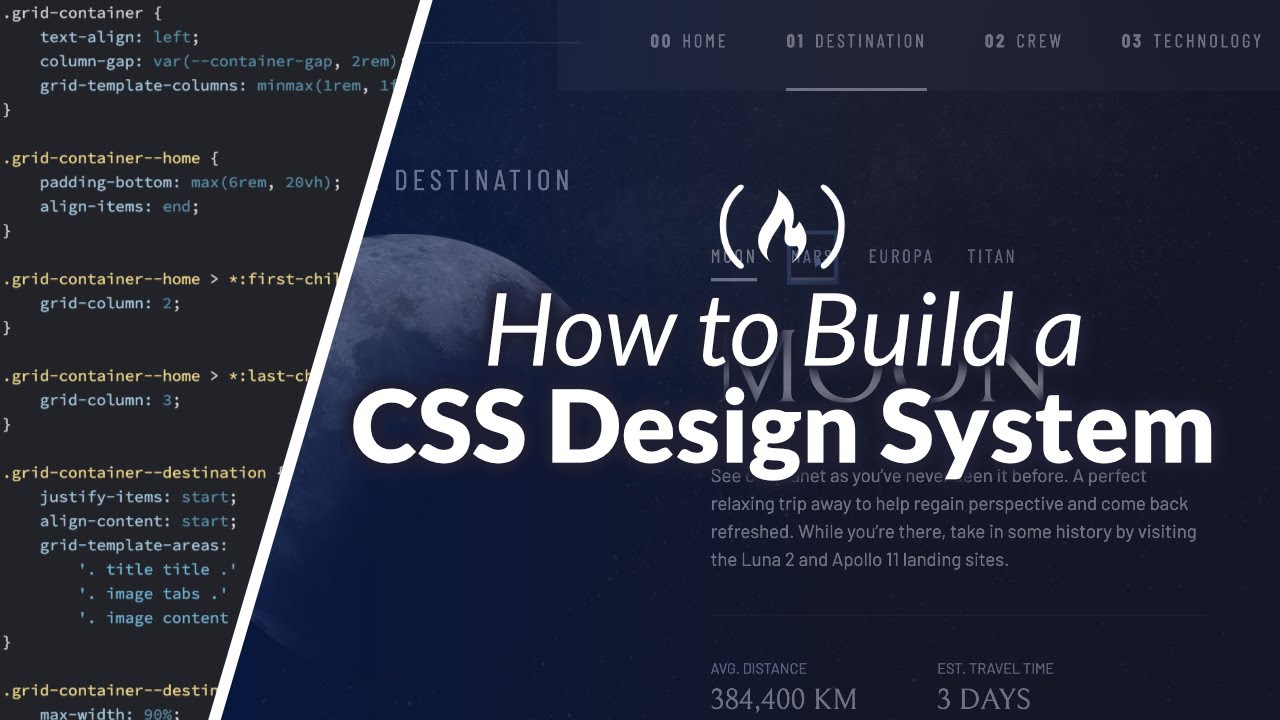


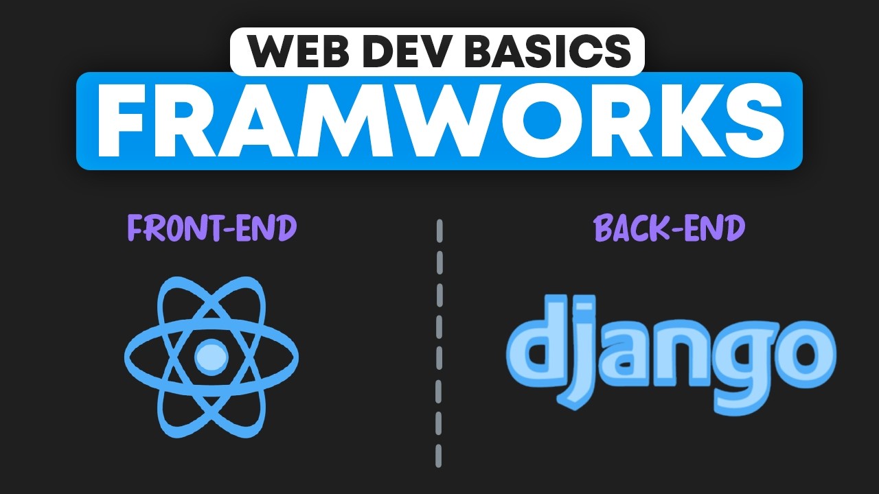