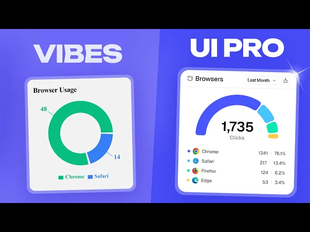
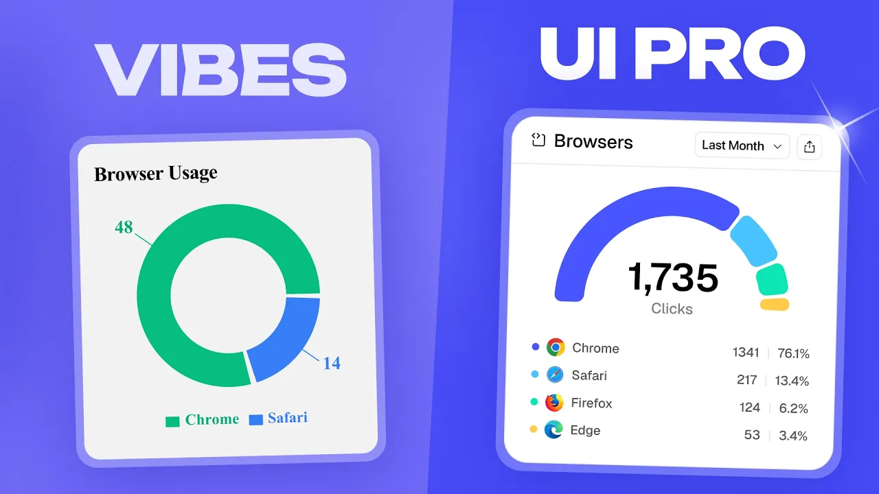
So, you come up with a new idea. Head over to cursor replet or builder to whip something up. It works great, but it doesn't look very good.
So, in the next 6 minutes, I'm going to redesign a real vibecoded URL shortener into a usable and beautiful product, so that by the end, you can design and ship software that looks and feels flawless. The first problem is pretty painfully obvious. Get rid of the emojis.
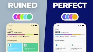
Admittedly, some apps like Notion successfully use them, but if we take this card and just swap to some more professional icons, it already starts looking better. I like phosphor icons, but Lucide or any other interface icon libraries work well, too. Along those same lines, never let an AI choose any of your colors.
They always go for bright colors that don't really work well together. But all we need to do is change the backgrounds from dark blue to dark green. Remove these icons, expand these KPIs, and add in some micro charts.
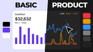
[music] From before to after, we've added in much more relevant information and color through charts instead of buttons and icons. [music] A few more color related changes, and we have the beginnings of a professional dashboard. And if you want a full deep dive on software color theory, check out my previous video right after this one.
But just like you can tell when there's too many of these dashes that an AI wrote this, these four KPIs at the top show up not once, not twice, but three times in a small app. Bringing me to my next point. Never let an AI choose your layout either.
Starting with the sidebar, if I'm in custom domains or teams, the amount of clicks and links doesn't really matter to me. If I need that information, I'll visit the dashboard or the analytics tab, which we definitely need to add. We'll align this to the left and tighten up the spacing, too.
AI also loves to make these gradient profile circles with letters in them. So, let's swap this for an account card. And with that, we can get rid of these links and tuck them into a popover on click and collapse settings and billing and usage together.
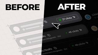
And finally for these cards, they're feeling a little busy. Let's collapse these buttons into a triple dot menu. Move the date to the center.
Collapse these chips to just icons. And move clicks to the right. AI sets up logic well if you tell it to.
And the same is true for features. For example, this create link flyyou is pretty sparse with fields even though we have a ton of space. Because of this, a modal is probably more fitting.
Let's collapse down the advanced options by default and give this a bit of a more modern look. We're also missing a few options like allowing users to swap between their custom domain and link cards or add a description. This layout also allows for more features to easily slot in.
And this is honestly where you can spend the least amount of time and see the largest changes since AI is generally pretty bad at putting together complex layouts and cards. Now, if you actually want to take your designs straight from Figma into productionready code, you should check out today's sponsor, builder. io.
You can import your Figma designs directly. Drp in a screenshot, add a Slack thread with feedback, or even just describe what you need. And Builder.
io works like an AI front-end engineer that actually understands your existing codebase and design system. But what I found really unique is the visual editor. You can drag and drop components, adjust spacing, tweak colors, and fine-tune layouts directly in the interface, and those changes get reflected in your actual codebase.
I've been using it with one of my projects lately, and honestly, the workflow is pretty seamless. You can iterate visually without bouncing between tools and it generates production ready code that actually respects your design system. If you want to take your software to the next level, you can check out builder.
io with the first link down below. Now coming over to the billing and usage page using our new popover. This page definitely needs some human touch.
First, this card doesn't do anything. And that's a pattern you're going to see a lot with AI, so it can go. Then let's retitle this and create a few tabs since we're pretty much going to nuke this whole page and start from scratch.
First, these KPIs are very vibe cody and lame. Instead, a real simple two column layout really elevates things, especially with a few small doughut charts. Now, in the billing tab, these plans down here are a bit of a mess.
It doesn't make any sense that standard is less than hobby until you realize that this is discounted and team technically is too. At least we're going to assume that it is. Also, having five plans is really not ideal.
Hobby probably makes the most sense to drop, but at least one of them needs to go. The hierarchy isn't bad, but I think we can tune it up a little with that extra width we have. Let's drop some of the unnecessary elements and adjust the colors.
Drp the size of the name since no one cares about that. Increase the size of the cost per month since people do care about that. Business has become enterprise since if you need 50,000 links per month, you probably need more.
Showing the actual discount the user is getting is very important. And also showing them what the next plan includes that the current plan doesn't have. This kind of pricing pattern is extremely common for softwares like resend or superbase.
Finally, let's throw in a billing email and payment method for good measure. The pro of this layout is as things scale and you need to add documents, integrations or AI, it's easy to add another tab and go. Now, we've added in the analytics tab for a reason.
So, let's use it. Let's first toss these KPIs as we discussed earlier along with these tabs. Now, when you're creating features for your SAS, don't forget about the lowhanging fruit.
The simple features that make your app way [music] better. First, let's move these actions down here and add a toggle to split into individual links. Doing this allows you to compare certain links against each other.
Something super easy to implement and genuinely useful. Then, I'll shove a lot more useful information into this row with helpful icons that also add a splash of color. Finally, below that, instead of a boring bar chart, let's actually show them a map with shaded regions and the actual data to the left for a much more rich experience.
Seriously, from start to finish on just analytics, we've created such a big change just by changing a few charts and adding in some icons. Finally, let's talk landing pages. This is where you'll lose most of your customers if you vibe code it.
There's definitely a standard of quality on SAS landing pages that establishes trust, even subconsciously. Applying some of the color and layout principles we talked about helps, but what we really need are some graphics. Even adding something as stupid simple as link cards with some skew really starts to elevate the page.
And instead of these lameass icons, we can use a slightly edited image of the analytics page we designed or same idea with password protection. Landing pages aren't about complexity, they're about presentation. And generally, the better the presentation, the better the conversion.
And that is everything you'll need to turn your vibecoded app into a pro piece of software. If you'd like to check out builder. io, it'll be the very first link down below.
And the link to all of the Figma assets will be down there, too. Thank you so much for watching, and I'll see you in the next one.